Featured interiors:
No items were found matching your selection.

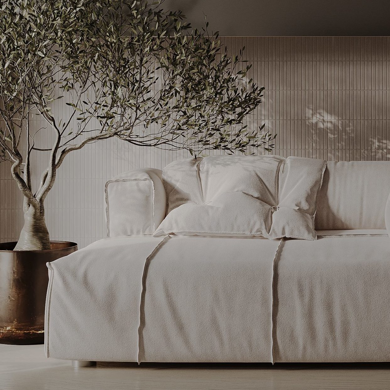
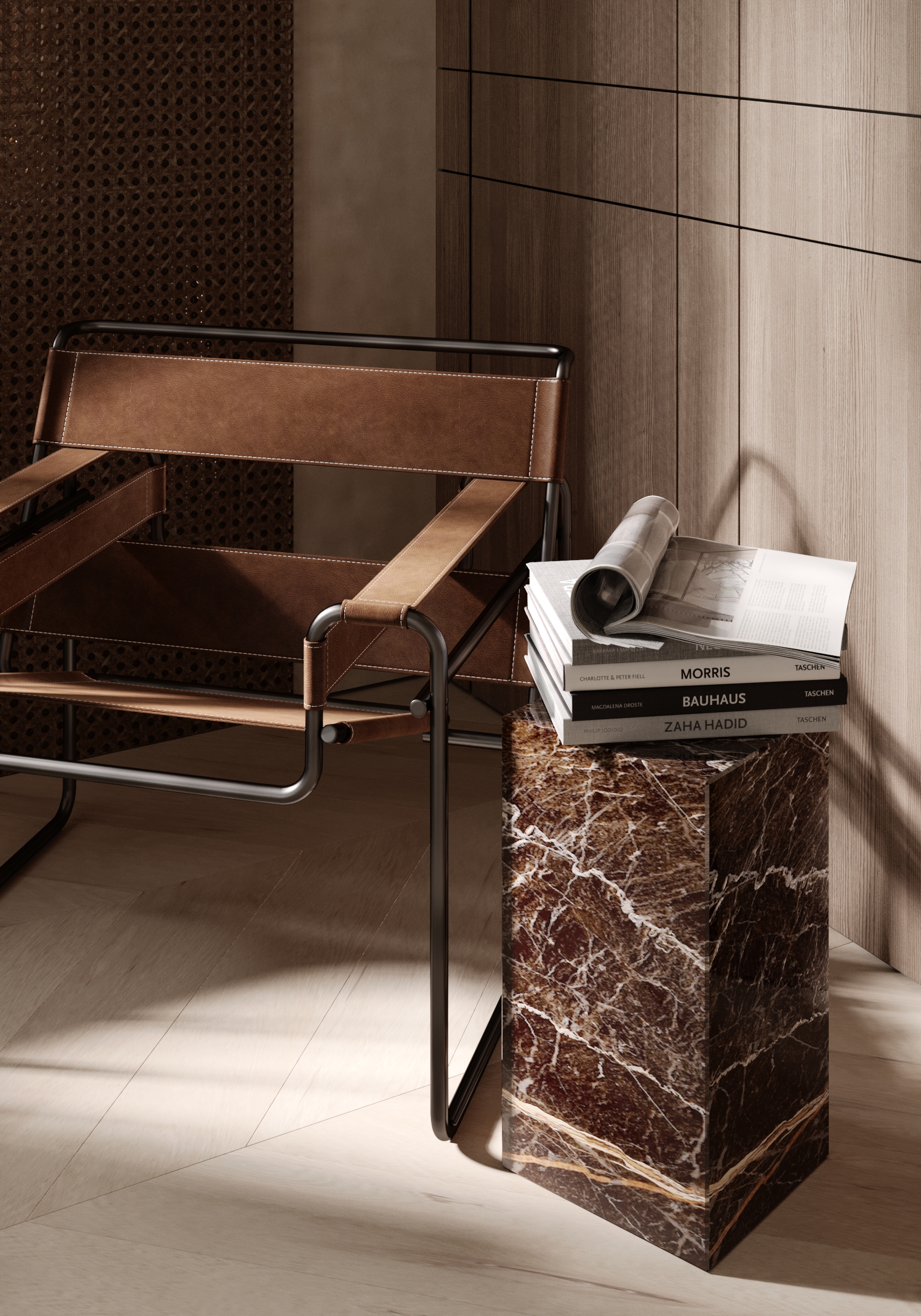
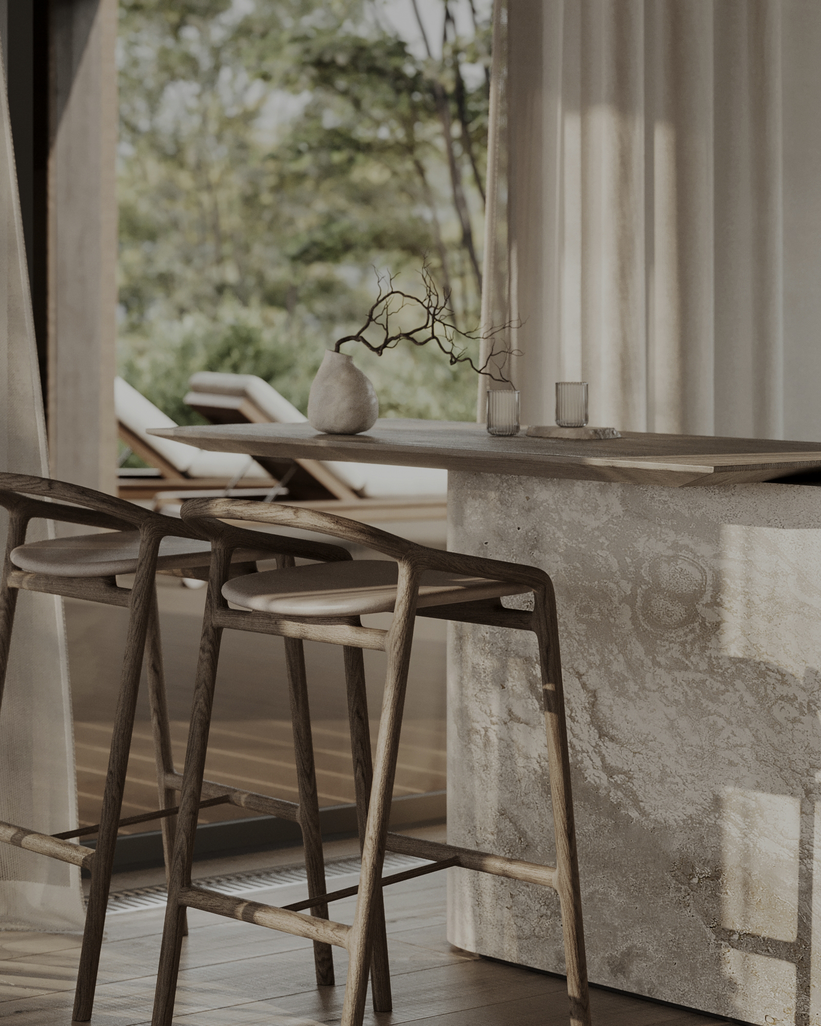
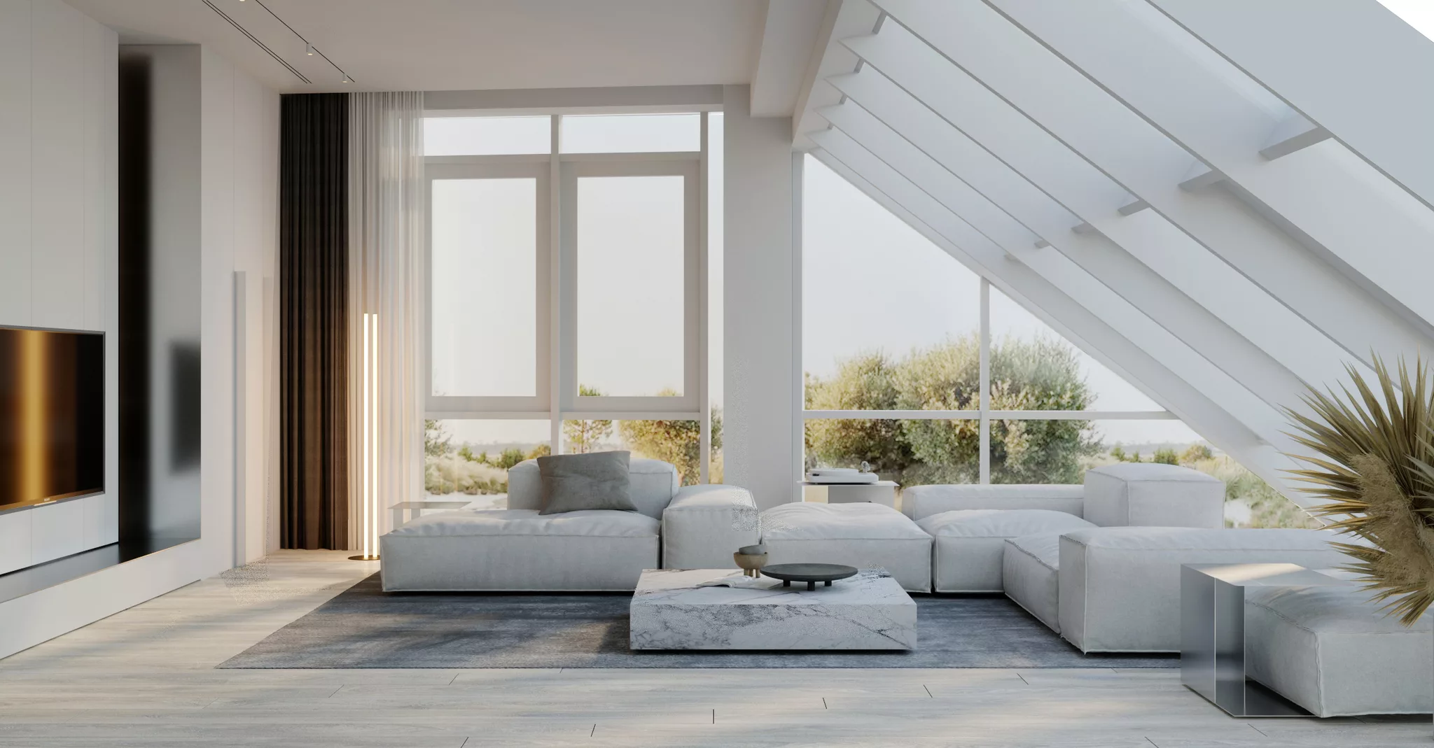
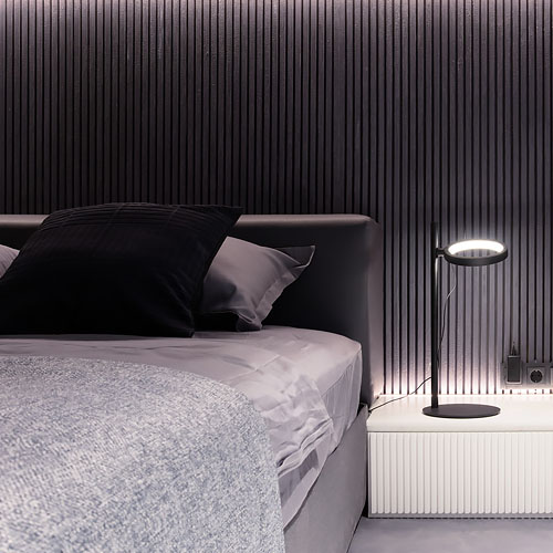
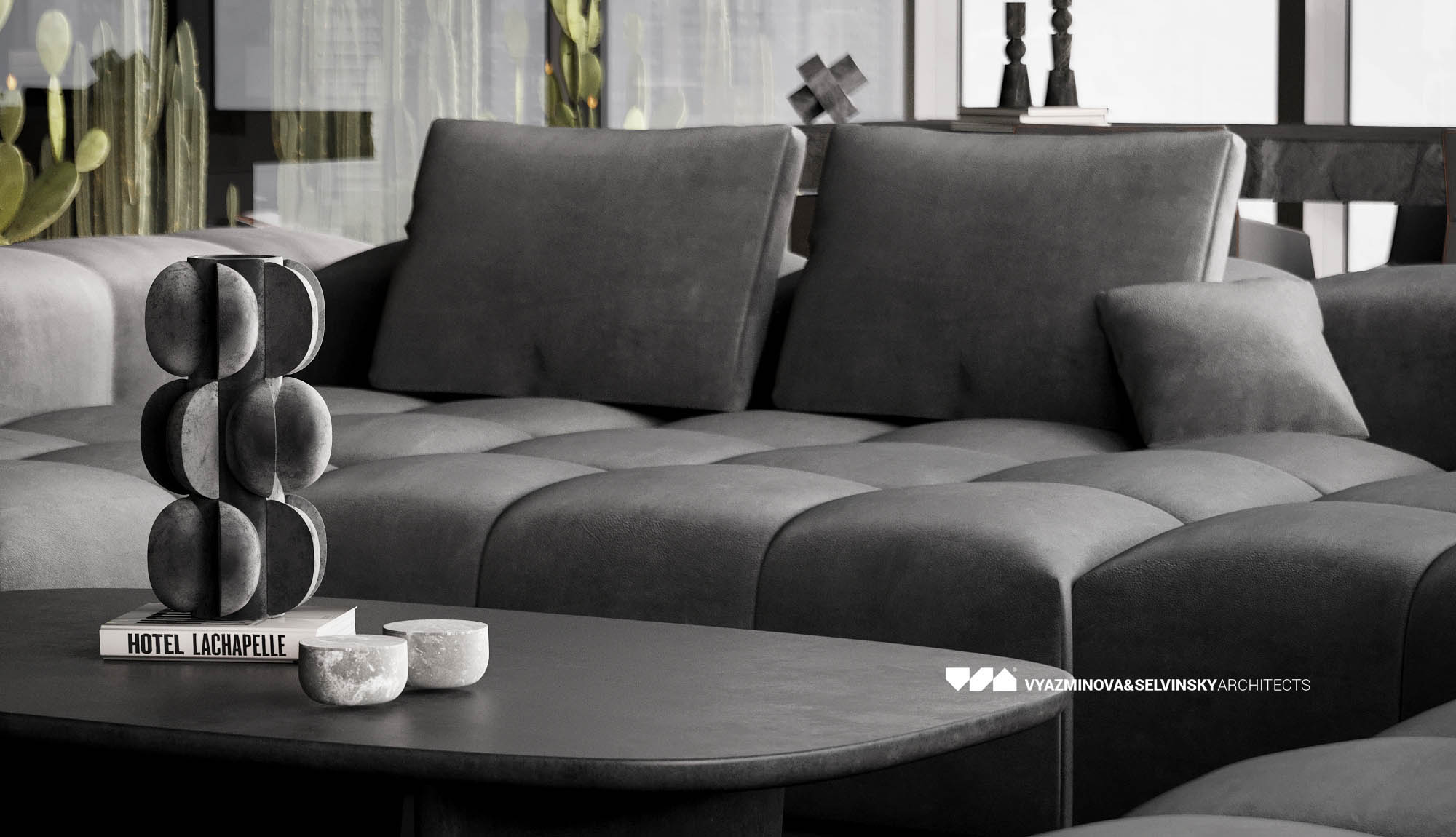
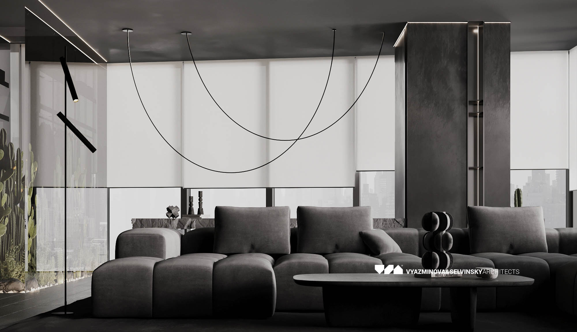
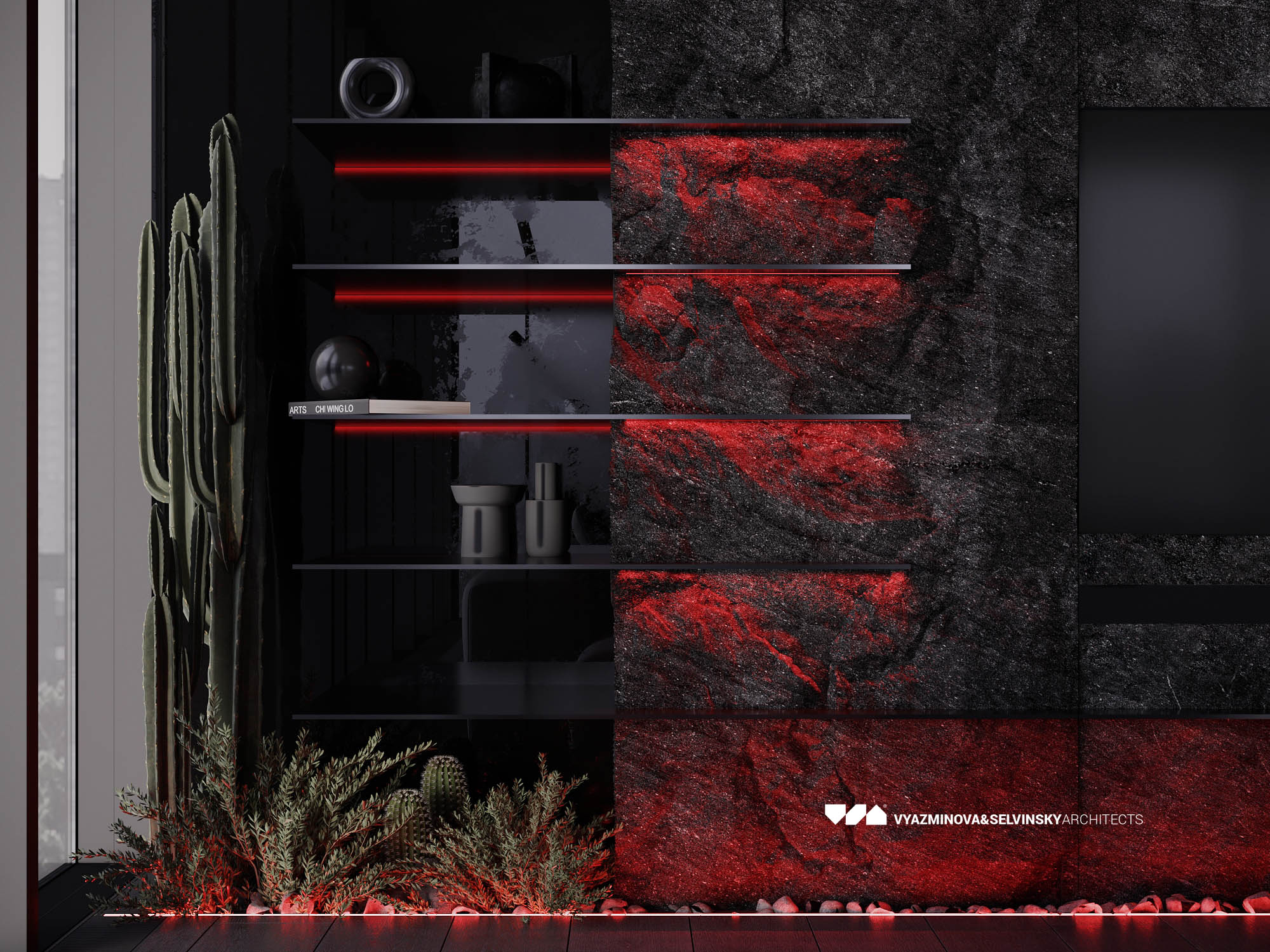
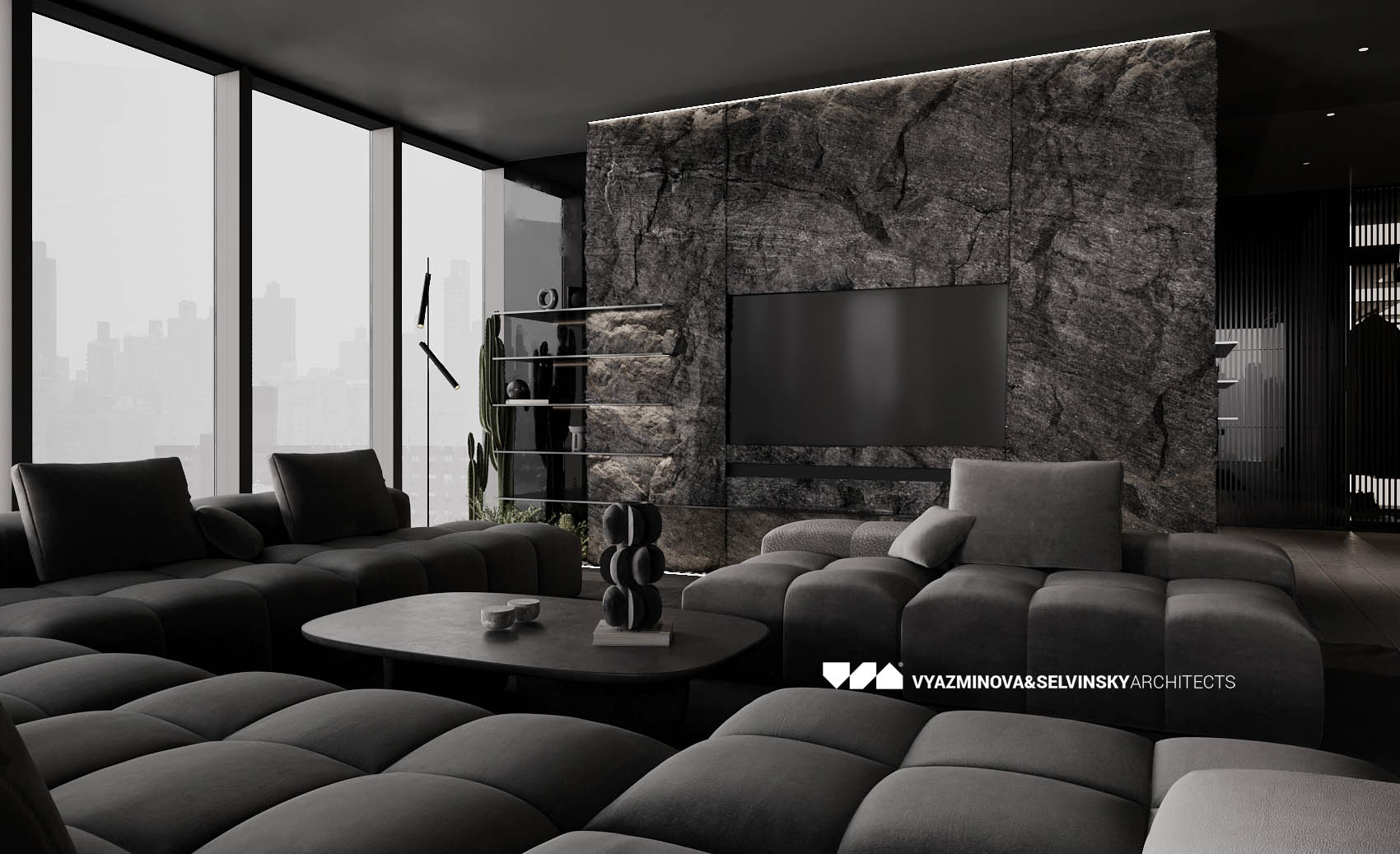
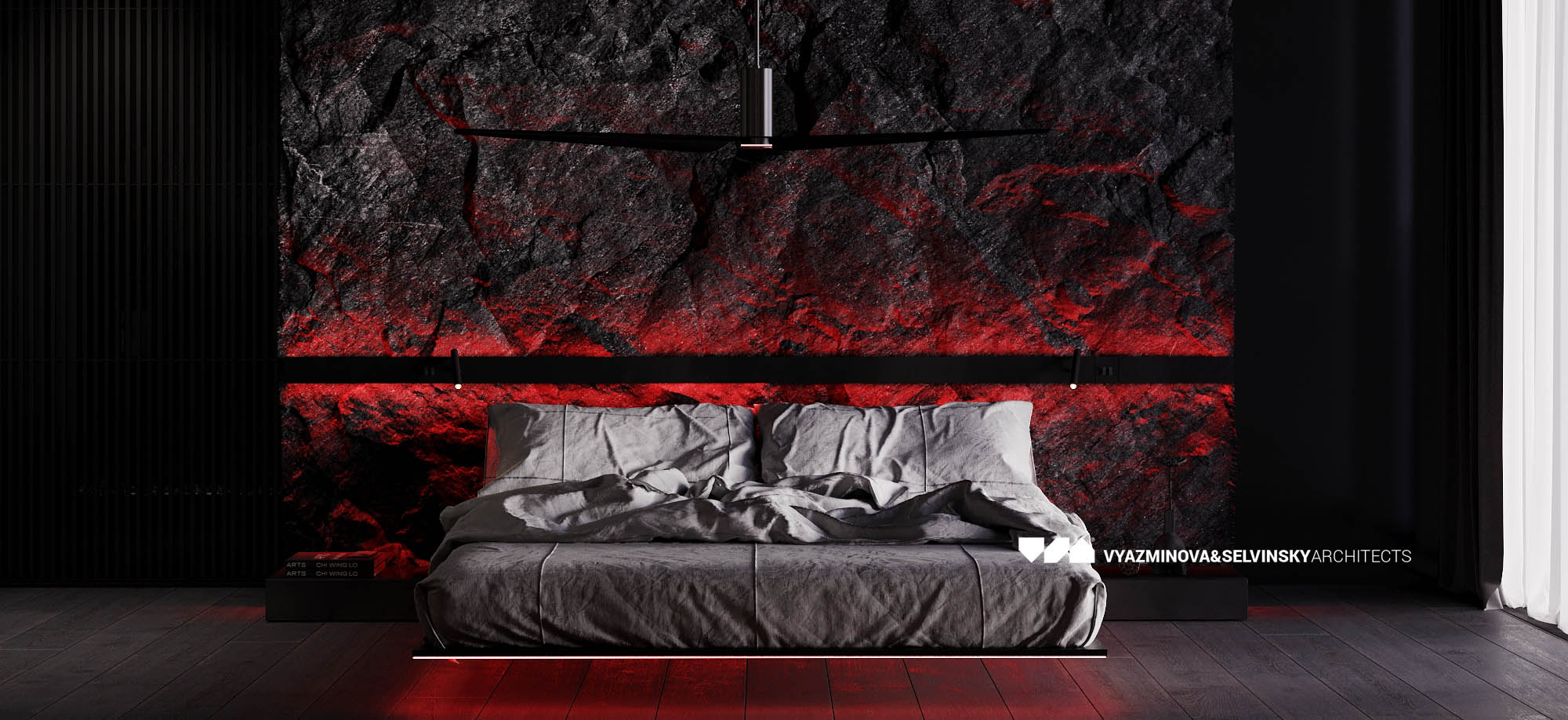
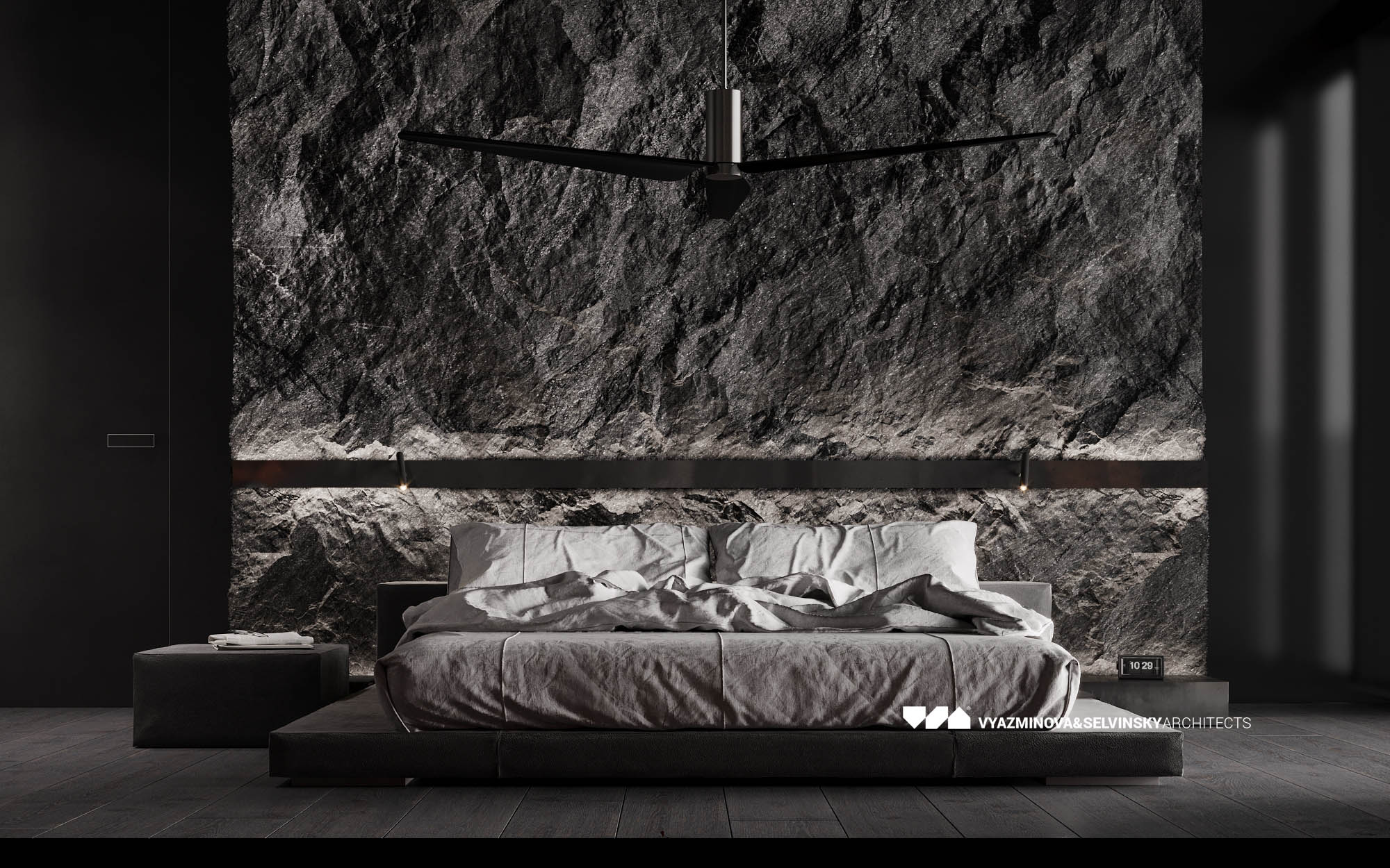
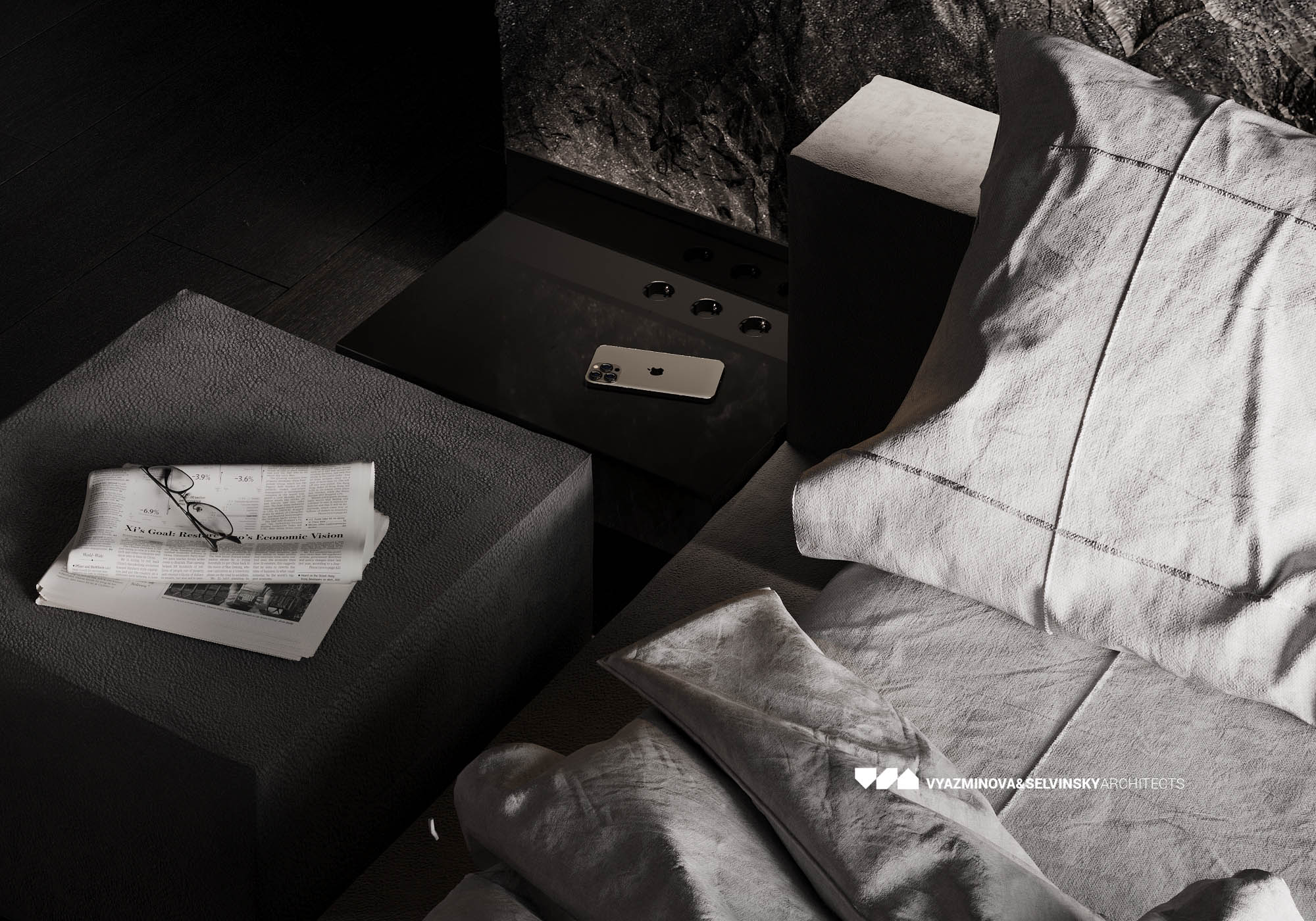
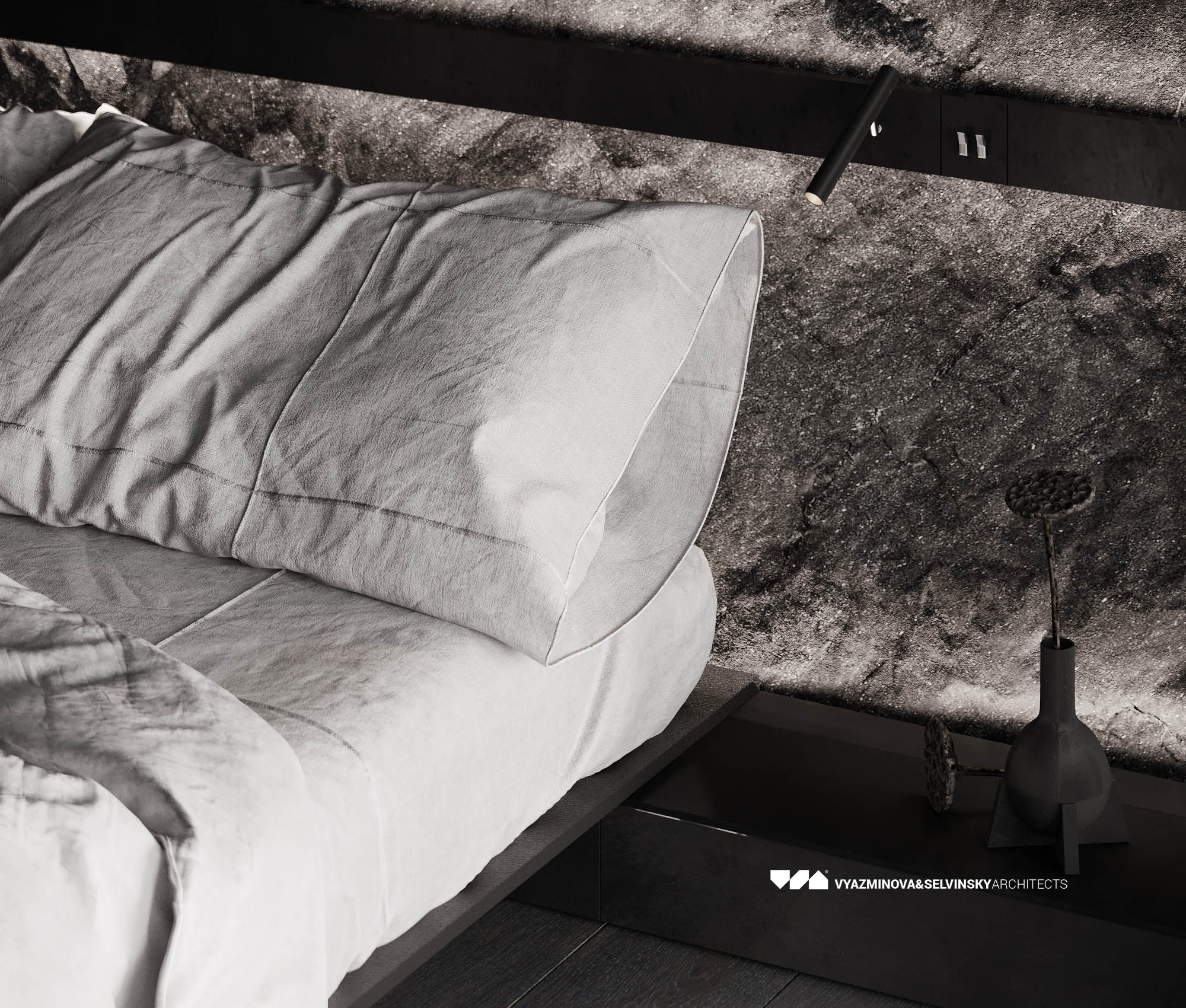
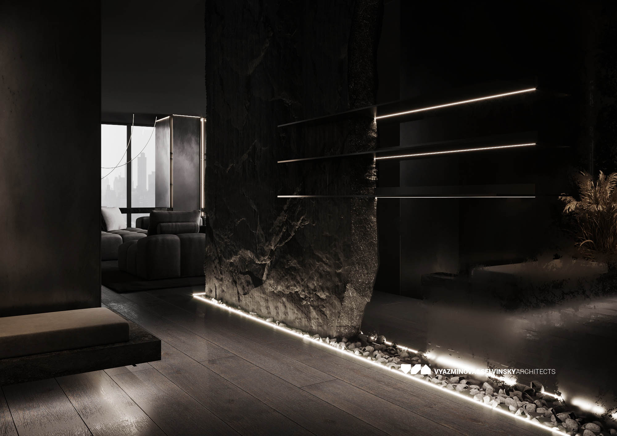
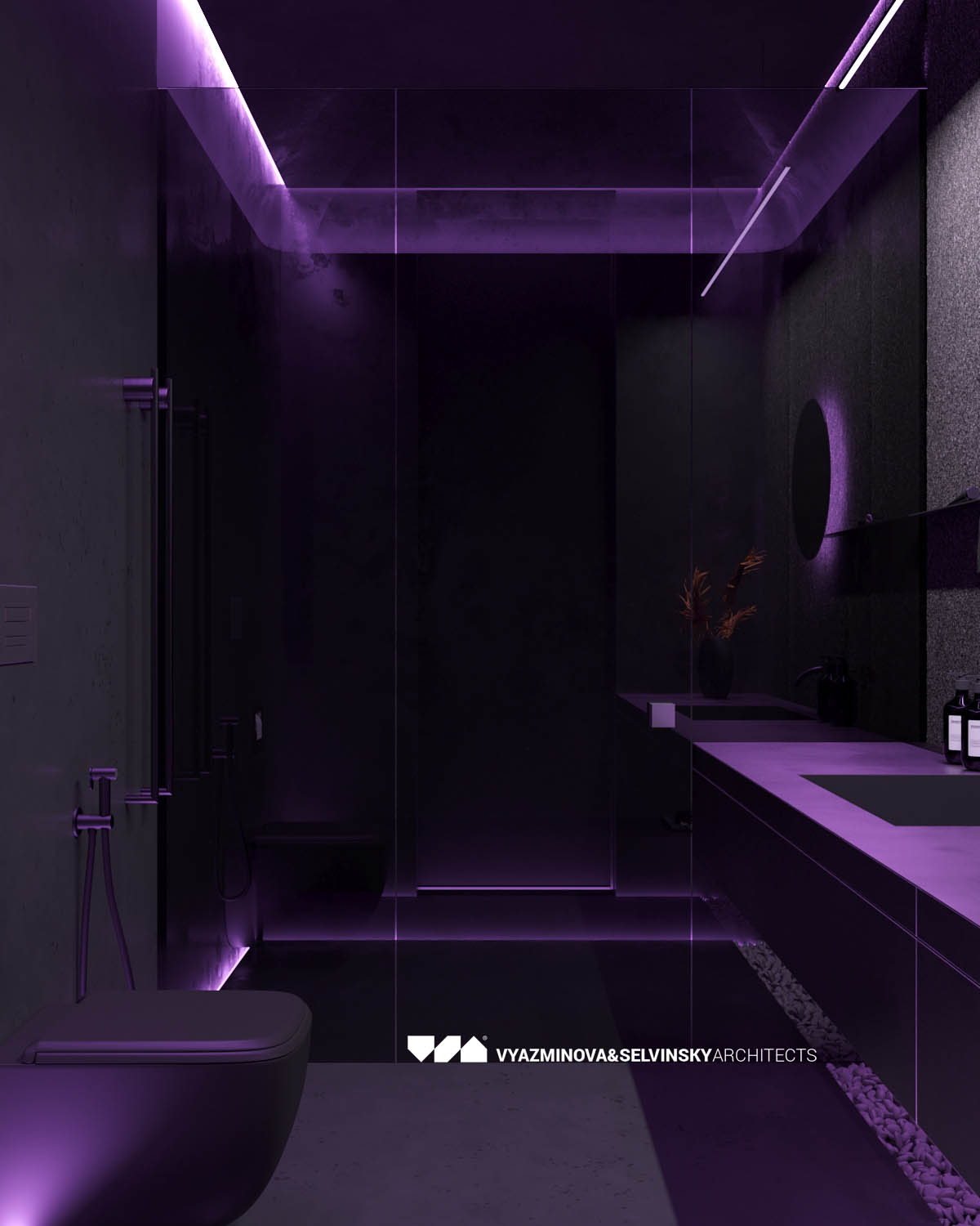
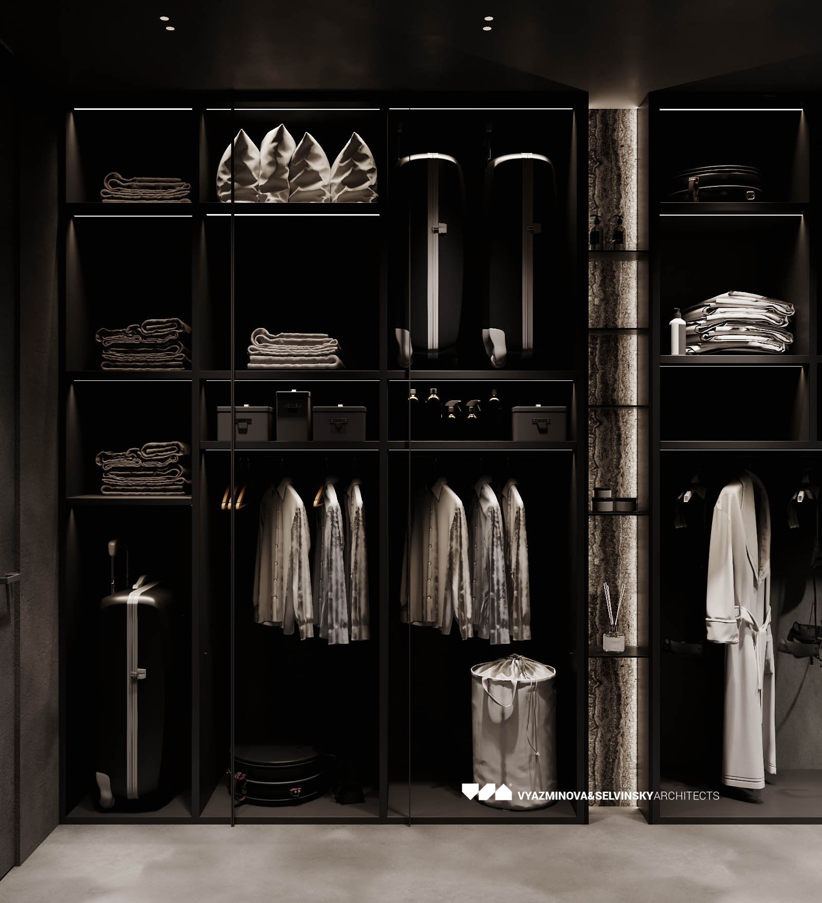
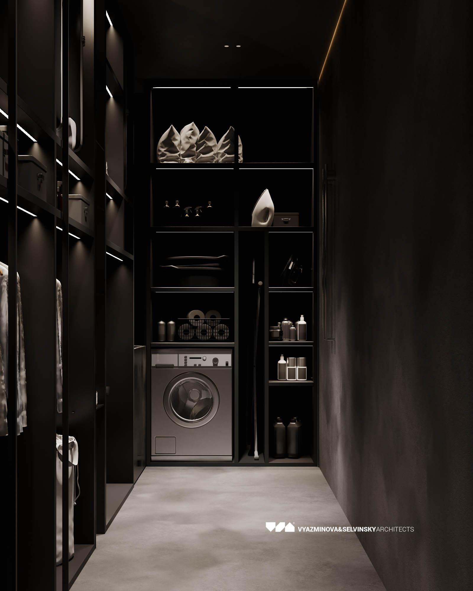
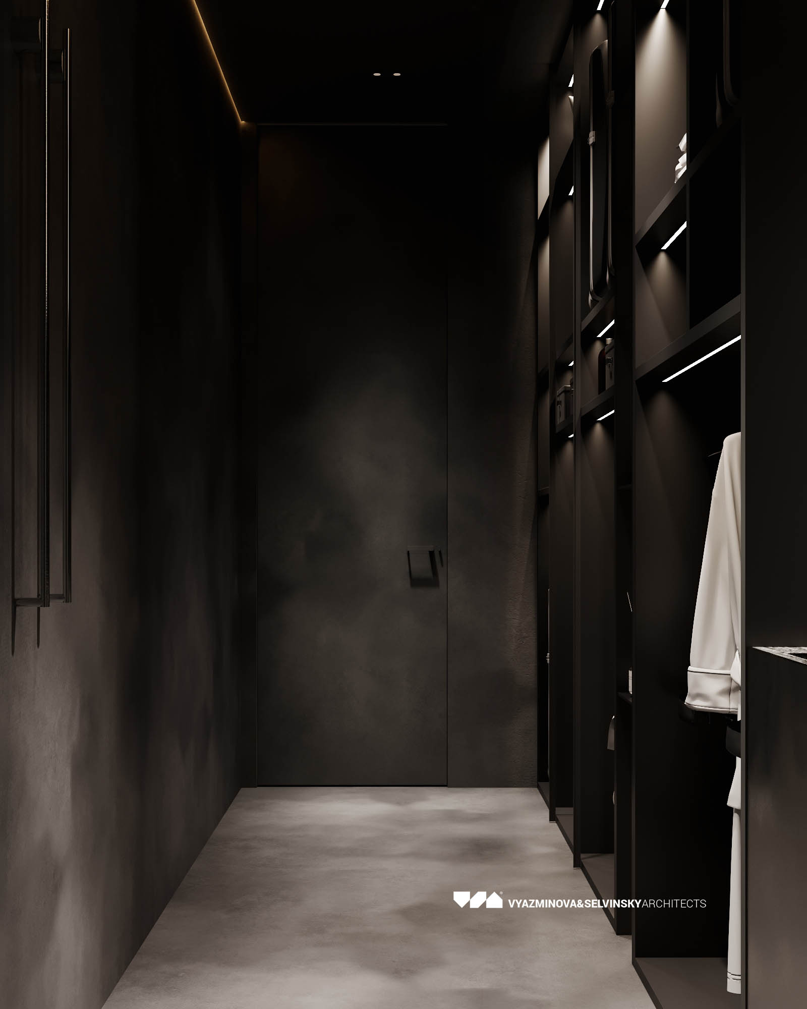
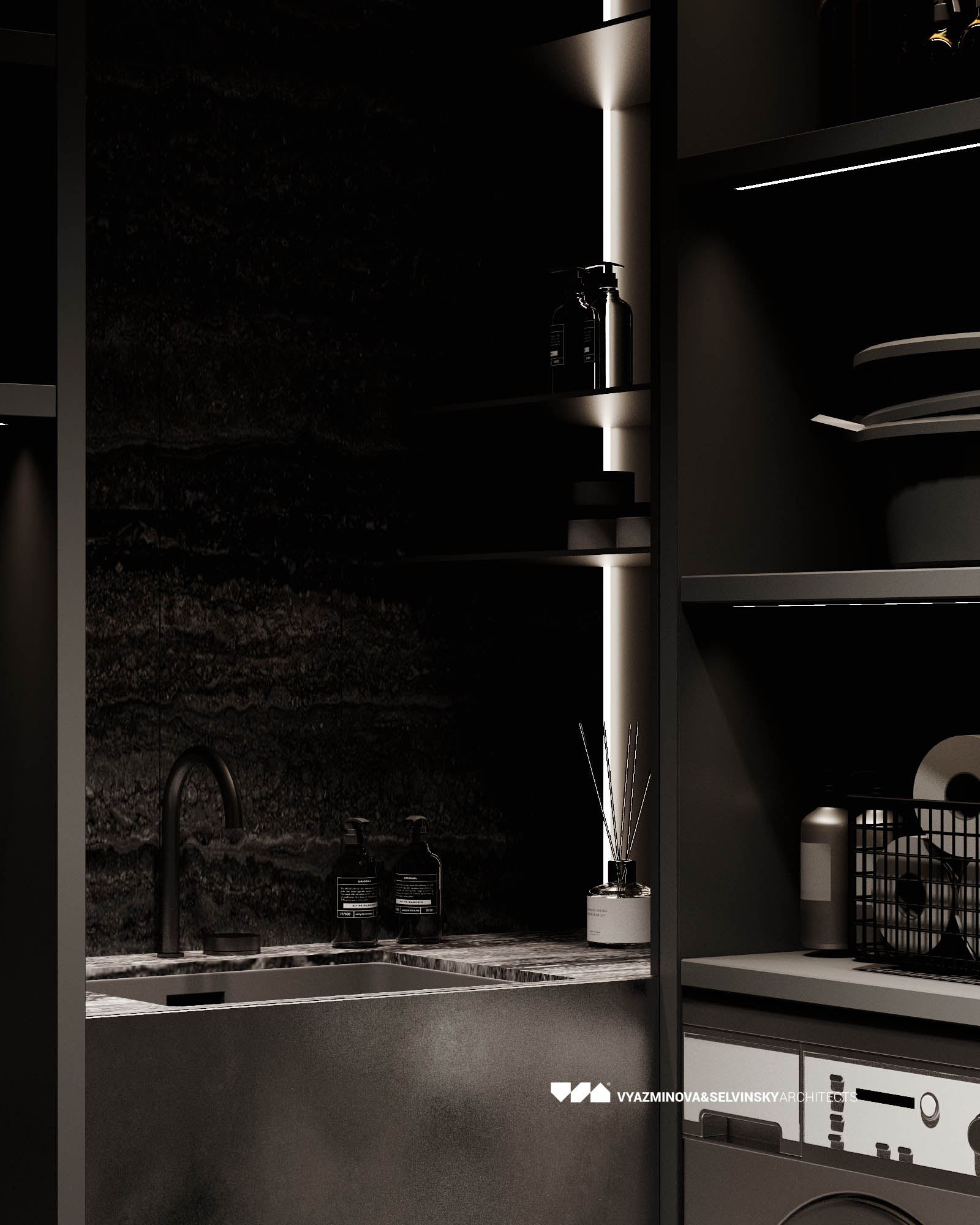
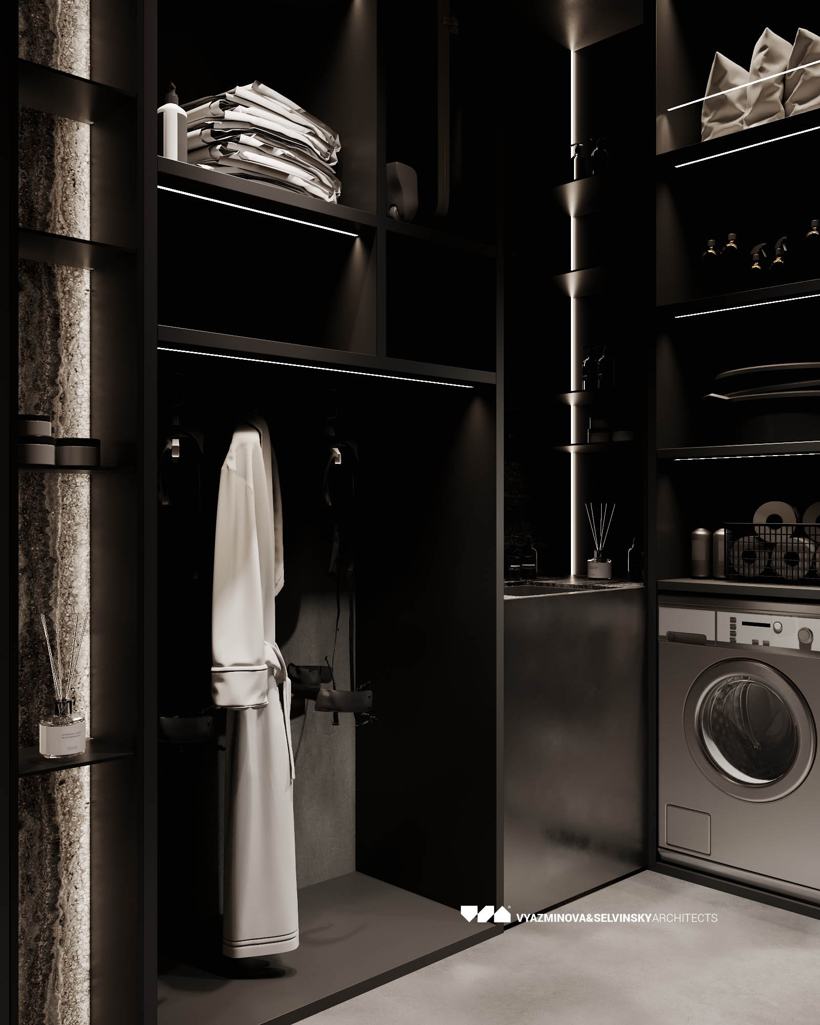
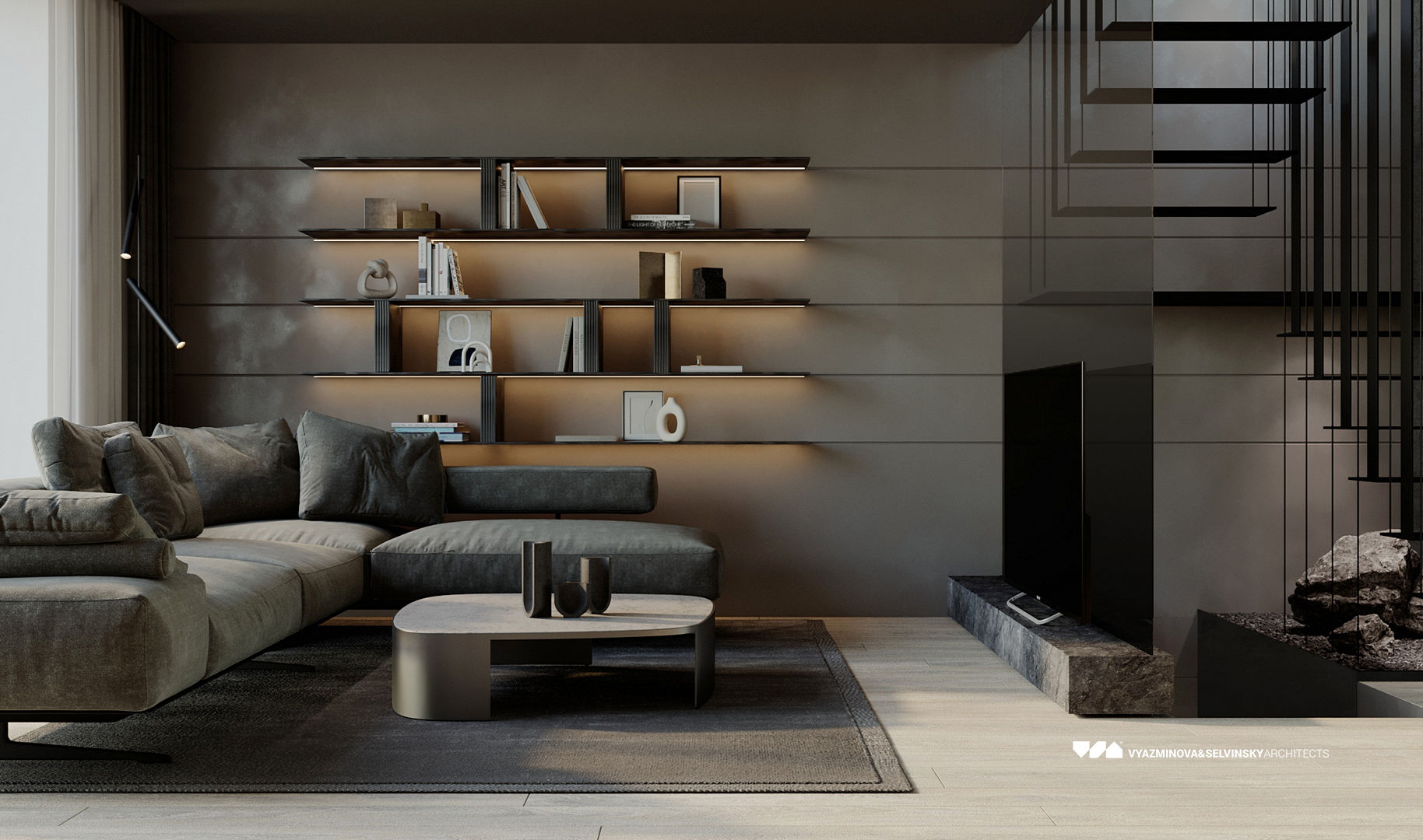
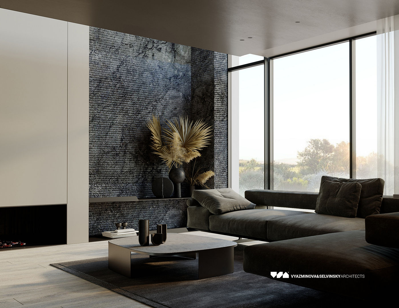
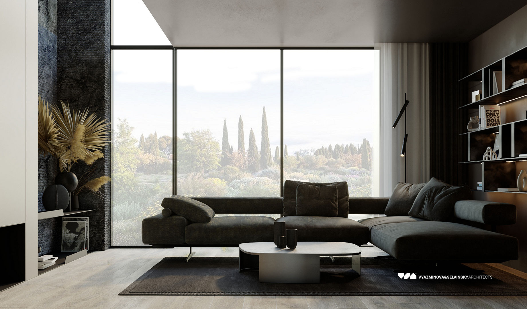
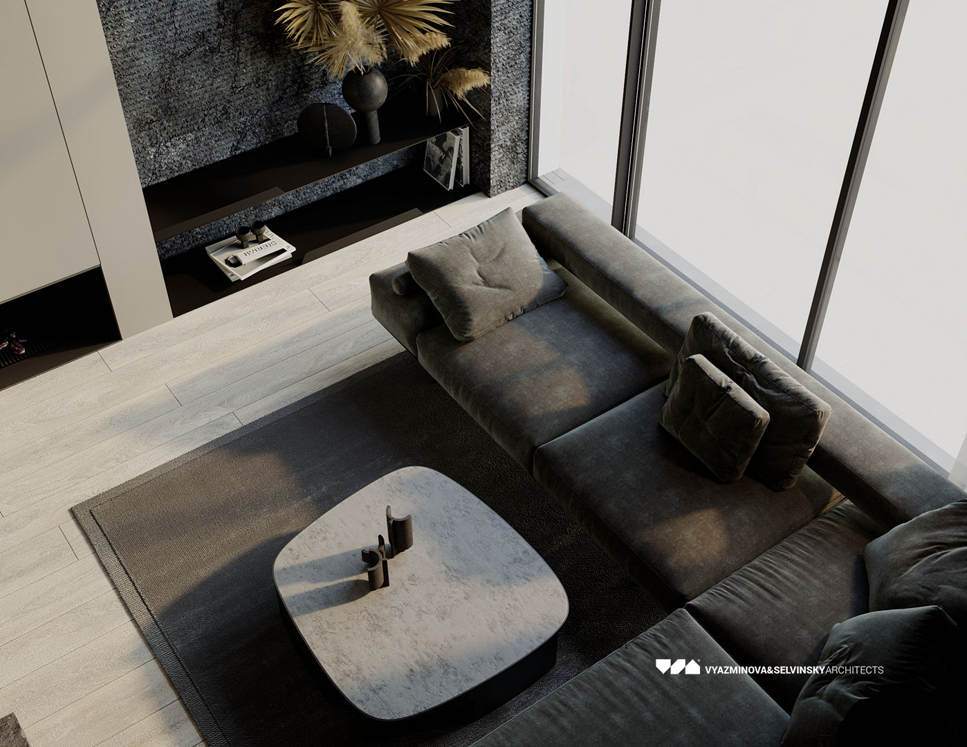
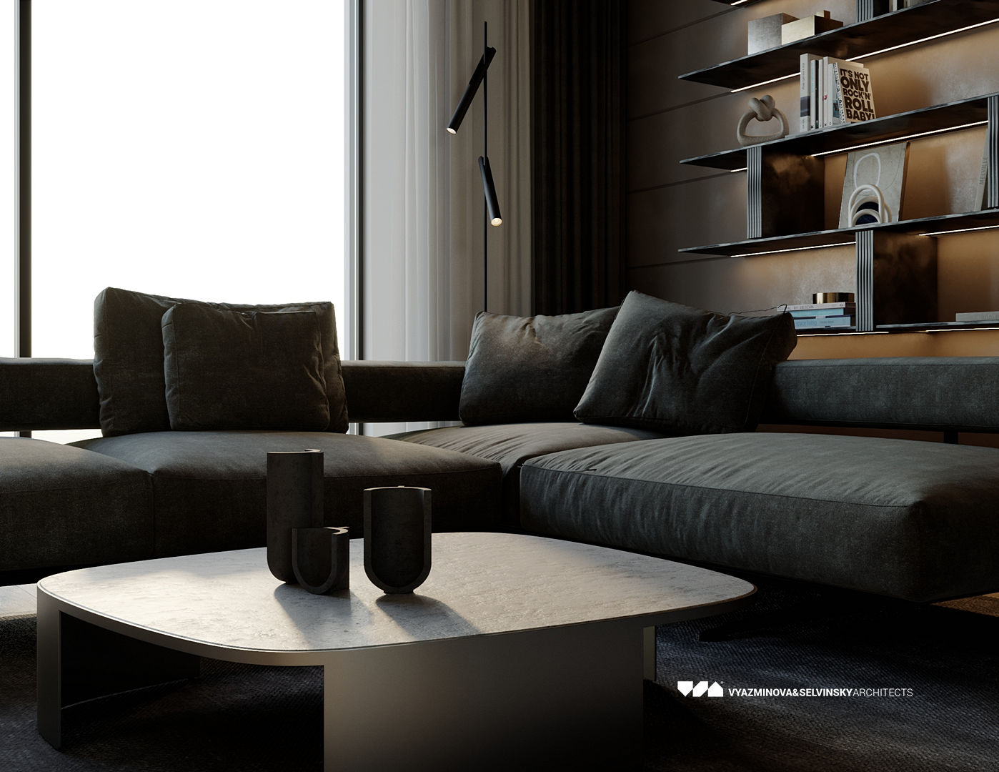
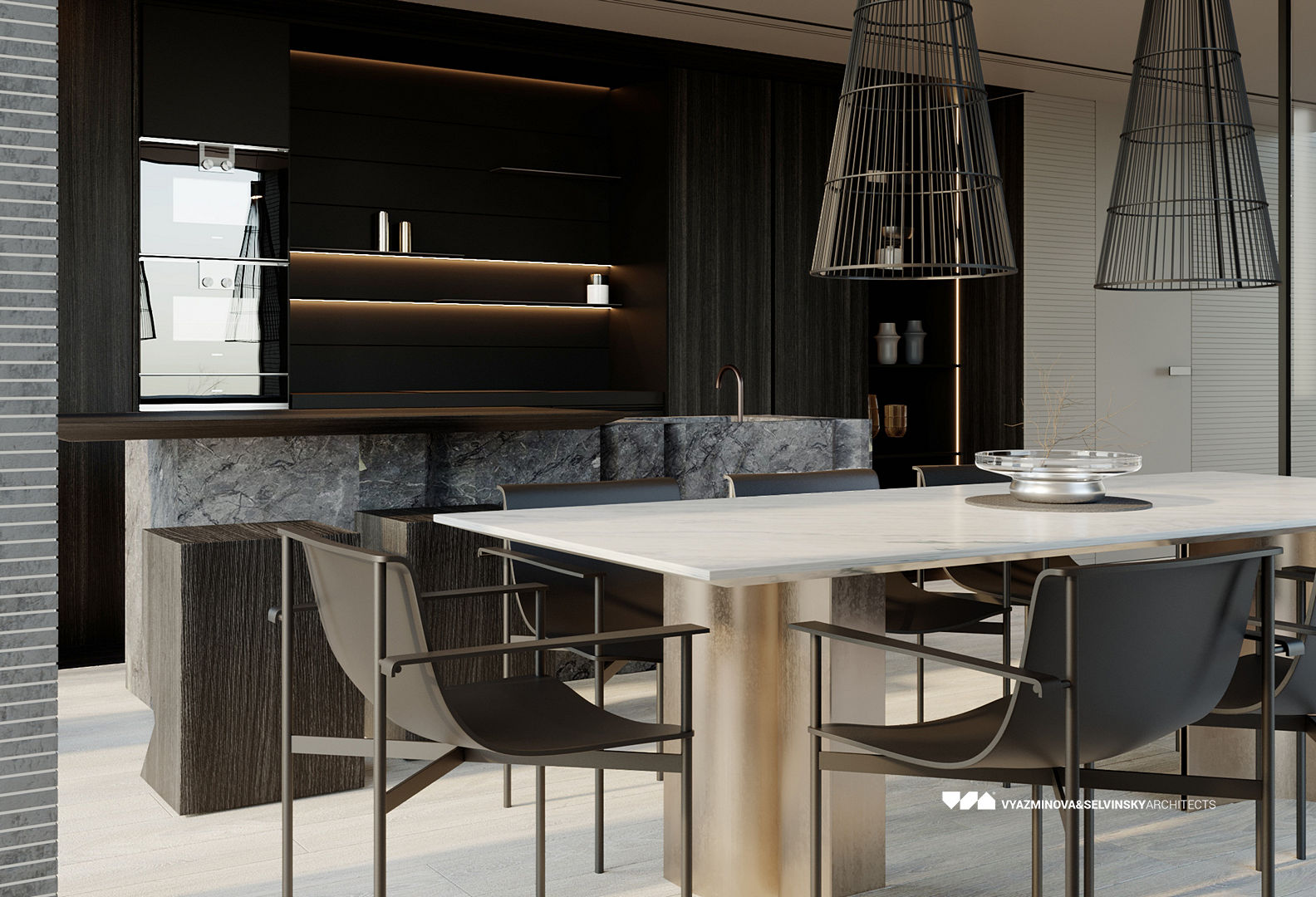
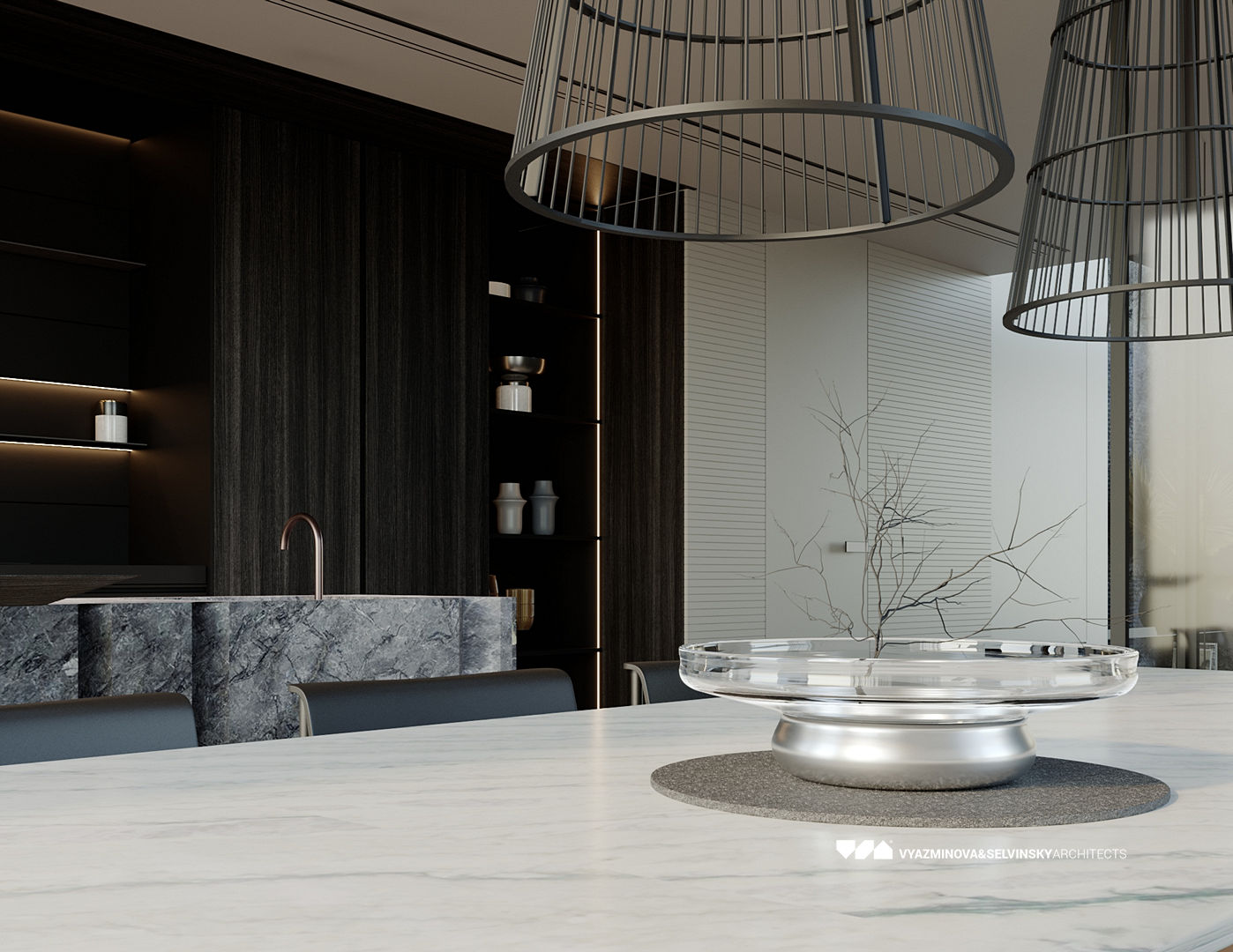
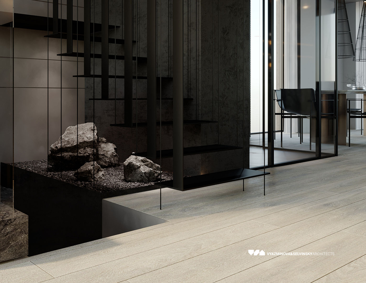
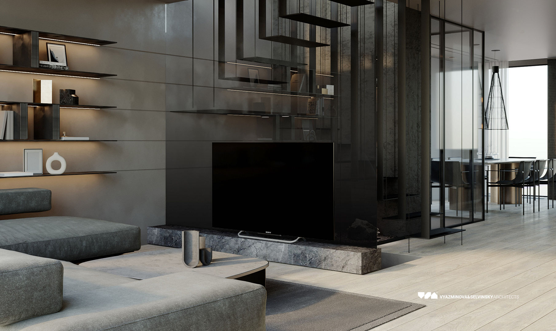
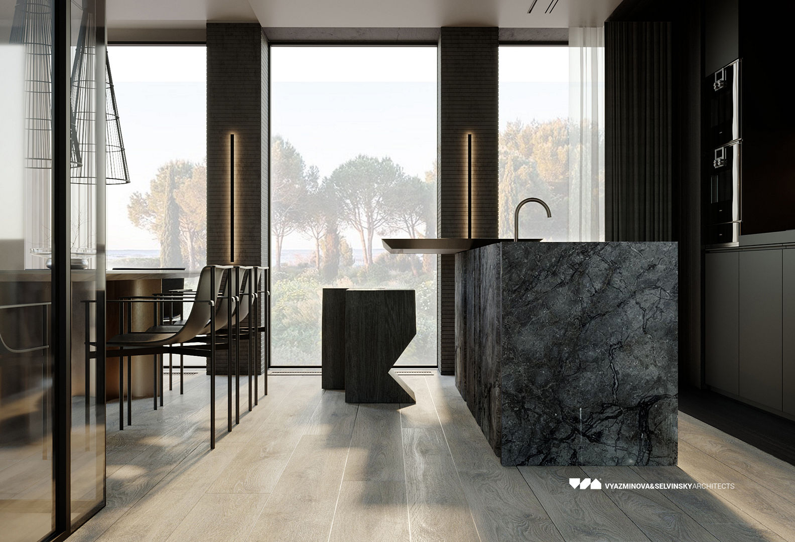
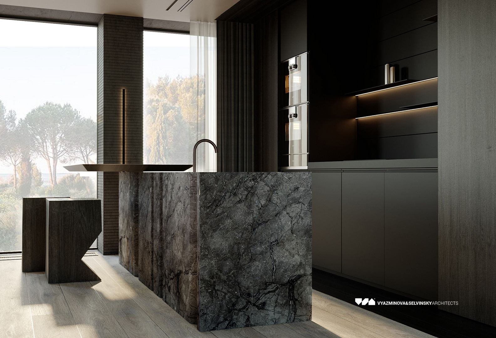
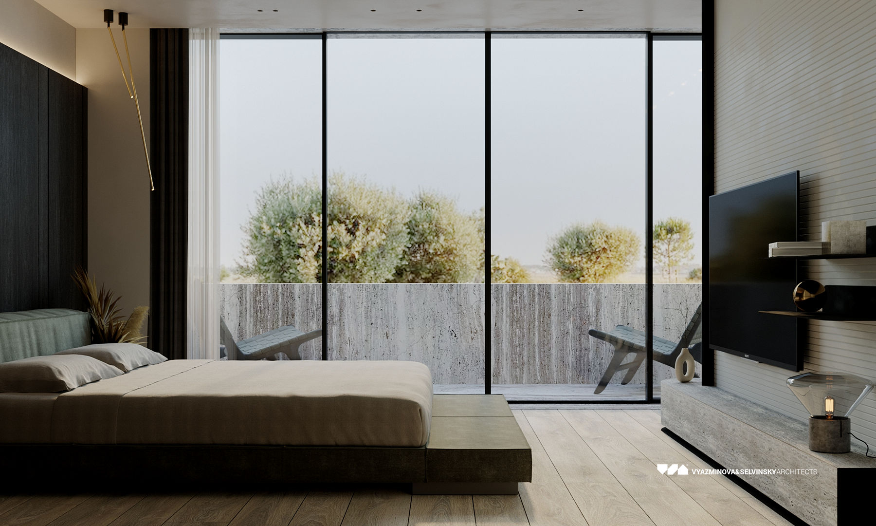
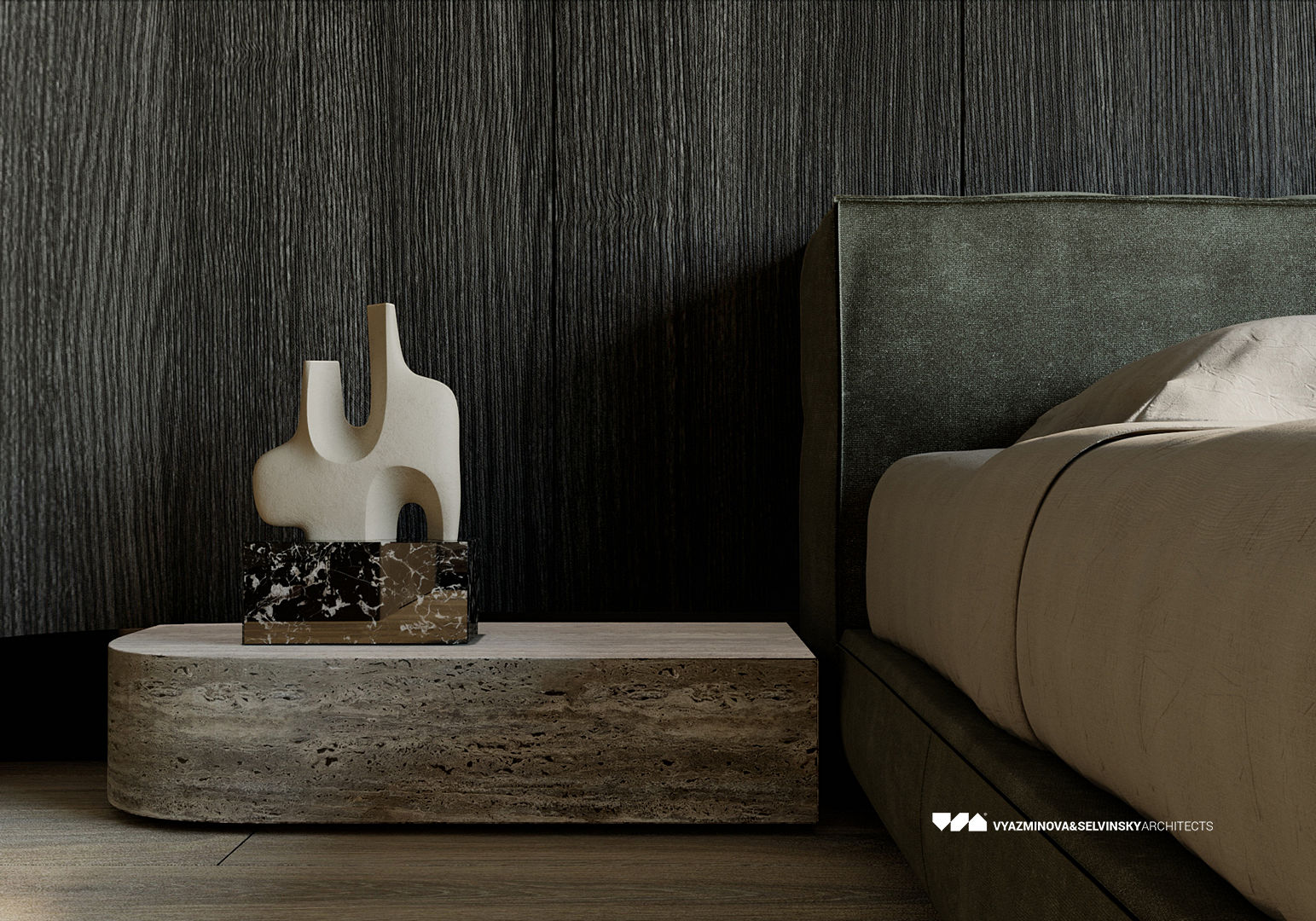
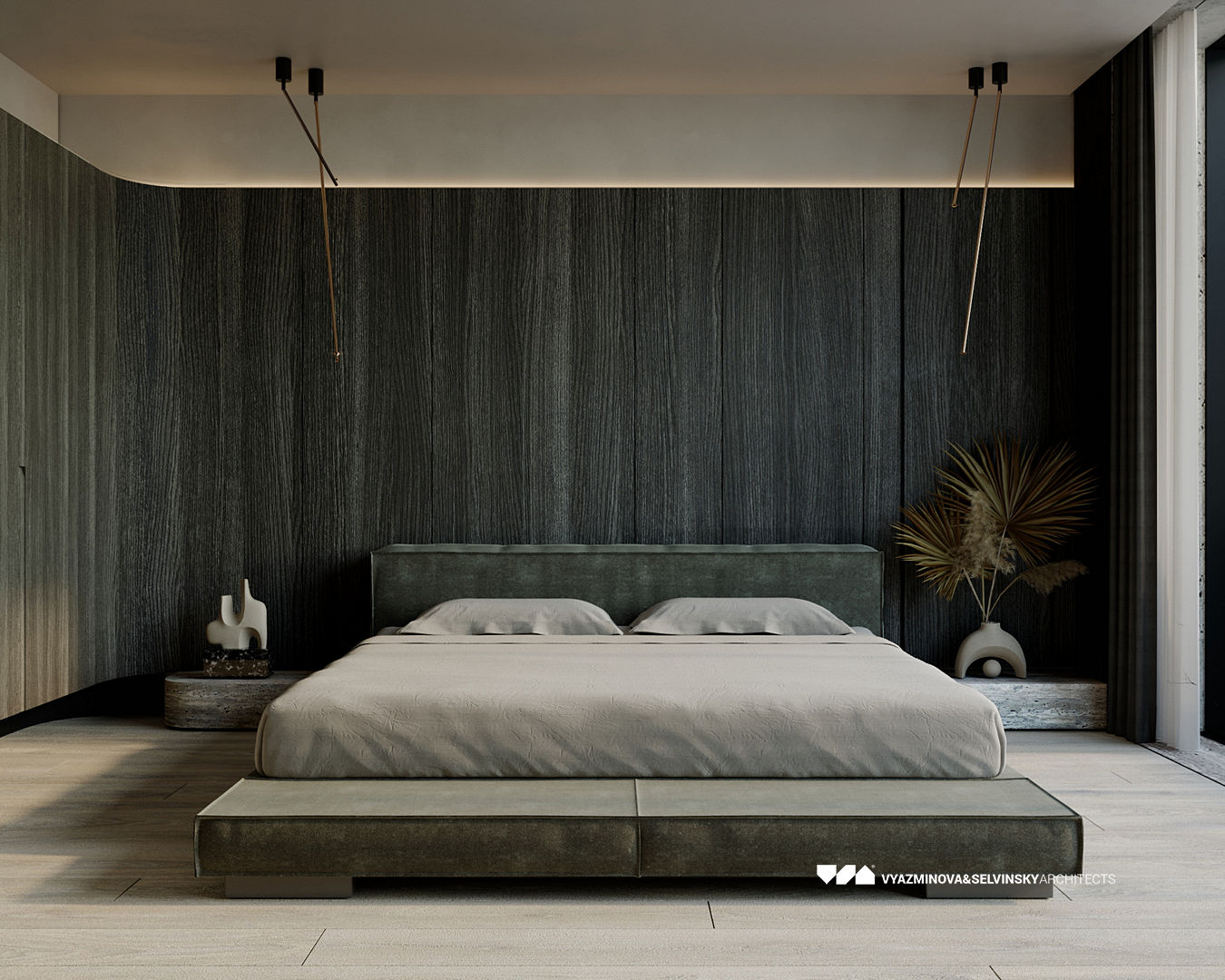
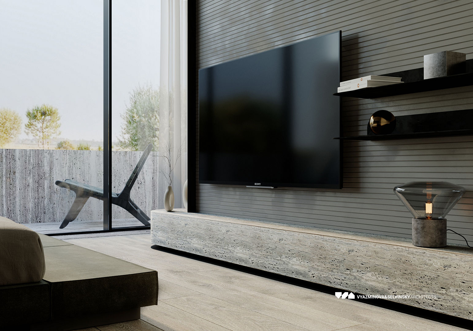
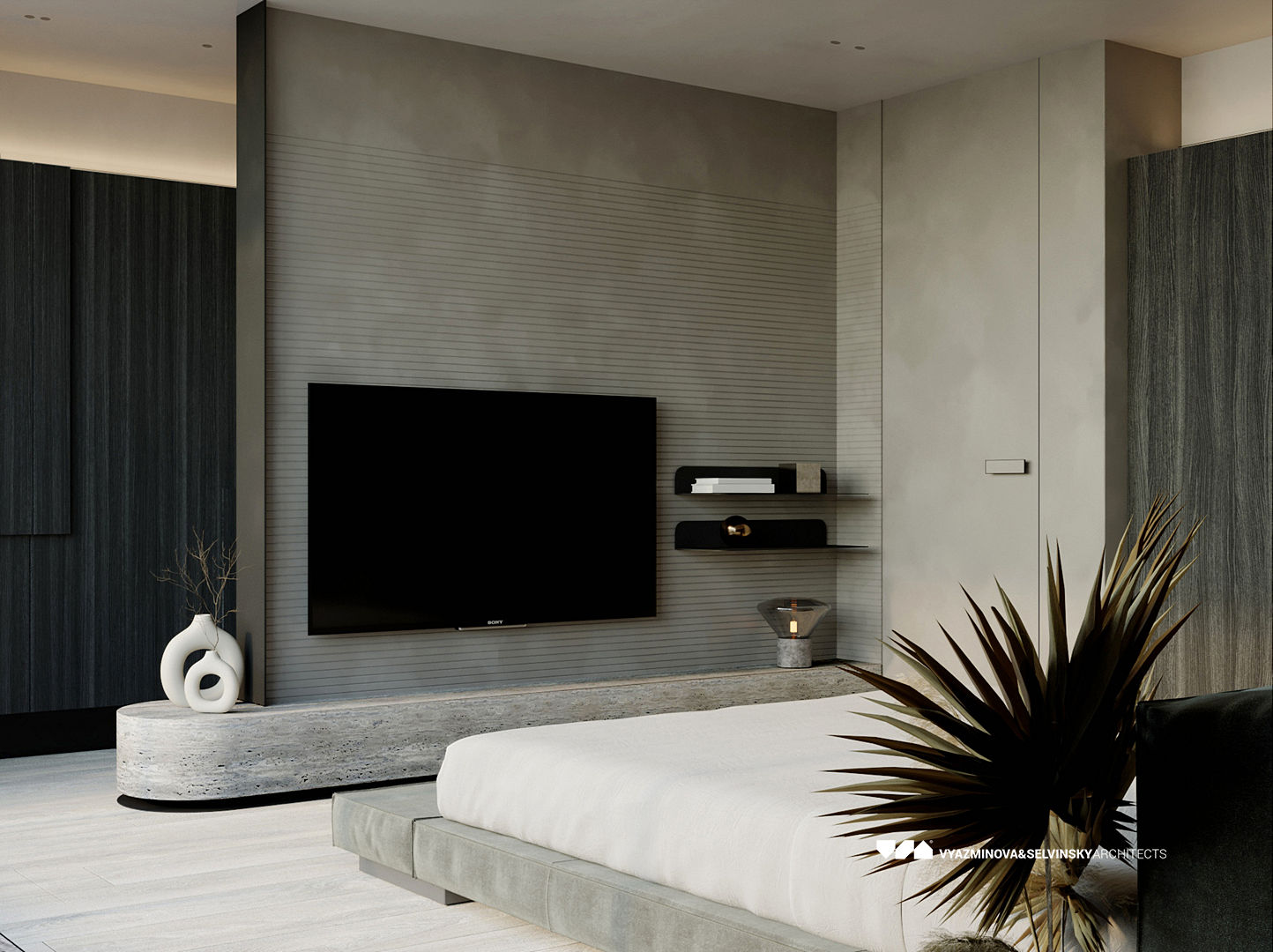
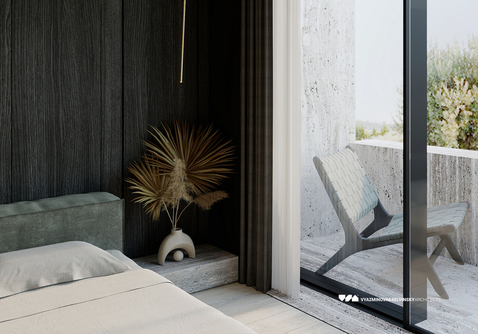
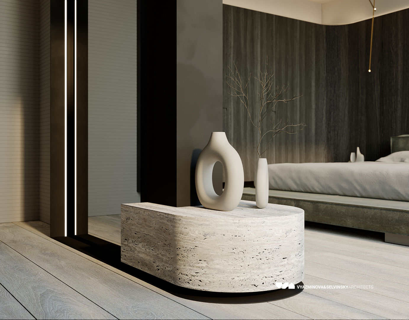
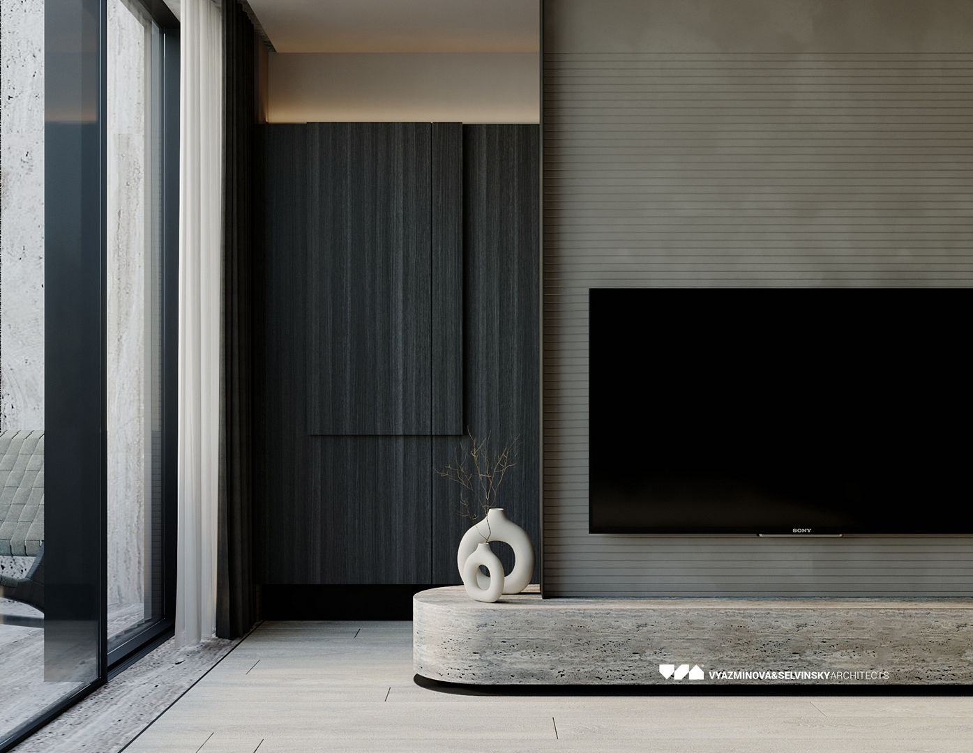
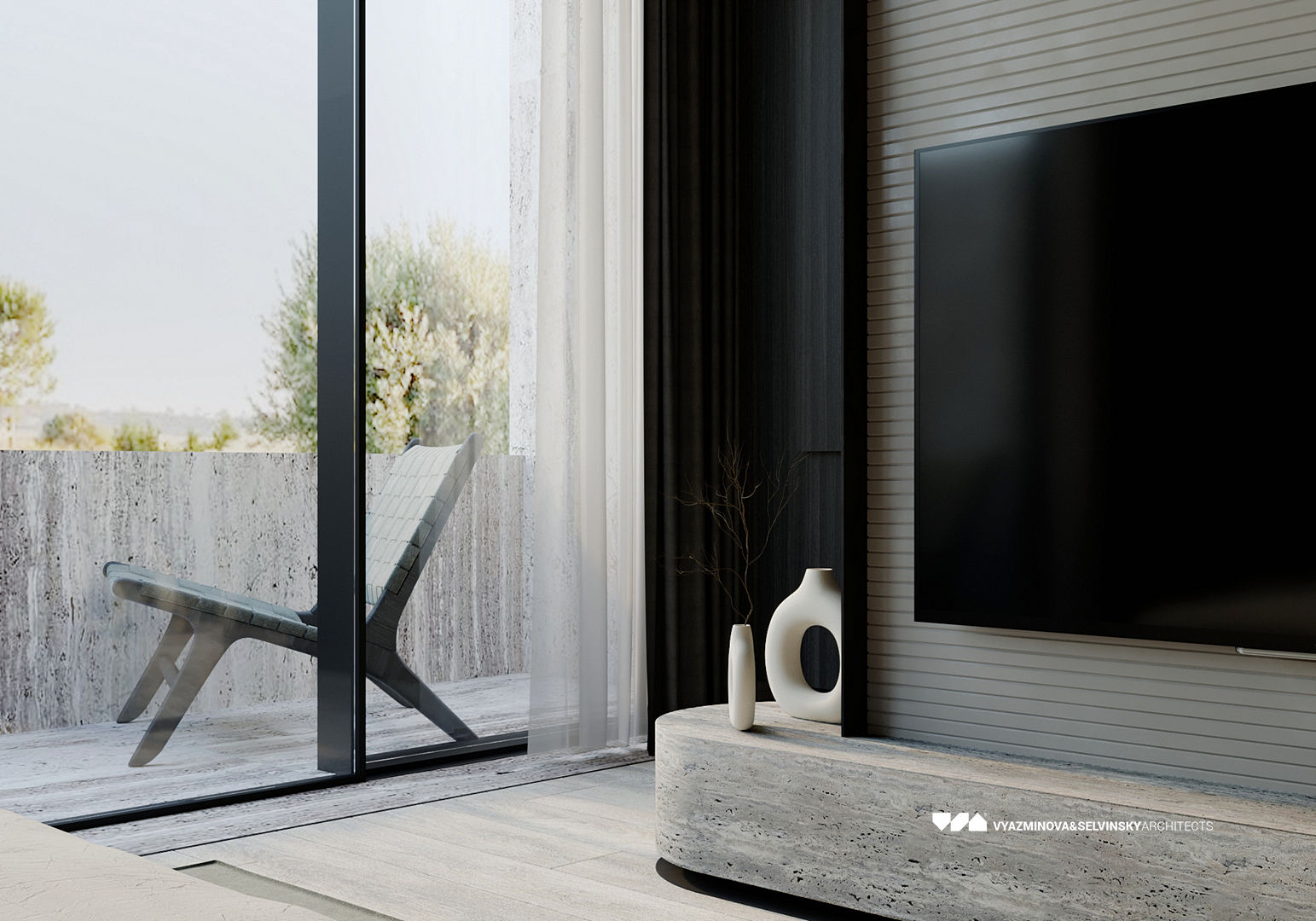
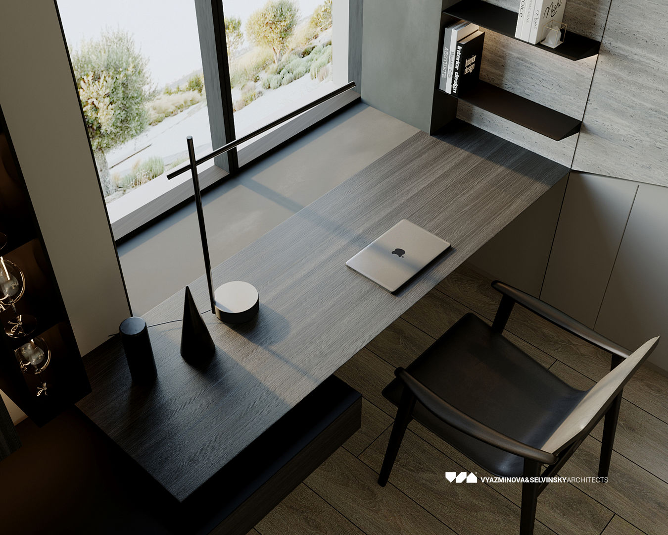
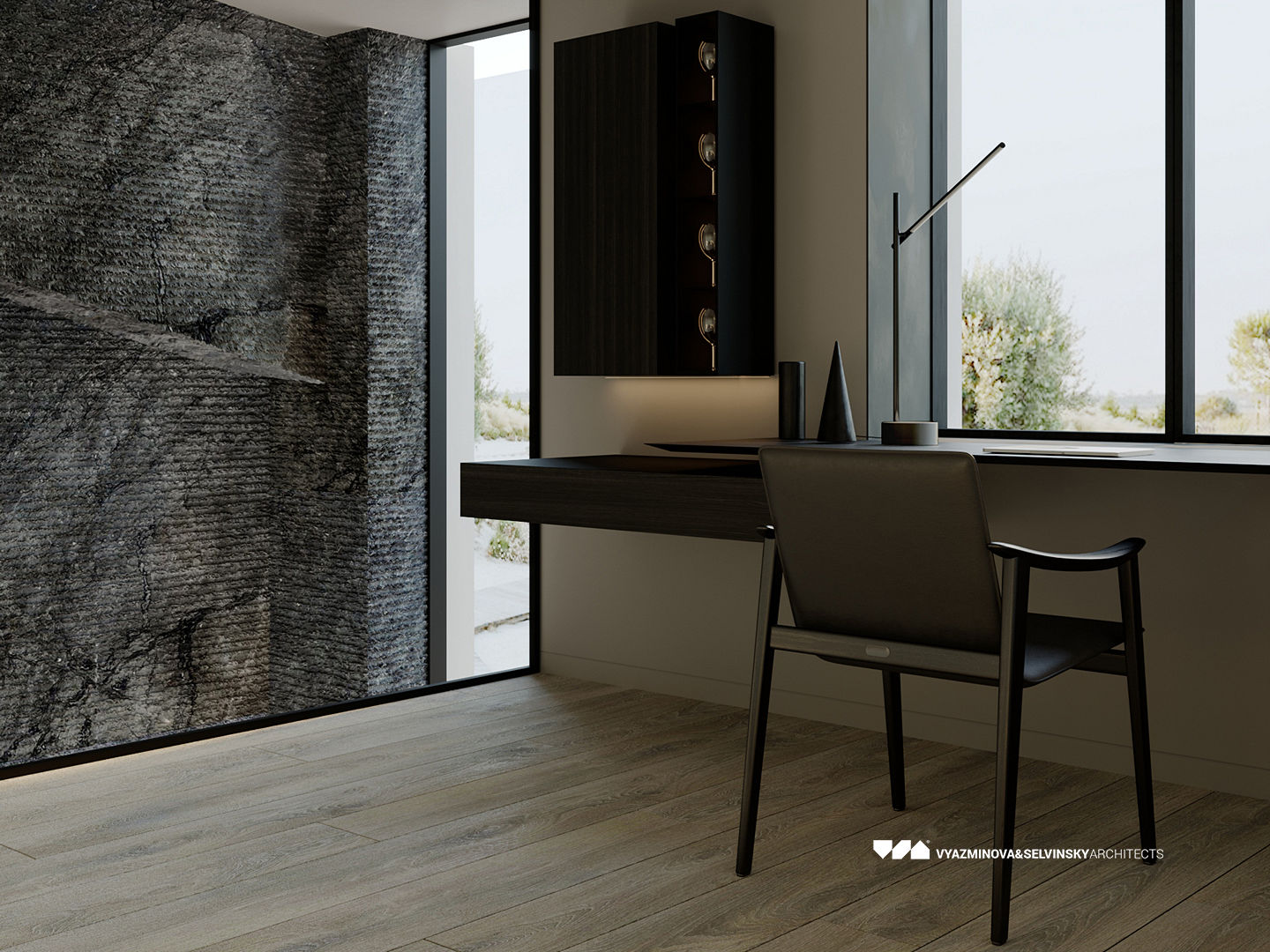
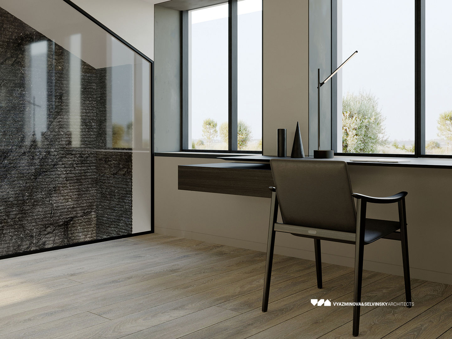
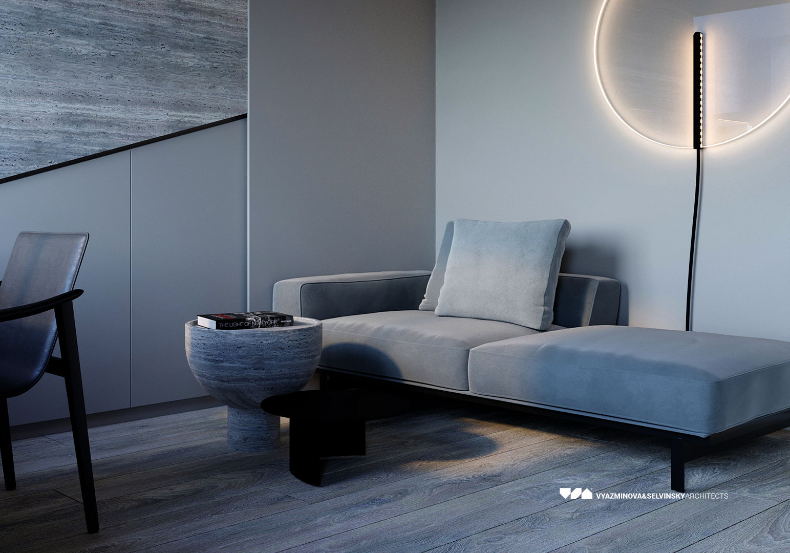
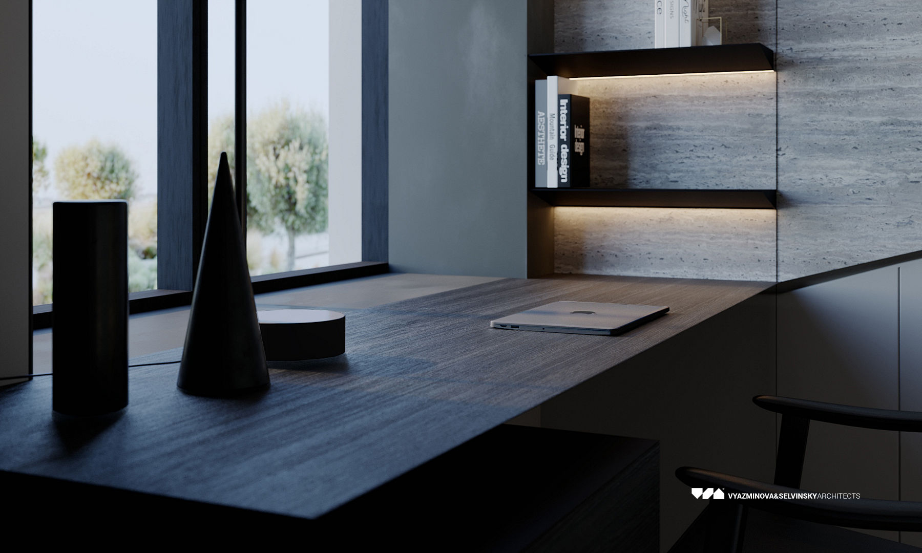
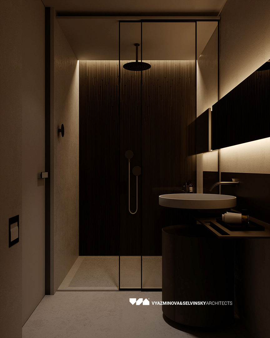
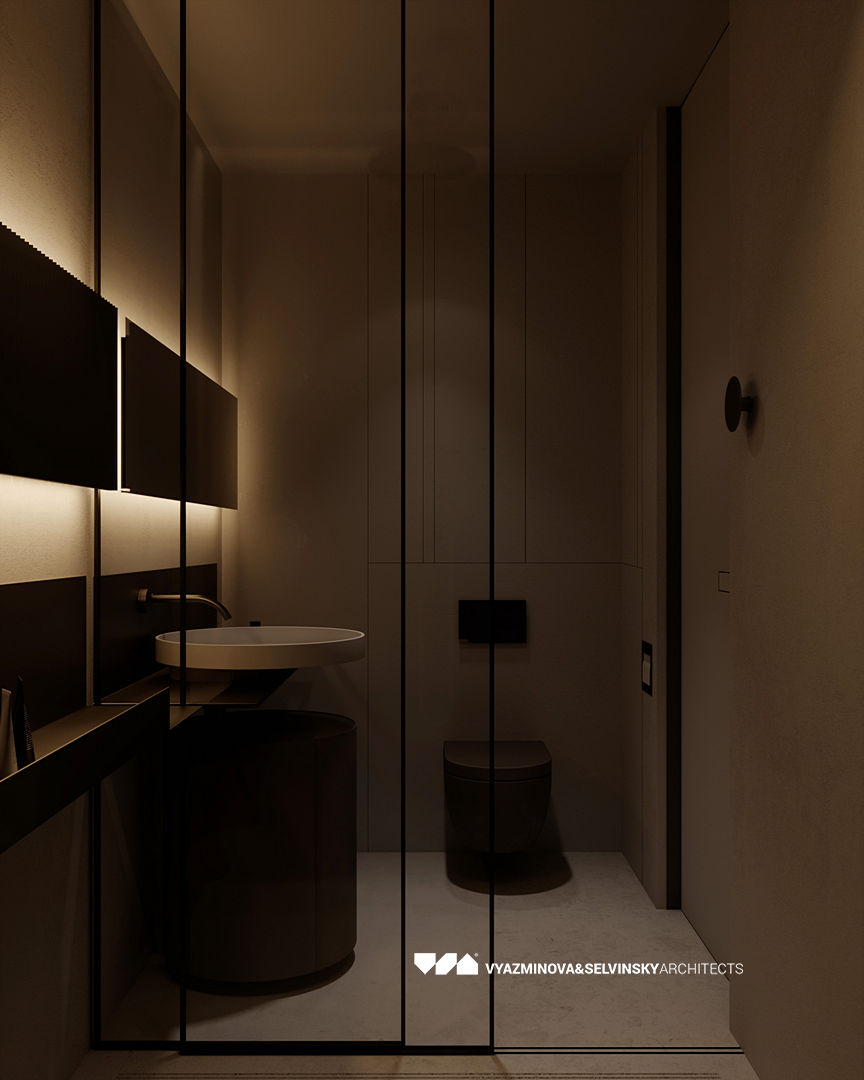
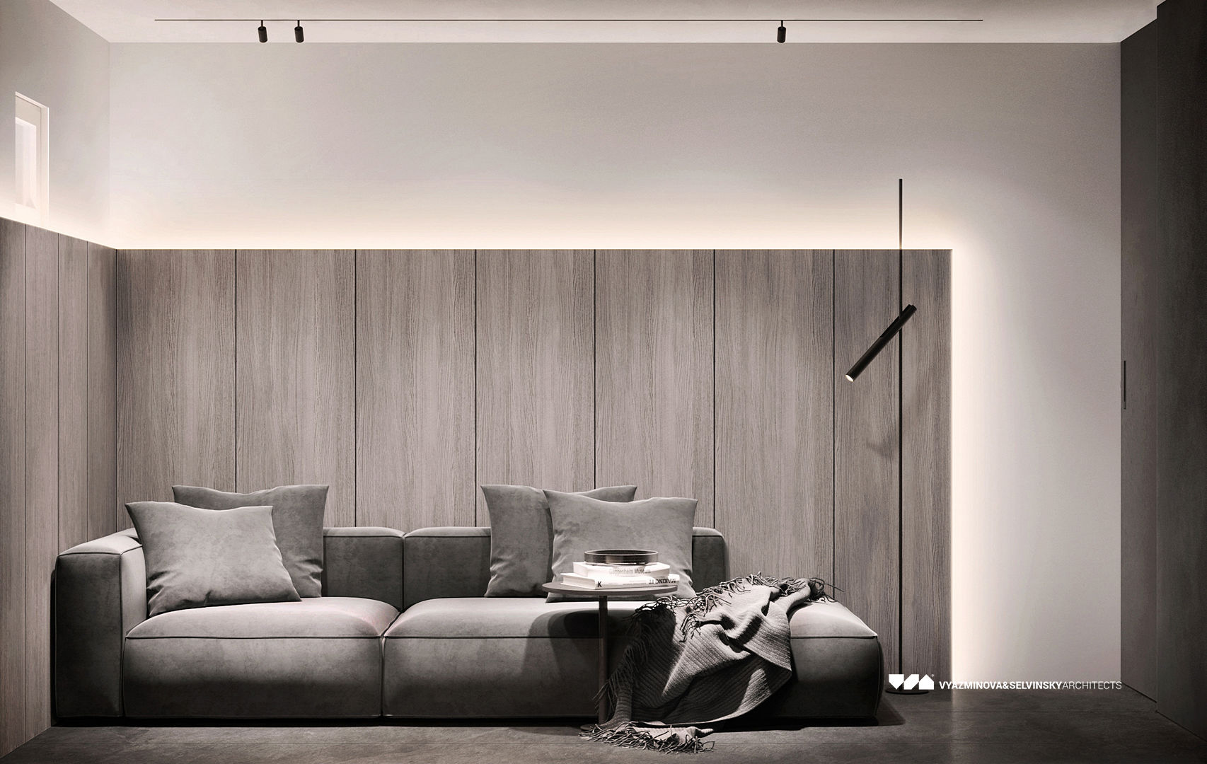
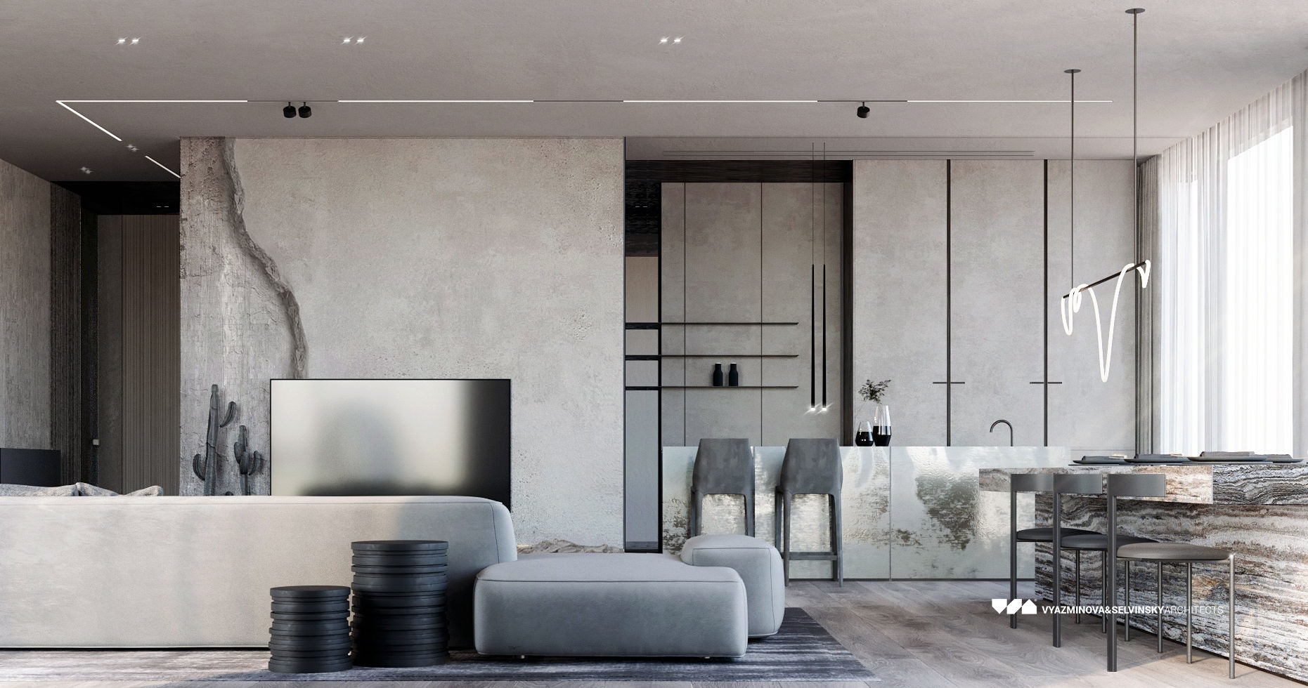
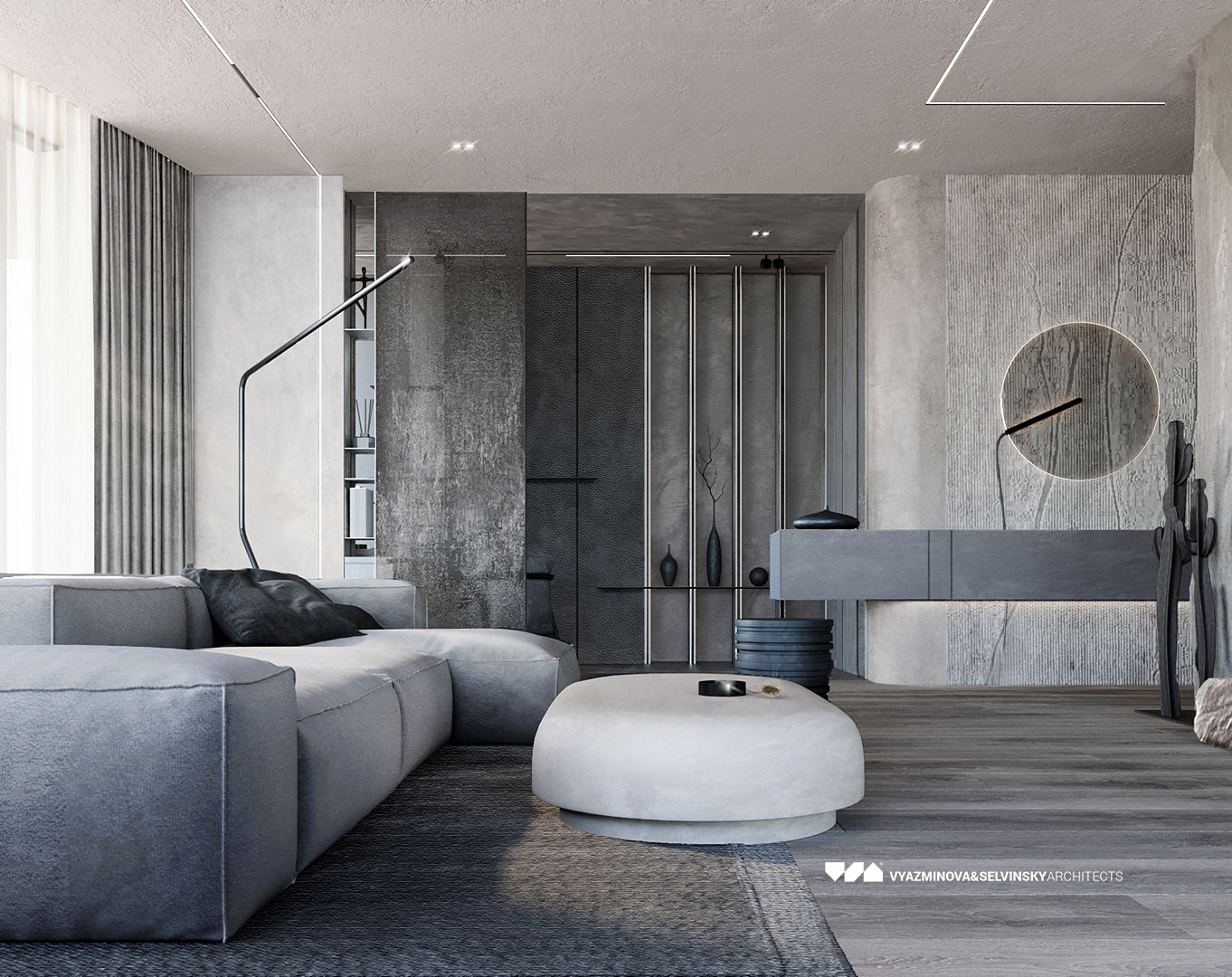
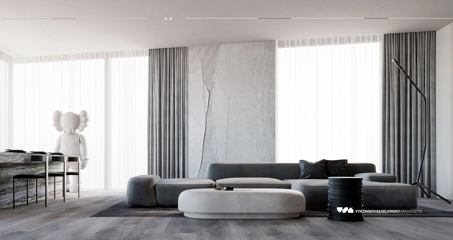
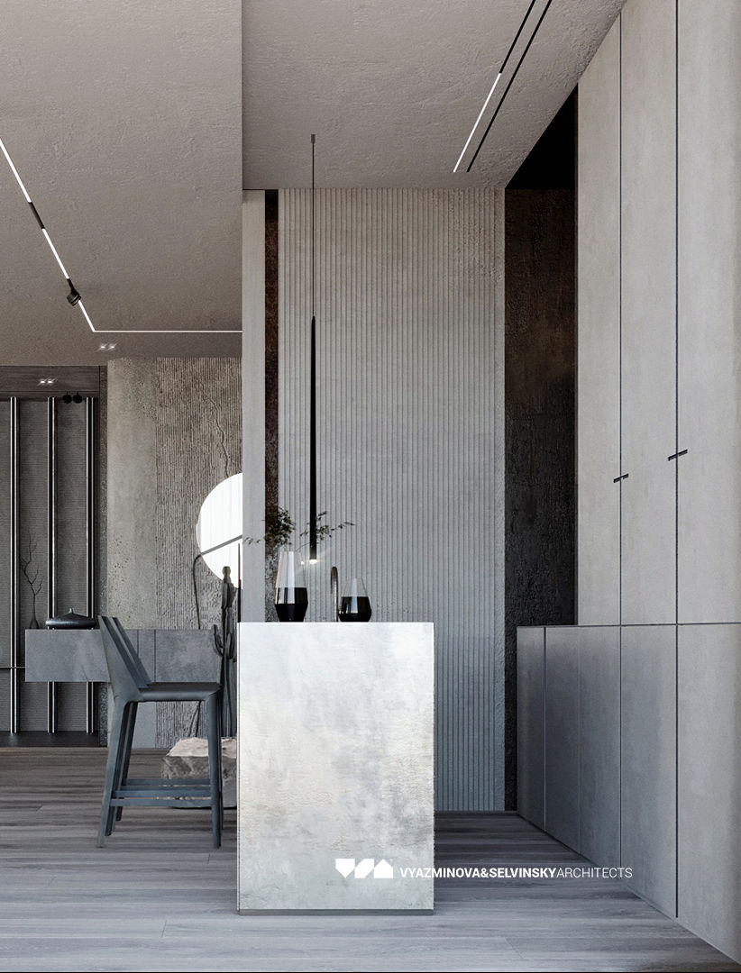
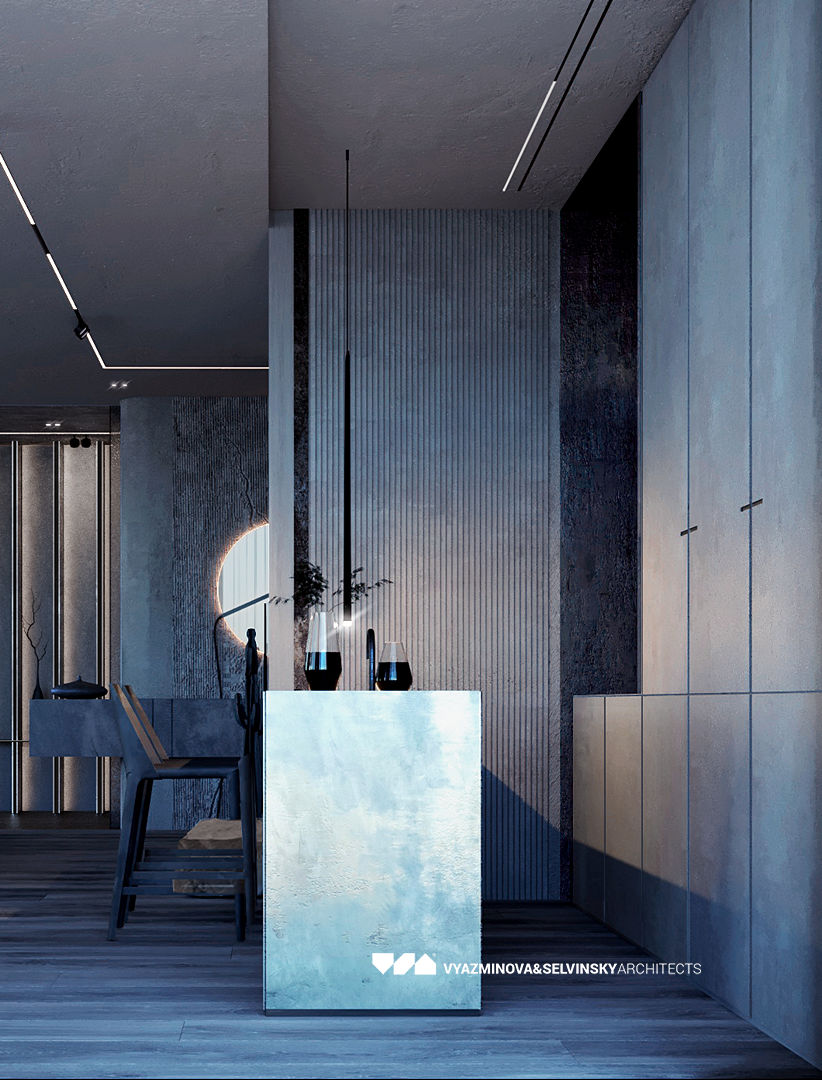
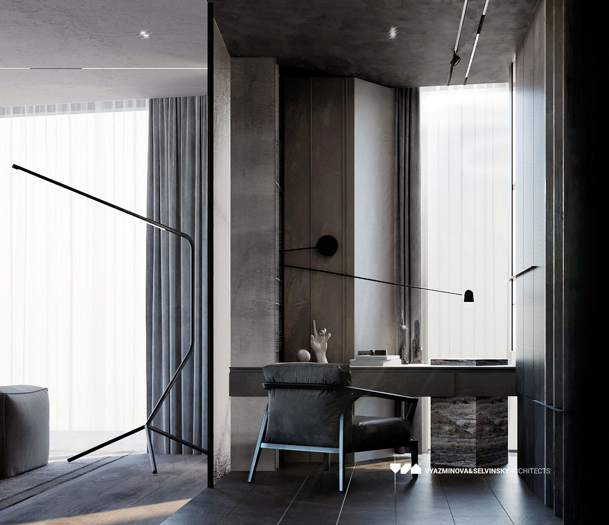
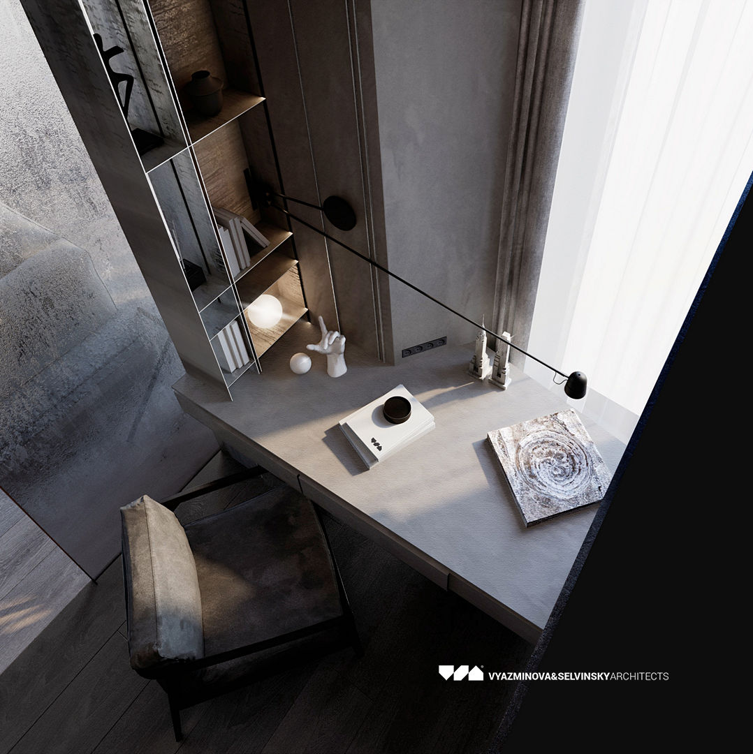
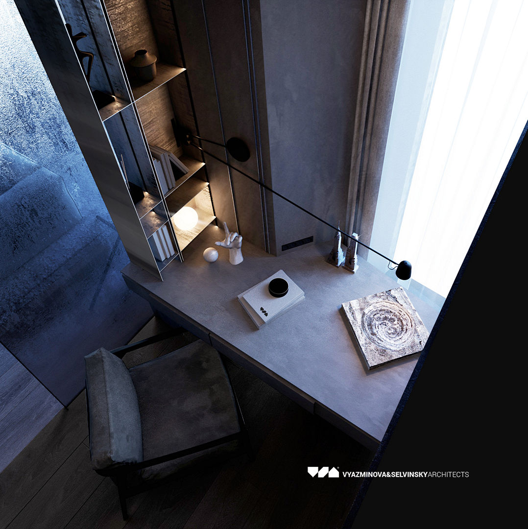
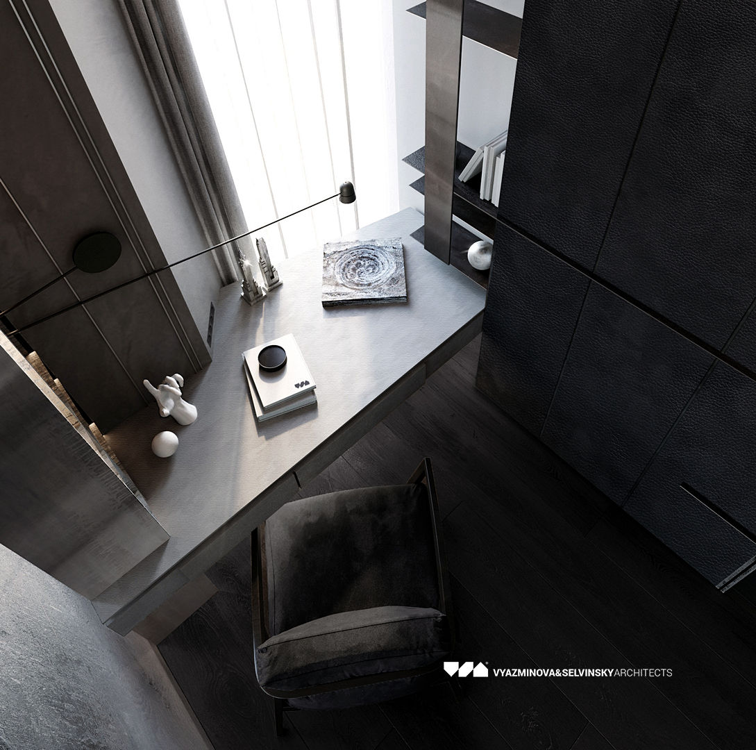
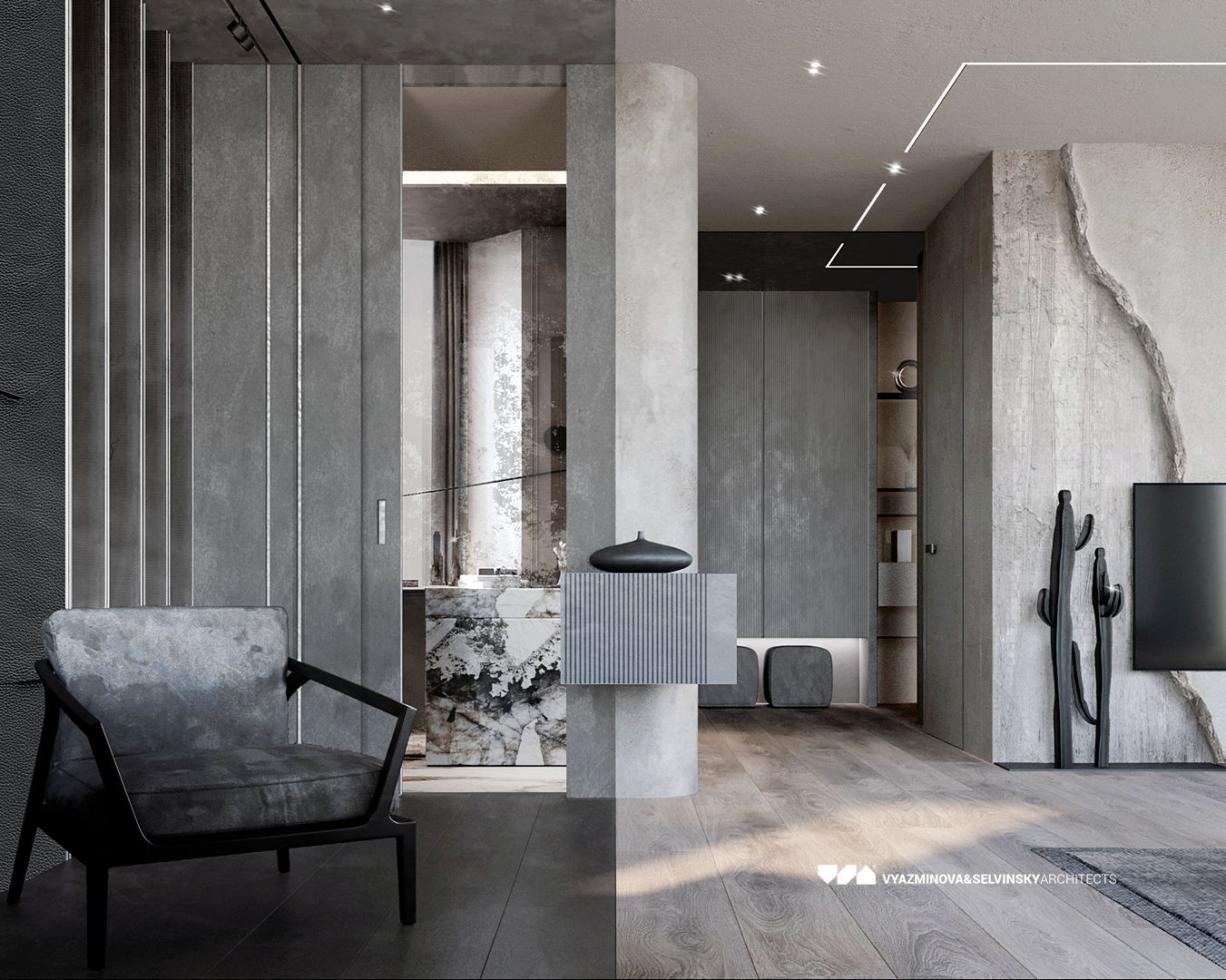
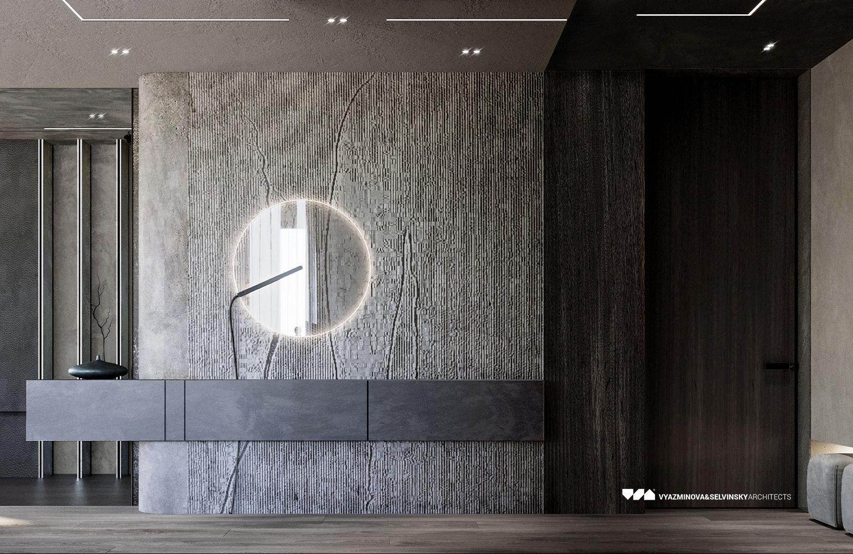
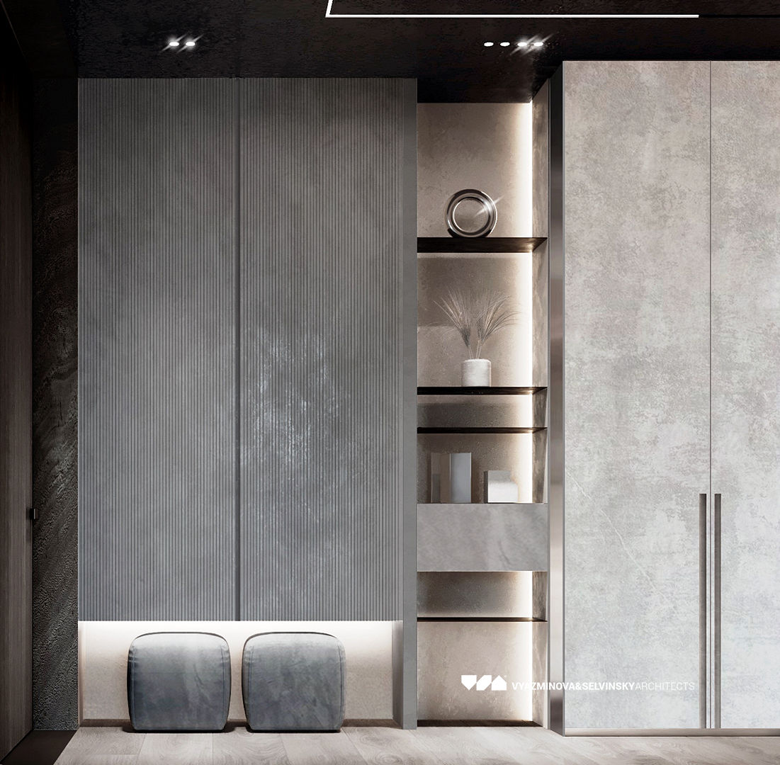
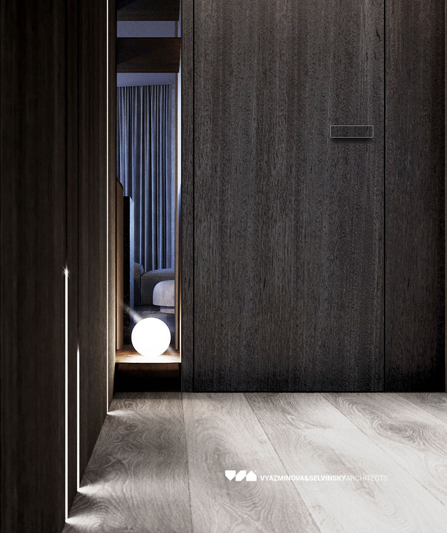
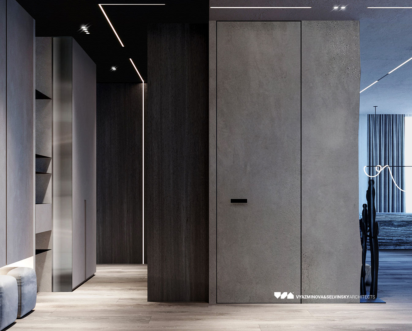
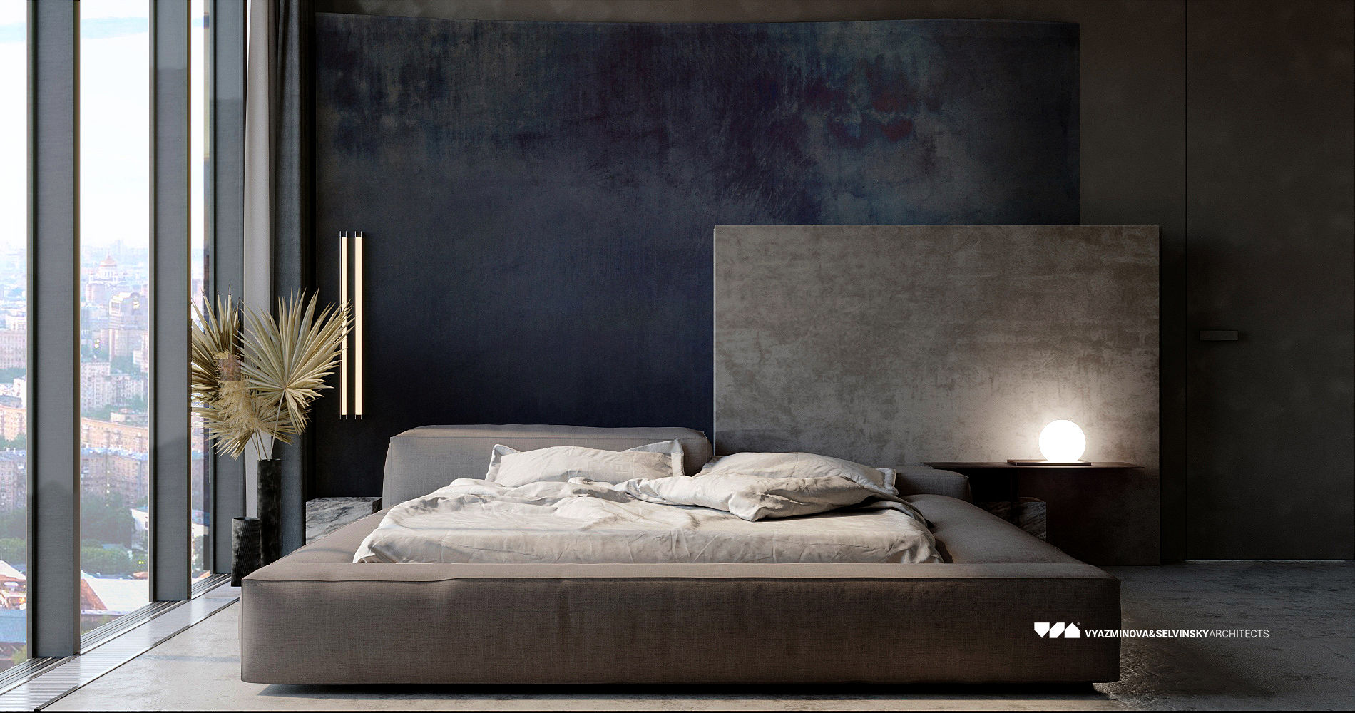
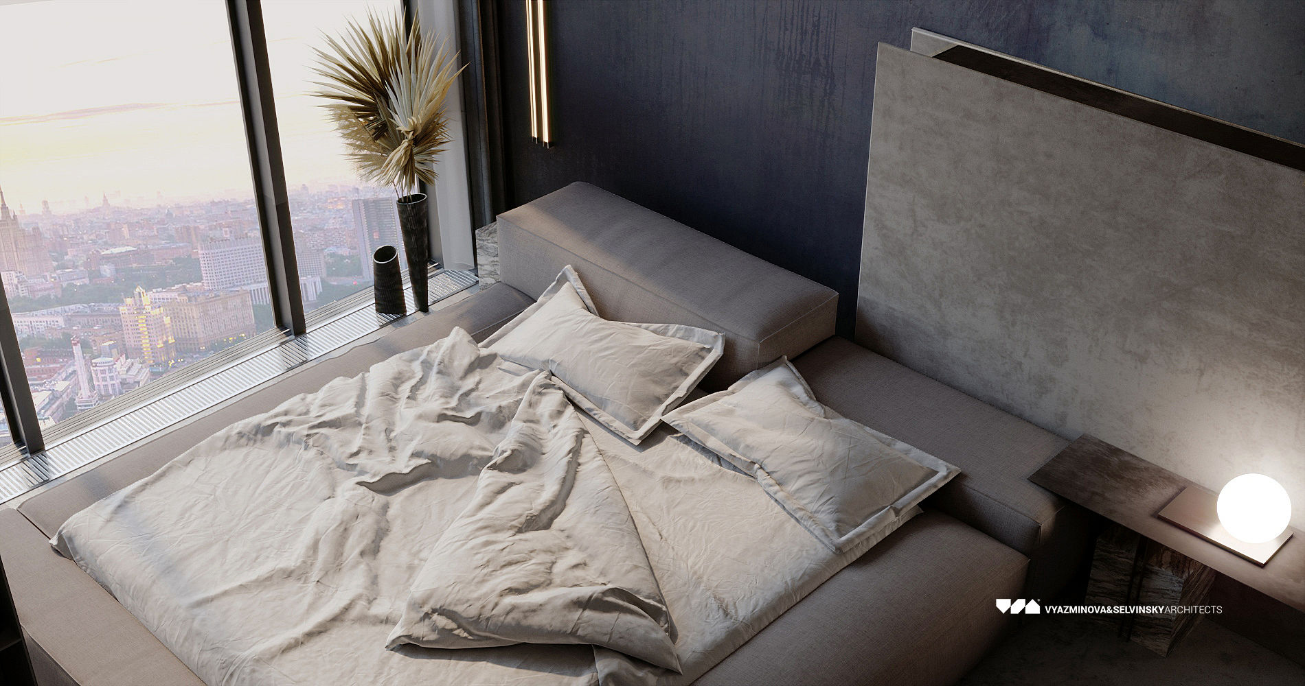
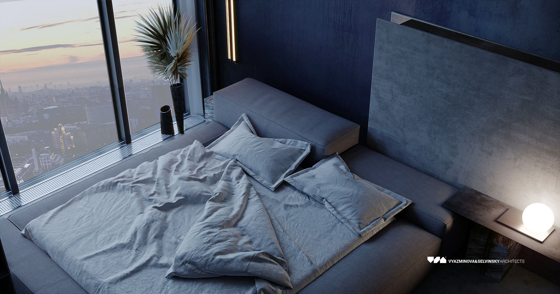
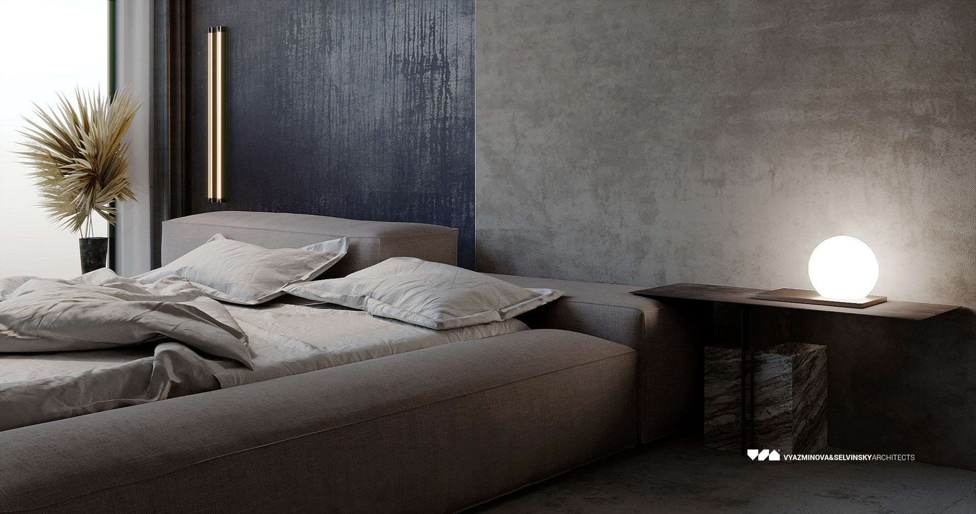
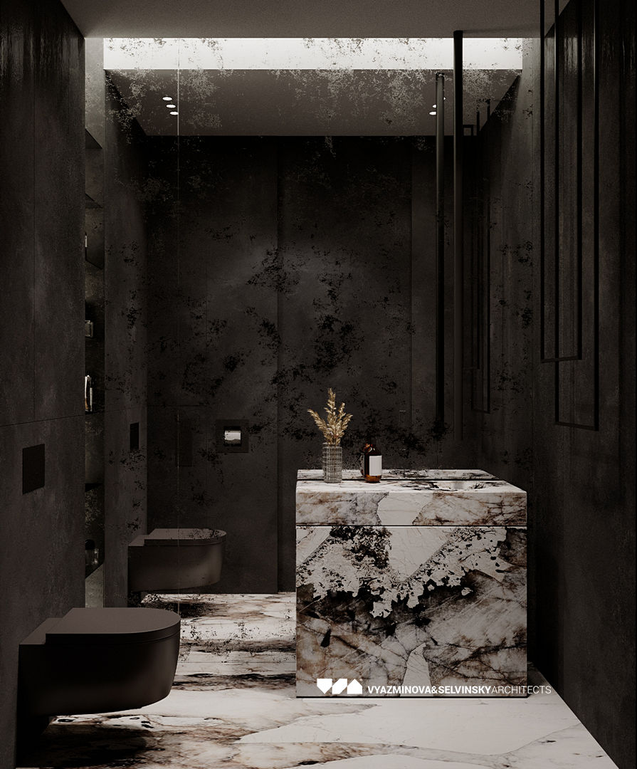
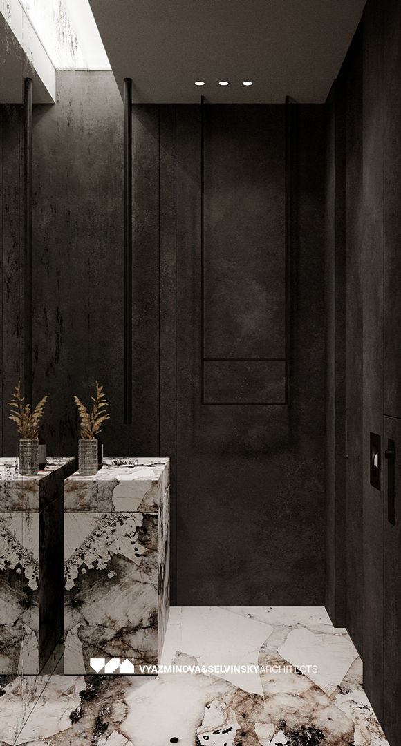
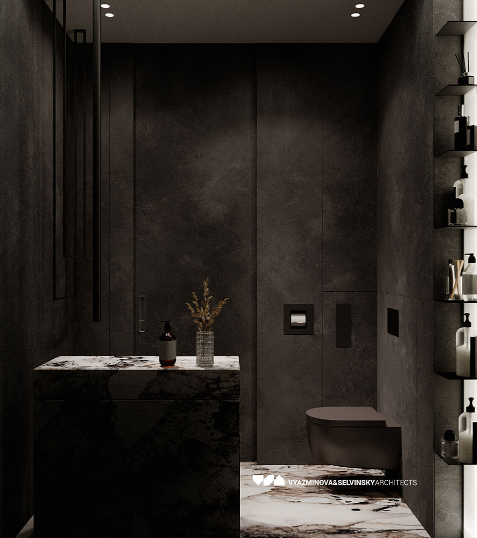
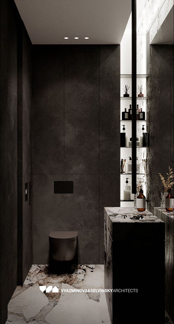
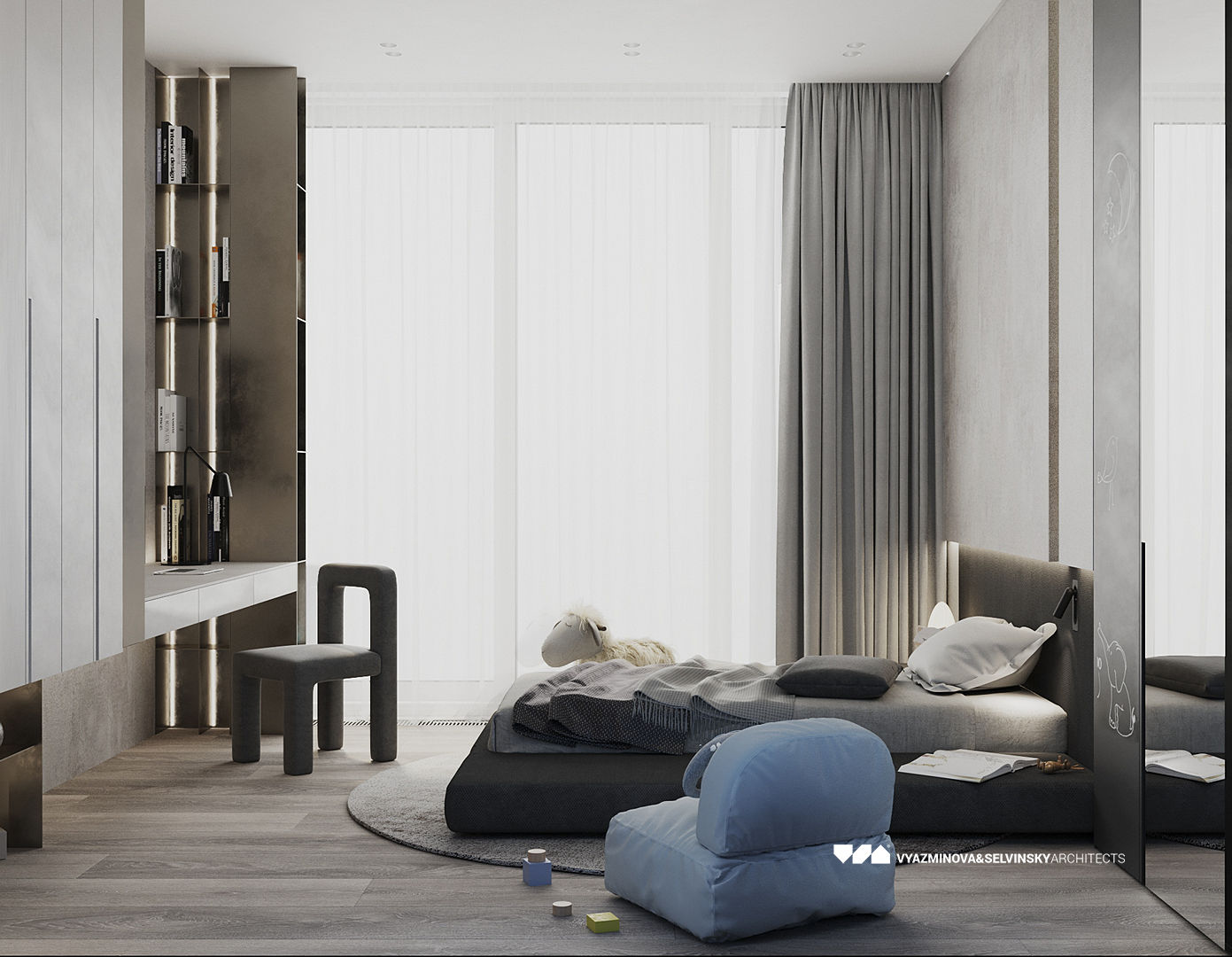
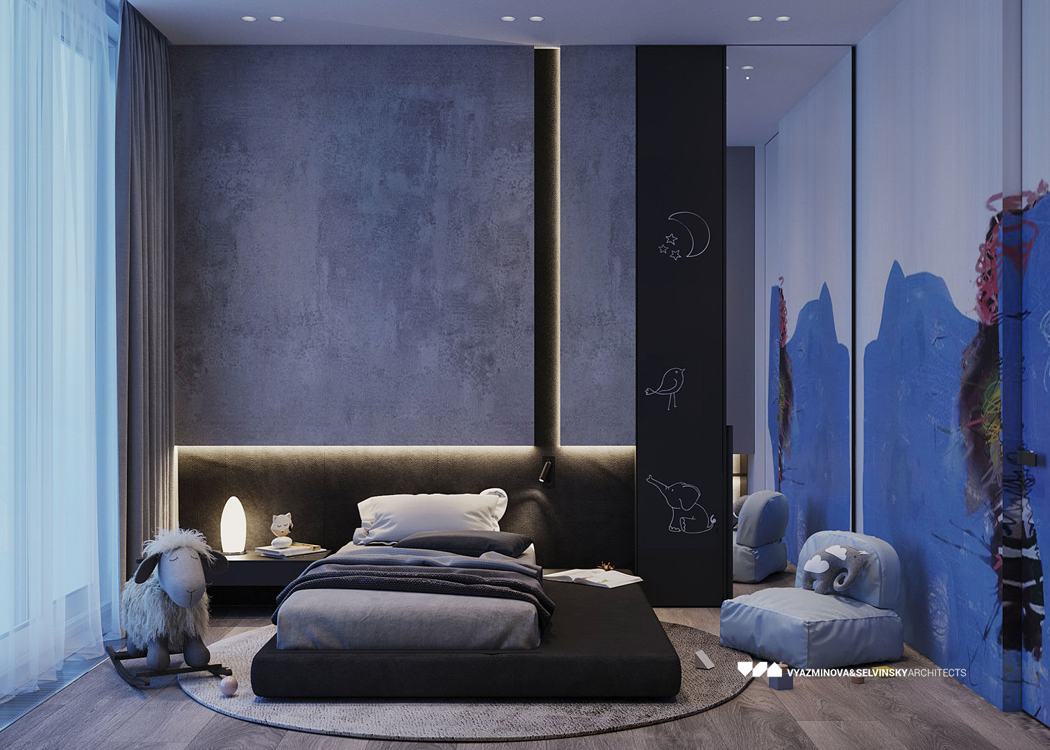
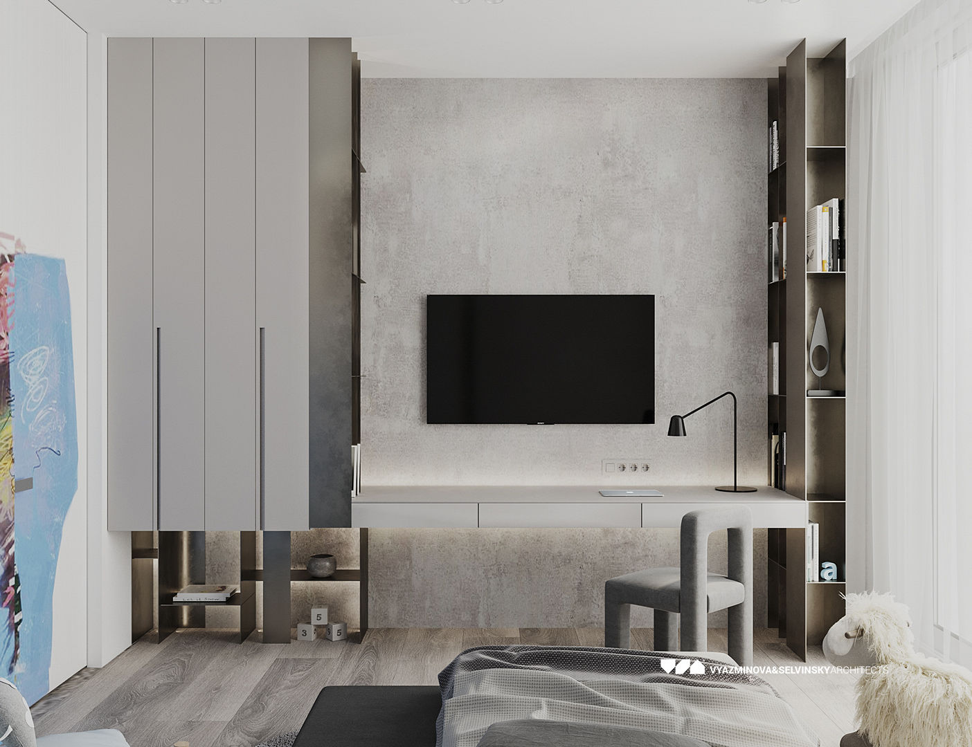
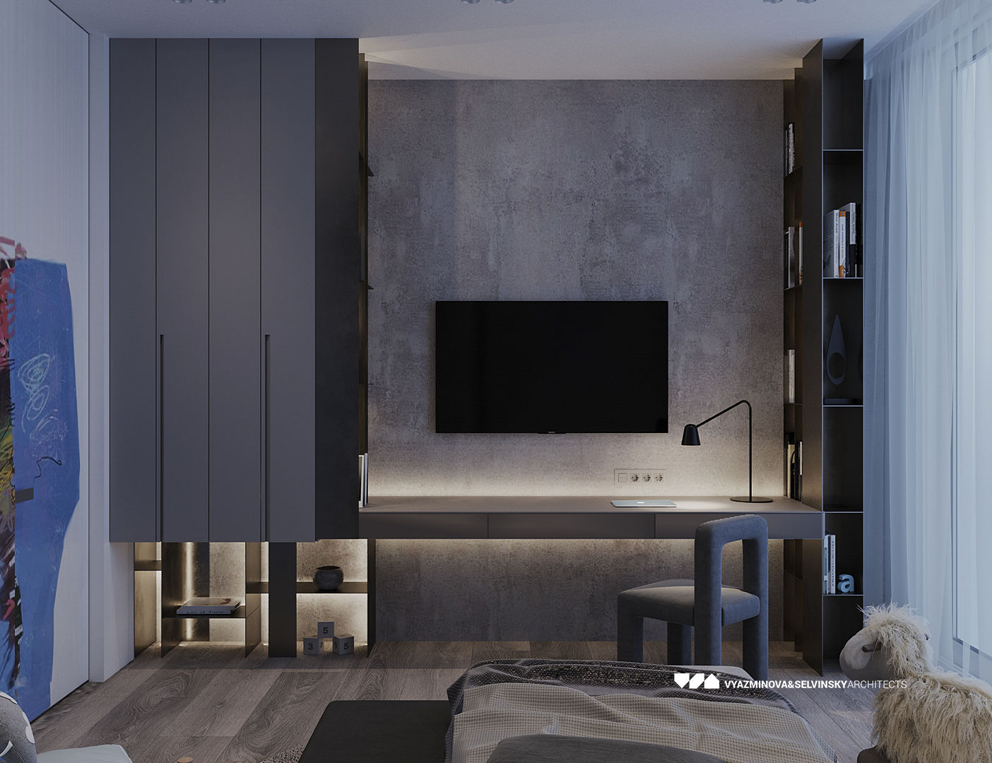
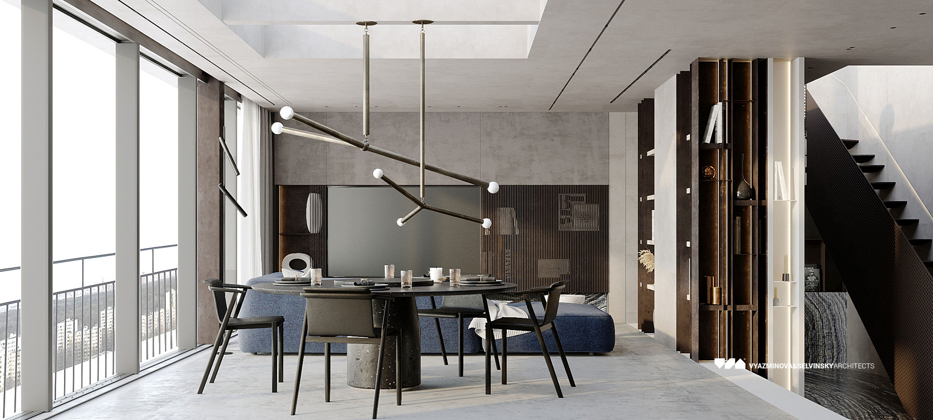
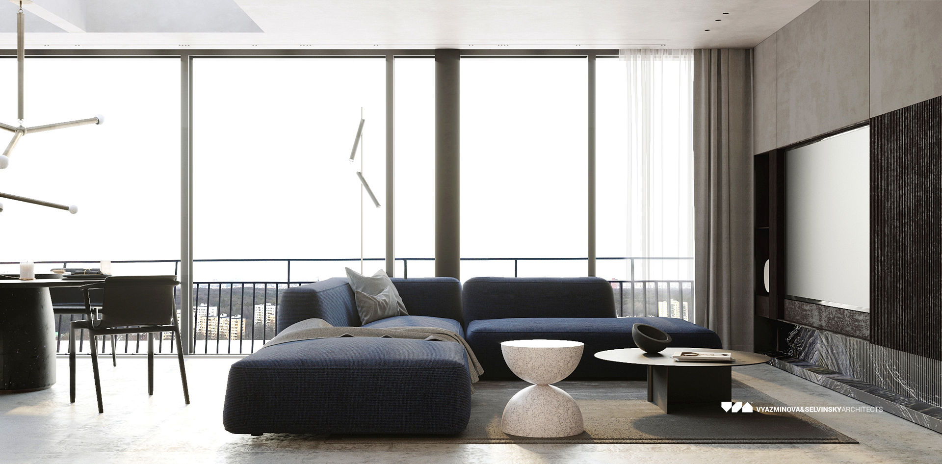
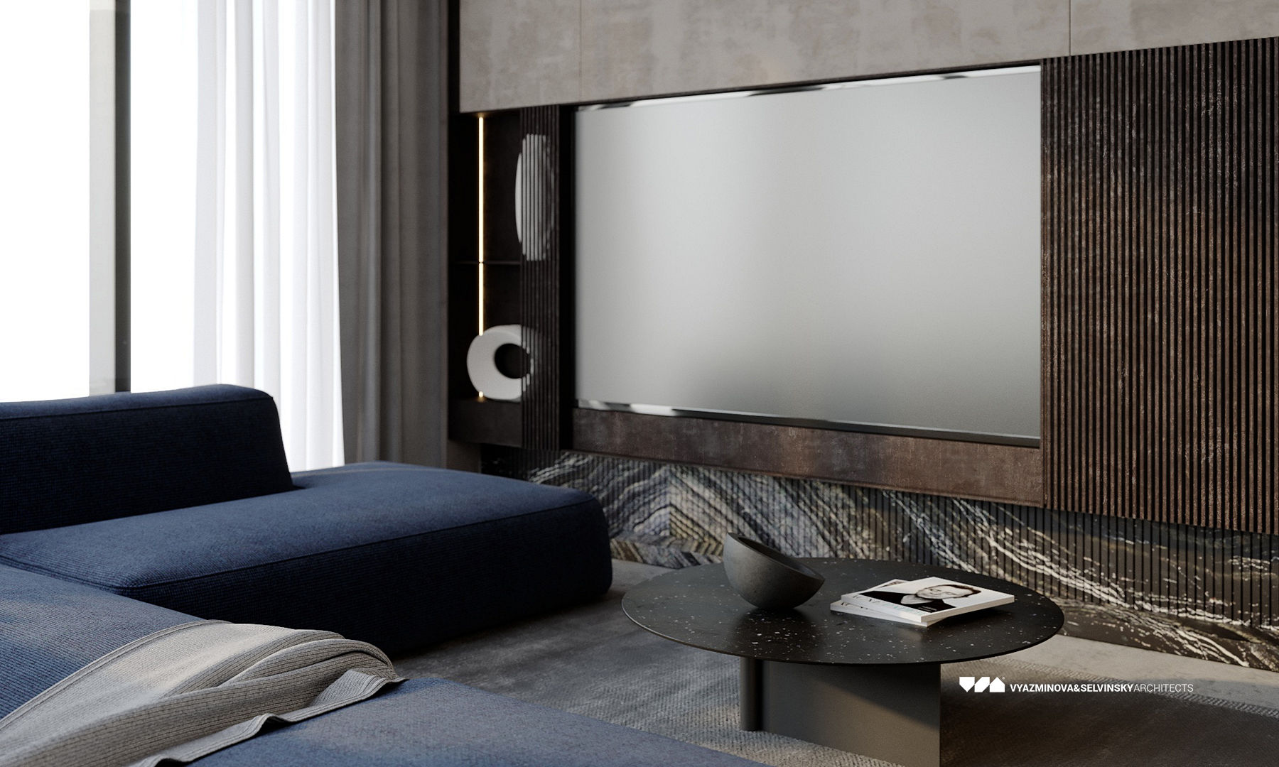
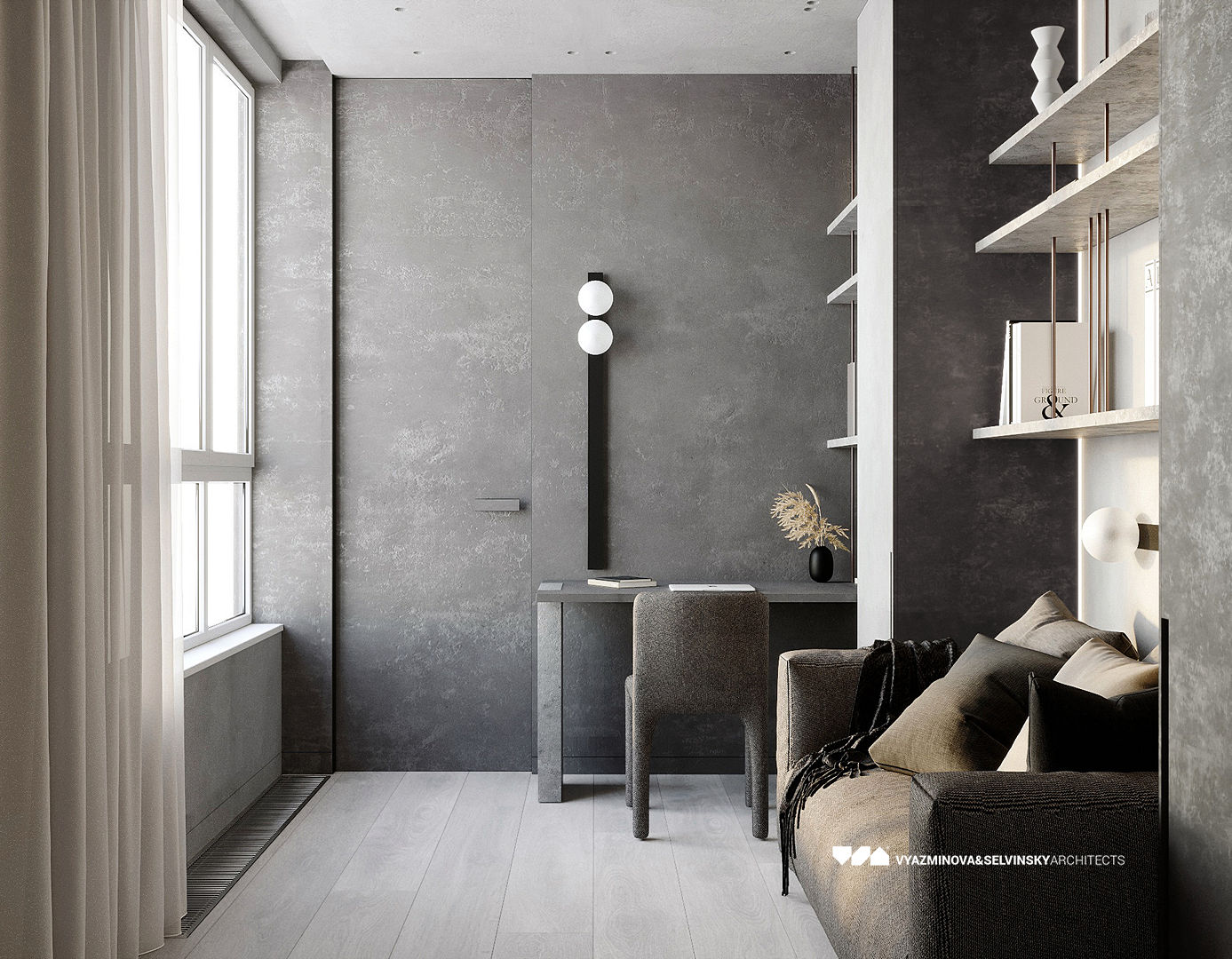
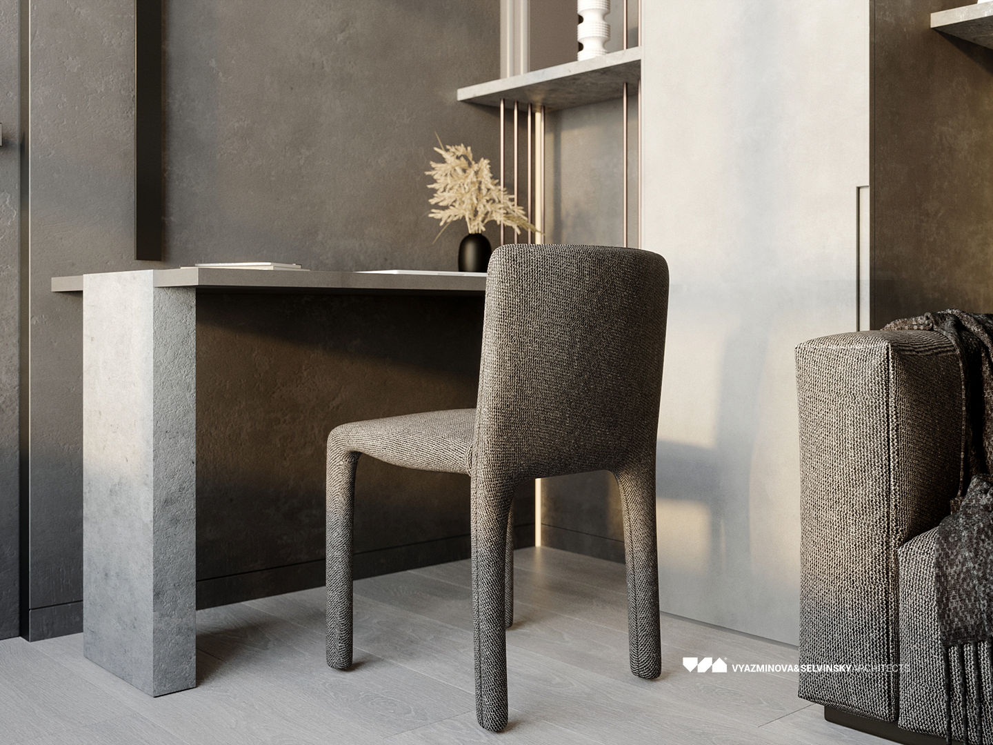
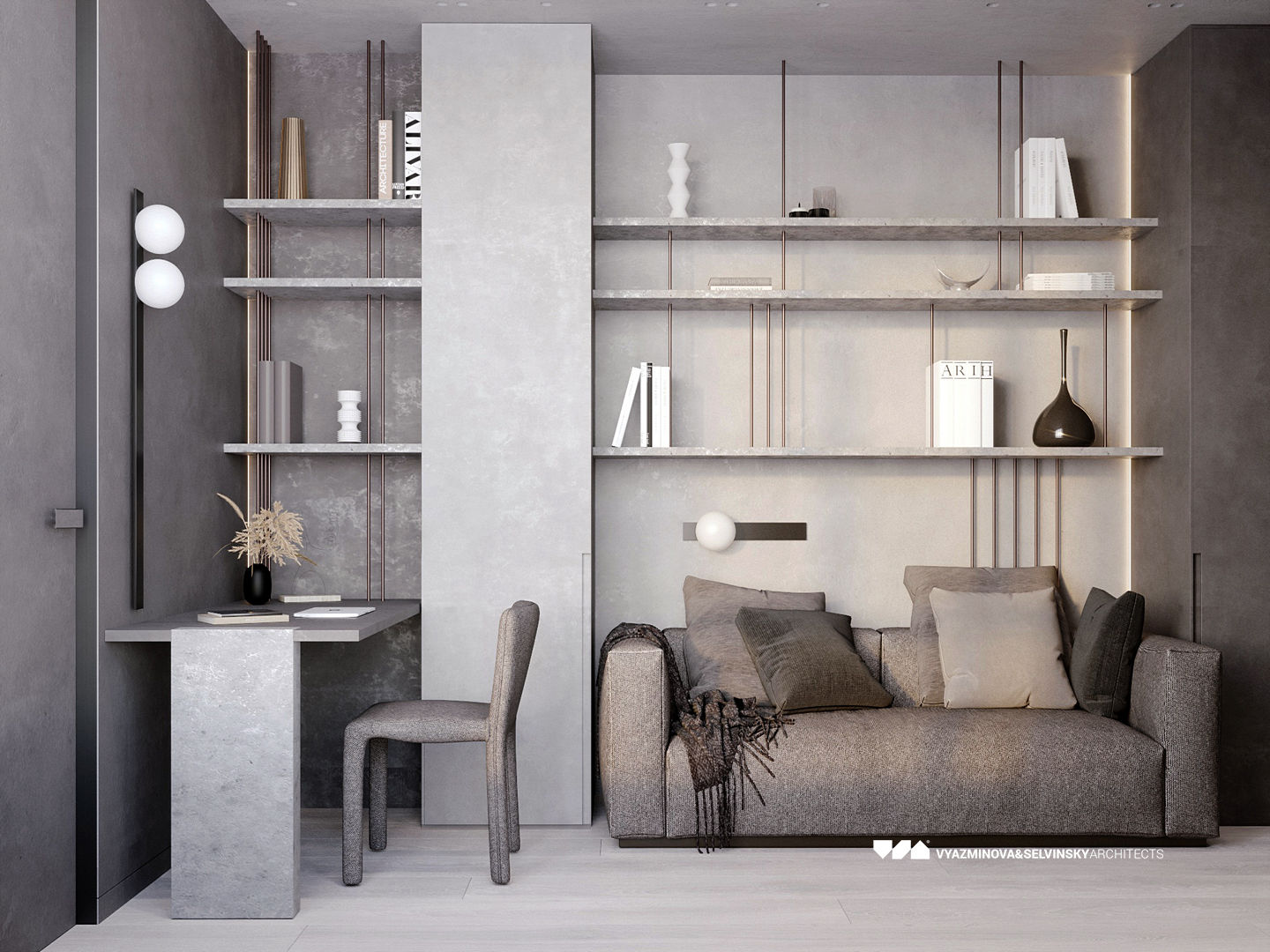
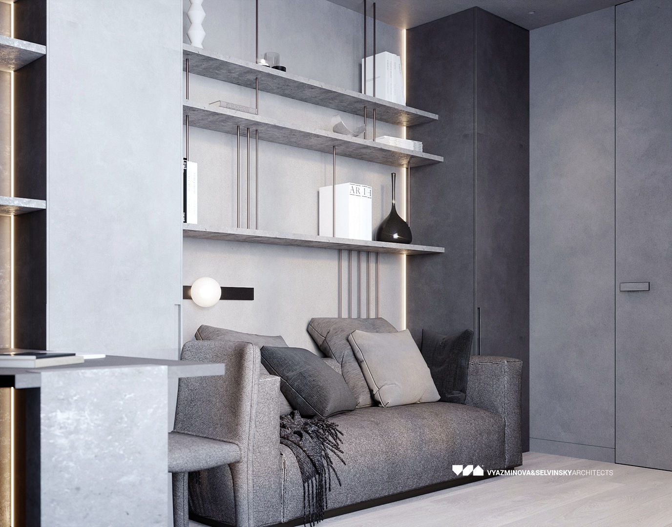
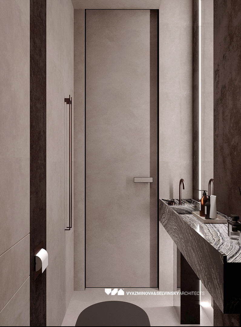
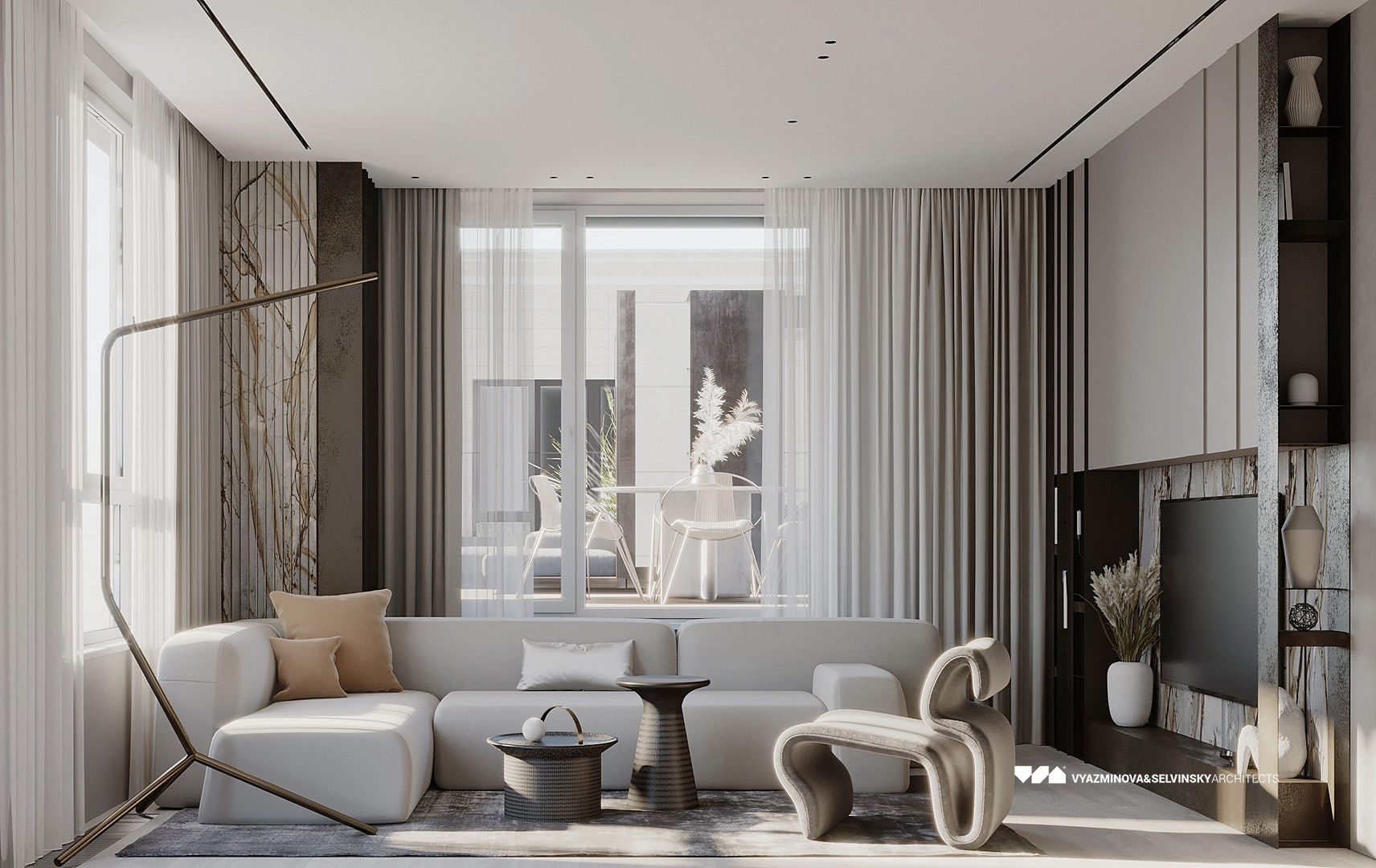
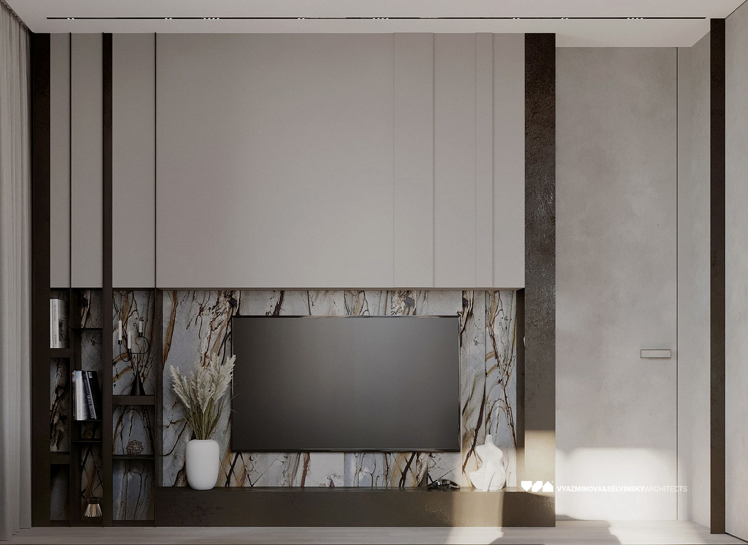
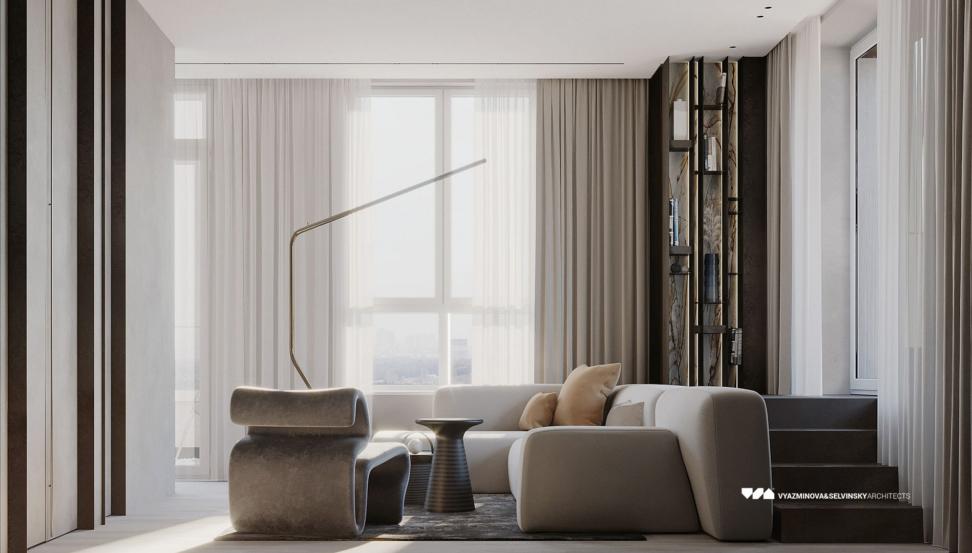
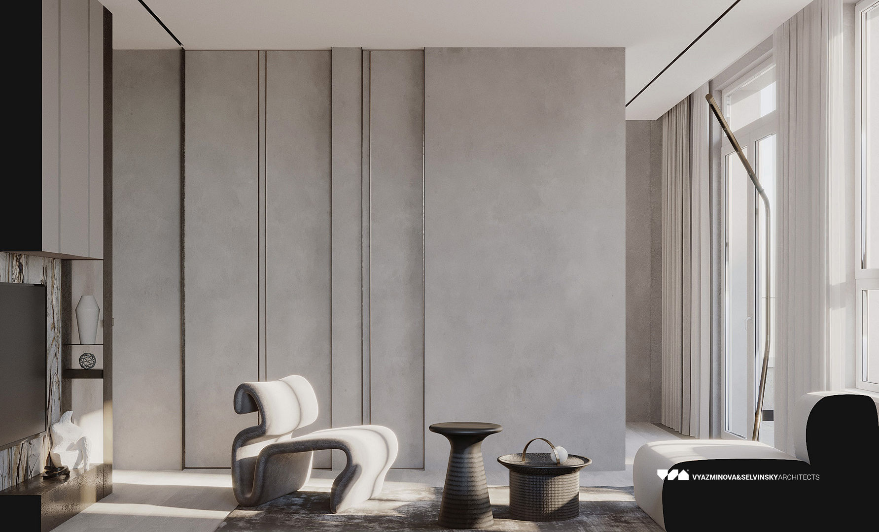
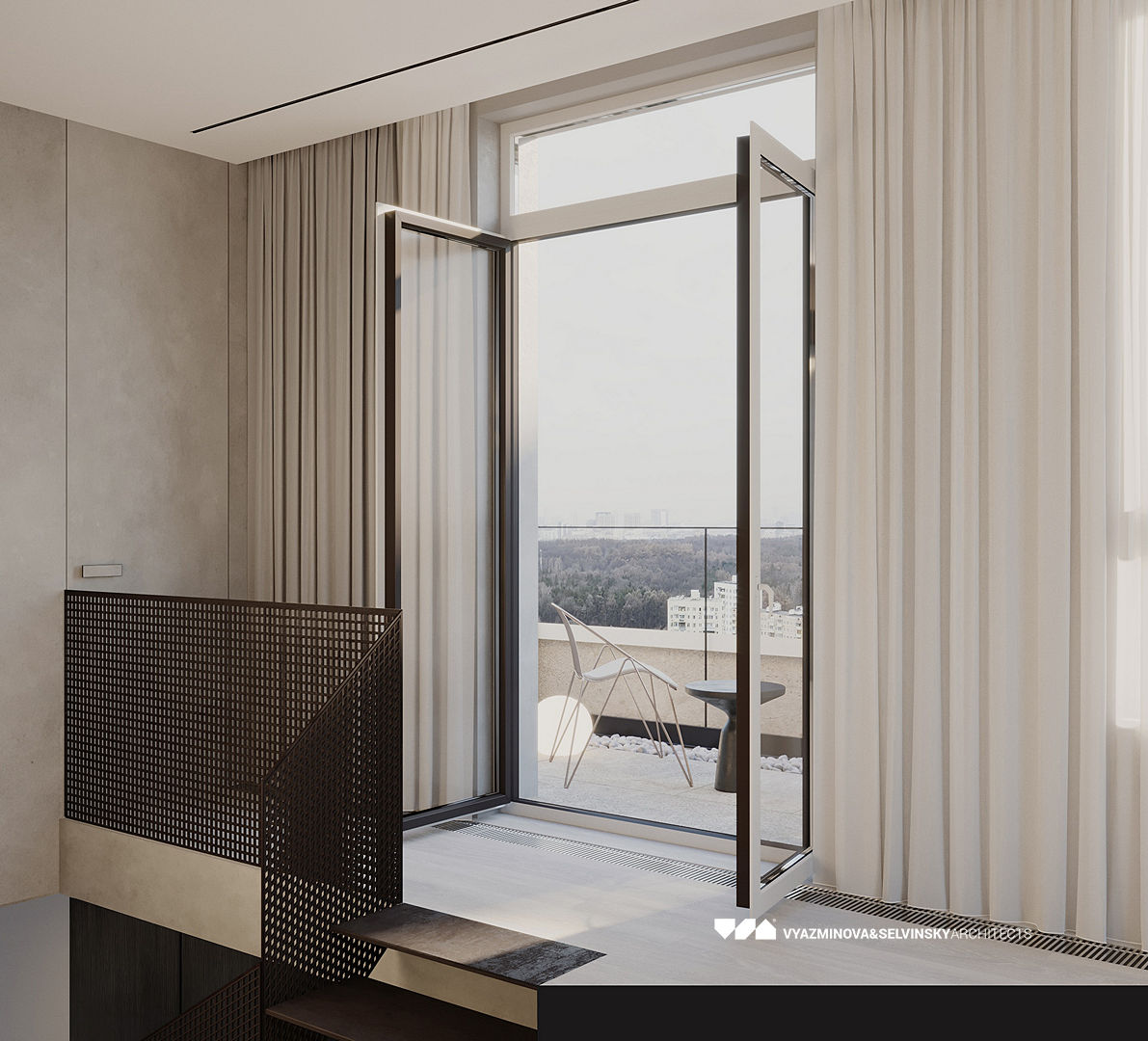
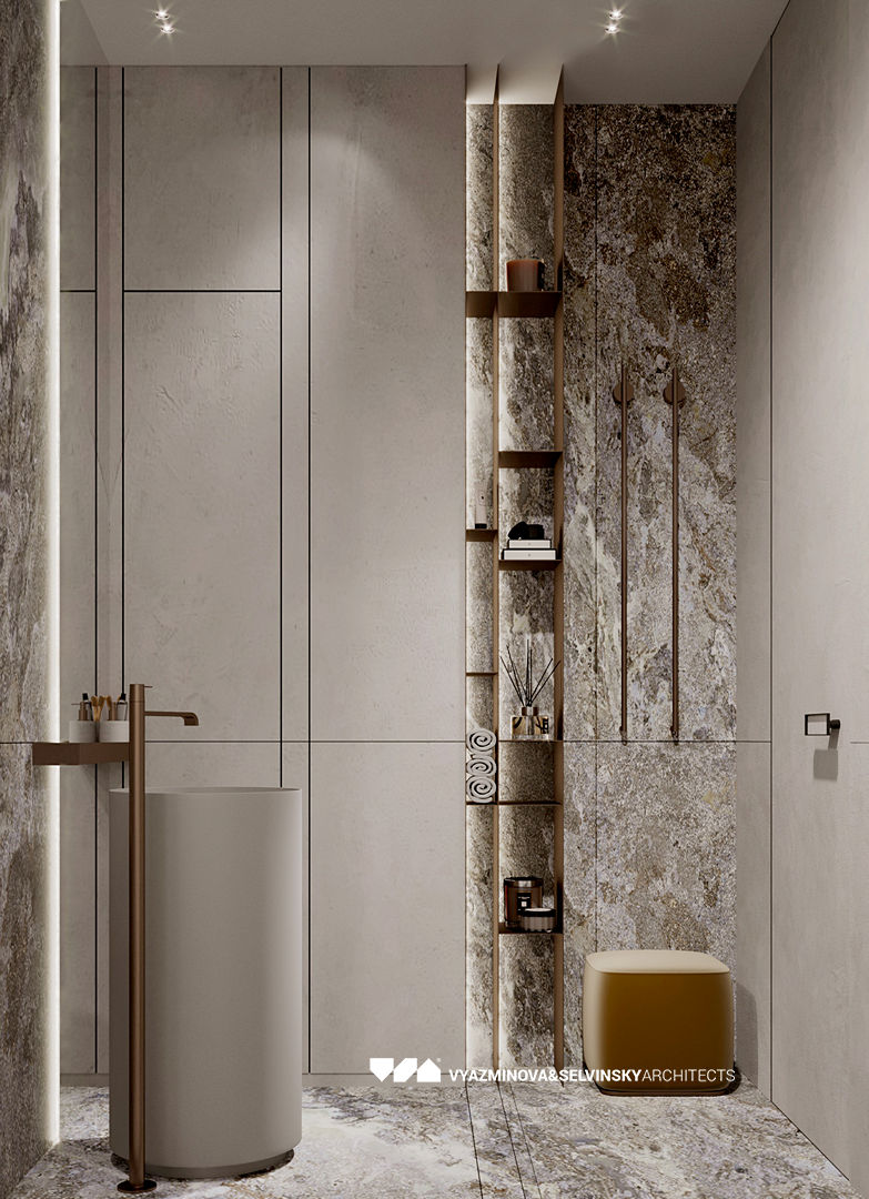
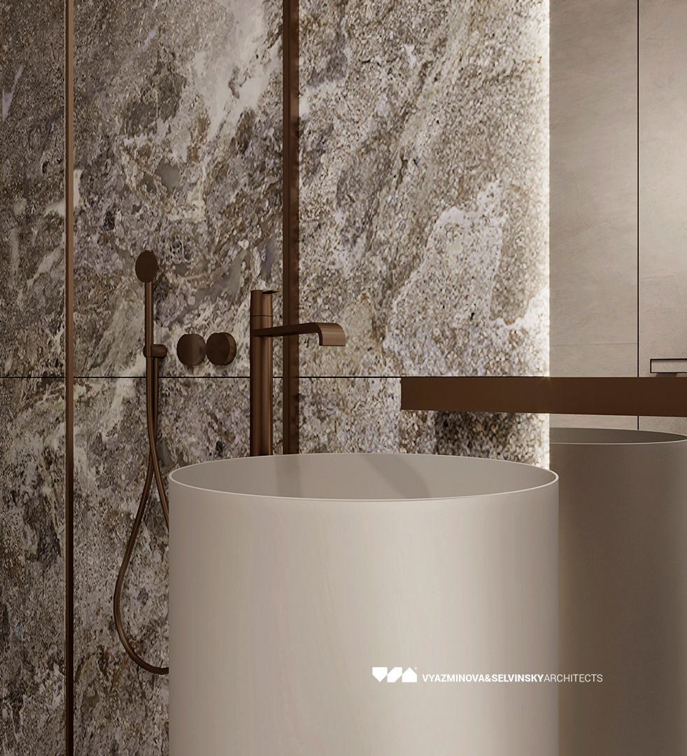
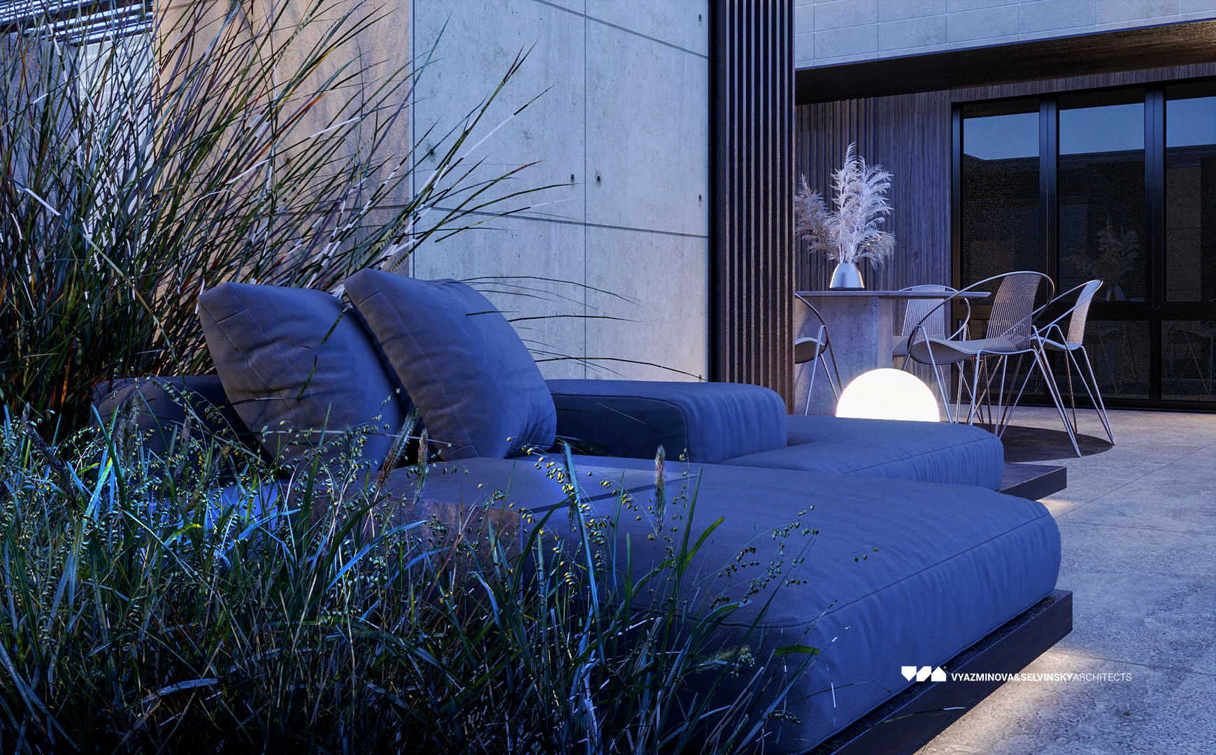
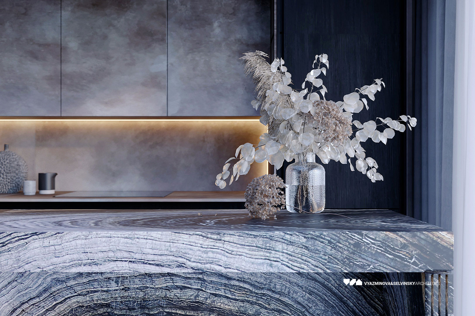
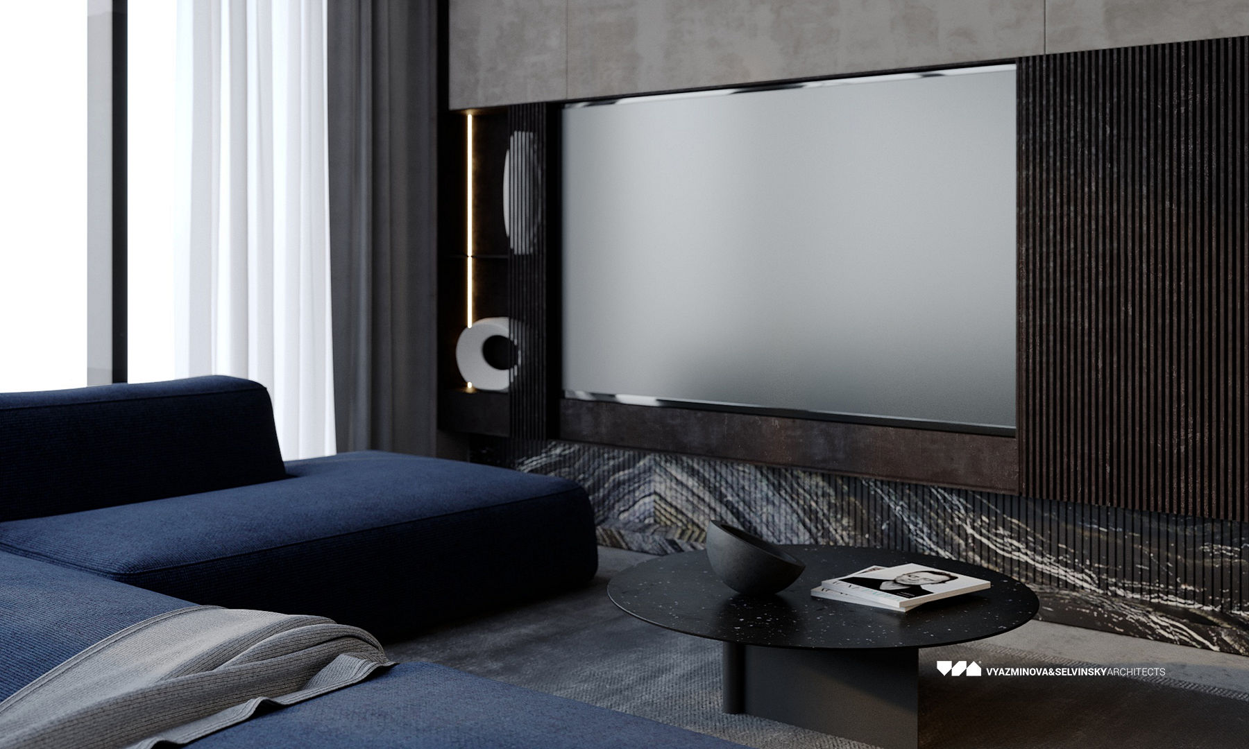
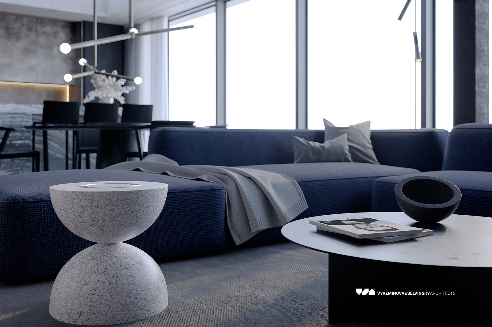
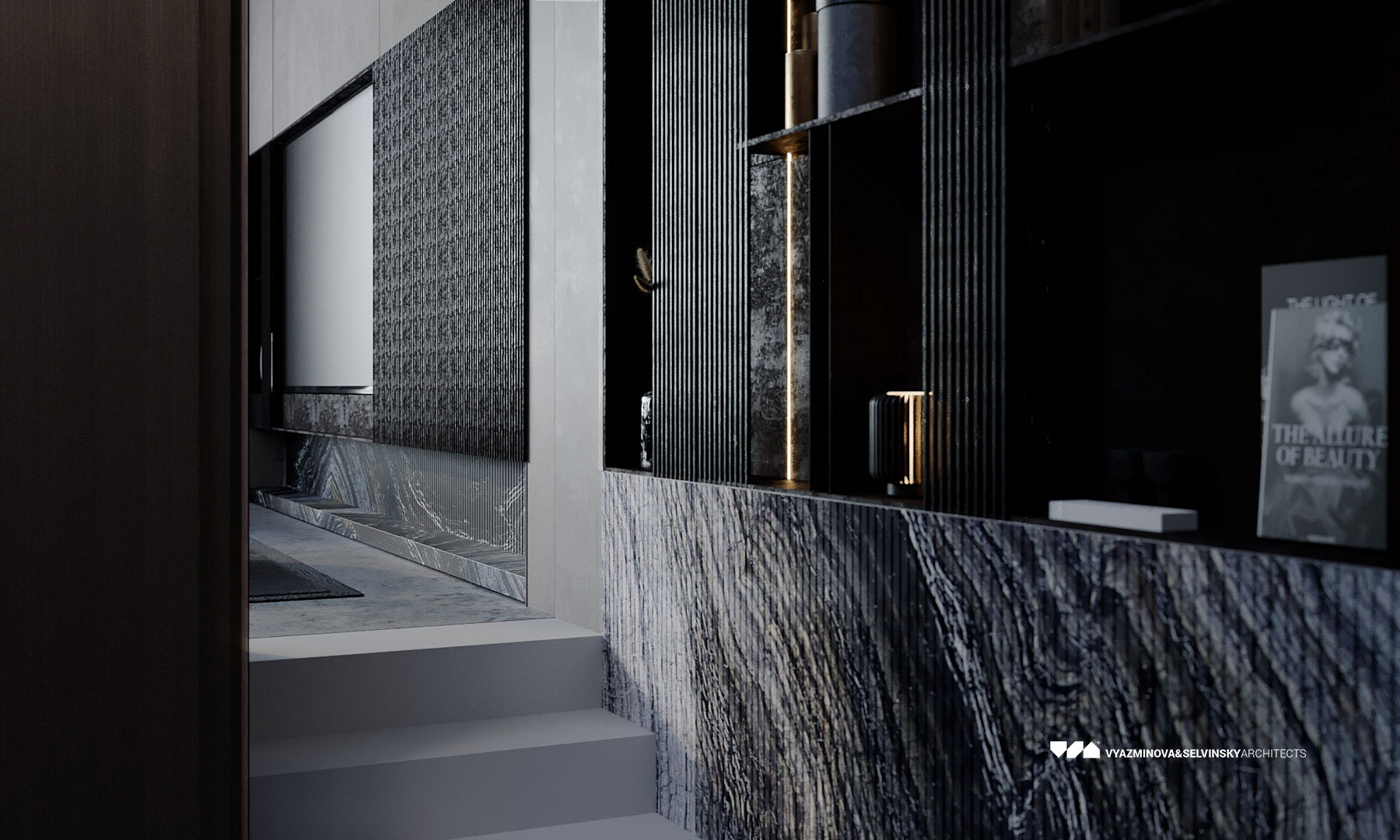
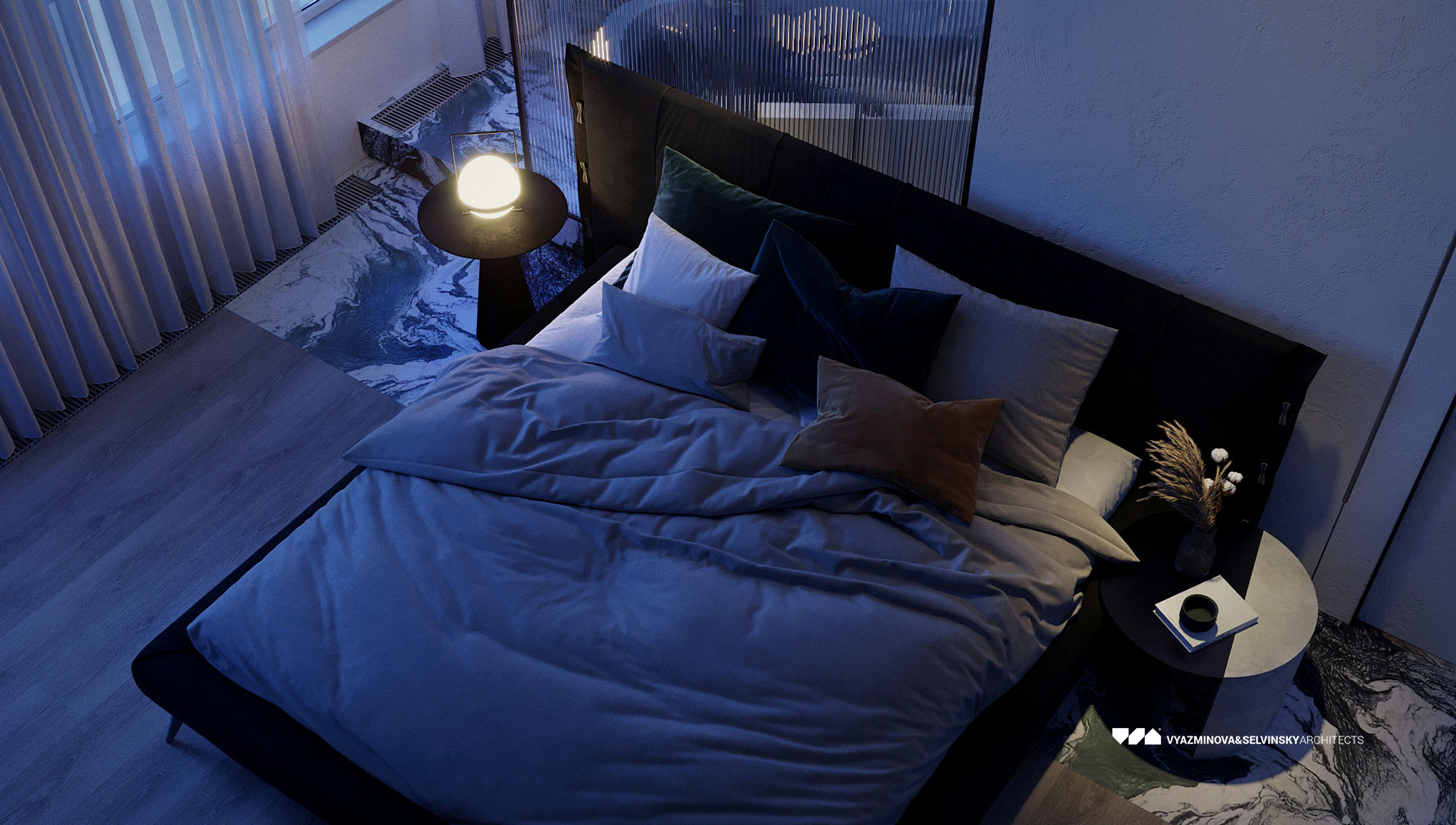
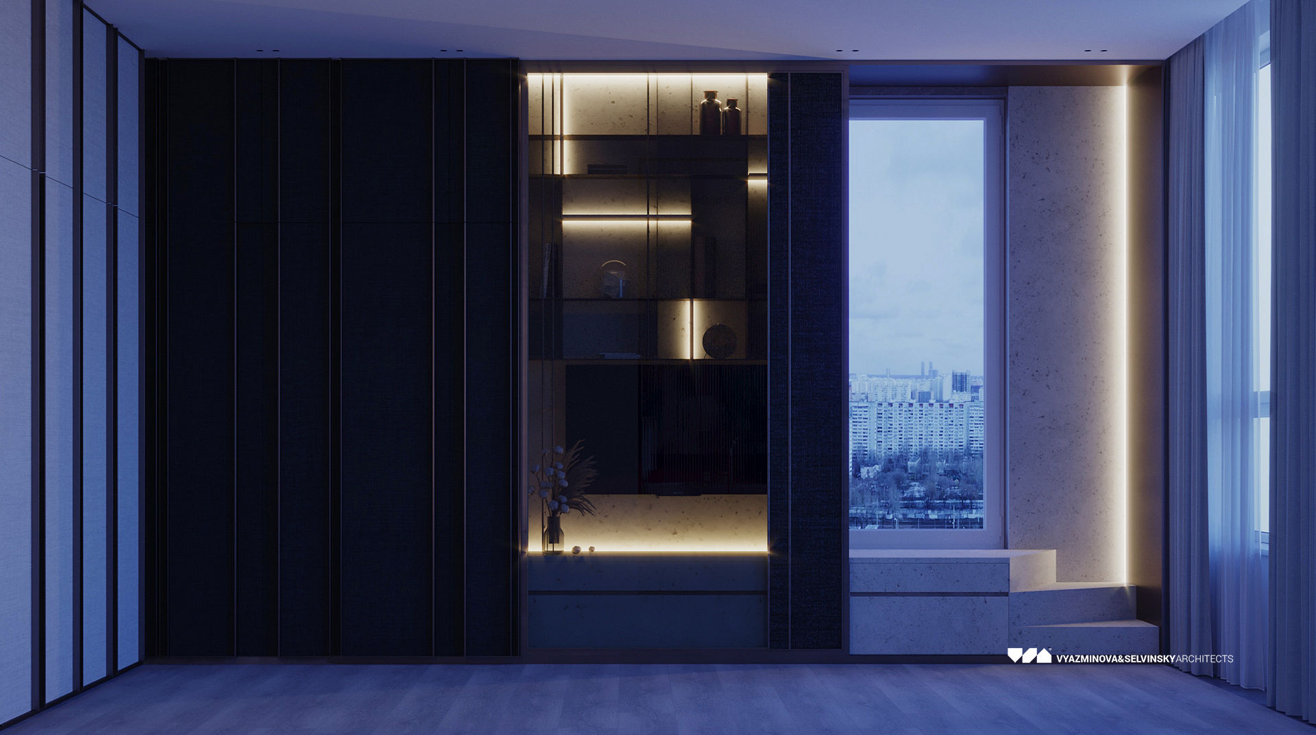
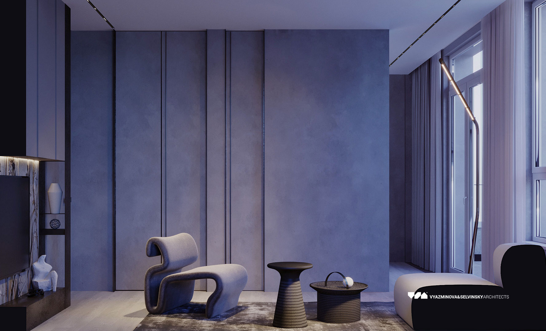
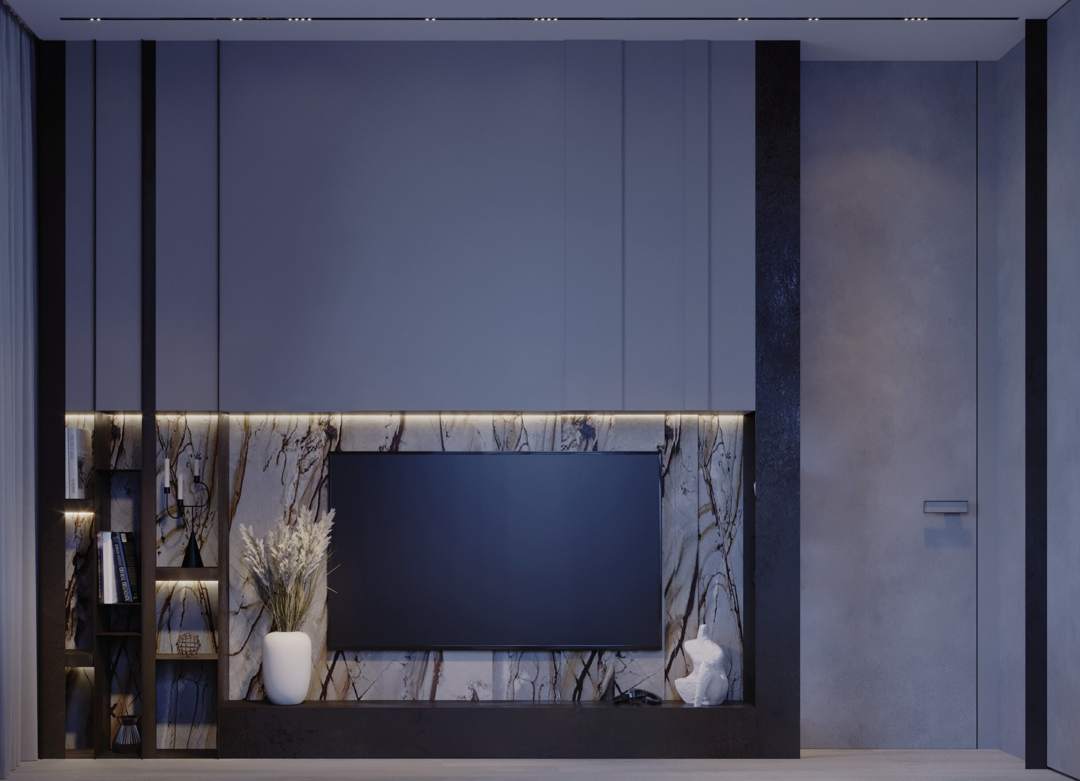
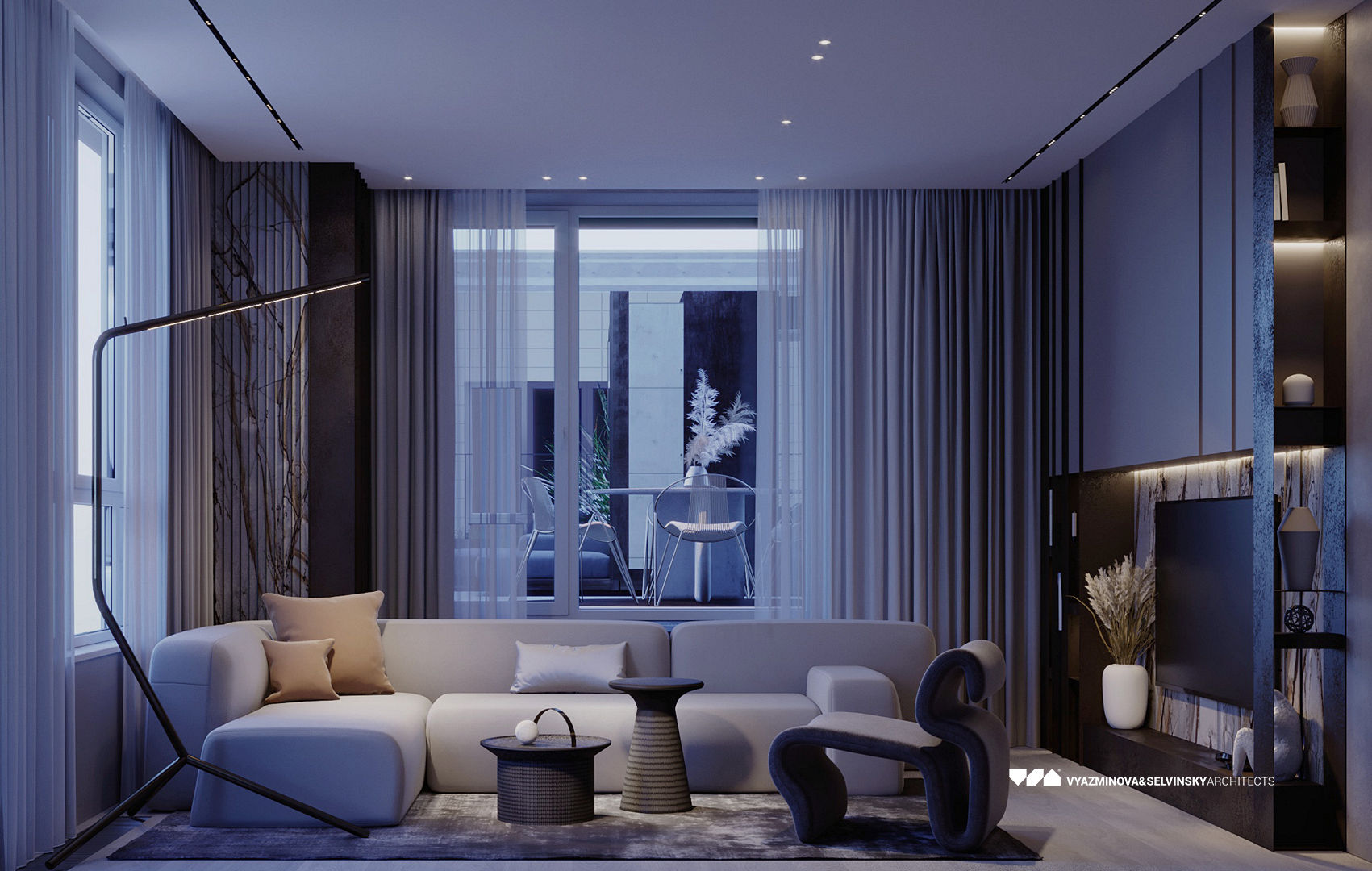
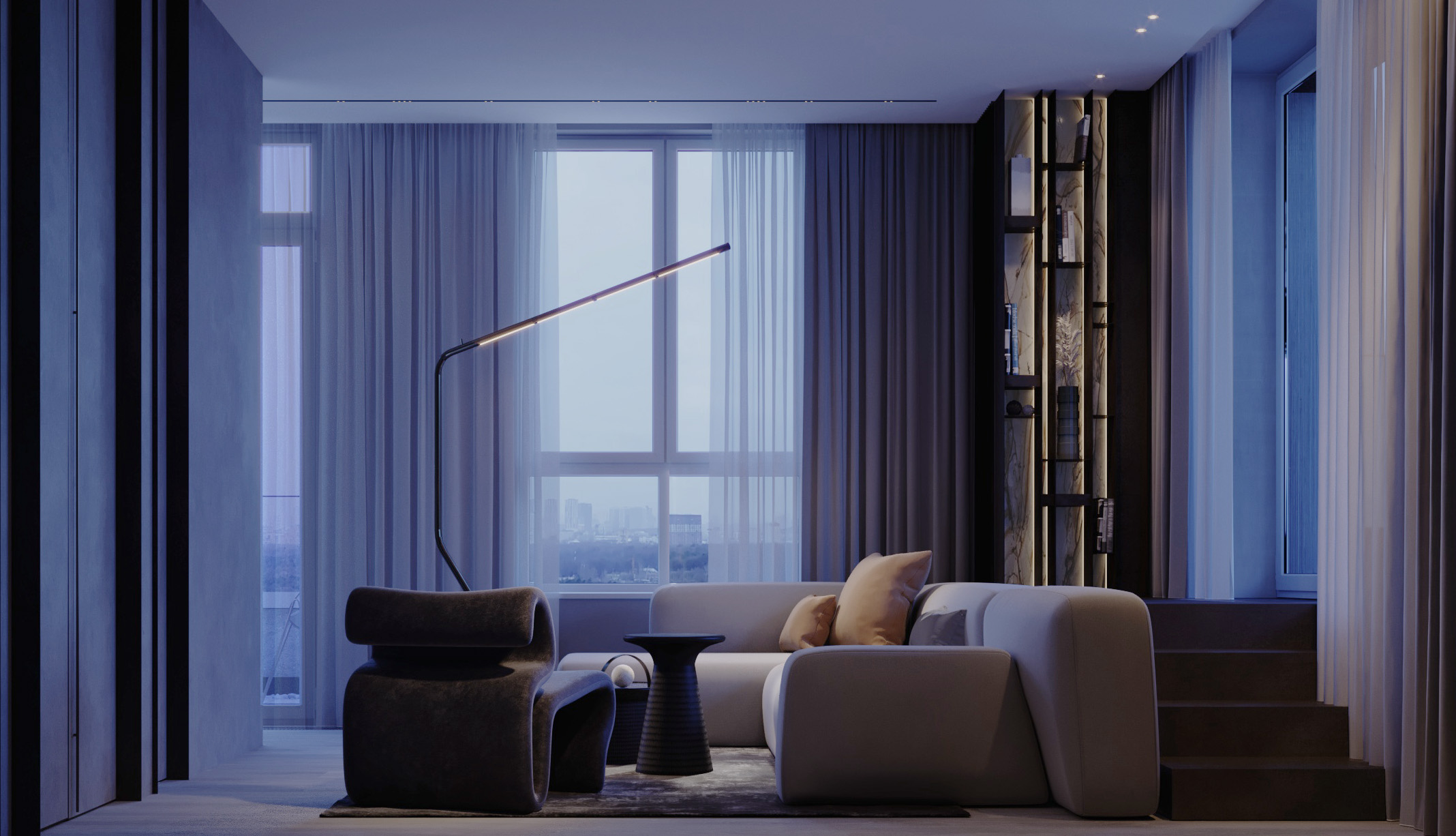
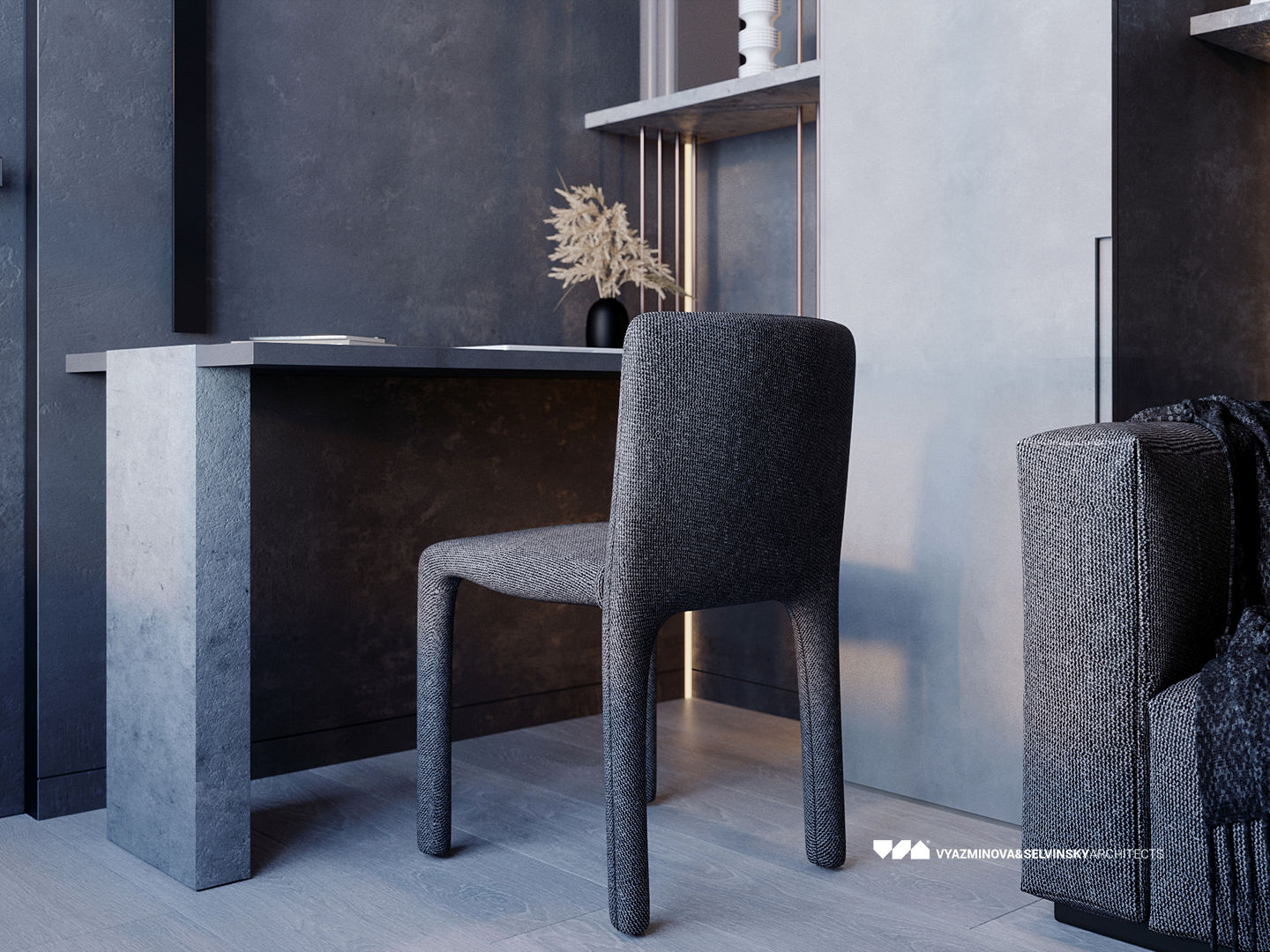
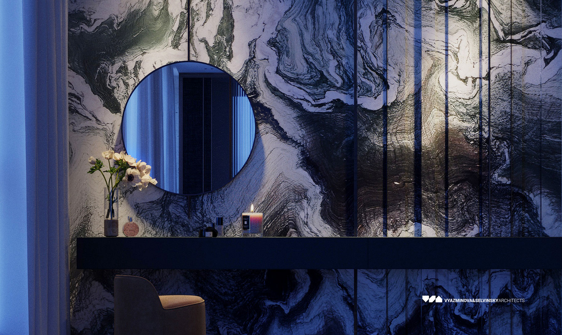
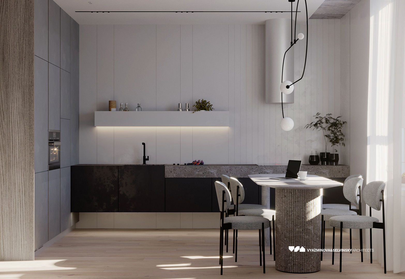
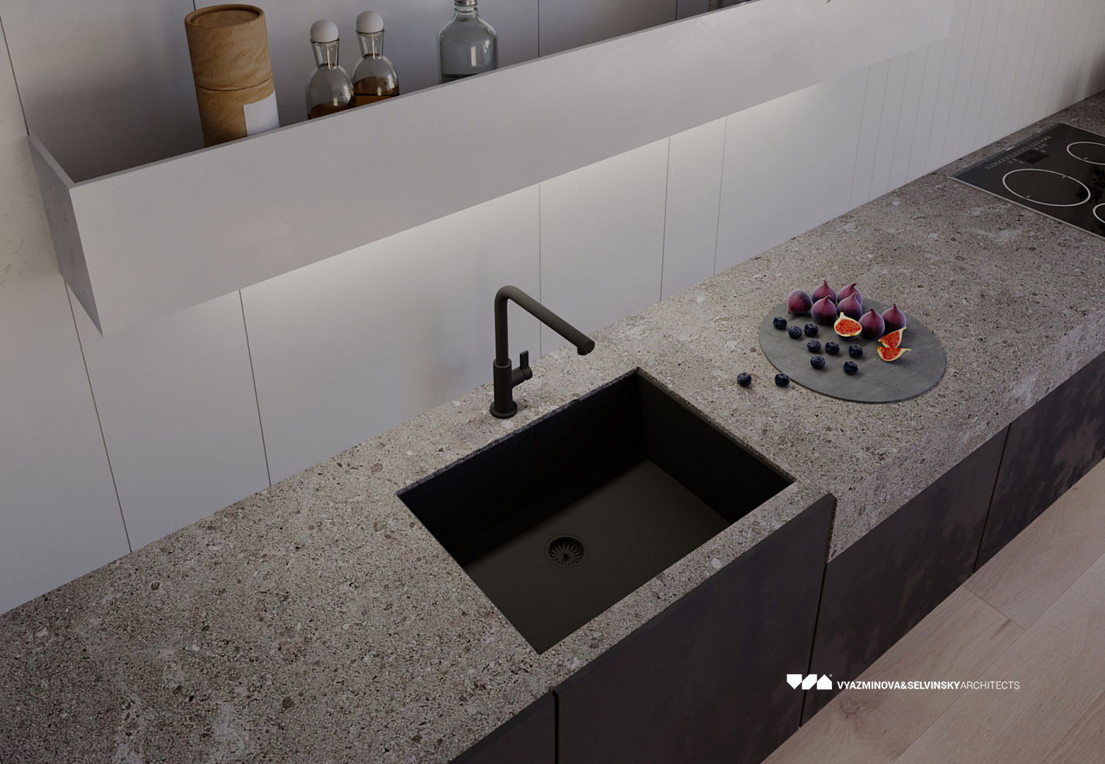
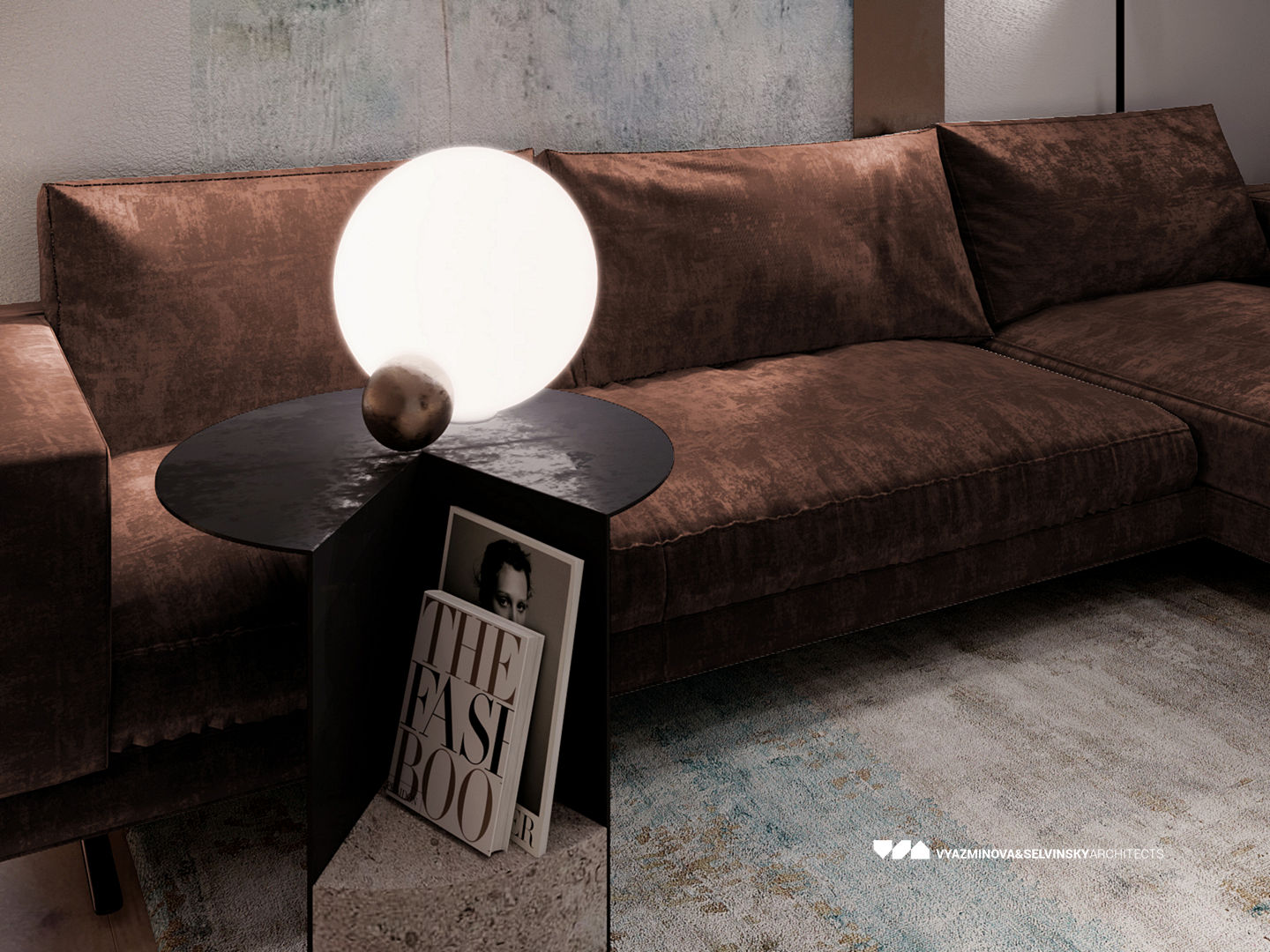
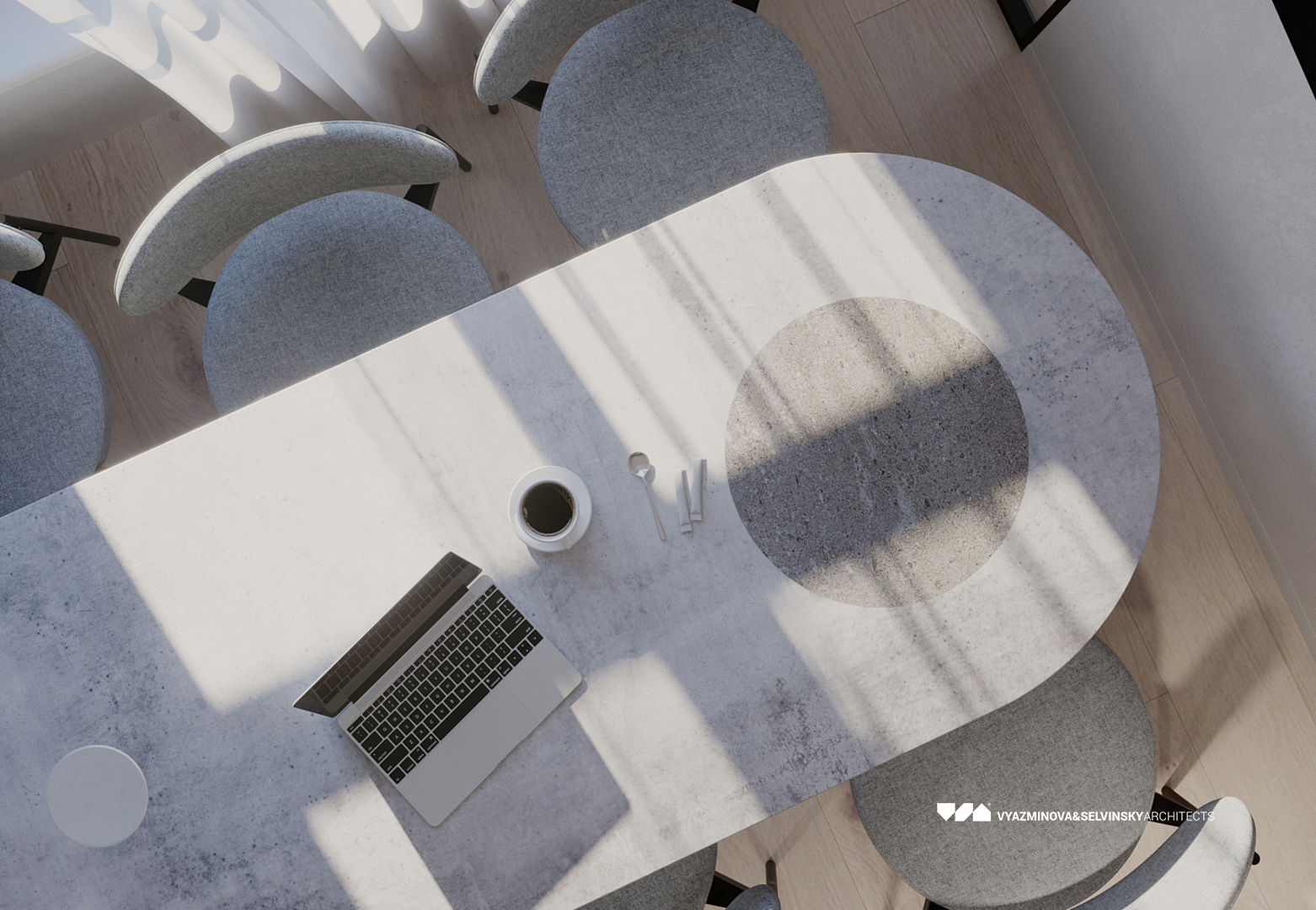
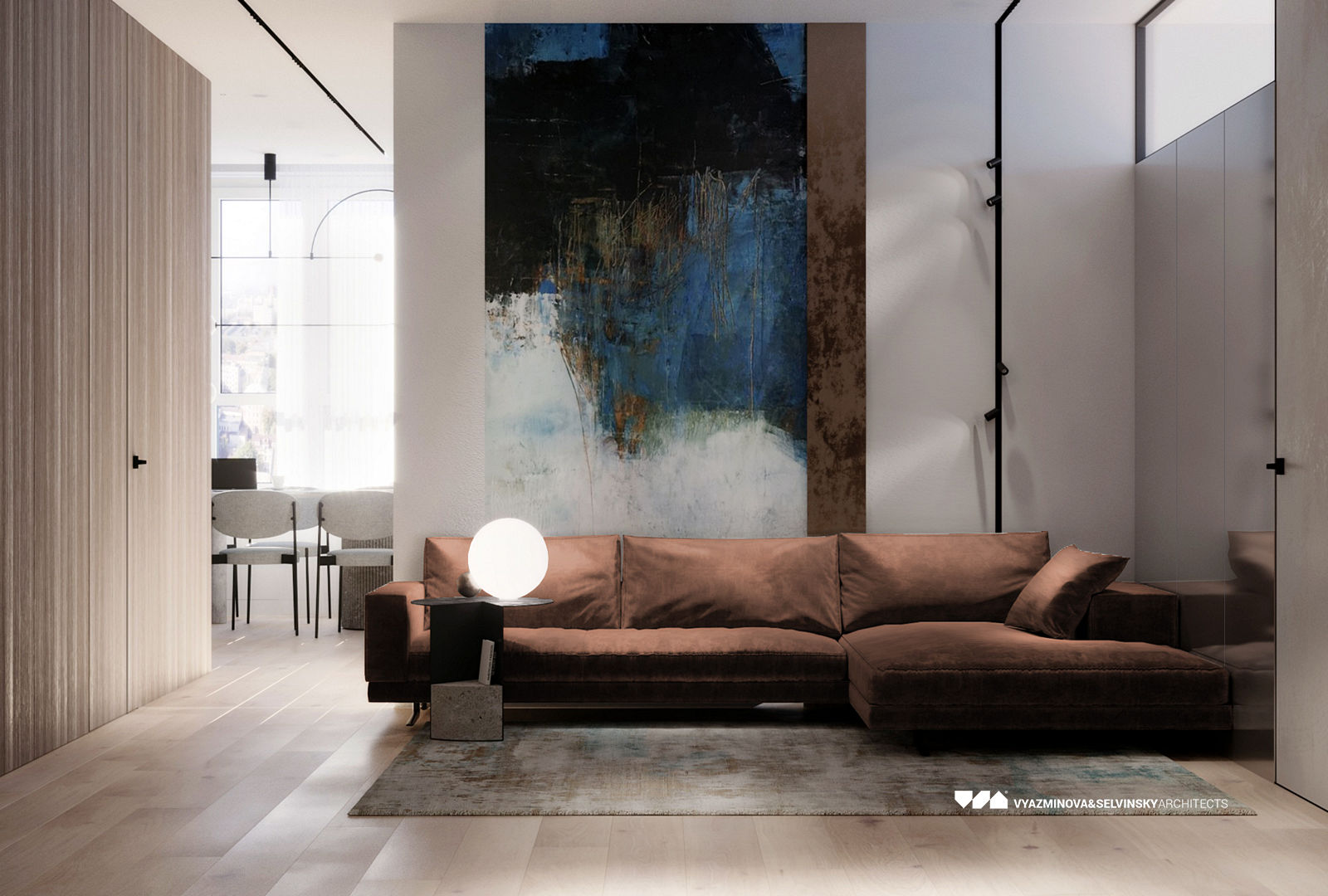
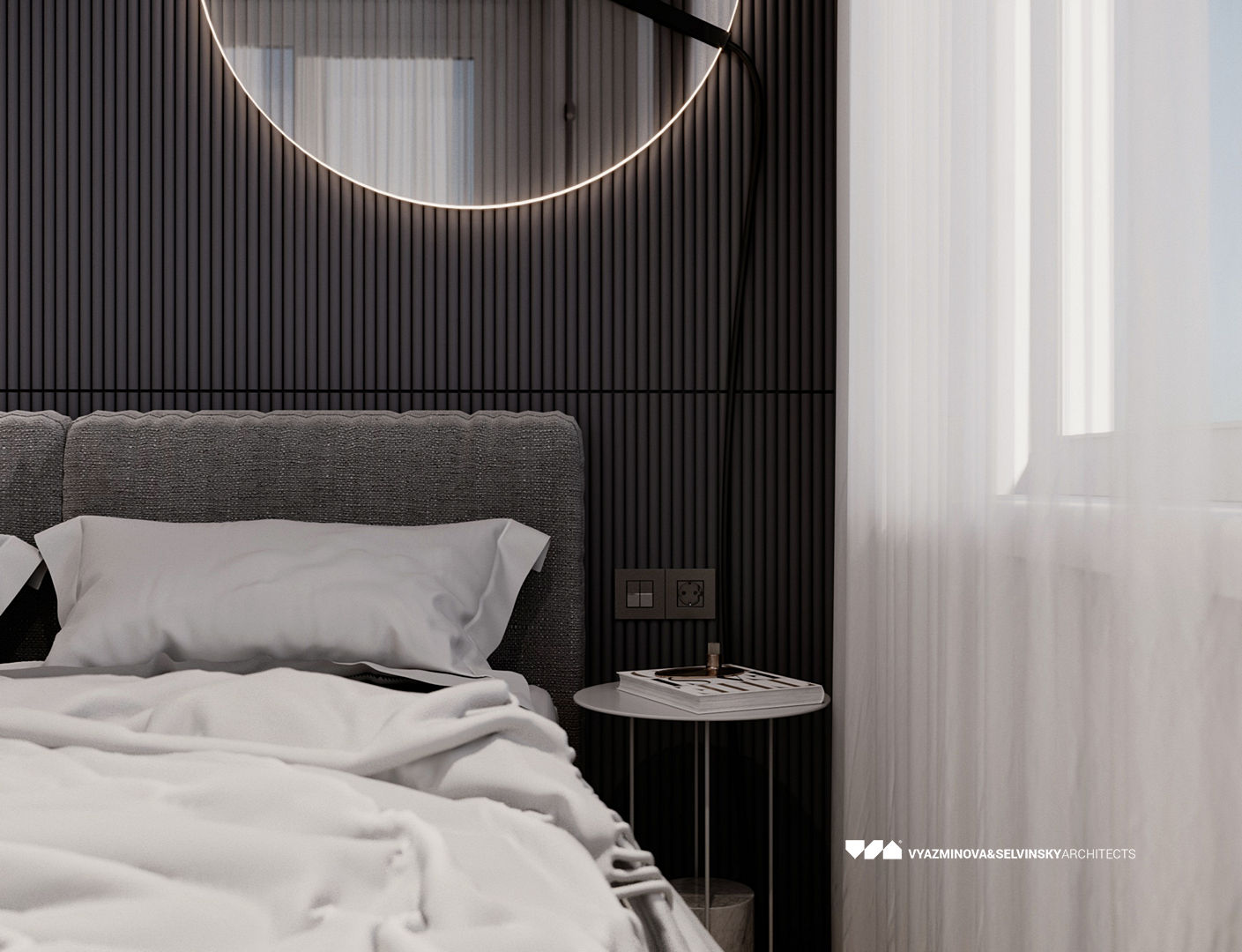
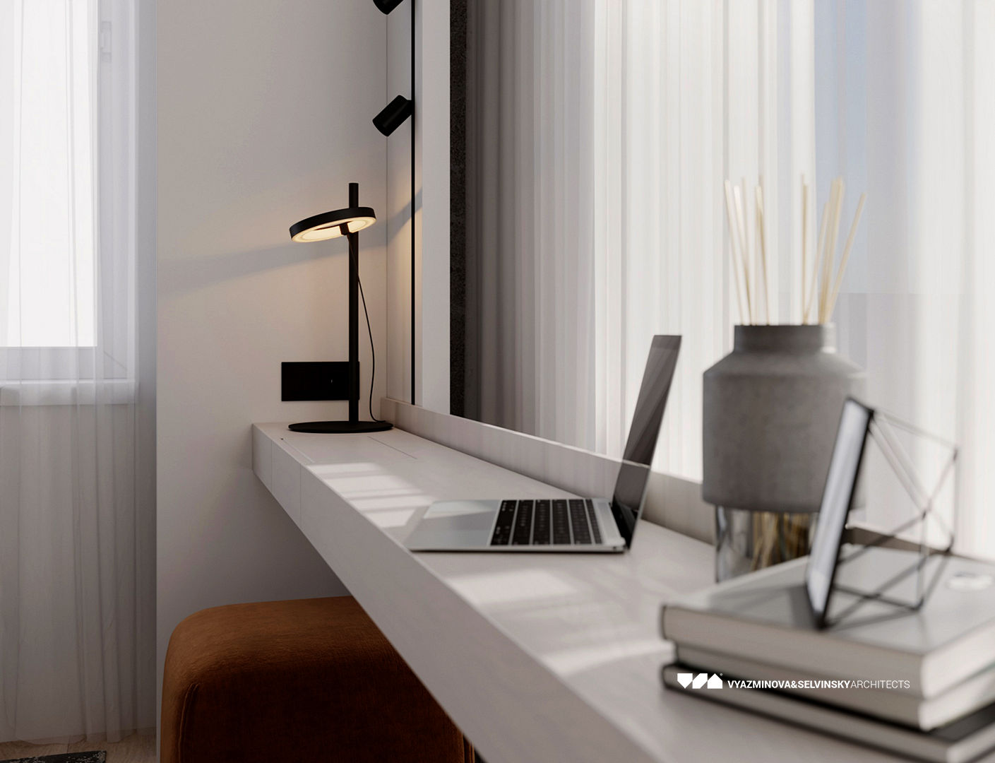
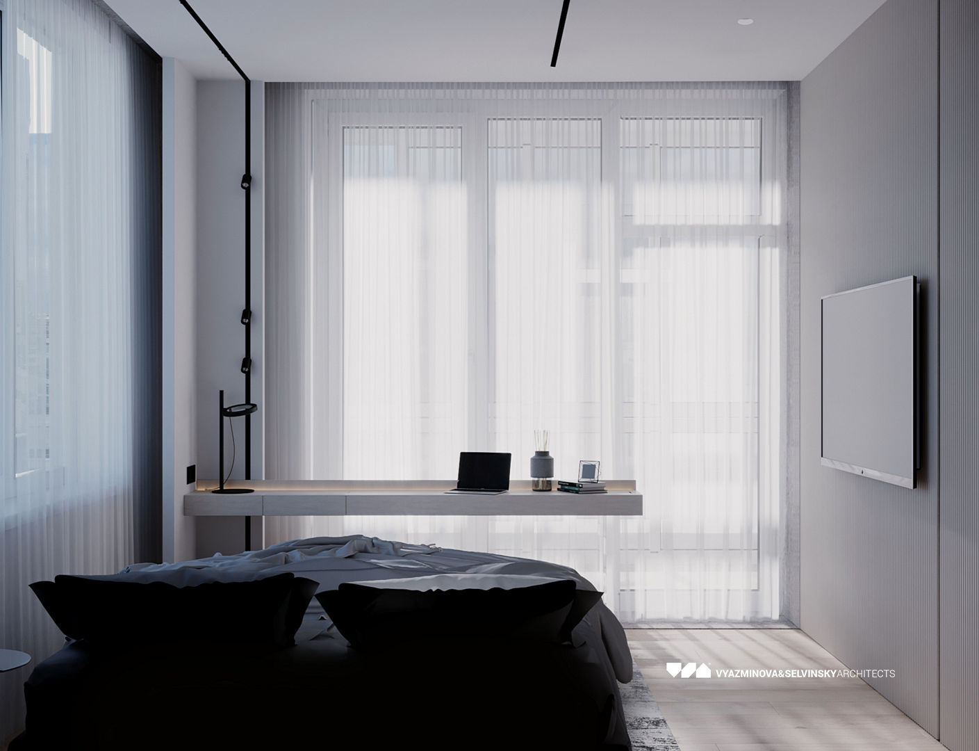
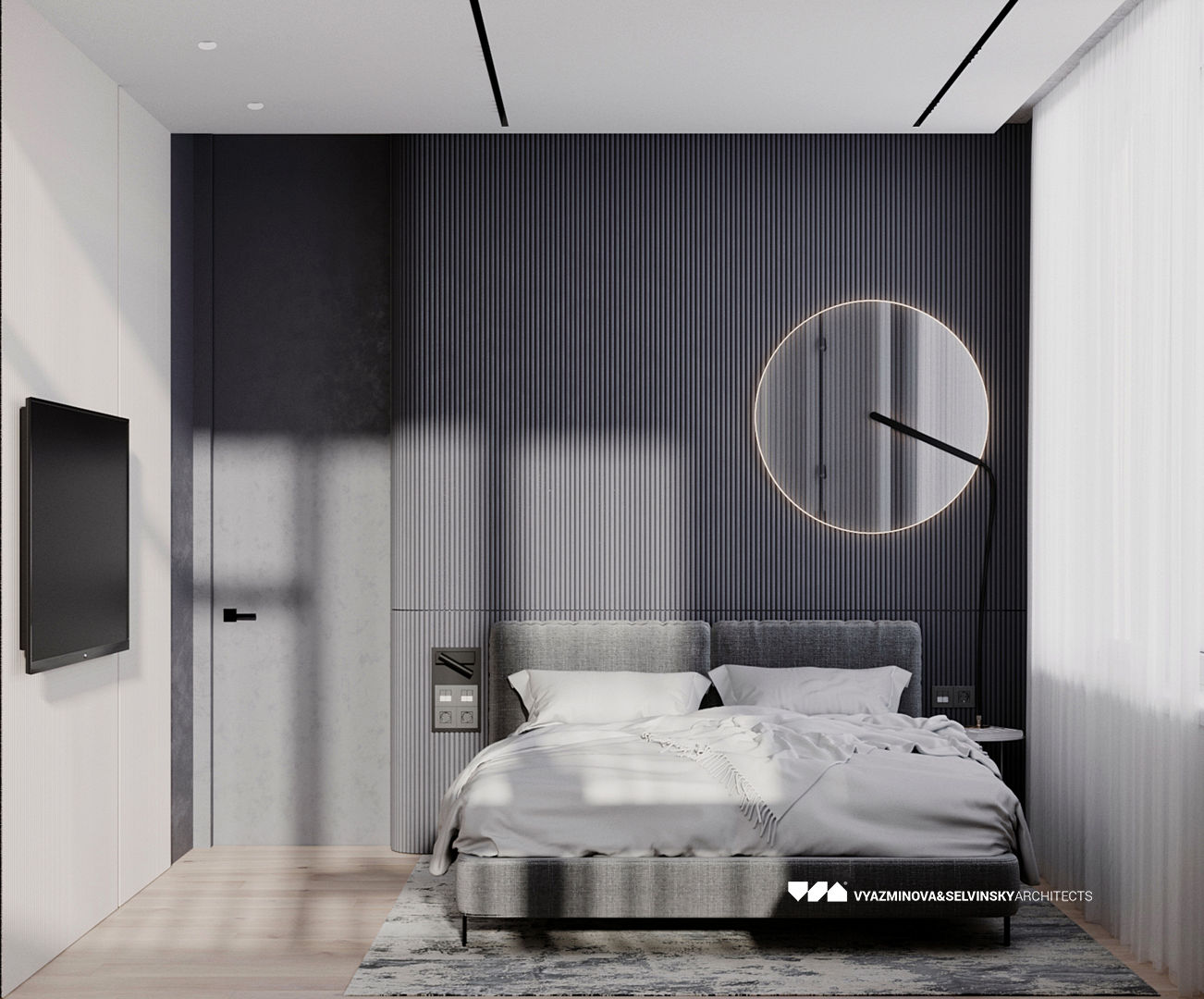
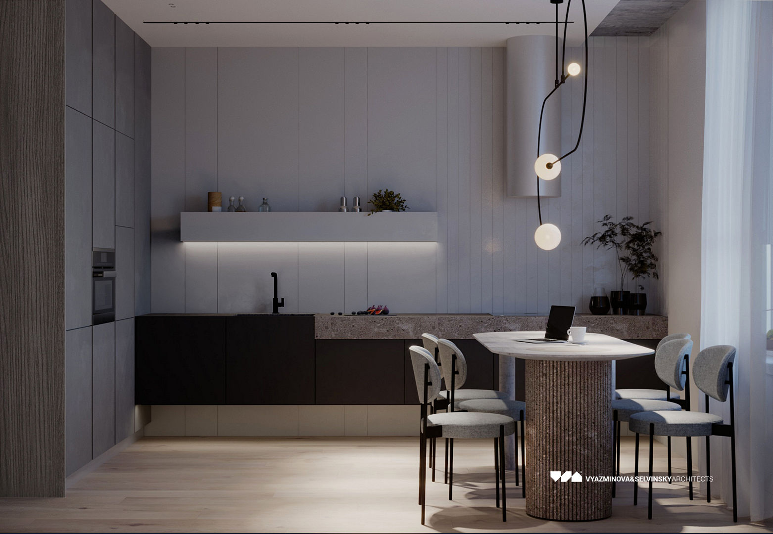
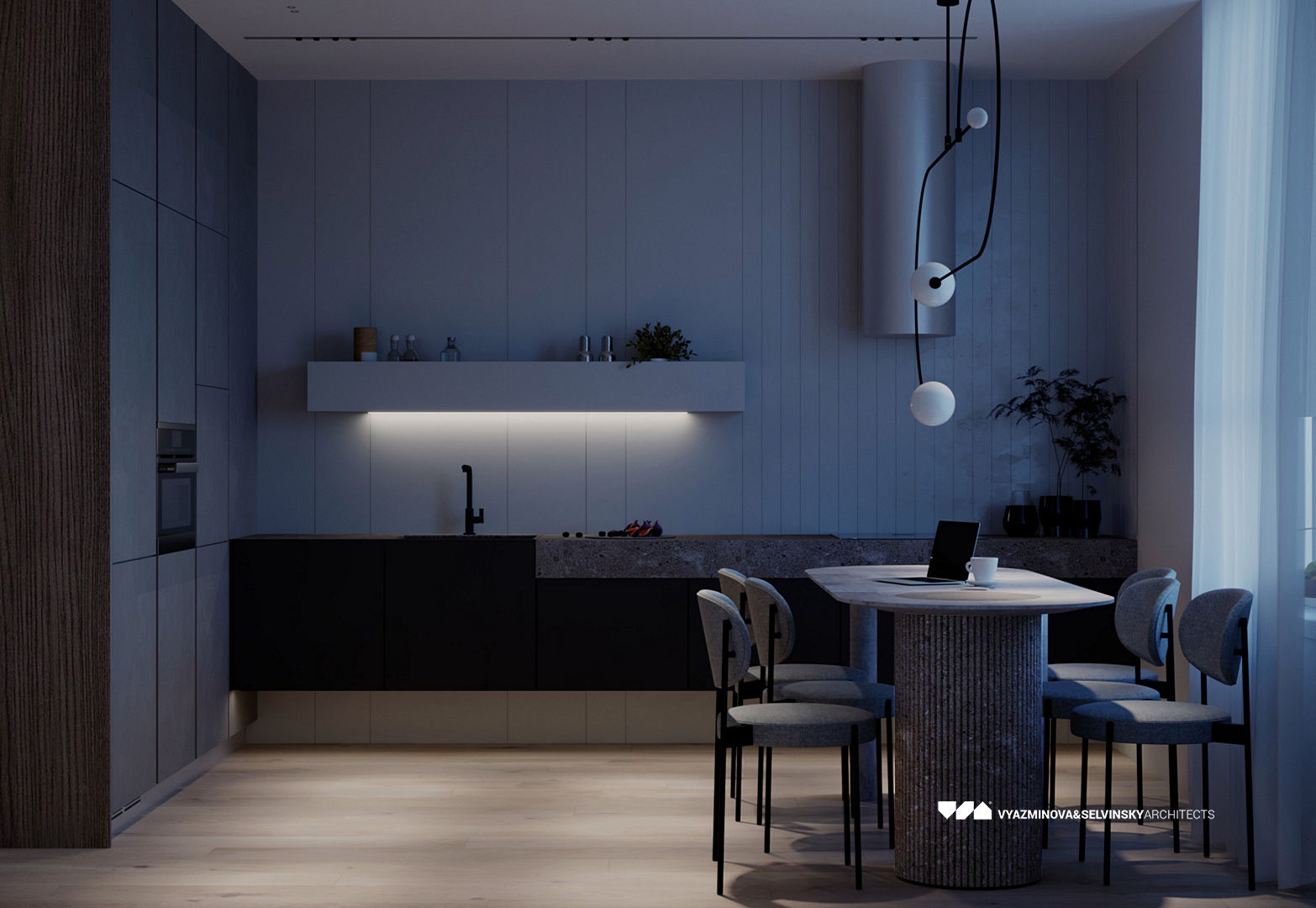
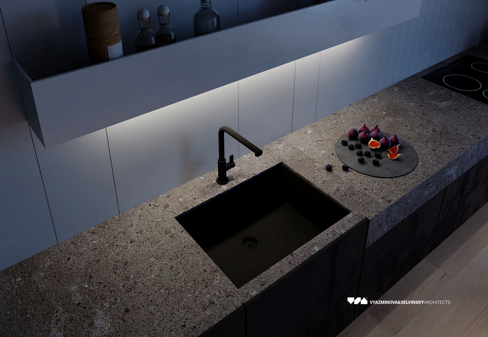
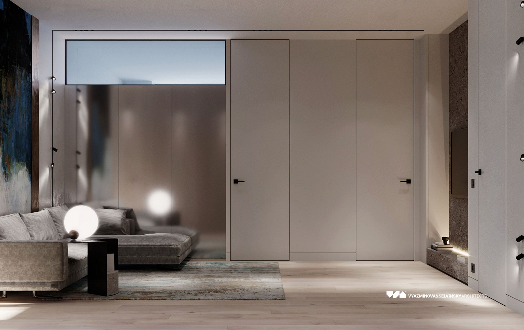
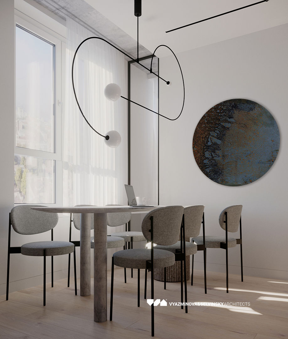
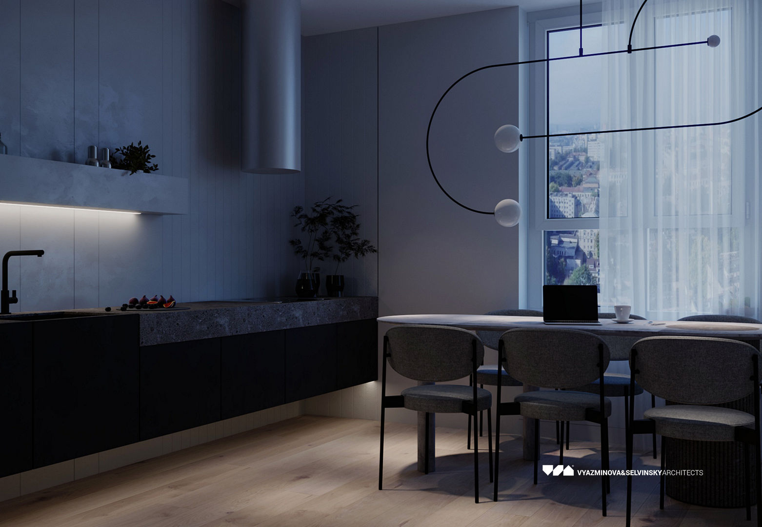
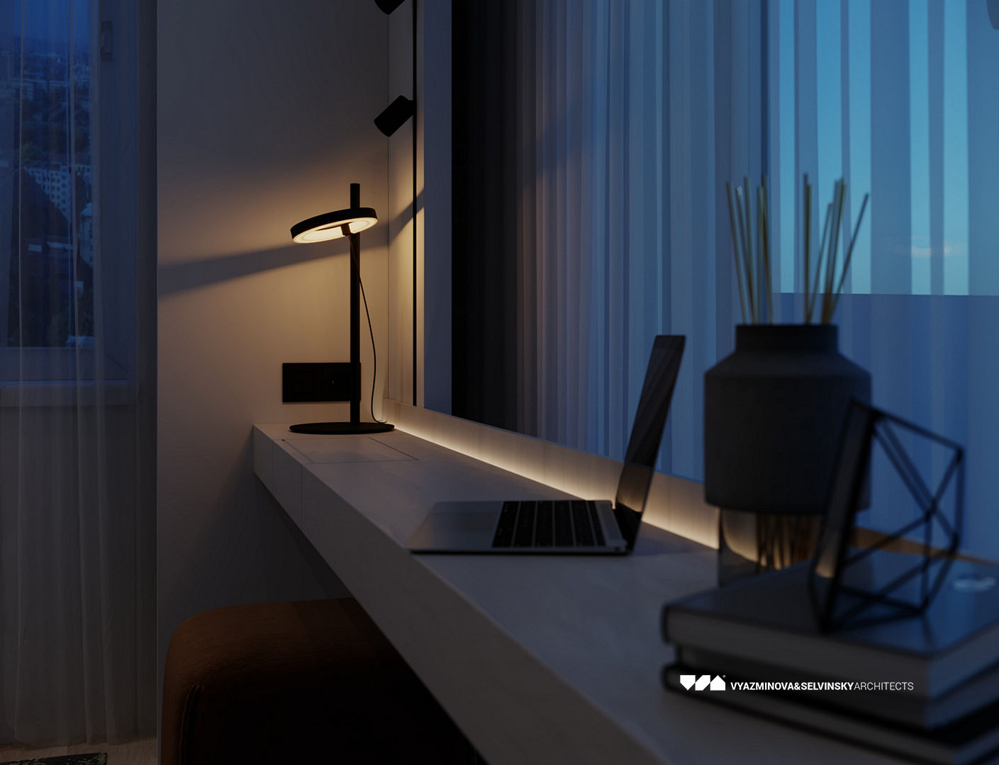
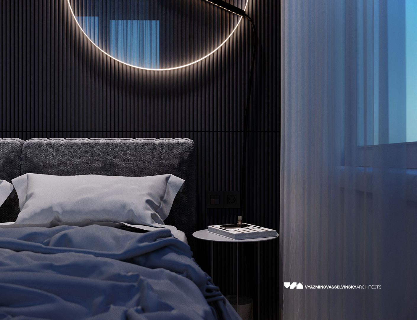
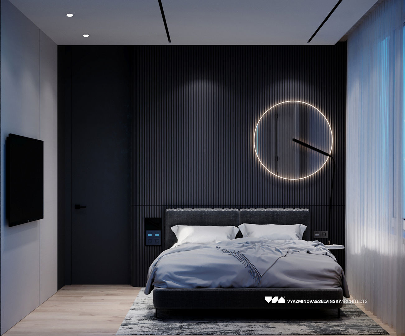
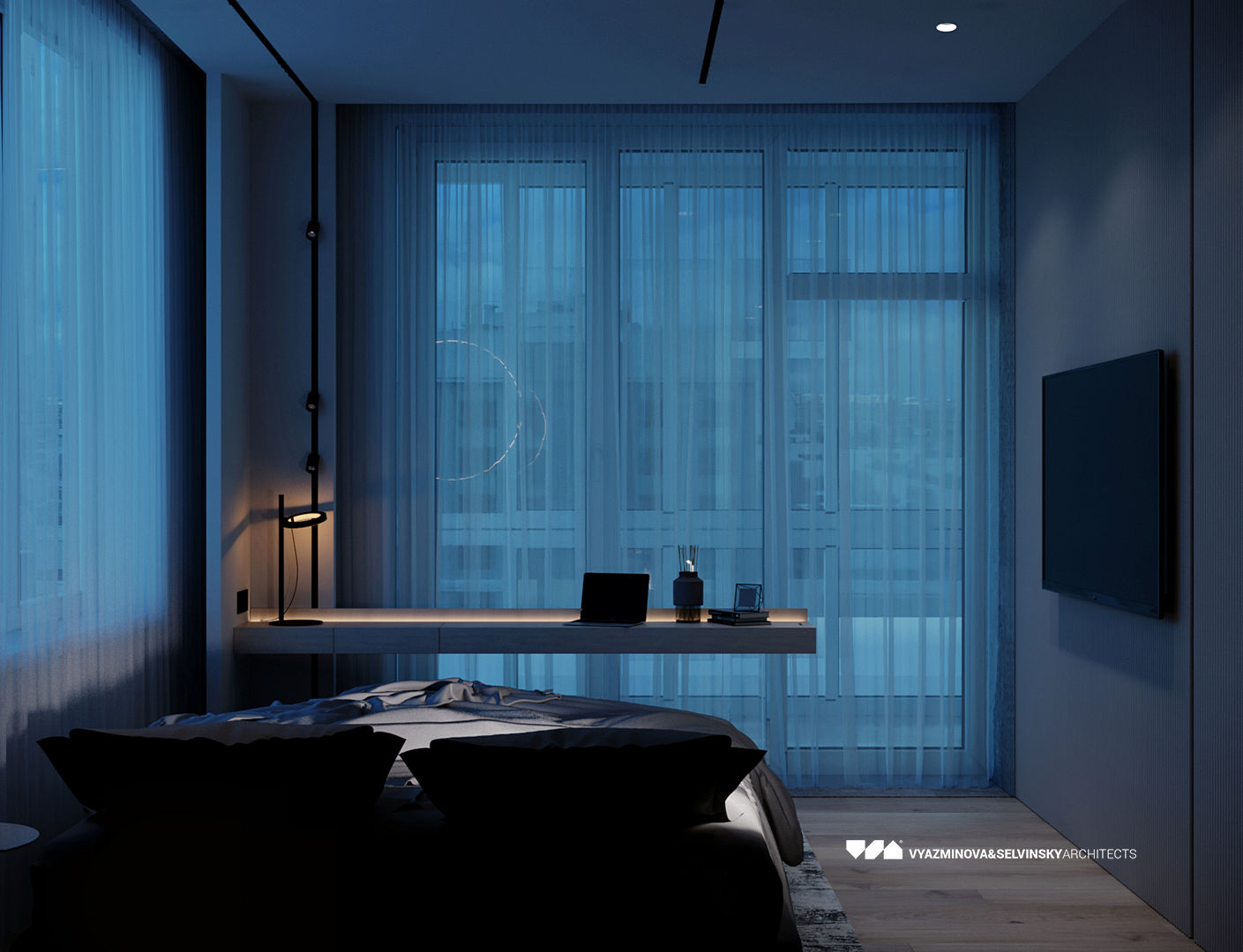
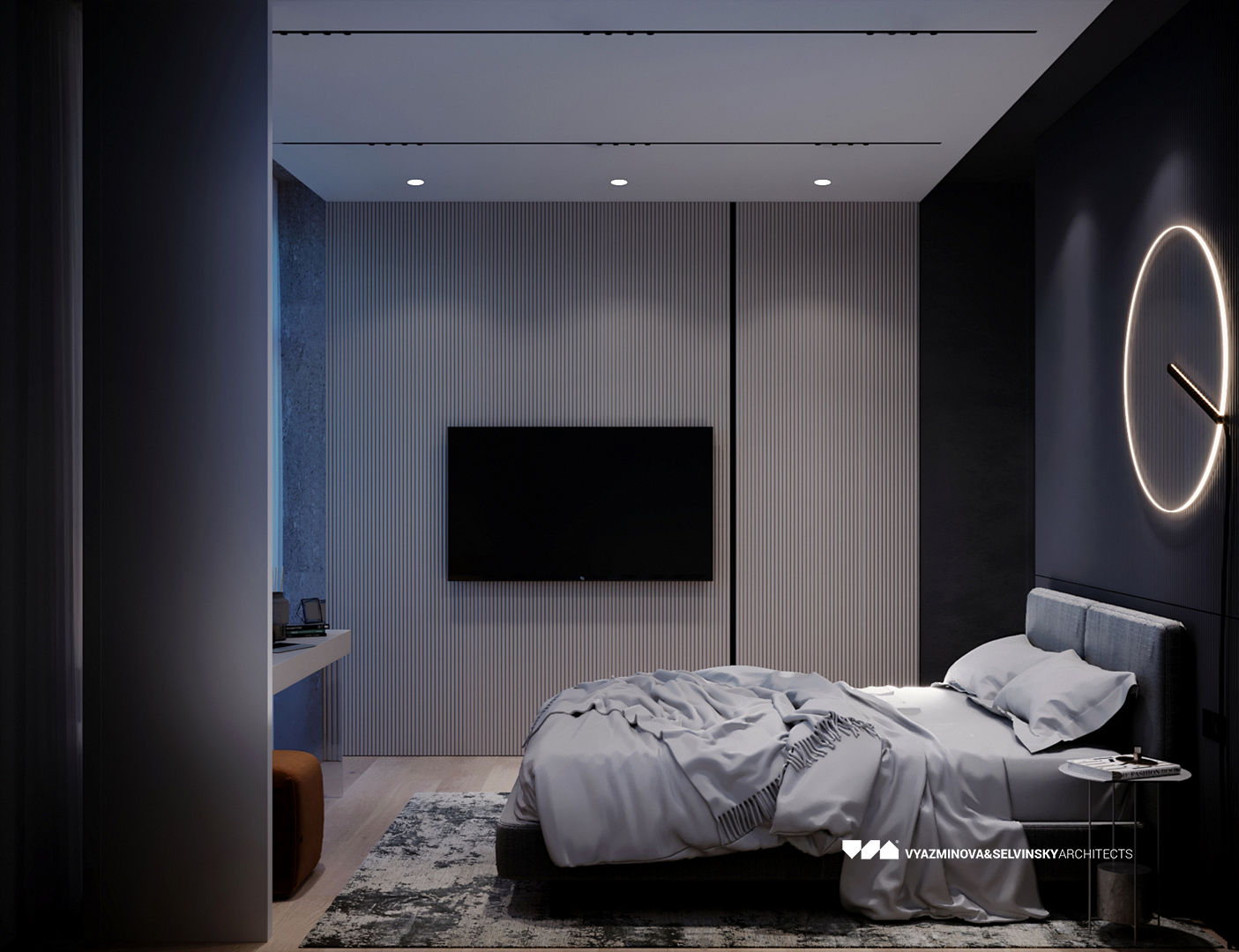
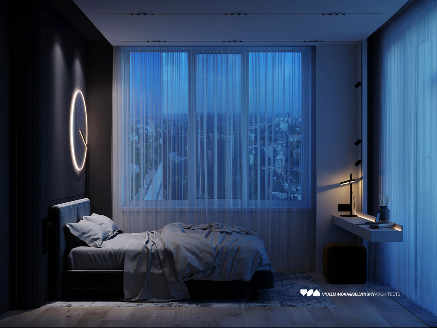
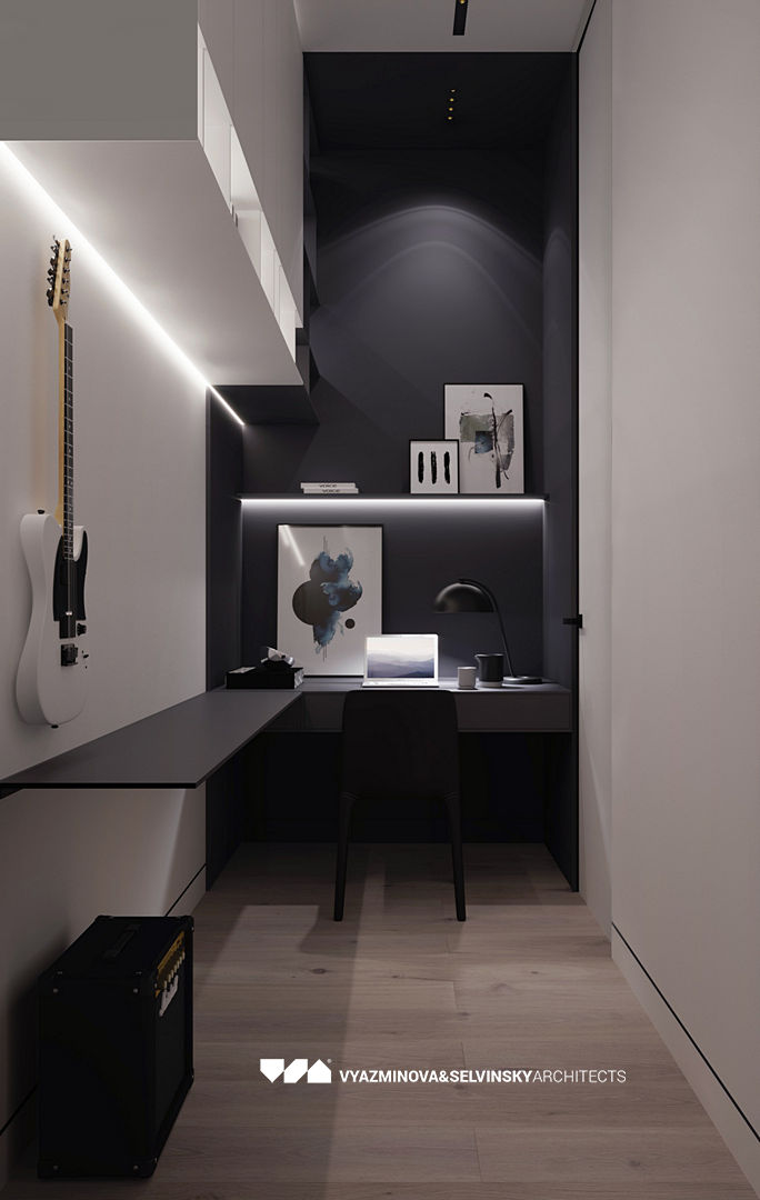
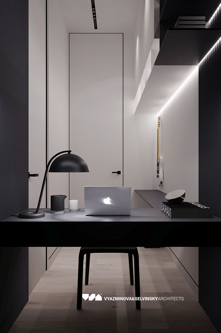
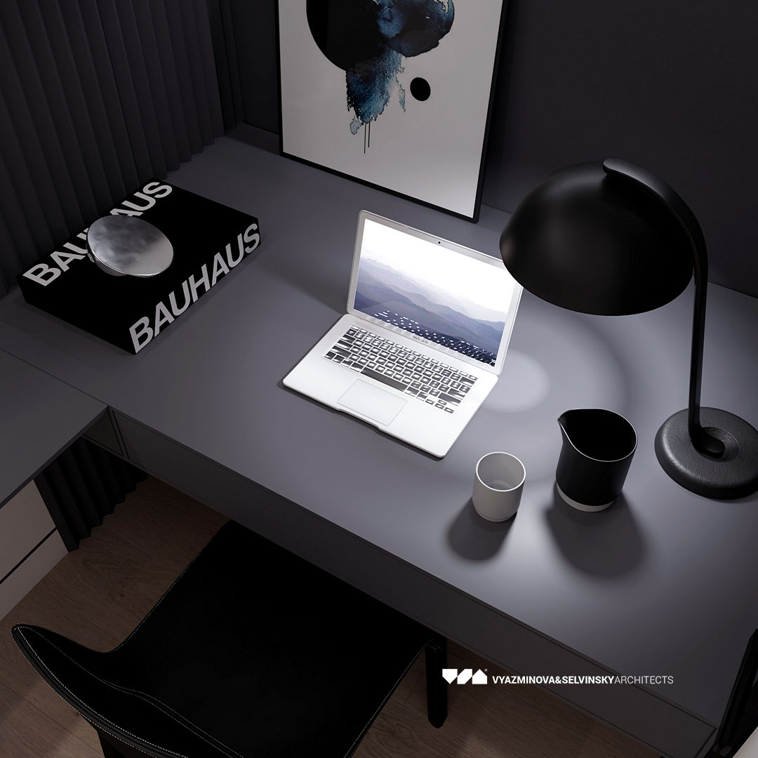
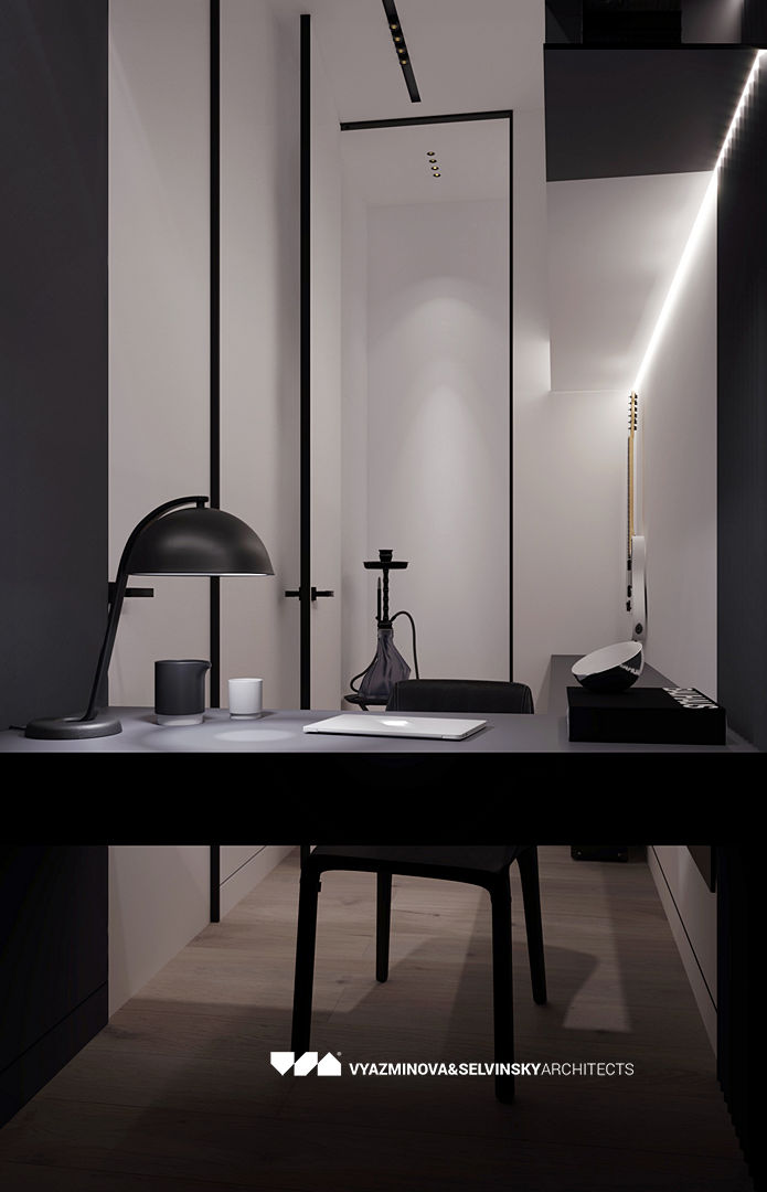
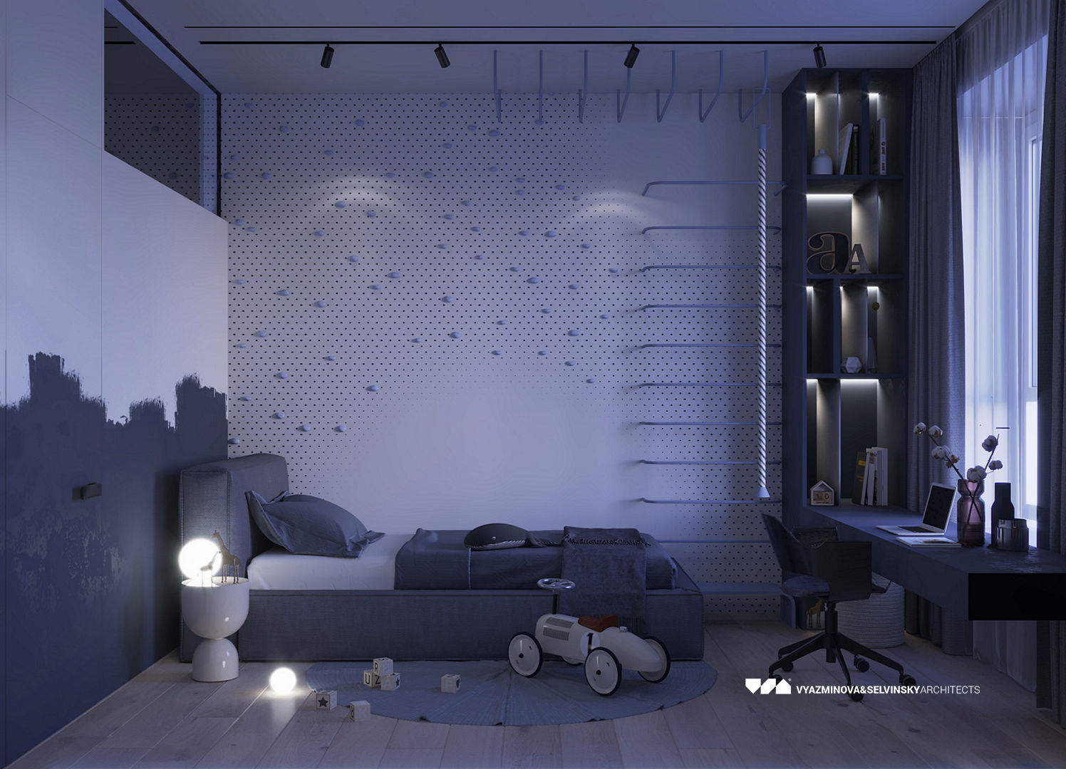
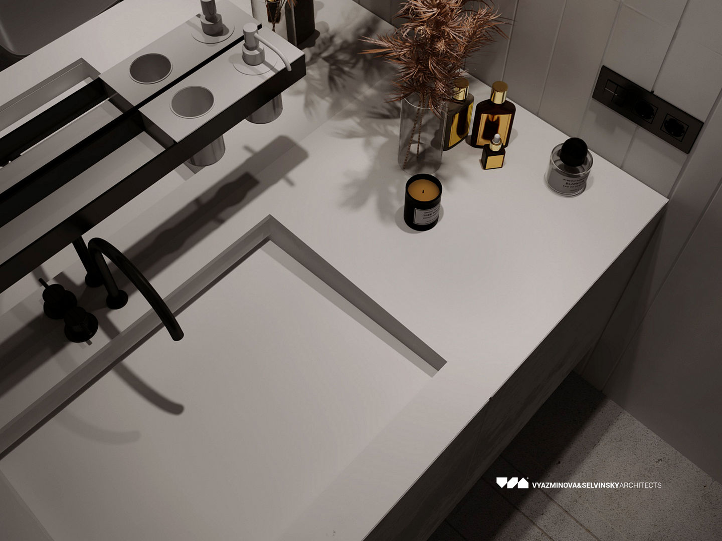
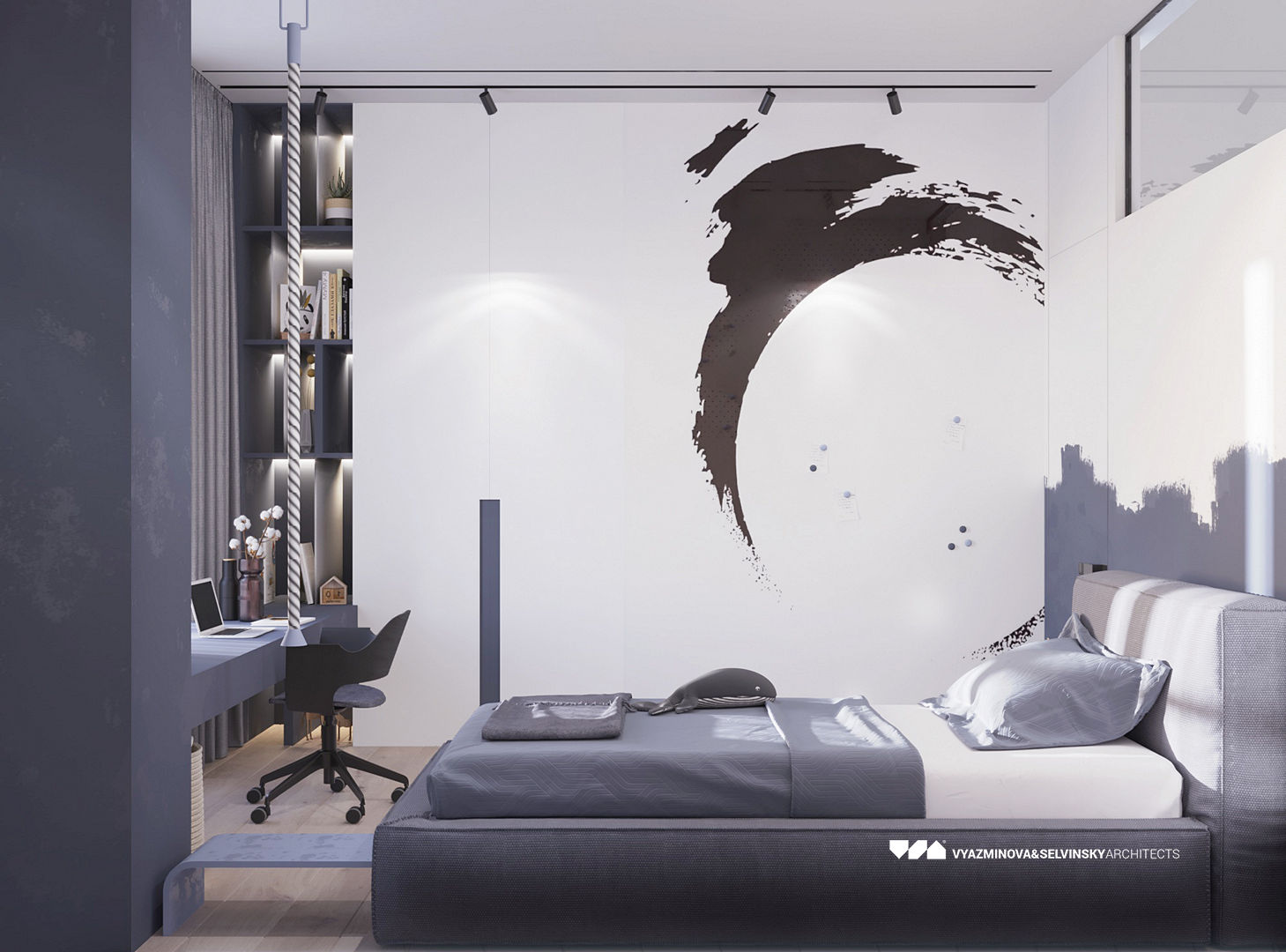
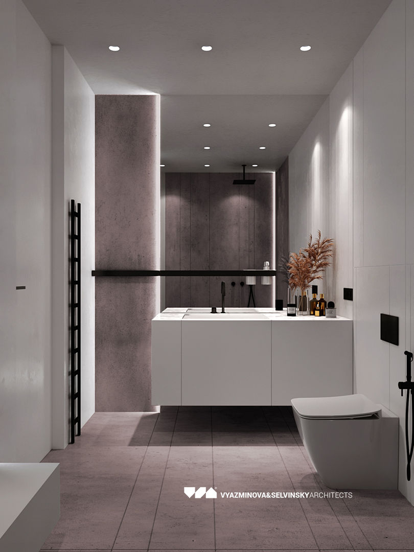
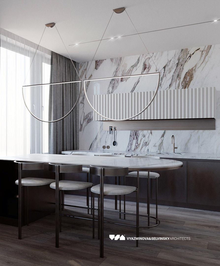
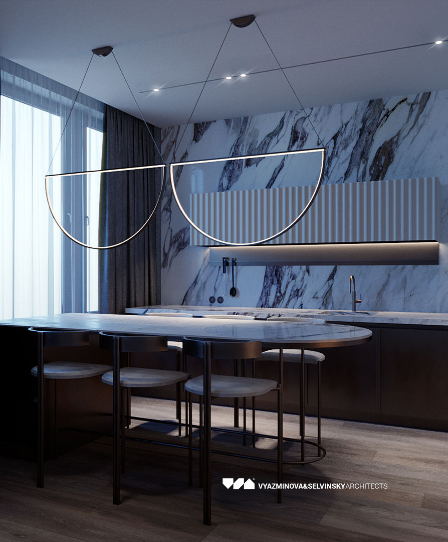
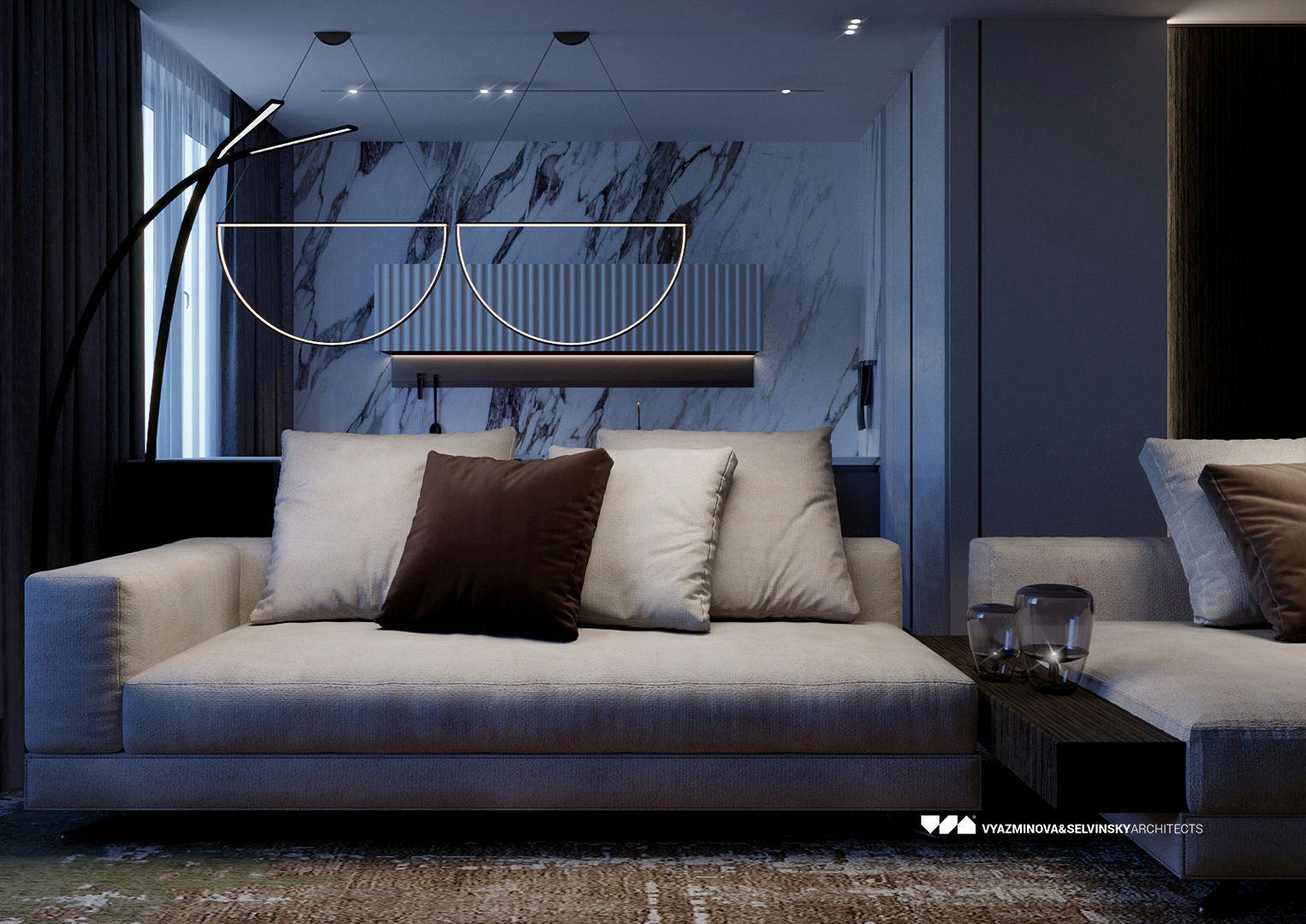
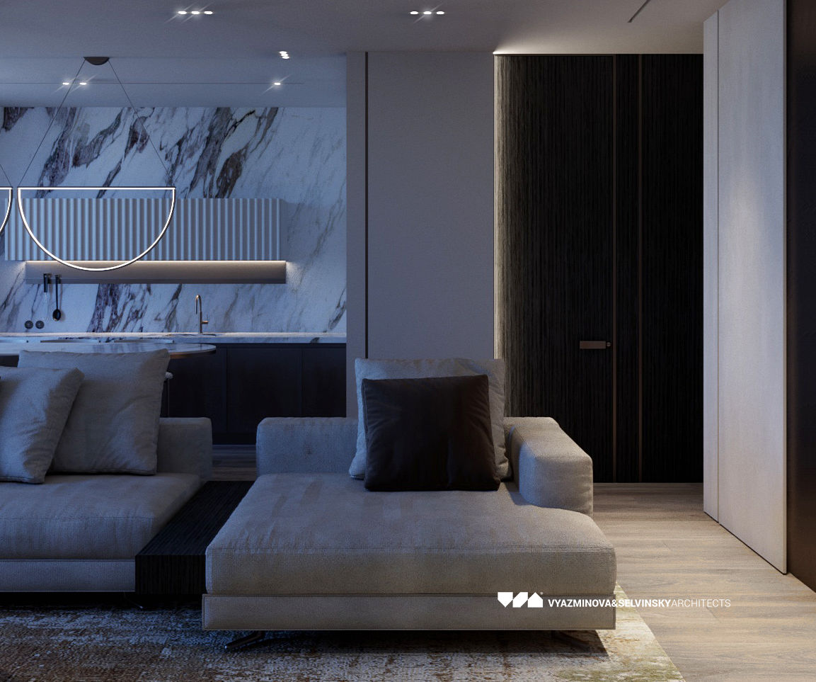
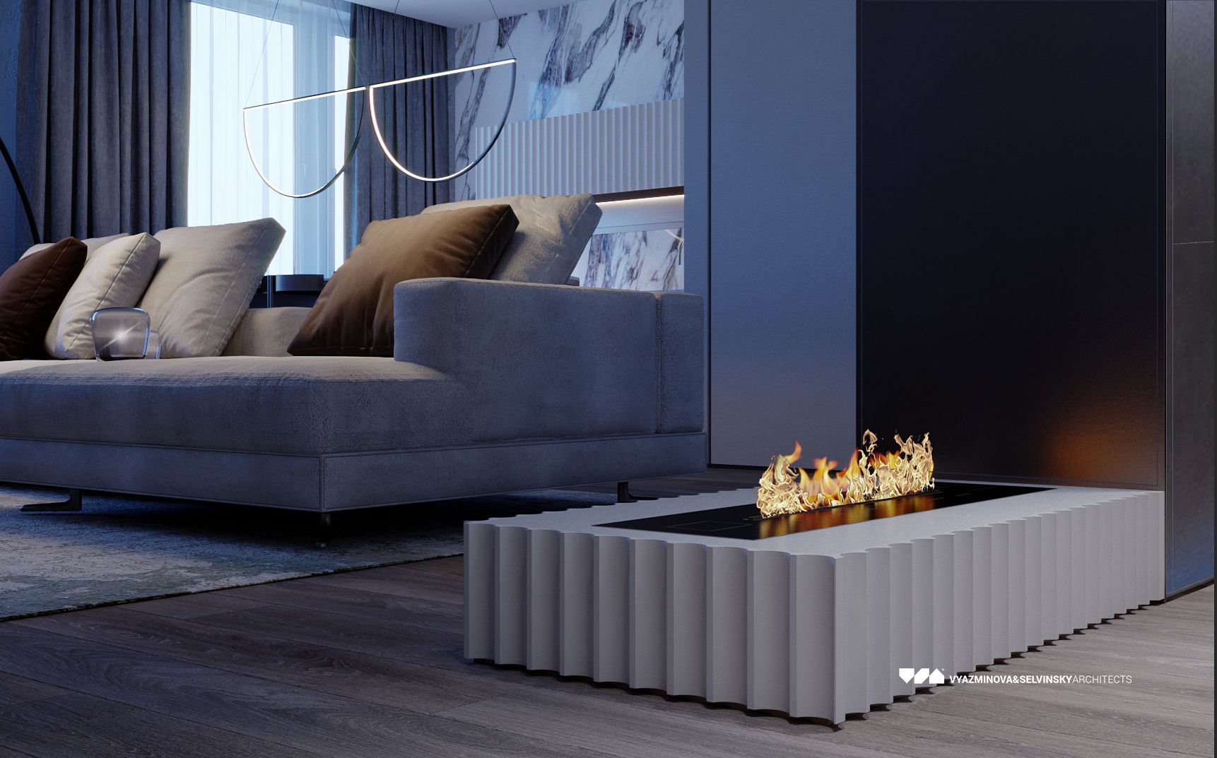
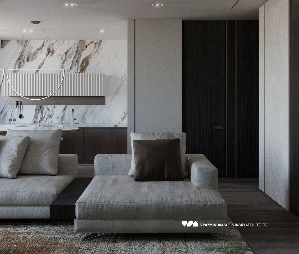
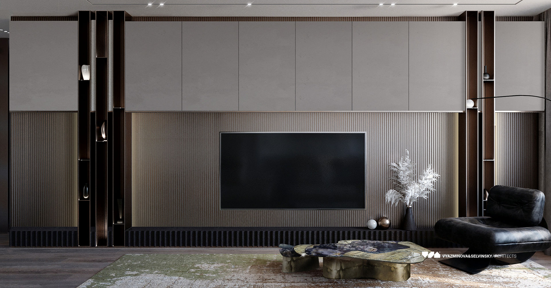
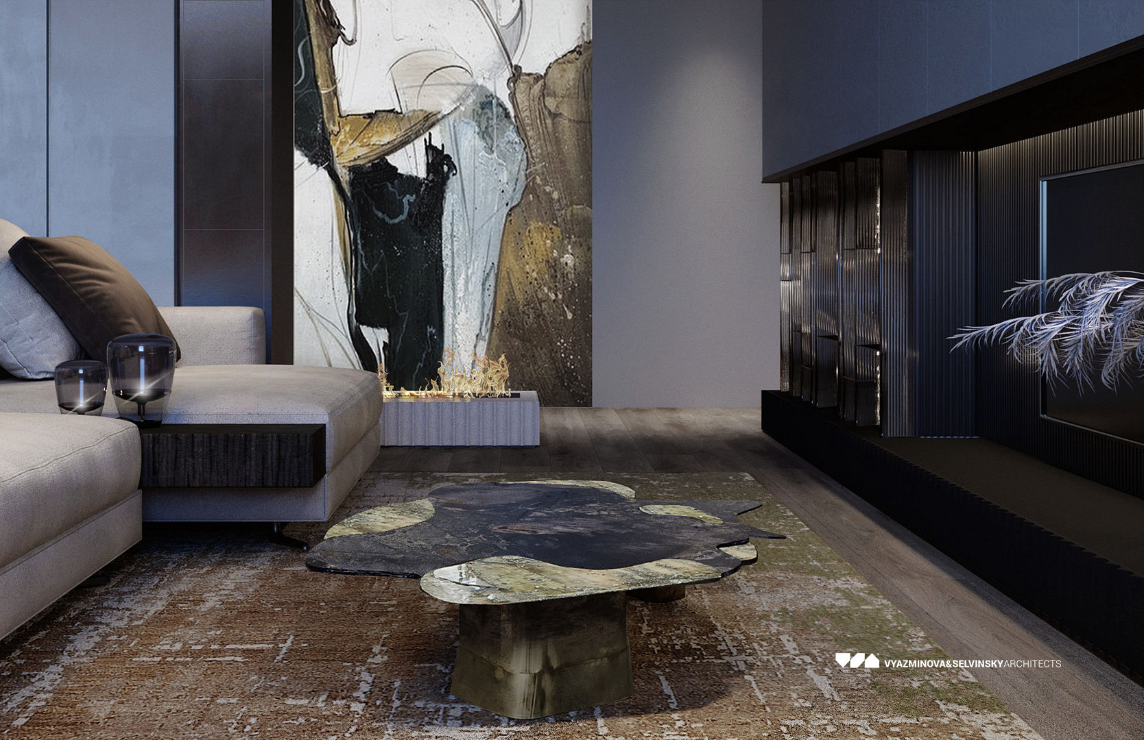
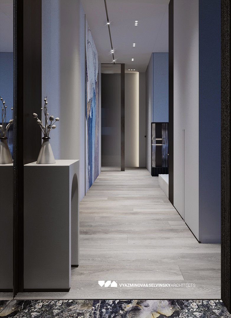
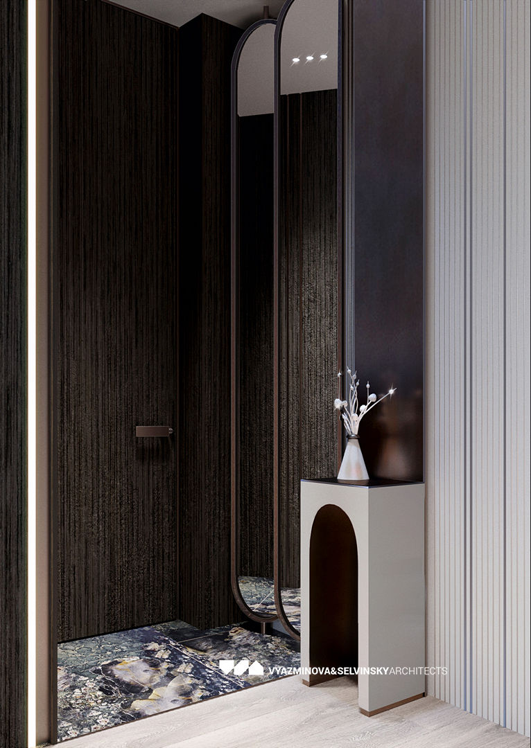
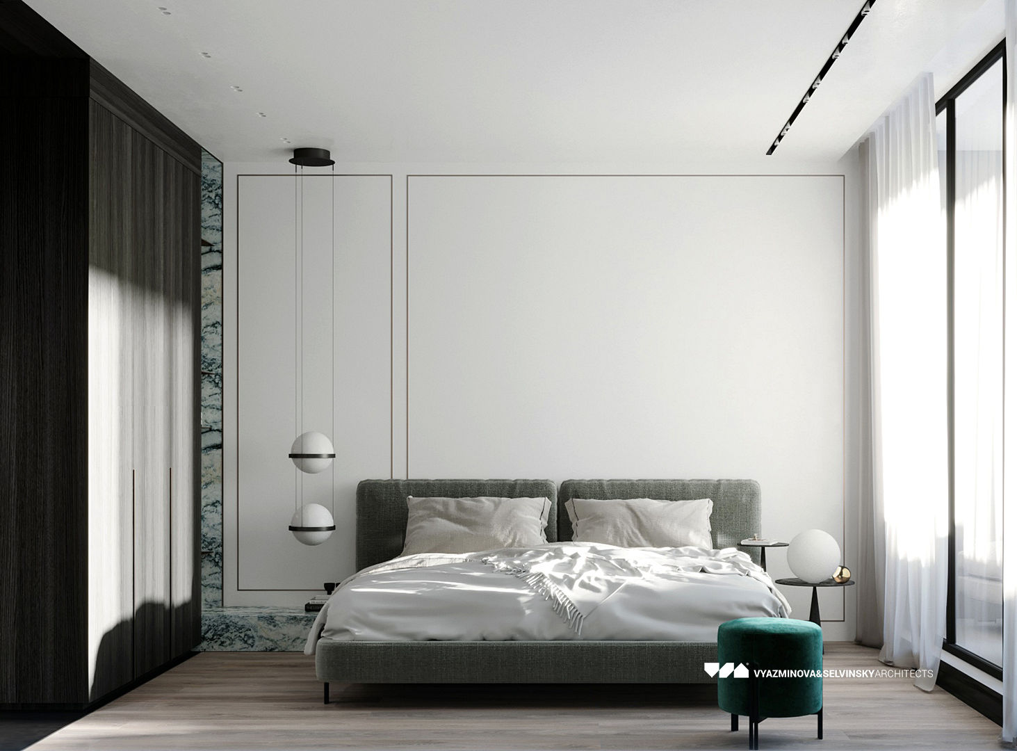
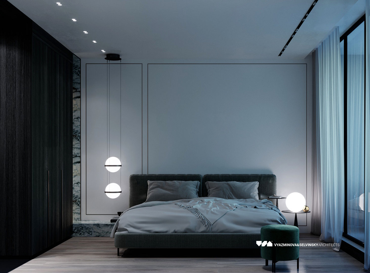
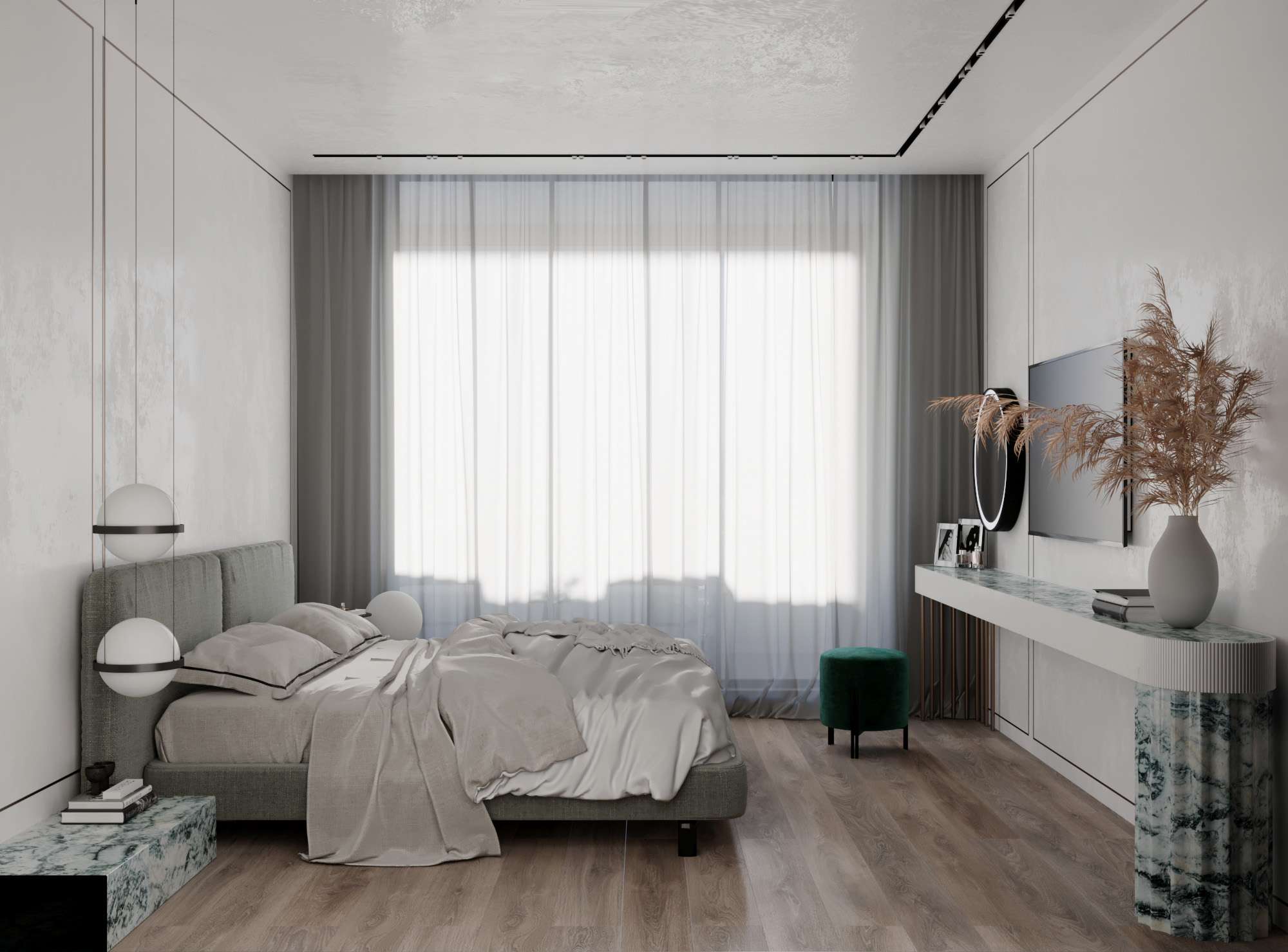
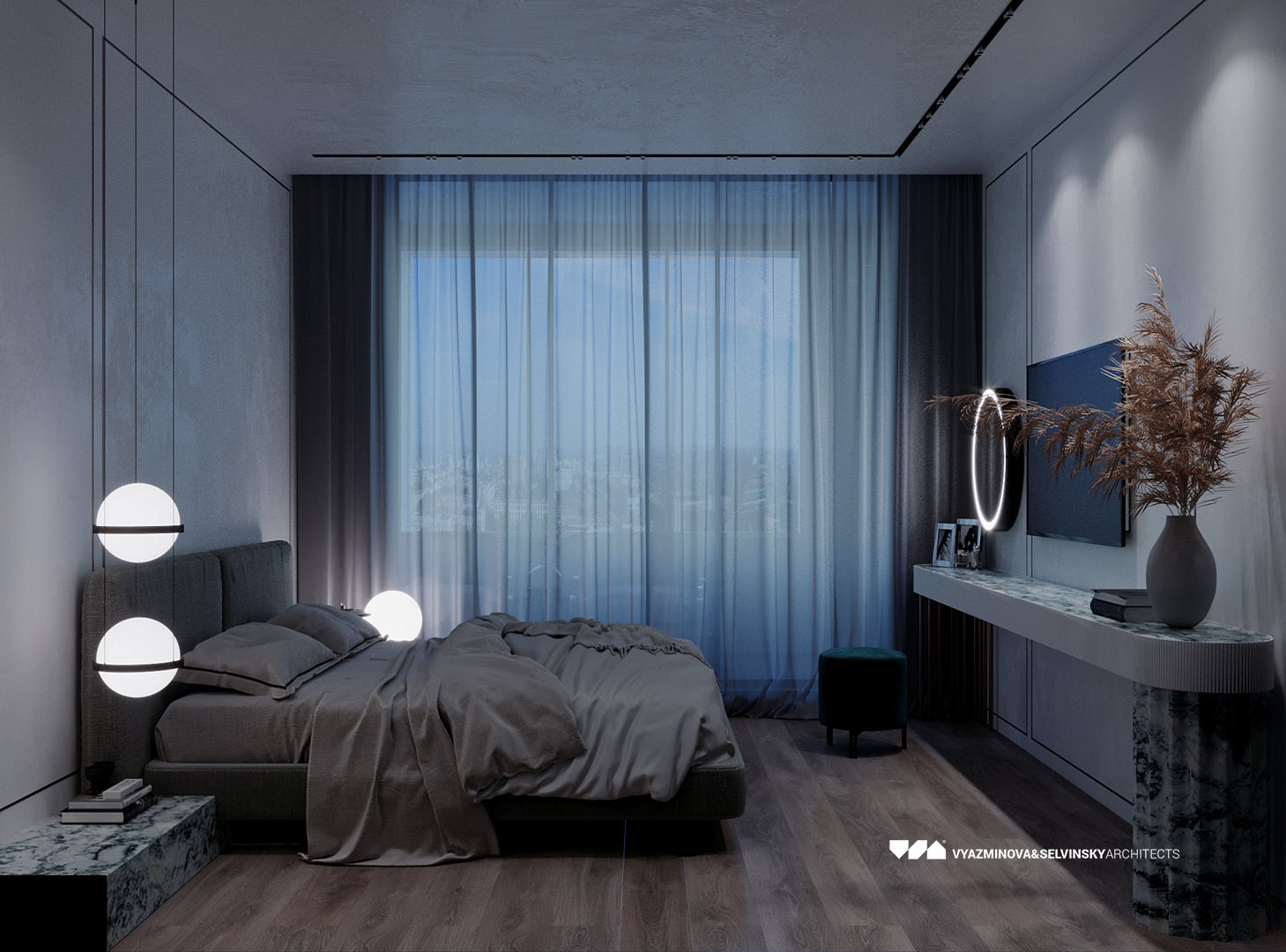
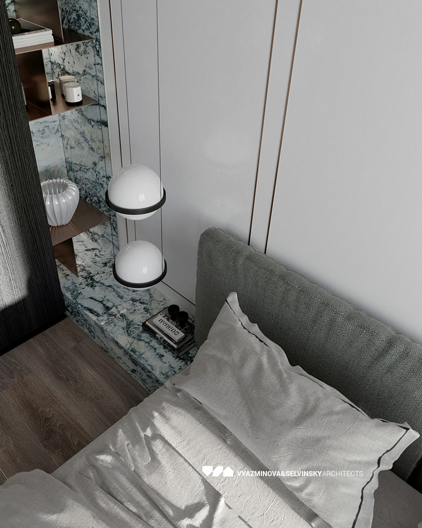
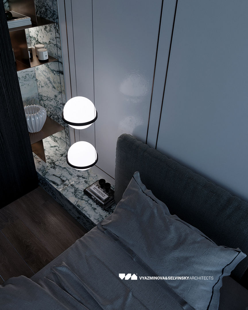
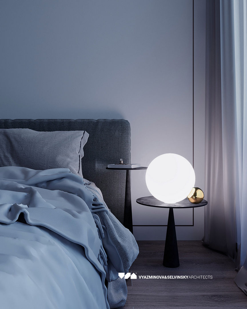
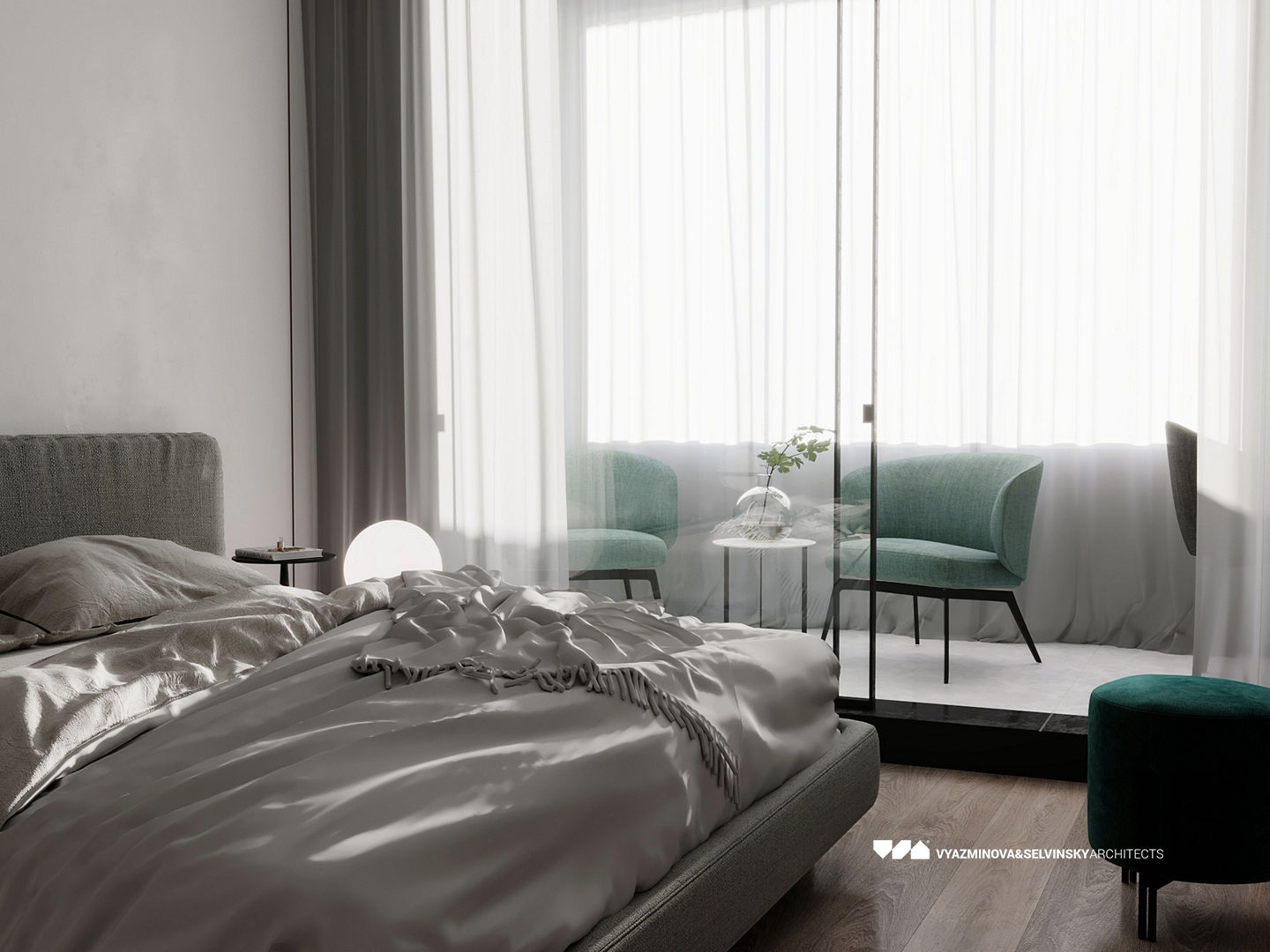
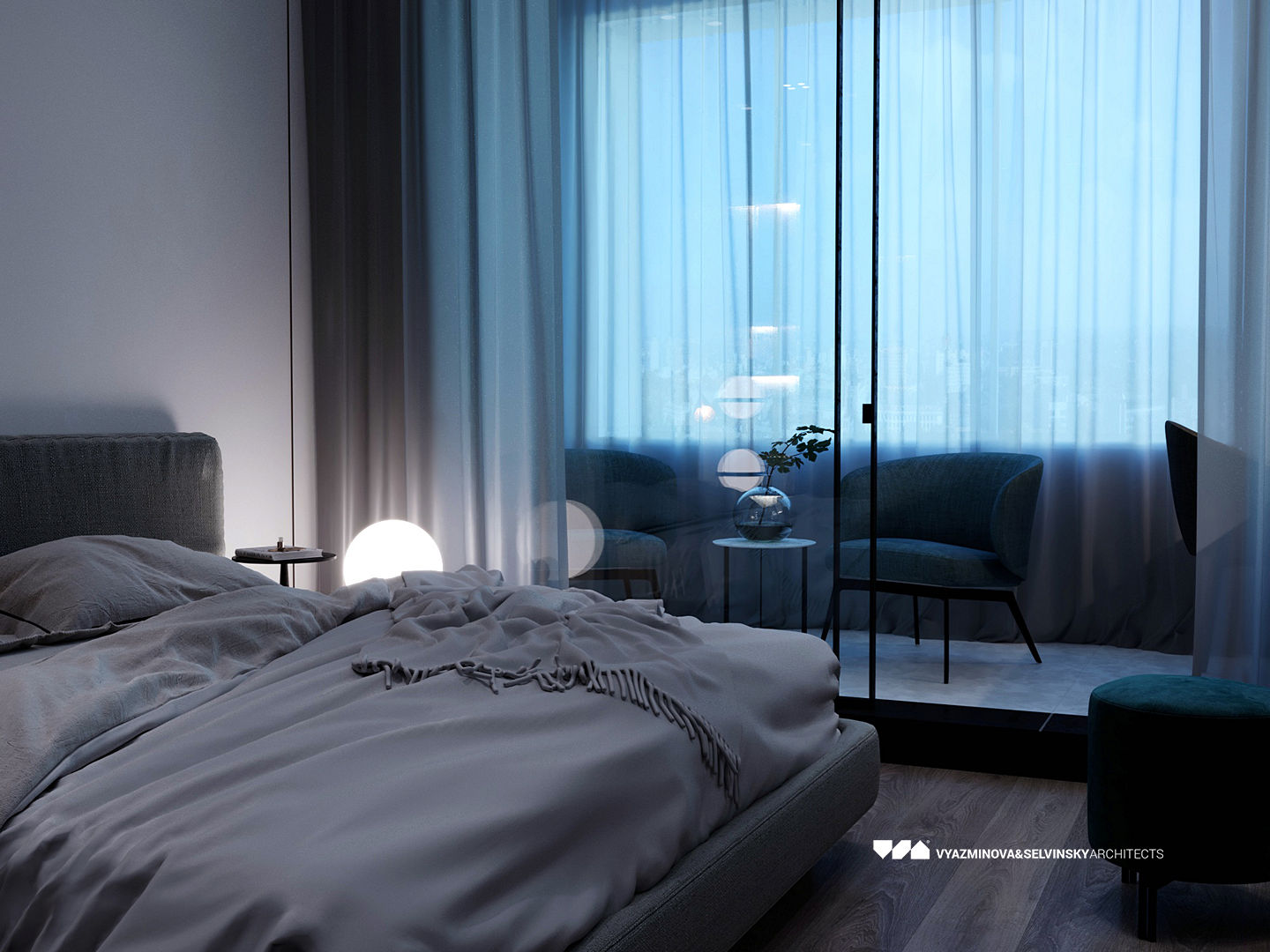
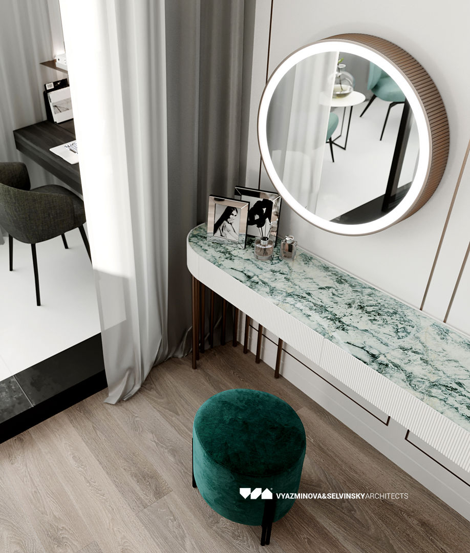
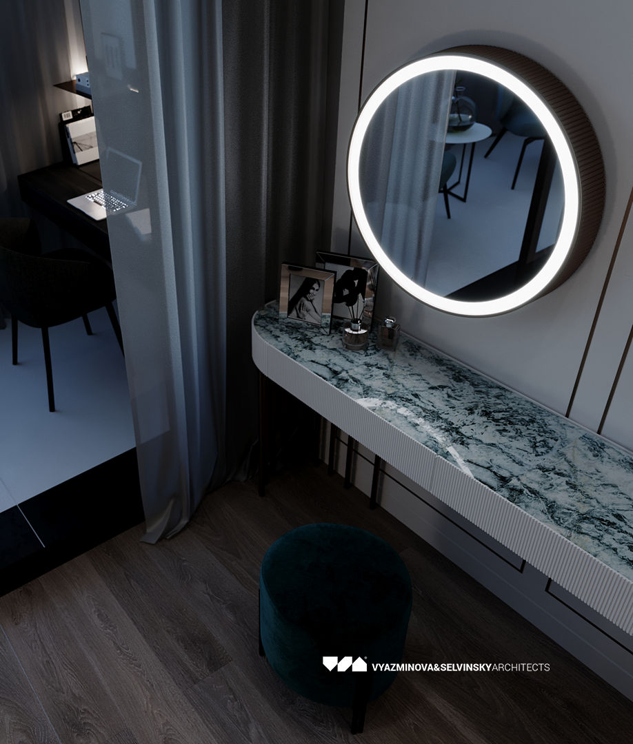
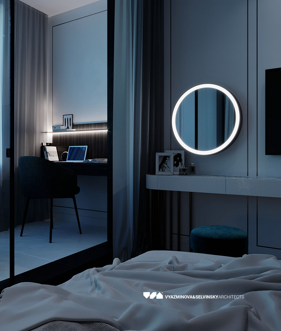
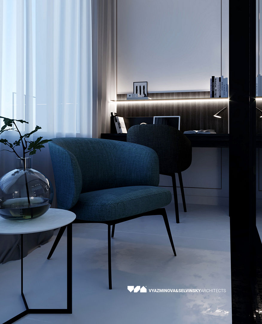
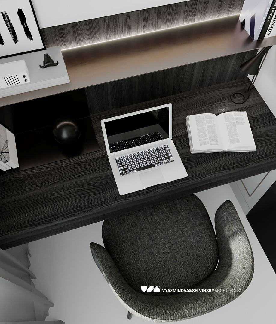
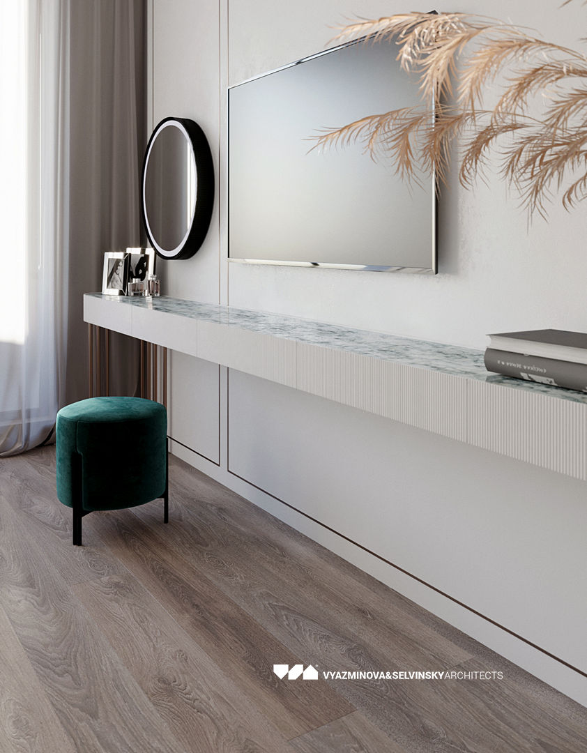
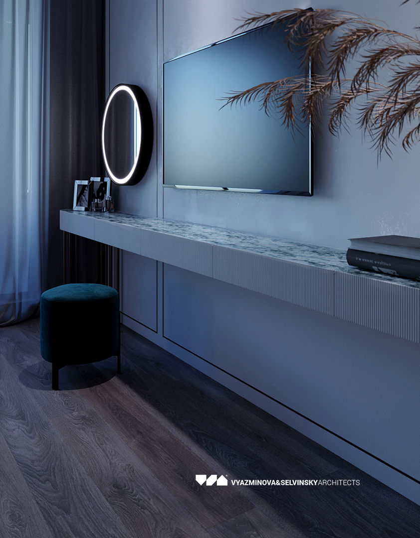
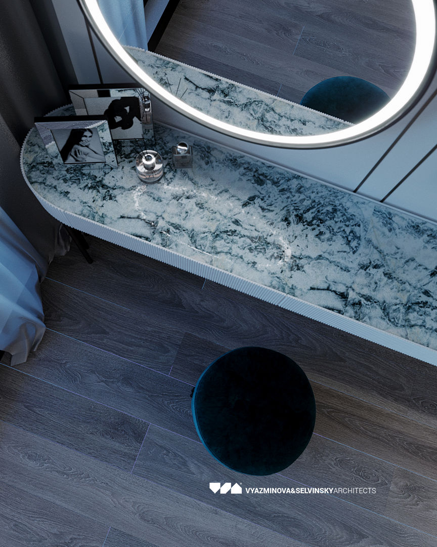
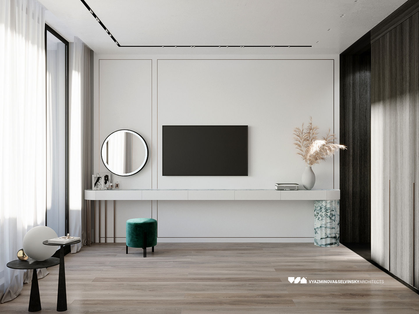
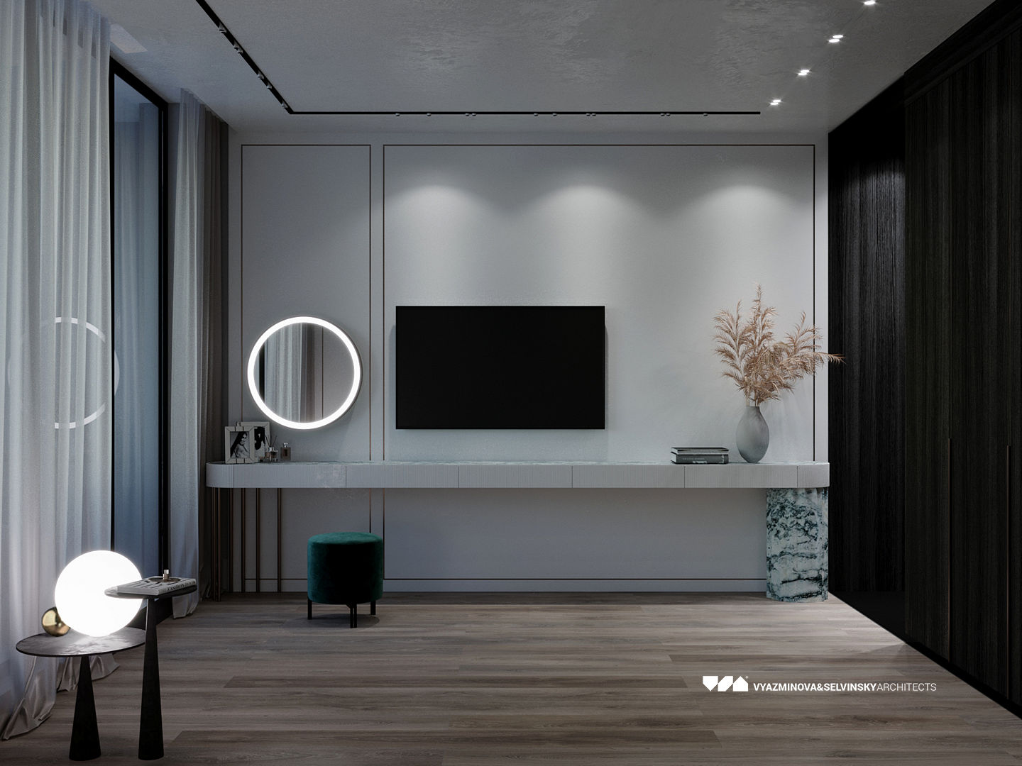
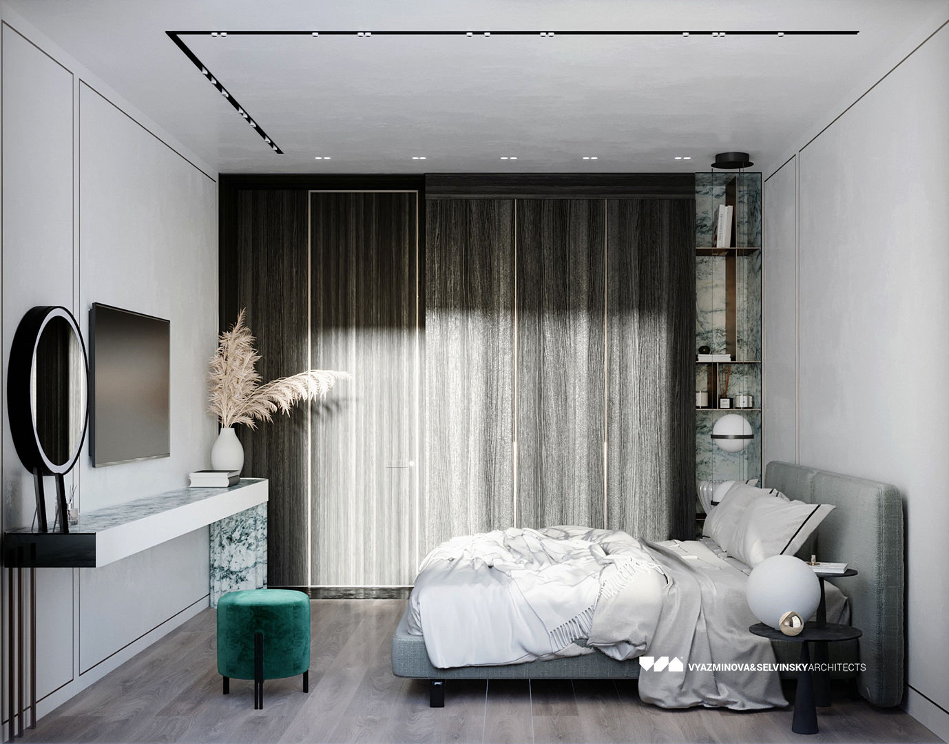
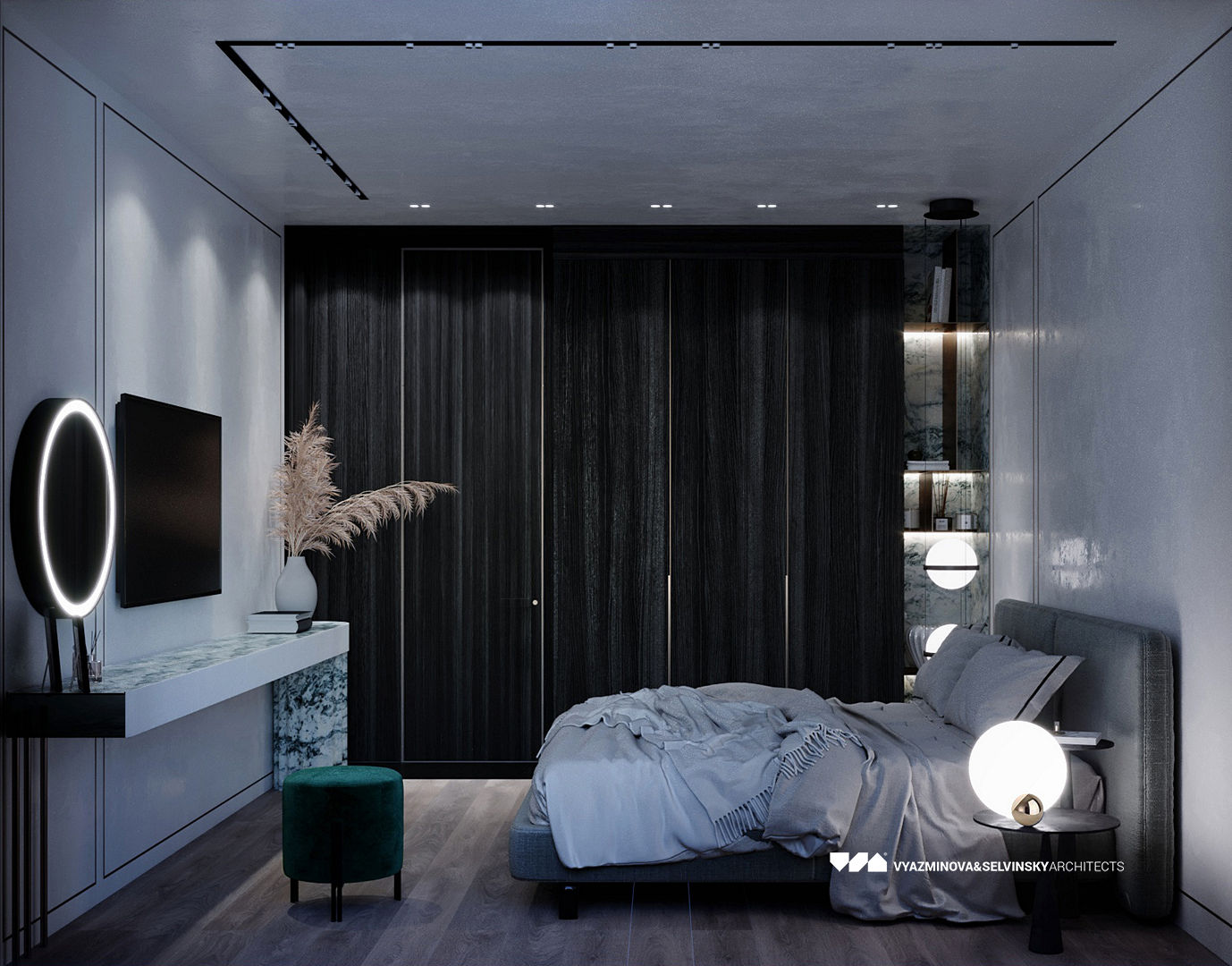
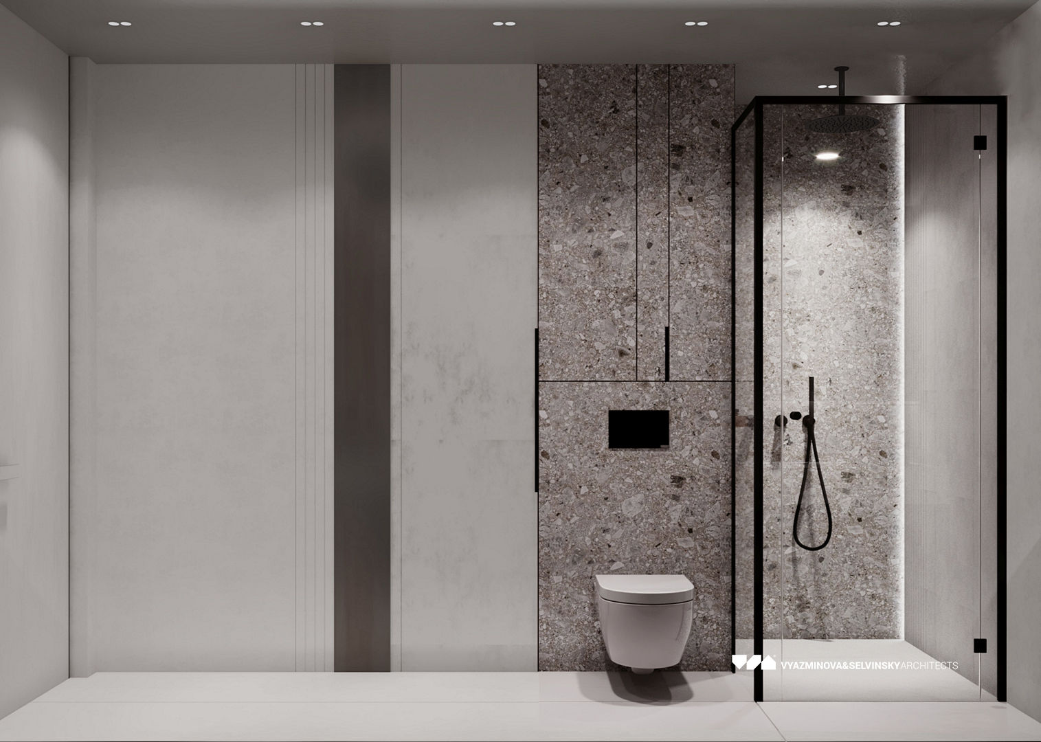
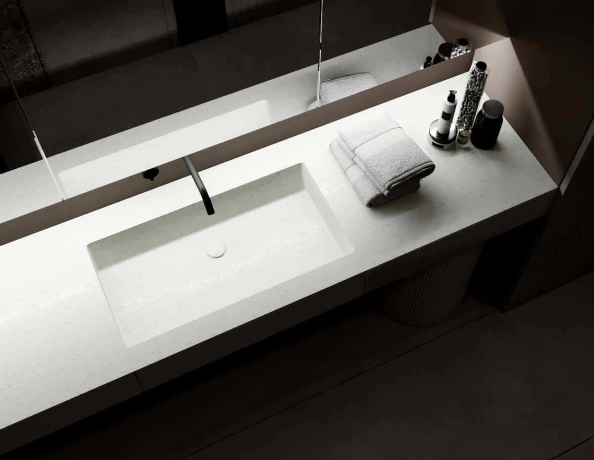
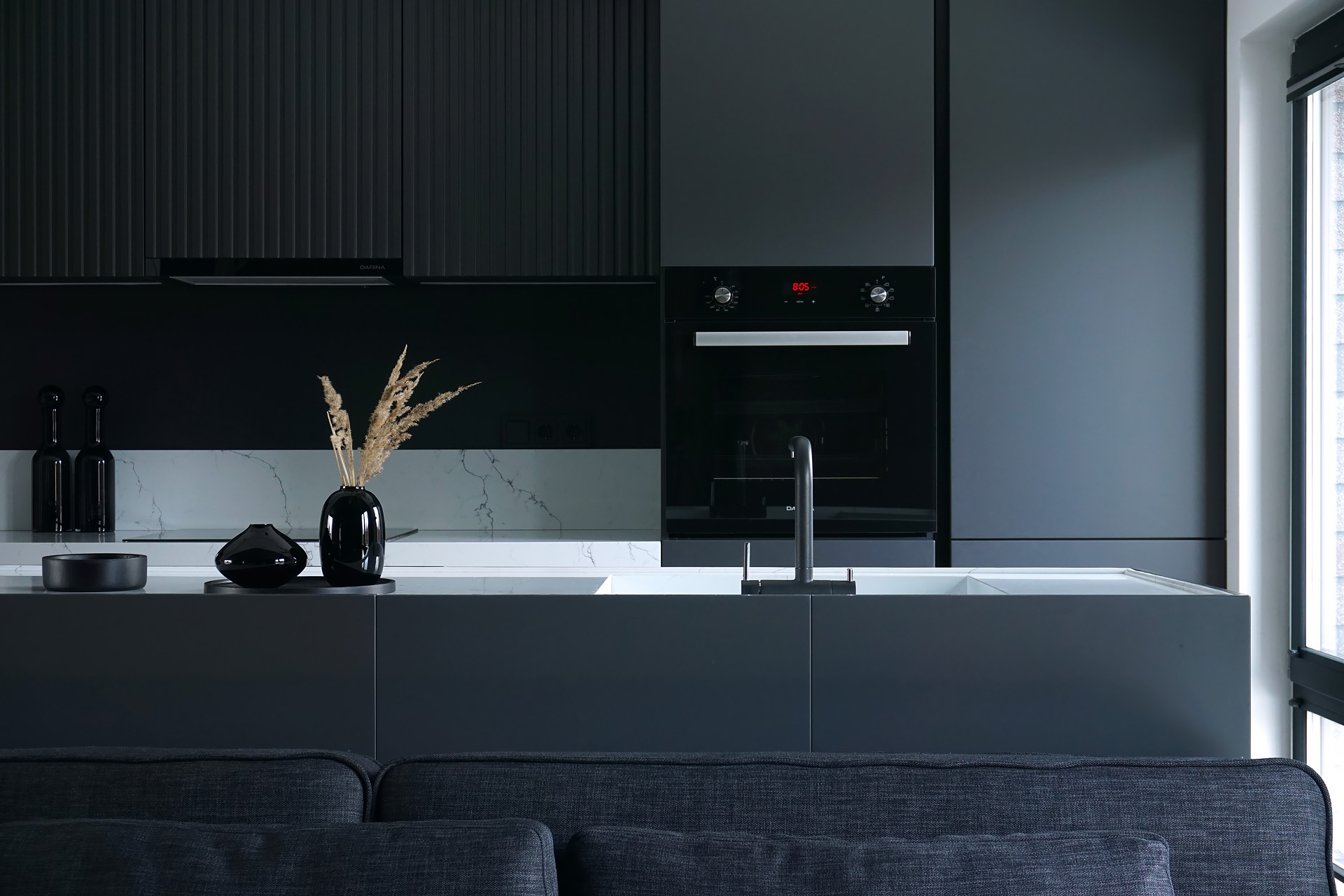
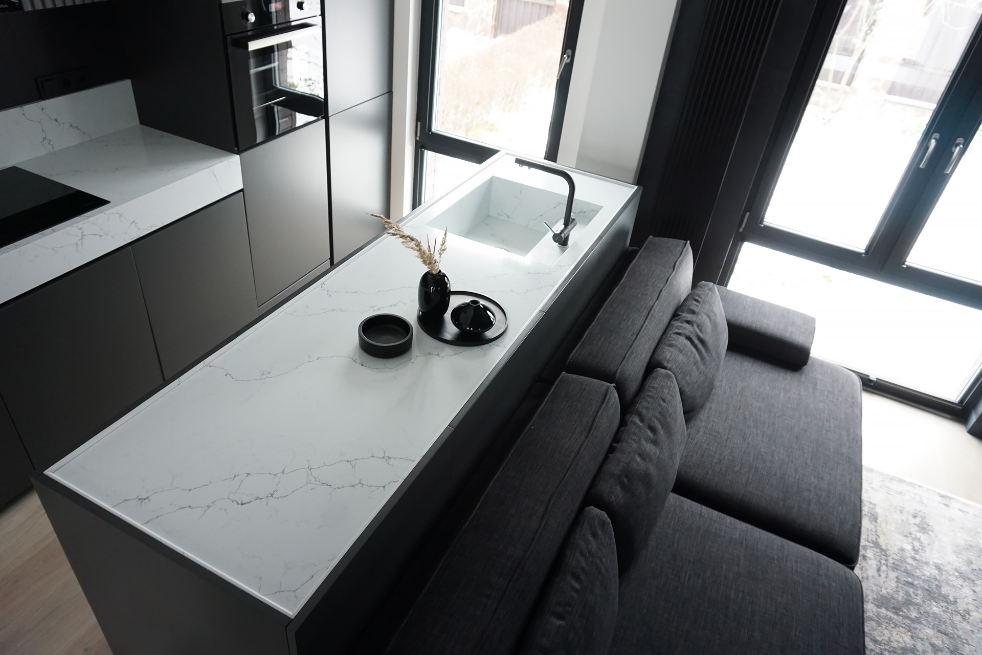
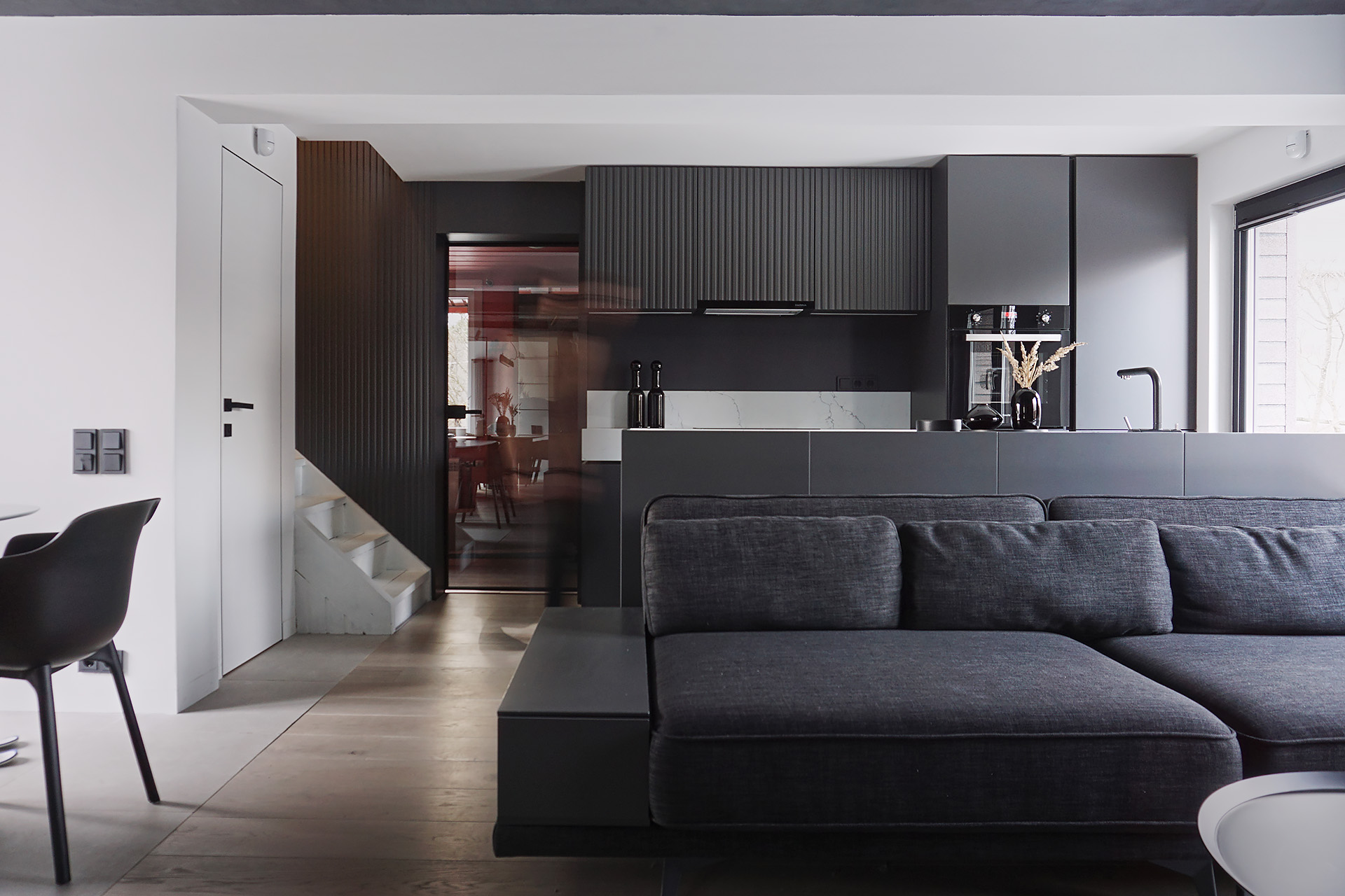
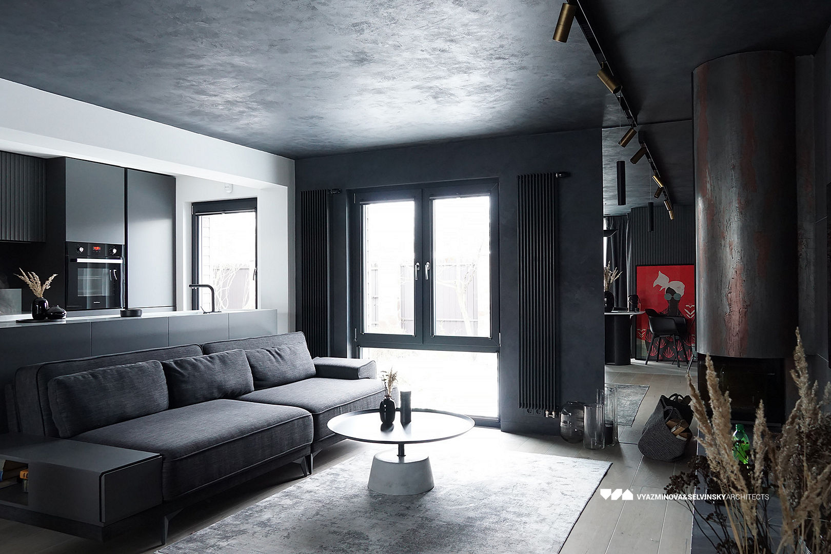
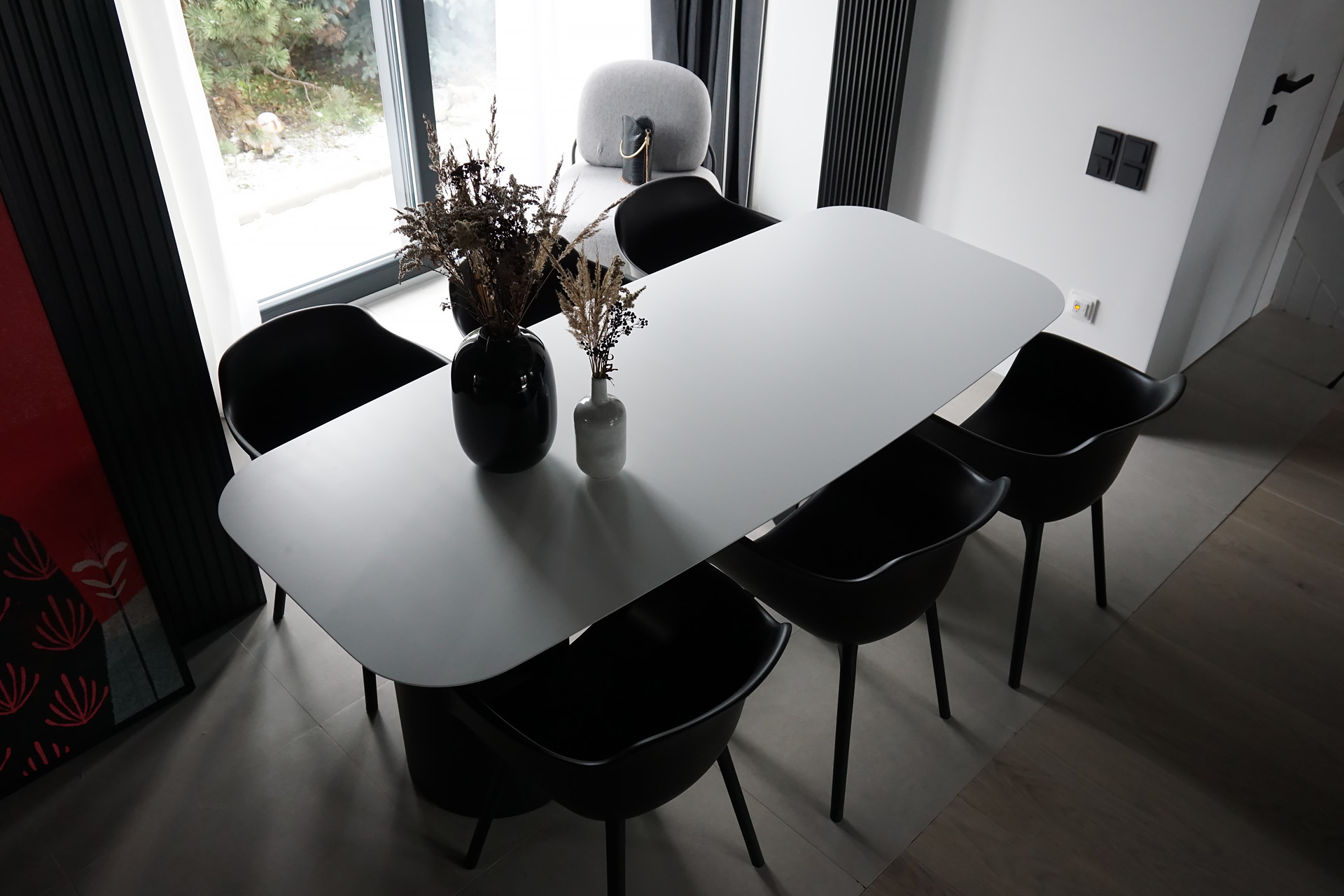
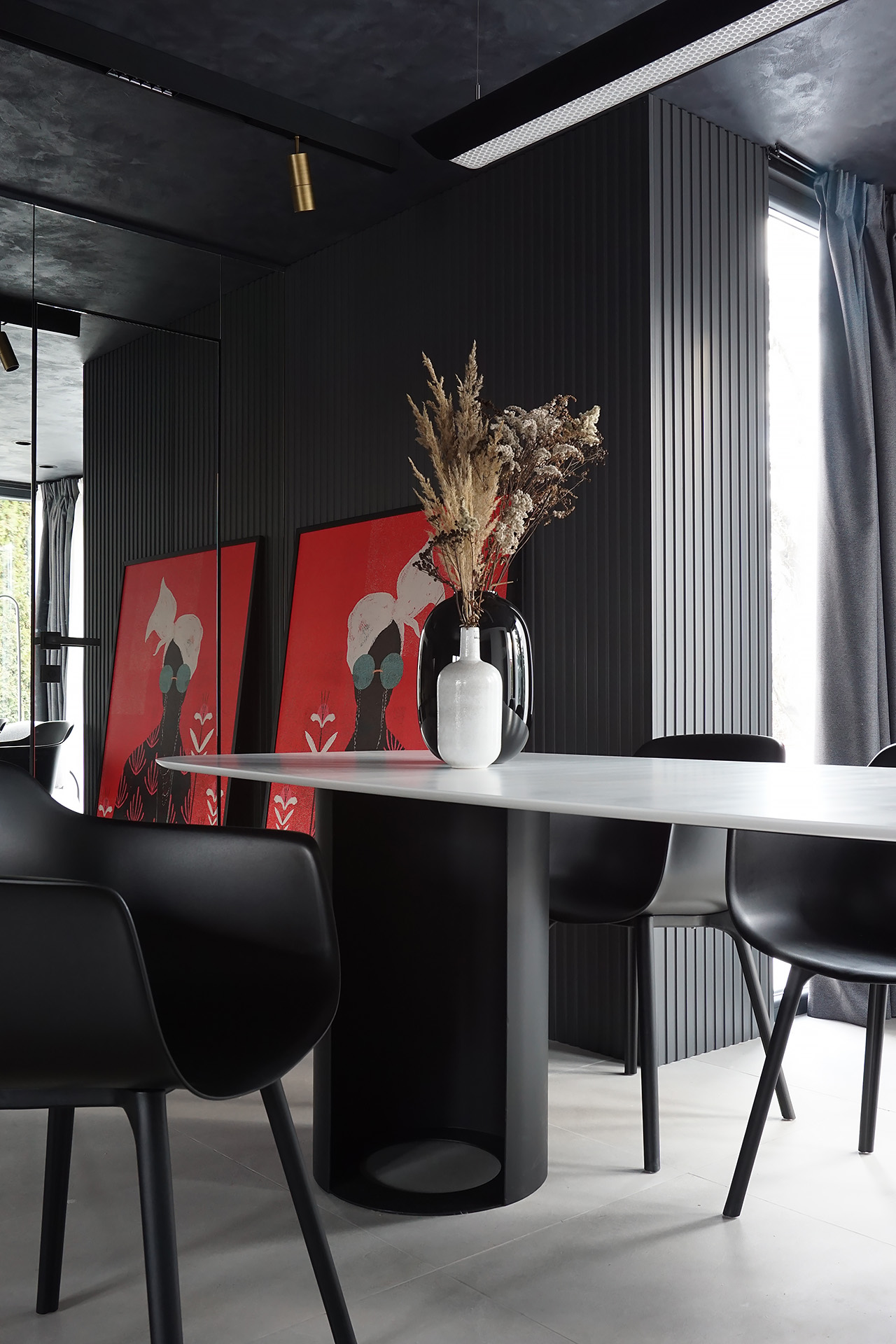
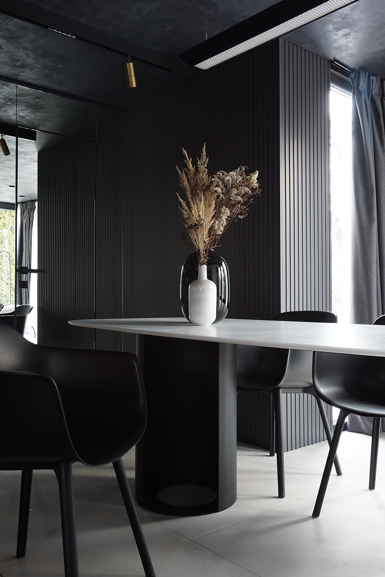
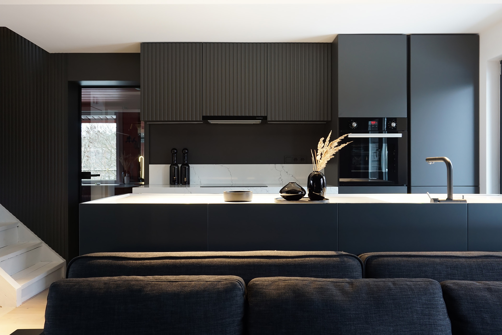
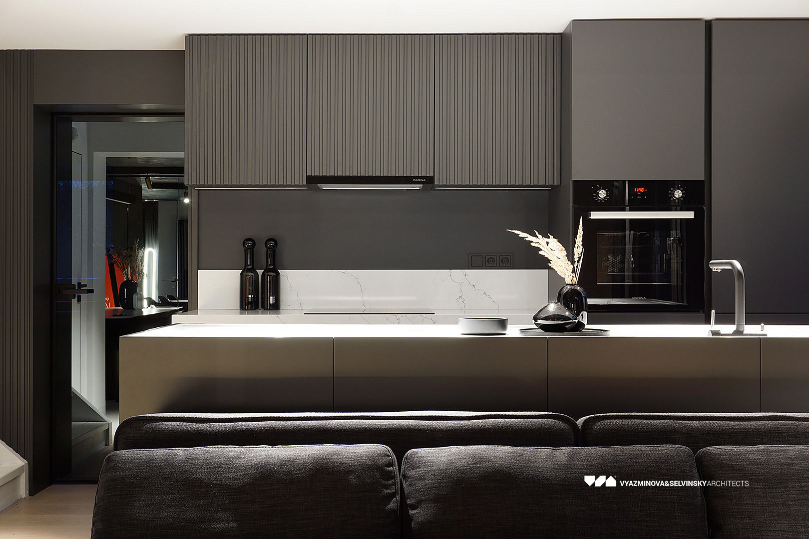
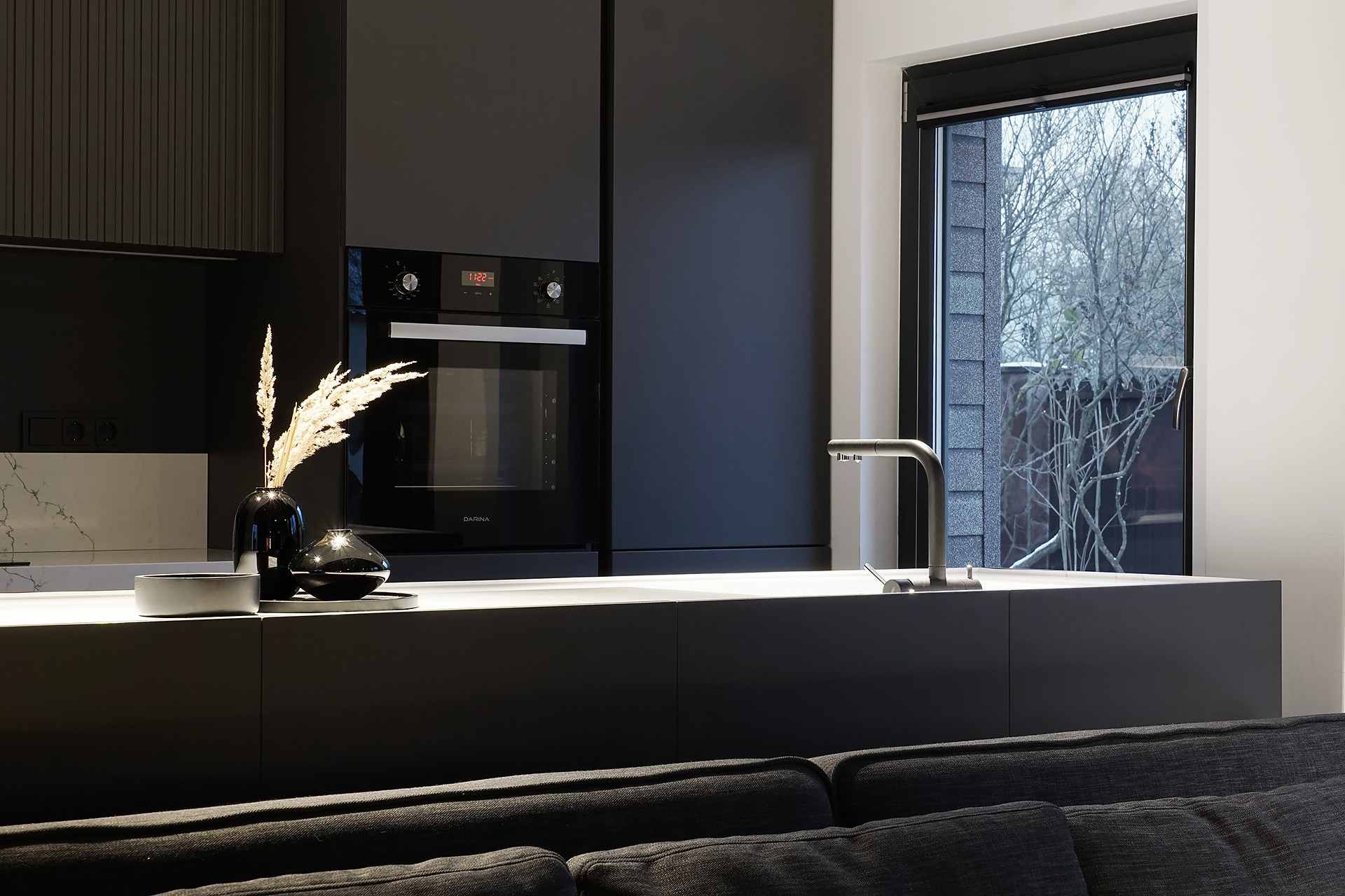
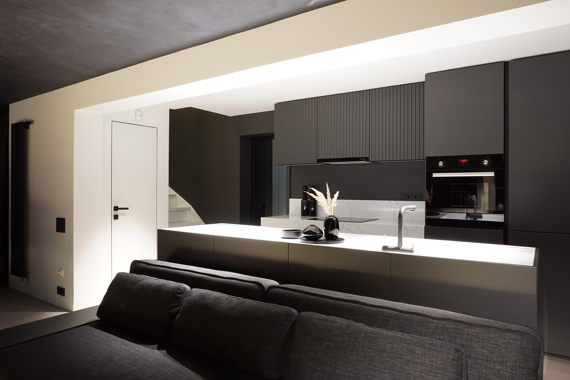
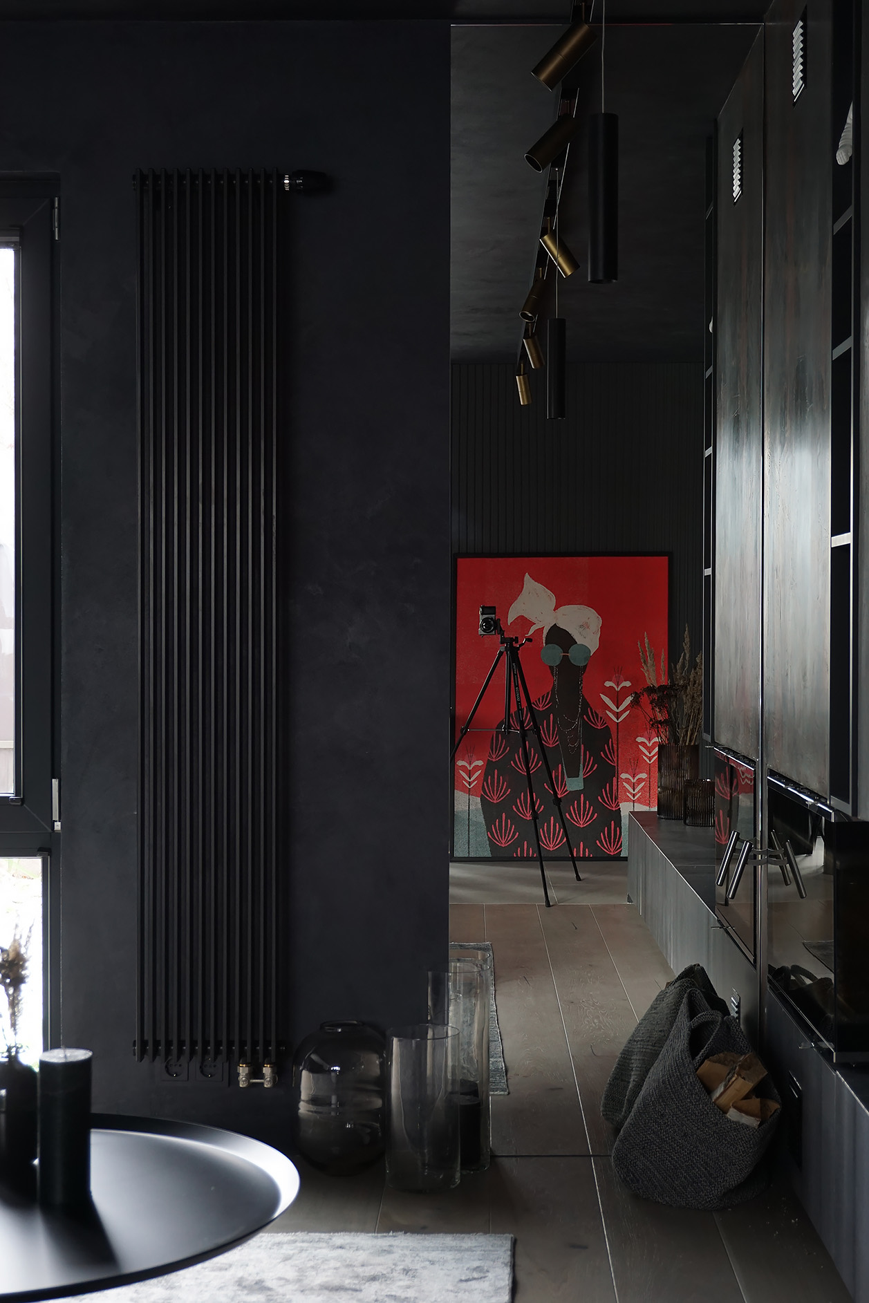
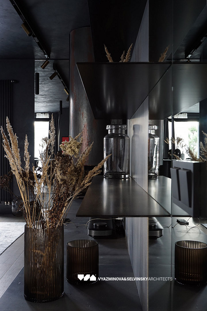
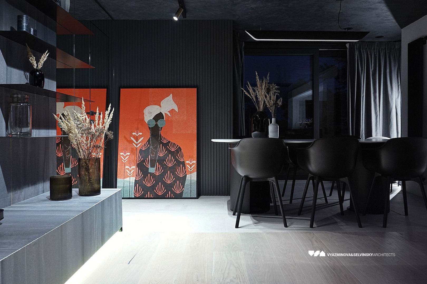
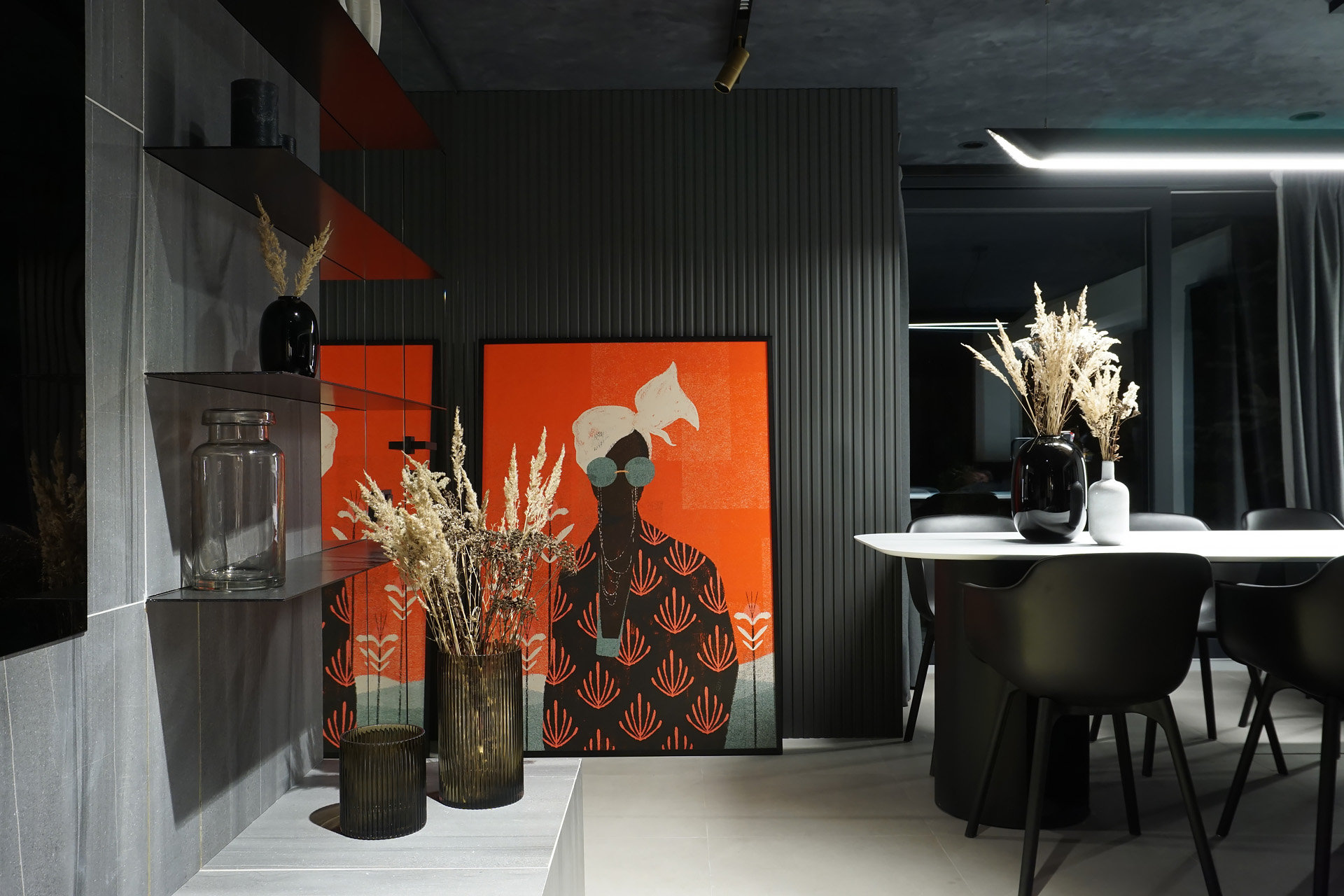
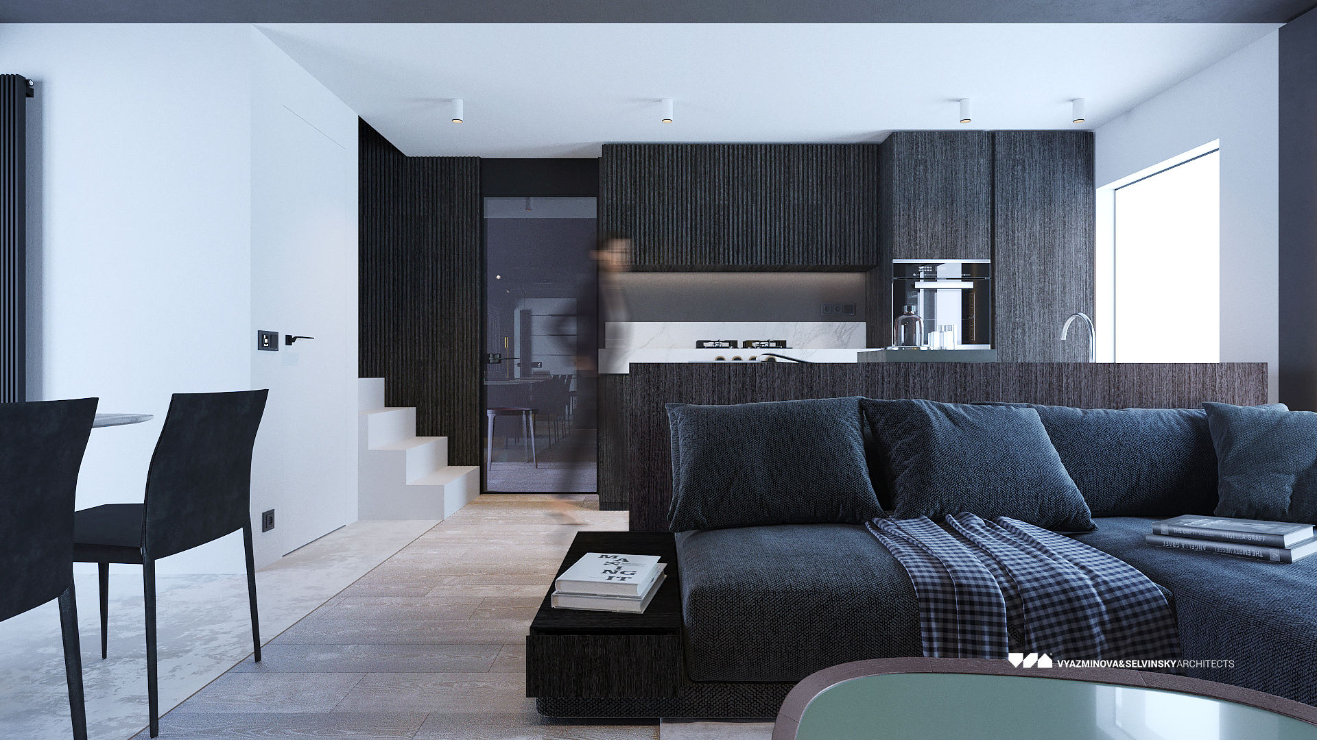
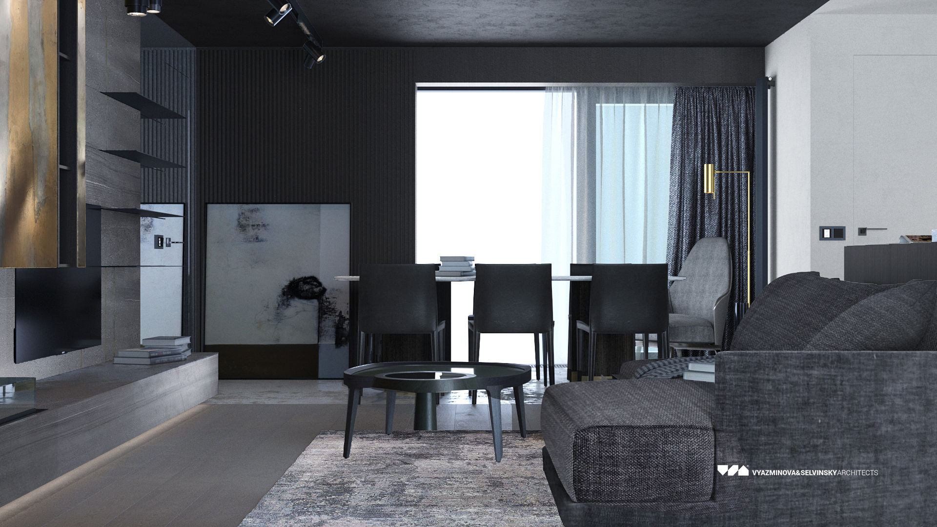
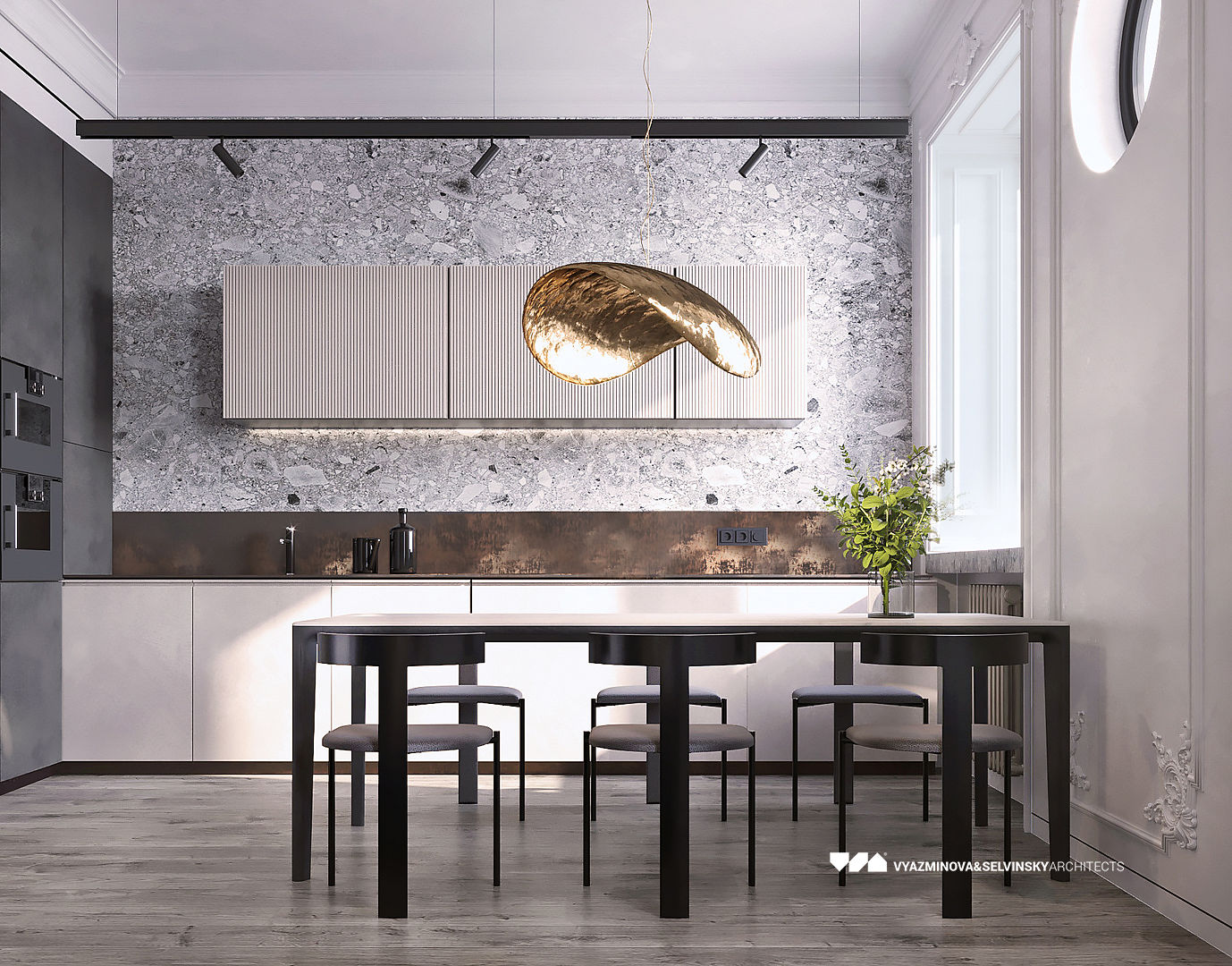
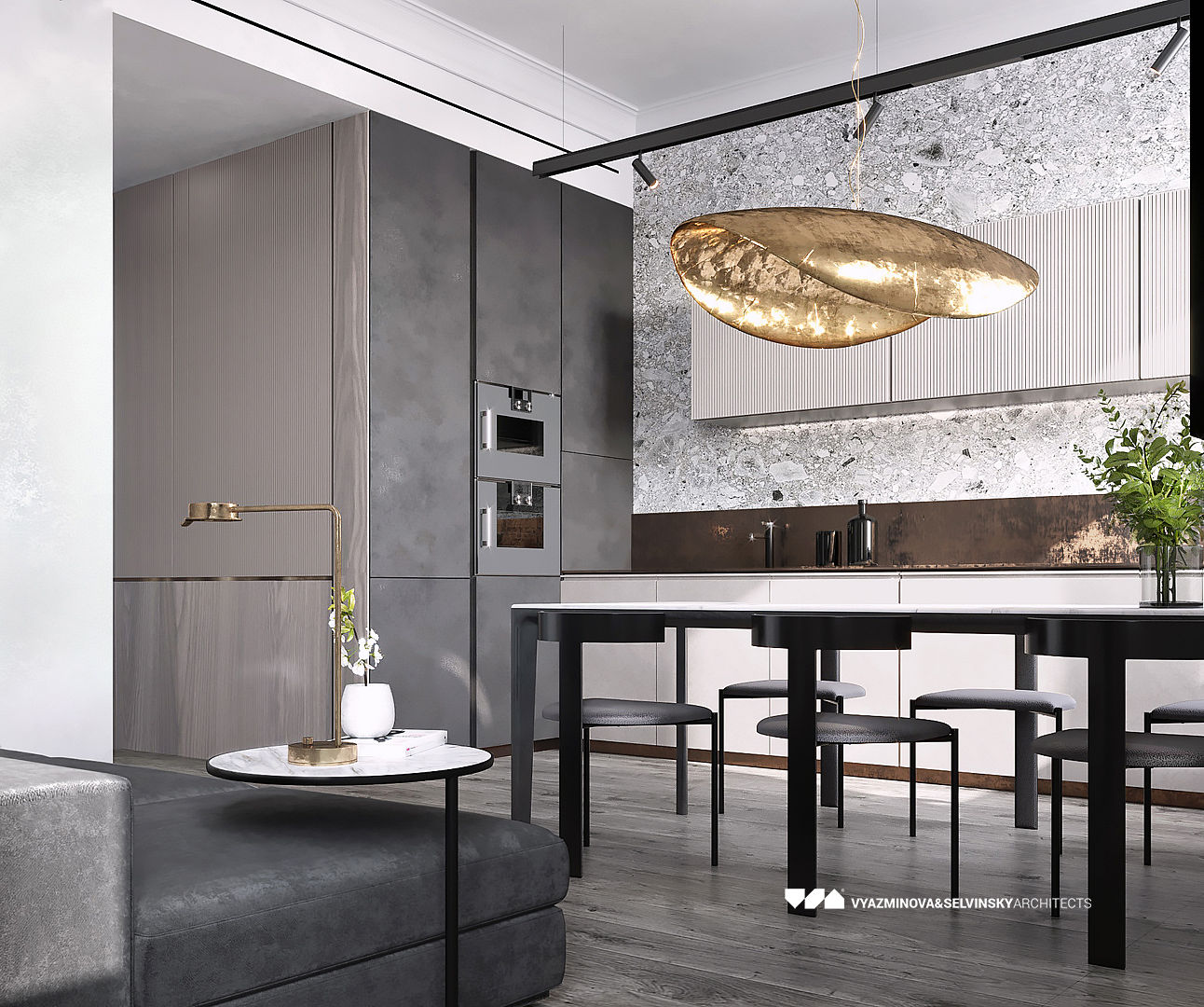
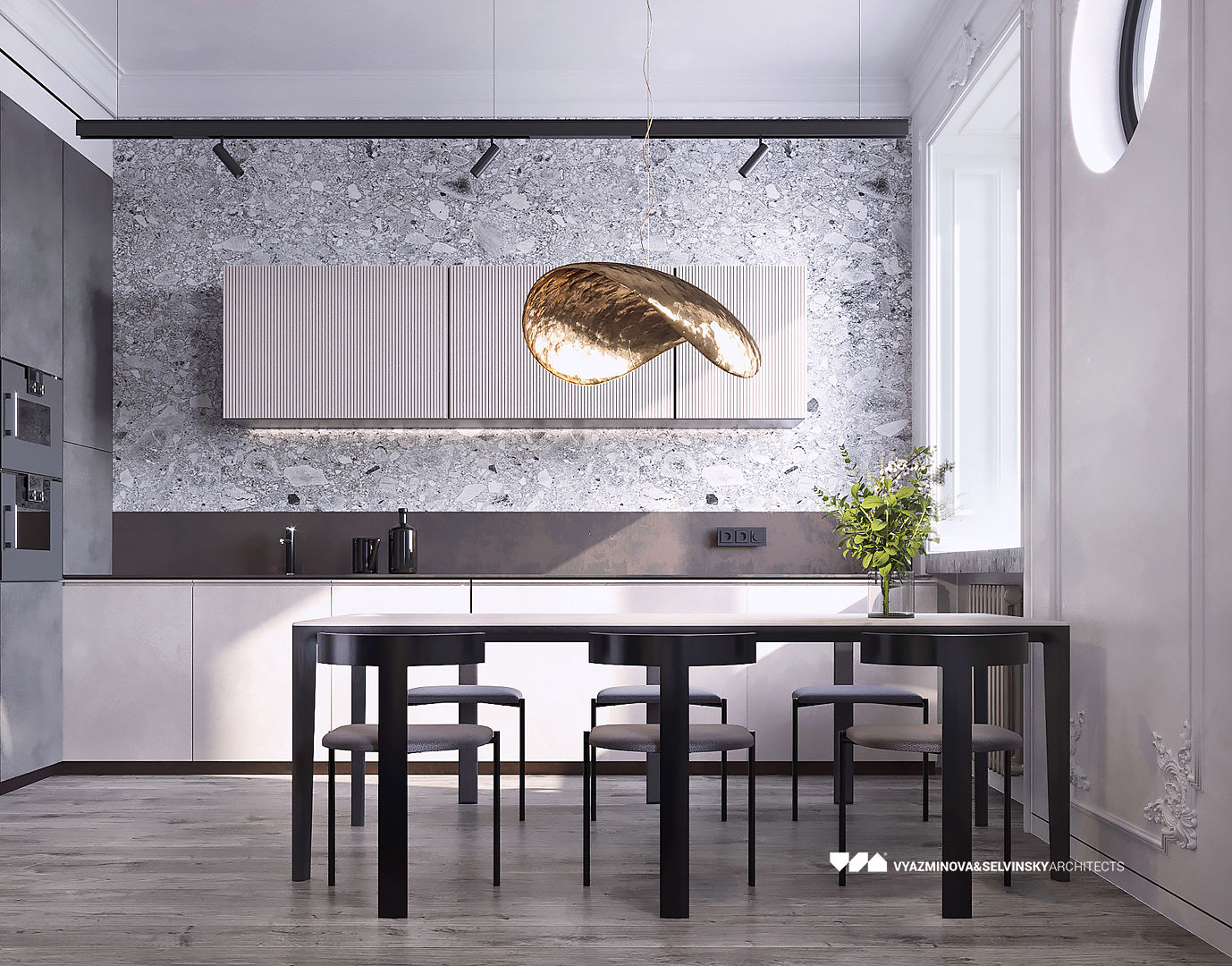
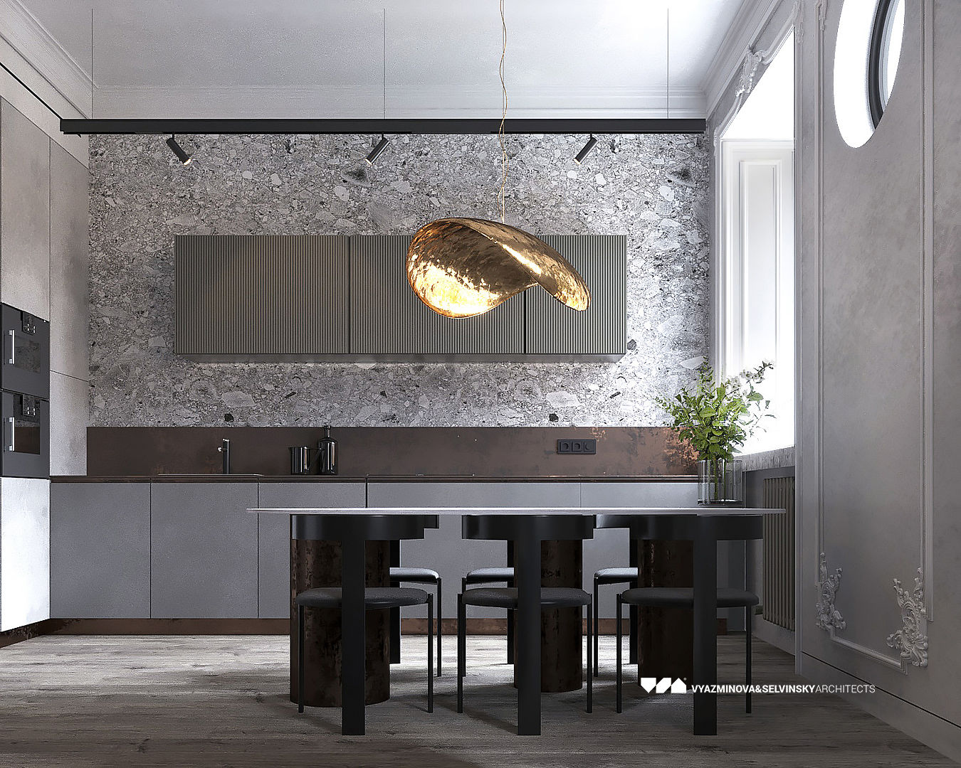
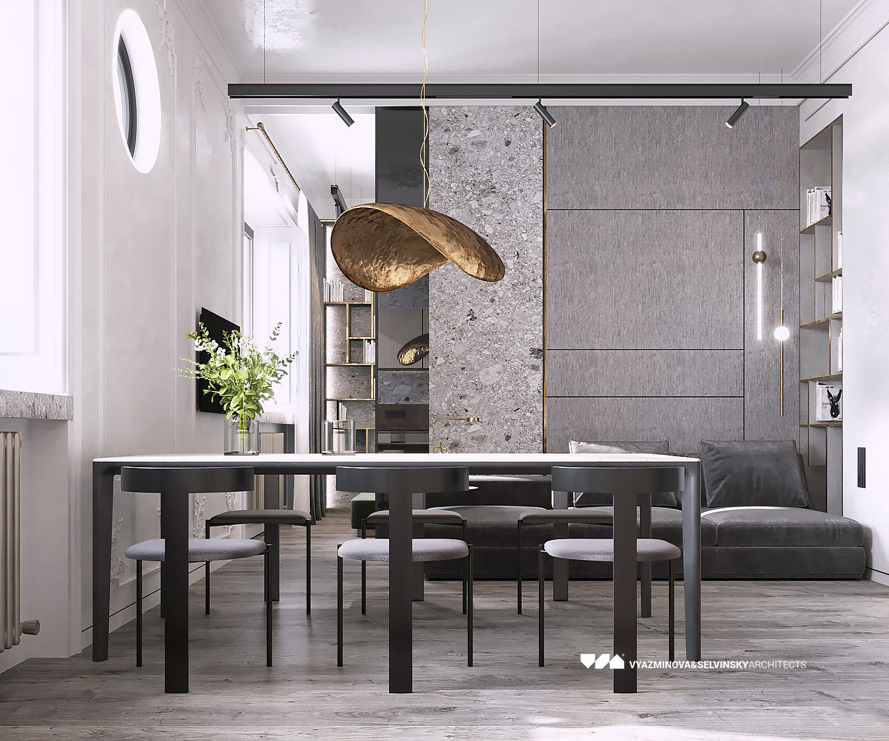
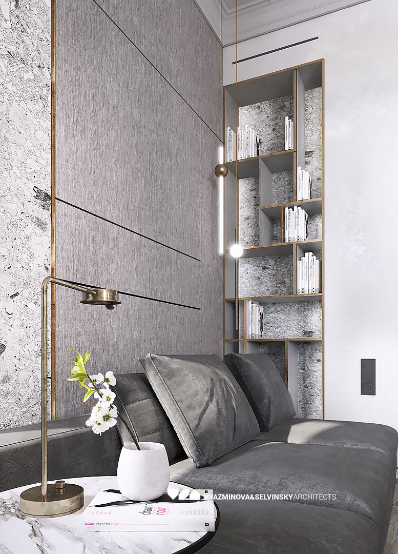
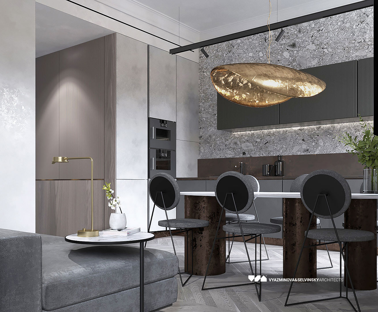
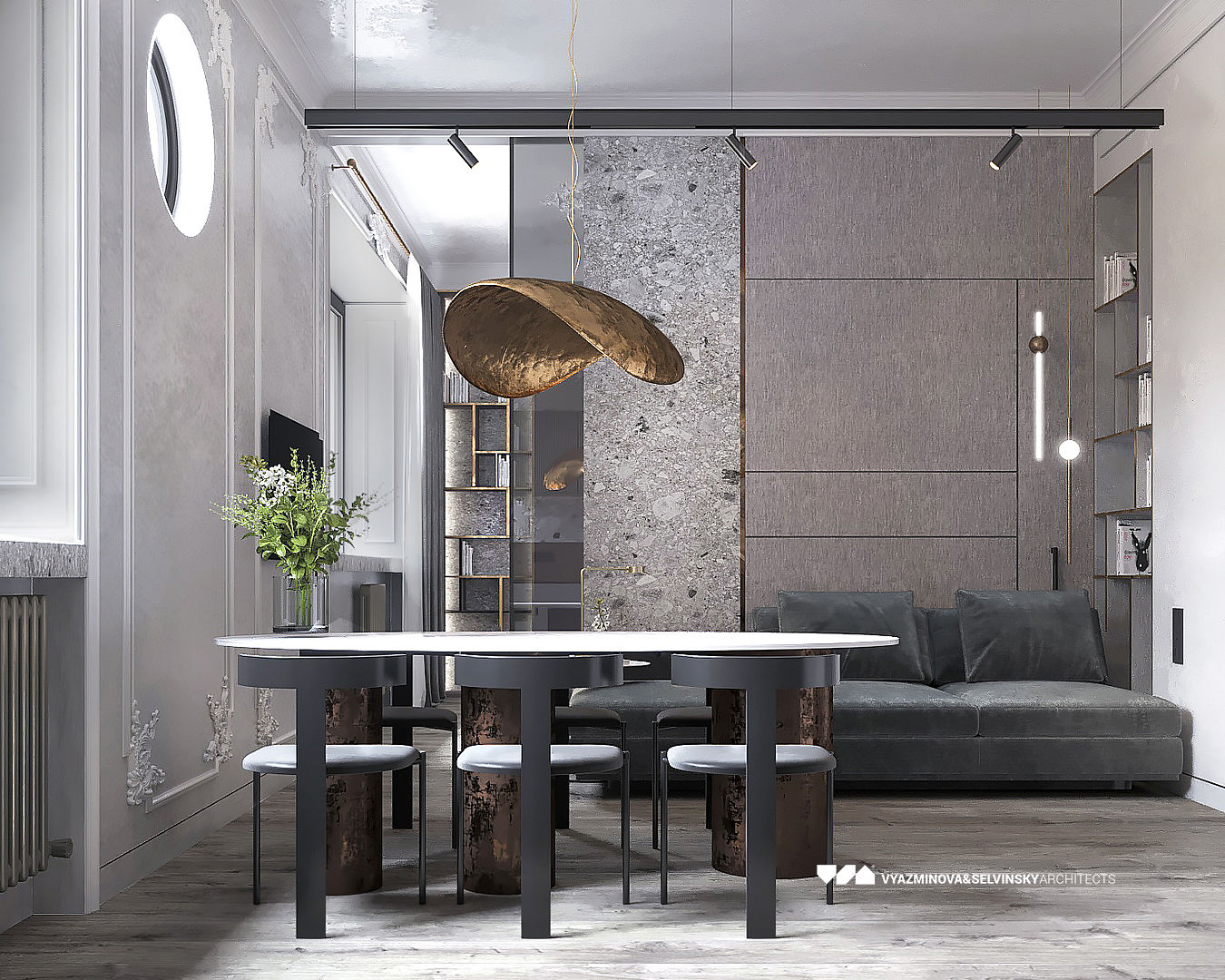
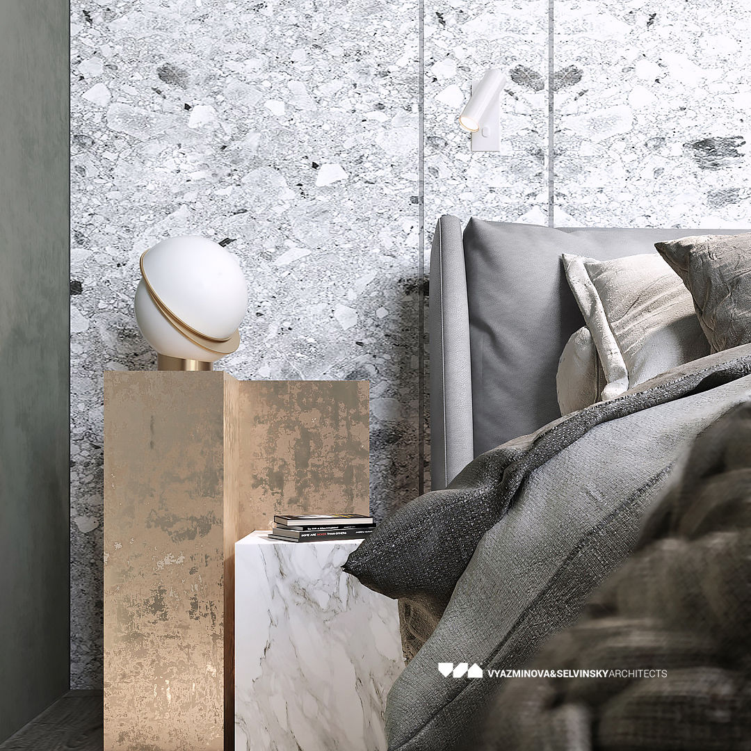
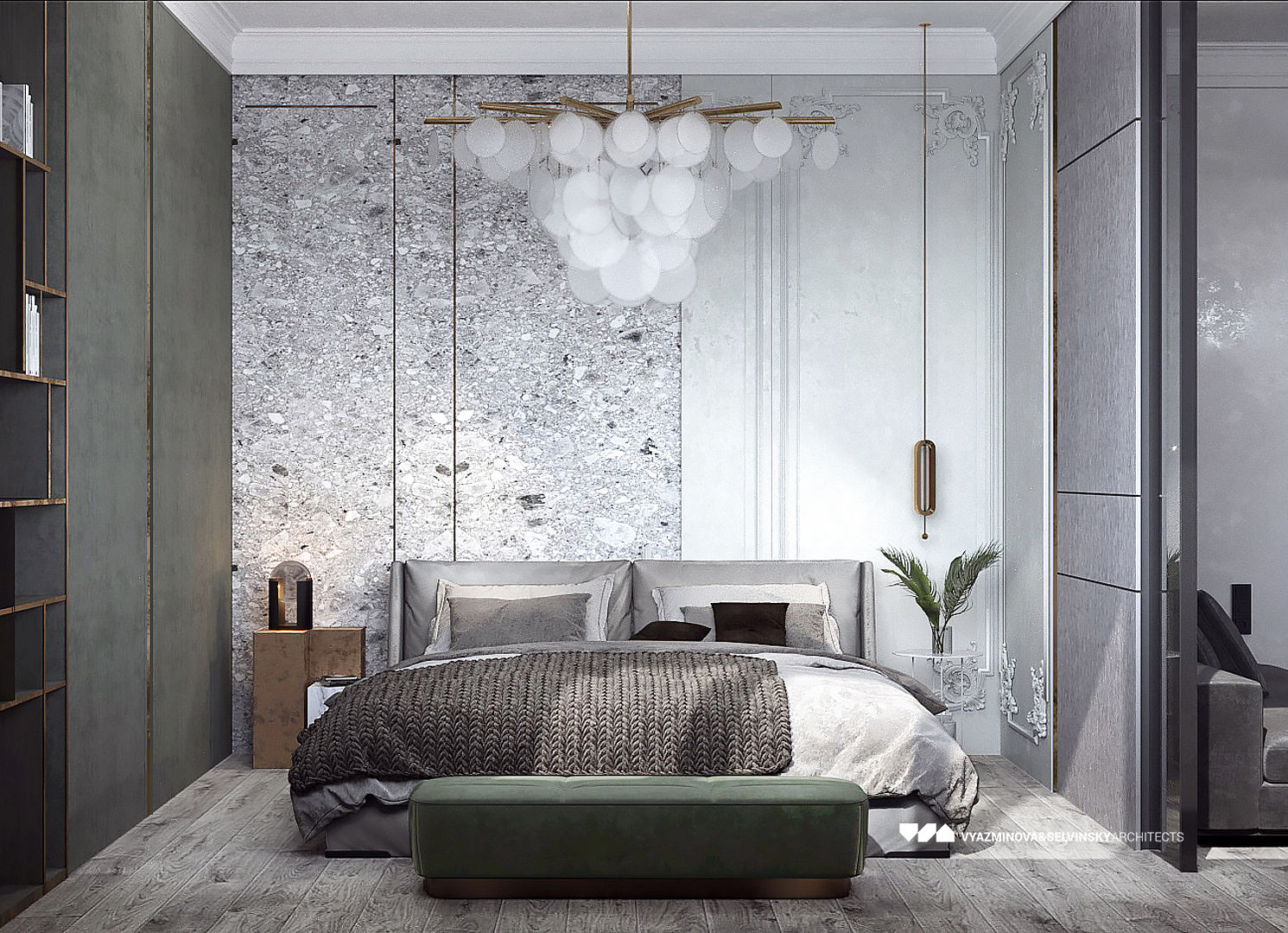
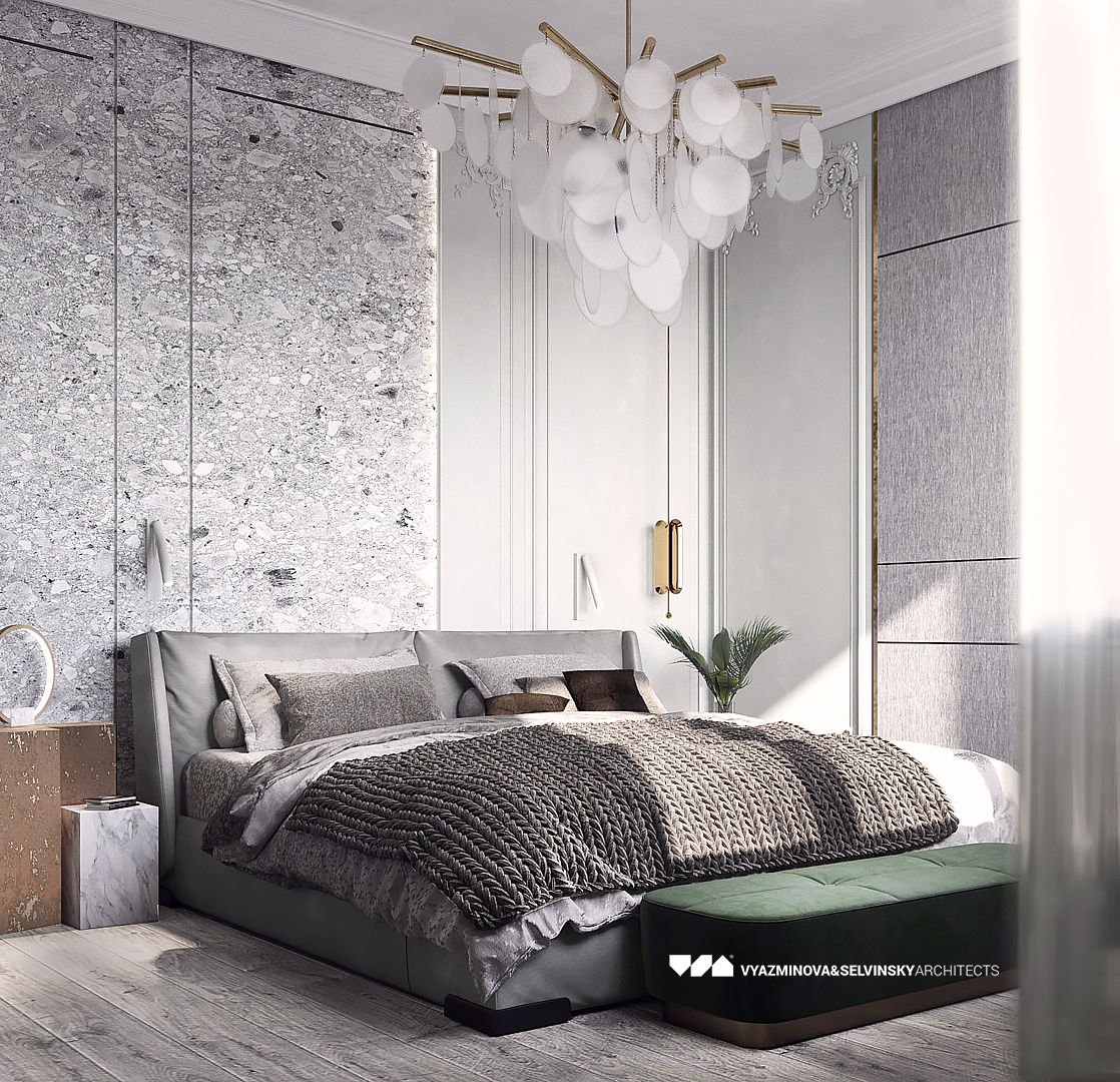
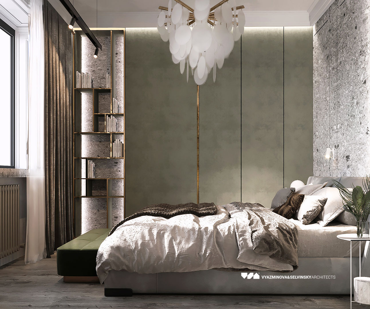
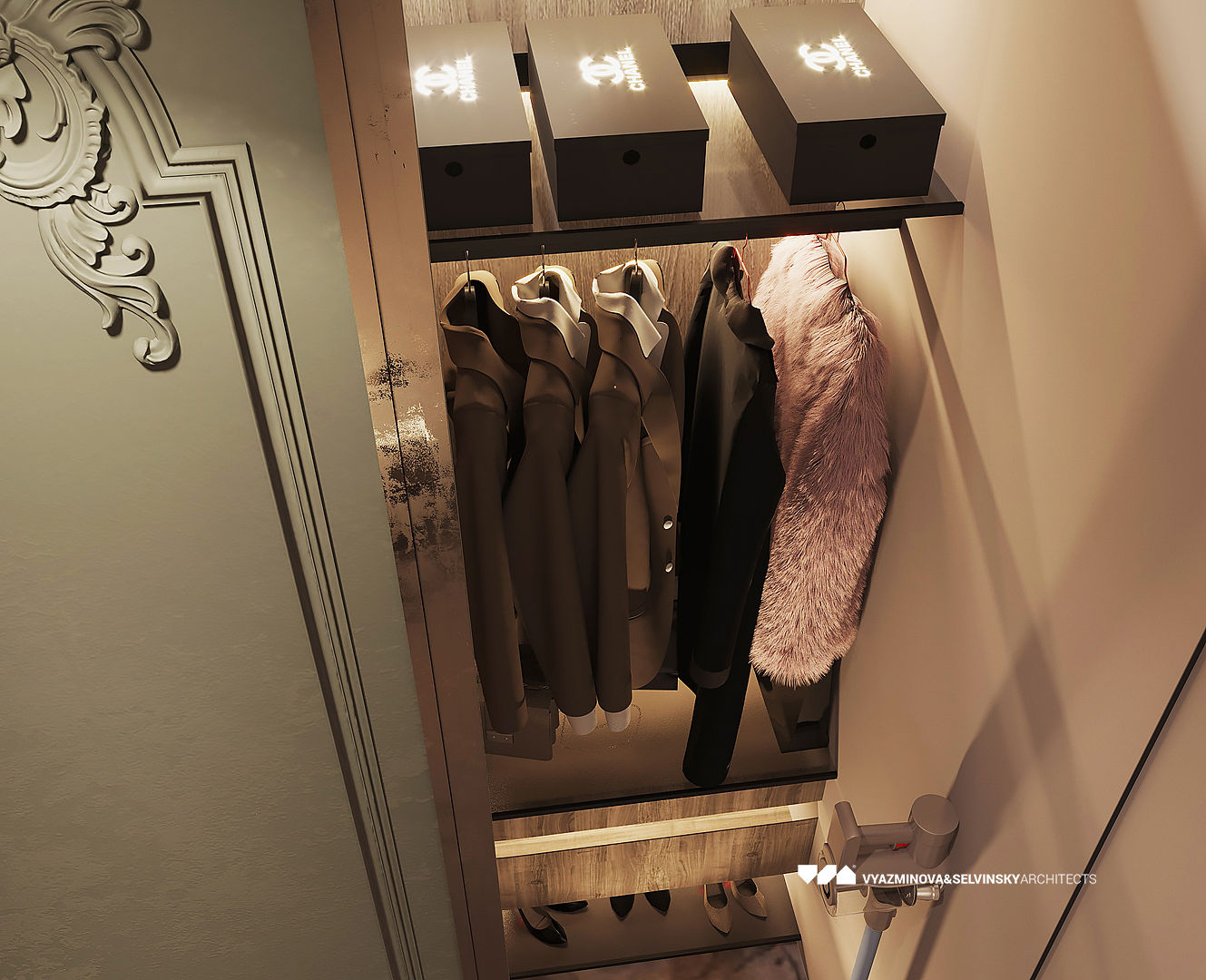
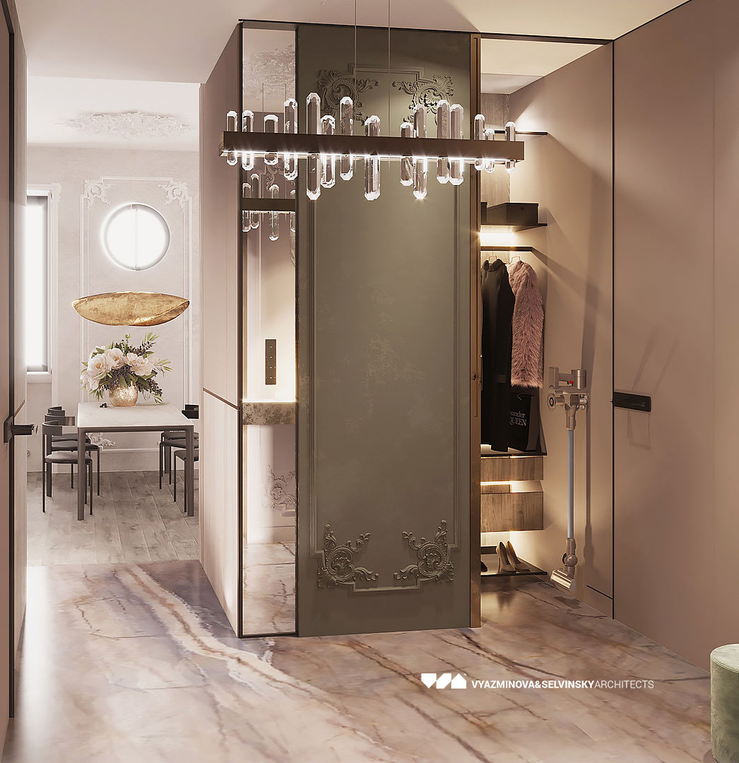
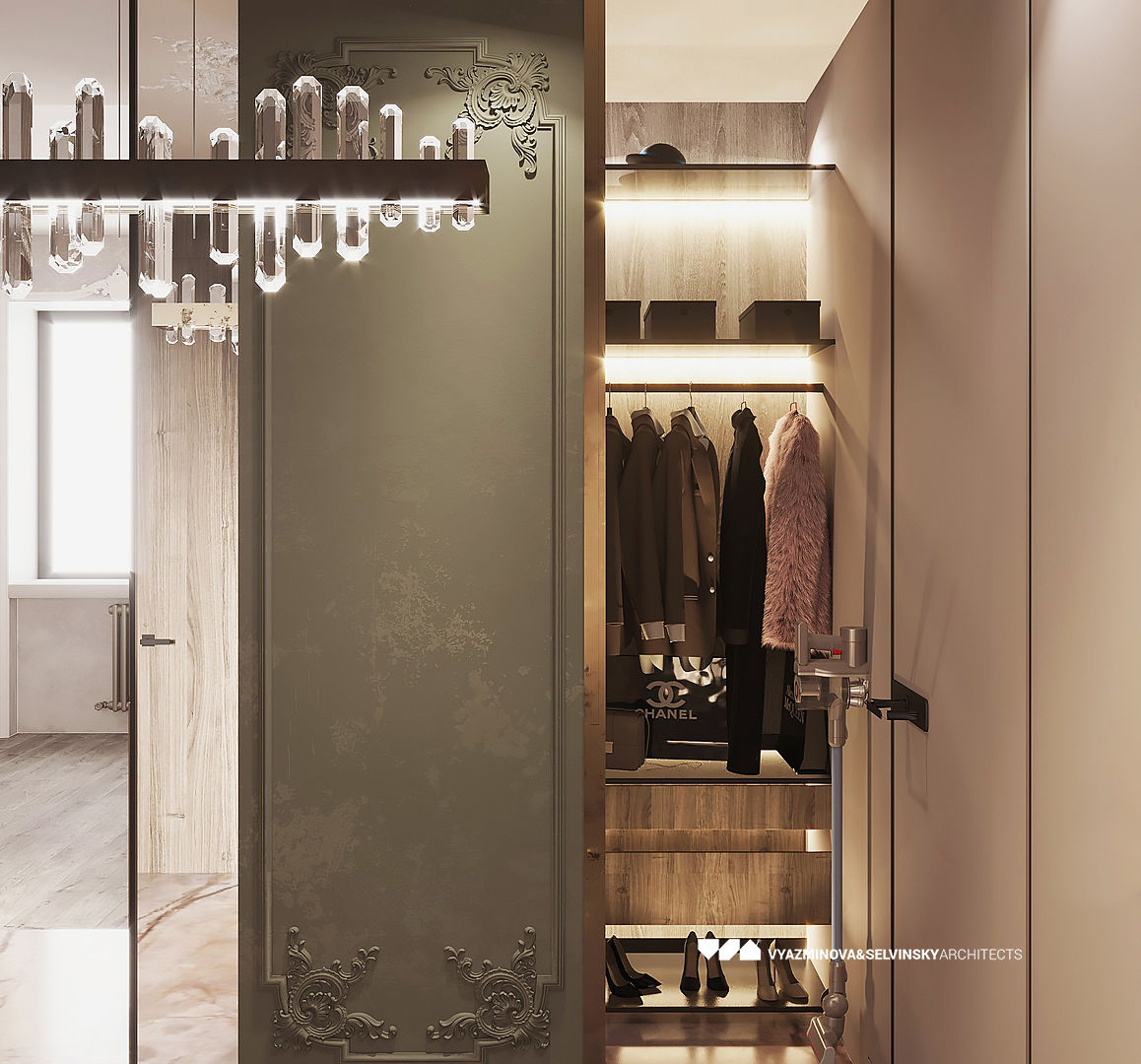
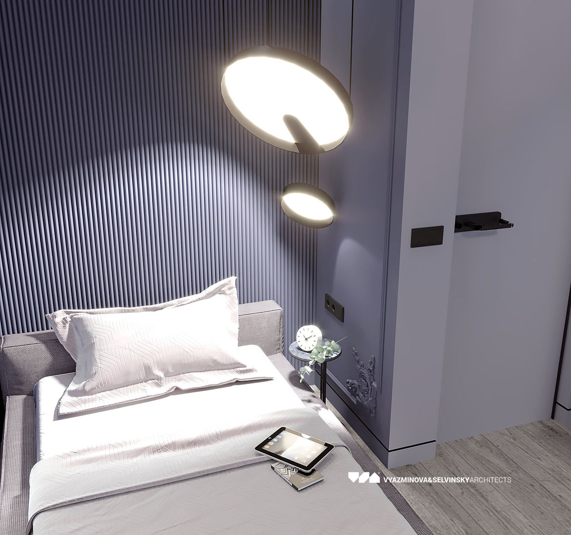
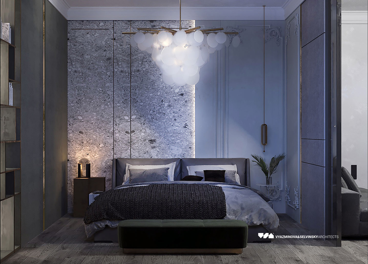
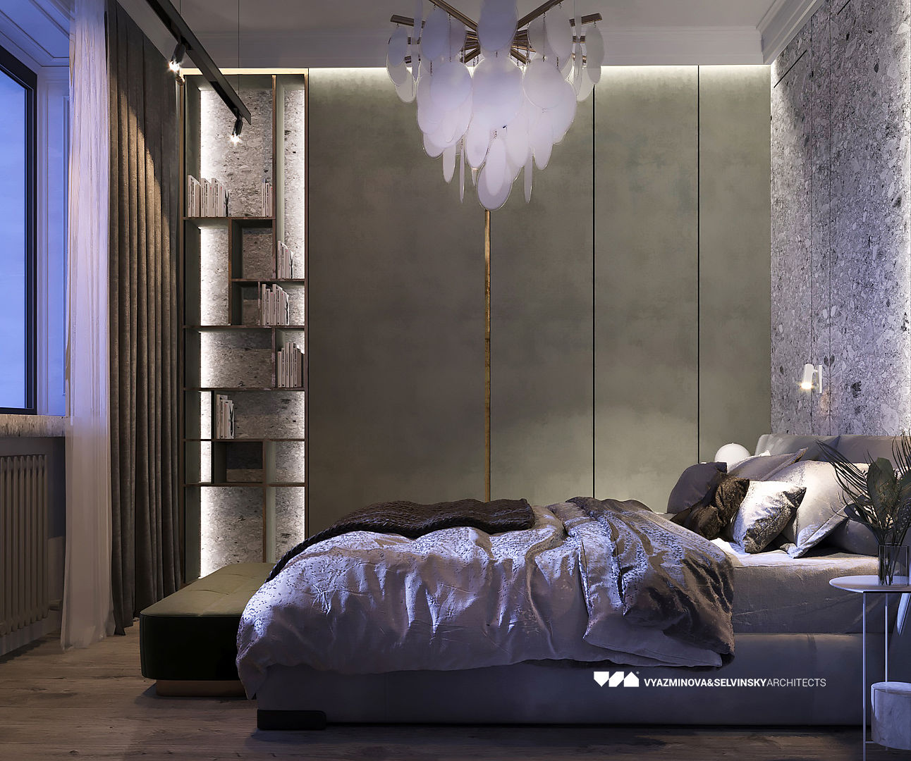
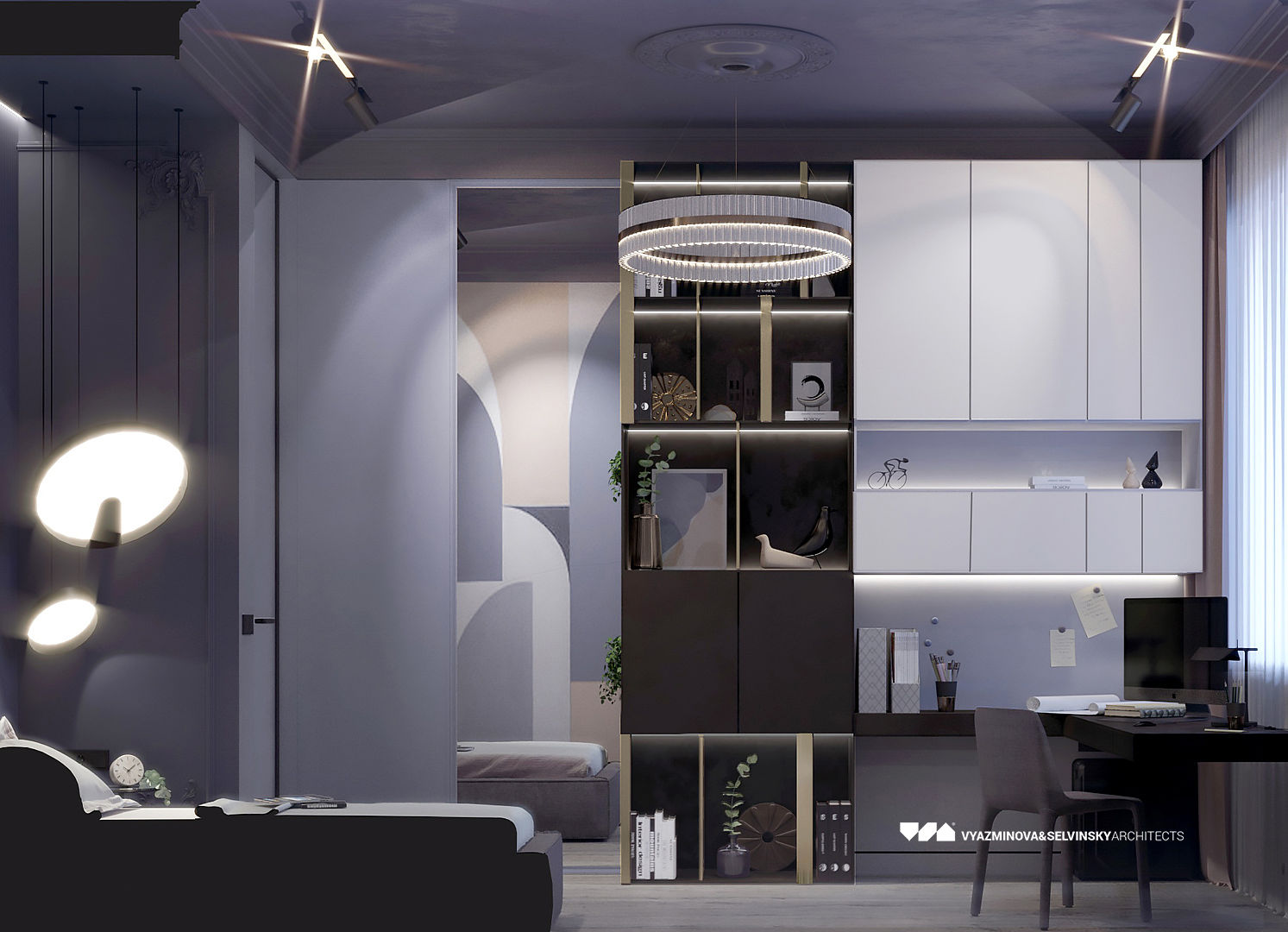
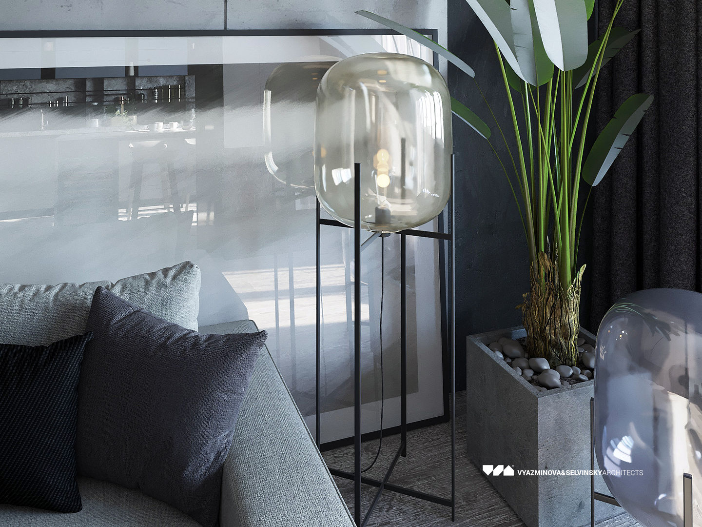
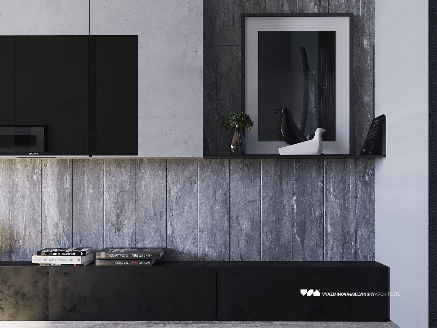
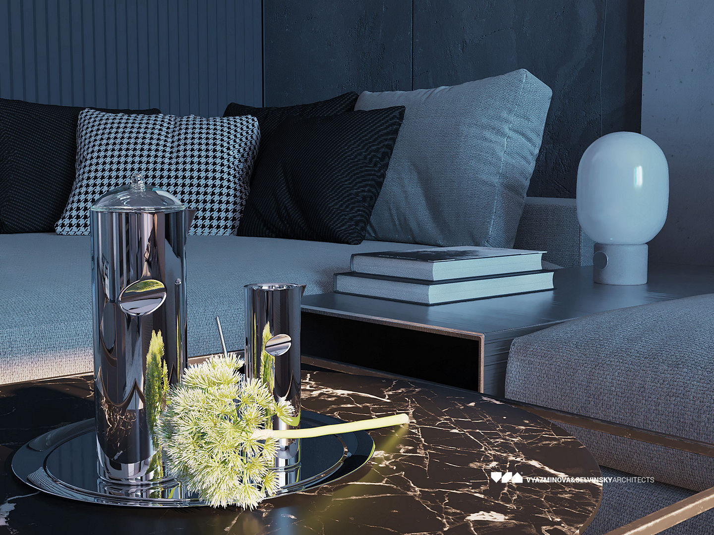
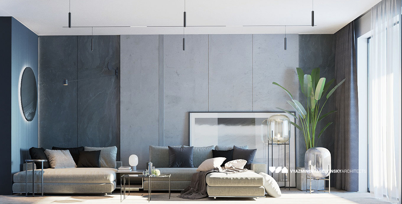
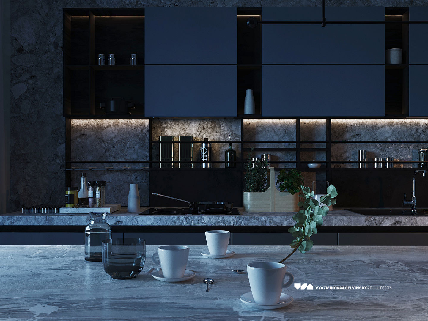
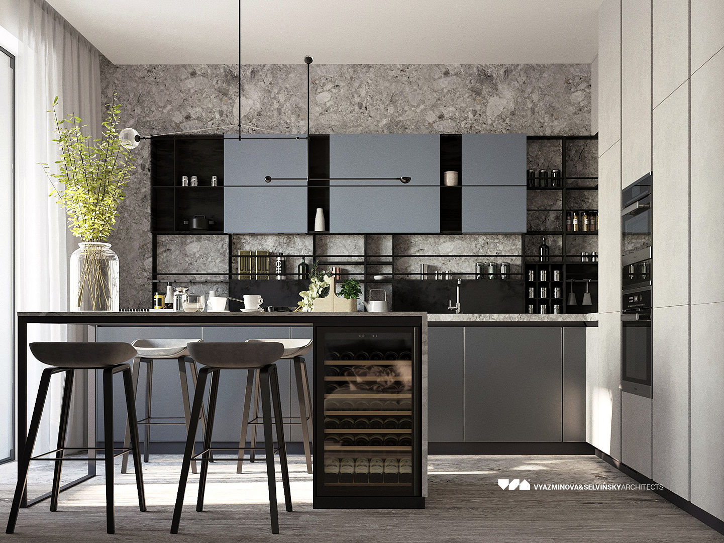
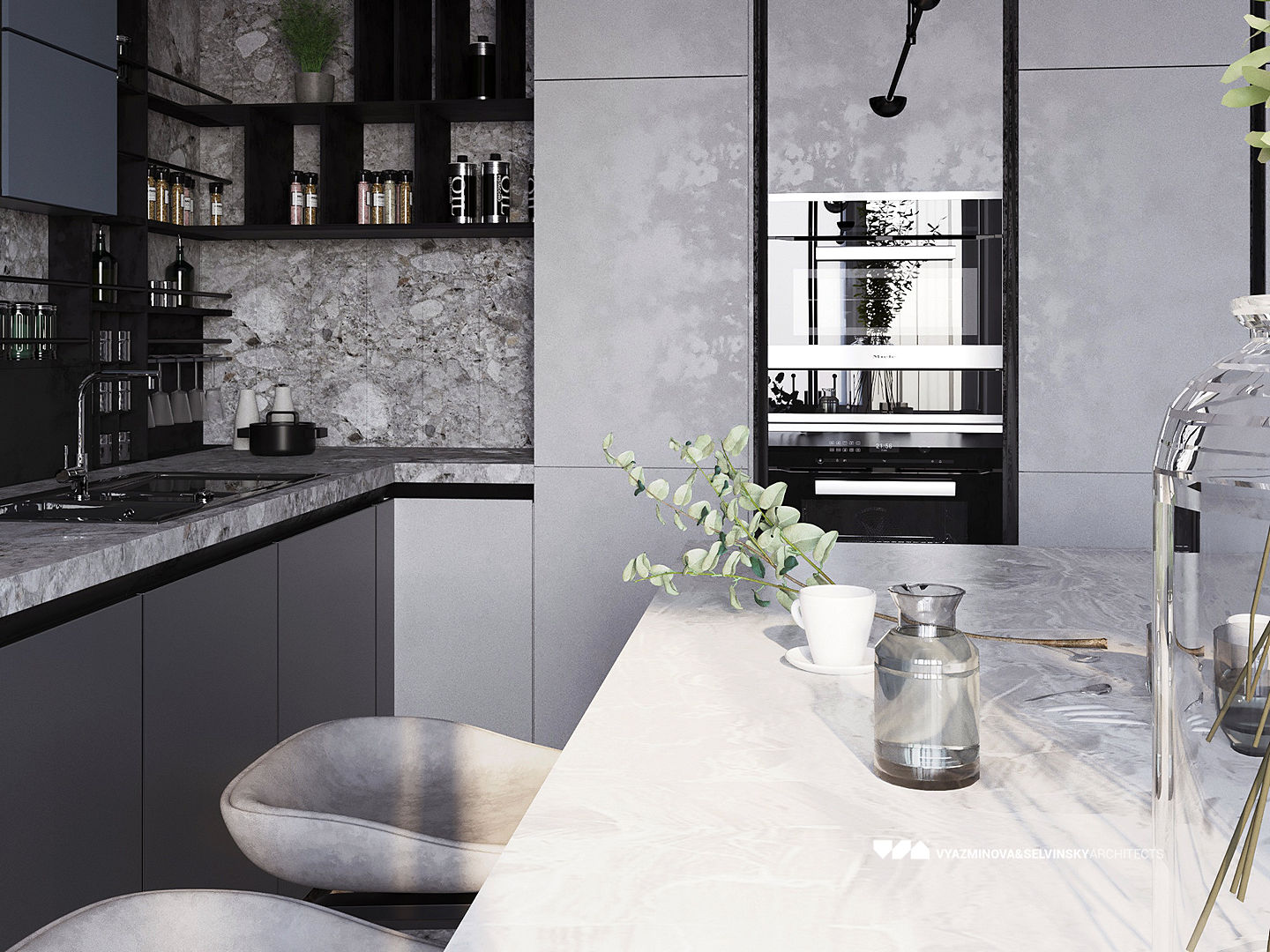
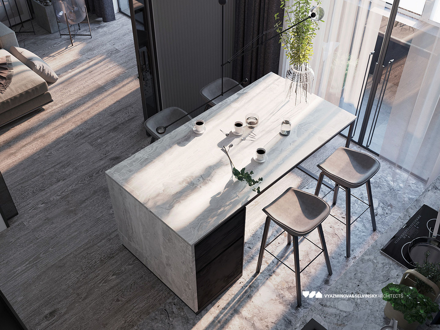
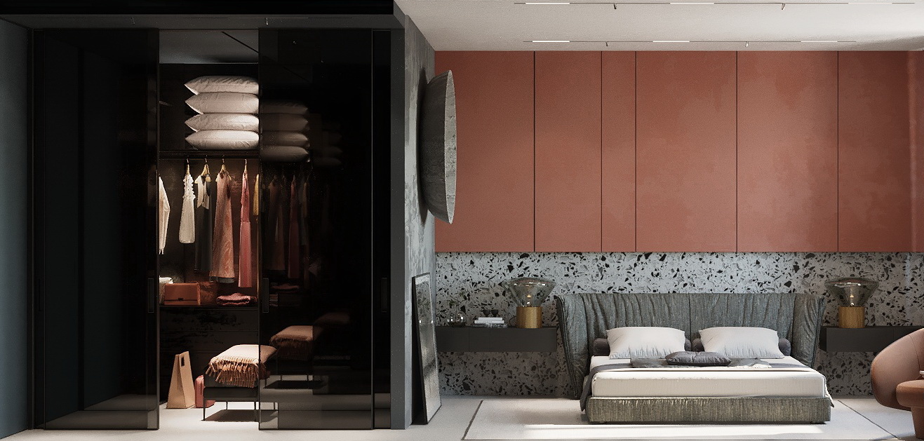
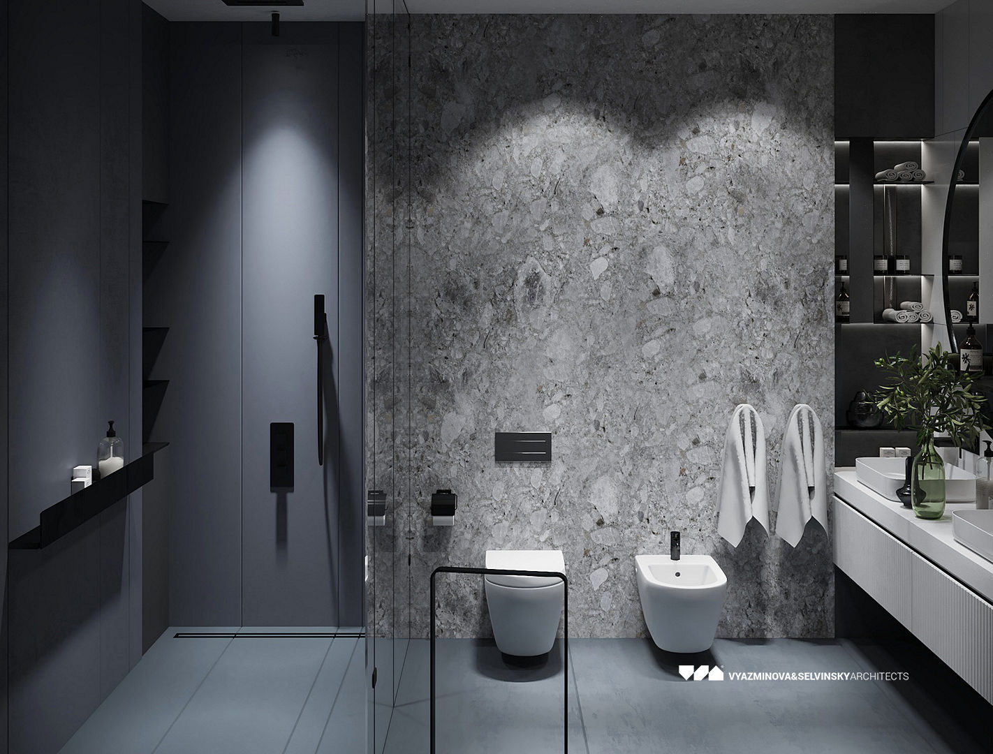
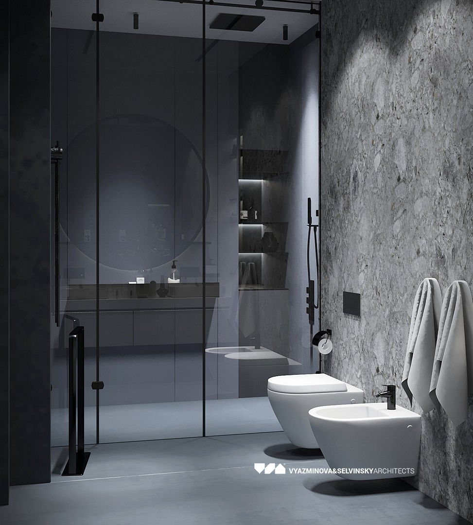
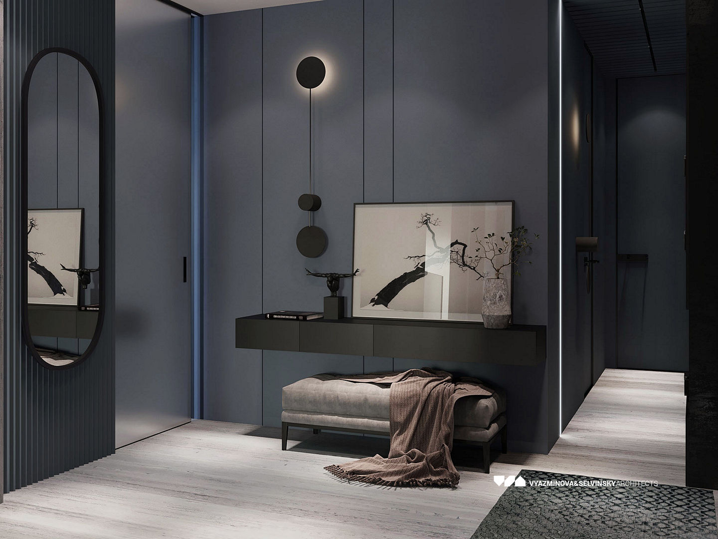
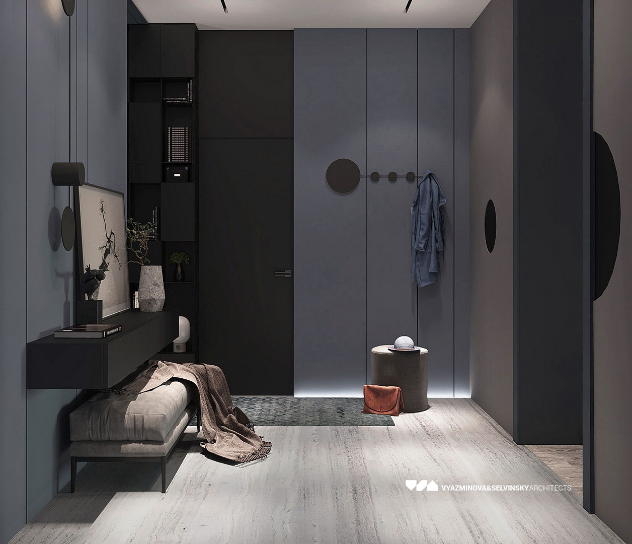
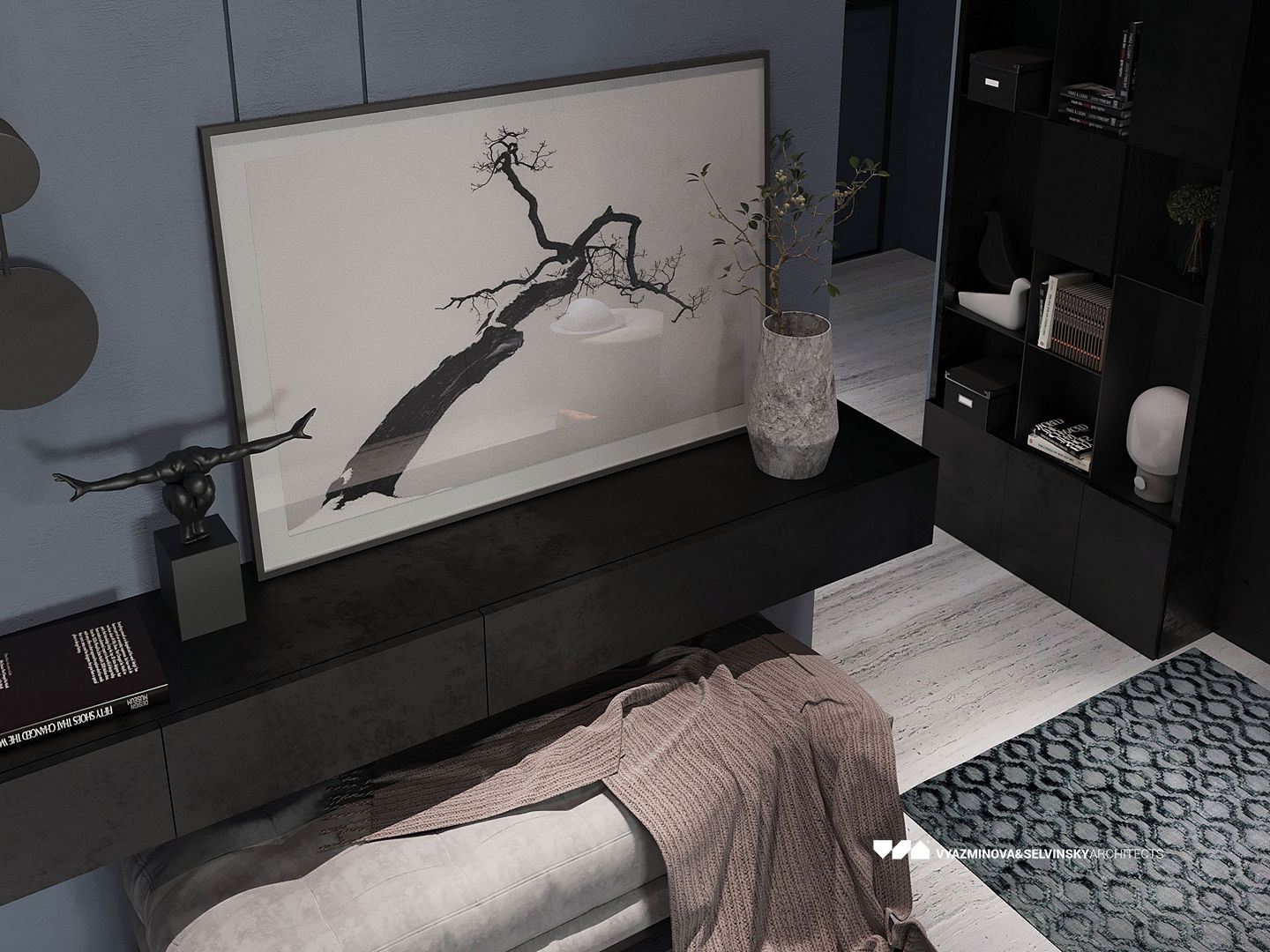
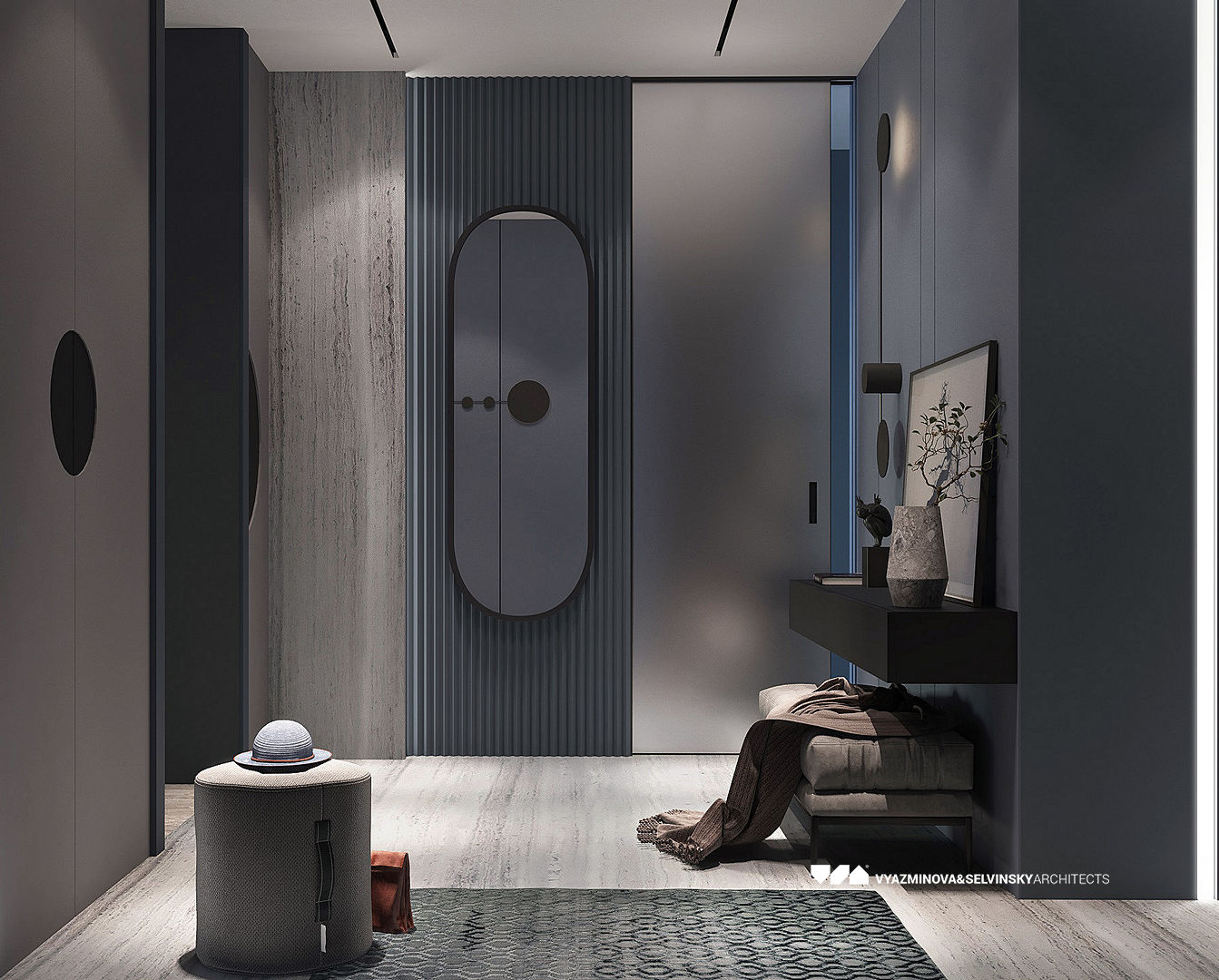
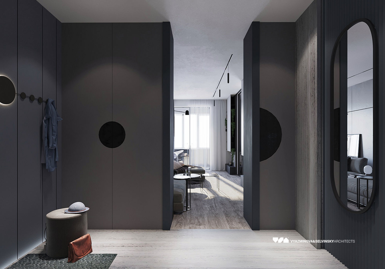
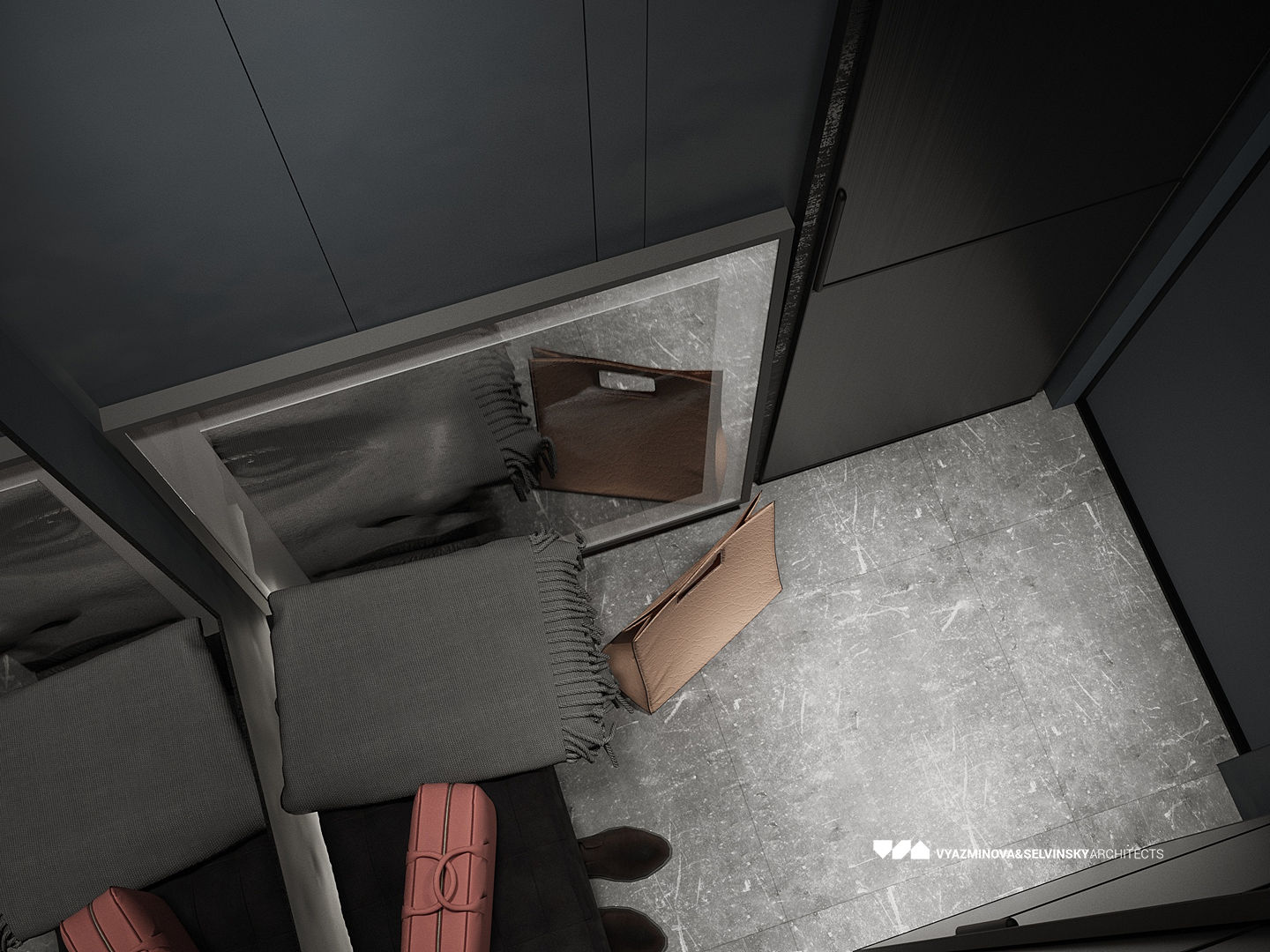
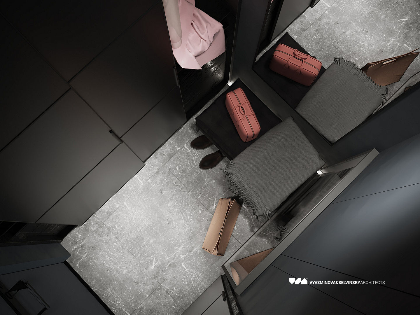
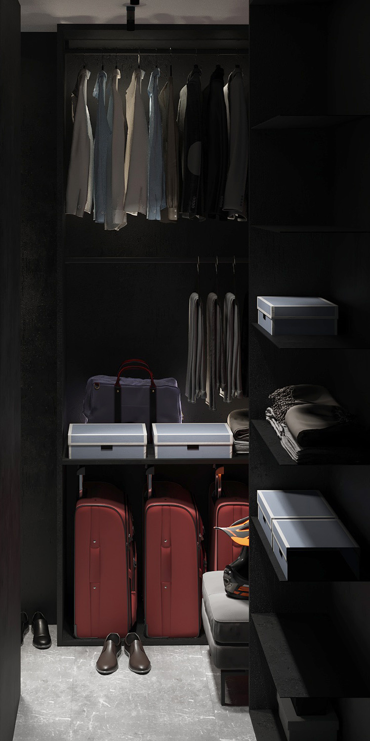
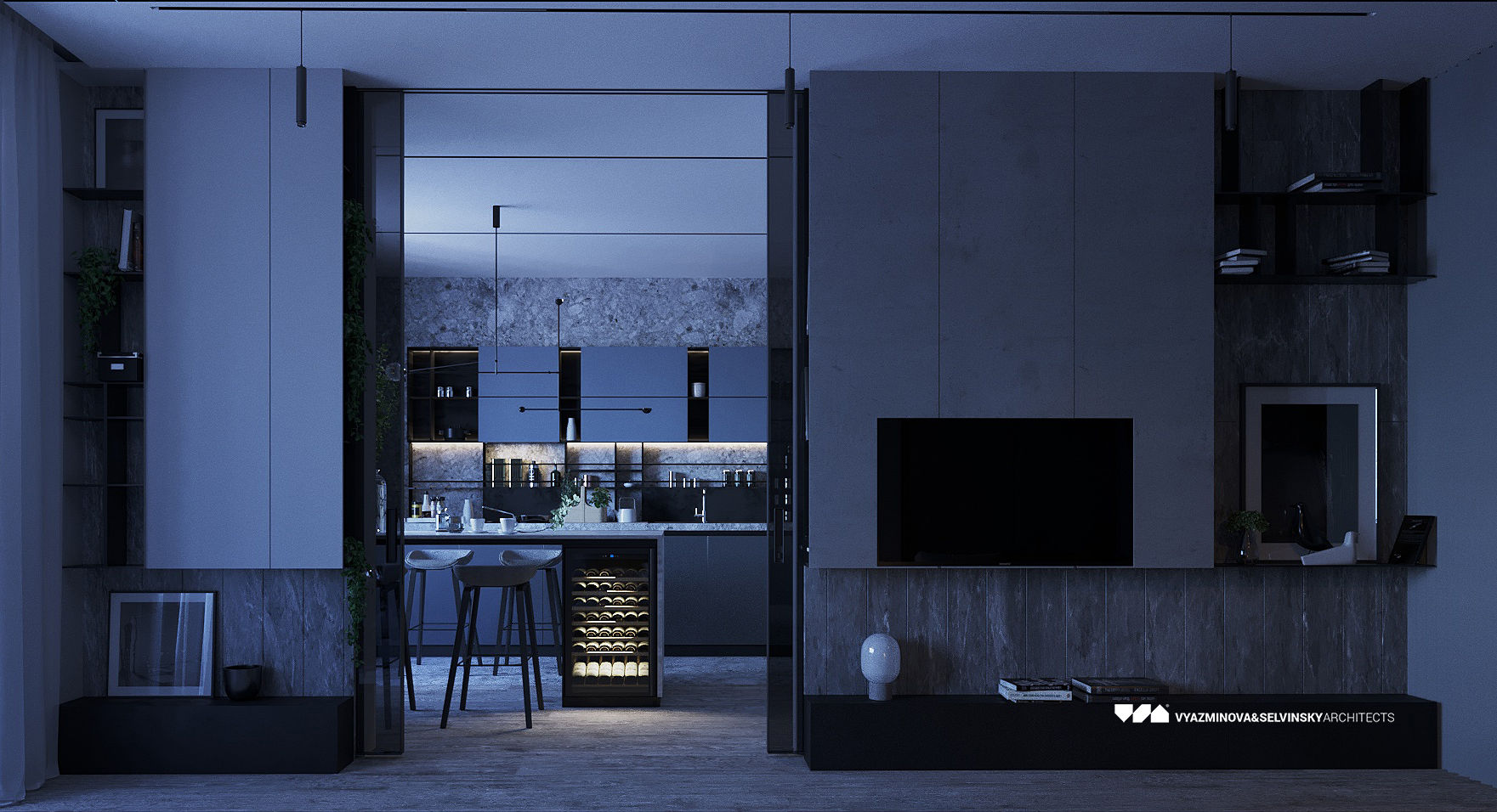
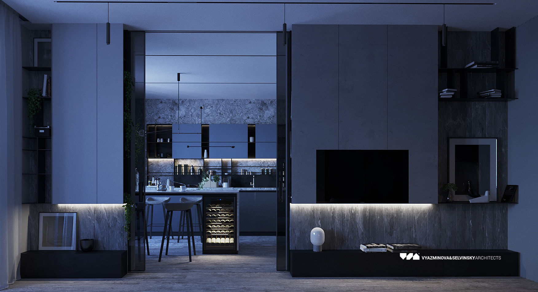
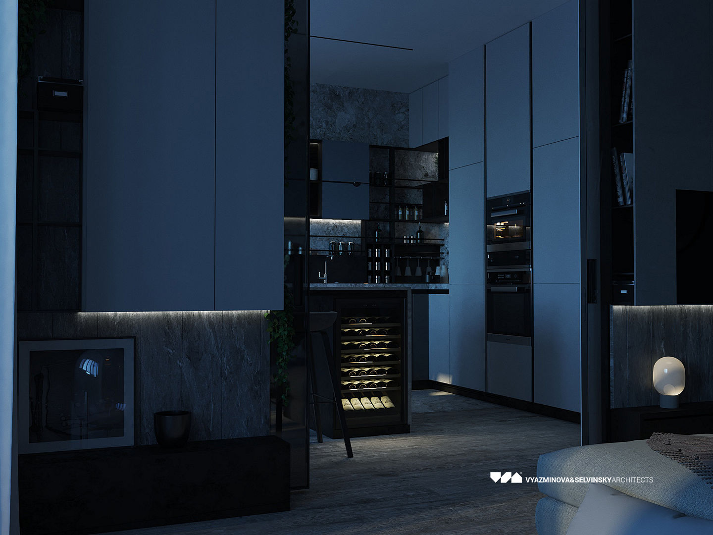
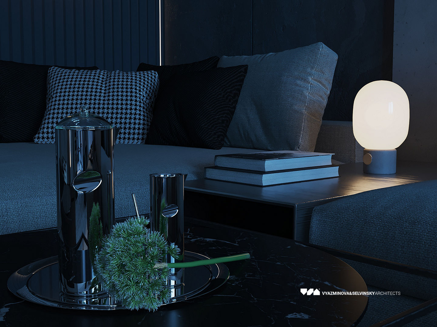
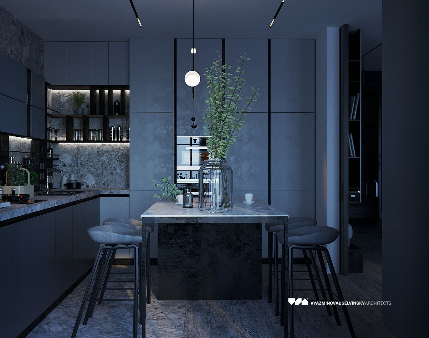
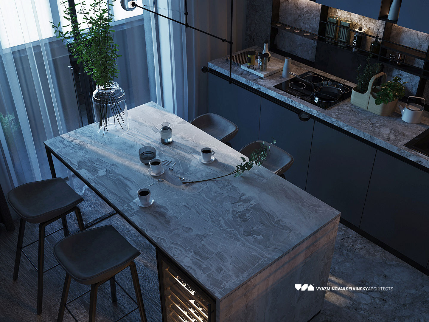
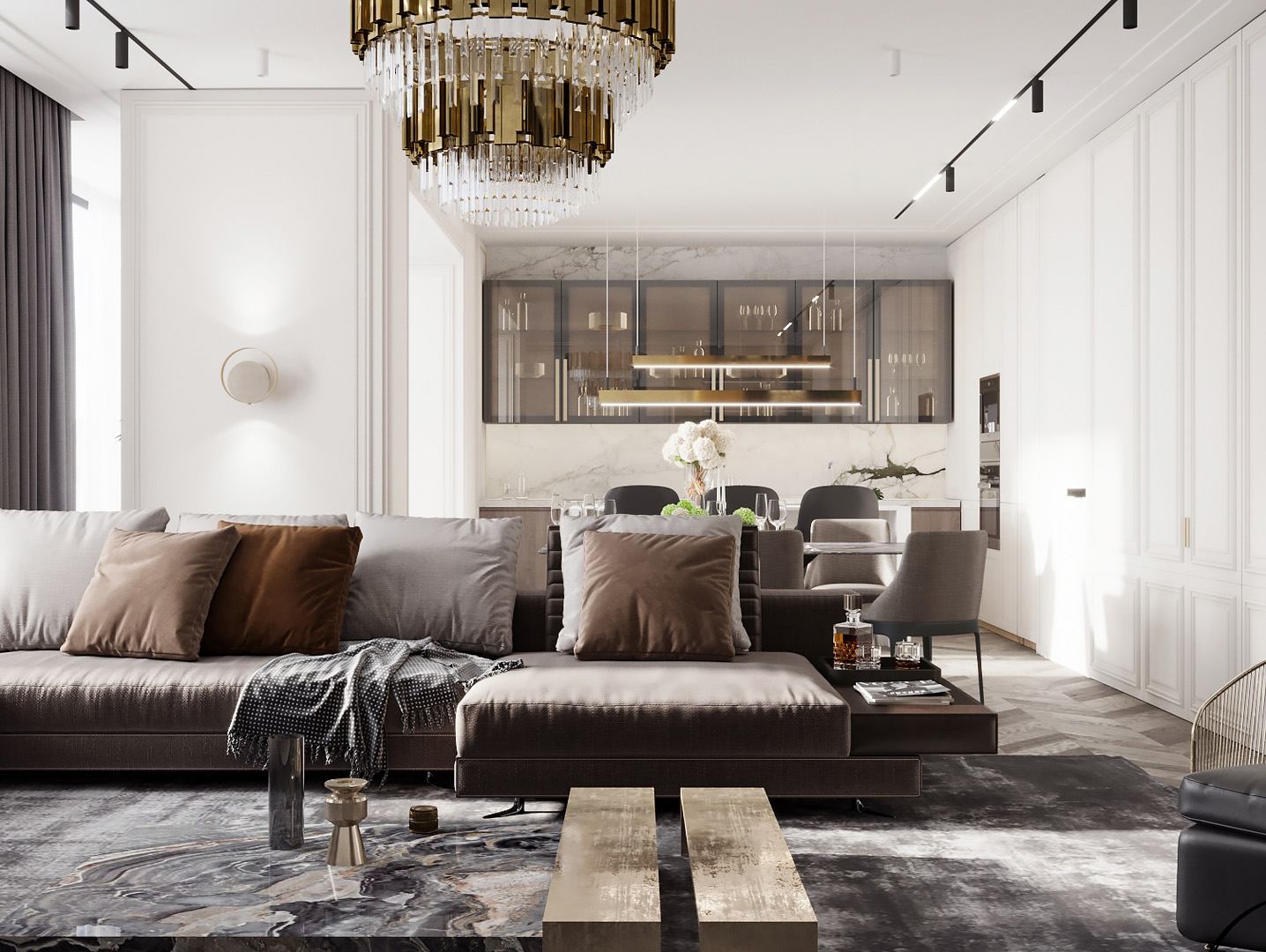
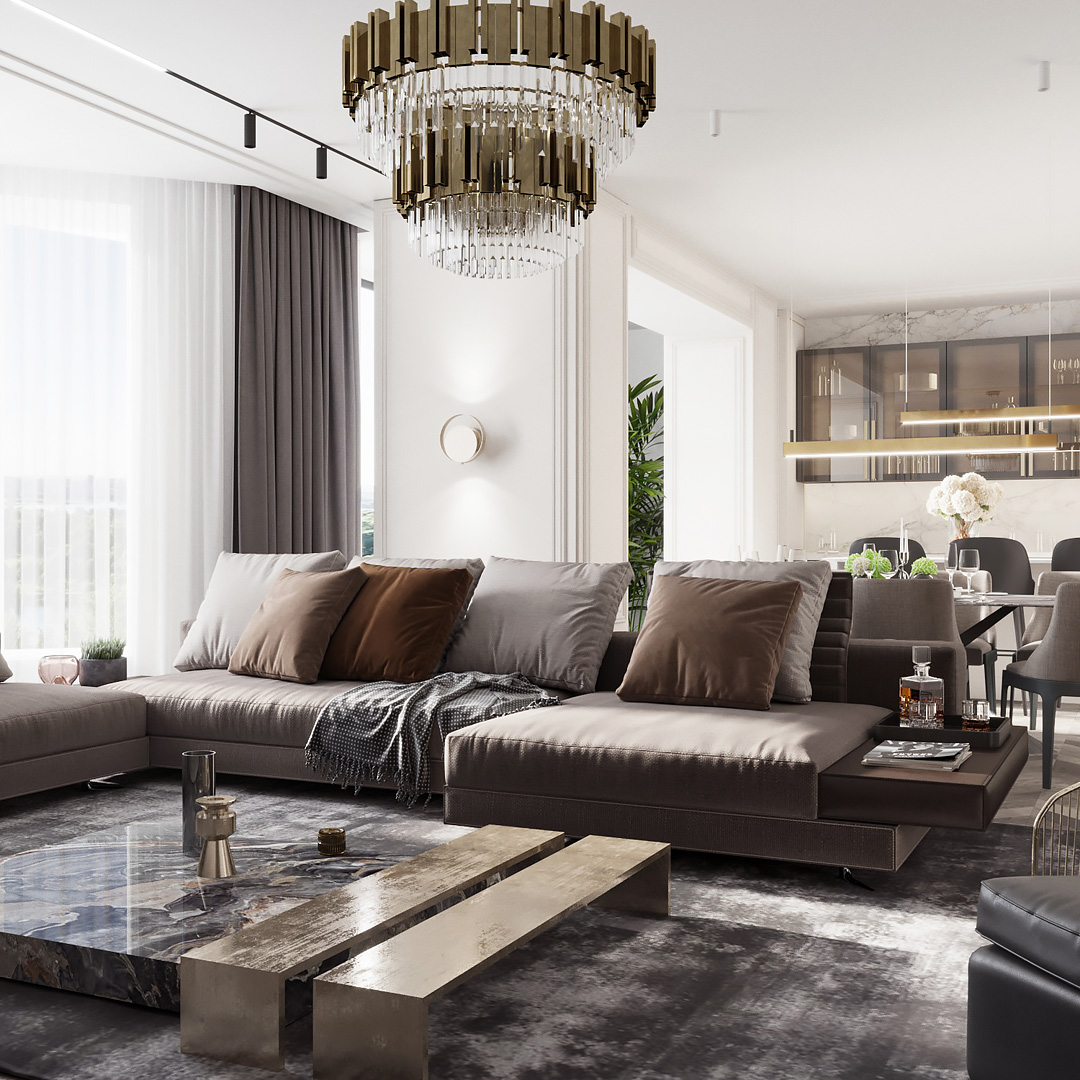
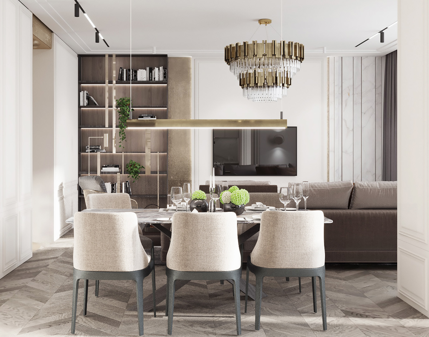
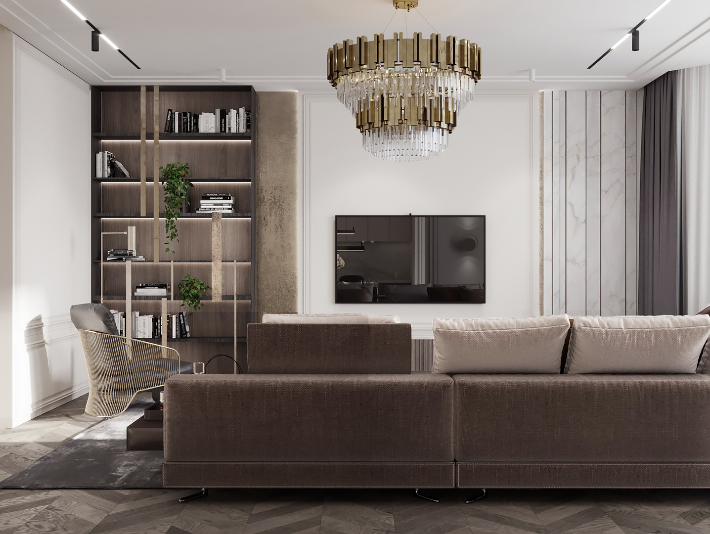
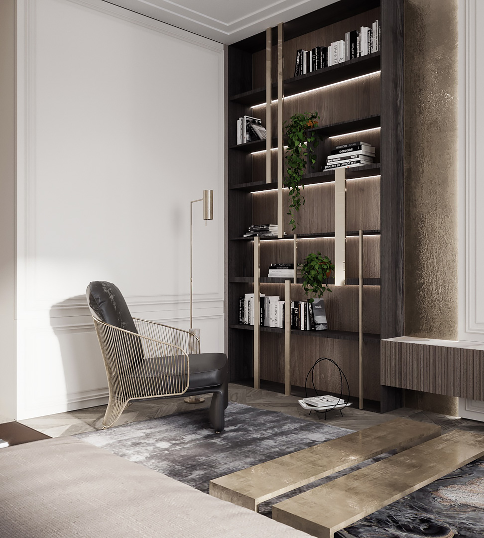
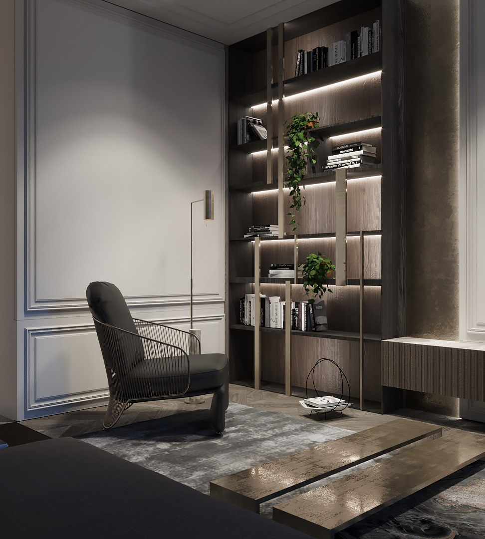
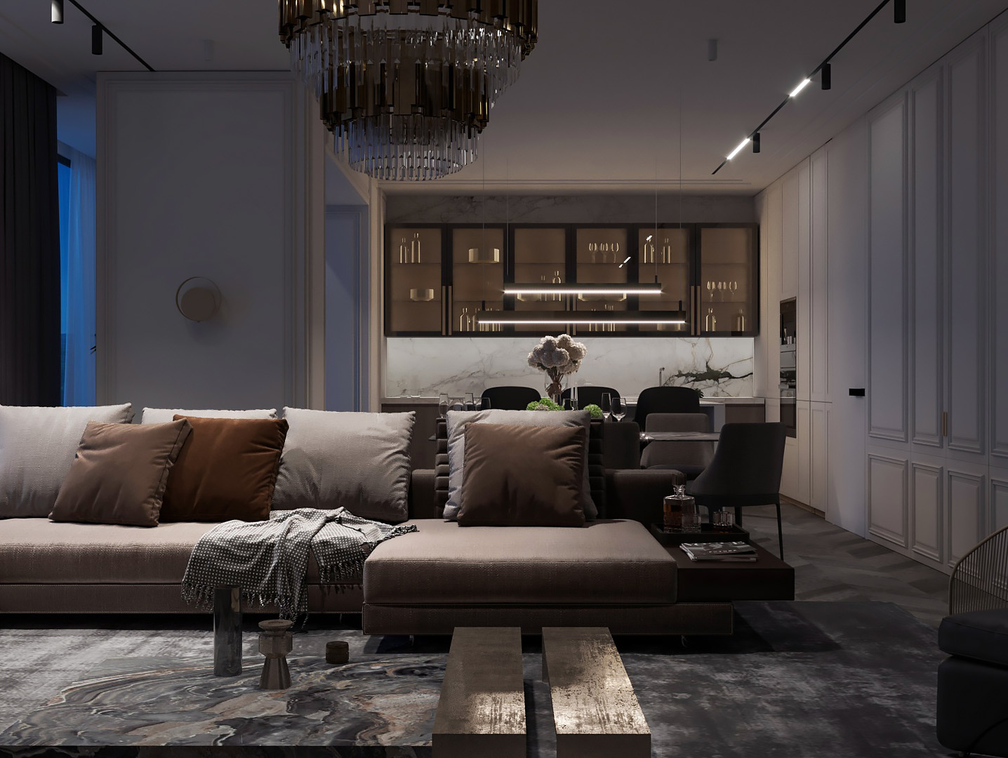
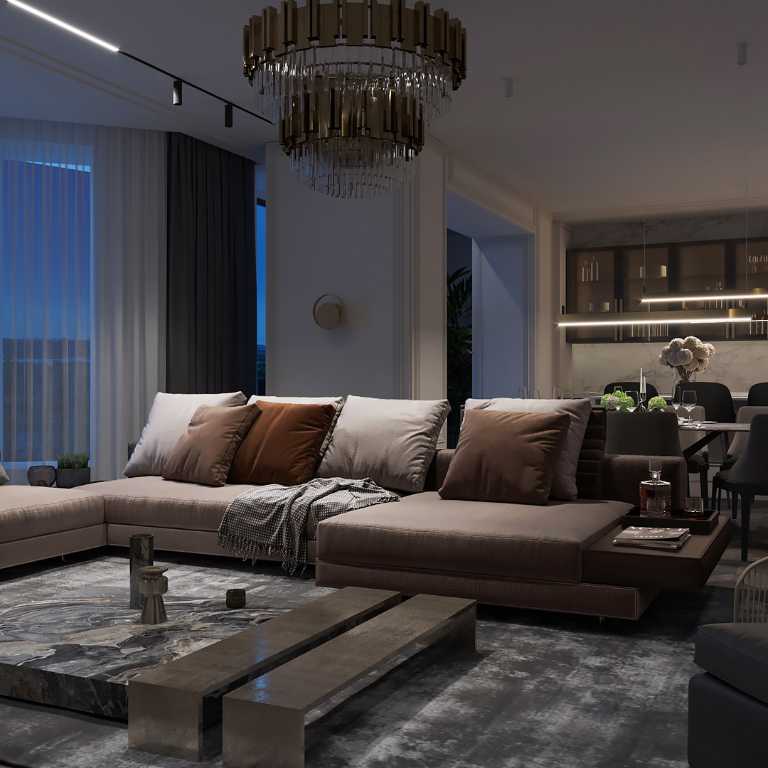
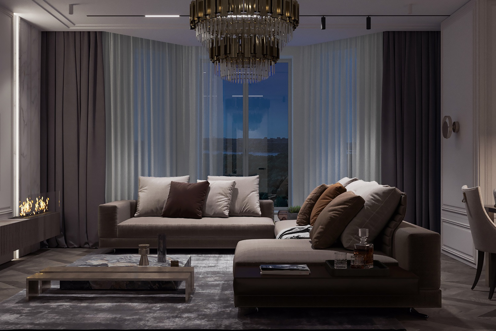
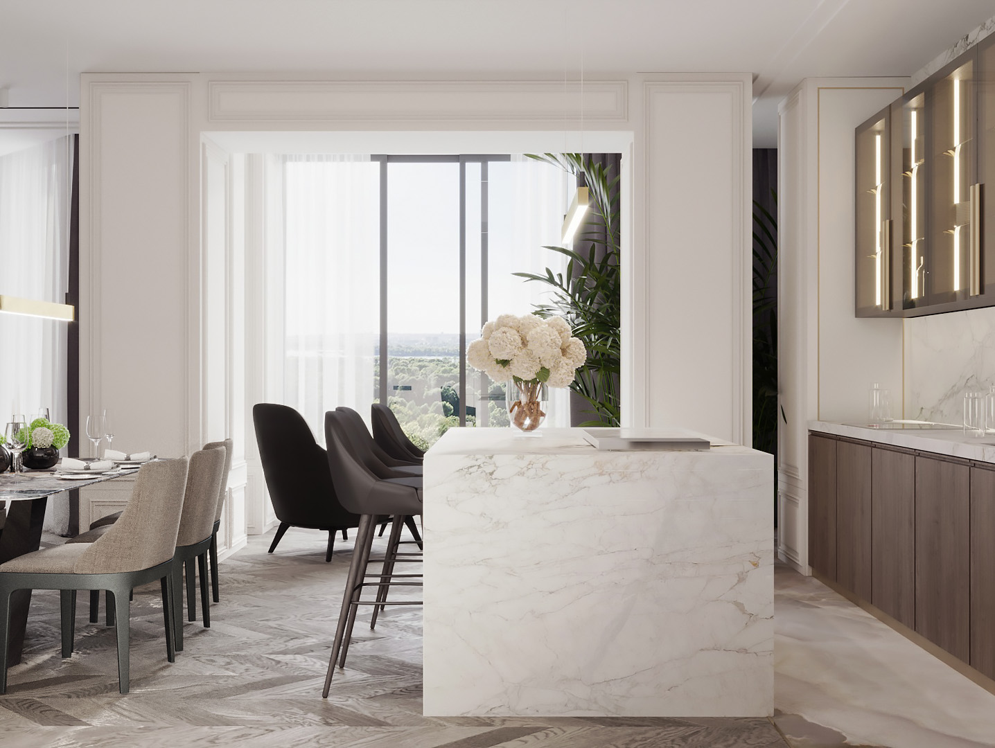
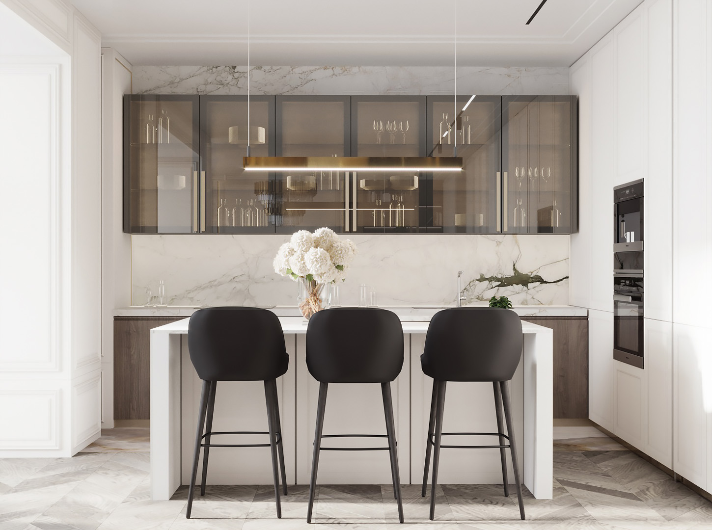
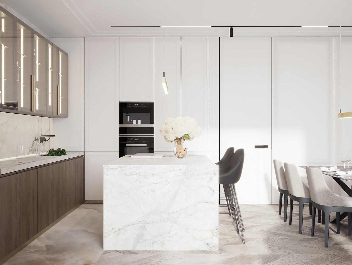
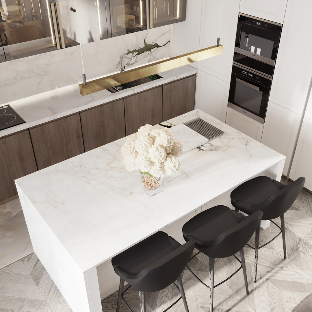
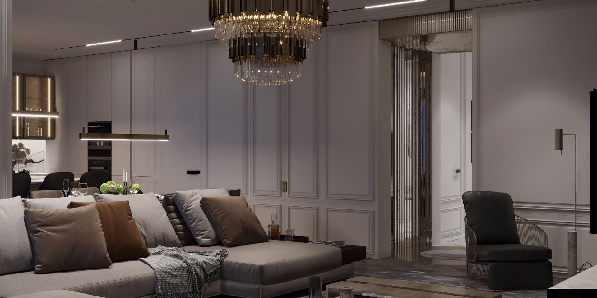
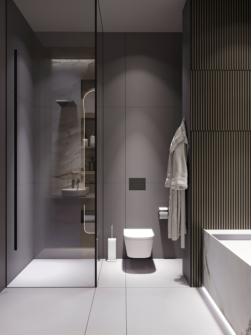
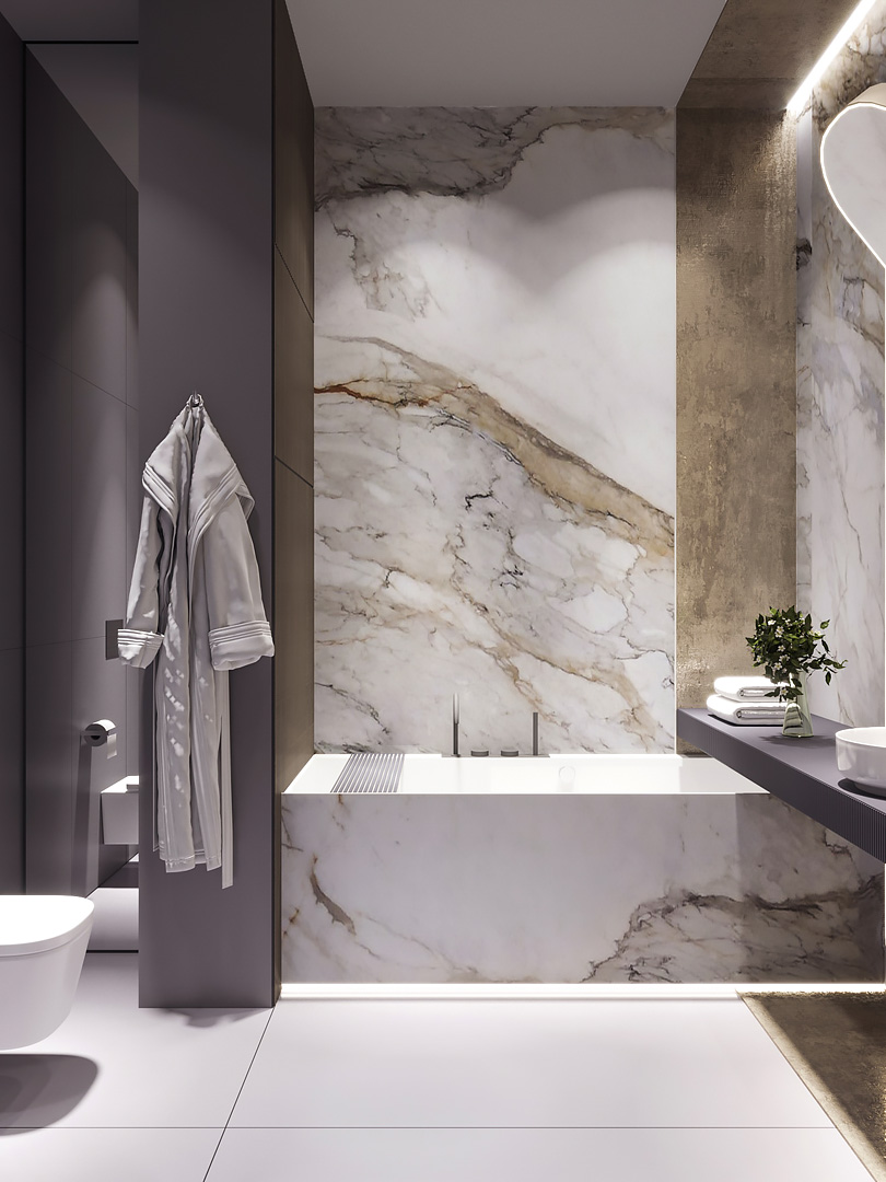
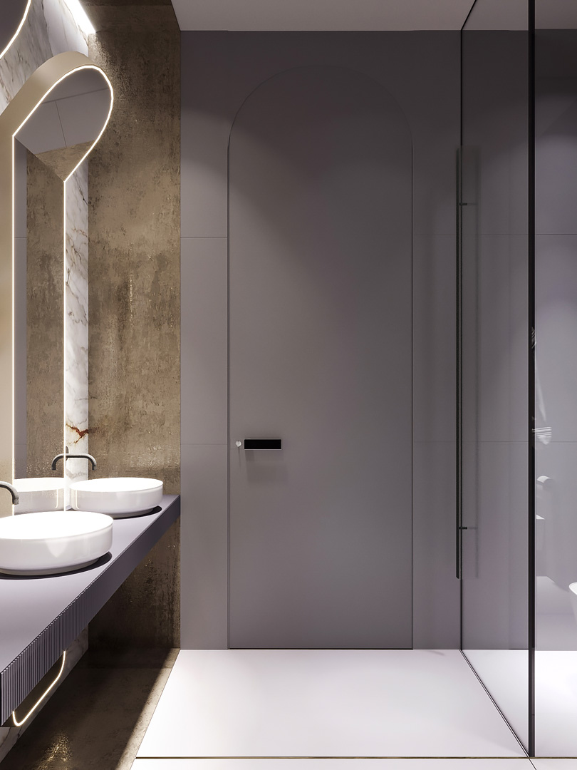
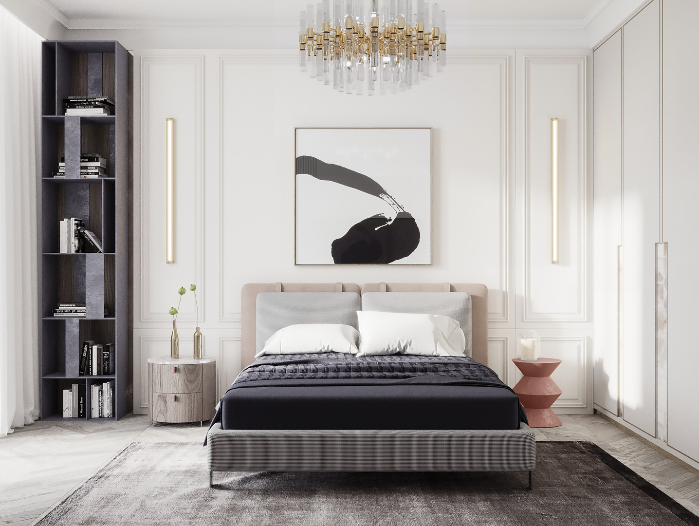
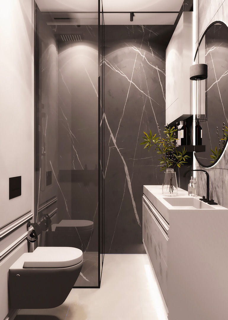
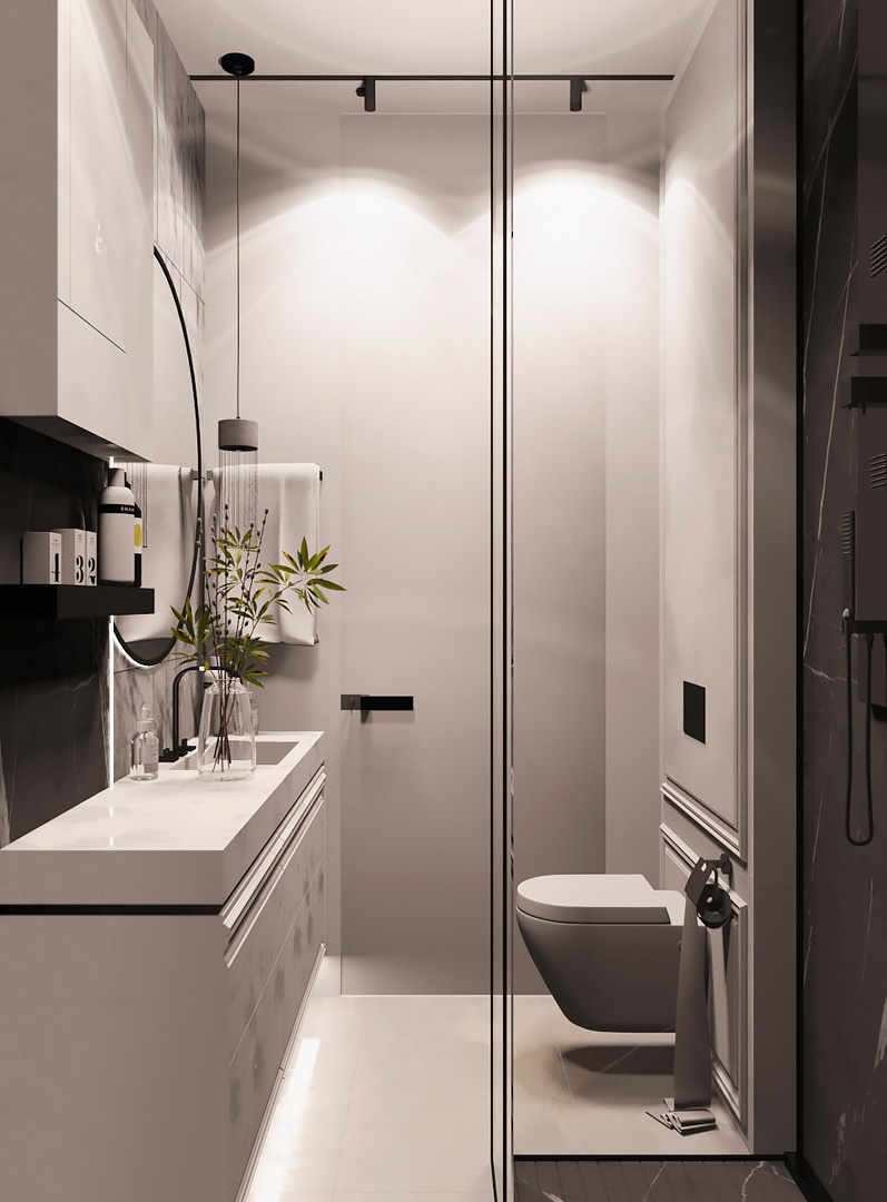
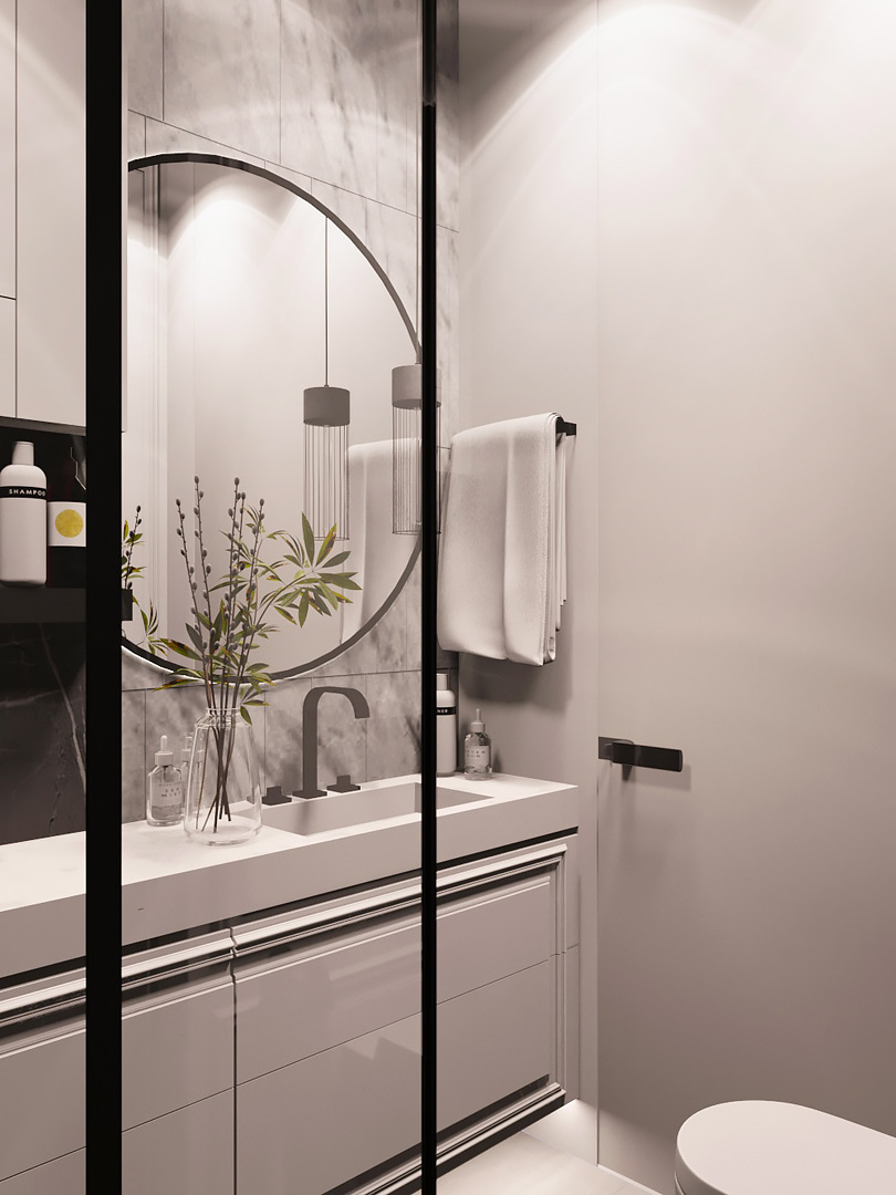
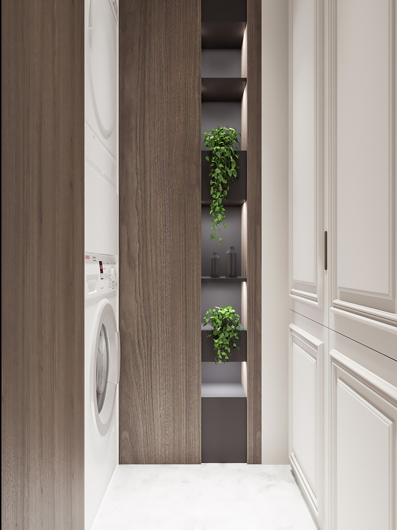
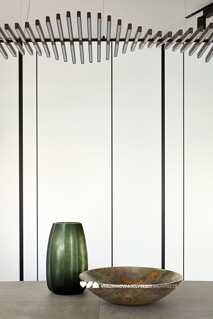
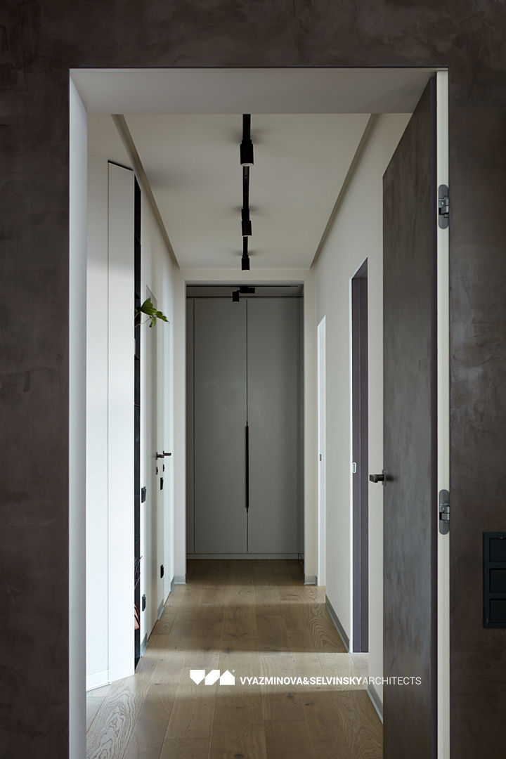
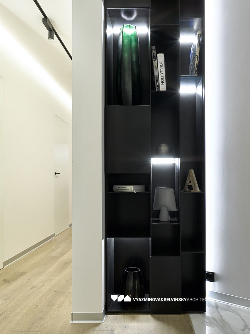
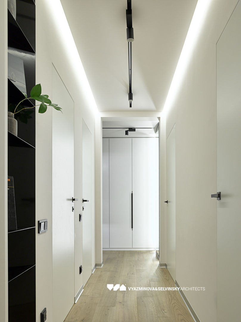
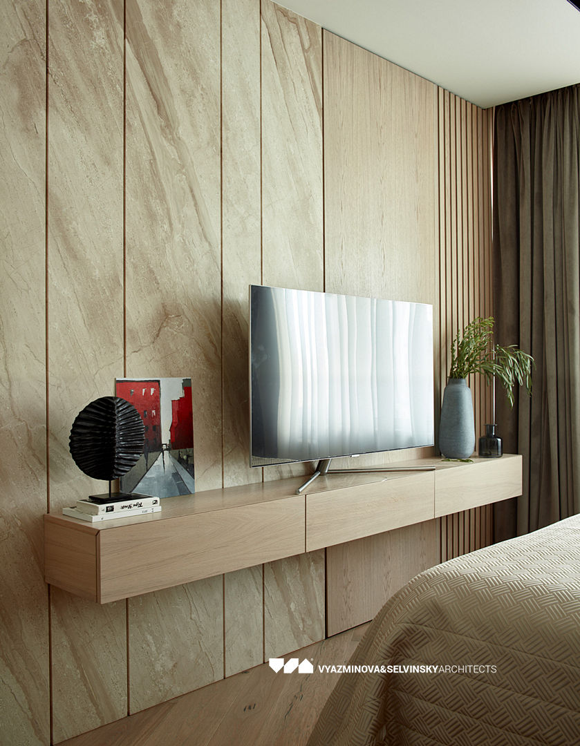
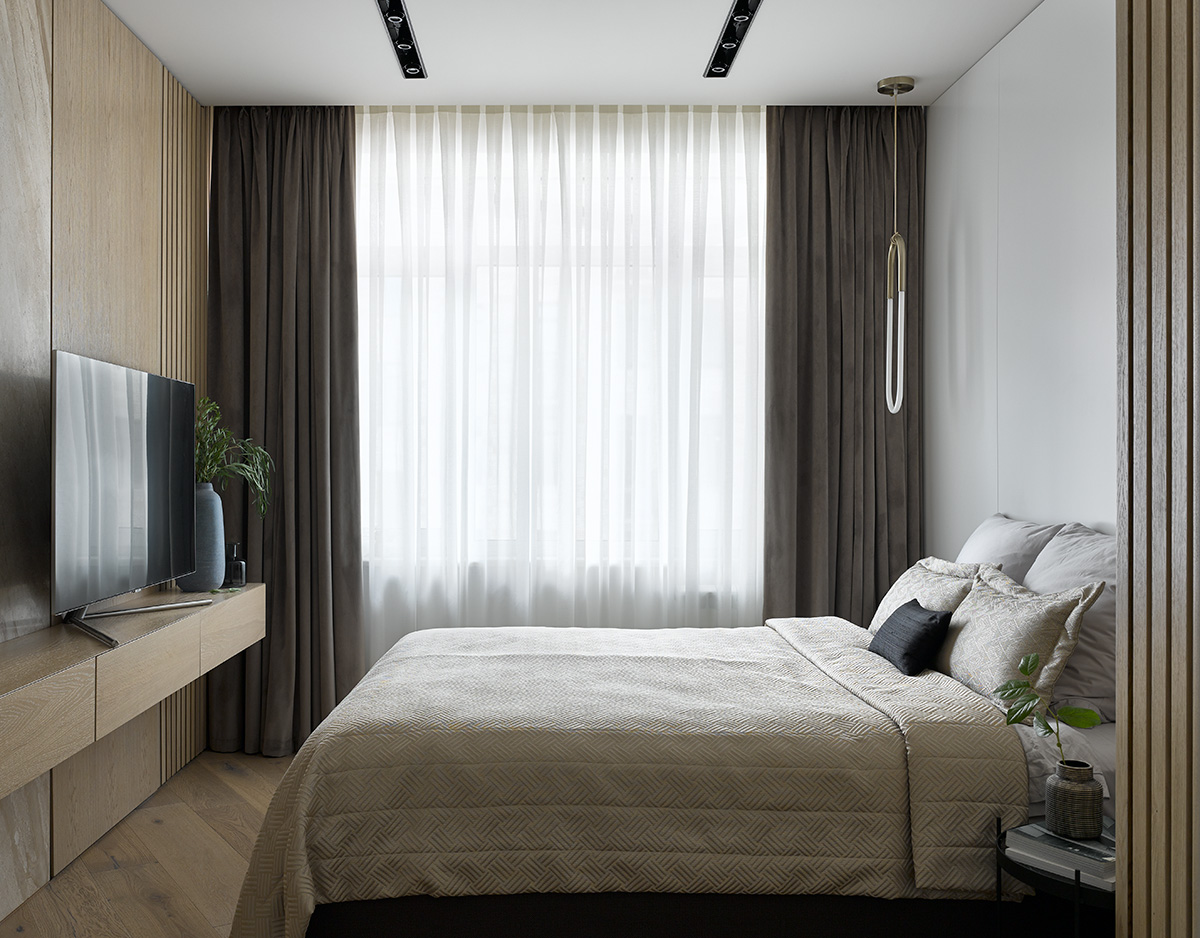
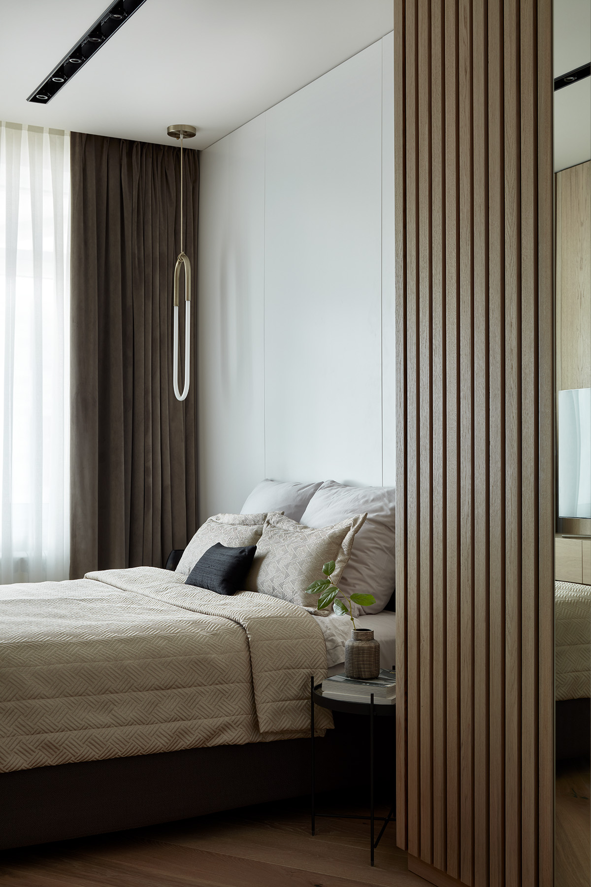
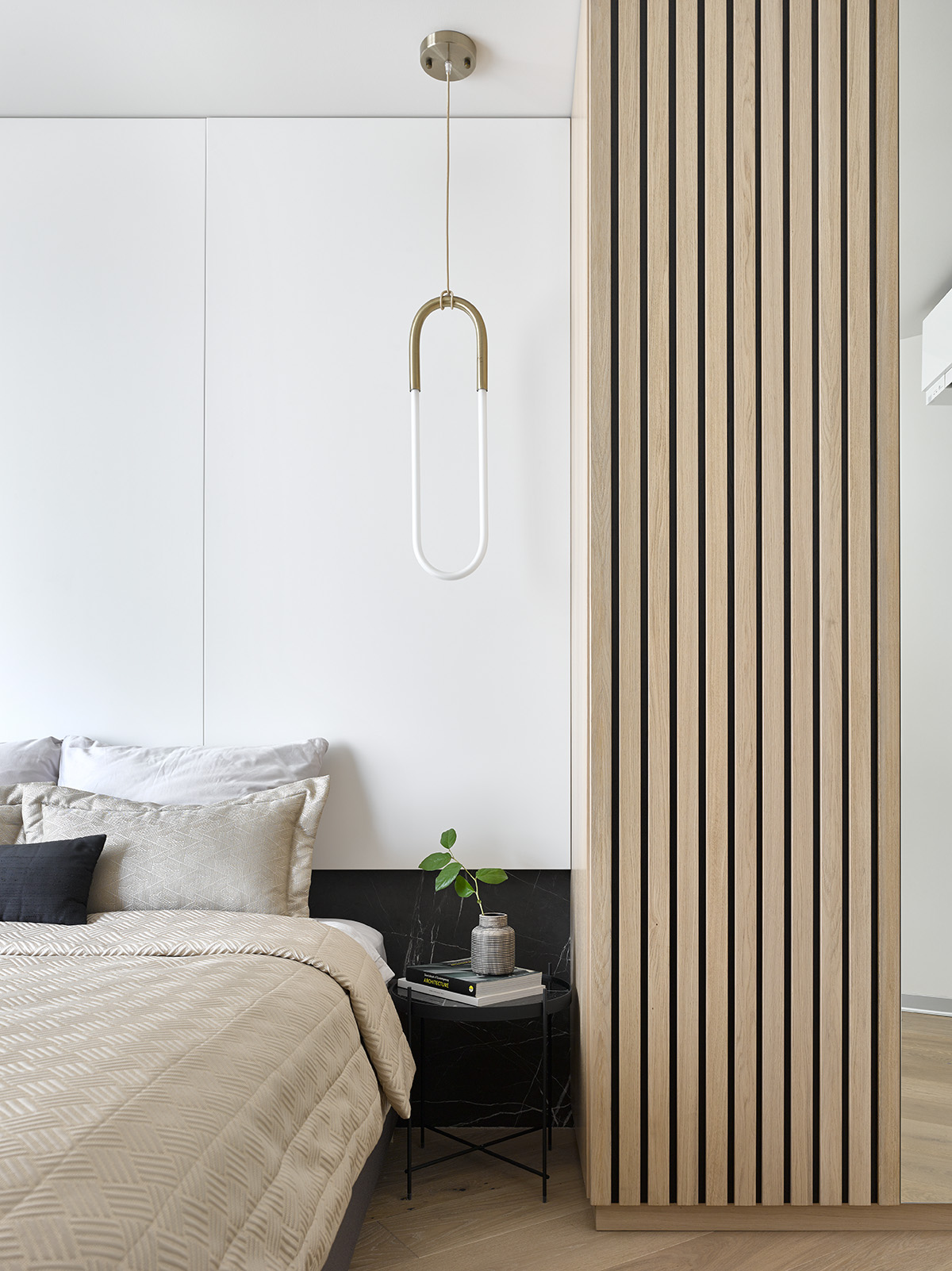
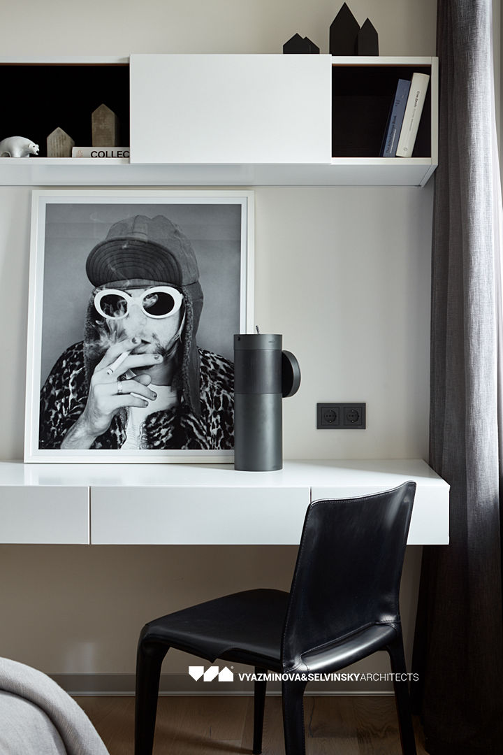
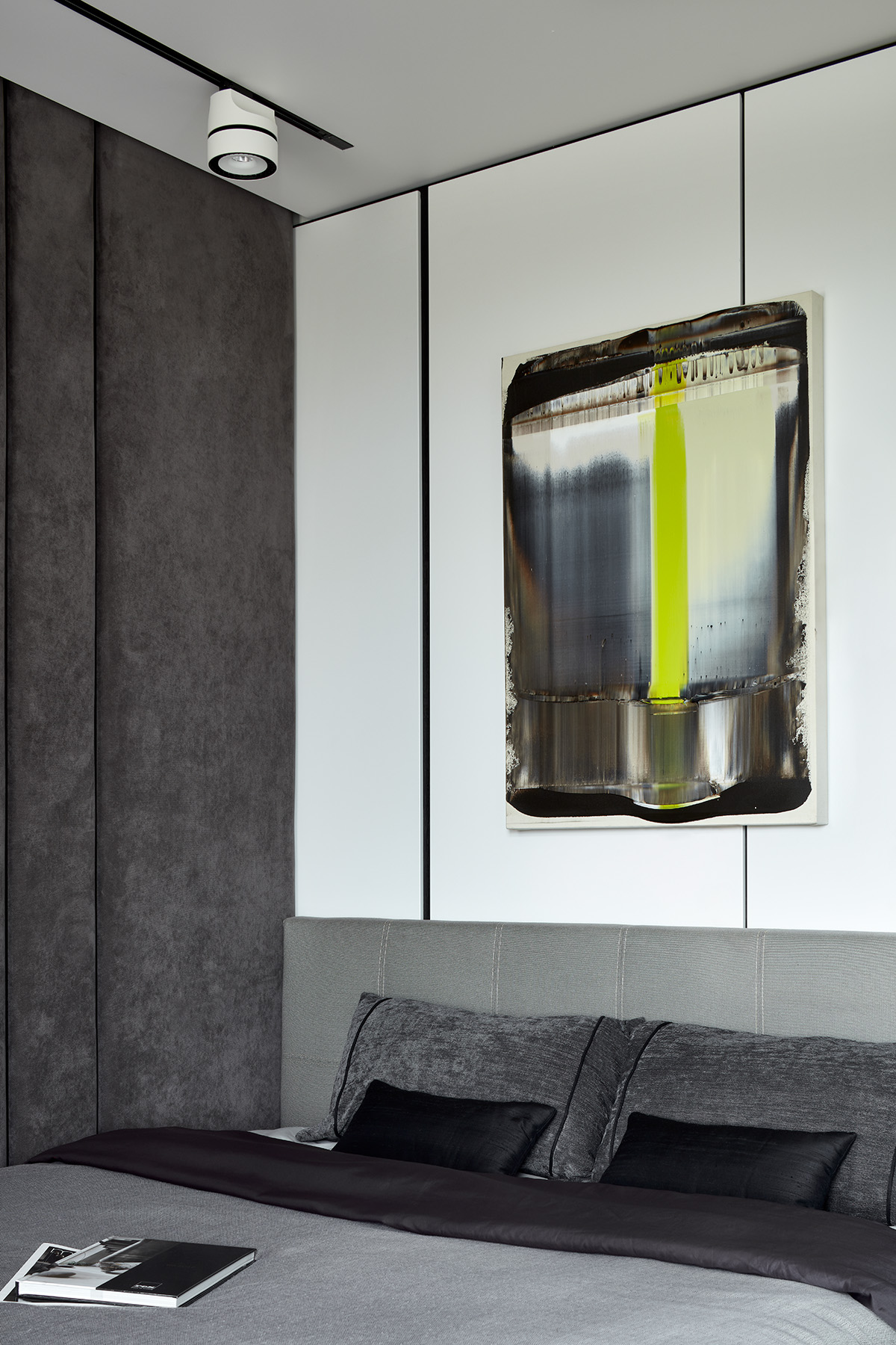
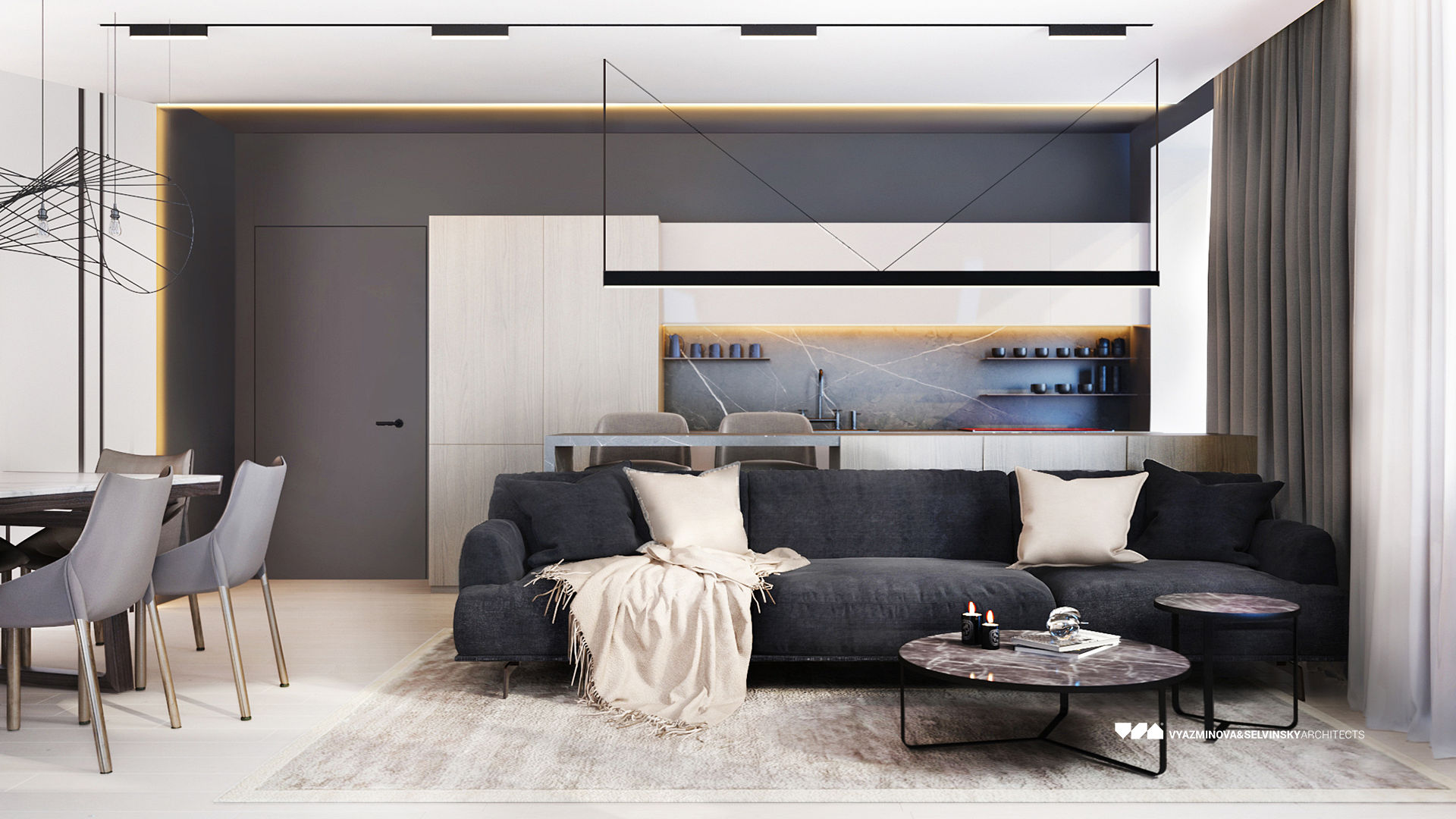
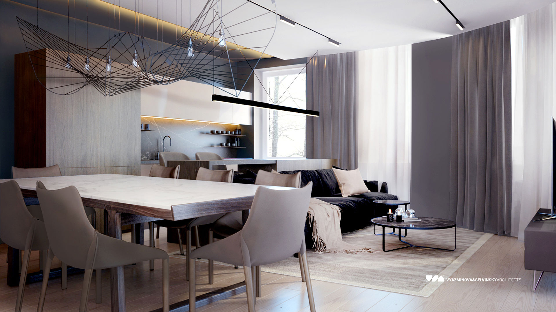
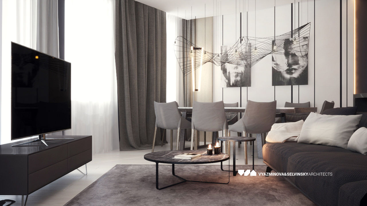
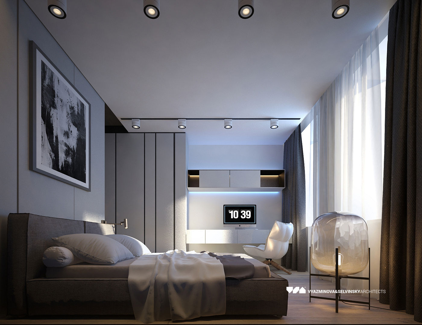
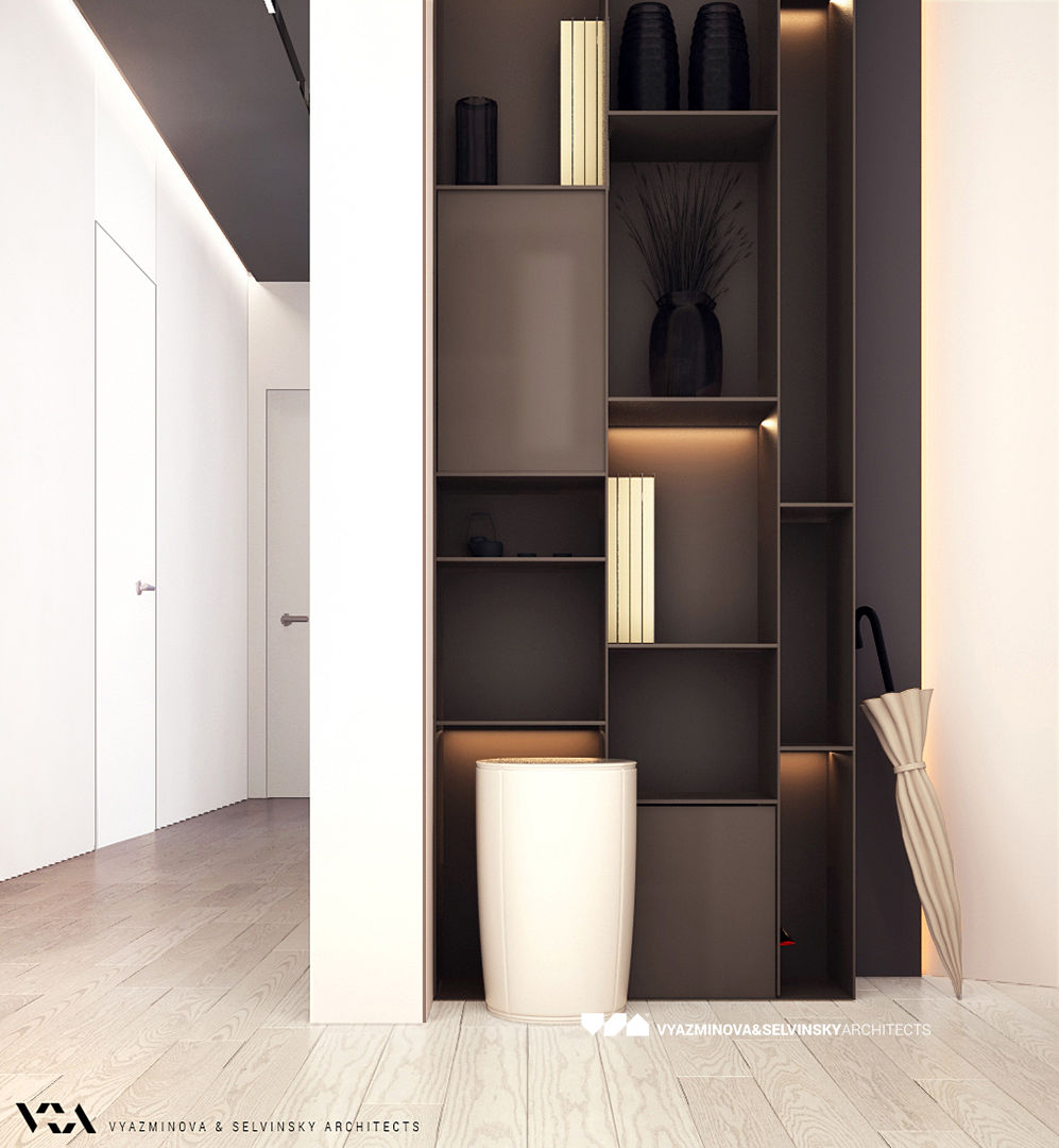
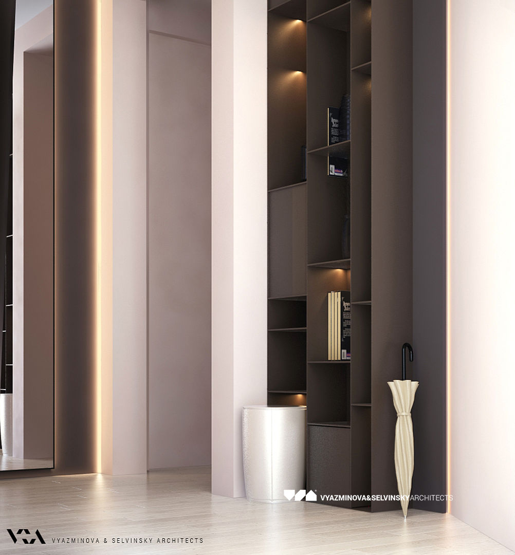
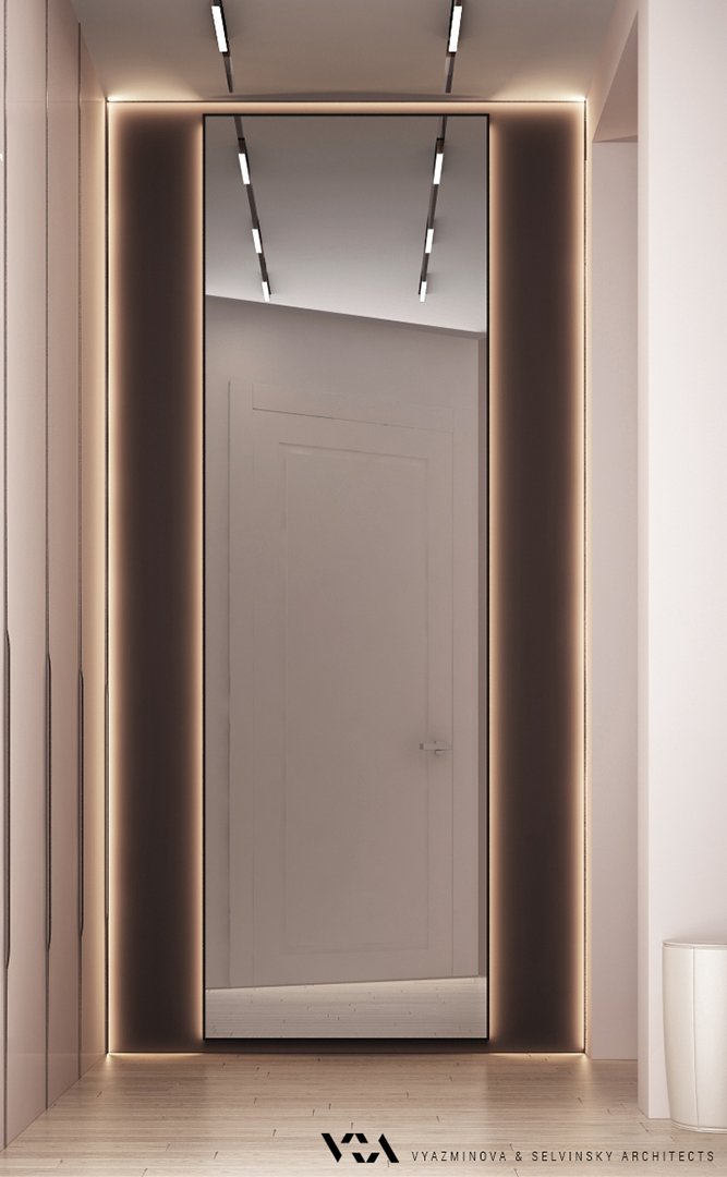
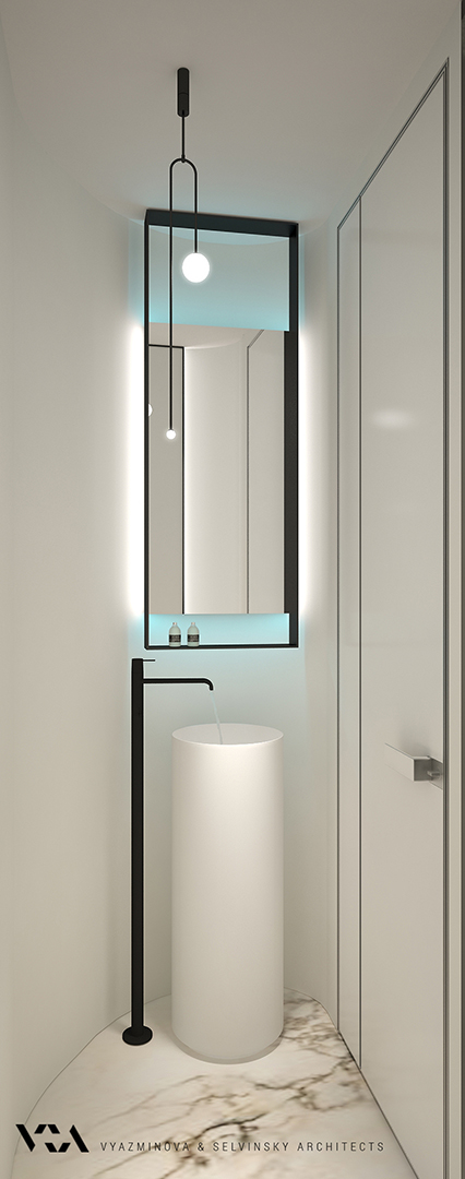
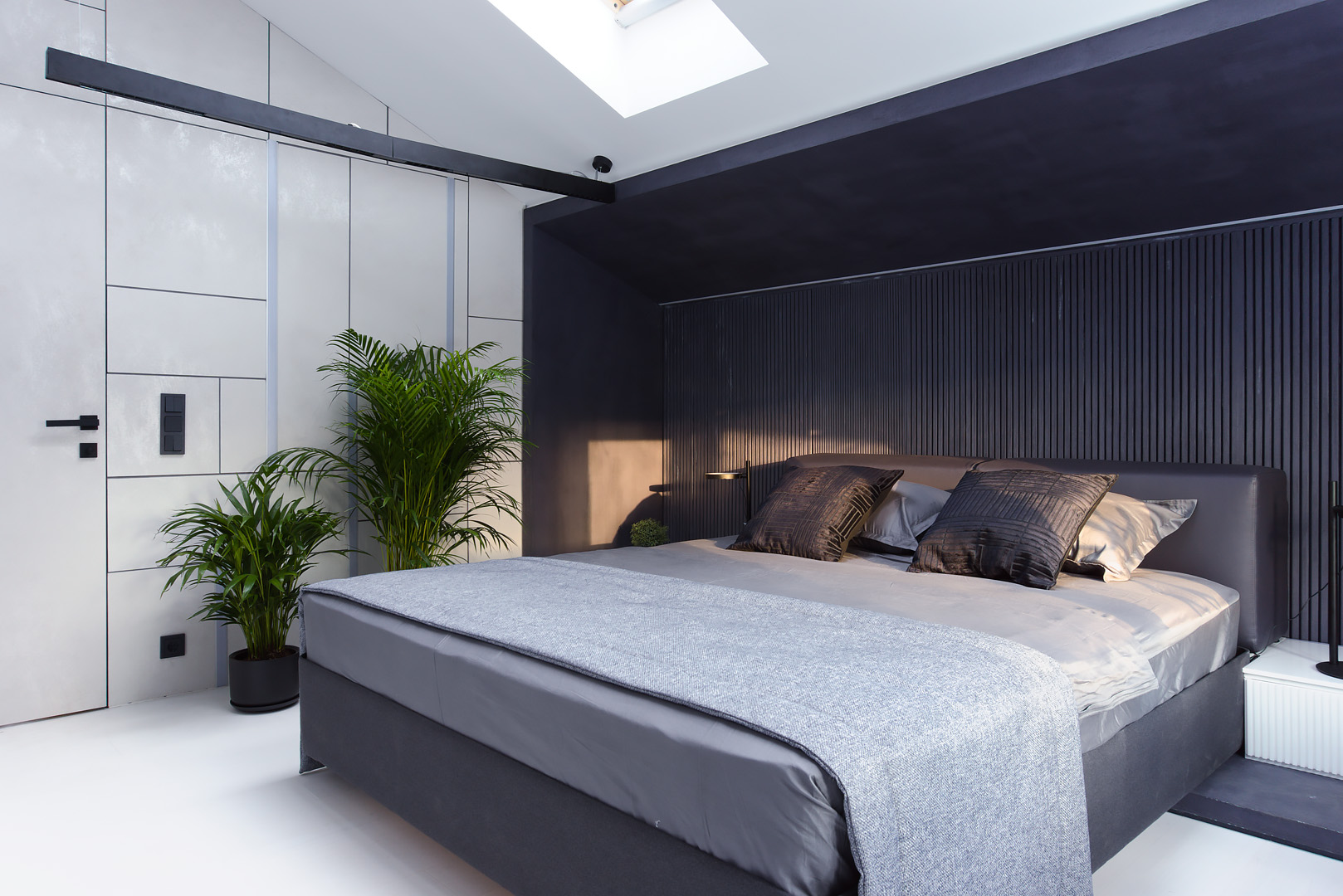
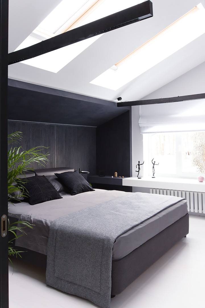
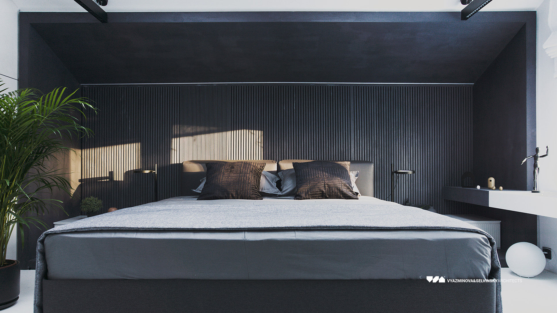
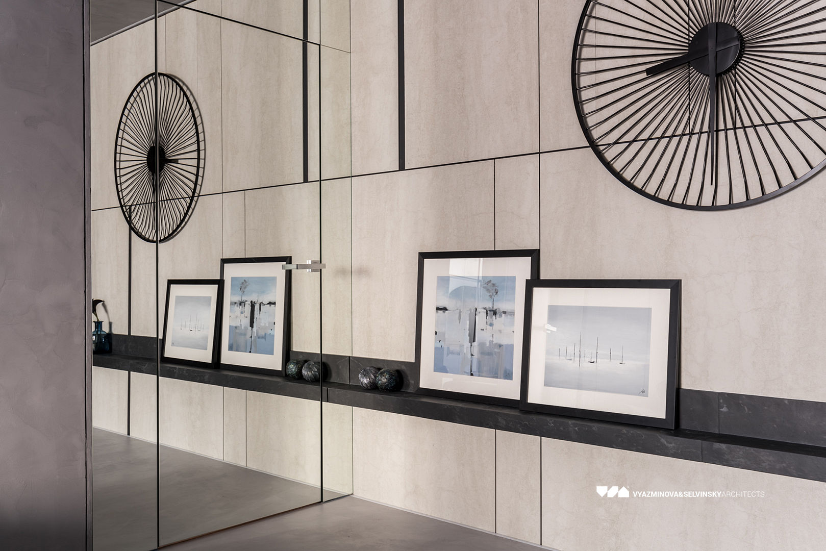
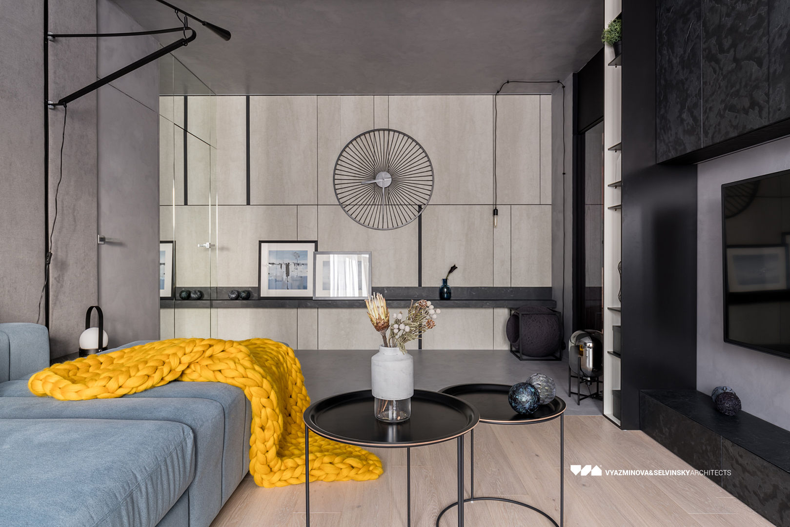
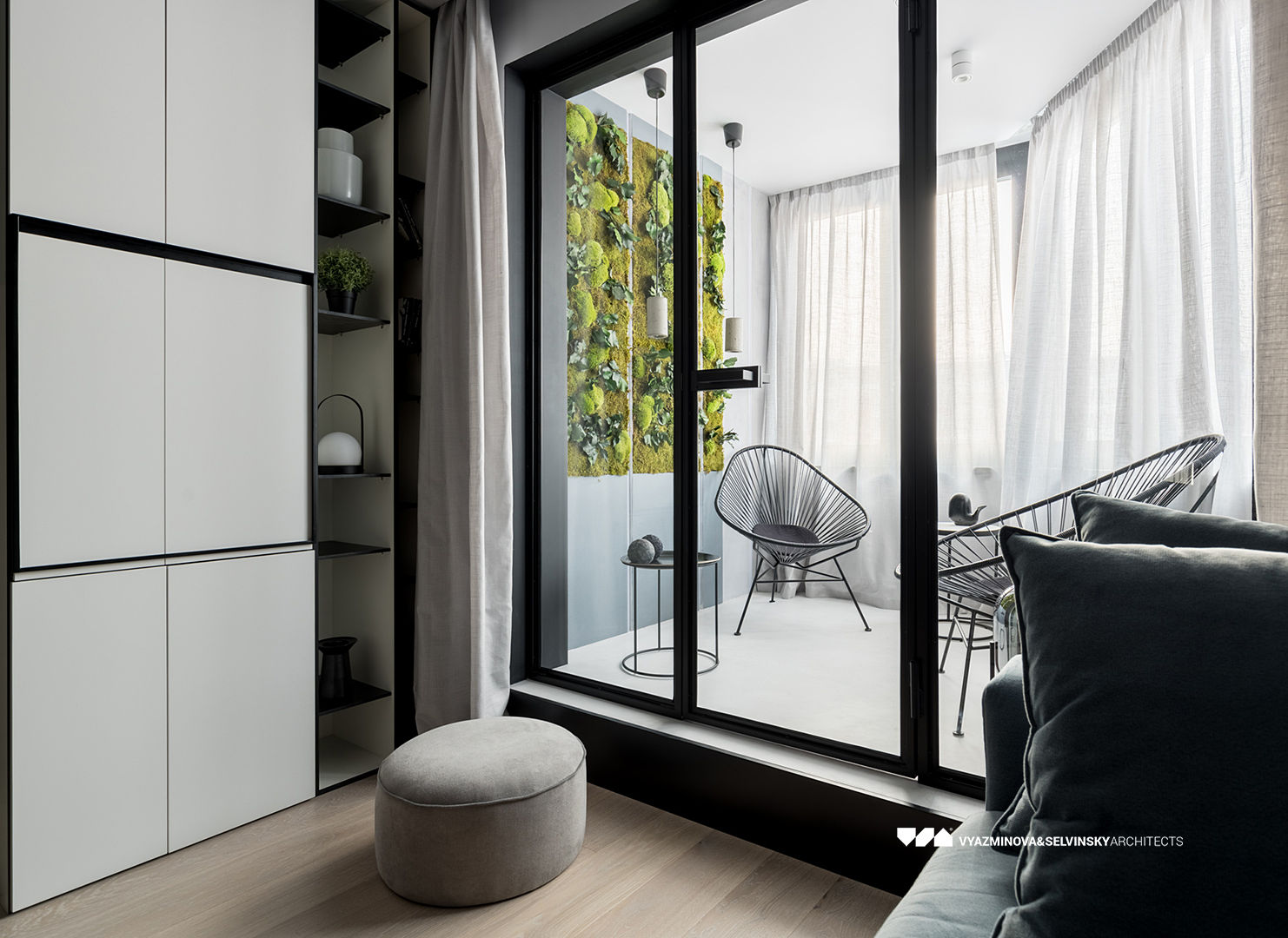
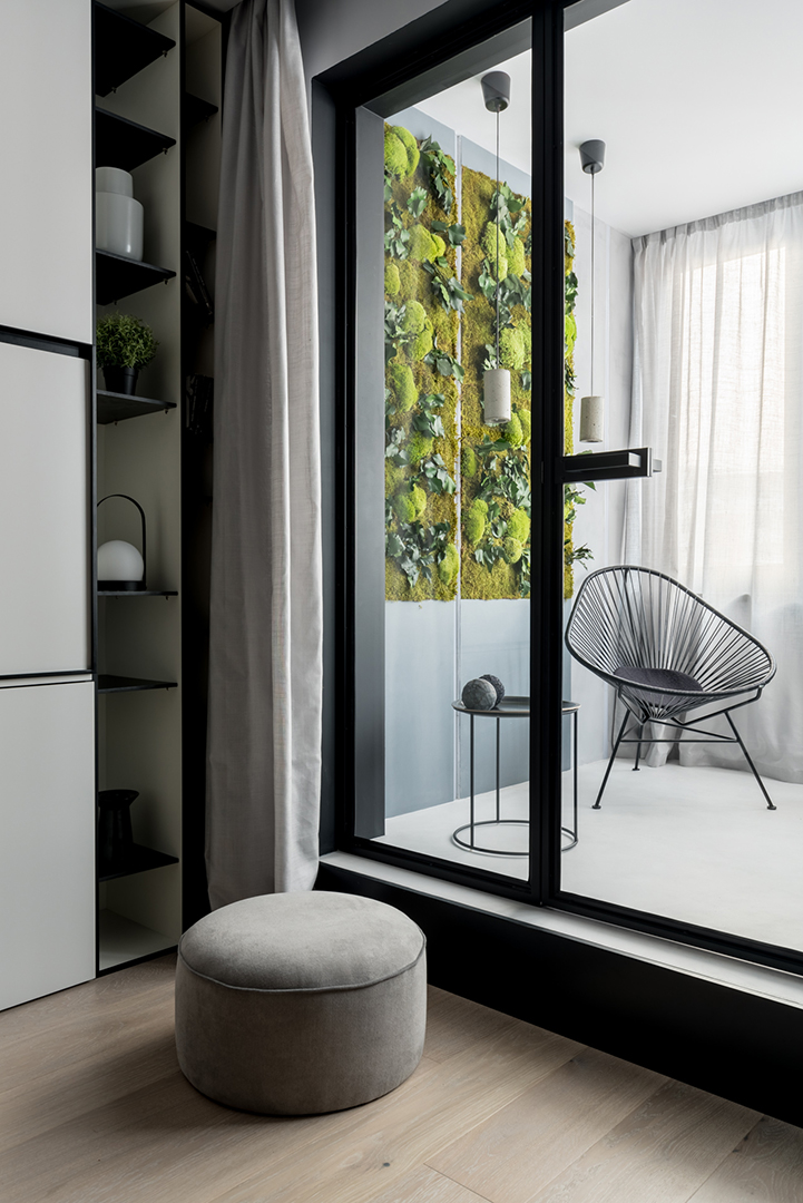
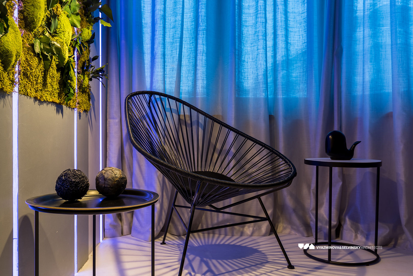
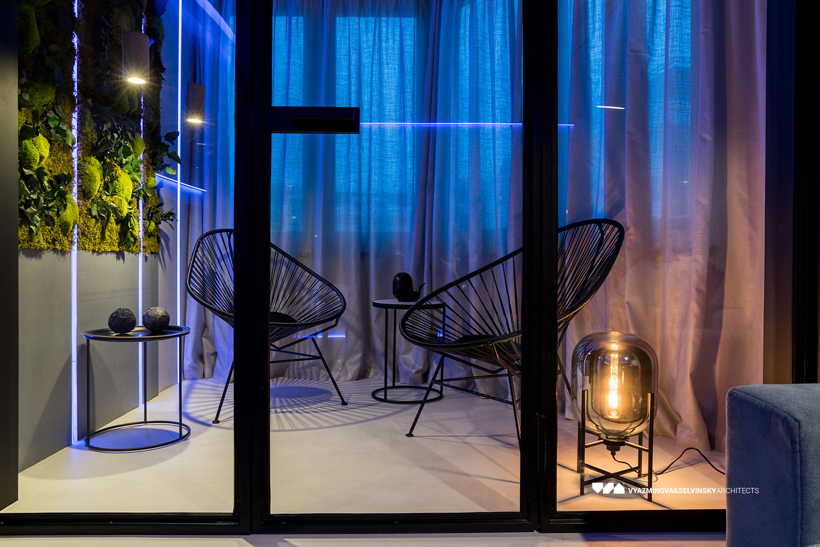
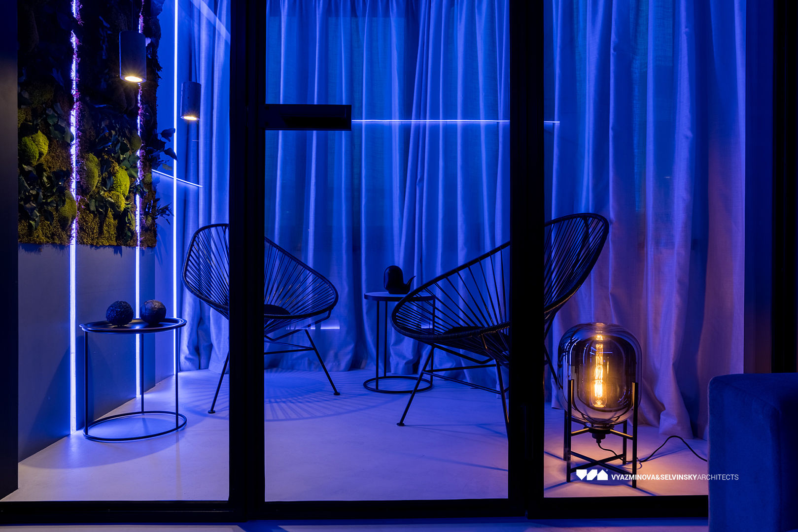
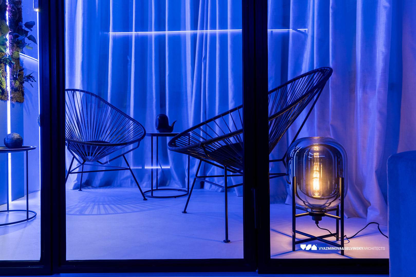
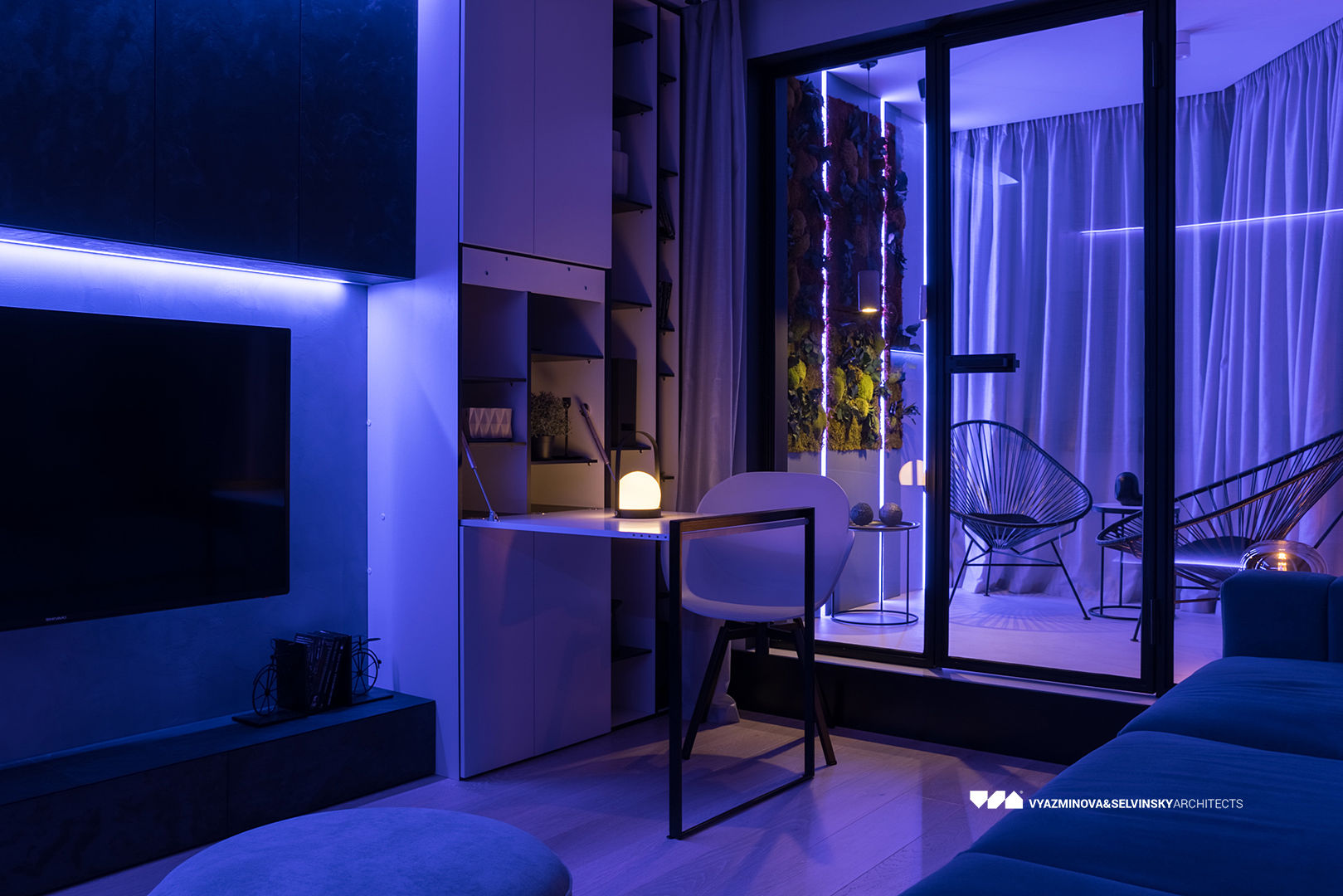
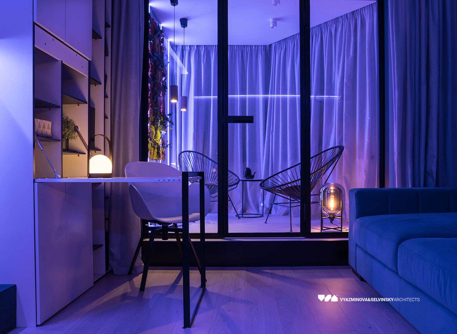
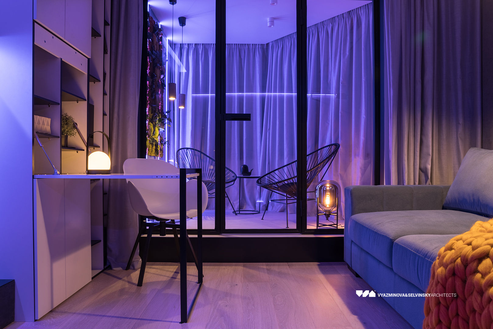
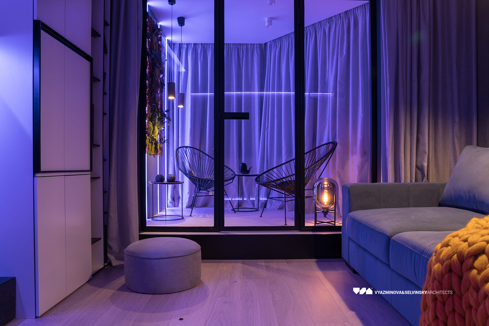
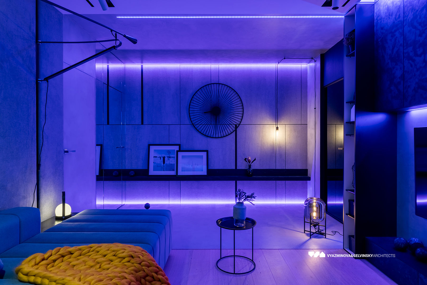
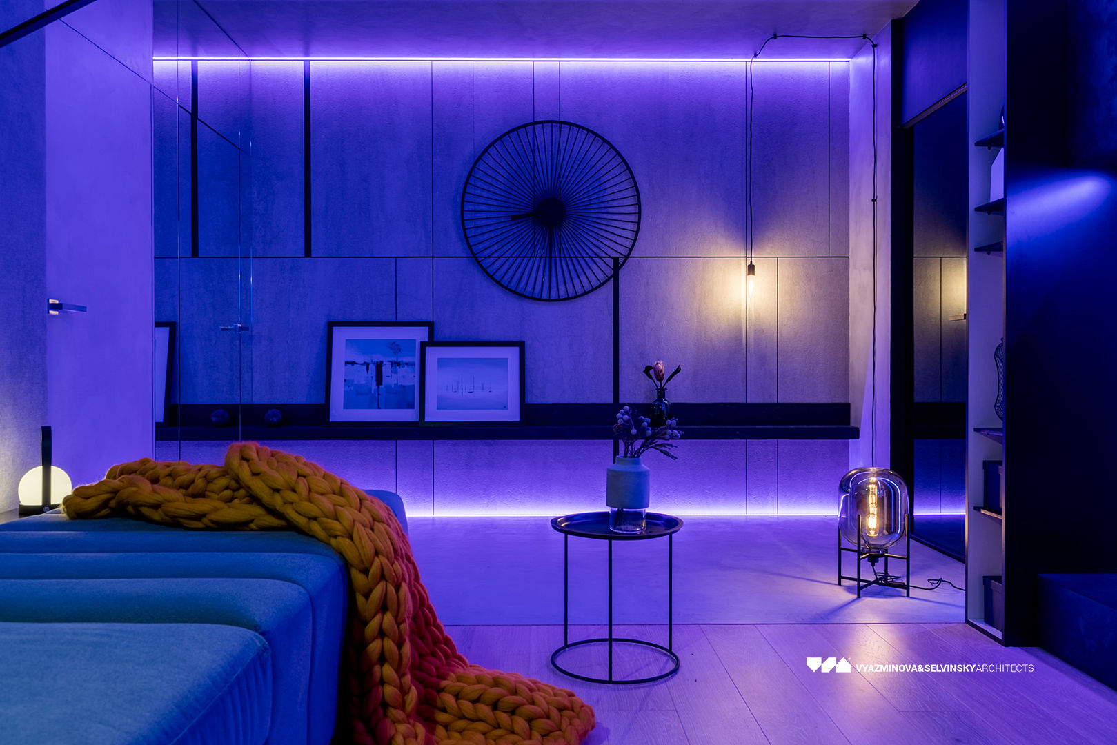
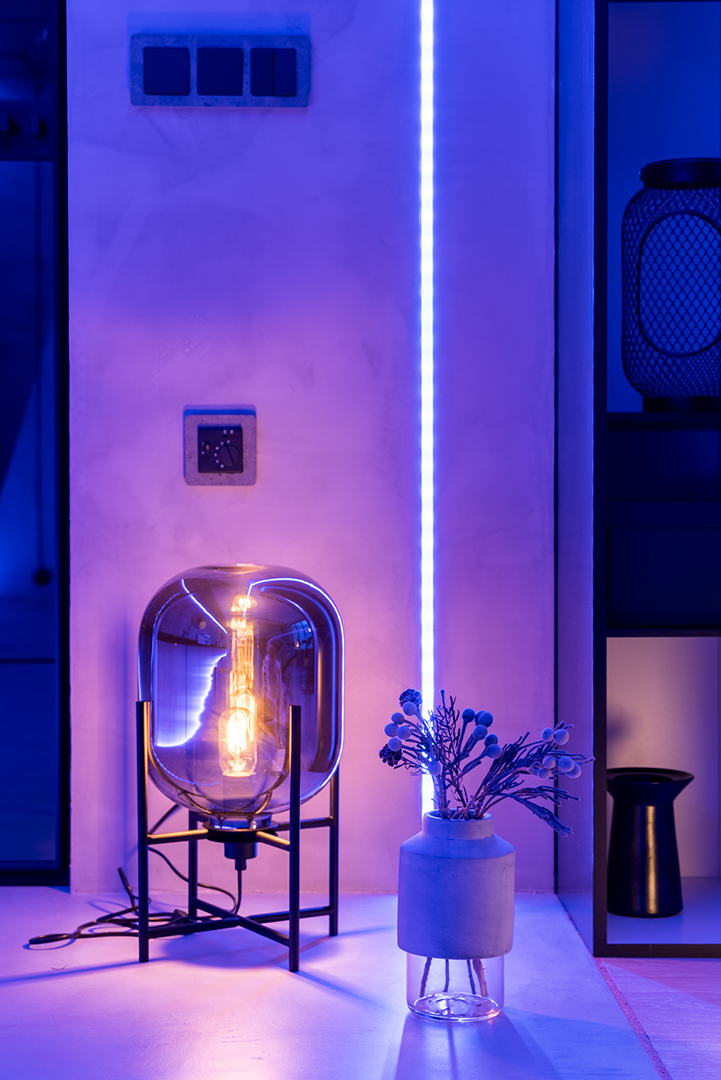
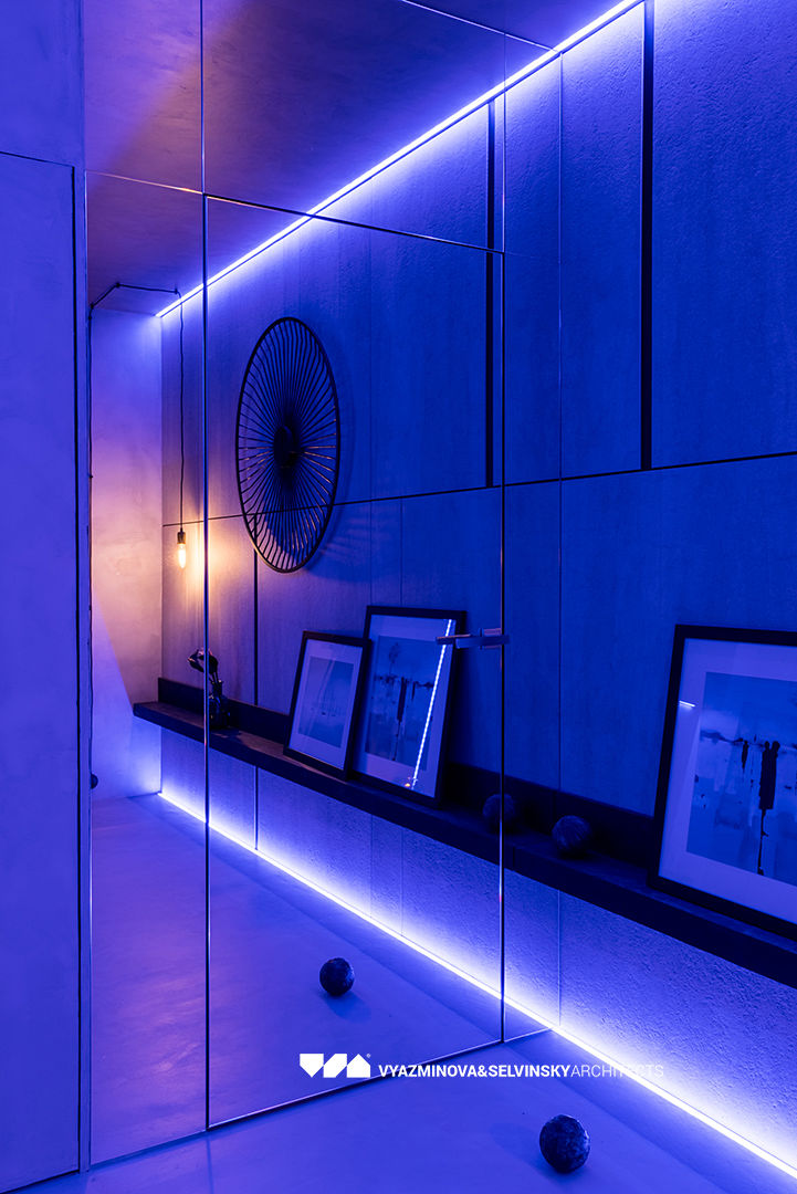
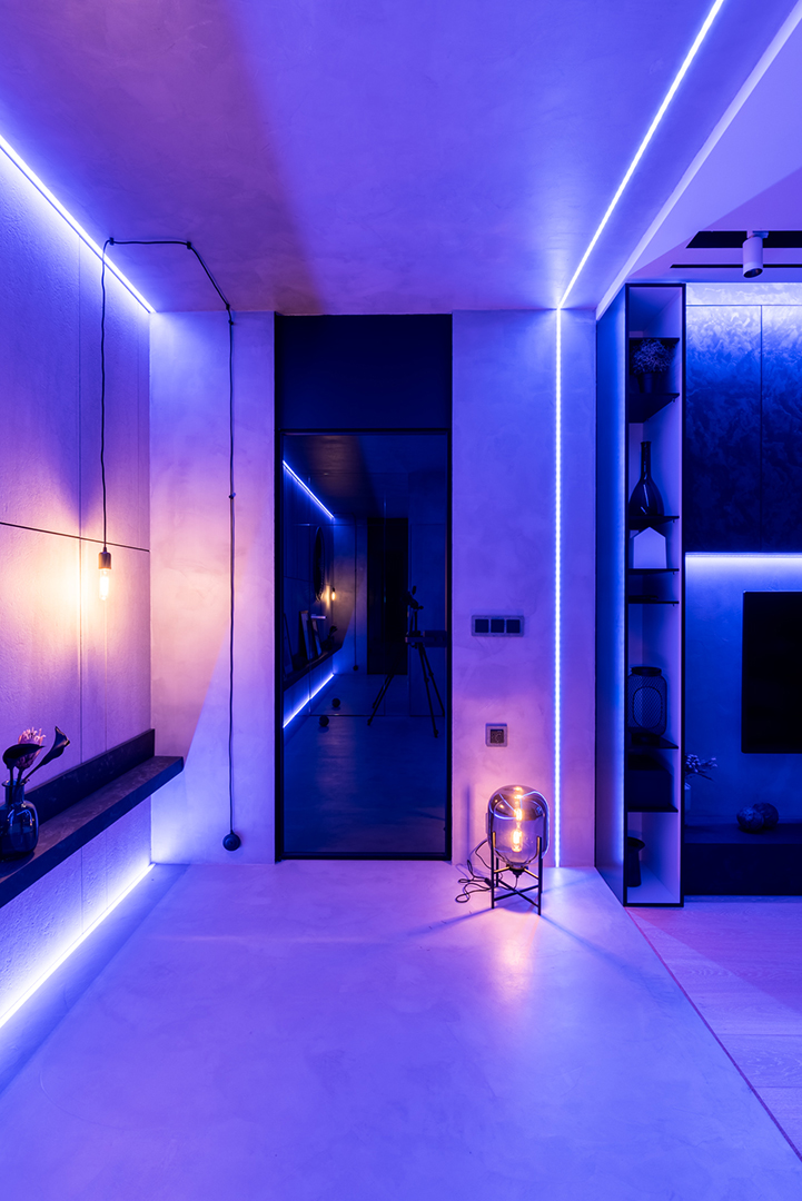
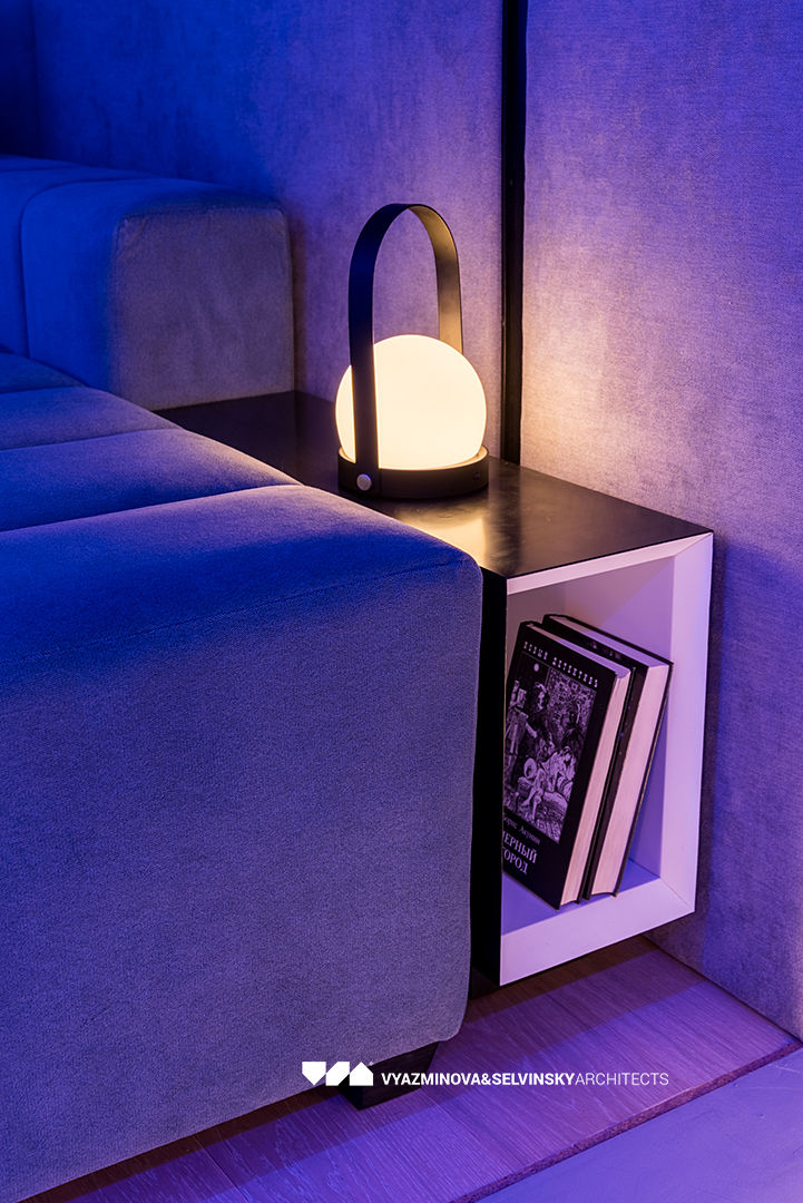
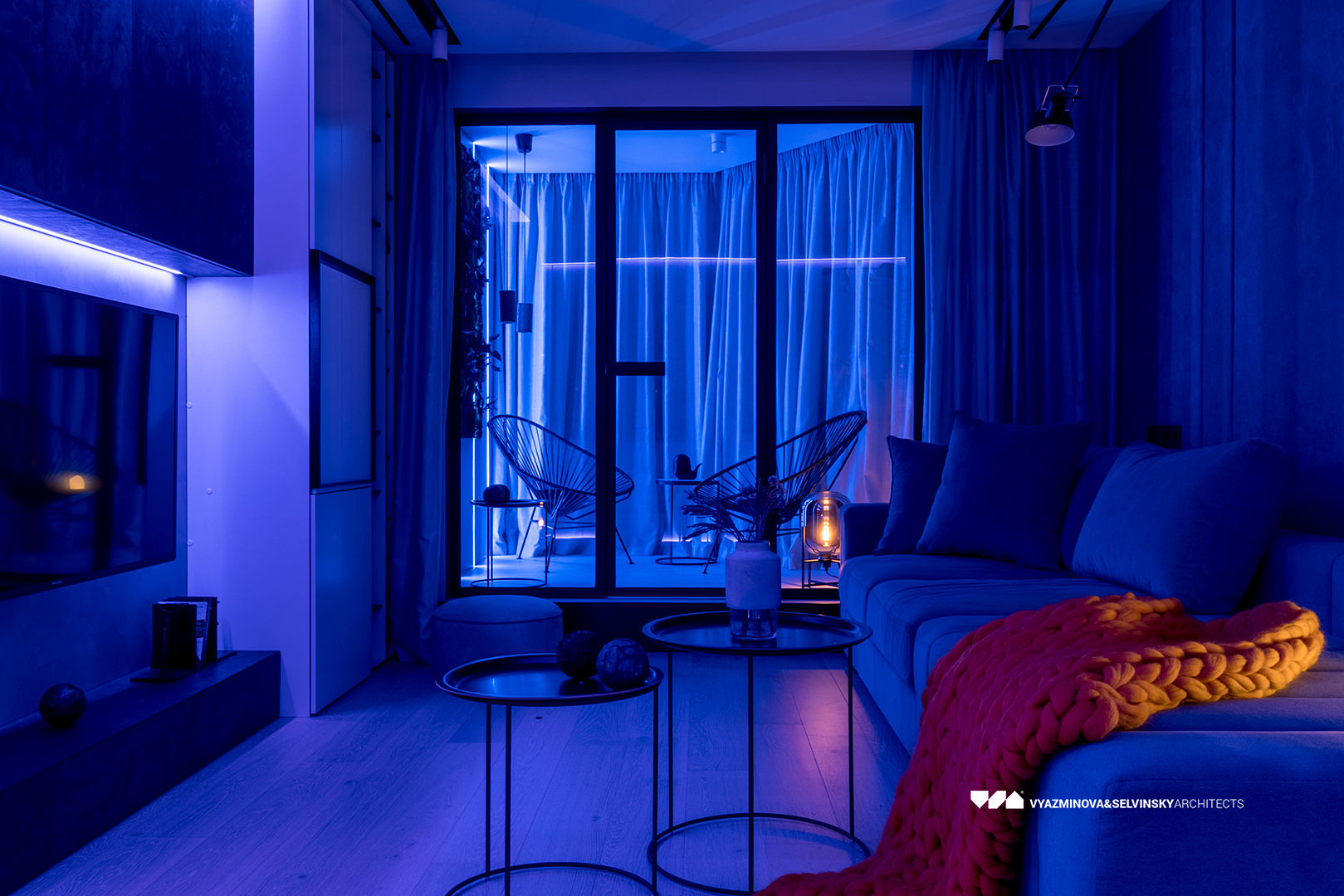
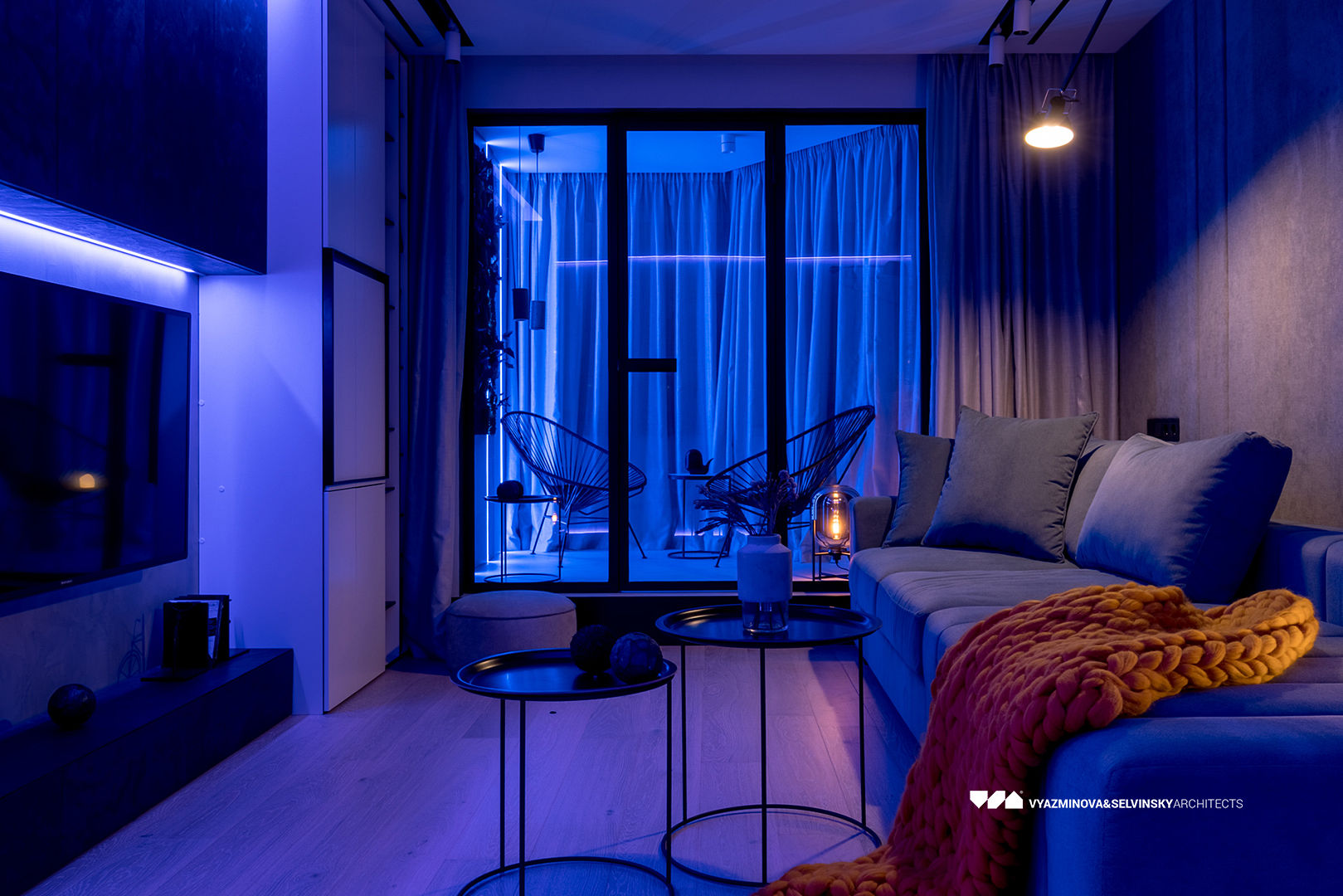
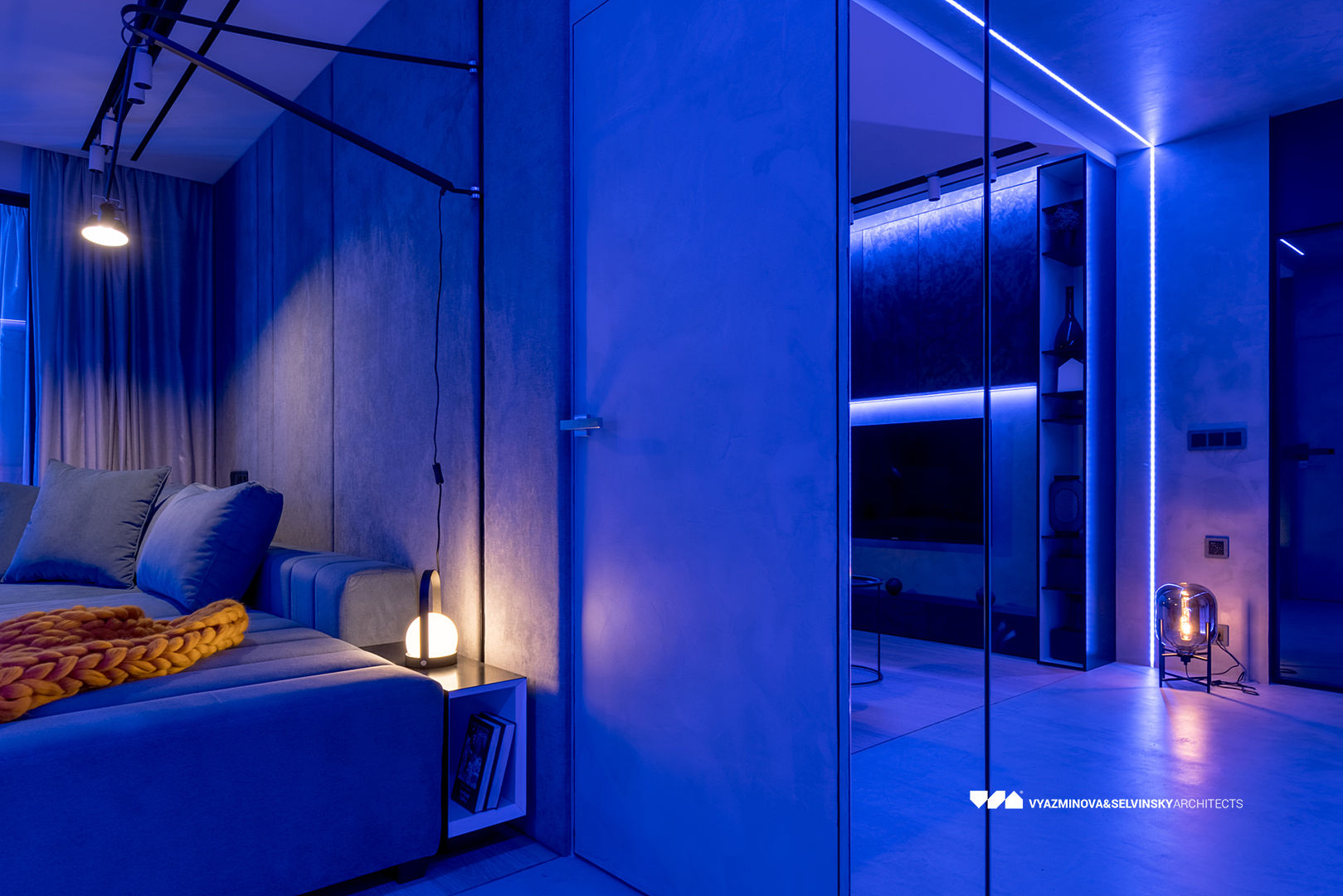
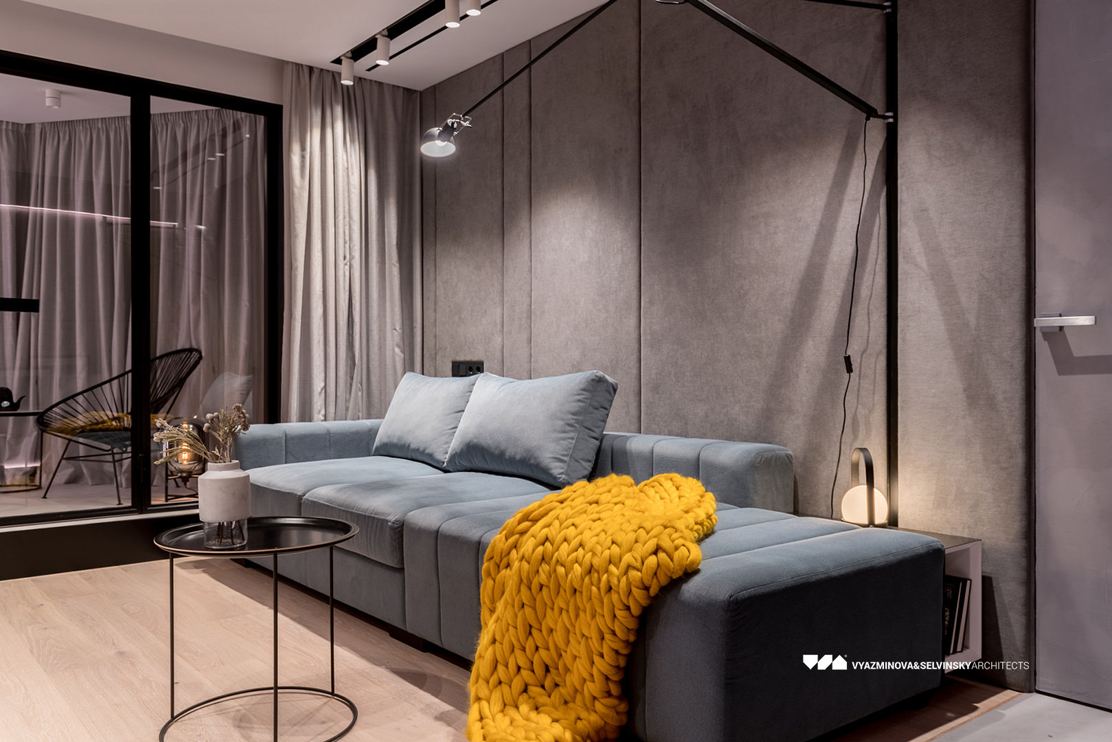
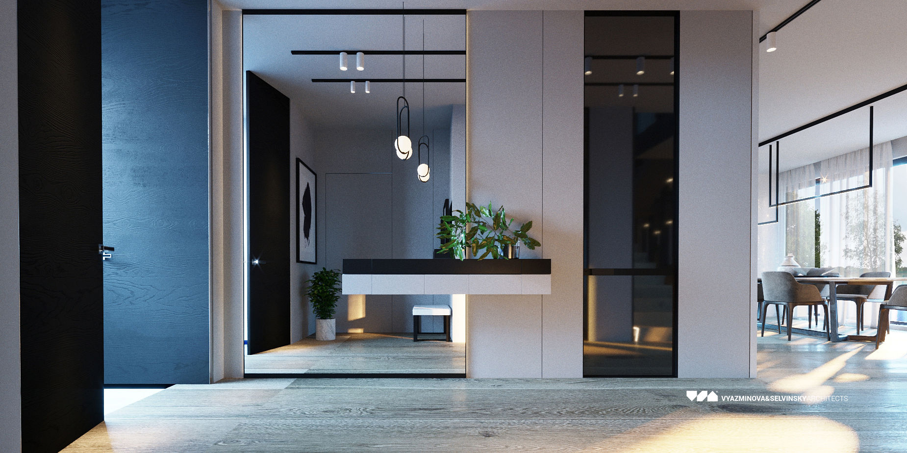
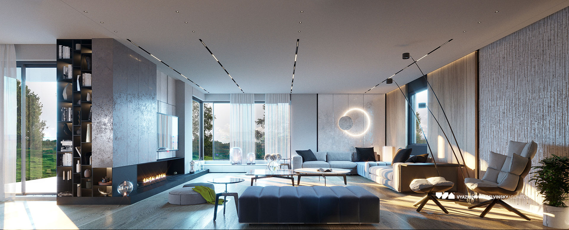
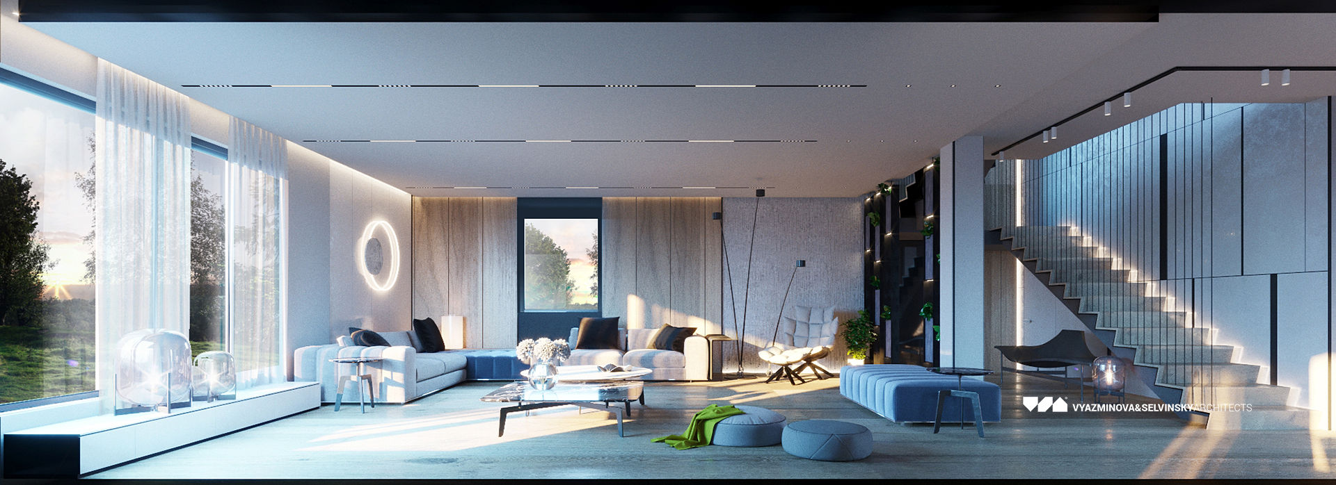
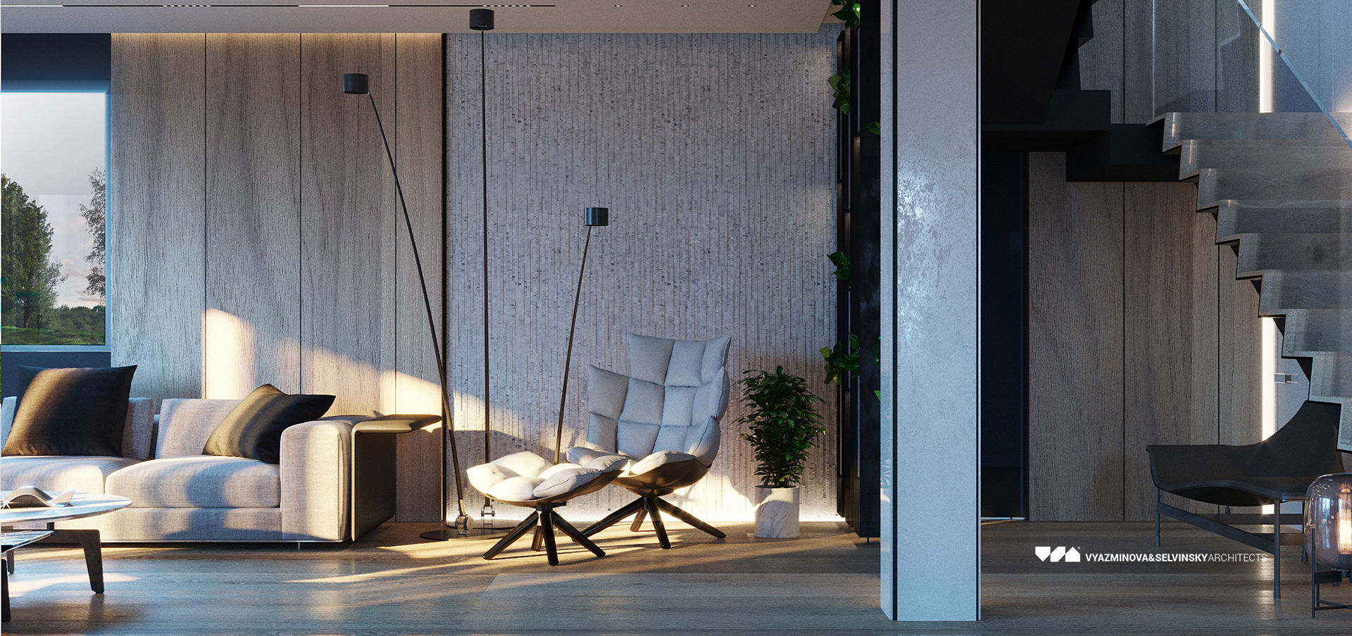
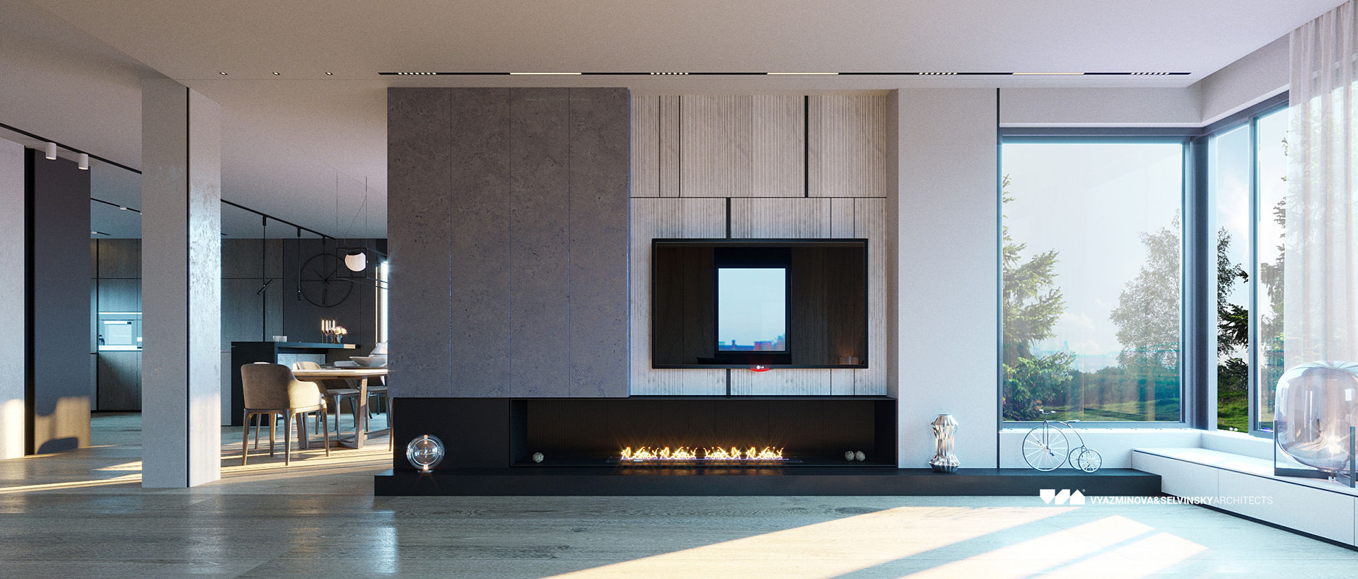
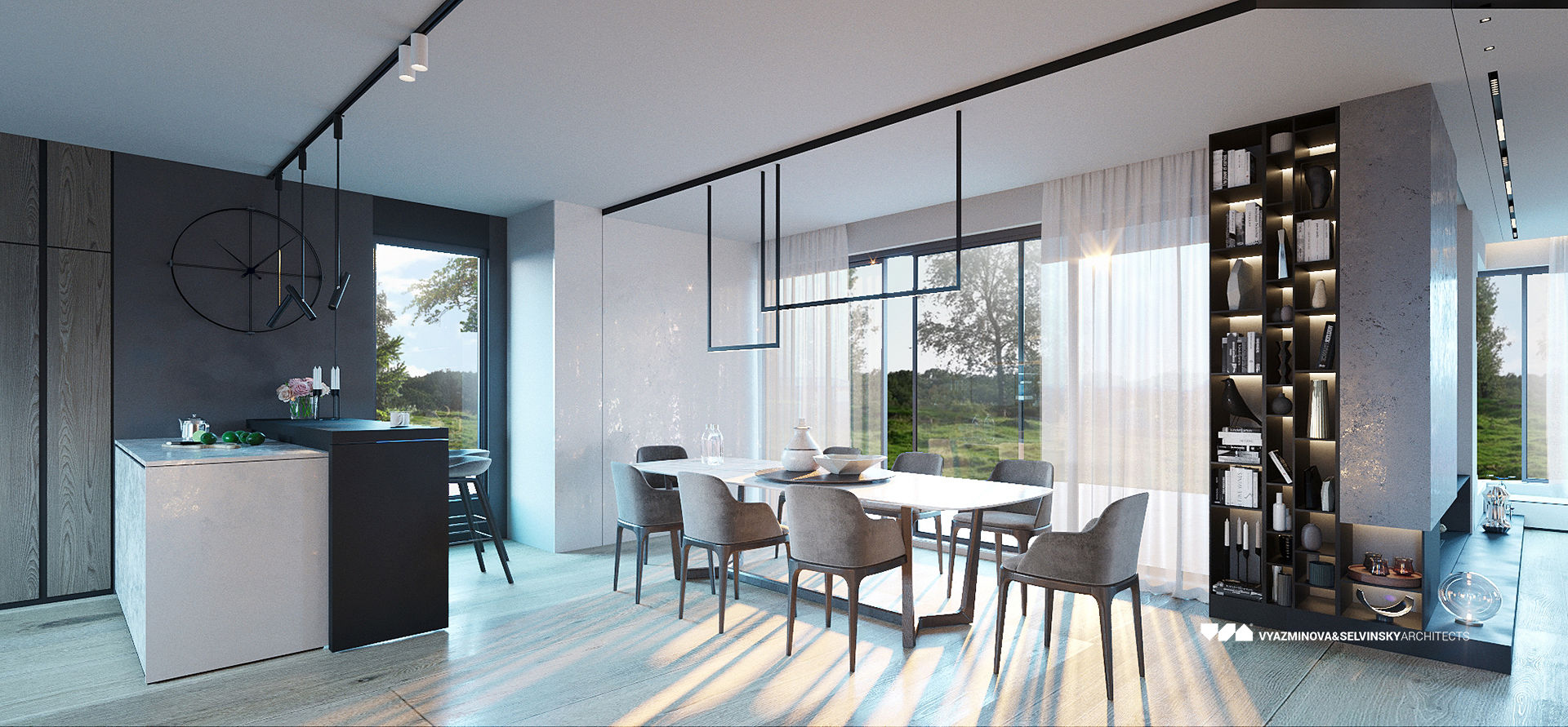
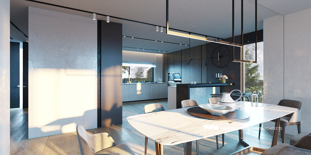
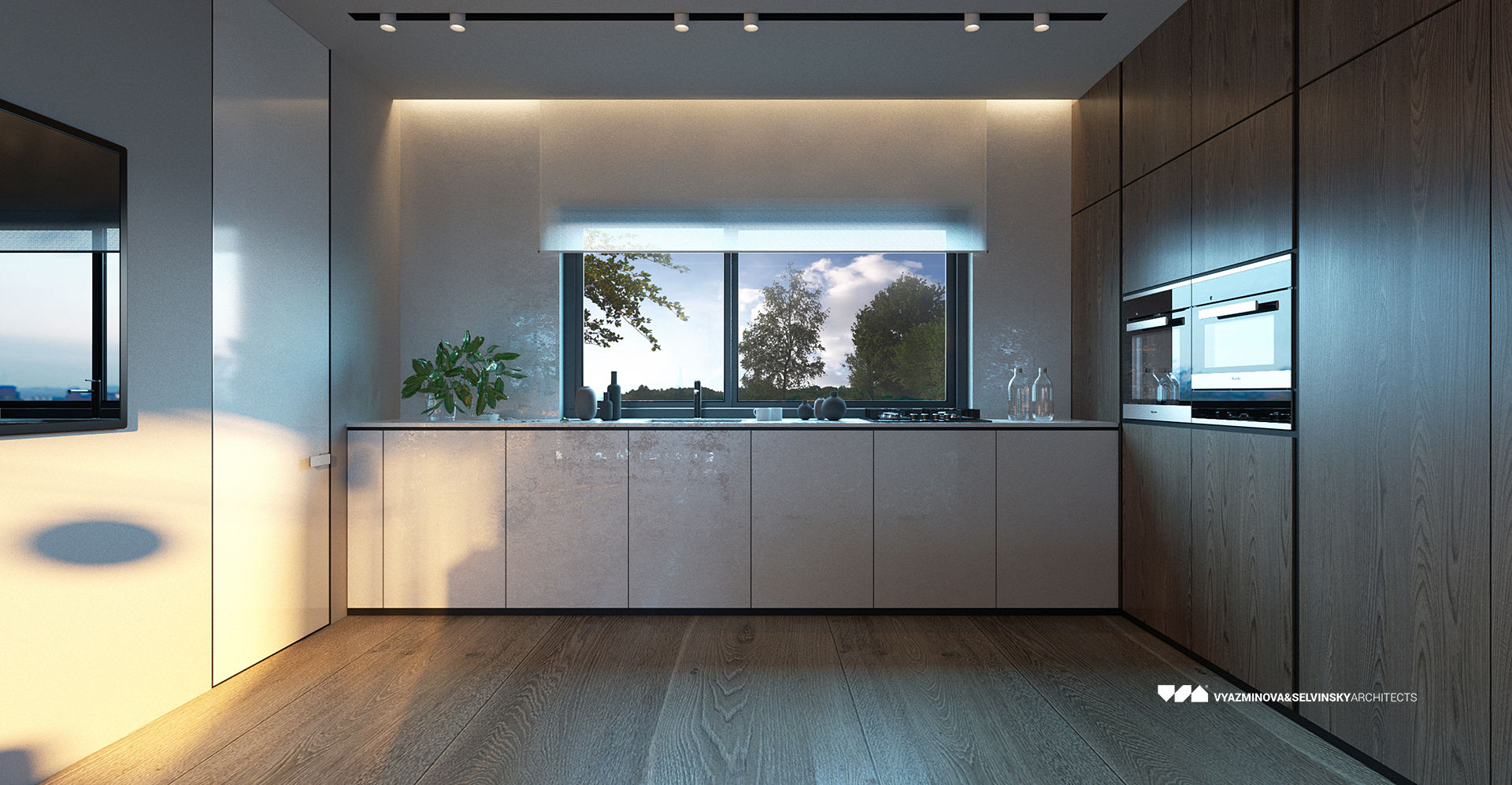
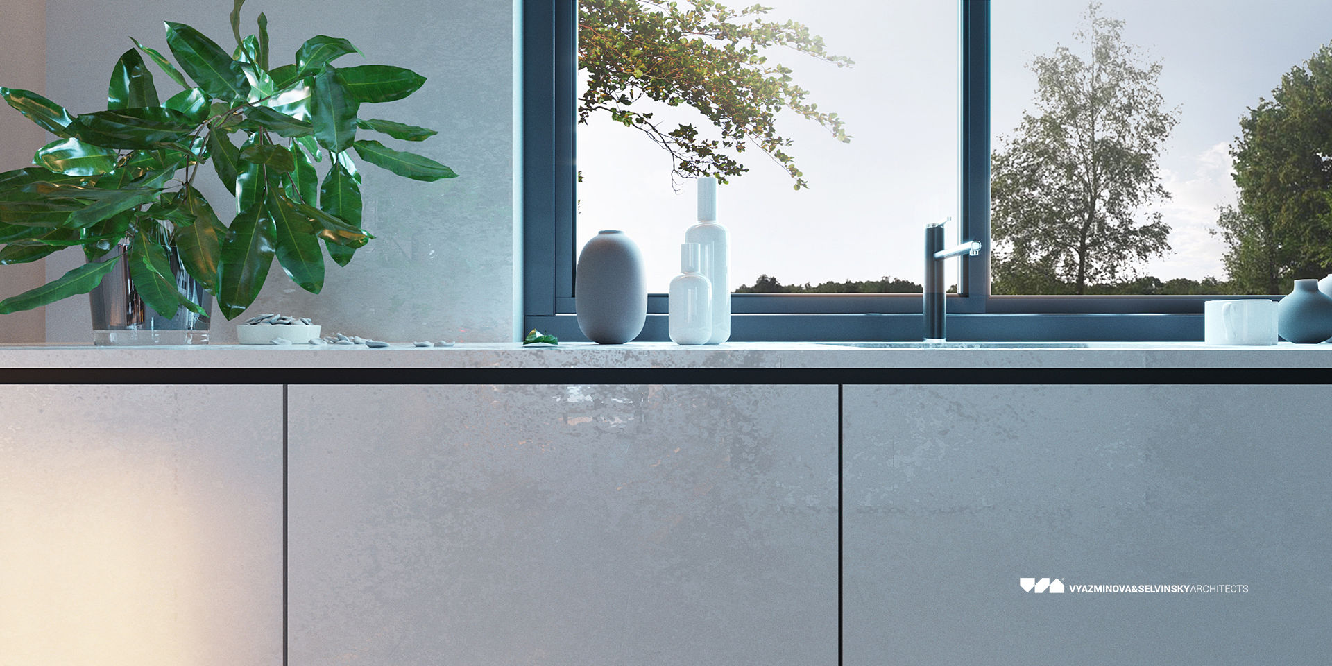
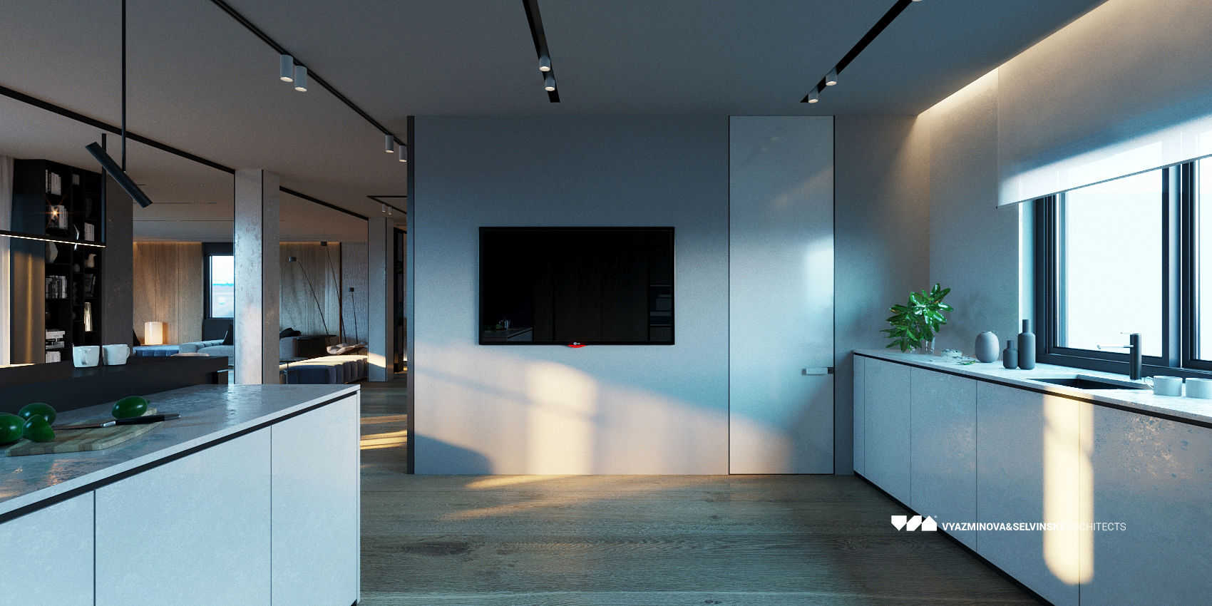
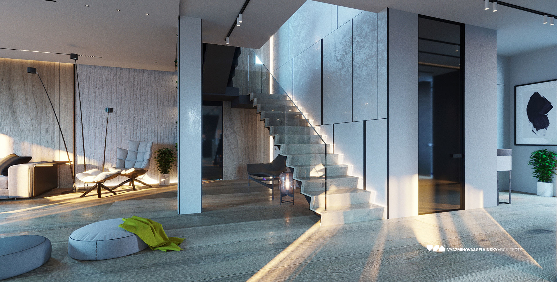
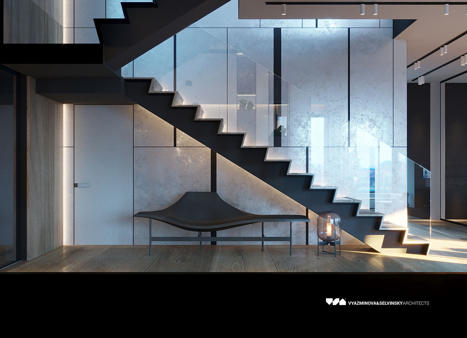
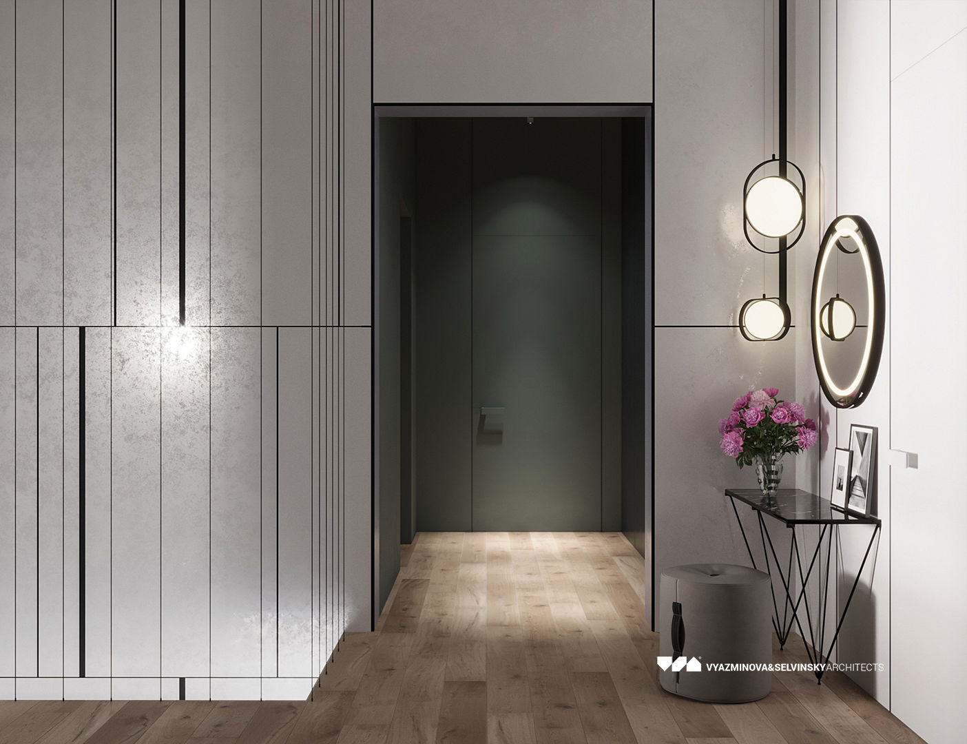
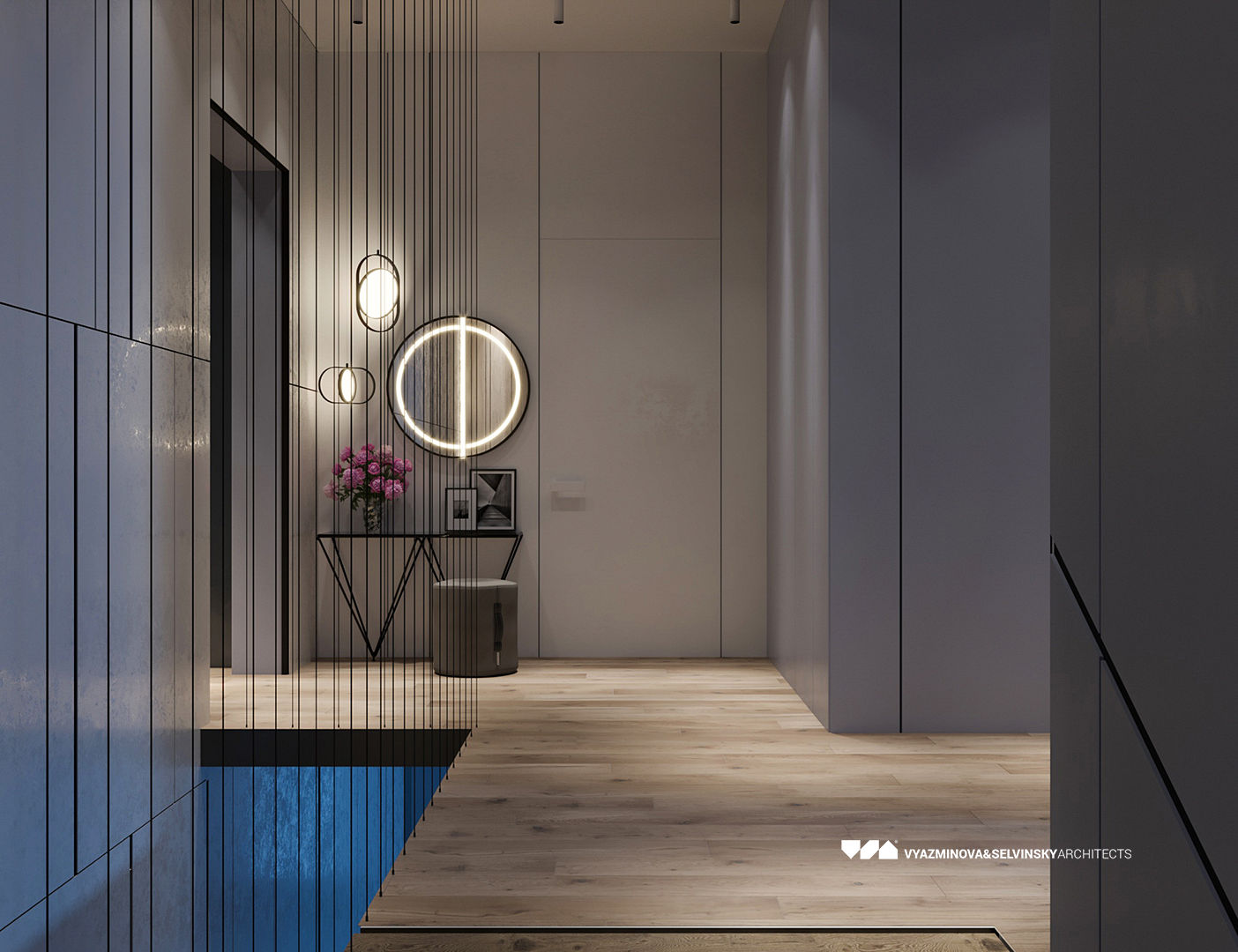
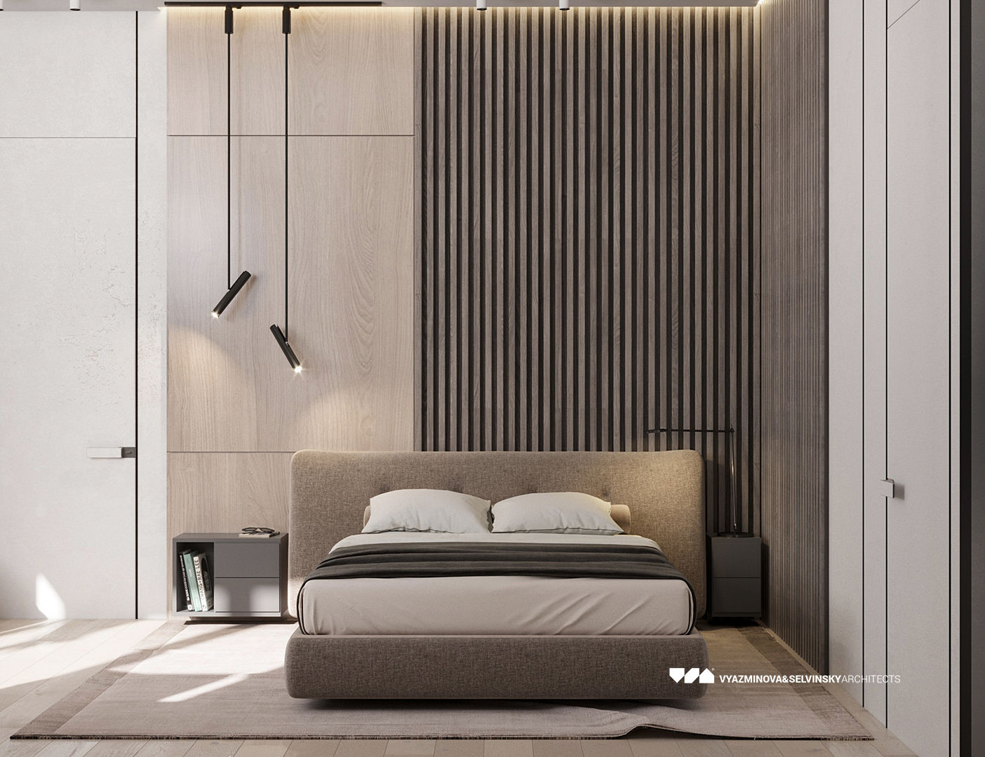
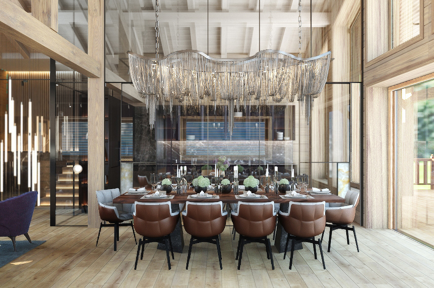
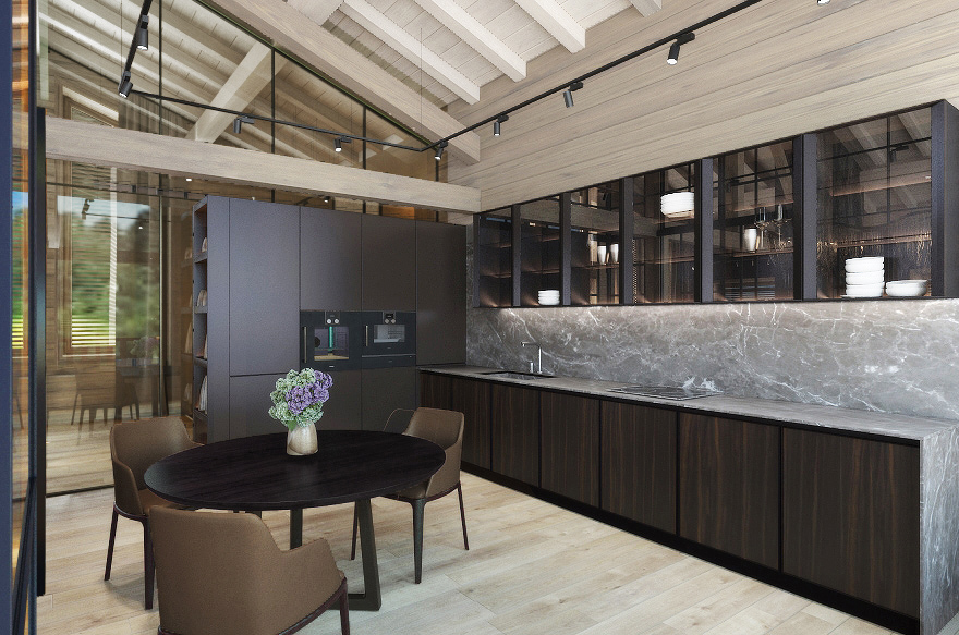
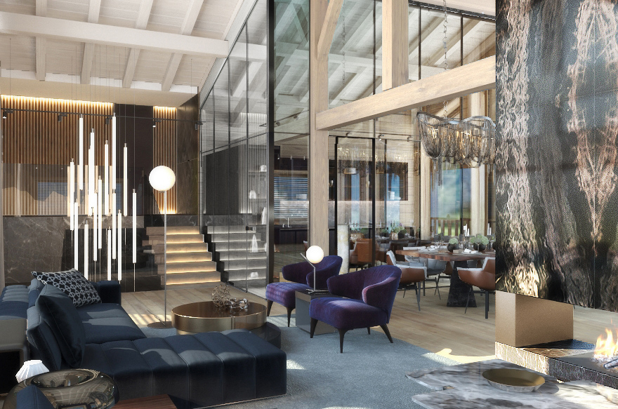
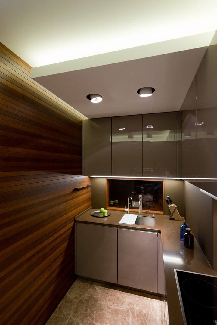
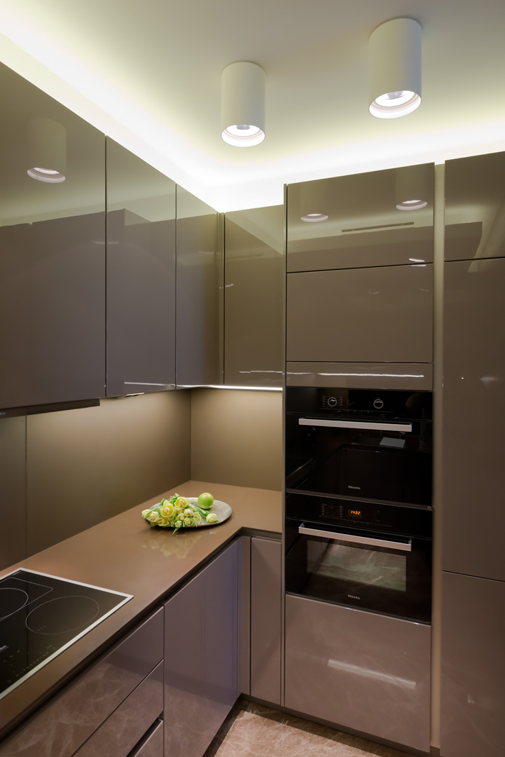
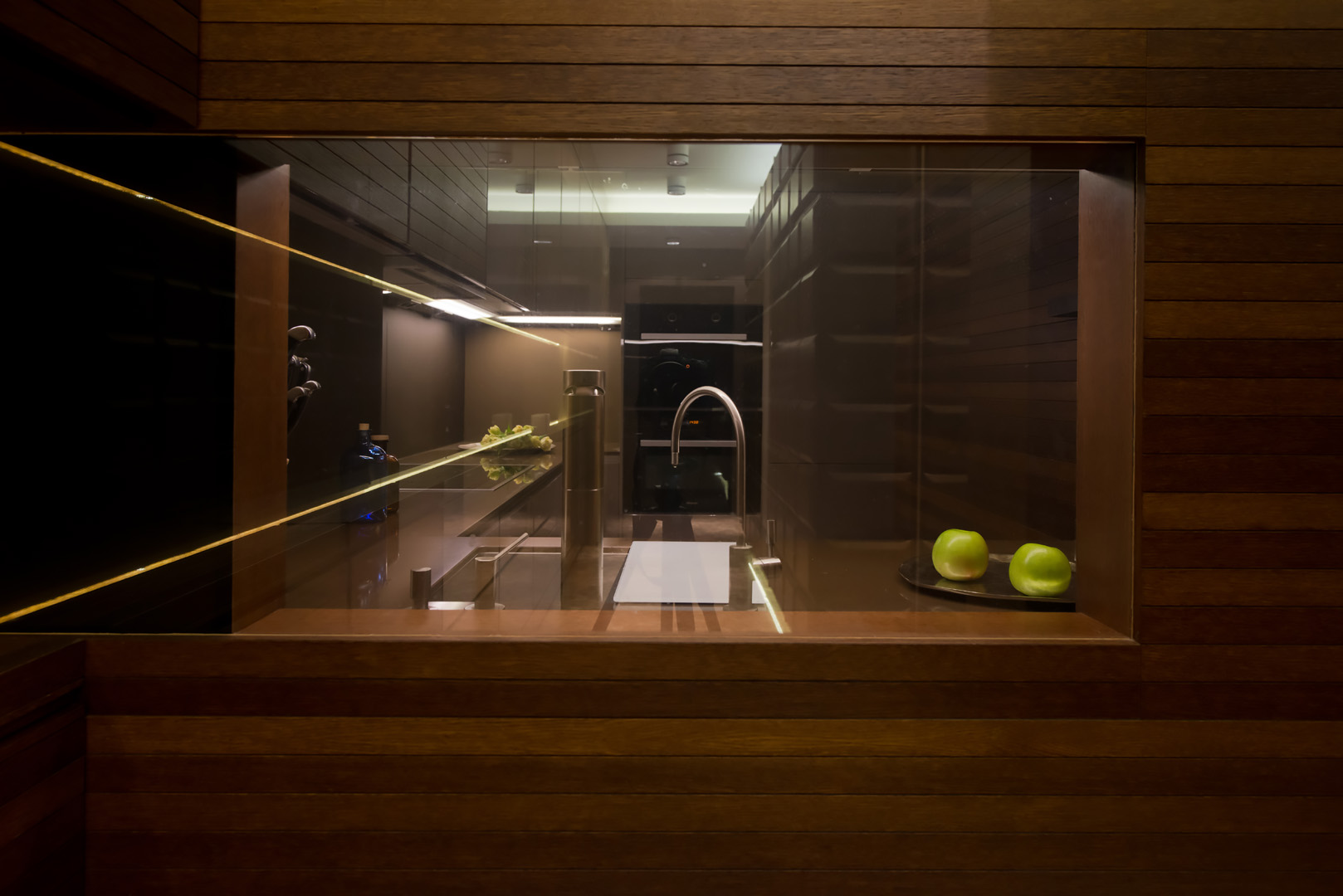
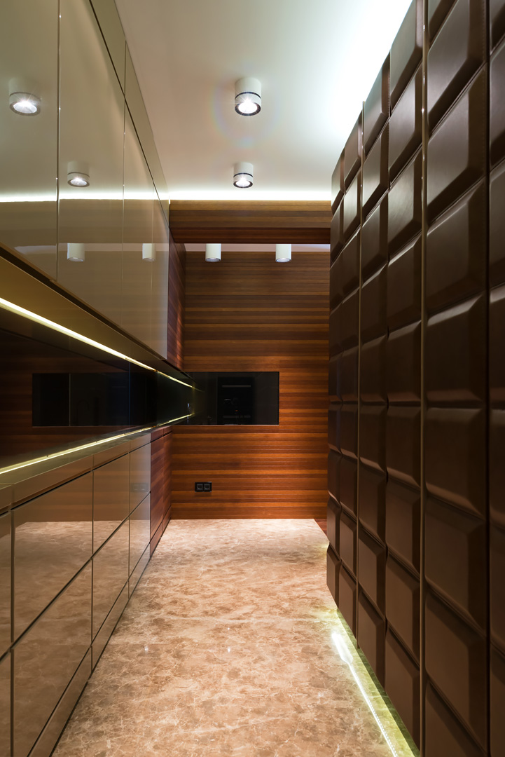
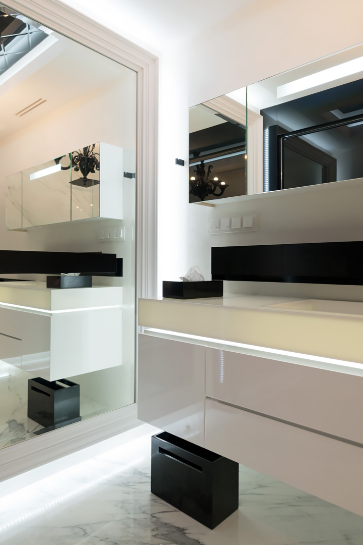
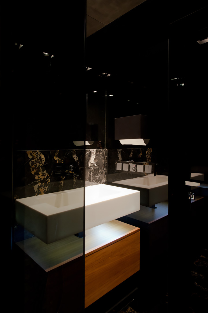
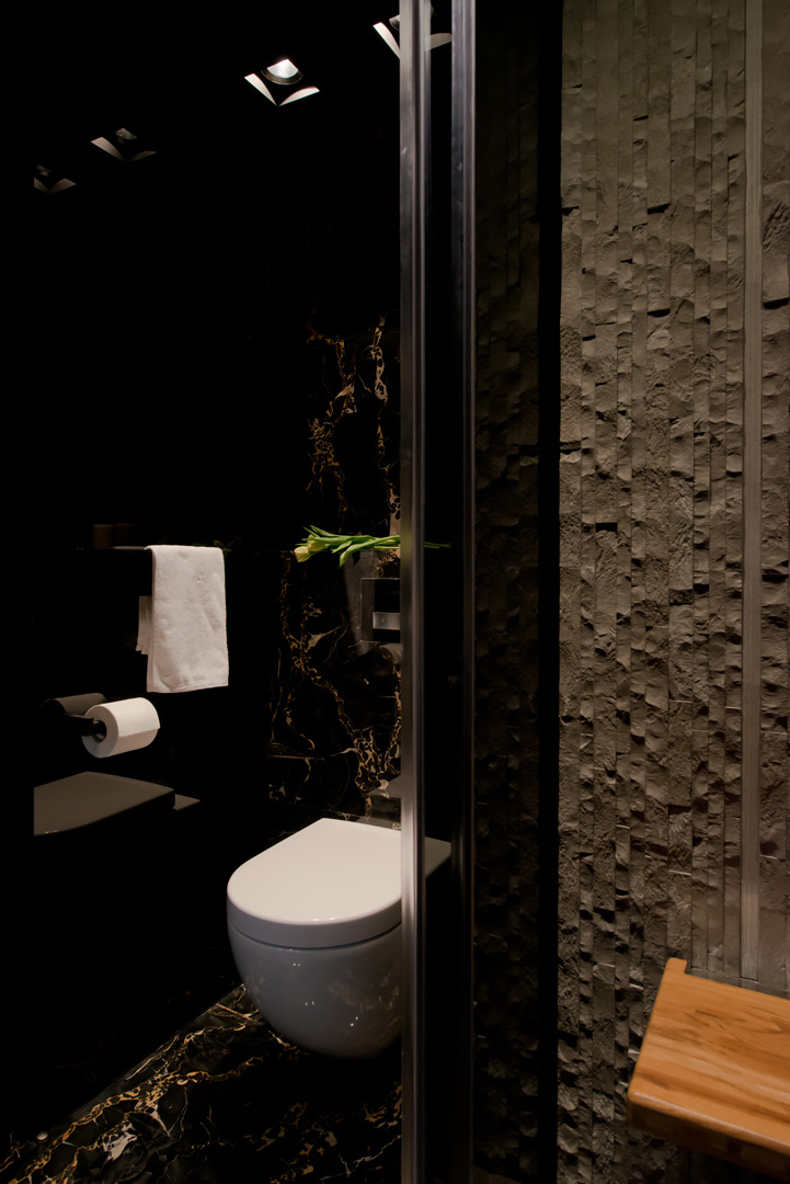
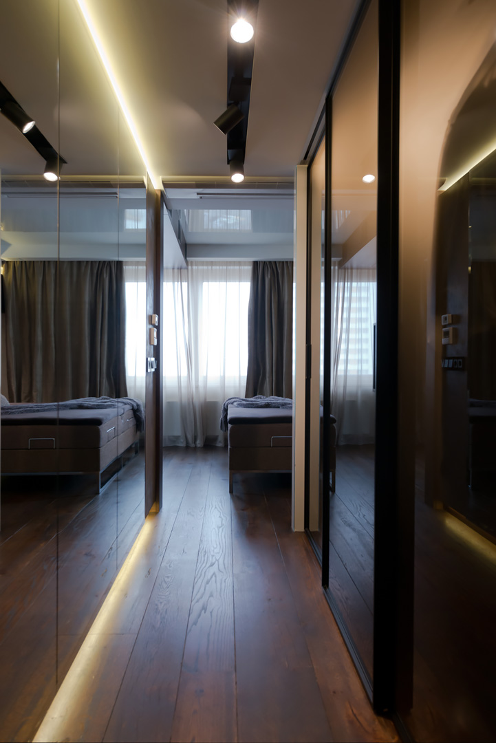
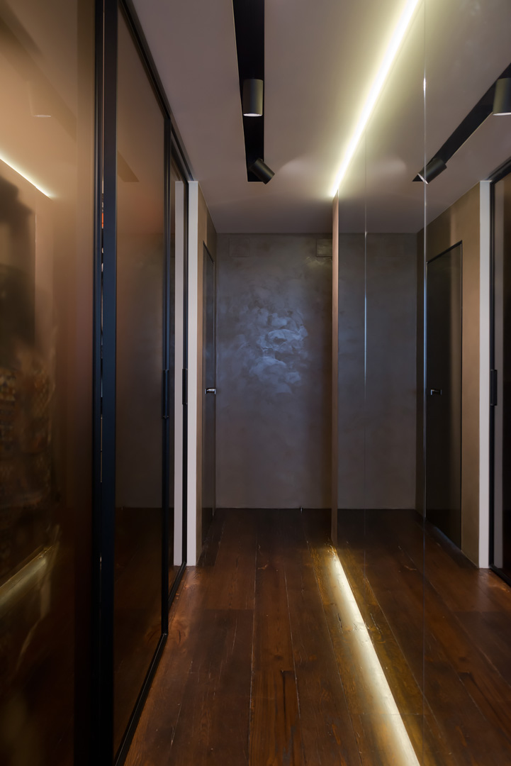
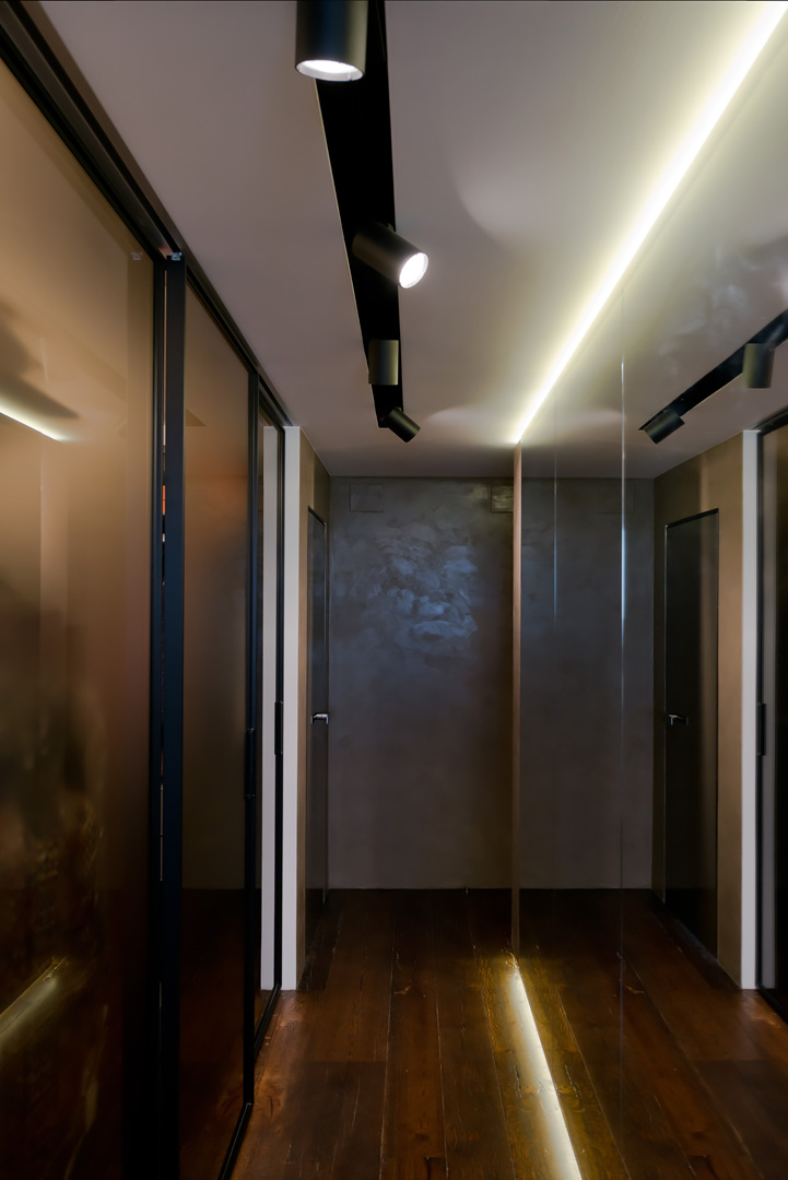
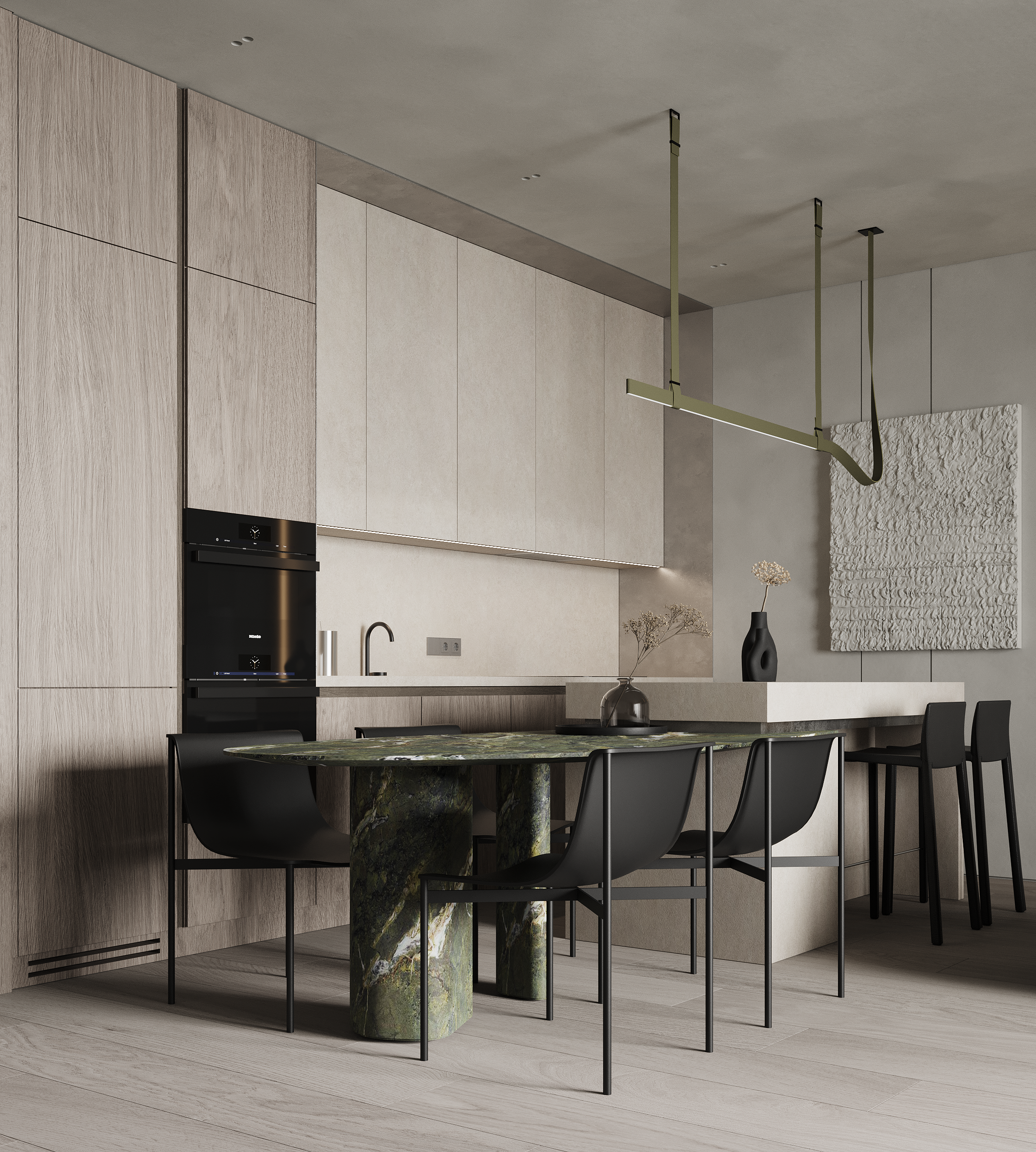
Our team designed the interior for a typical apartment in the clubhouse LUCE on Krestovozdvizhensky Lane for MR Group. One perfect style in three color schemes: light, dark and polychrome. We offer you the dark version.
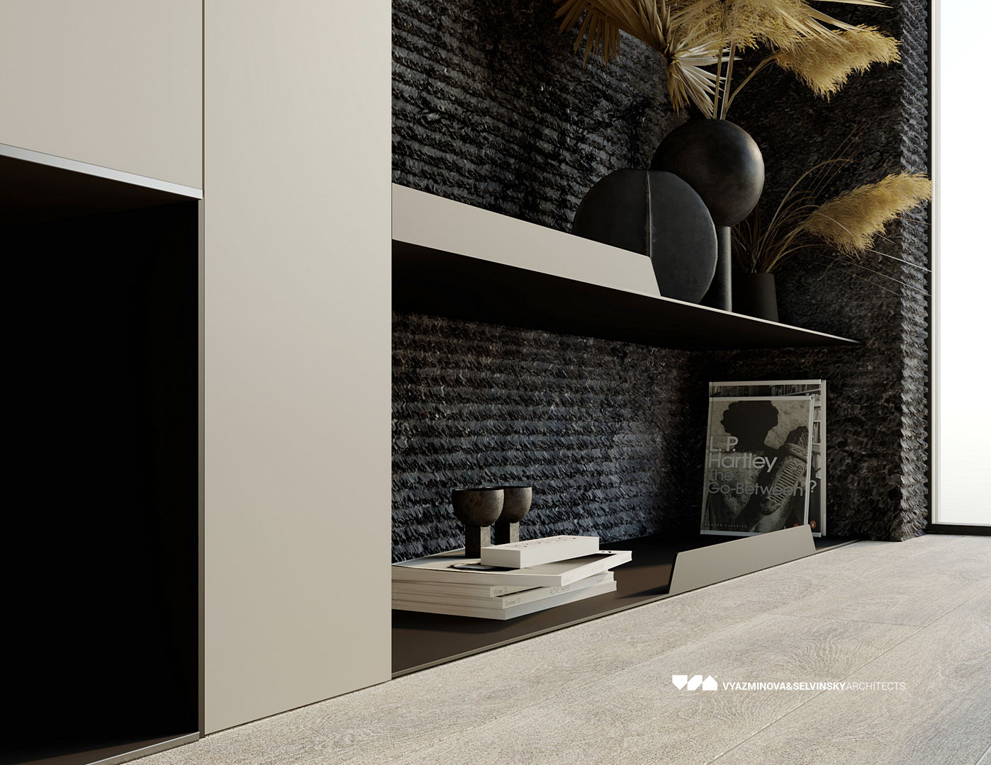
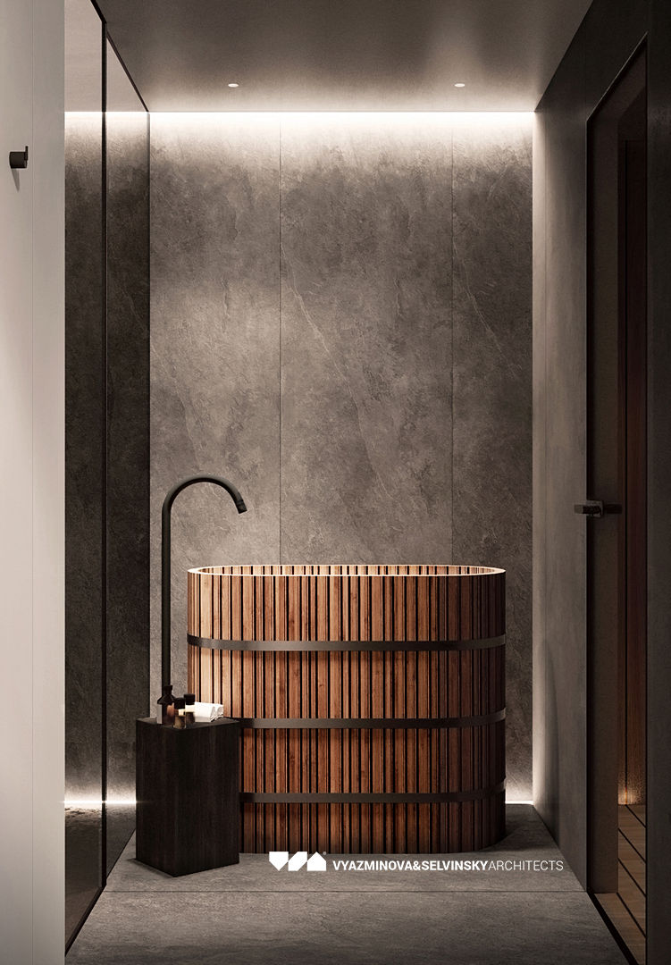
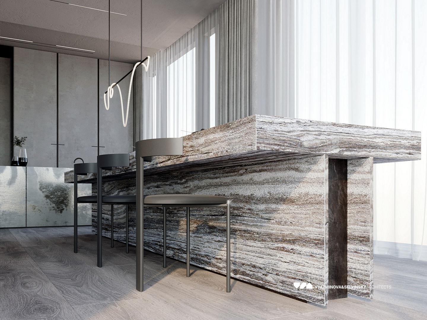
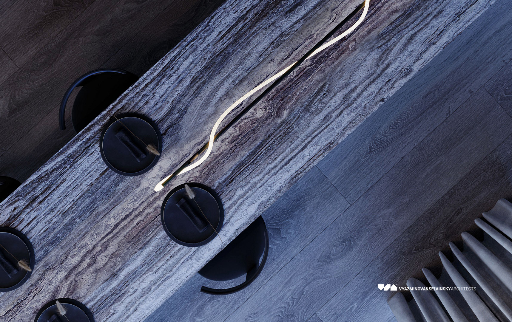
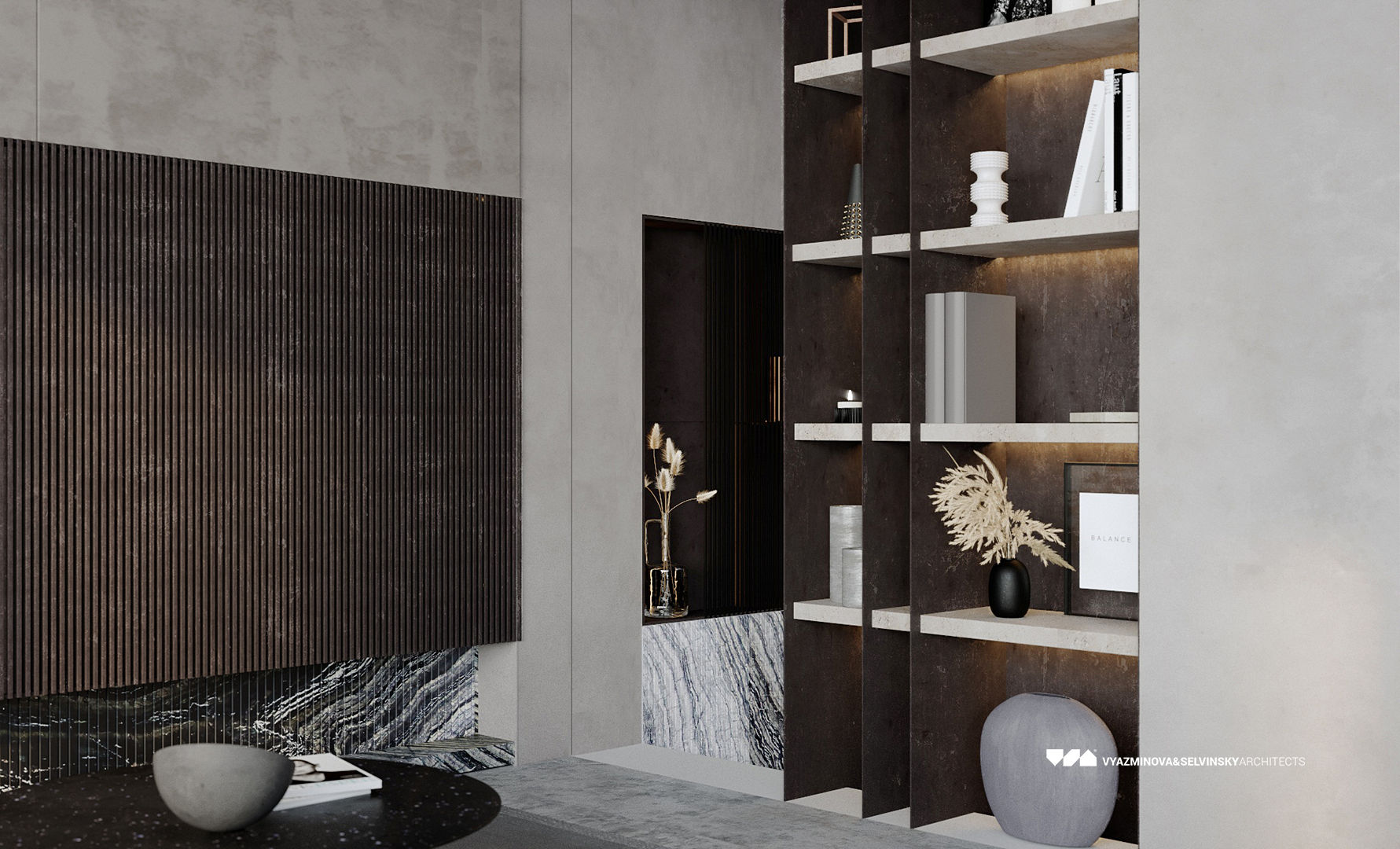
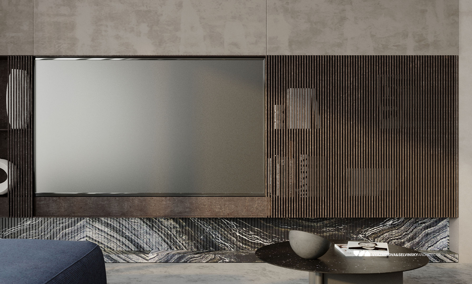
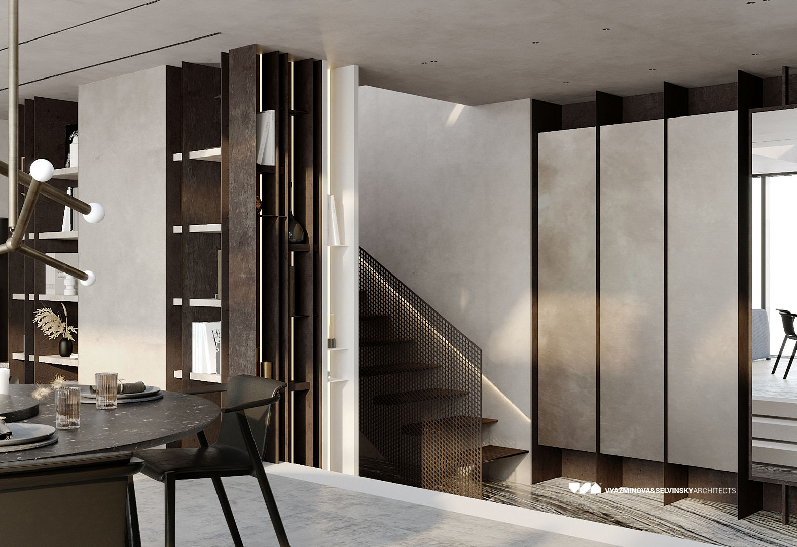
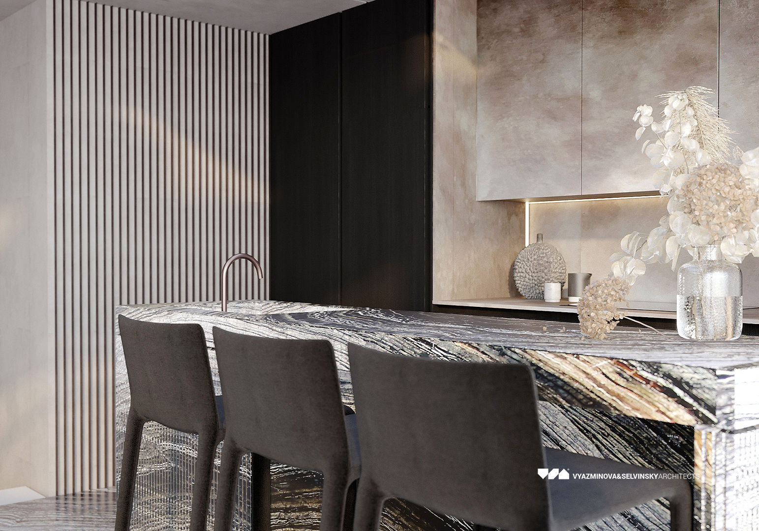
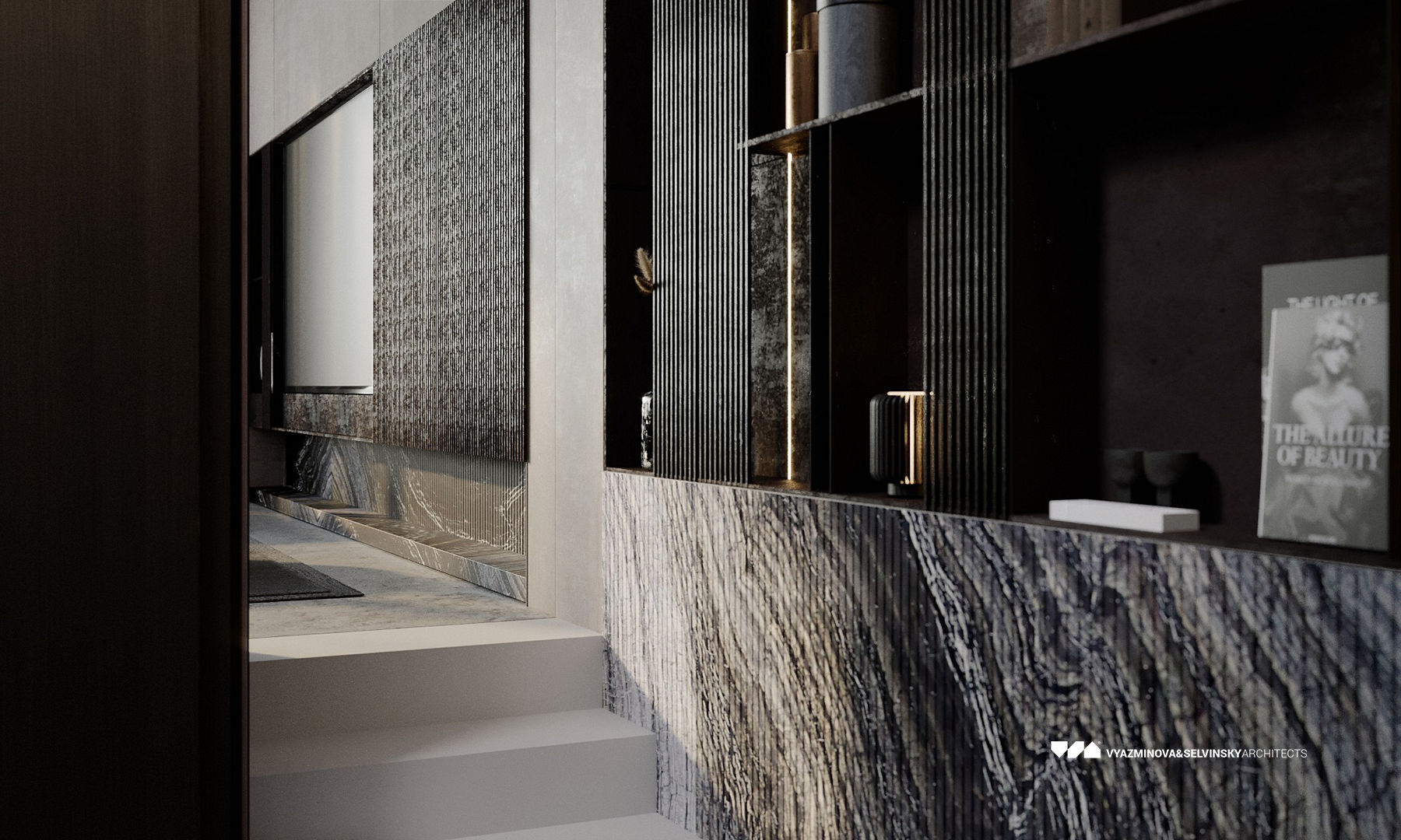
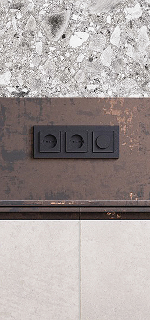
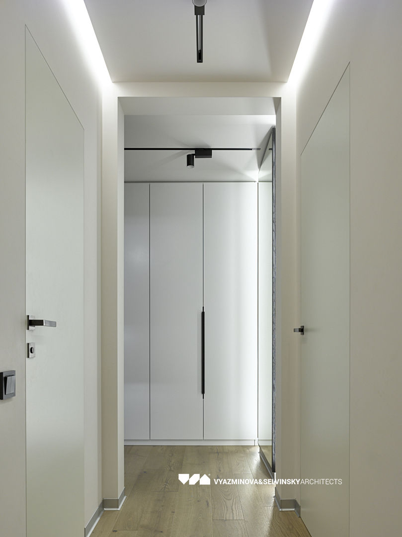
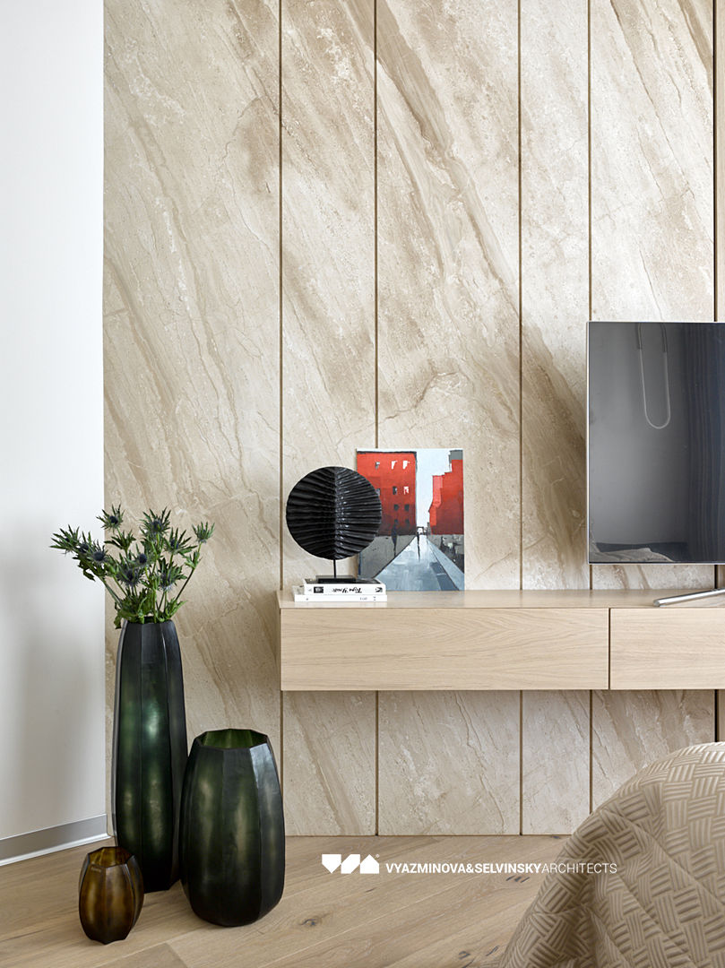
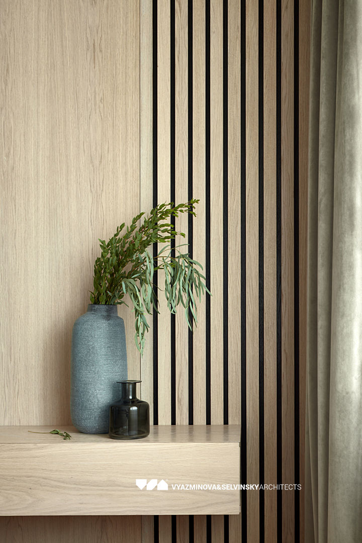
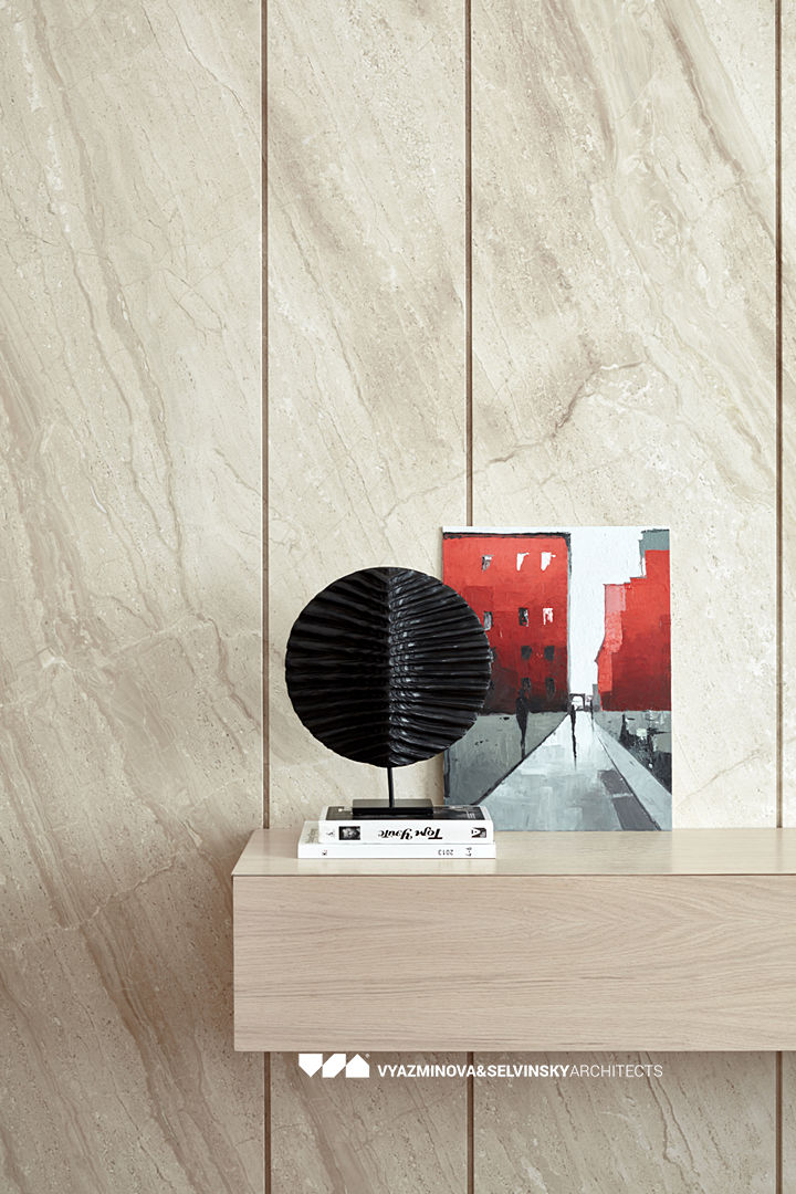
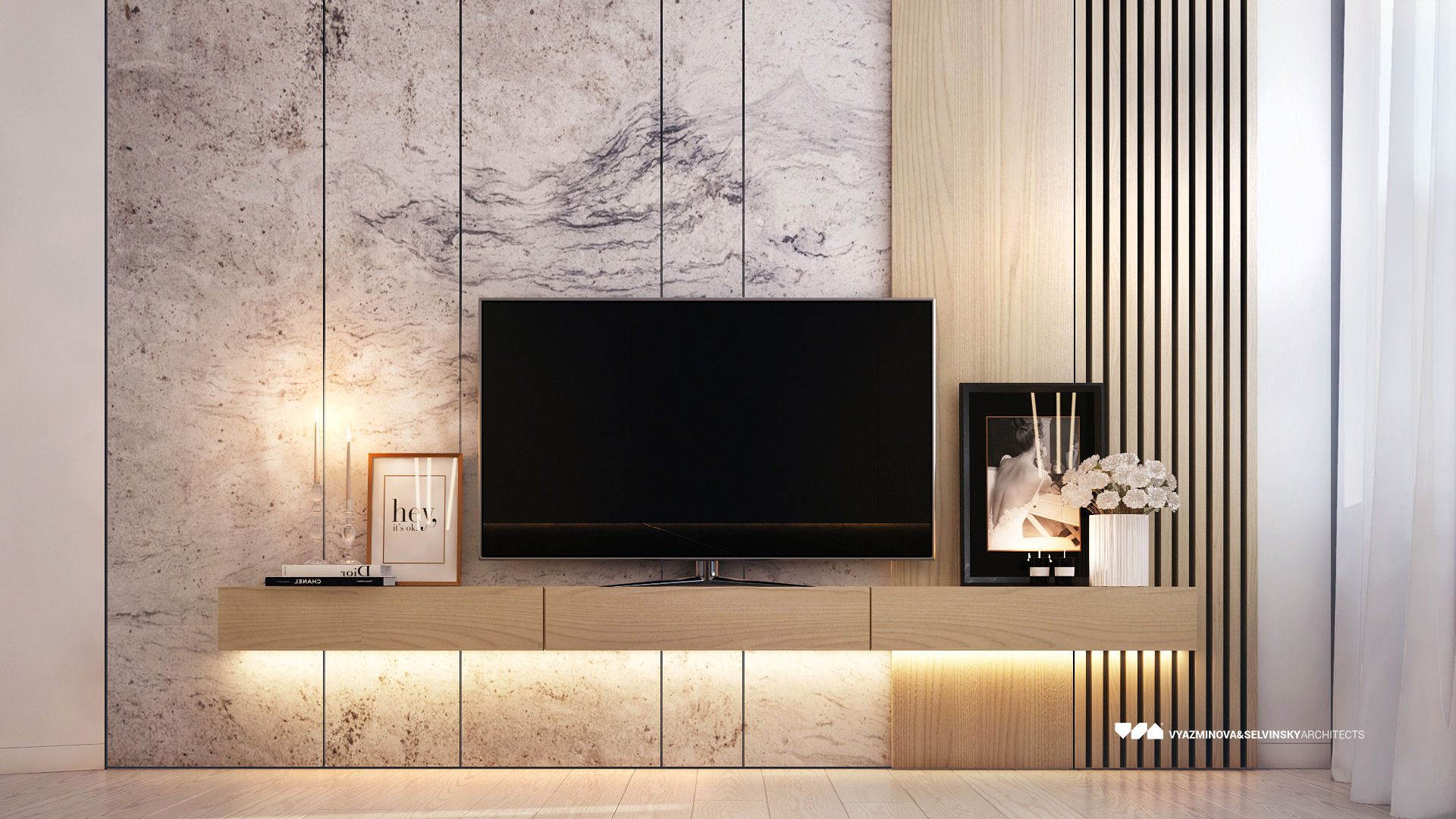
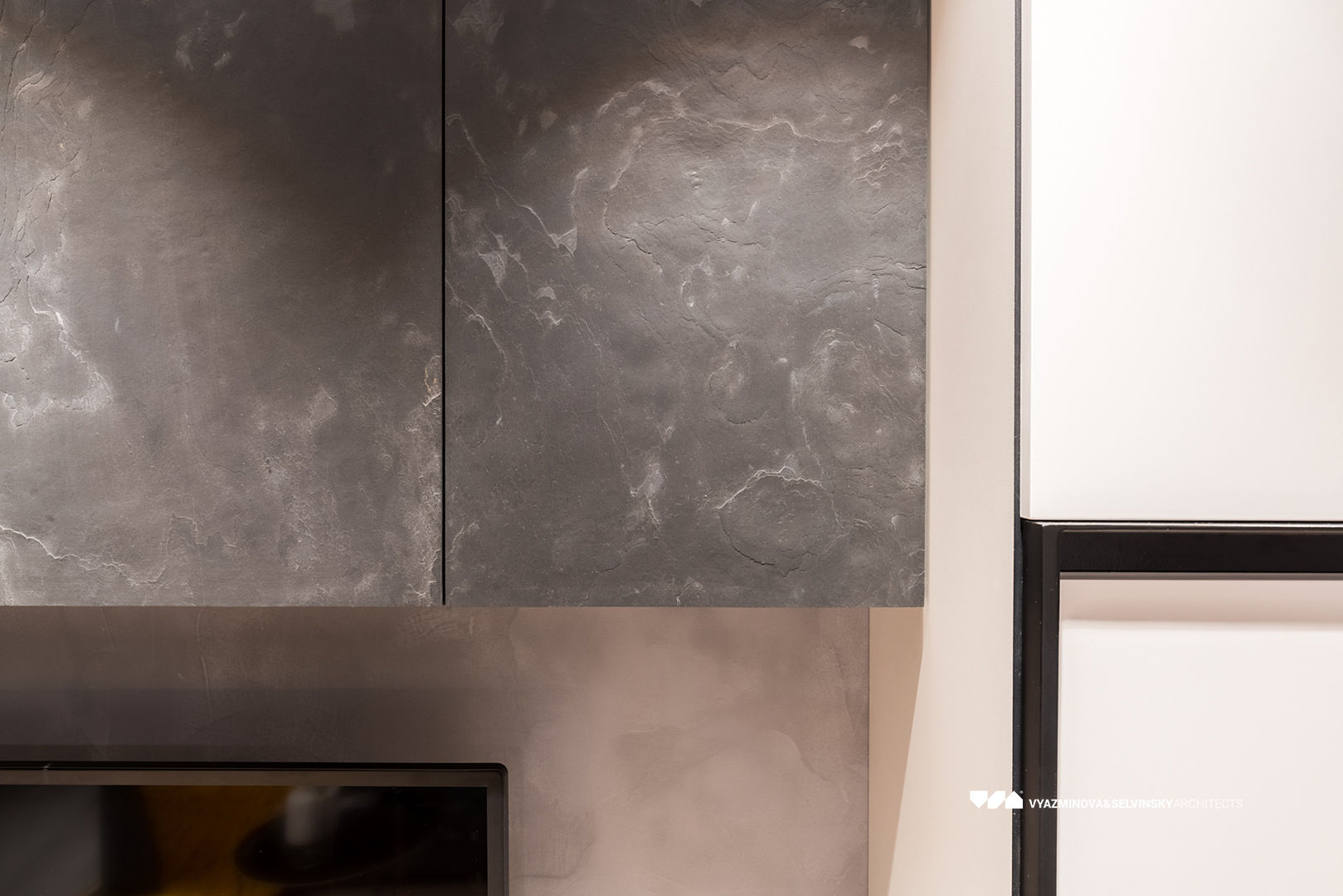
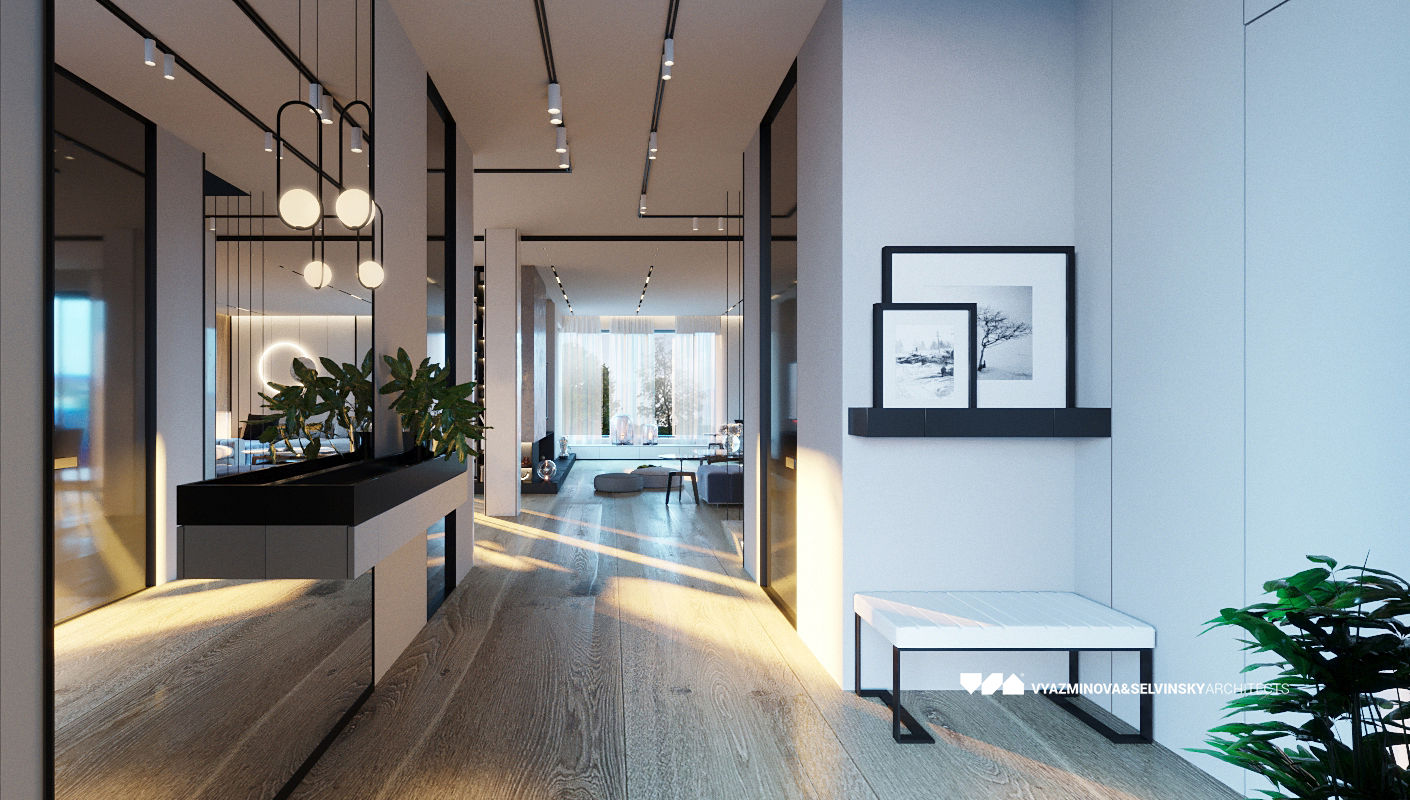
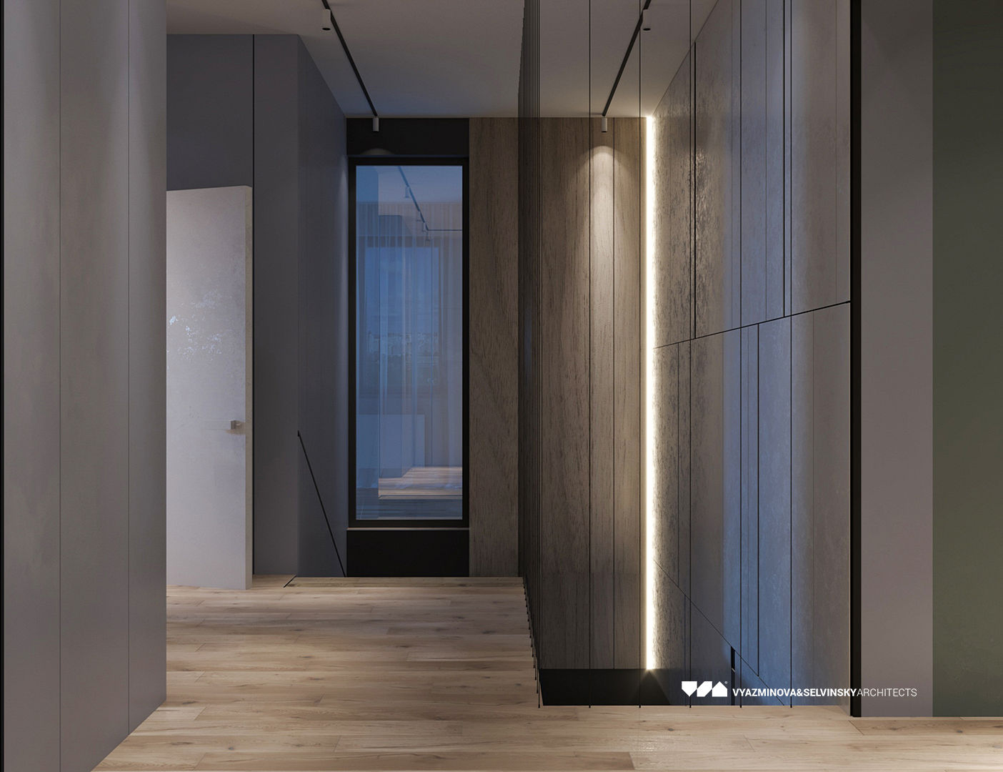
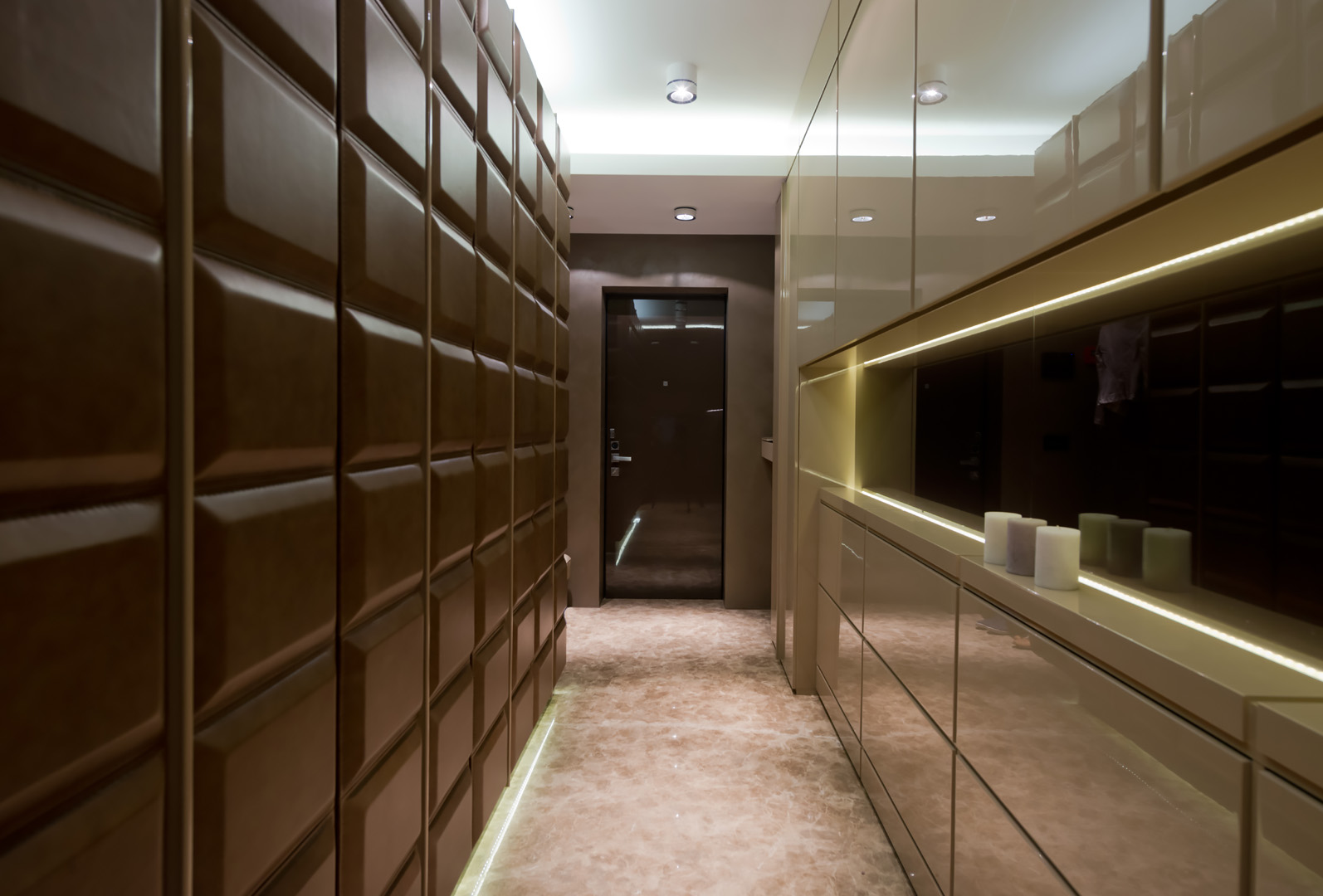
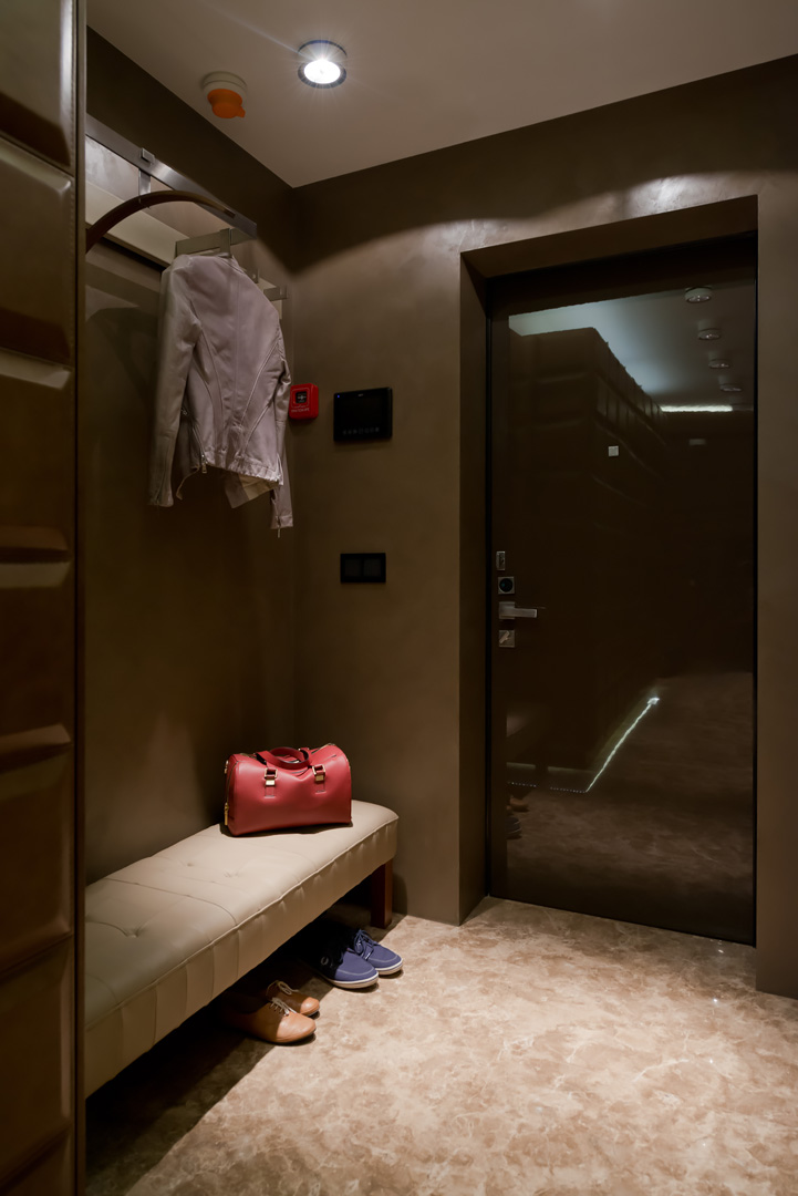
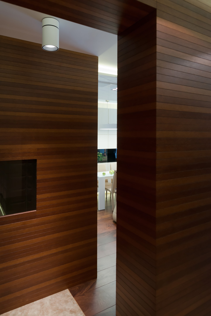
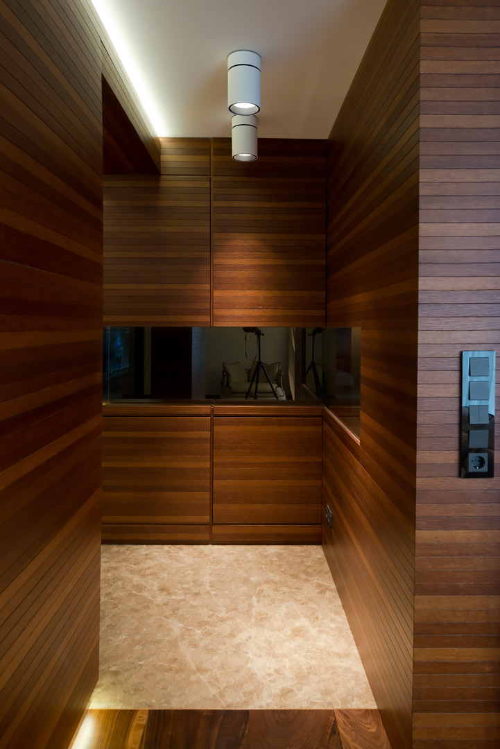
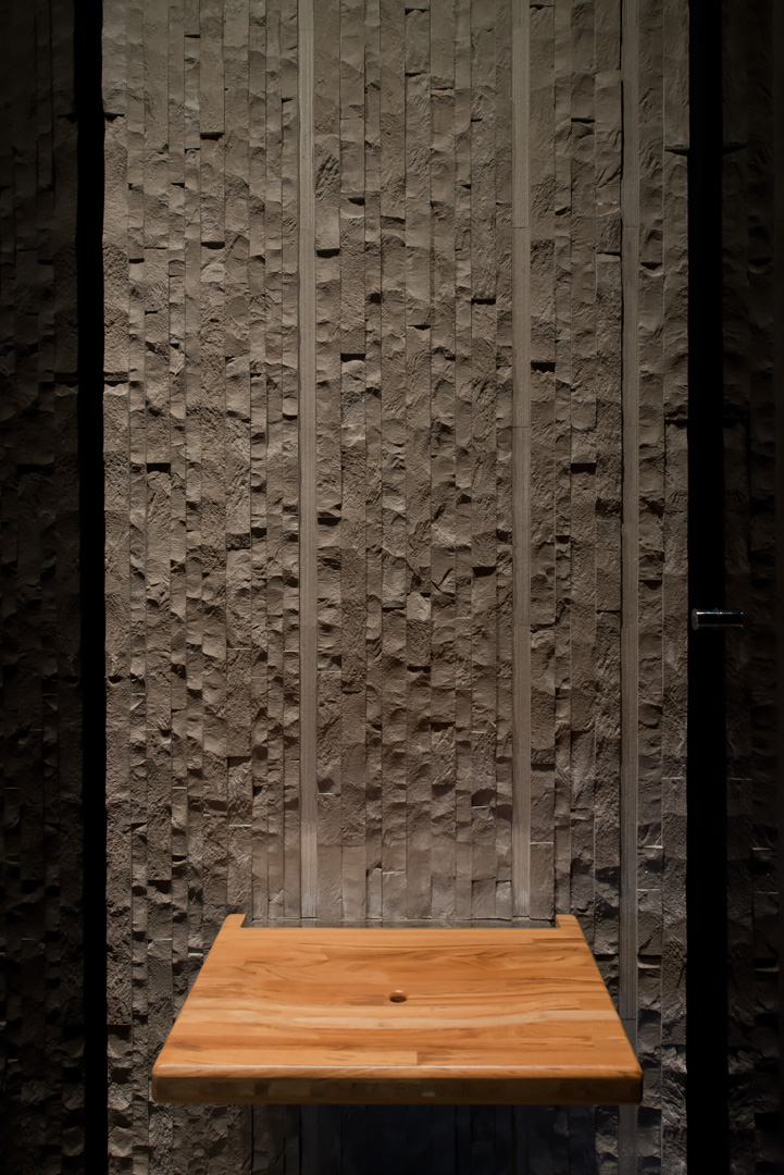
In addition to the apartments we have also developed a concept for the interiors of common areas in the house LUCE, designed in a style of strict minimalist luxury, with tactile surfaces of natural materials – wood, aged travertine and oxidized metal.
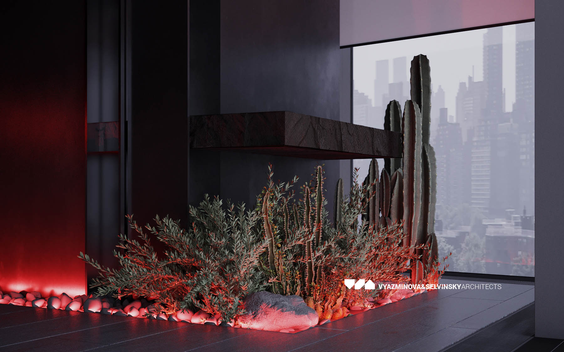
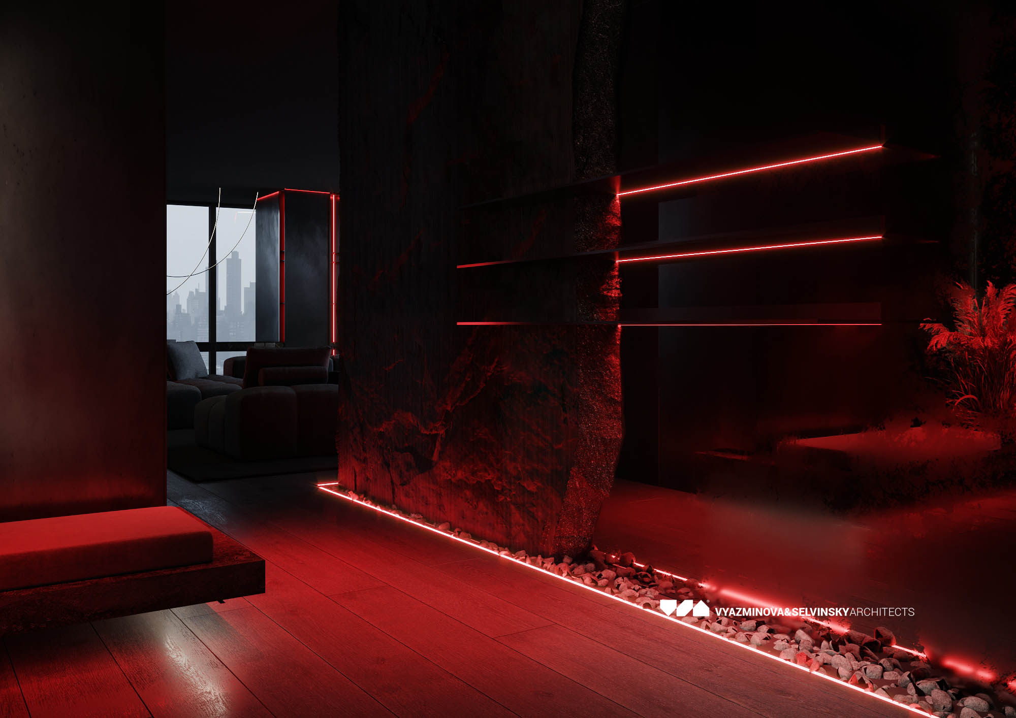
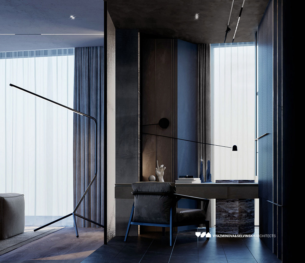
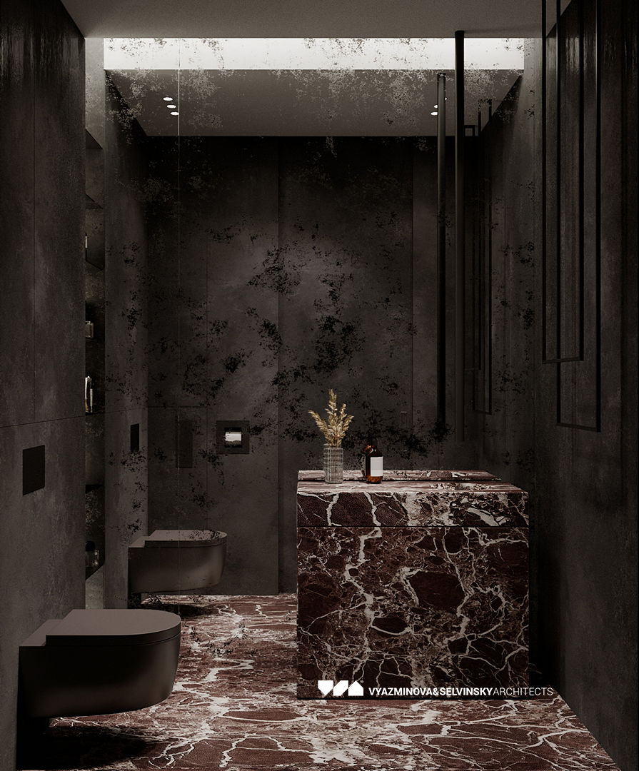
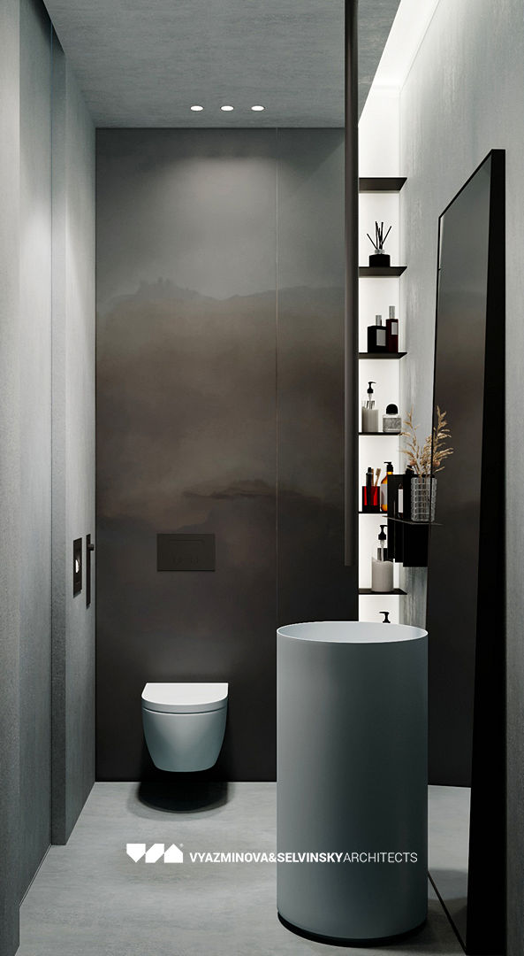
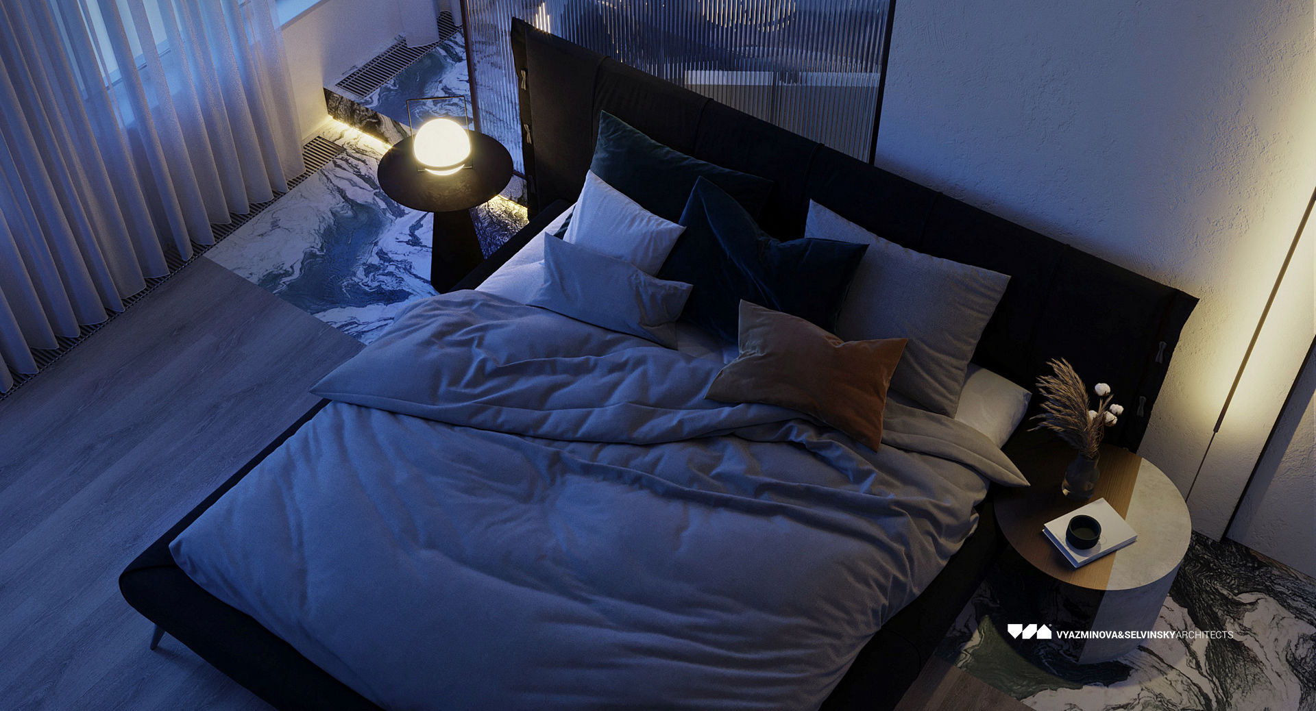
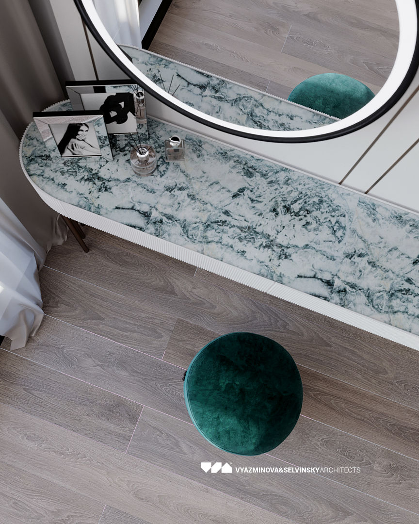
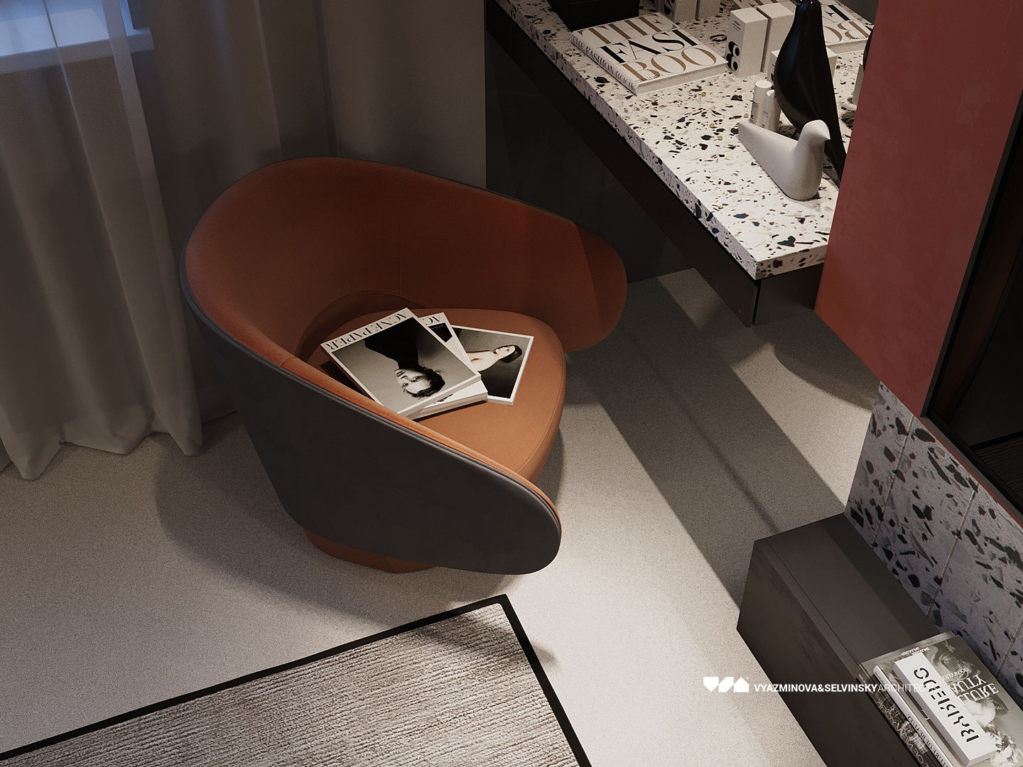
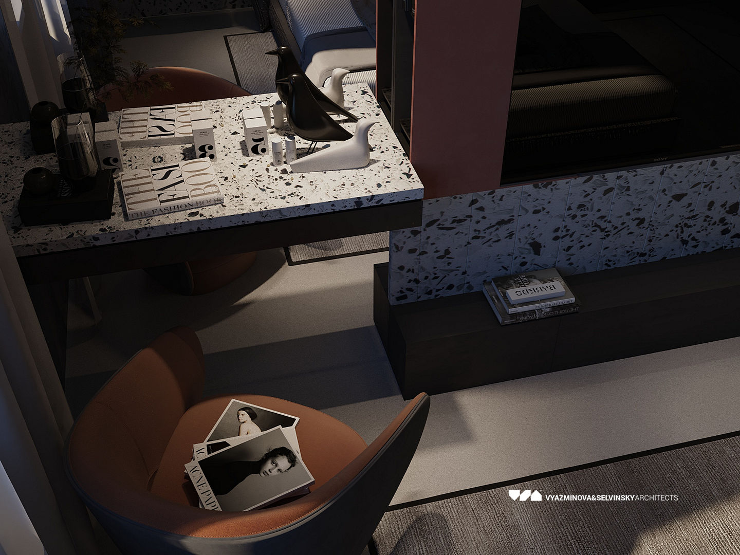
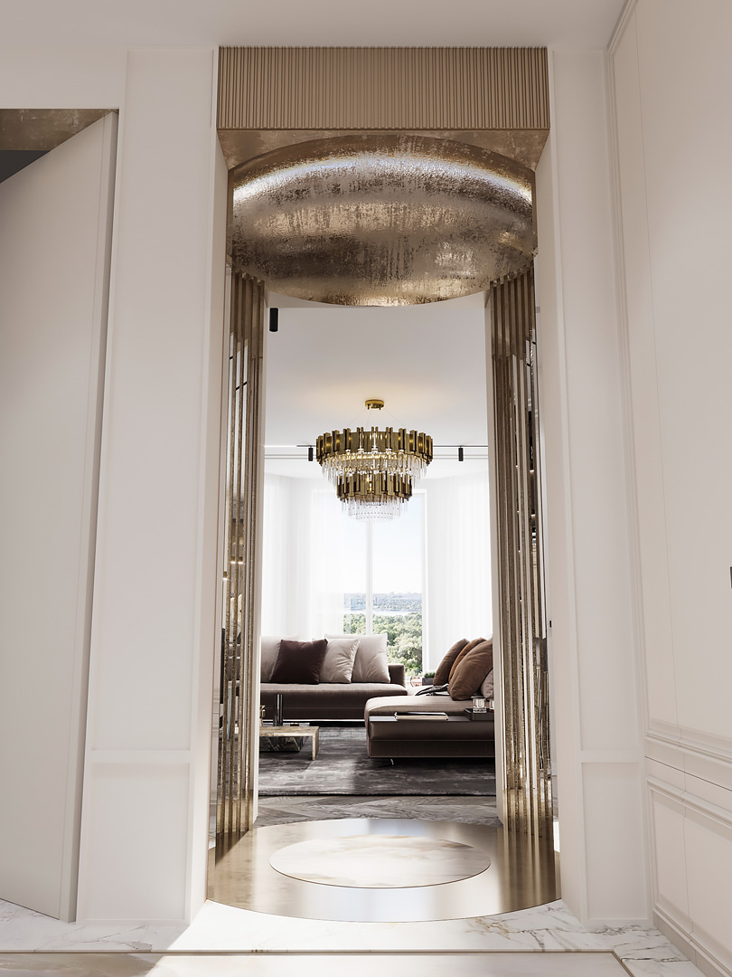
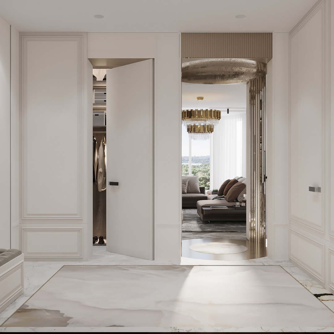
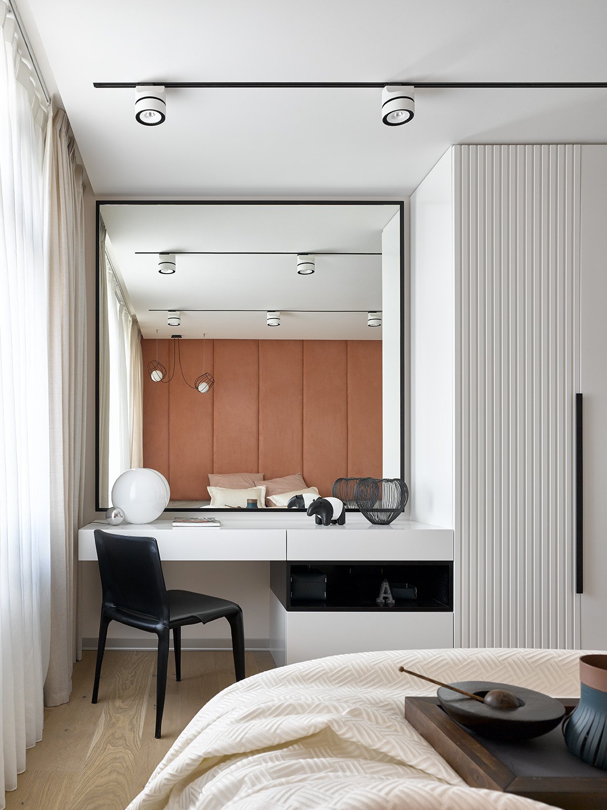
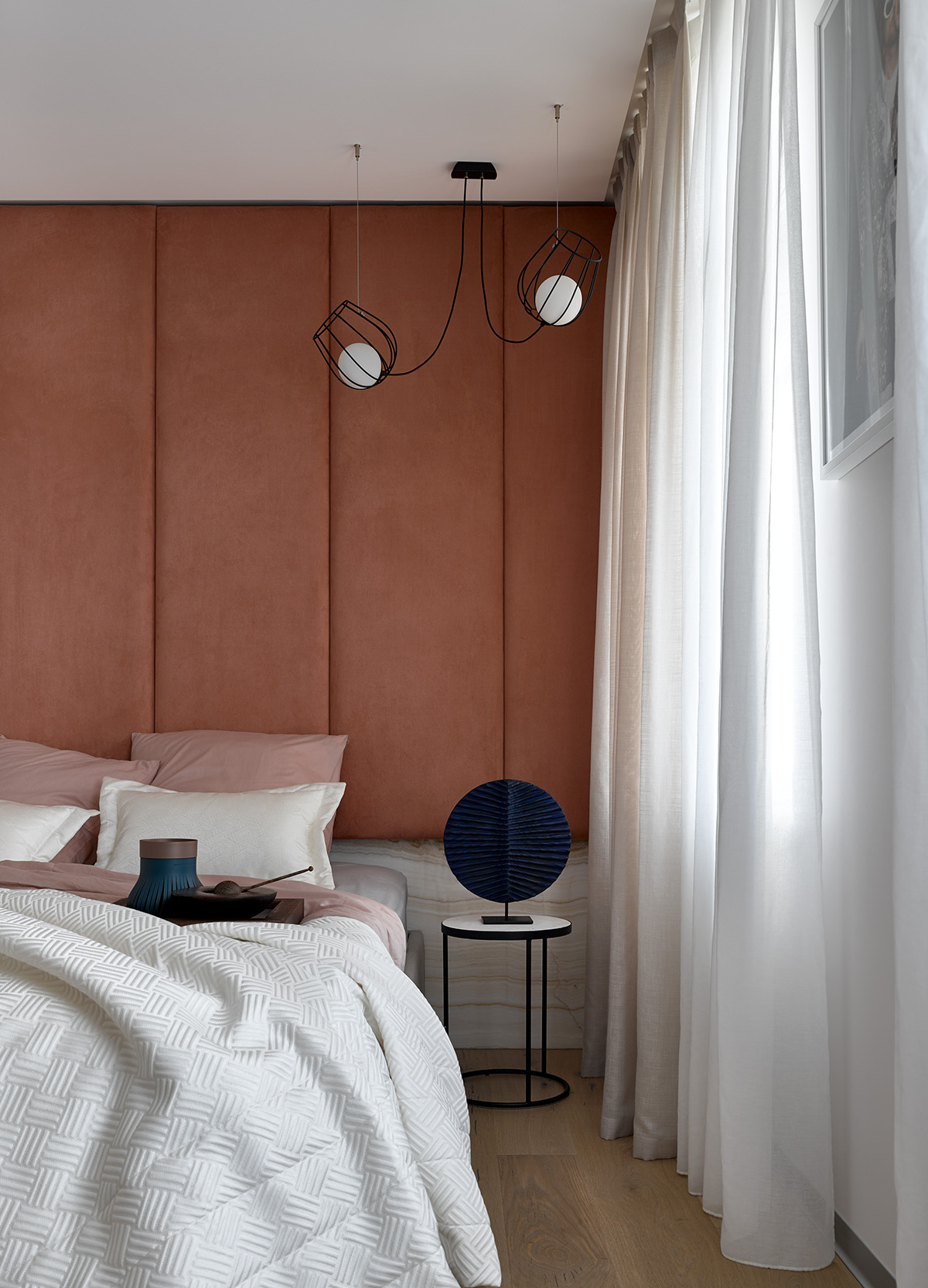
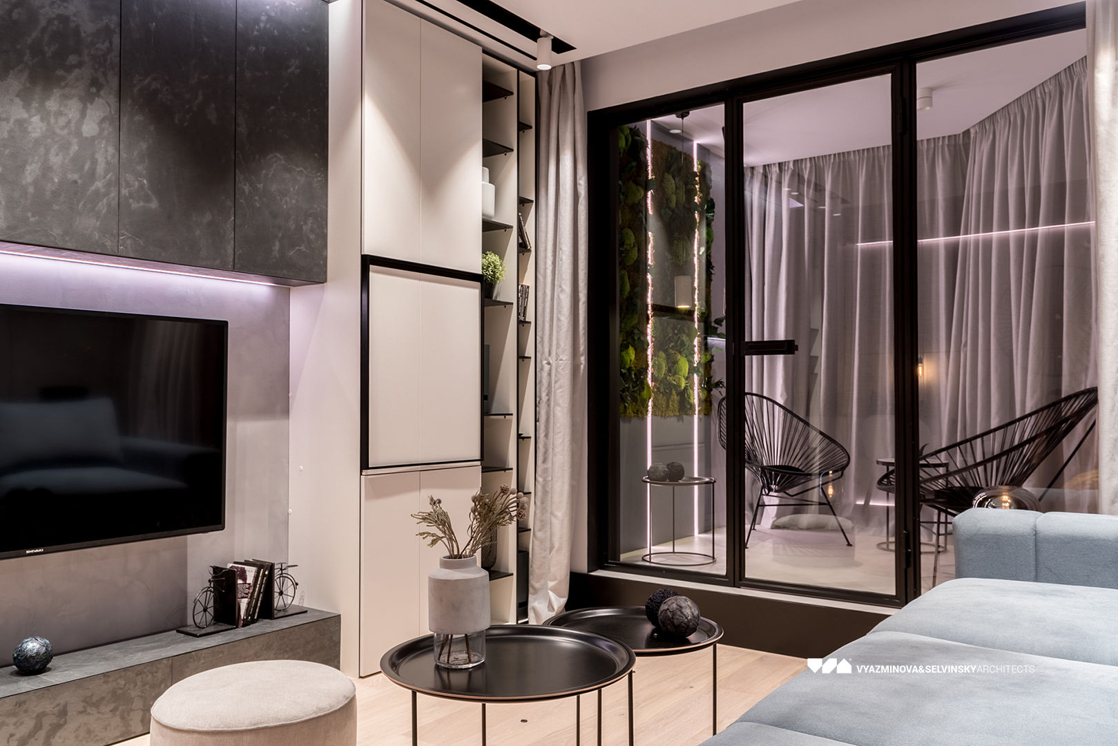
Our team designed the interior for a typical apartment in the clubhouse LUCE on Krestovozdvizhensky Lane for MR Group. One perfect style in three color schemes: light, dark and polychrome. We offer you the polychrome version.
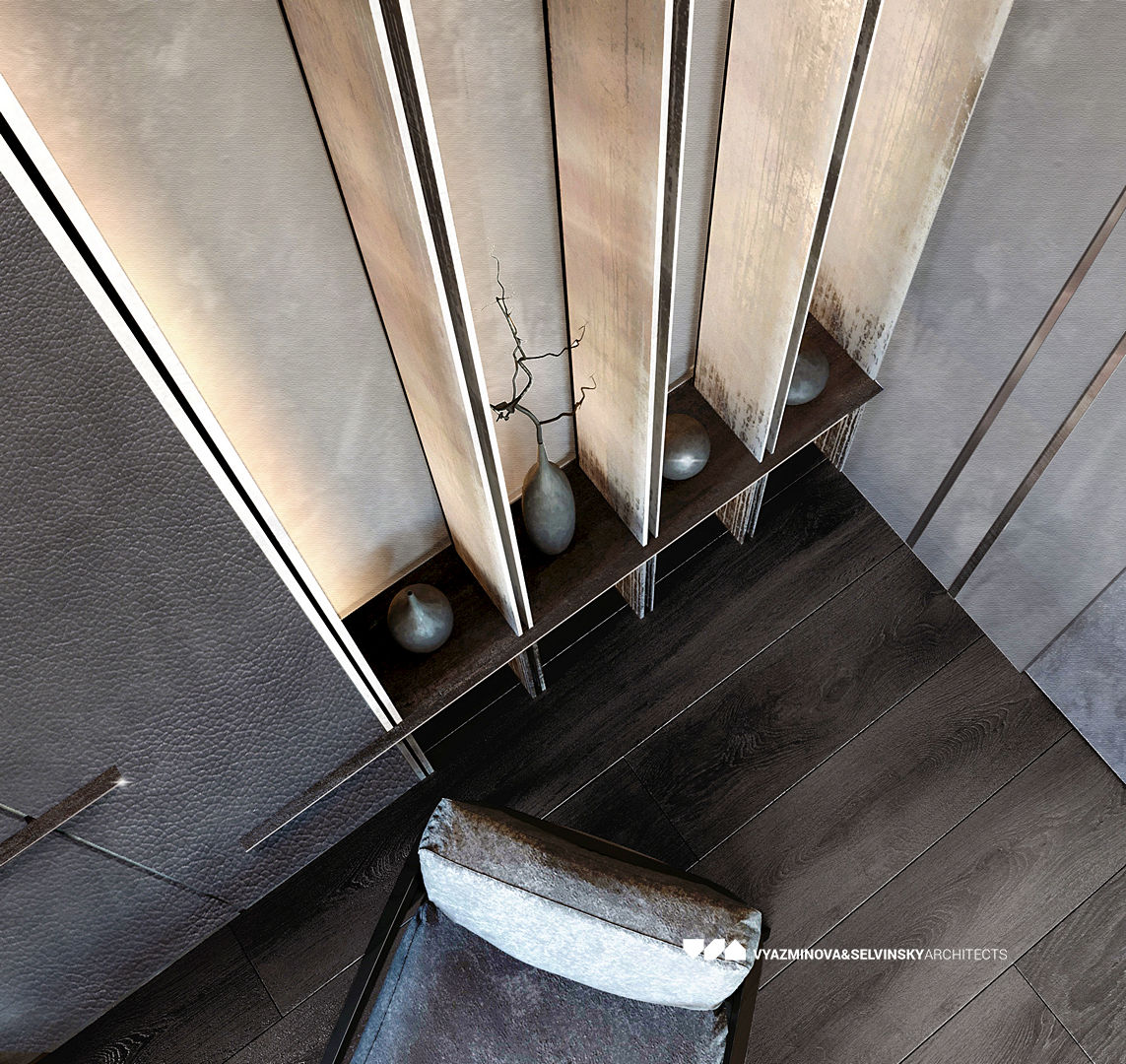
In addition to the apartments we have also developed a concept for the interiors of common areas in the house LUCE, designed in a style of strict minimalist luxury, with tactile surfaces of natural materials – wood, aged travertine and oxidized metal.
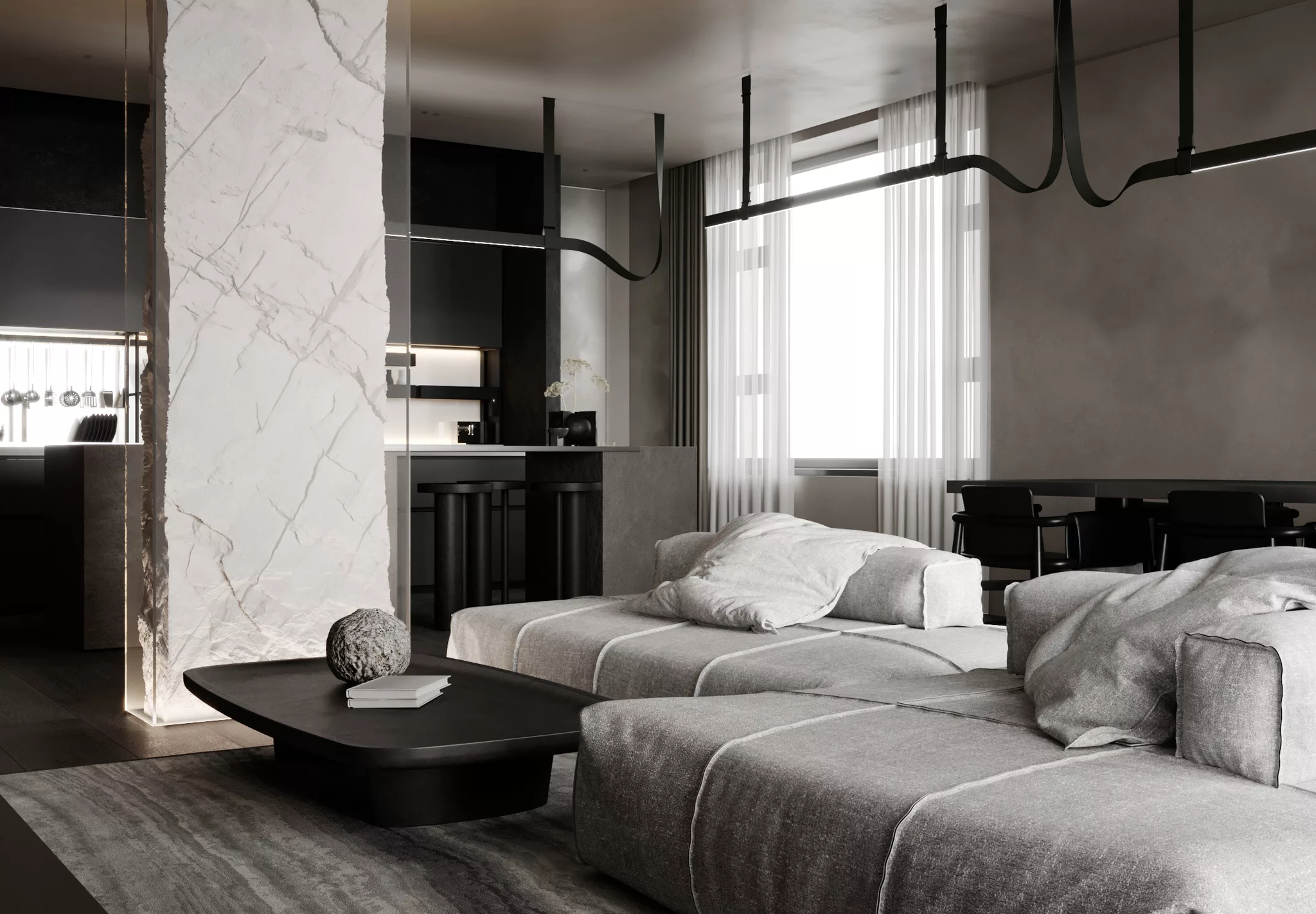
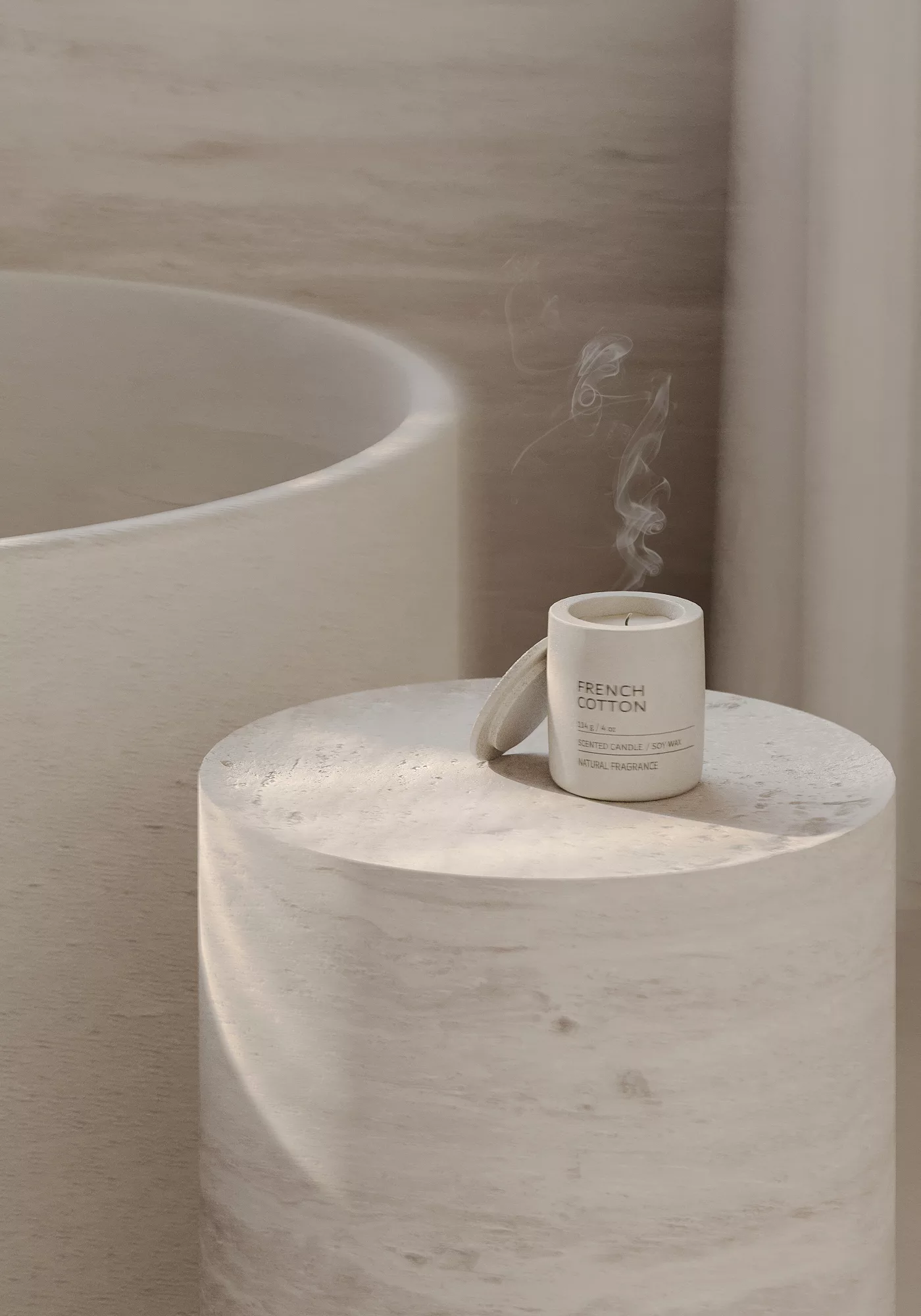
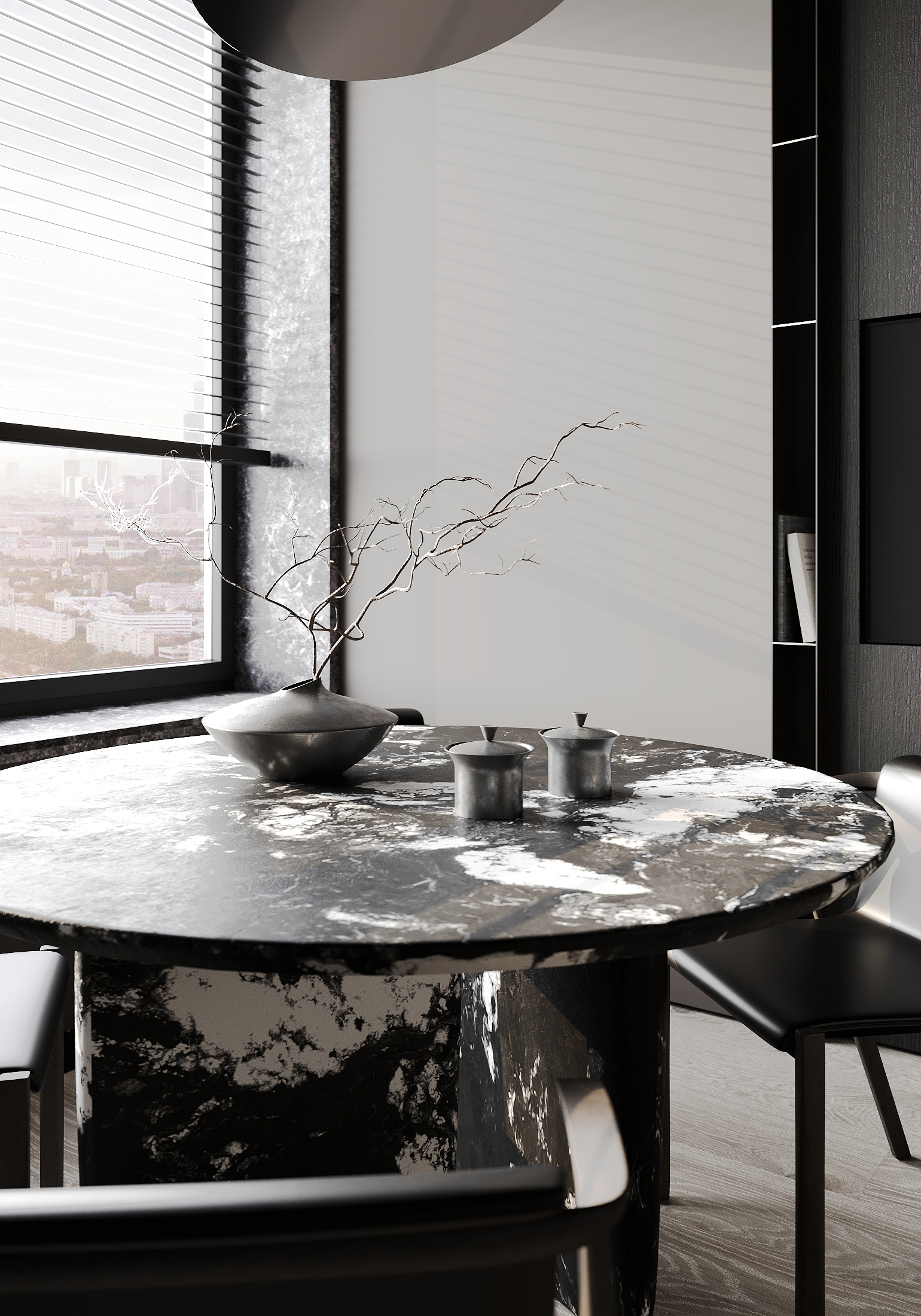
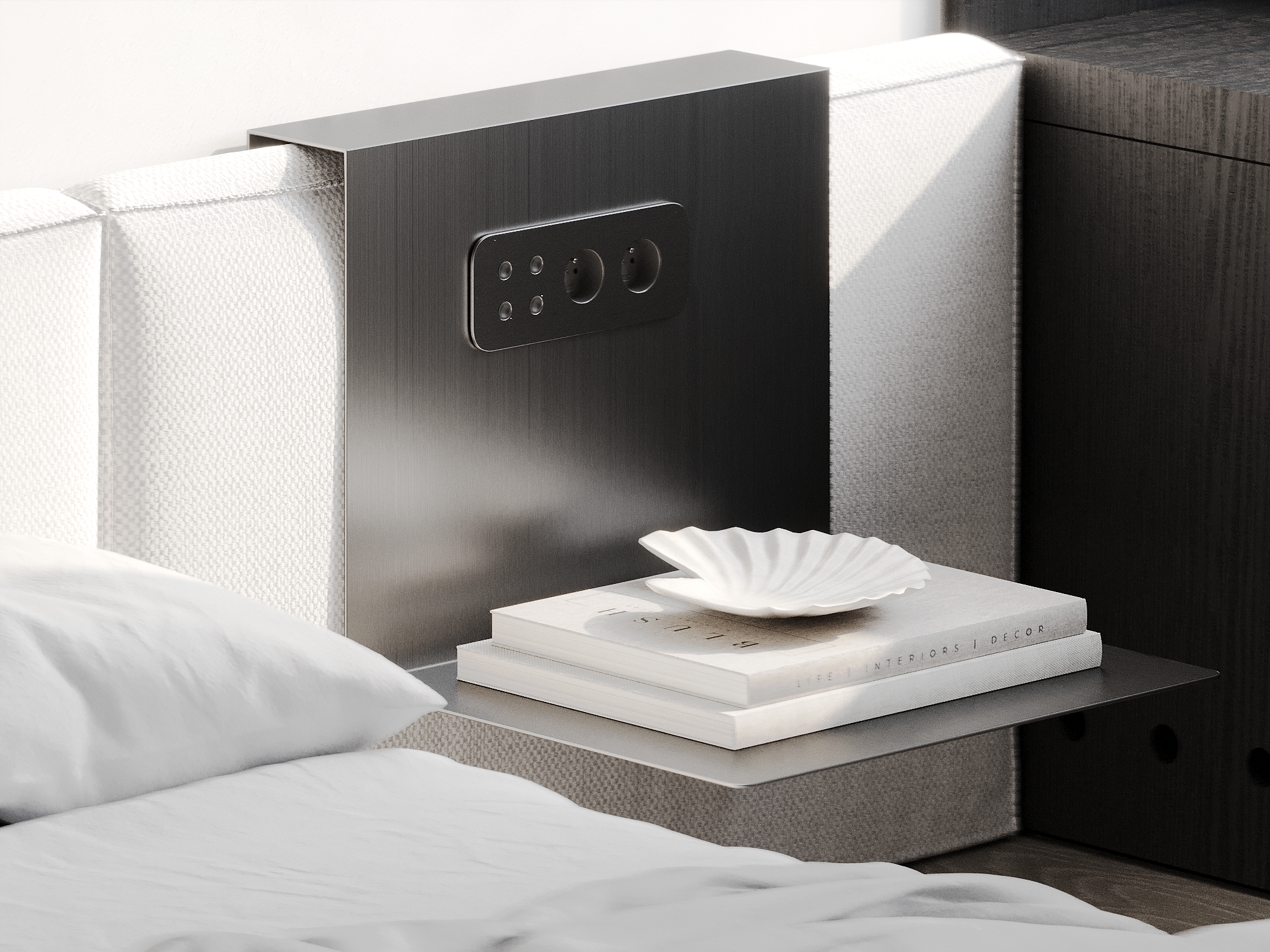
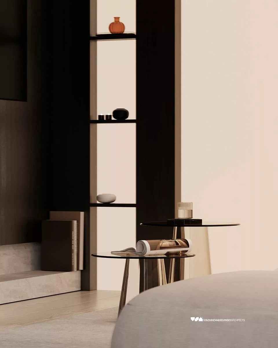
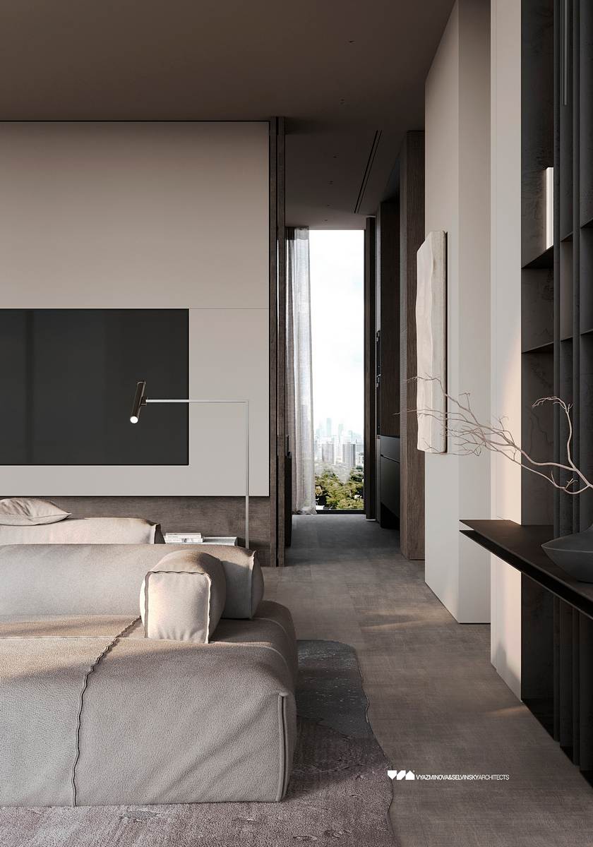
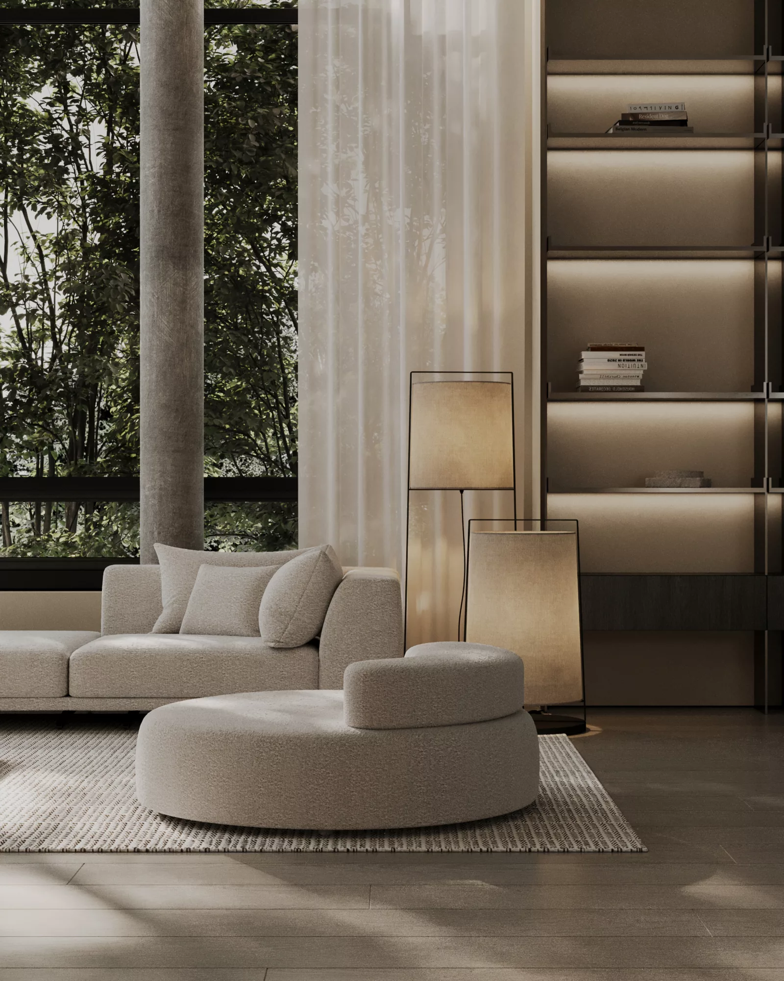
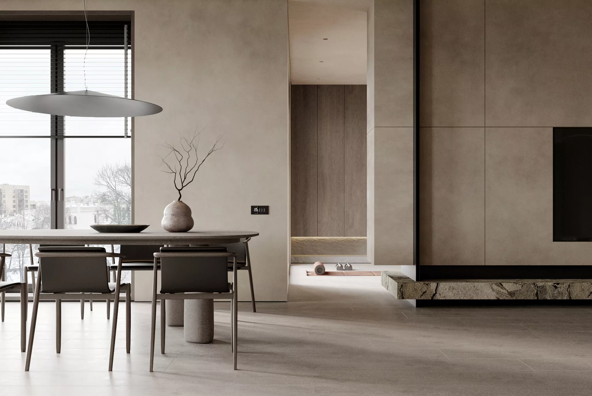
Our studio has developed a unique apartment design for a married couple, embodying two perspectives on space — masculine and feminine. As a result, the interior is built on a play of contrasts: soft, flowing forms coexist with strict, geometric ones, creating a dialogue between feminine and masculine energy.
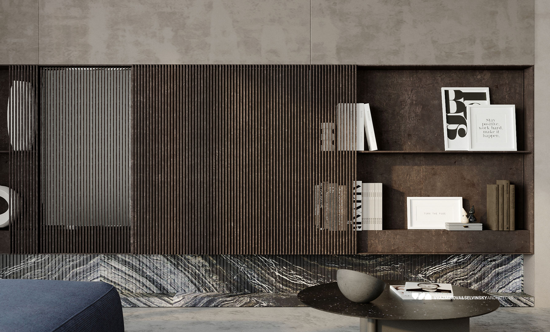
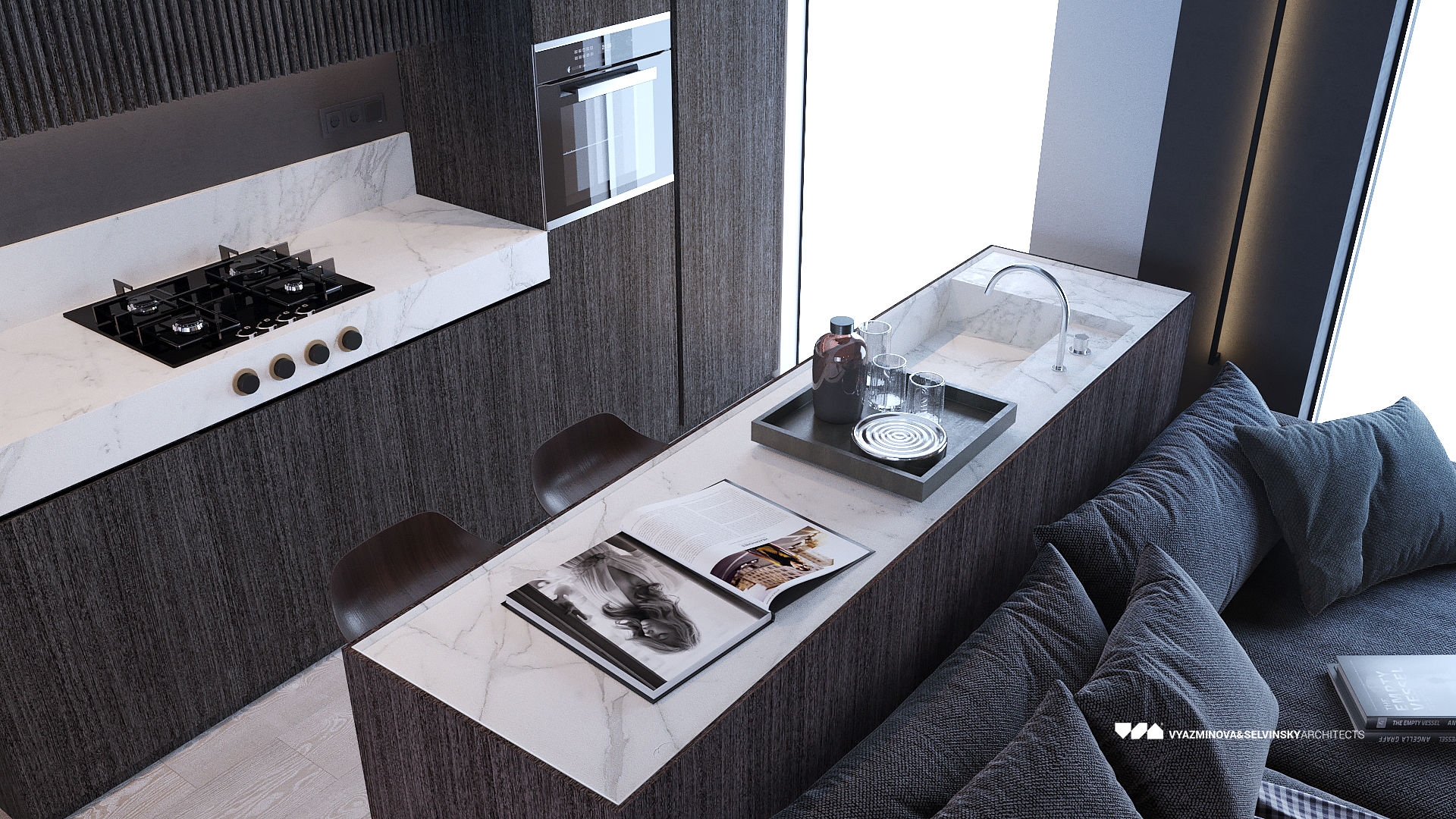
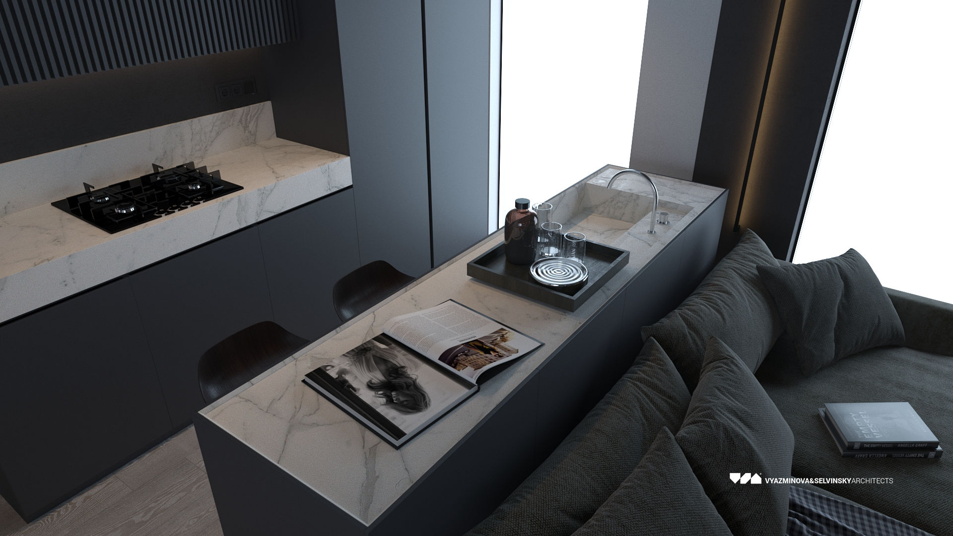
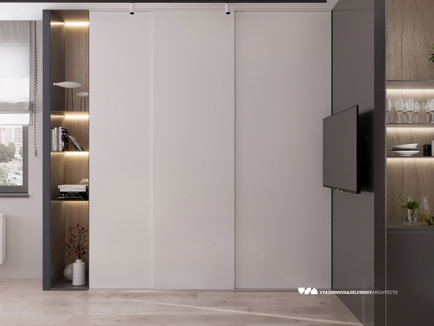
Special attention was paid to detail and functionality. In the living room, for instance, a tea corner appeared: behind the sofa, a hidden cabinet was installed to store everything needed for a traditional tea ceremony — the homeowners are true tea connoisseurs.
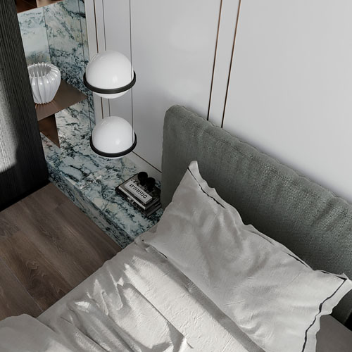
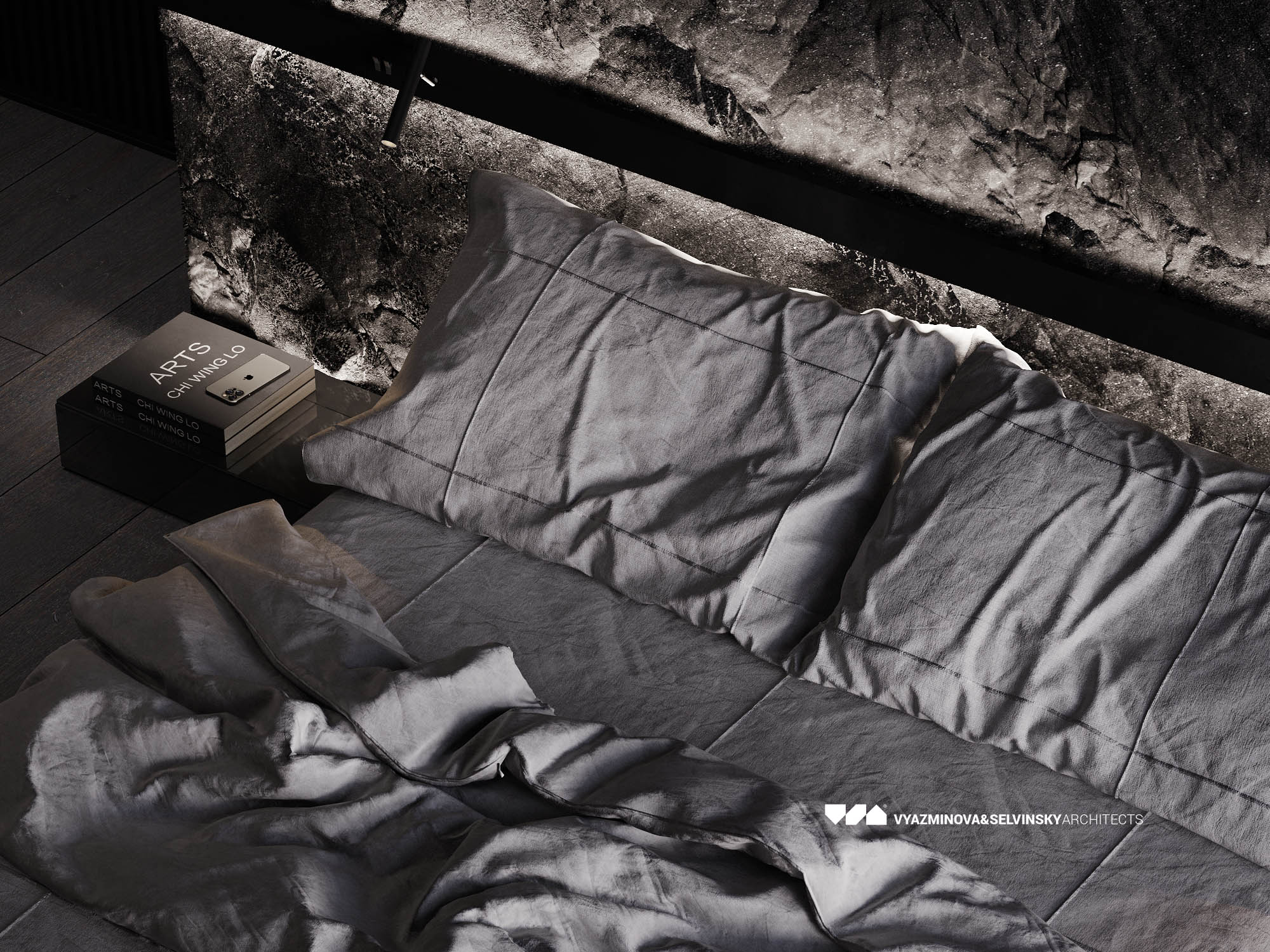
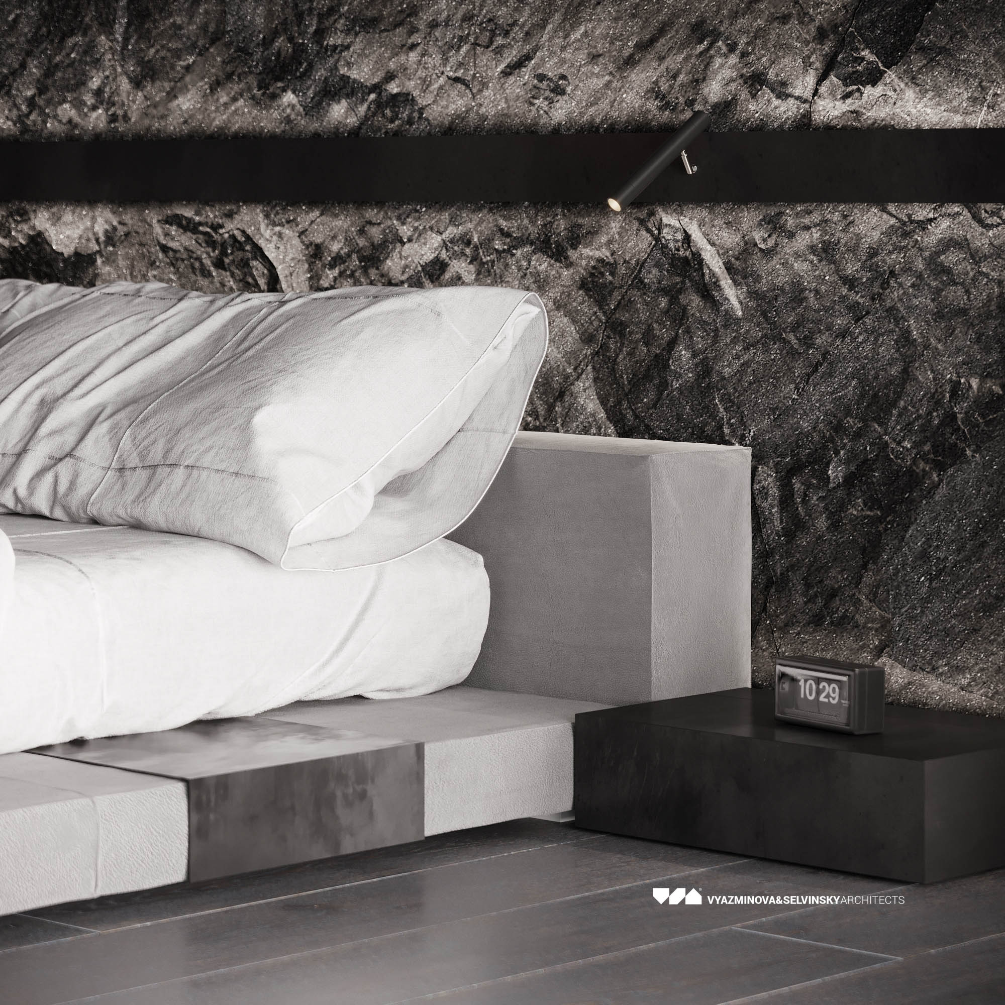
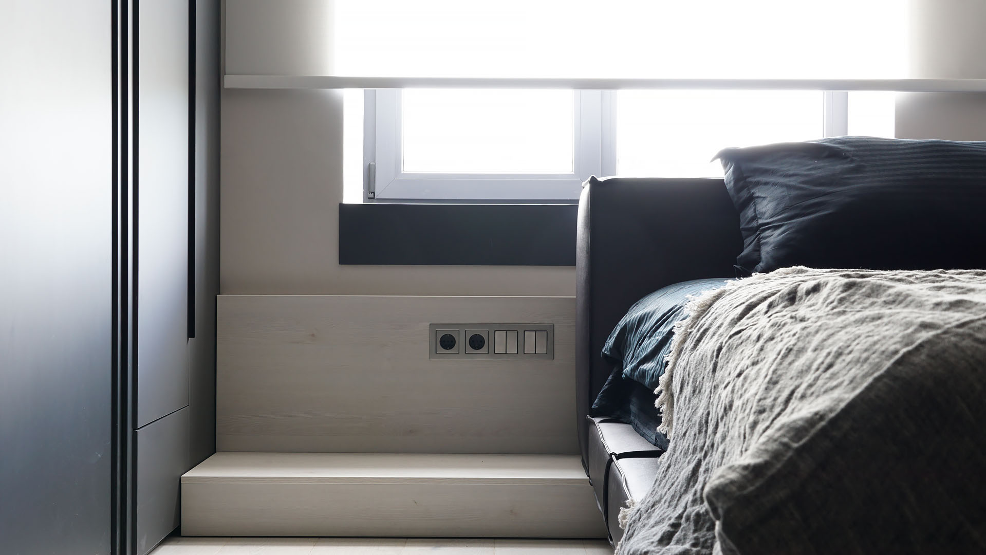
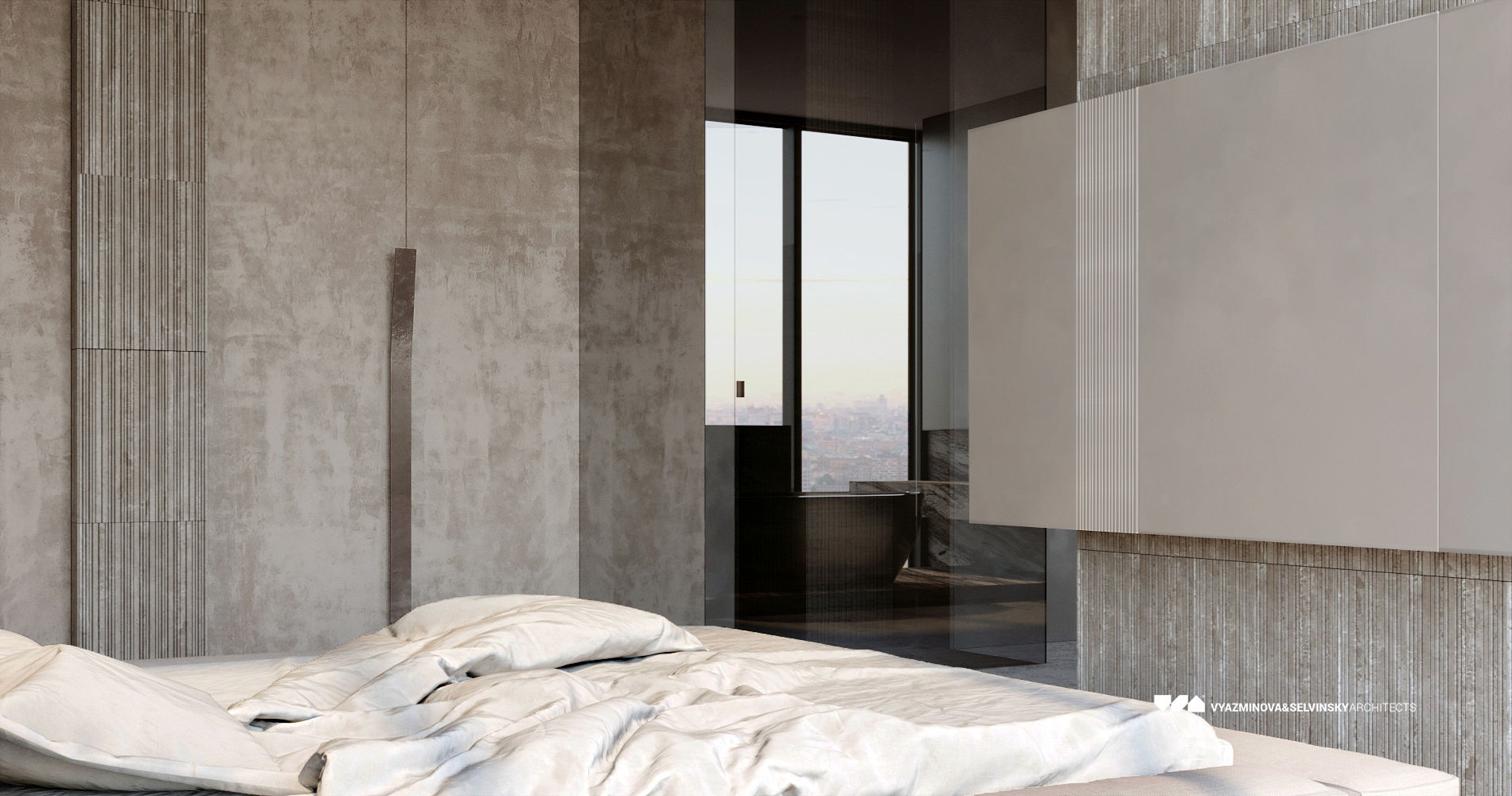
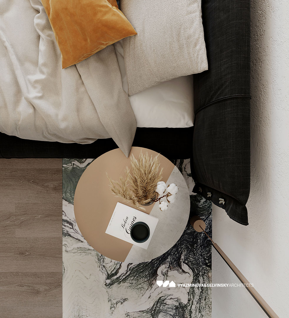
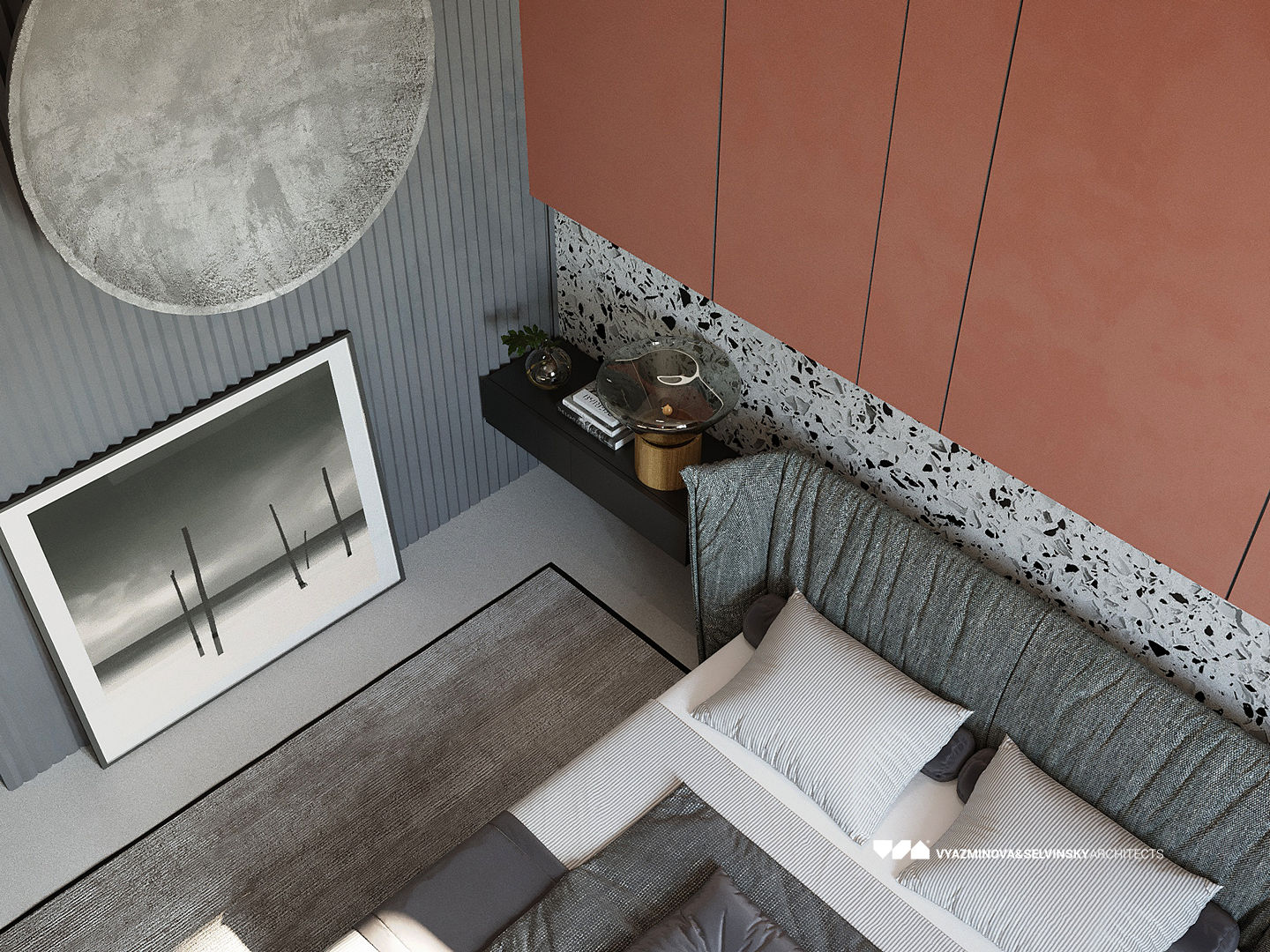
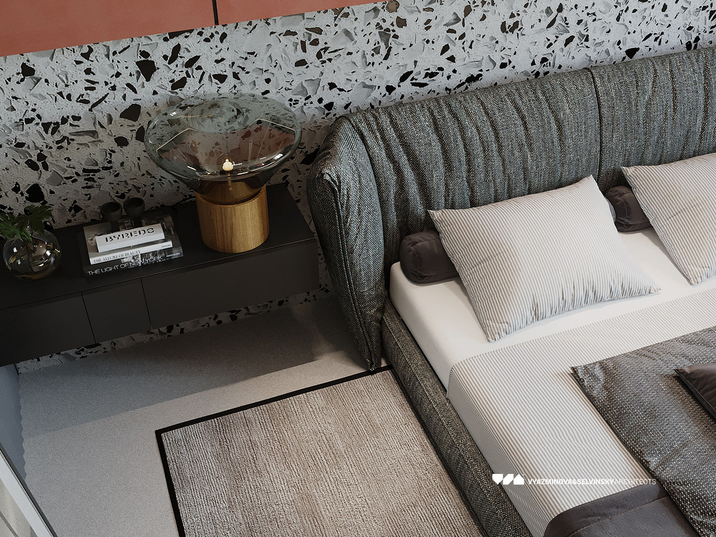
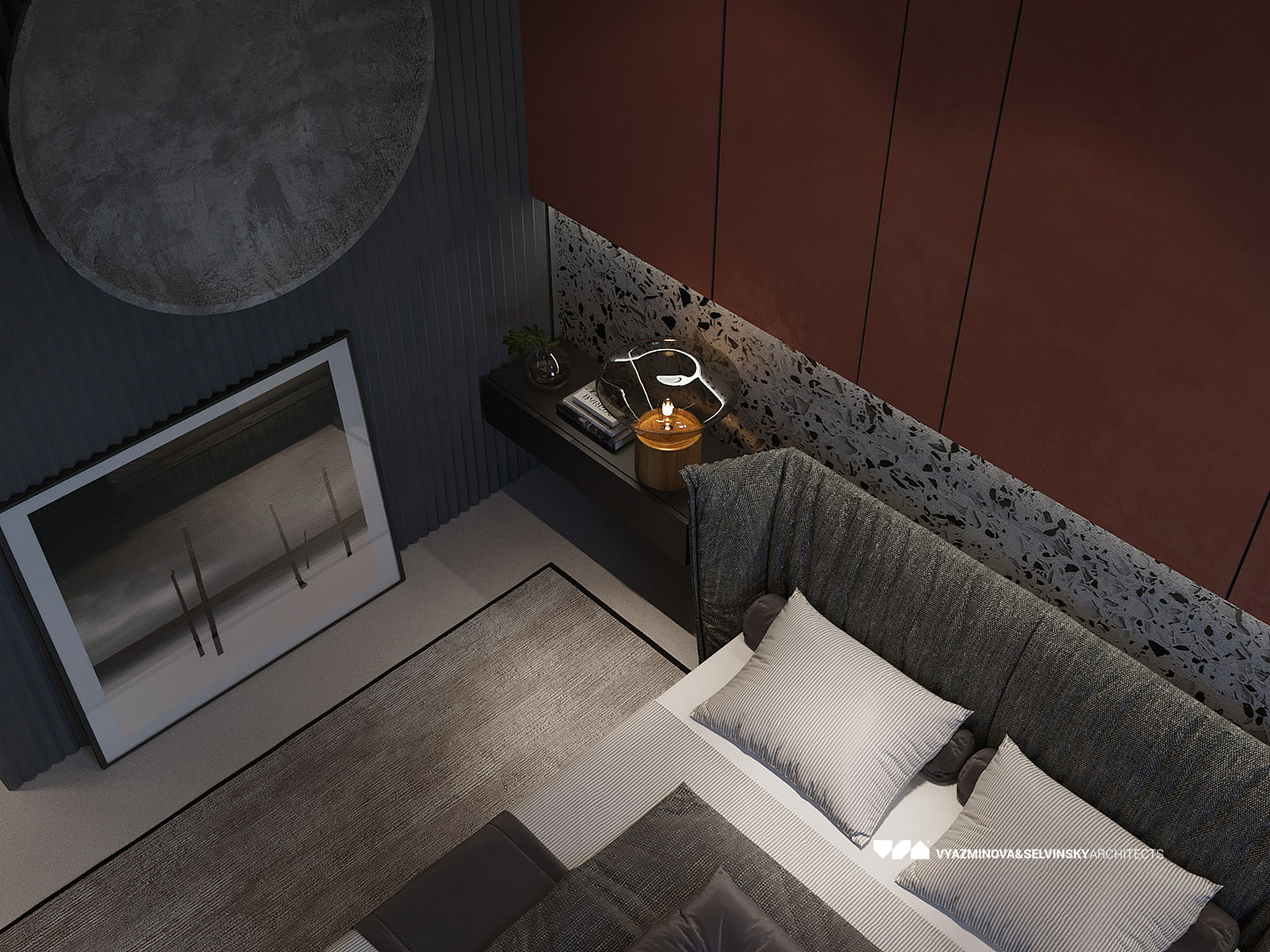
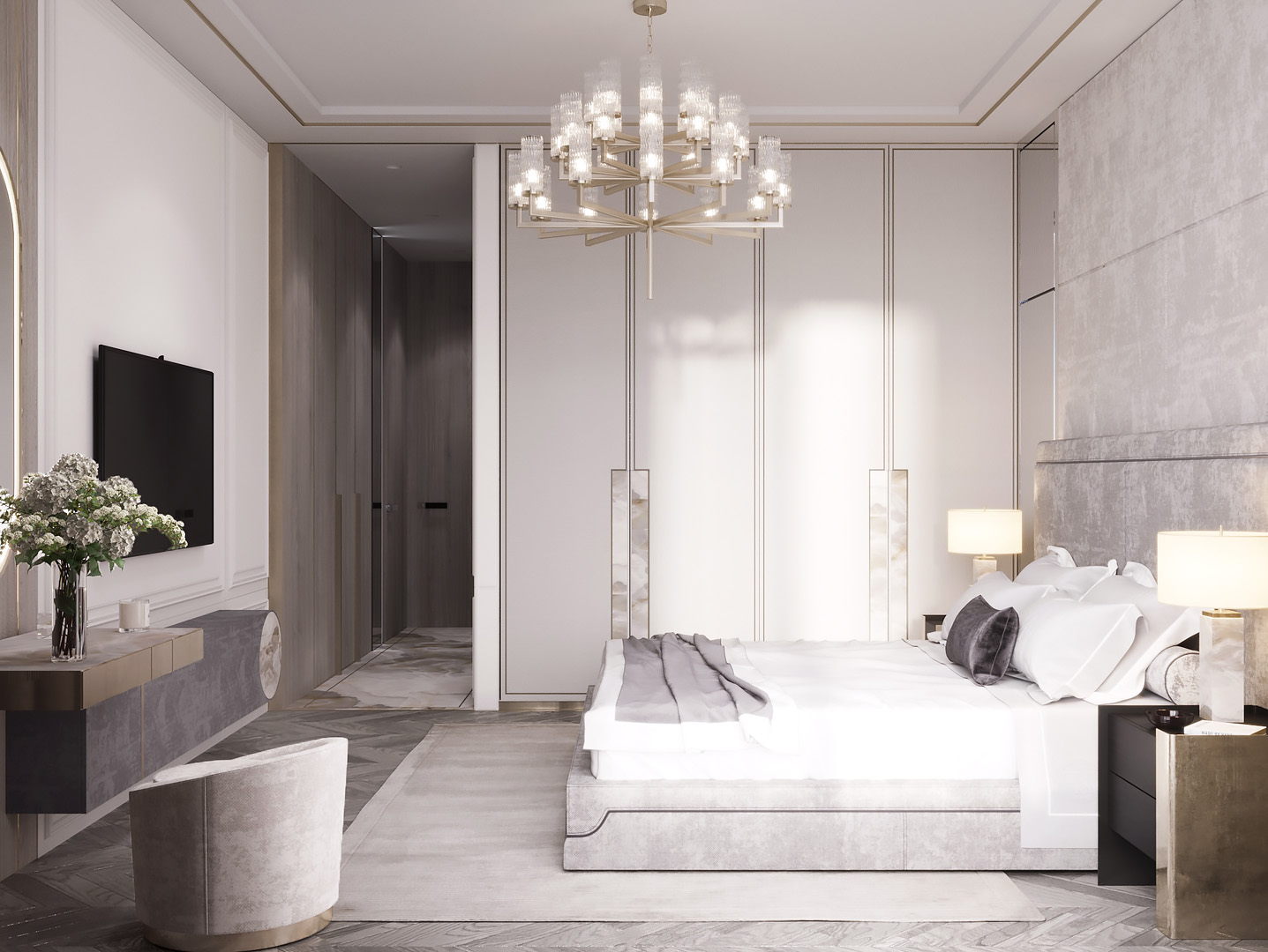
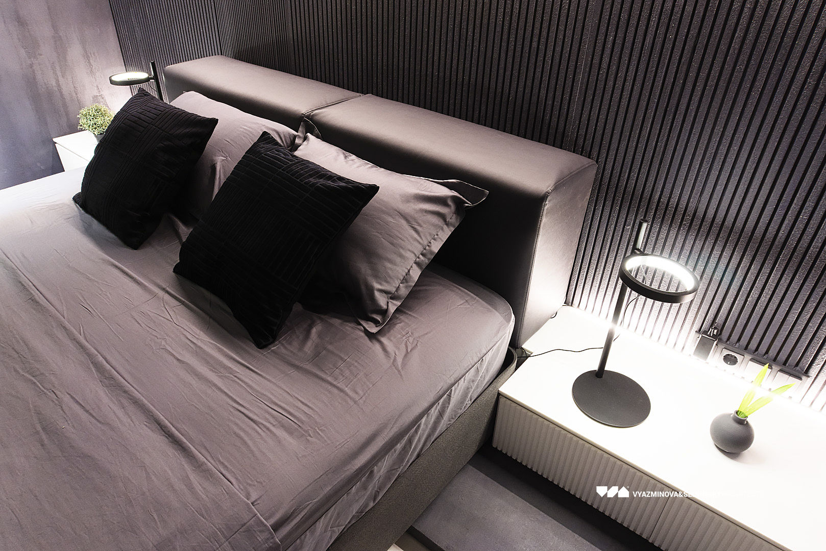
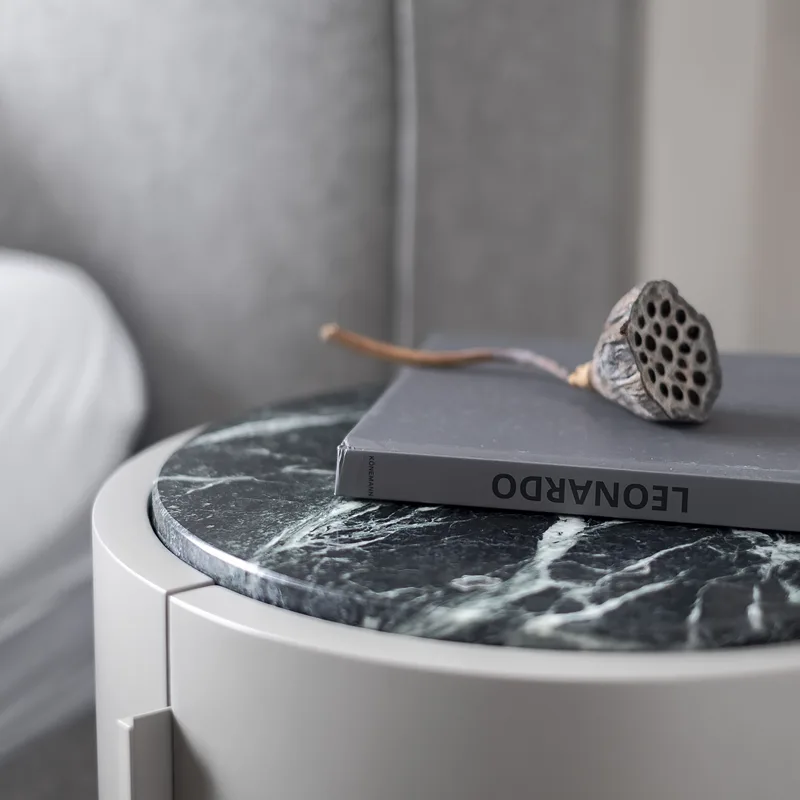
Innovation also found its place in the project. In the master bedroom, the bedside tables are made from solid stone, yet each serves a different purpose: one holds books, while the other has a jewelry tray integrated directly into the stone. They are united by an asymmetrical composition along with the bed’s headboard, where rounded lines meet metal inserts. This solution is not only aesthetically pleasing but also practical — the headboard subtly shields the sleeper from the entrance to the room.
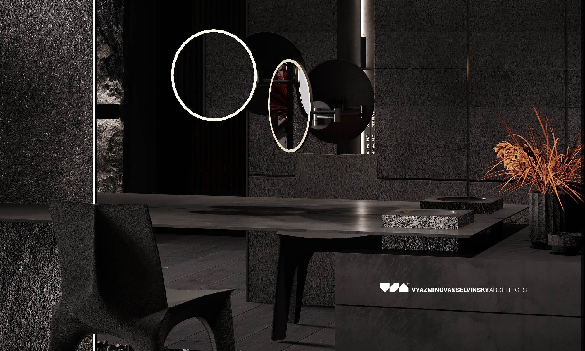
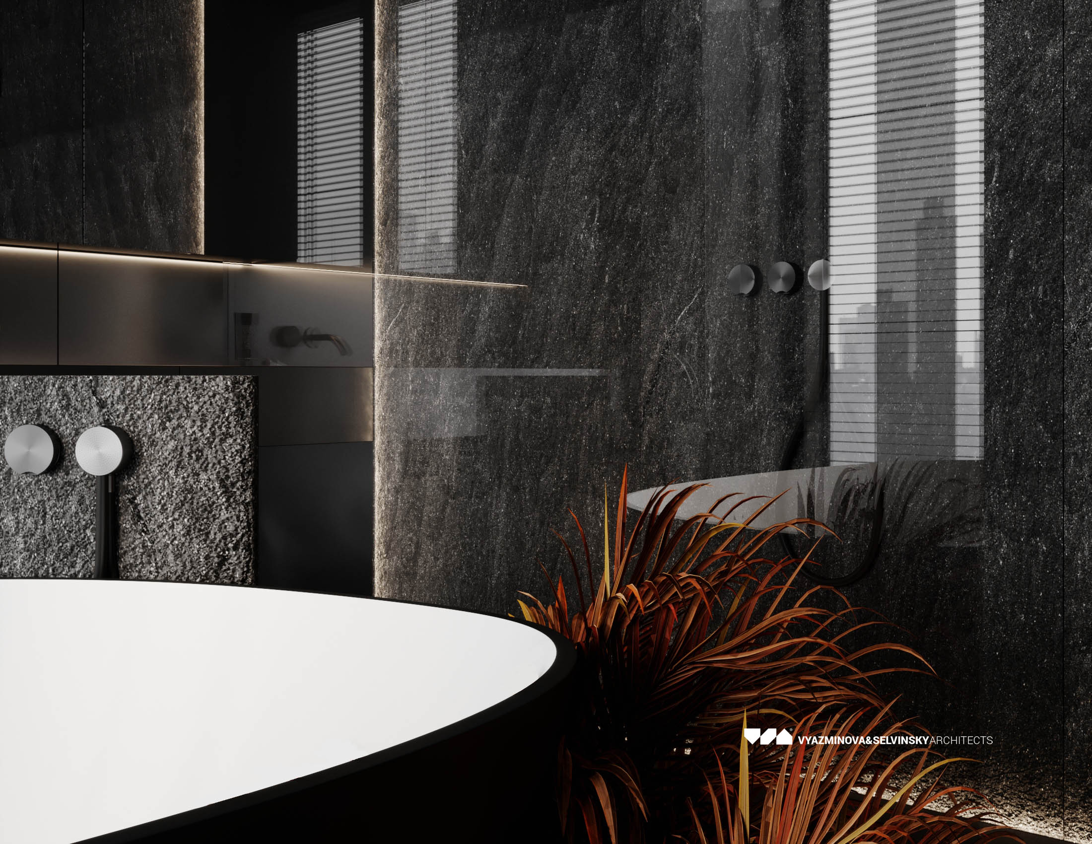
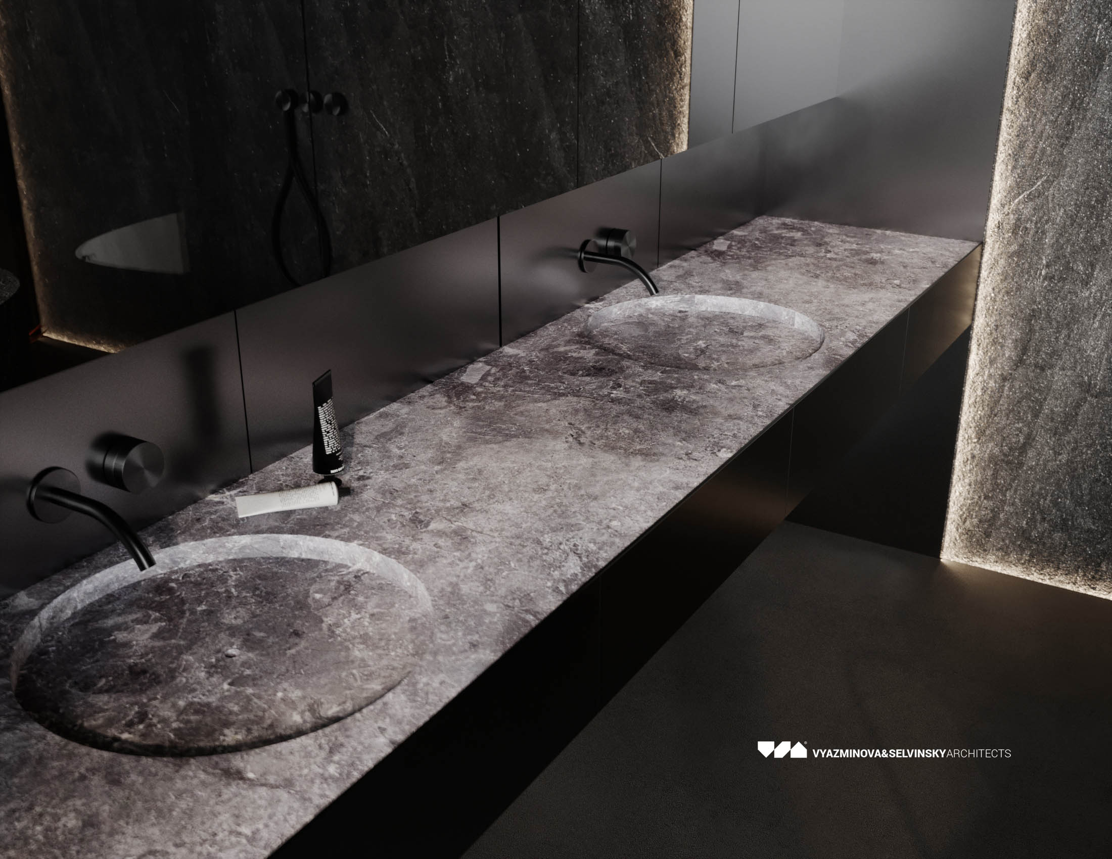
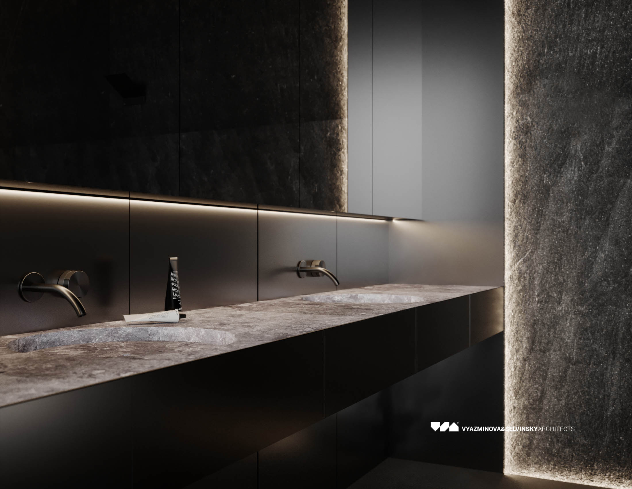
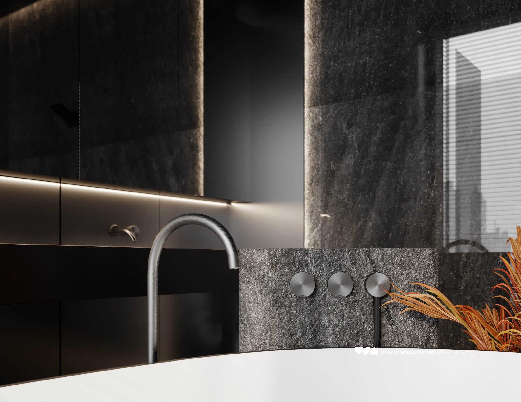
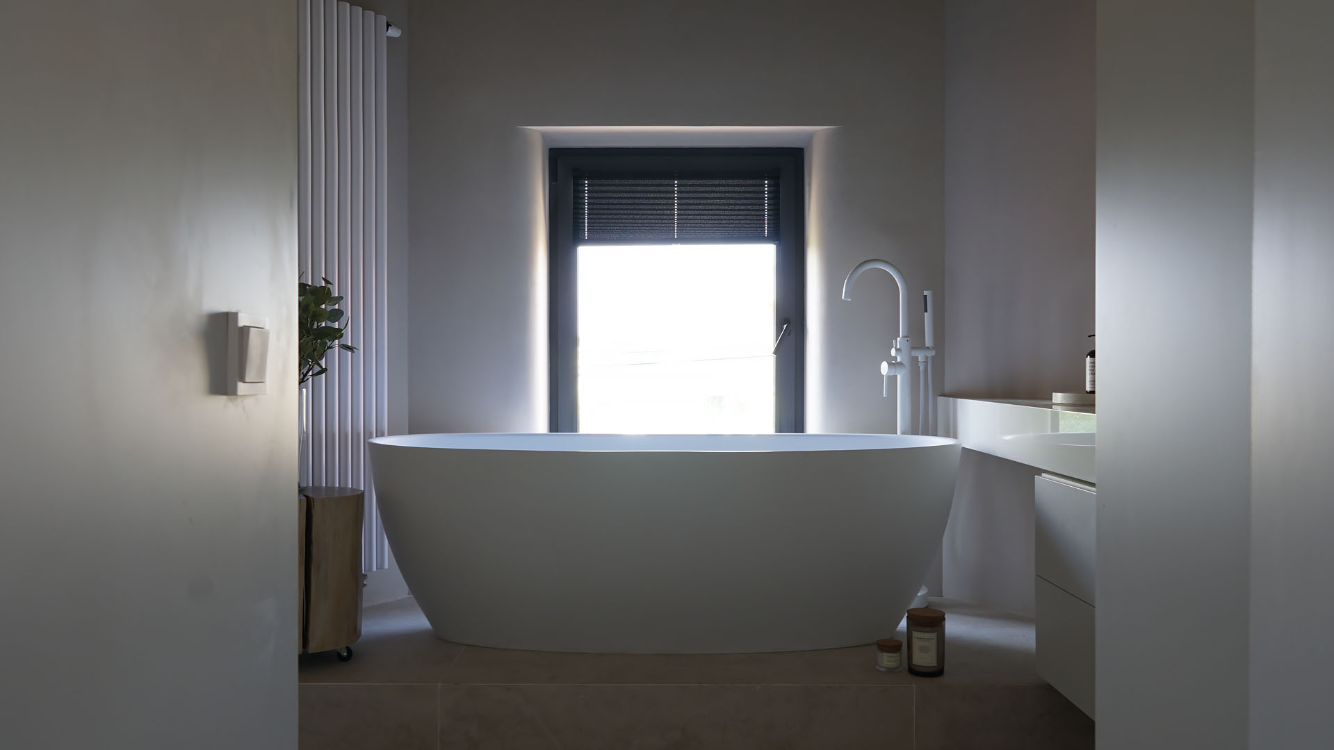
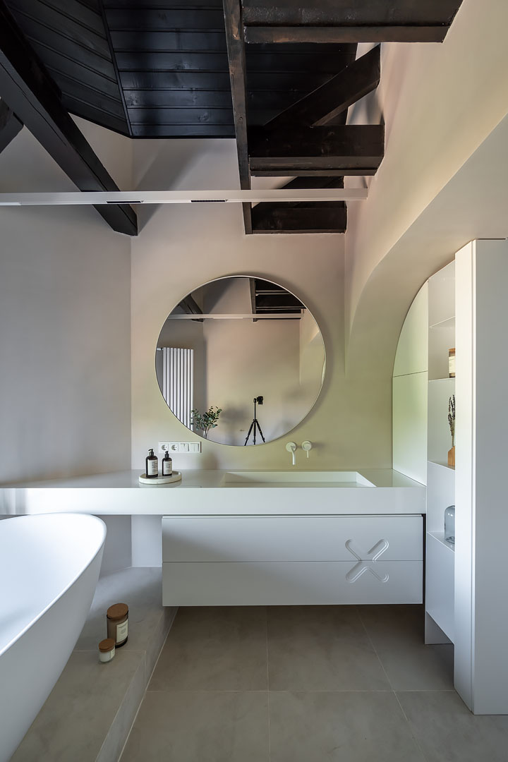
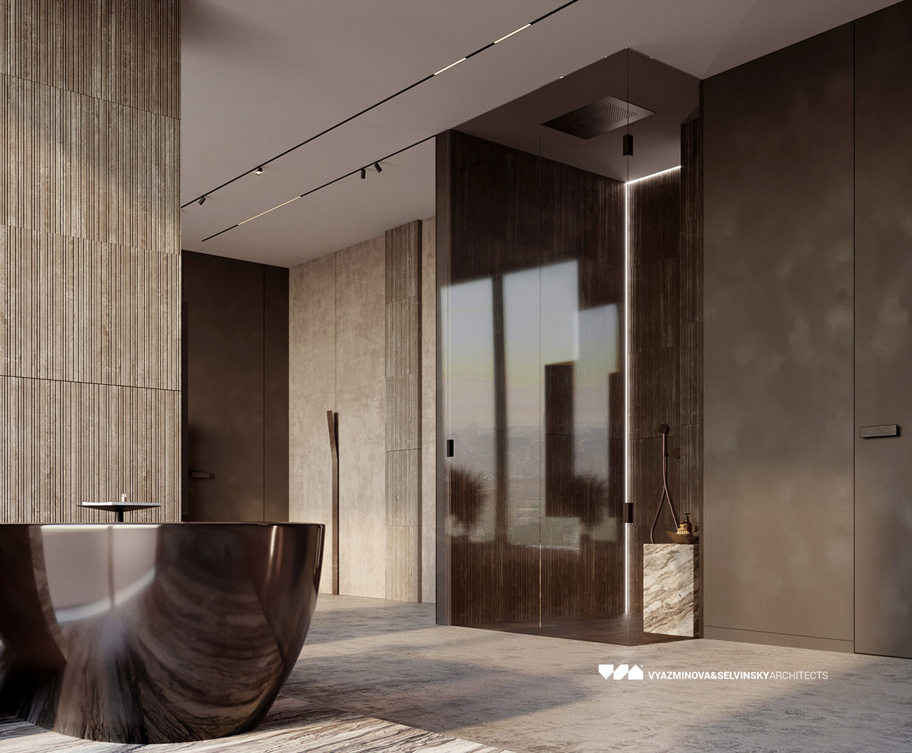
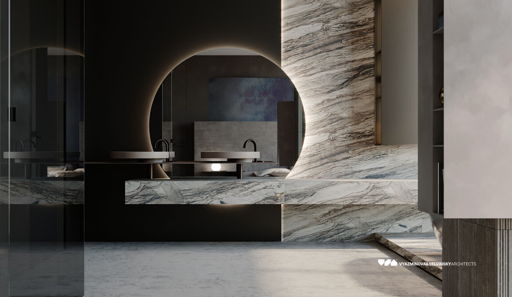
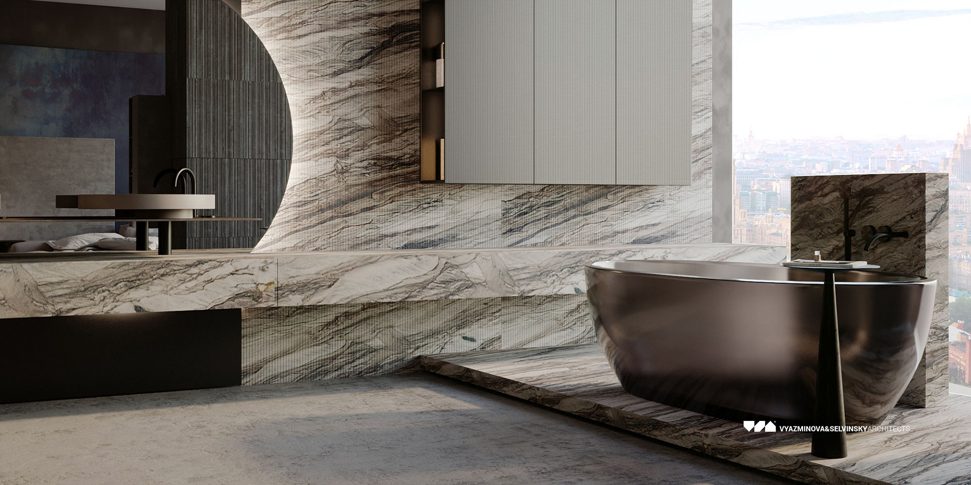
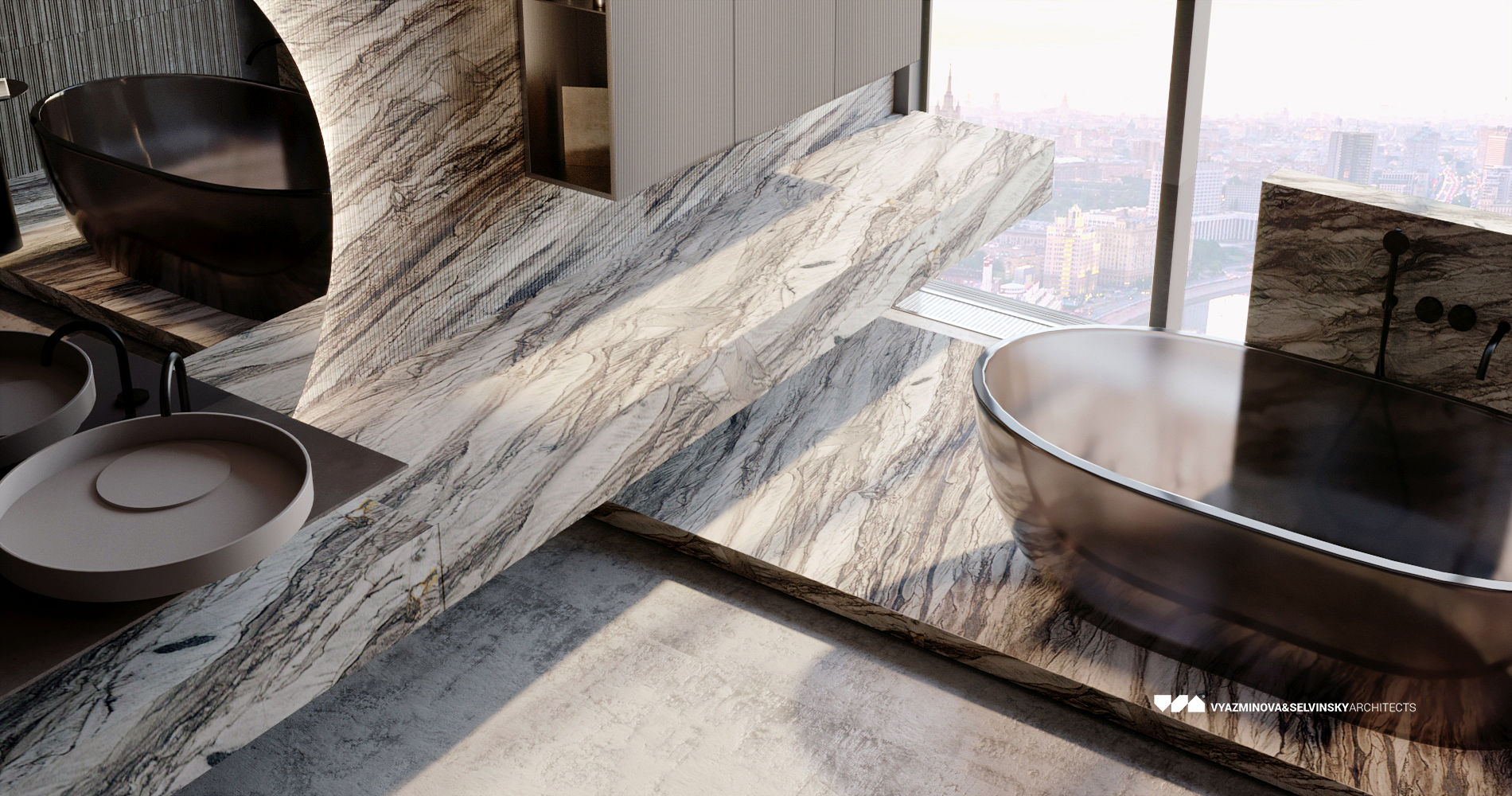
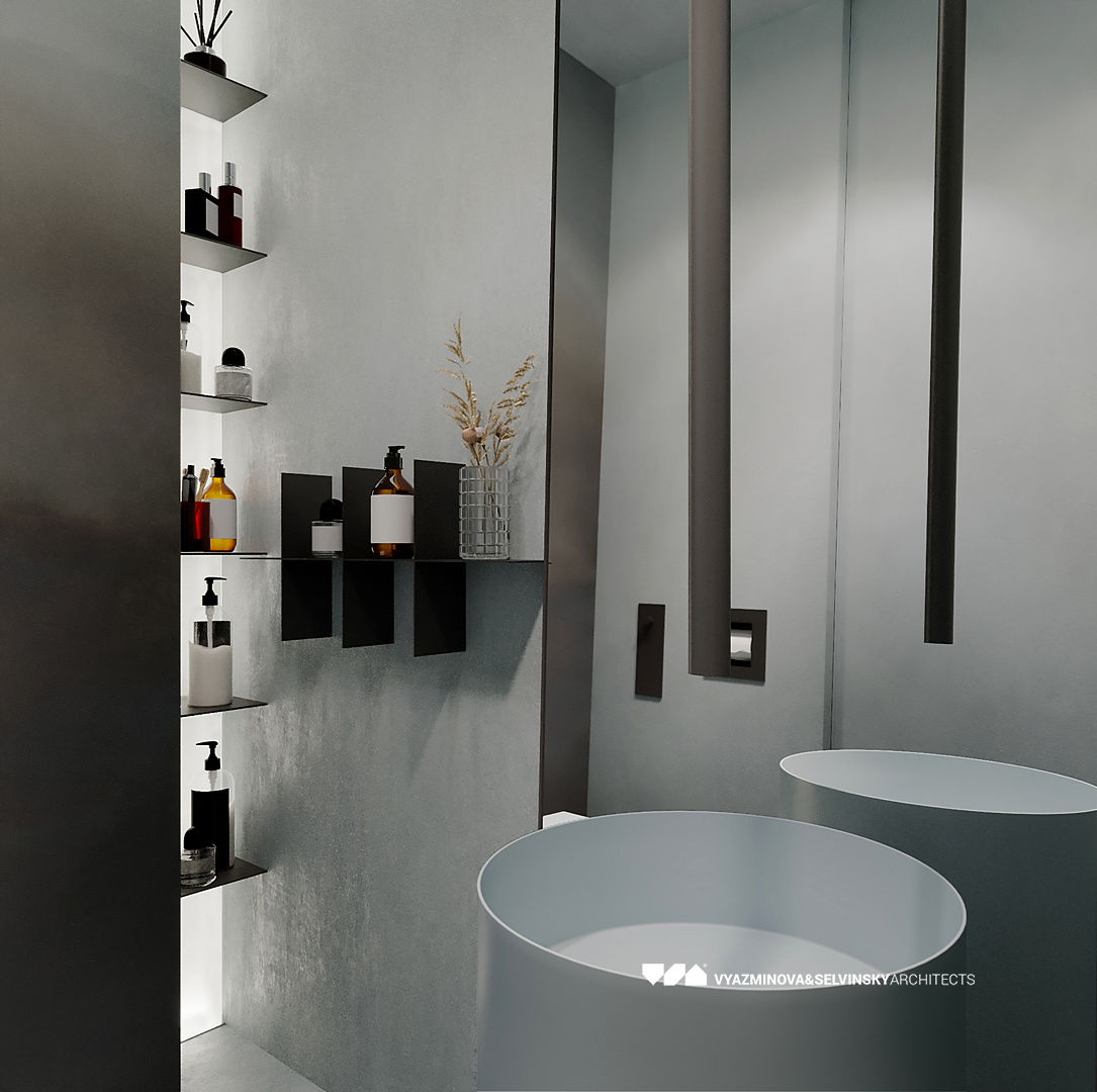
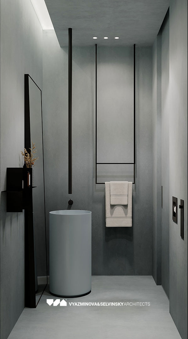
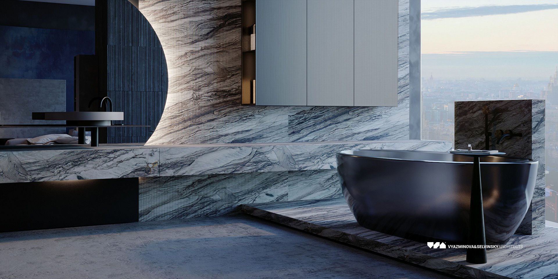
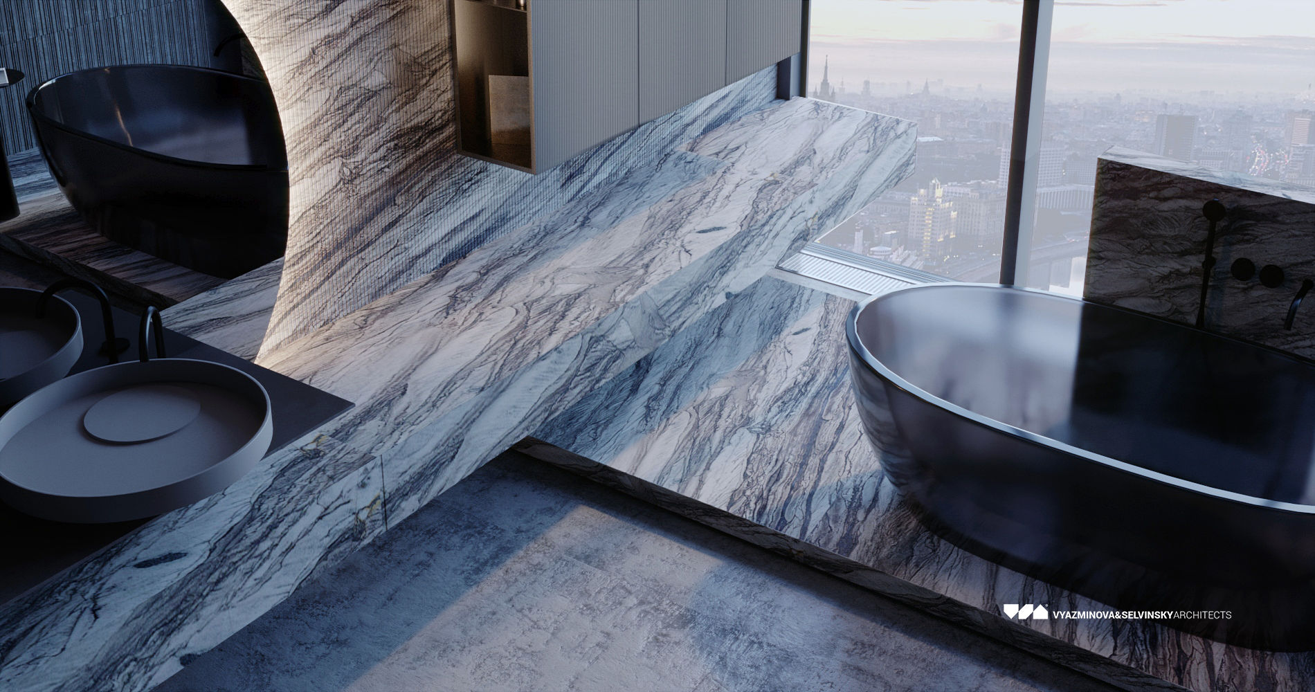
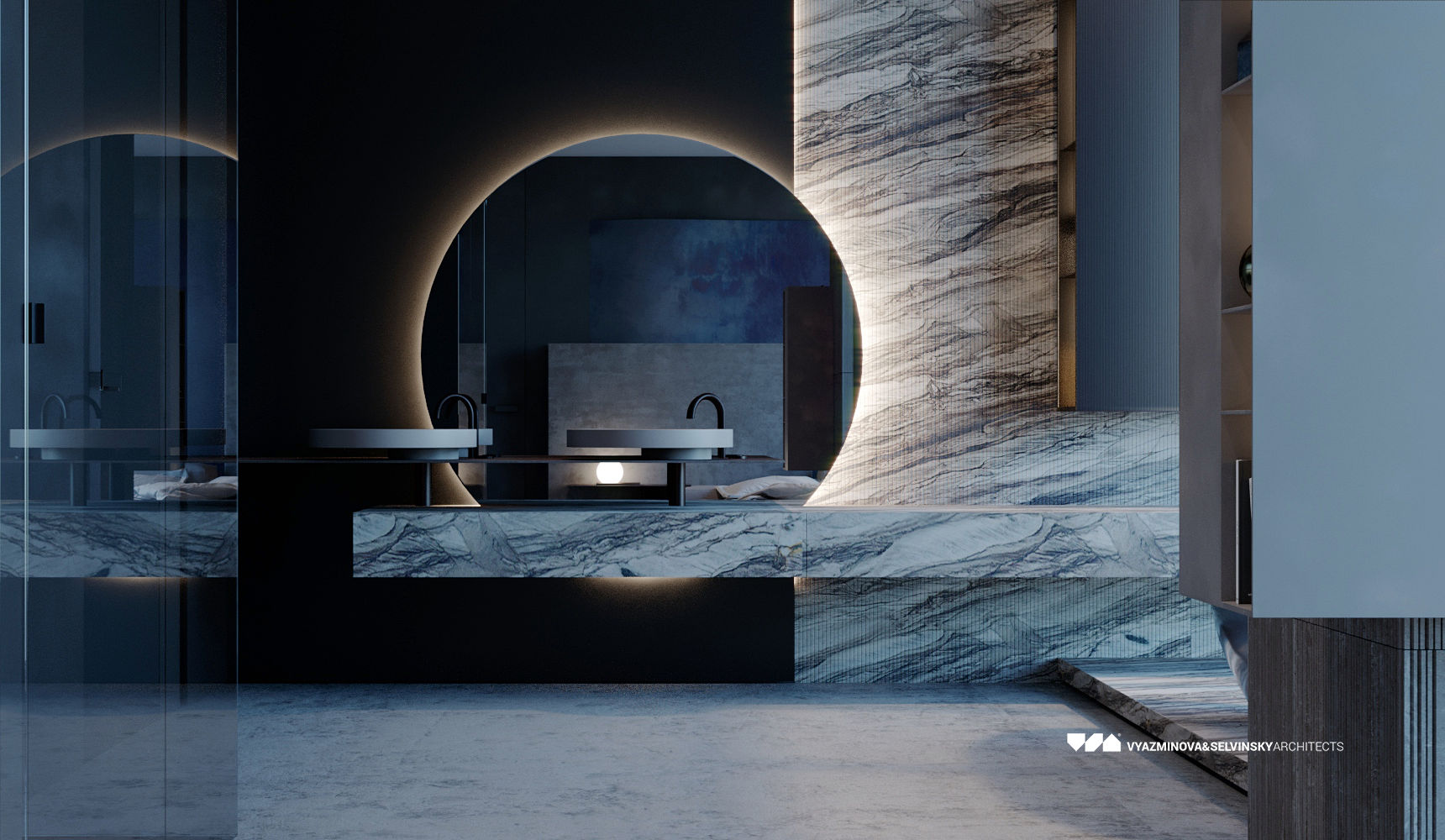
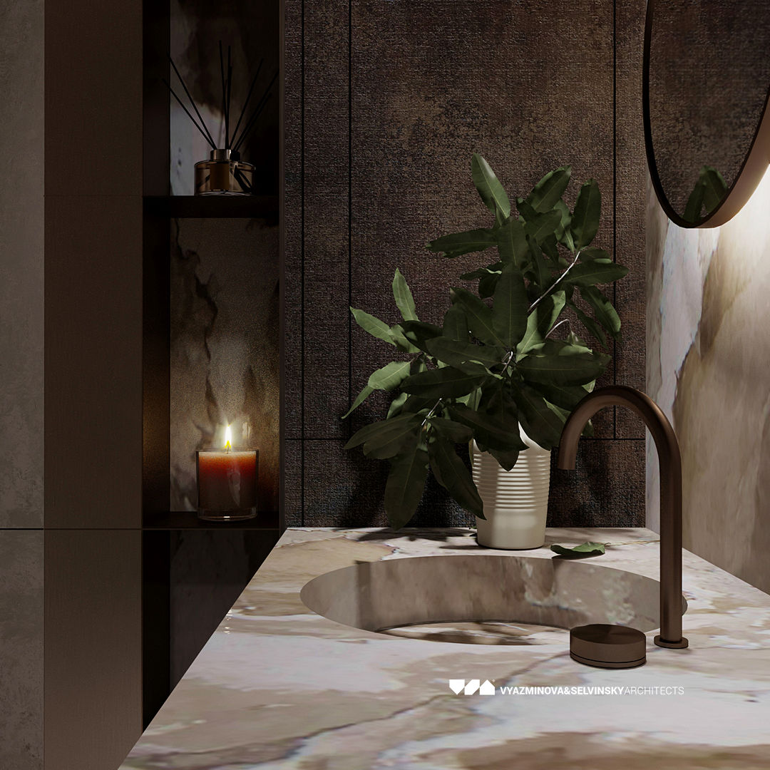
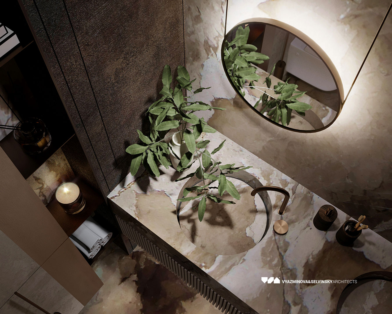
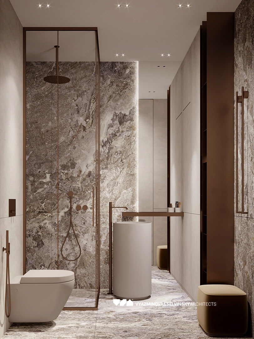
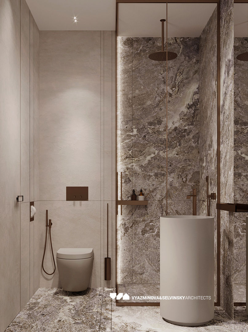
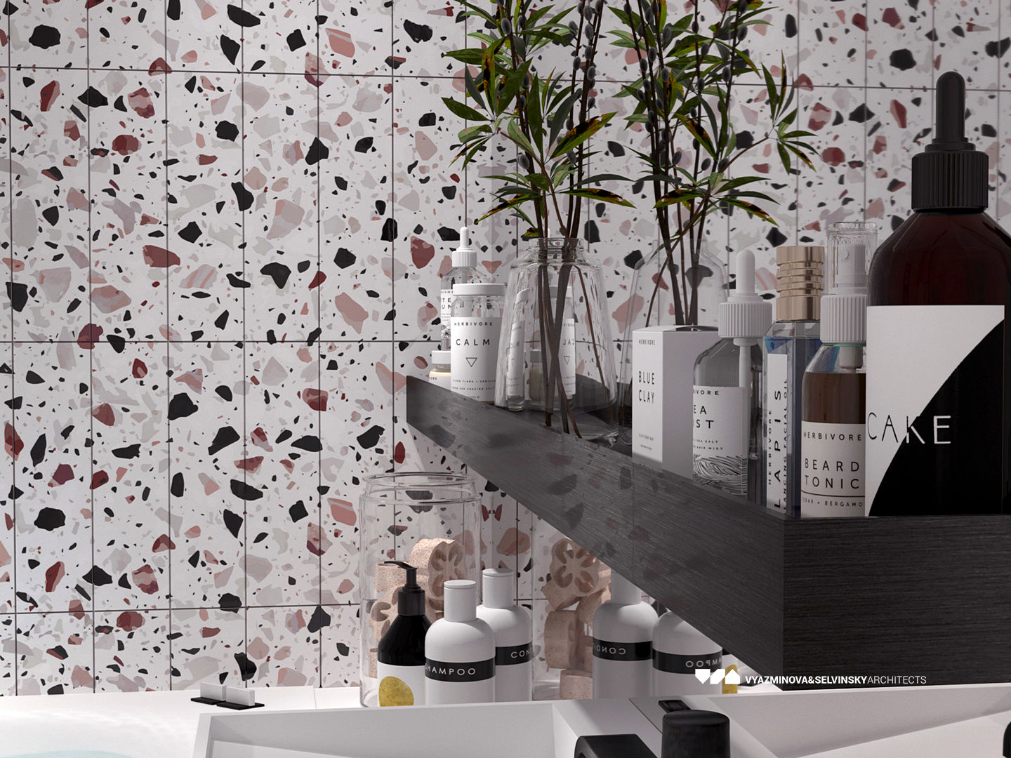
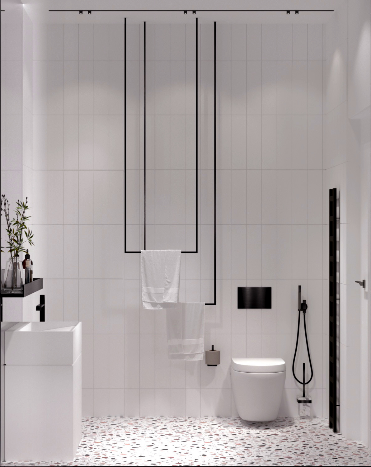
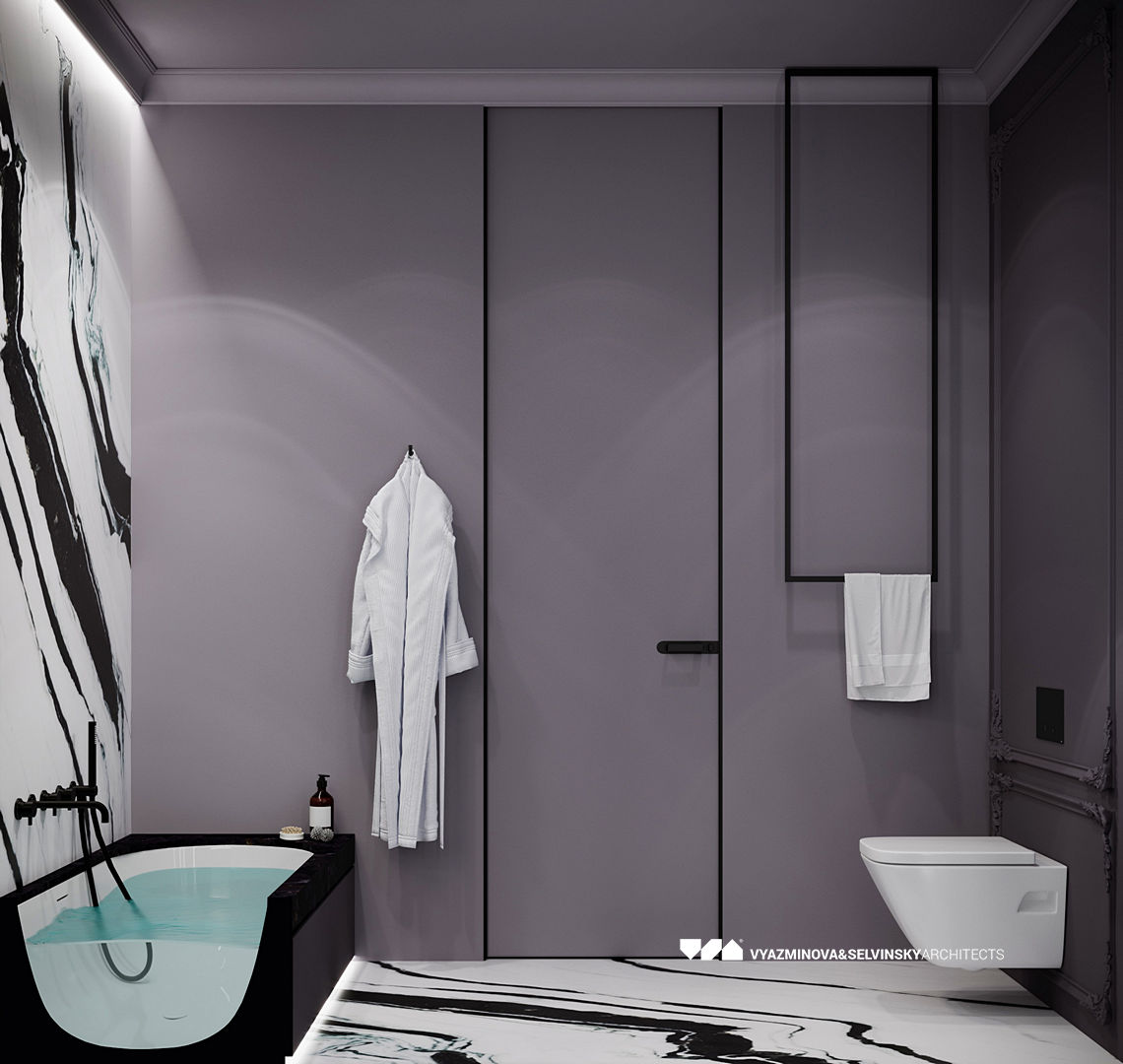
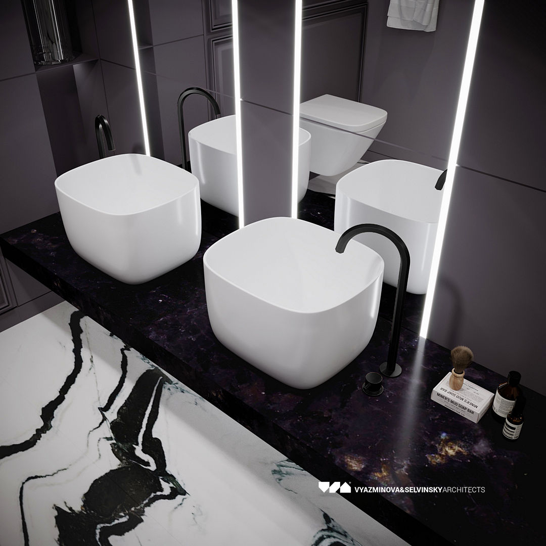
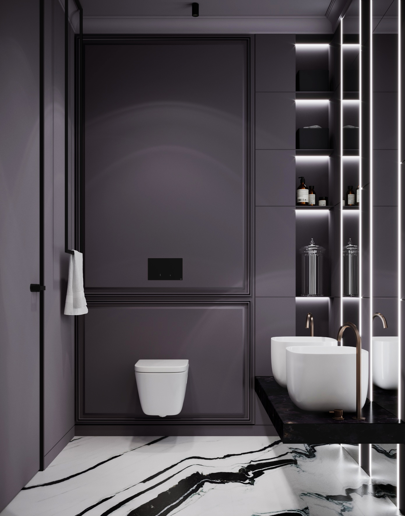
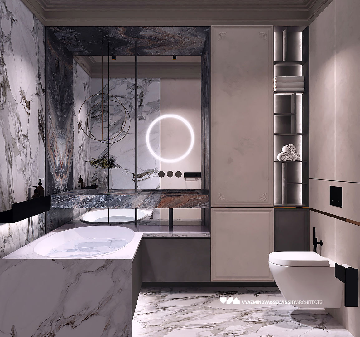
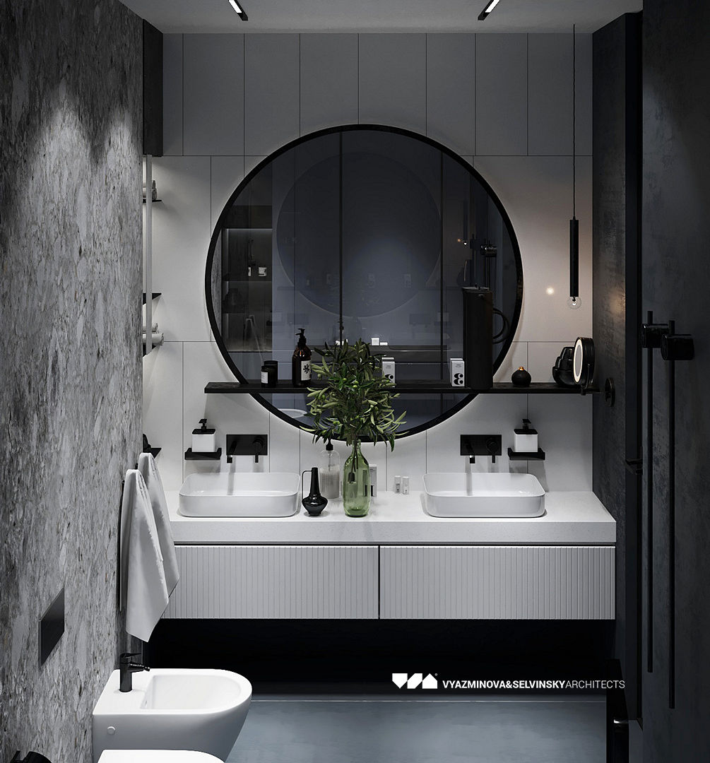
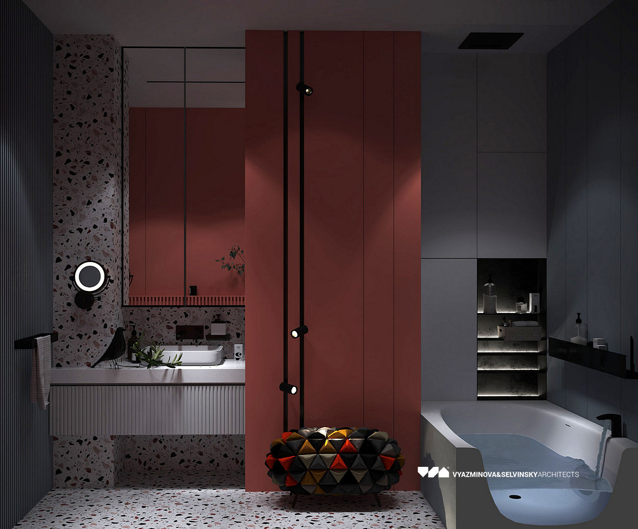
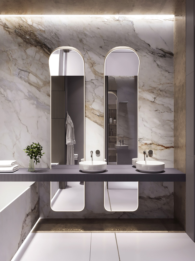
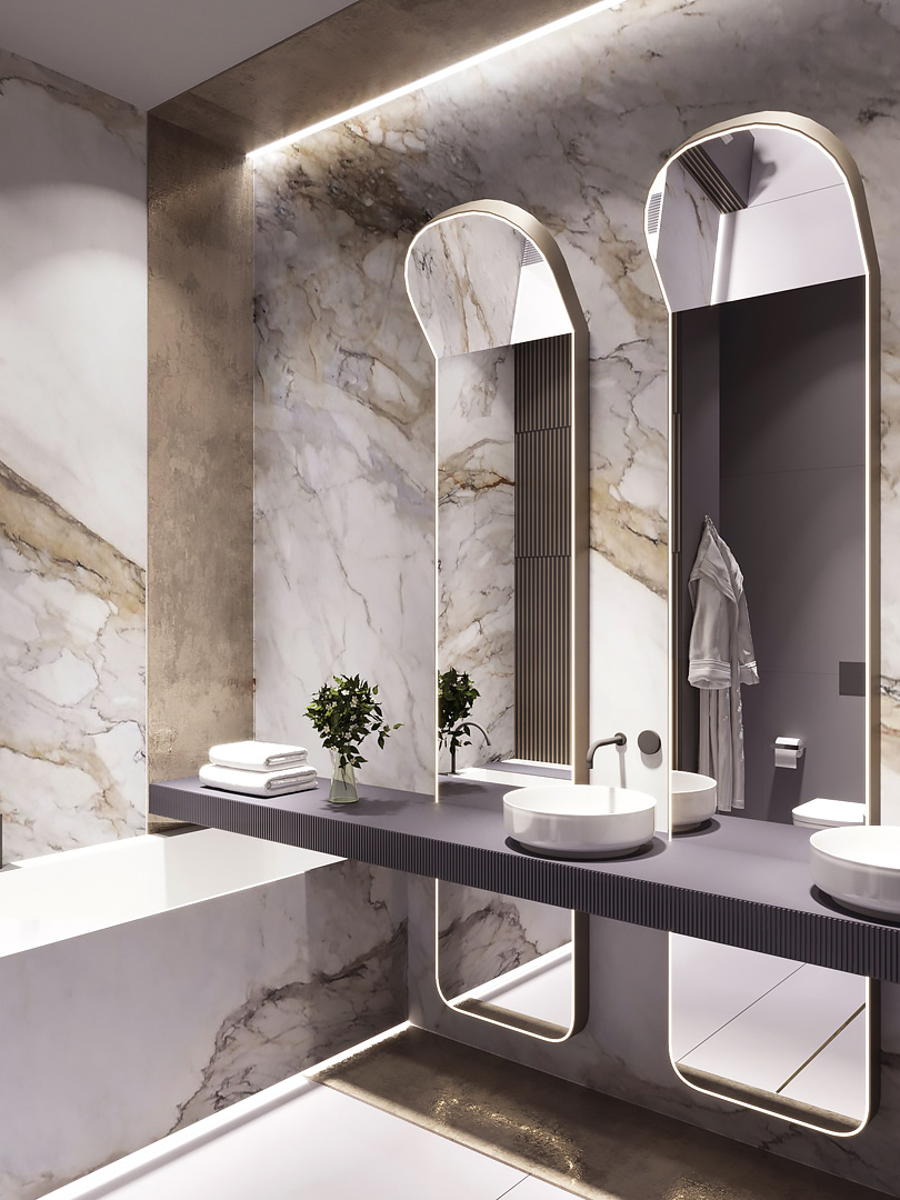
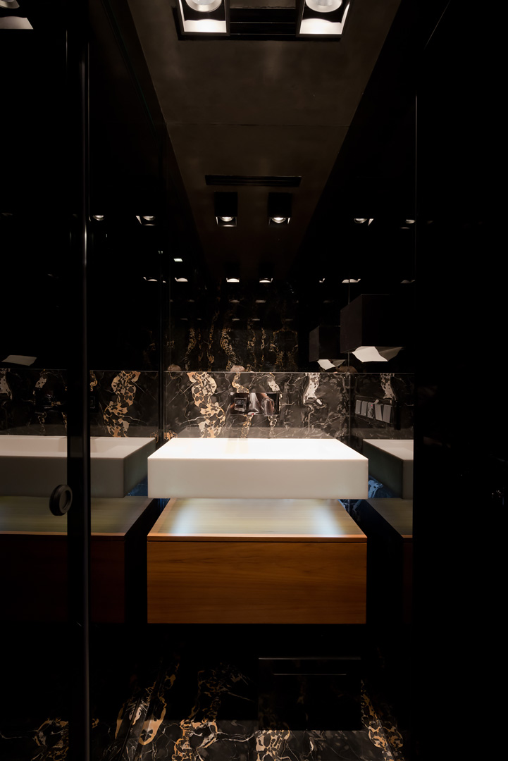
In the master bathroom, the strict lines of the sinks are balanced by rounded shapes, while the focal point is an unusual finish made of red travertine.
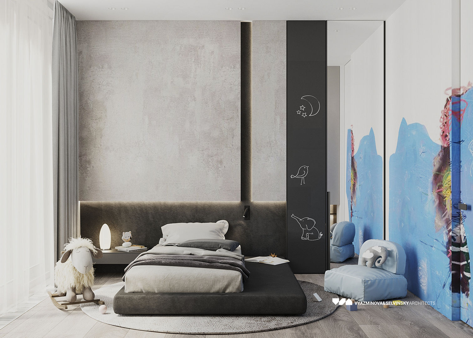
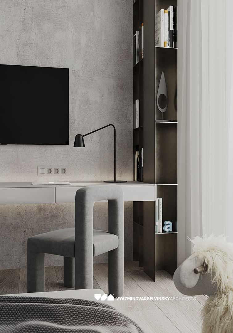
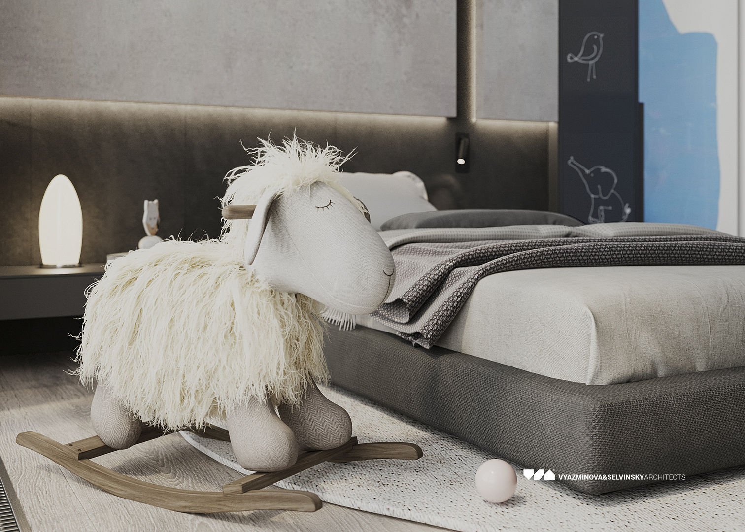
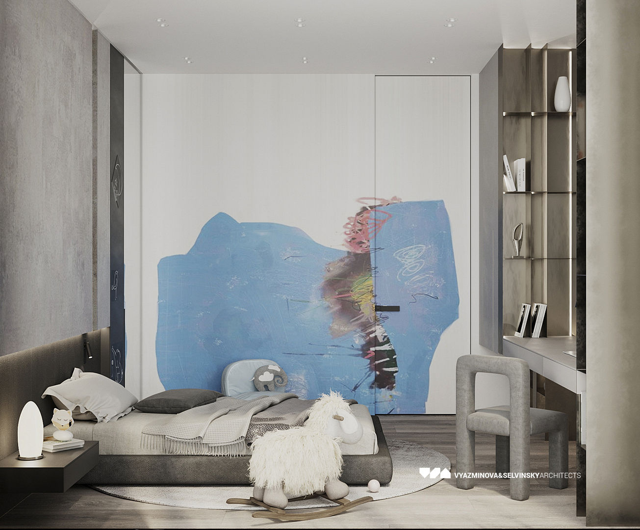
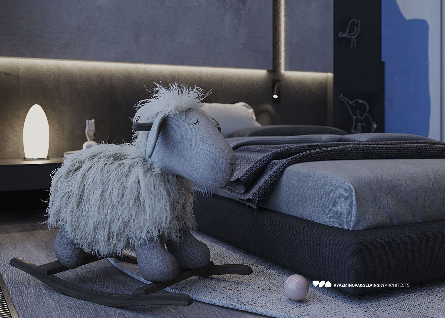
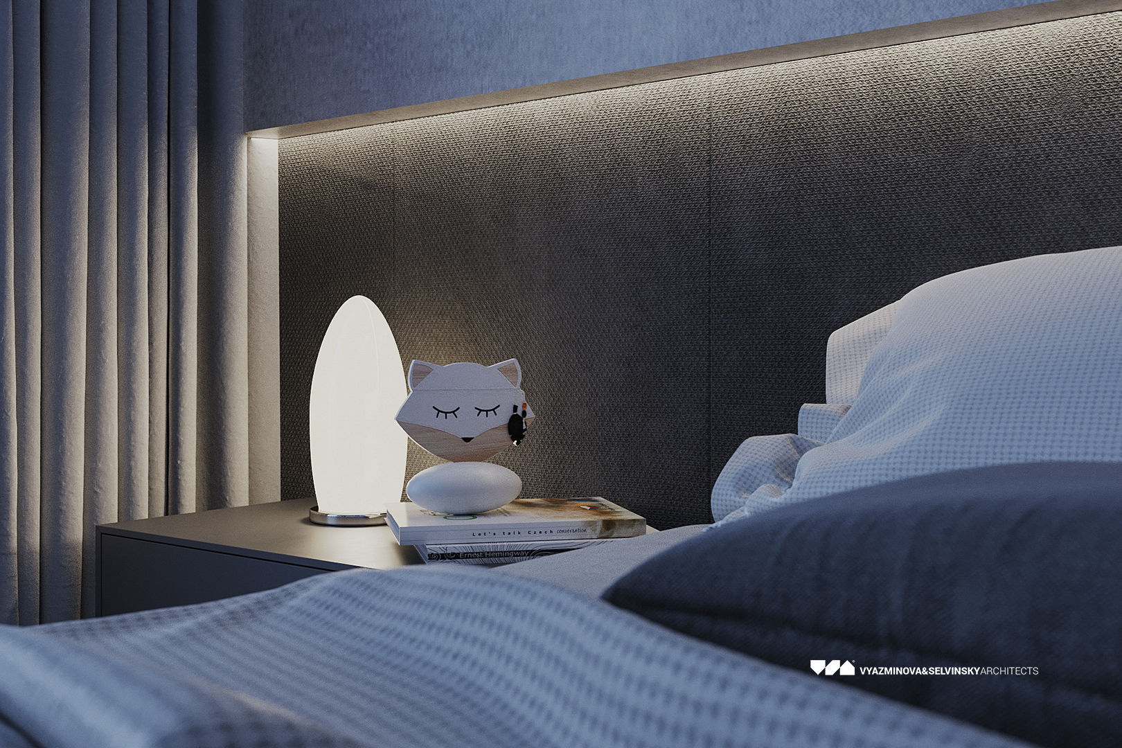
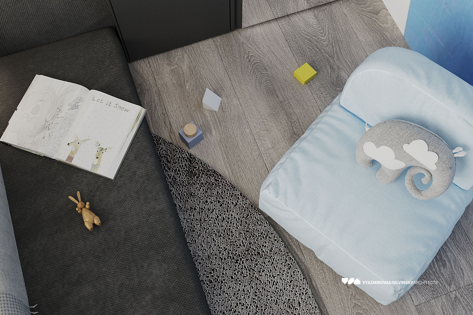
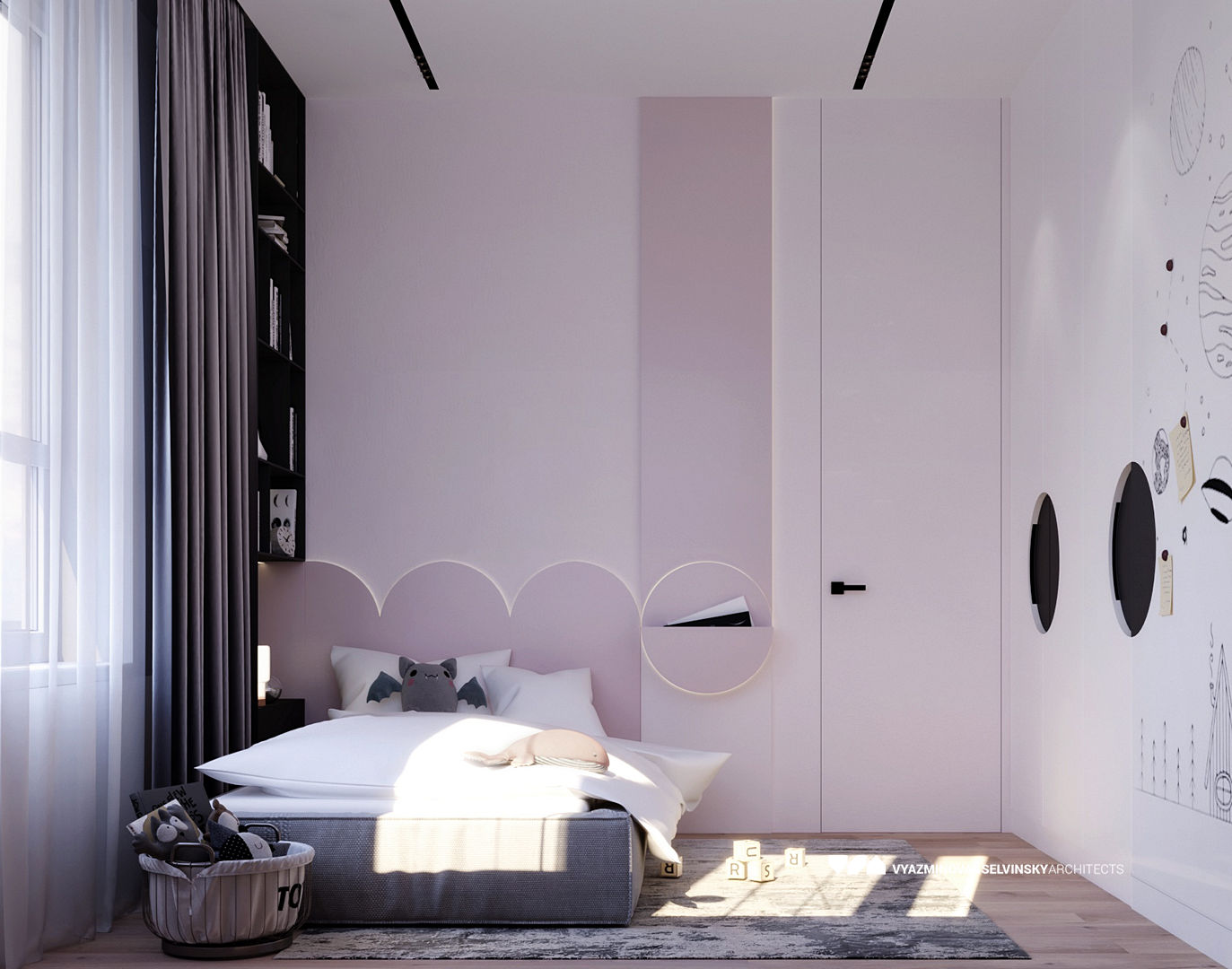
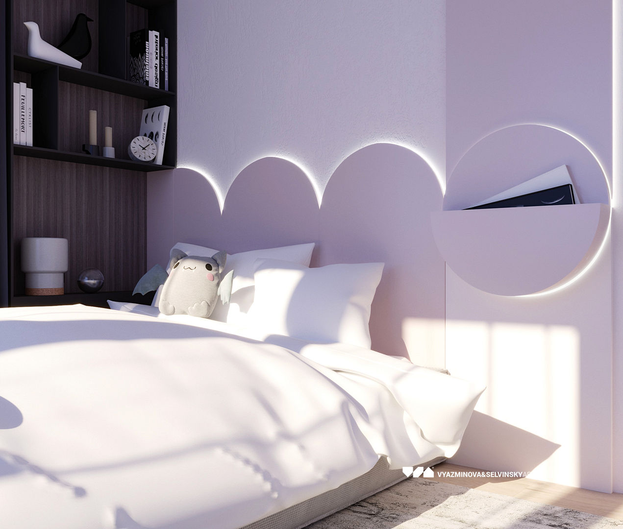
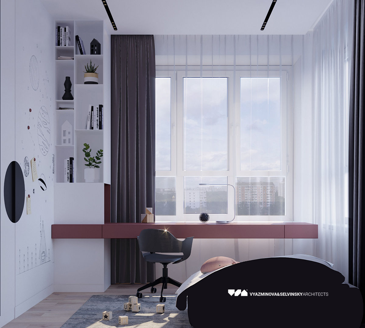
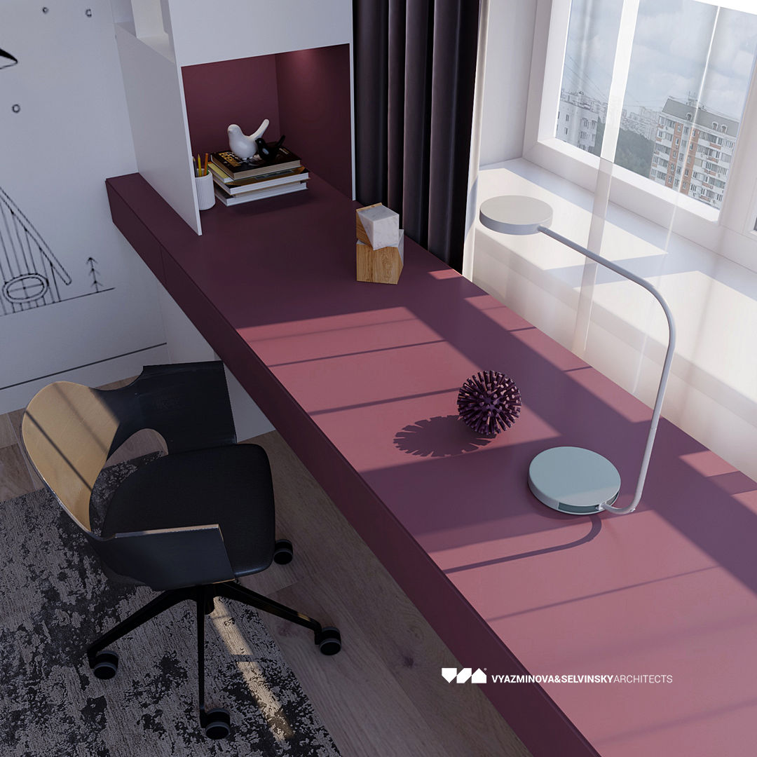
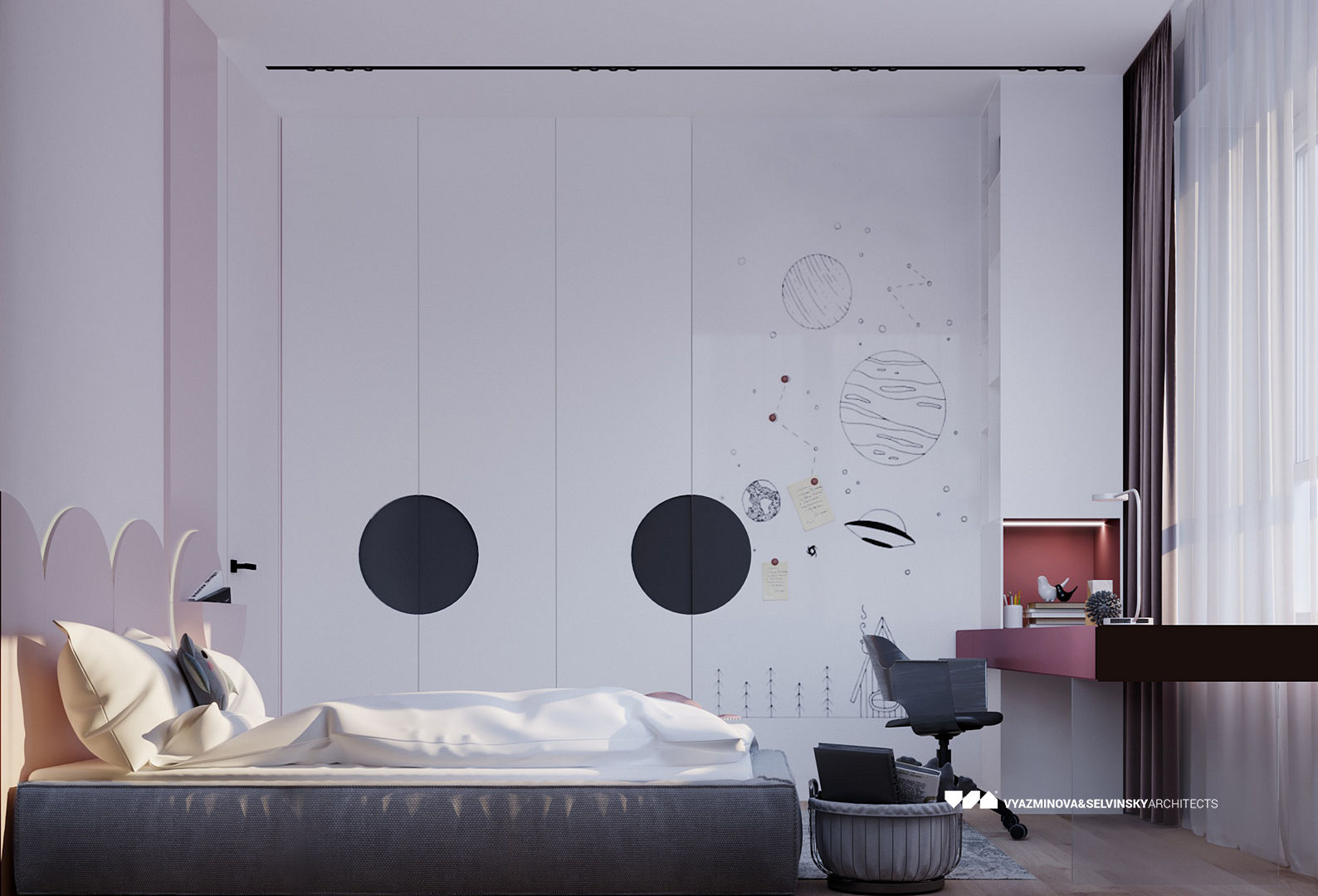
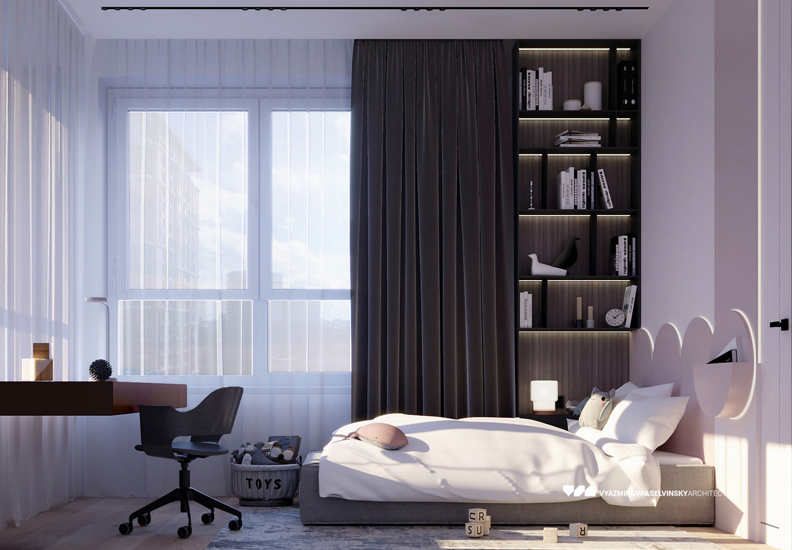
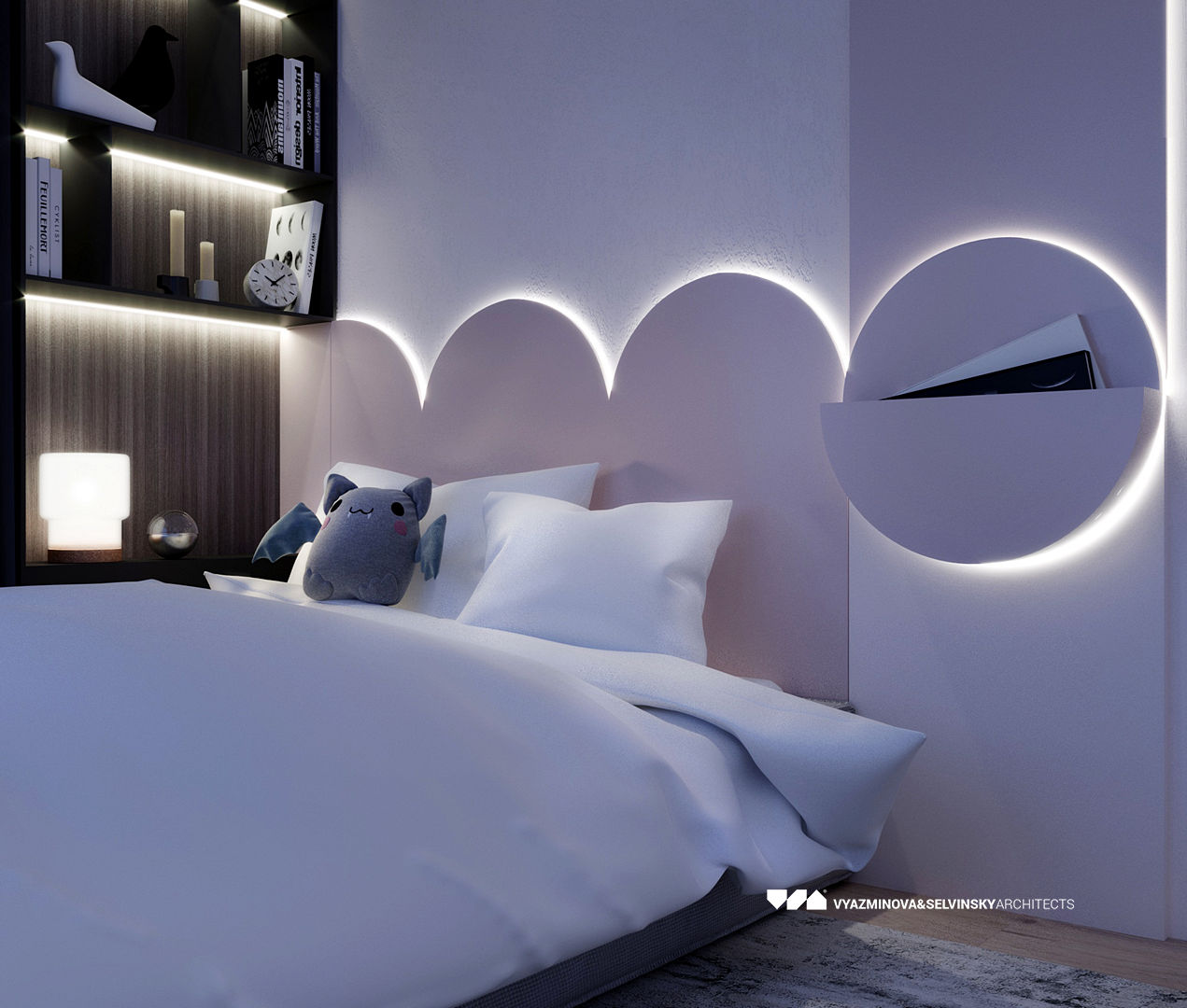
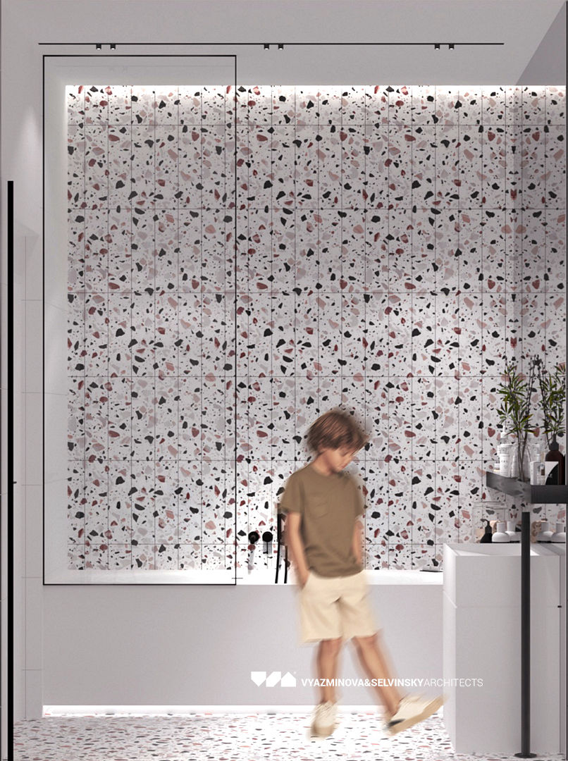
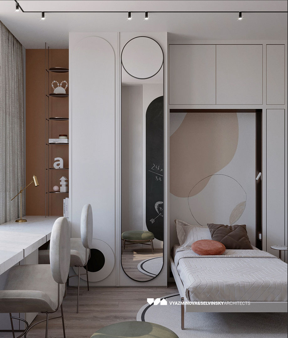
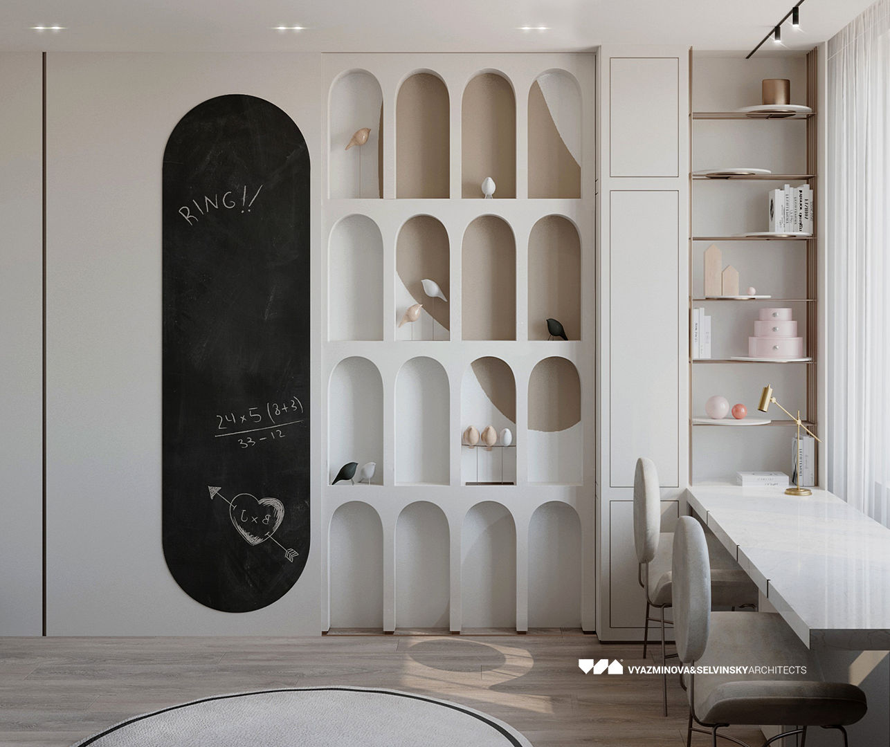
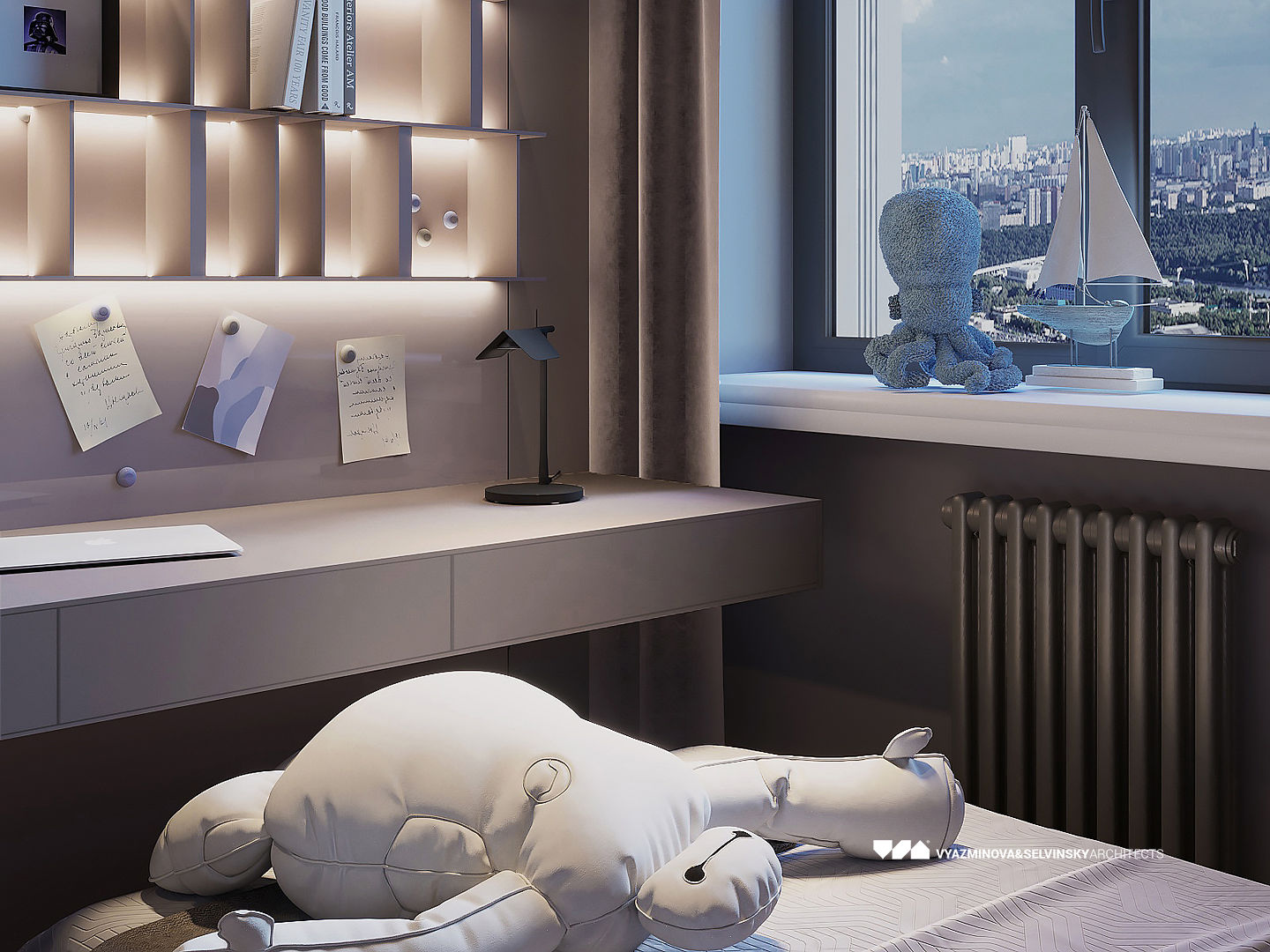
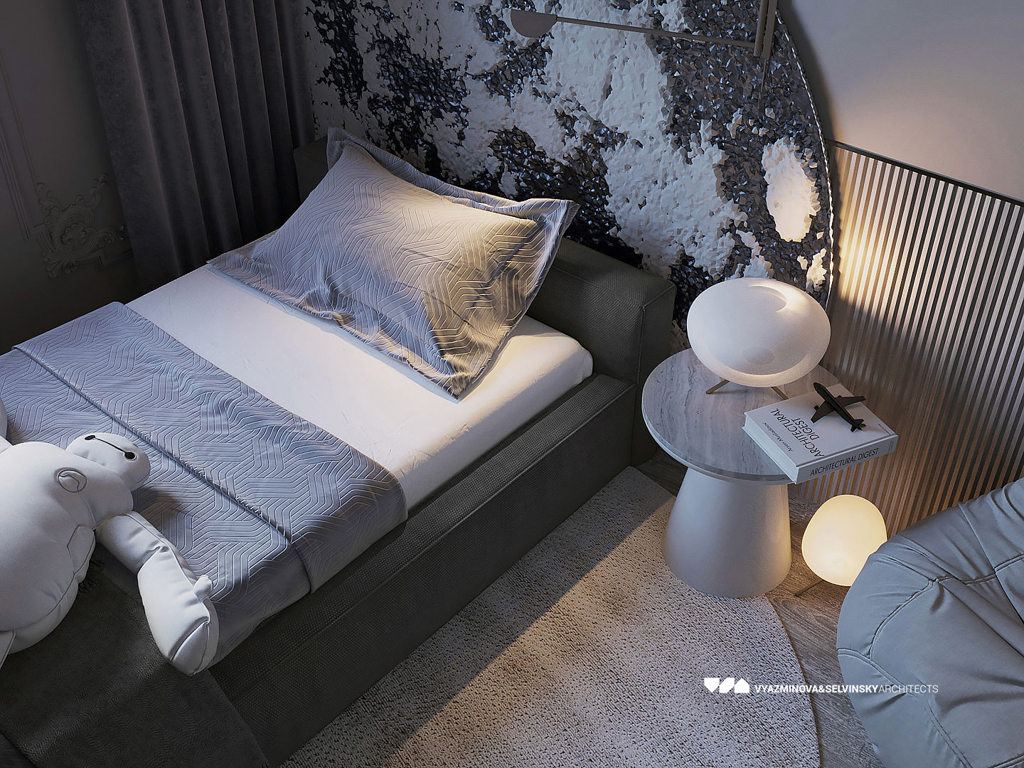
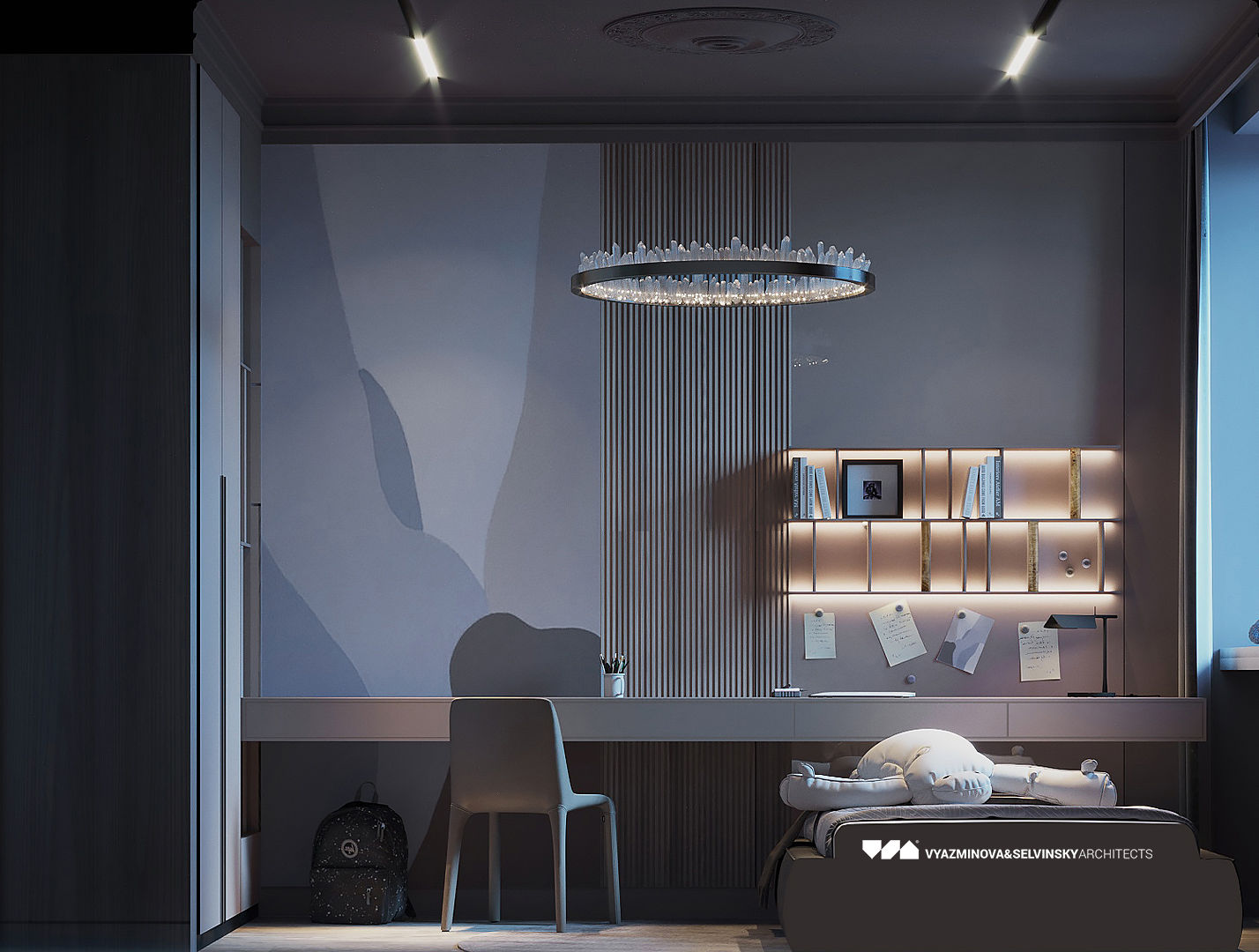
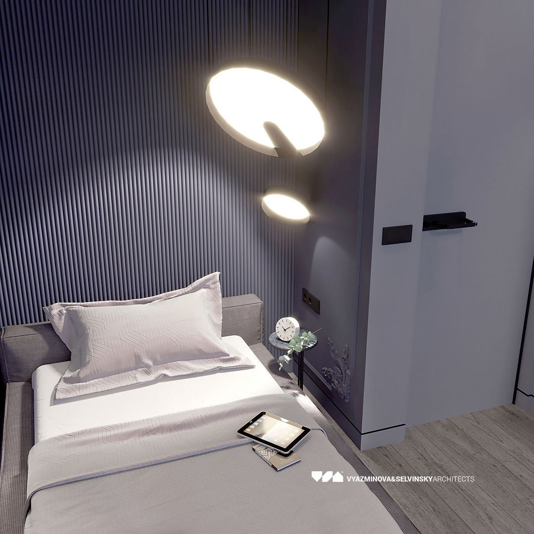
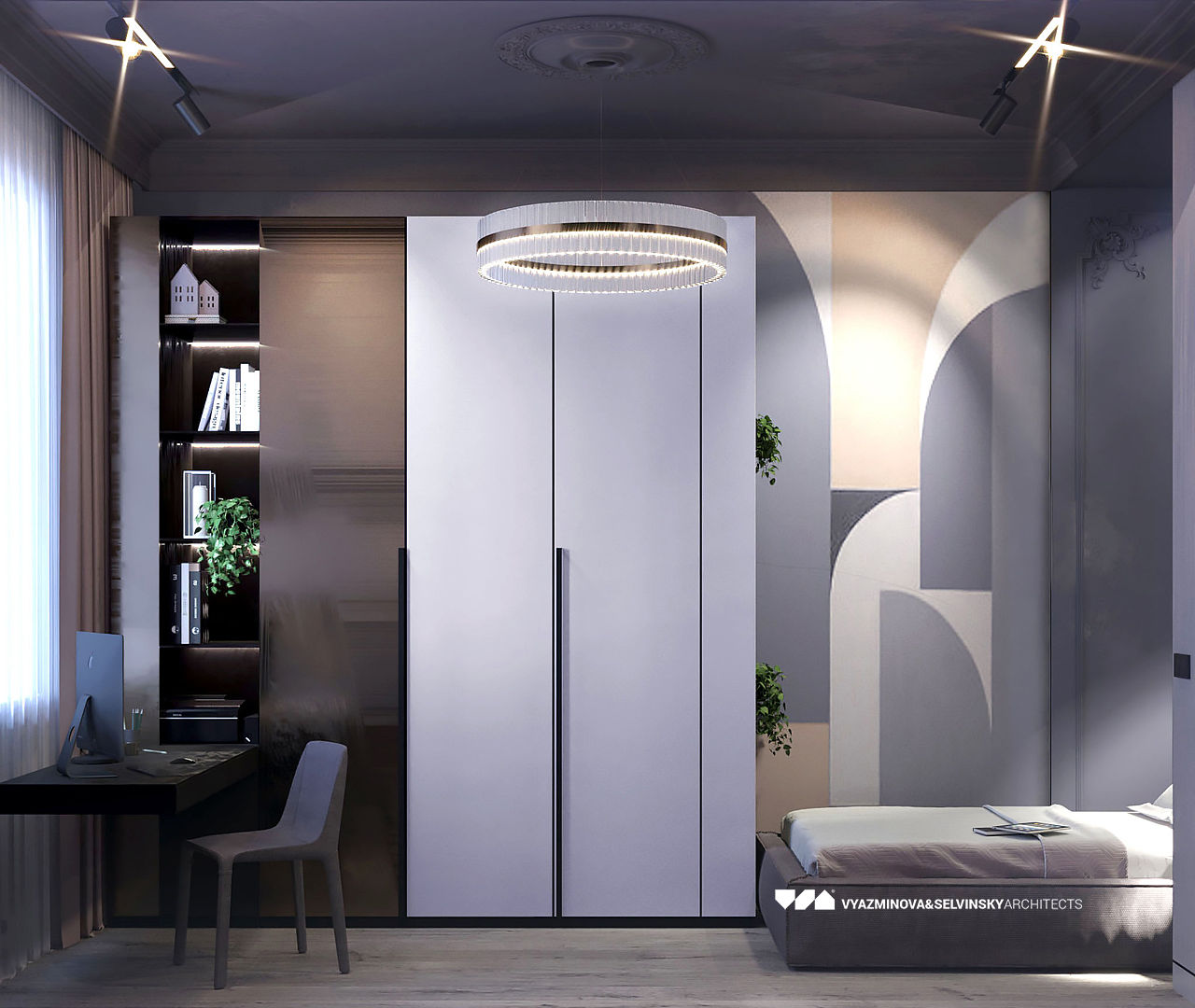
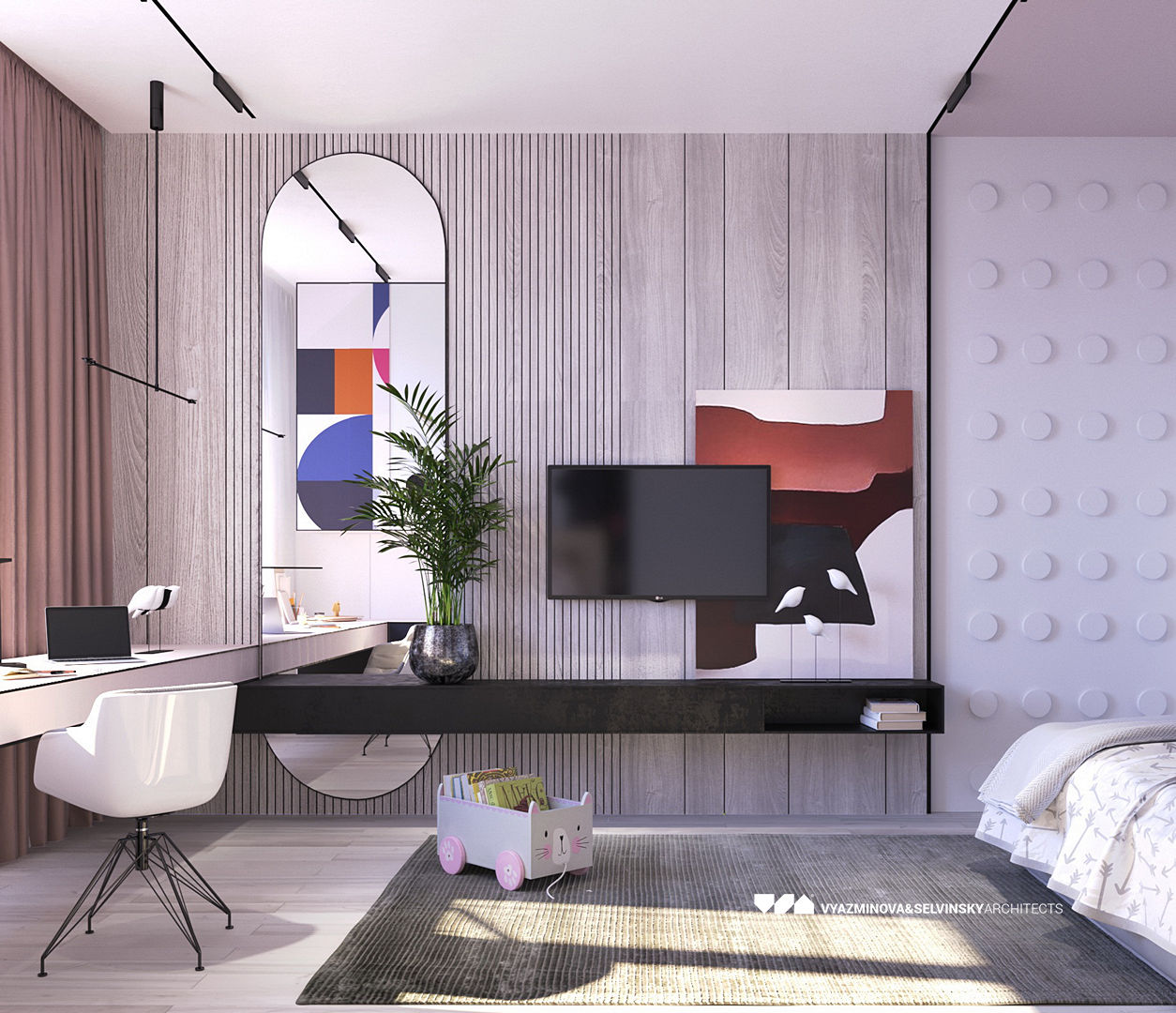
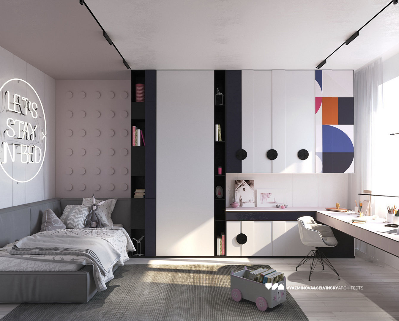
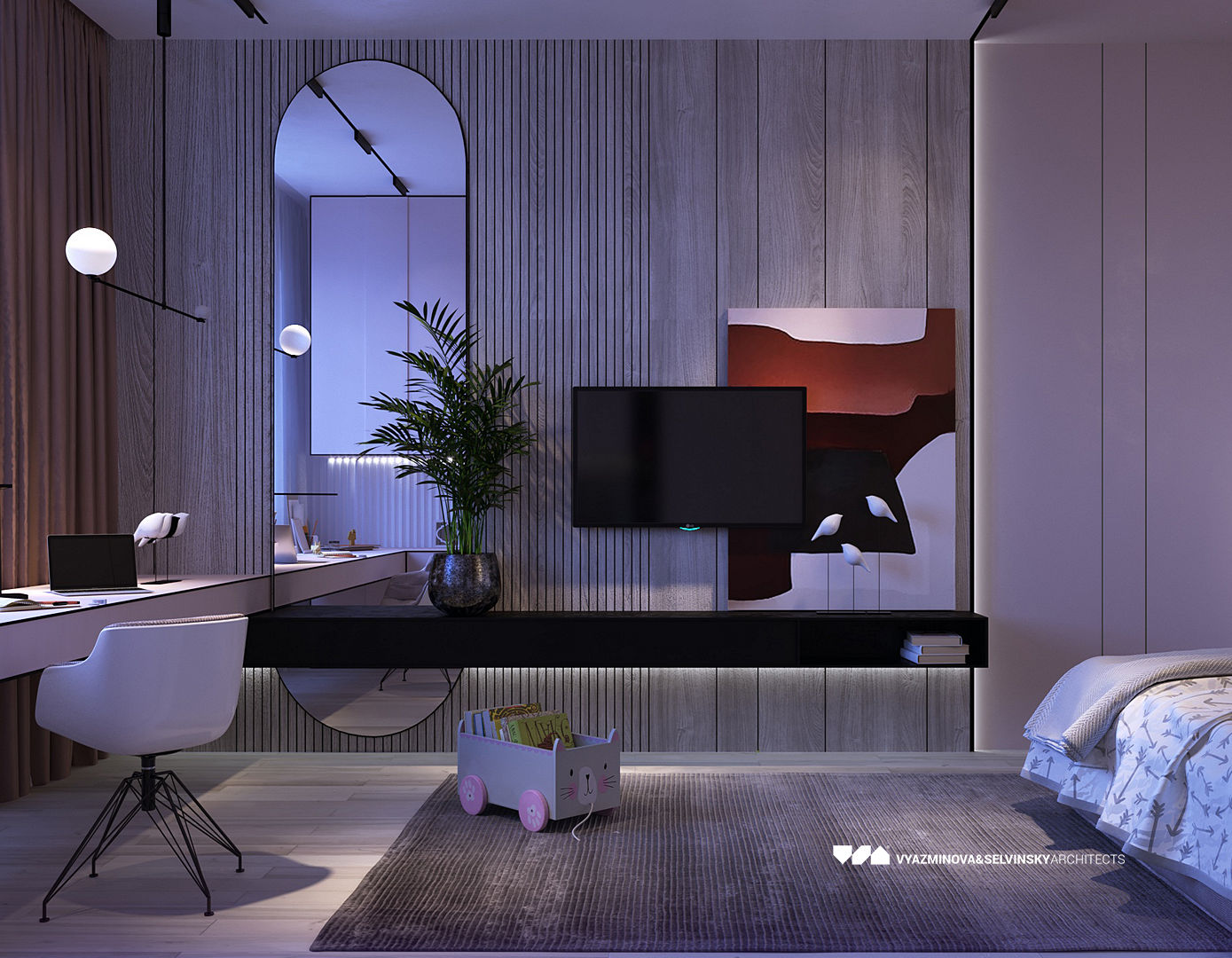
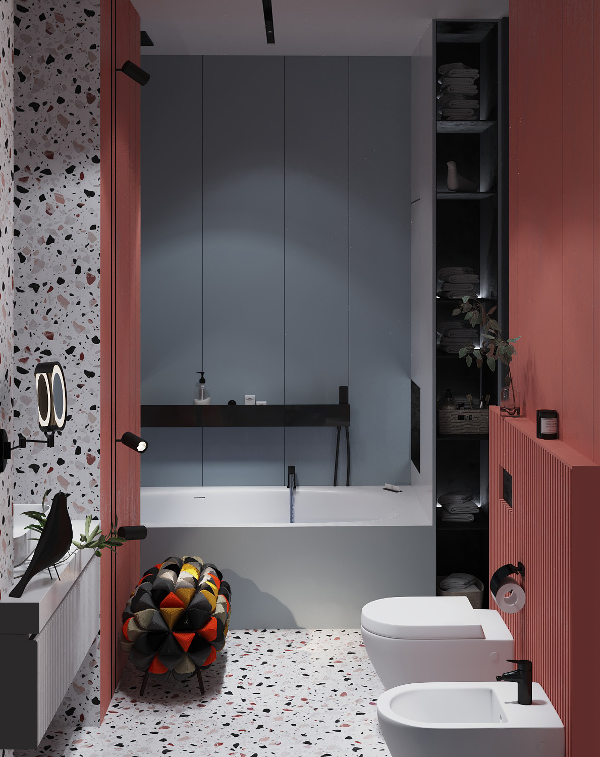
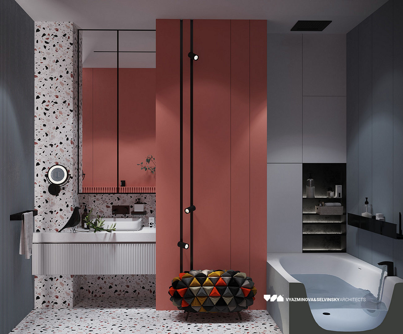
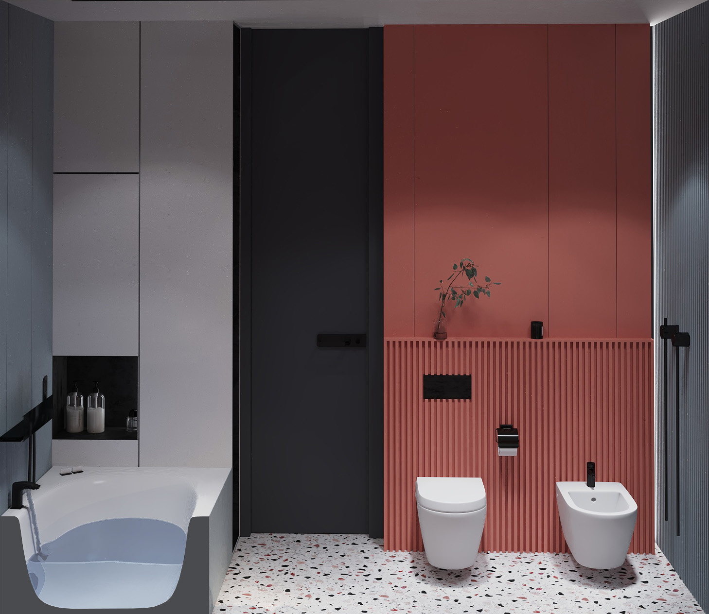
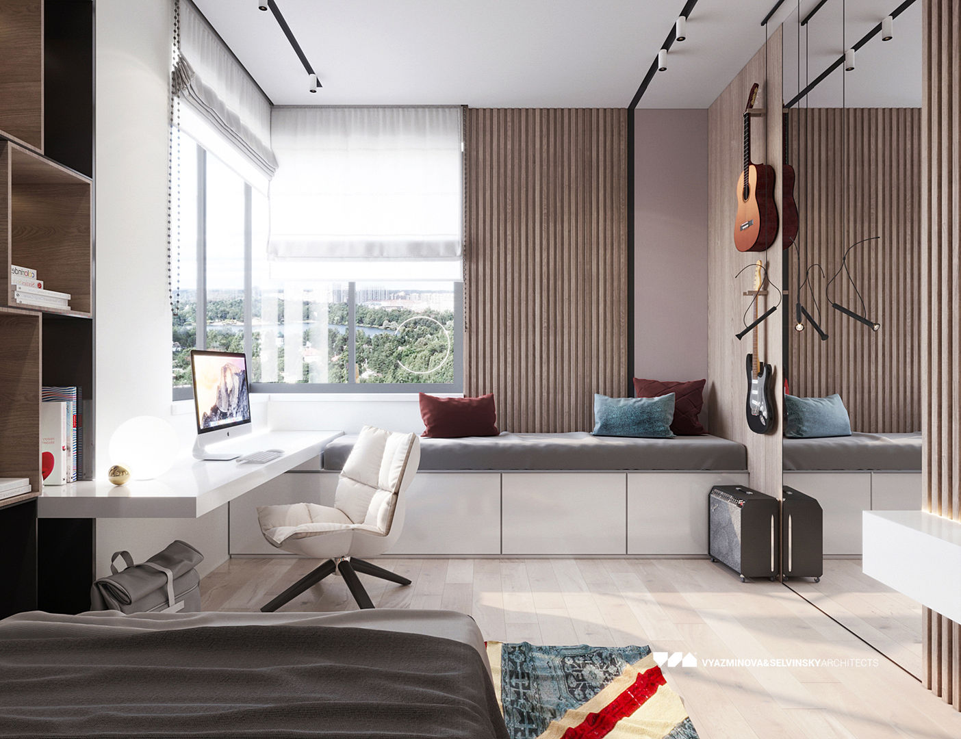
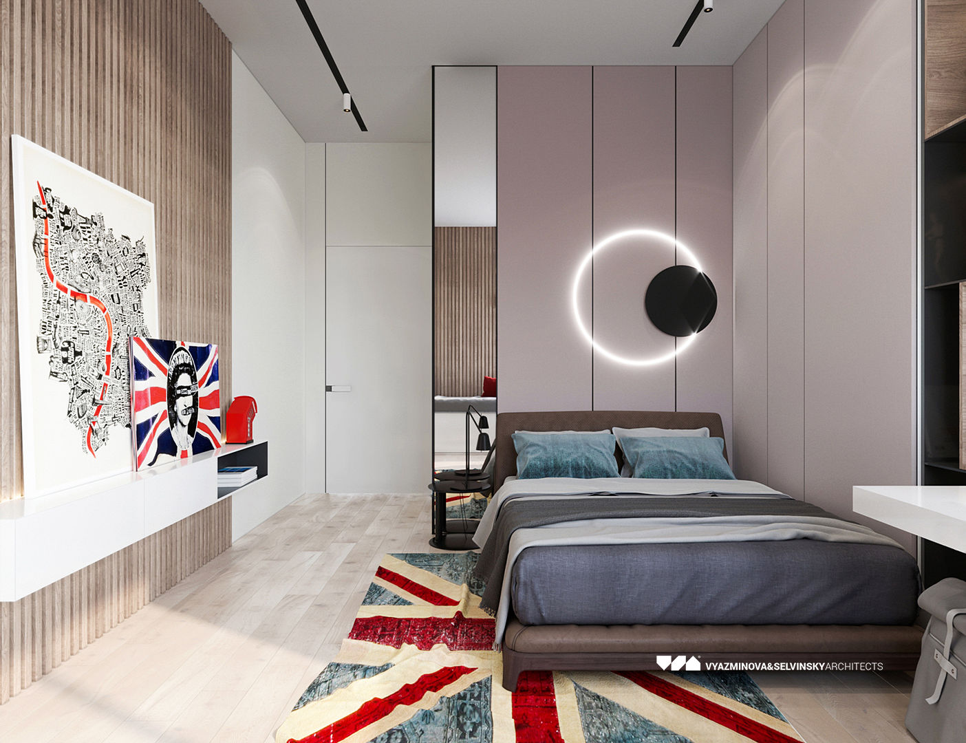
The project also includes a nursery for the couple’s future child. We deliberately avoid creating “children’s rooms in a children’s style,” preferring instead to design full-fledged spaces that grow together with their owners. The room has everything: a bed with shelves, a spacious desk, bookshelves, an armchair, and a projector. Even the bathroom continues the mood of the room — bright orange tones, playful dotted tiles, and even perforated ones, making the space unexpected and a little mischievous.
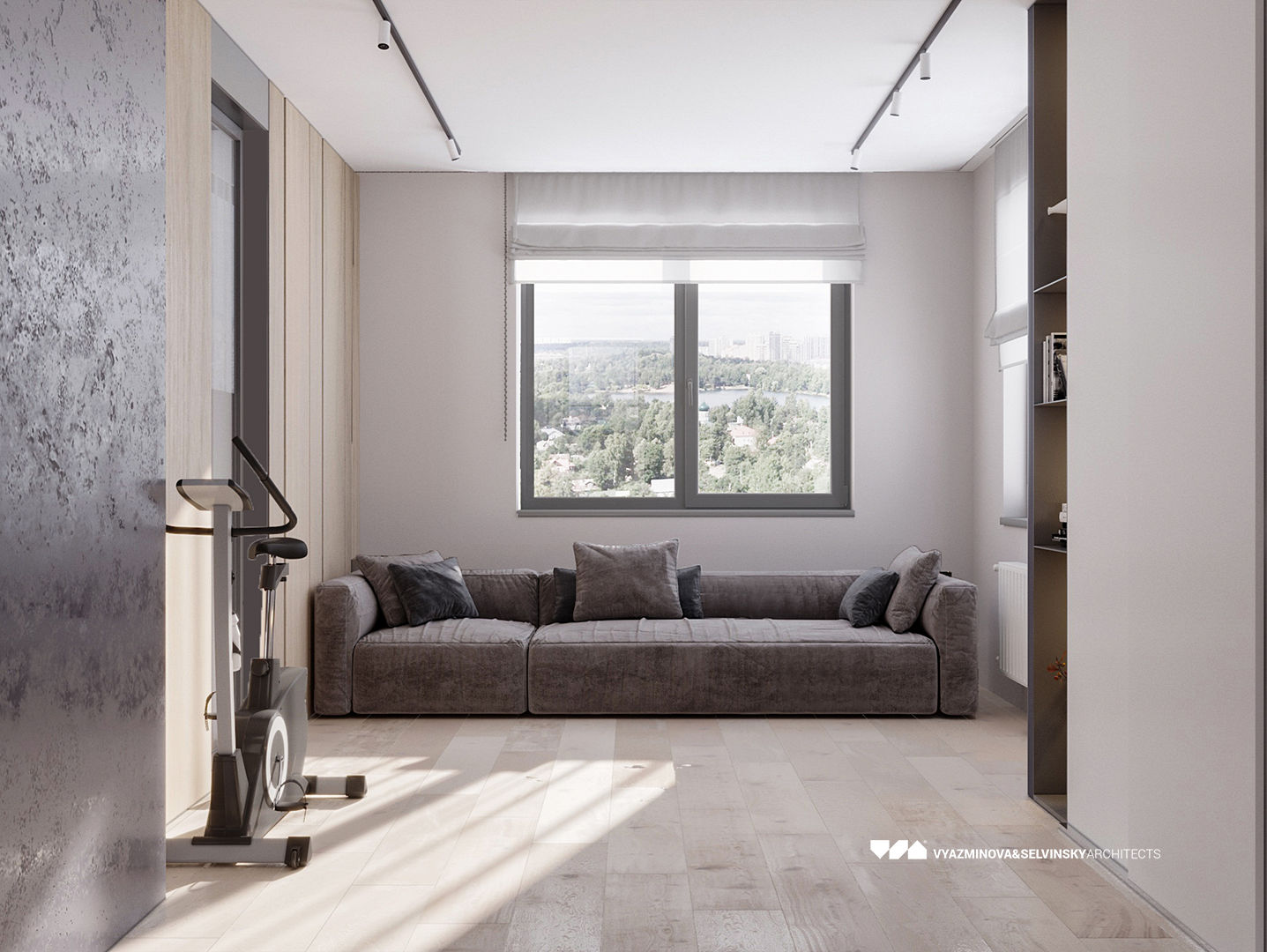
Another highlight of the apartment is the “zen and relaxation room” adjacent to the living room. It continues the overall philosophy of the interior — a place for peace, meditation, and recharging.
The project became a true reflection of the owners’ lifestyle: dynamic people who appreciate the beauty of detail, love tea ceremonies, reading, and yoga practice. The apartment harmoniously combines contrast and balance, innovation and comfort, strict aesthetics and the warmth of home.
In interior design there are two extremes, two specifics – designing small spaces, and designing large ones. In the first case, it is important to use every available centimeter, to know the basics of ergonomics and anthropometry, to use the possibilities of standard designs, and to be able to come up with transformable pieces of furniture. This is where folding beds, folding workstations, sliding doors and shelves, carousel shelves and much, much more come to the rescue. In contrast to this task is the opposite – the organization of large rooms. This is where all the principles that apply to small spaces cease to work – even the largest furniture can get lost.
This new, already the seventh issue of peredelka.tv with our participation is somewhat of a challenge to us as specialists and illustrates just such a case….
Creating large spaces requires a completely different design philosophy, where beauty emerges in the void.
The situation was further complicated by the fact that we have a lot of space but a limited set of functions. There were some specific requests related to Heroes’ love of songs and karaoke, but the main objective was to create a place of attraction for the whole family and guests. And, as said above, the difficulty was to harmoniously organize the large attic room, in which any, even the largest furniture can “drown”.
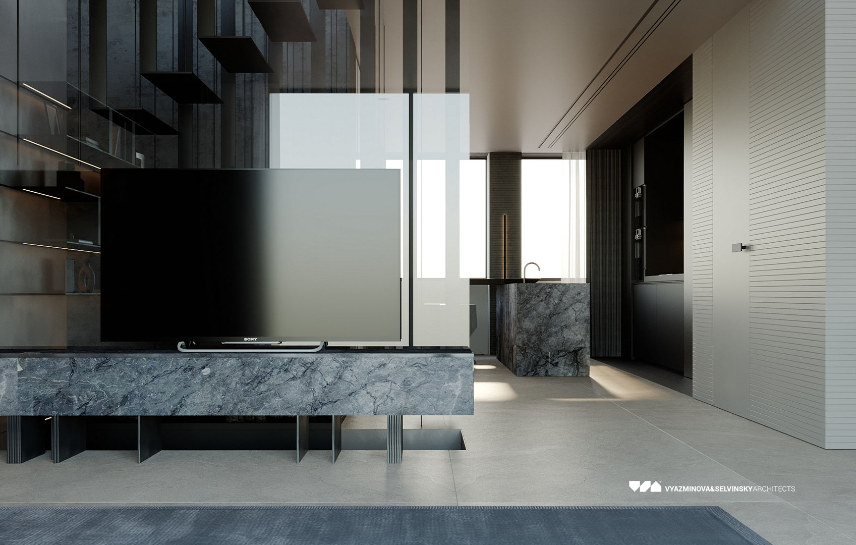
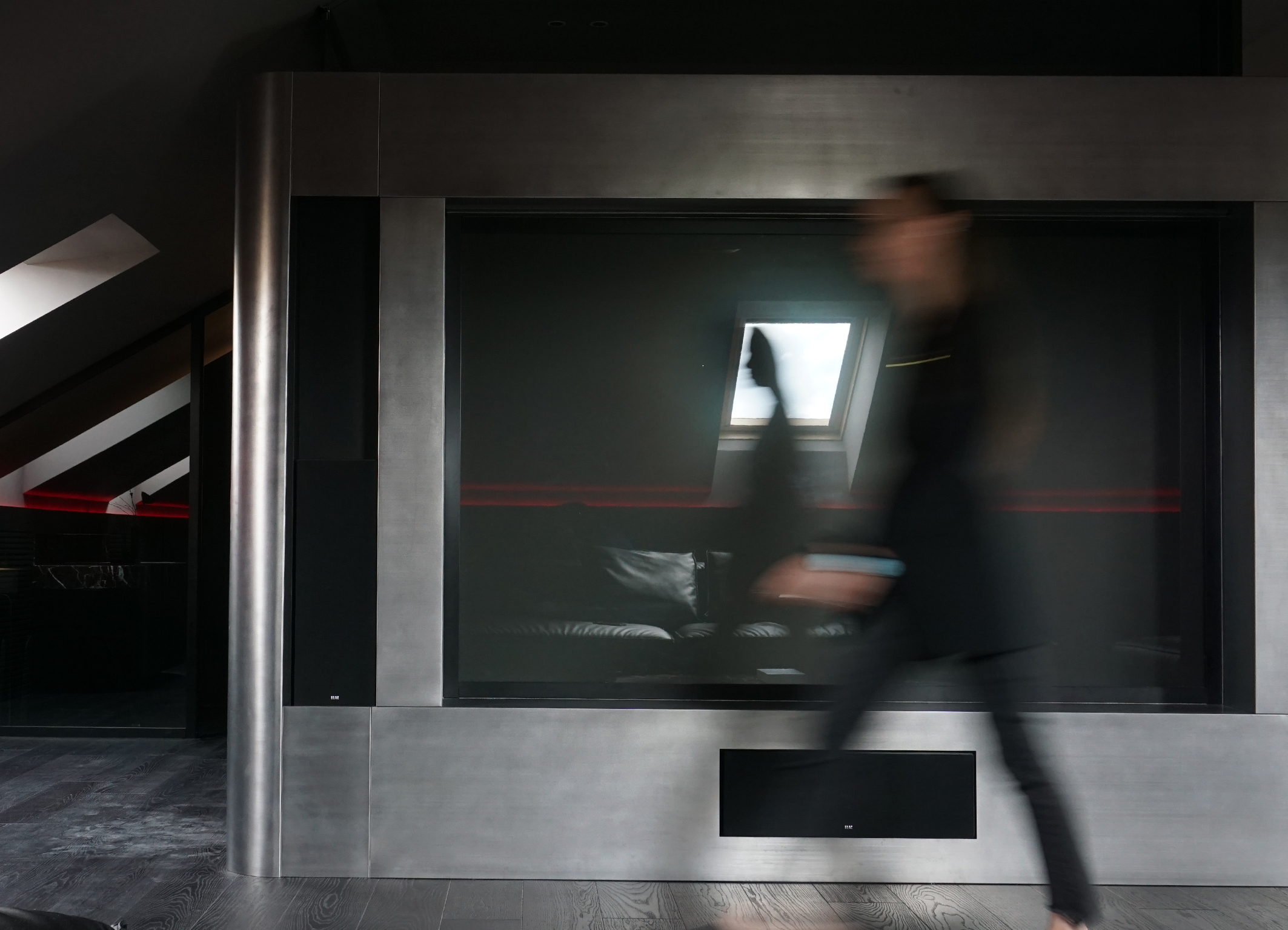
The central core of the project is a structure with an integrated projector screen. It is designed as a partition, not reaching the ceiling, with a large glass opening leading to the staircase. A motorized retractable screen mechanism is installed in the upper lintel of this structure. The solution with a glass opening to the staircase was not invented by chance: a narrow, dark staircase in this case receives additional lighting, visual depth is created and the room looks even bigger. But the most important effect is in the rear projection film glued on the glass stained glass. This film allows you to project the image directly onto the glass, thus creating a holographic effect – you see the image from one side (from the side of the sofas) and from the opposite side (from the stairs). You can display music clips or other video sequence on the screen of the projector, and the picture begins to reflect on the glass and on the wall of the staircase, thus creating an interactive scenery for the whole room – an excellent technique during a party or friendly gatherings.
For ourselves, we have identified several key tasks that the project should solve:
The first task is quite clear – a huge soft sofa area with a large coffee table in the center is responsible for this. One large sofa and its satellite – a freely arranged section, forming a carriage oriented in the center of the huge projector screen. Thus it is possible to comfortably seat a large number of people around the central table at once – it is convenient both when you chat and drink something tasty, and in cases when you play board games with each other.
The second task is a little more difficult. As a rule, the children’s area is either a children’s bedroom or a corner of the living room, when both are usually quite cramped. In our case it is possible to give children a huge part of the room with a carpet, on which you can lie down, and tumble, and scatter toys, and build shalachas. And adults will be no less cozy here – sitting near a large stained glass window you can sit with a book in silence, when all the household scattered on their business.
Realizing that the family is large, and everyone needs to be able to do different things, often requiring concentration, we decided that it is important to make a separate, isolated office, where you can do lessons, and call, or just work. It is a very small part of the room, but due to the glass partition and wooden lining the office looks like a small and very cozy box.
We didn’t forget that it’s always a good idea to have a place to store all sorts of things. We didn’t know exactly what kind of things and in what quantity (some people sometimes don’t have a whole garage for storage), but nevertheless we allocated some more space for a pantry with shelves, where a vacuum cleaner, boxes of books, toys and many other things will fit. The door to the pantry is disguised under the finish of the cabinet and is completely invisible.
In conclusion, another task that had to be solved is isolation from noise. Of course, if you want to solve it as efficiently as possible, you need to insulate the perimeter walls, put a swing door with a tight seal, or better yet, organize a full-fledged vestibule. But we were initially limited by the configuration of the house, where the stairs go directly under the sloping slope. Swinging door here will not open because of the lowering of the ceiling, and to put the door right at the edge of the step is simply dangerous – a person can stumble. The best solution in this case, we considered the use of a sliding door, which moves along the wall of the office and covers the stairwell, while not taking up unnecessary space. In addition to the door, perimeter glass is installed over it, and over the projector screen structure. This will not make it absolutely airtight, but it will definitely reduce some of the noise that will appear during games and karaoke.
Attic area : 80 sq.m
Initial state : “white box”
Project : 2023
Realisation : 2023
Katerina Vyazminova
Ivan Selvinsky
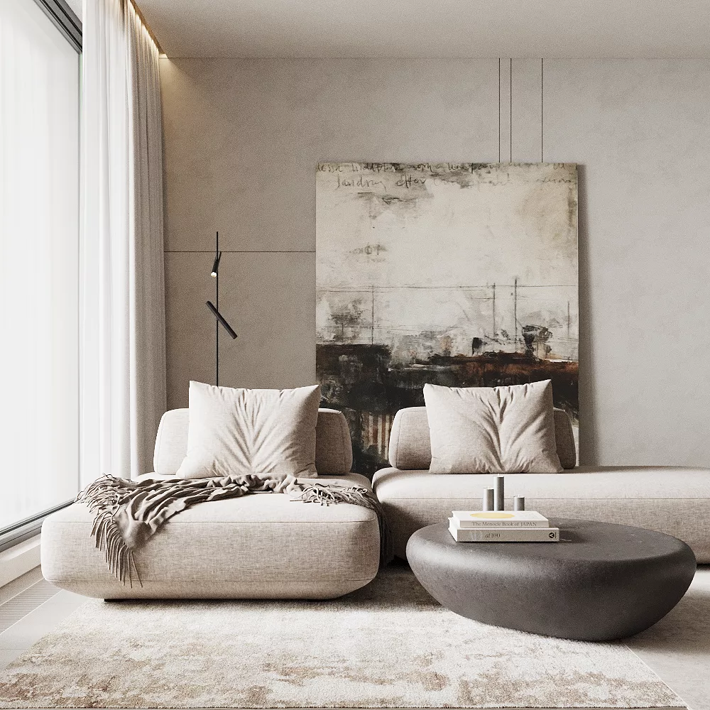
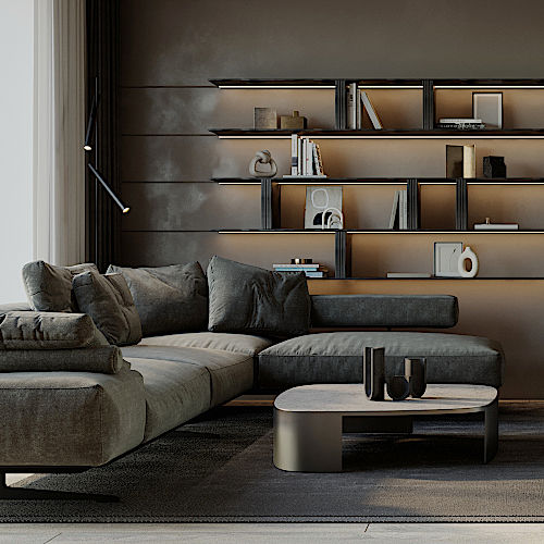
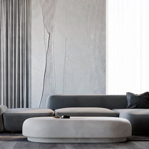
Area: 130 m2
Design: 2022
Realization: 2023
Lead designer: Ekaterina Zhigaleva
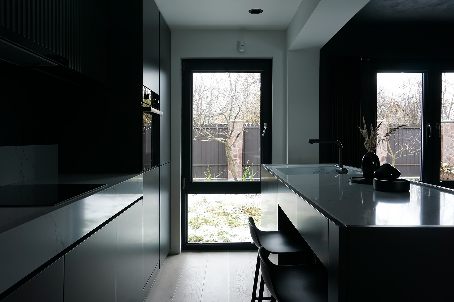
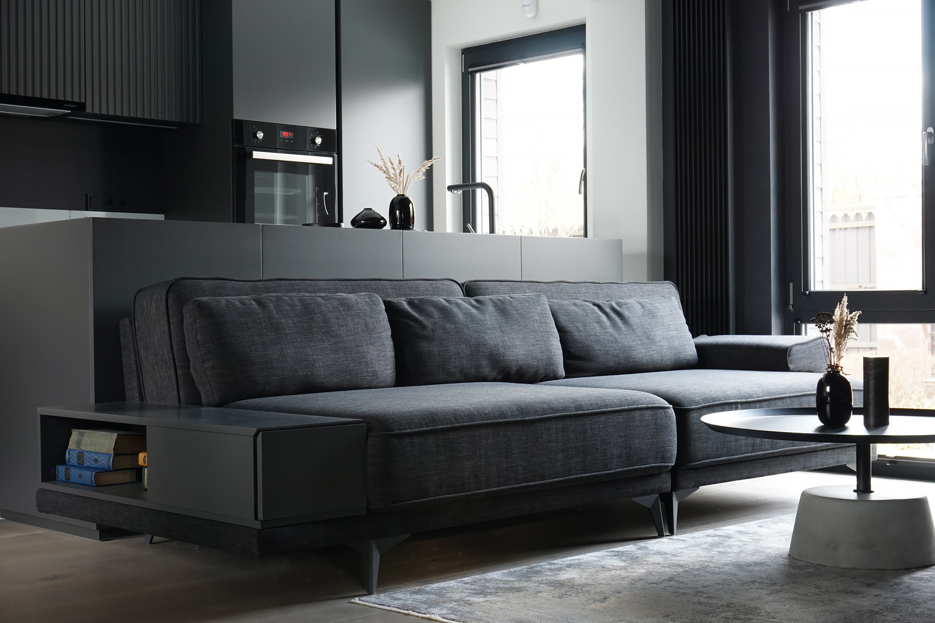
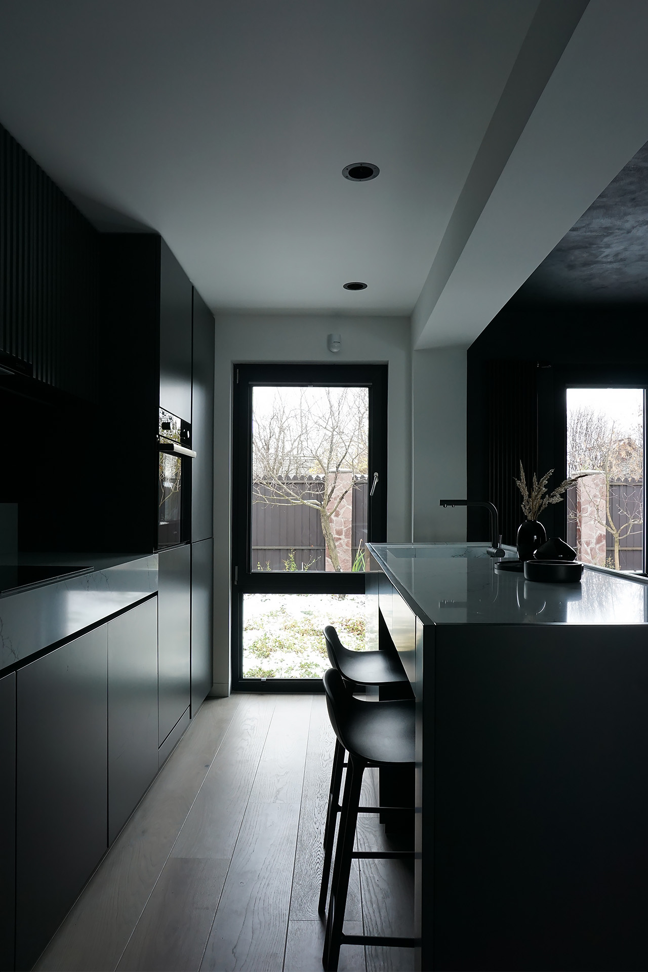
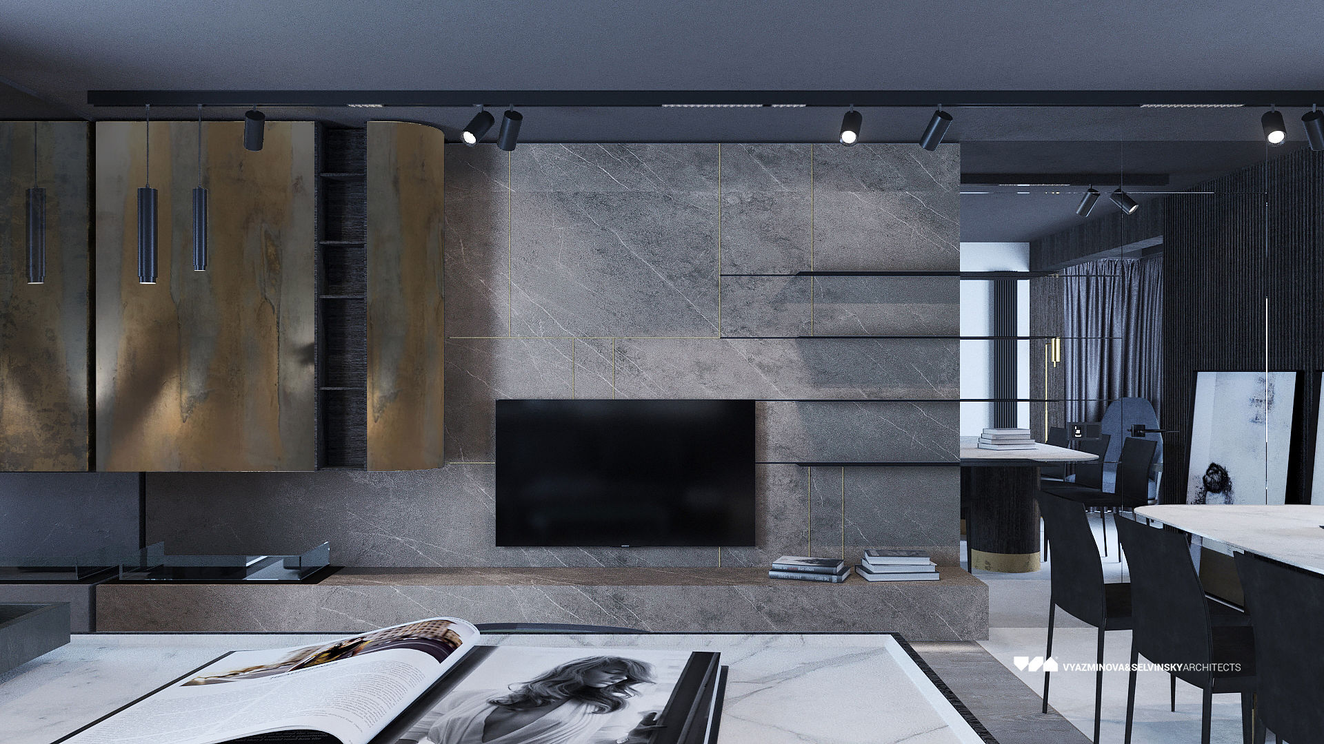
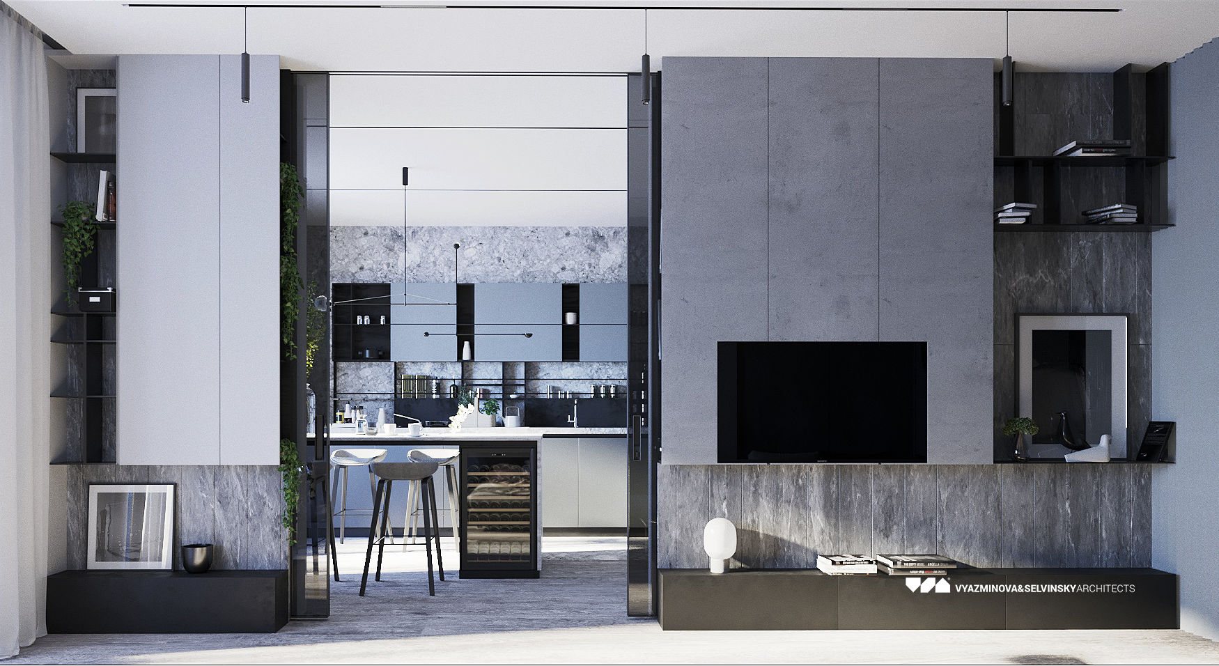
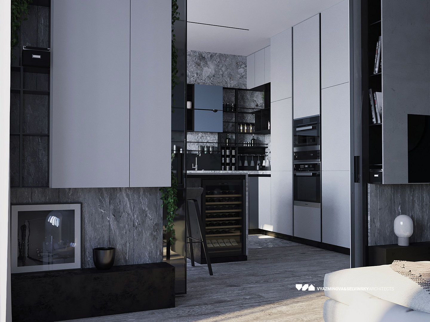
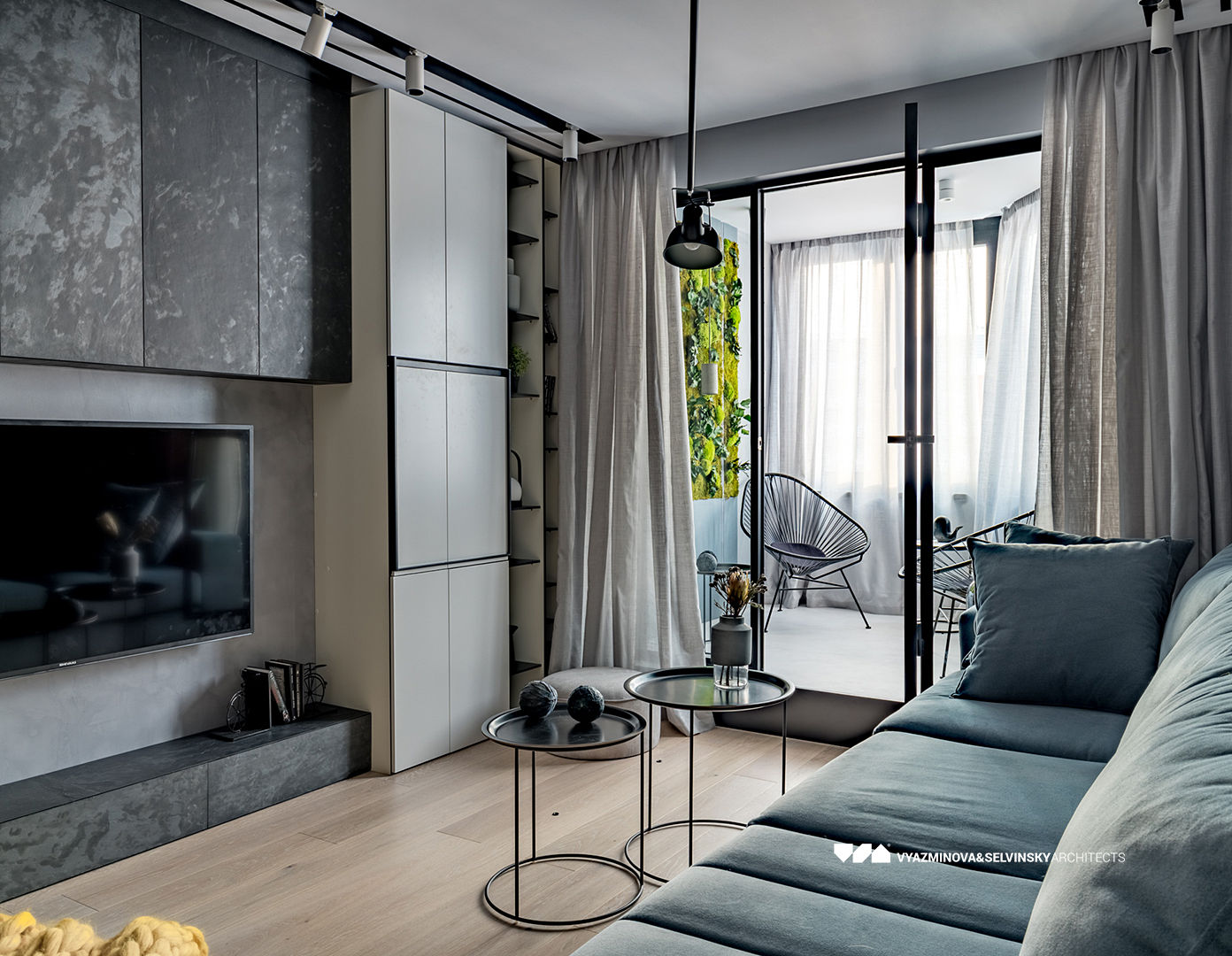
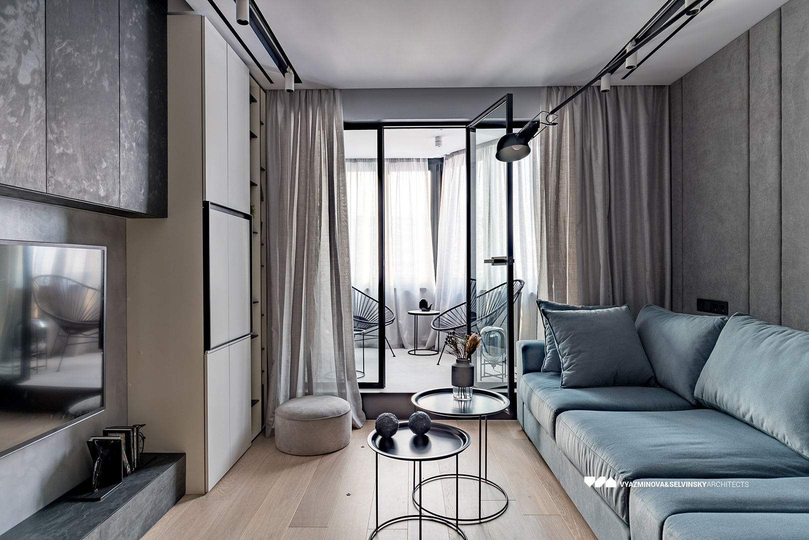
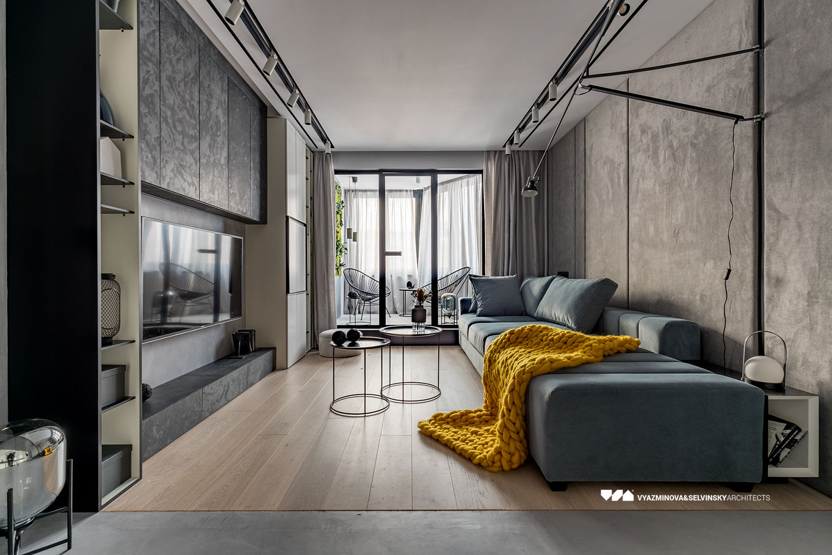
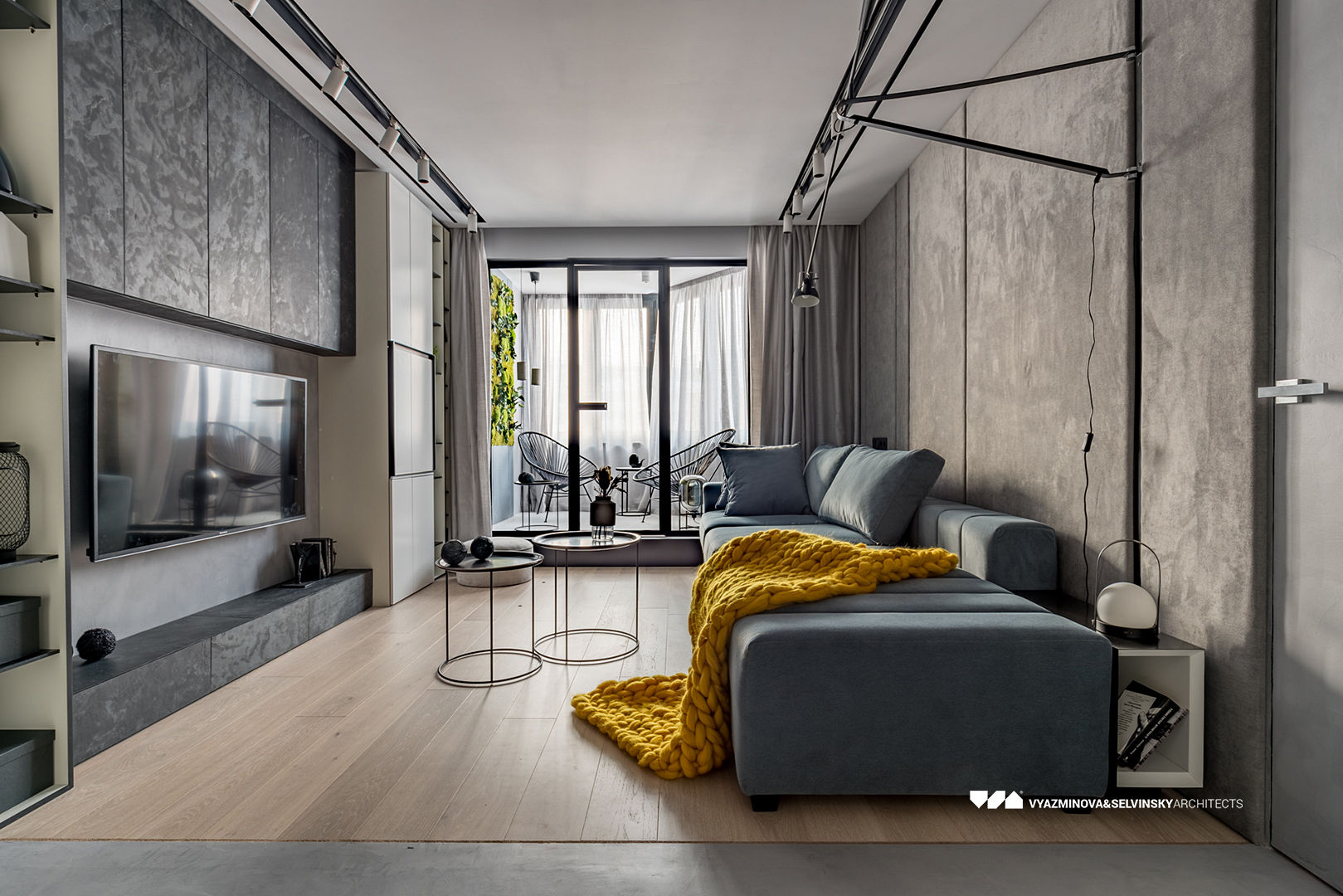
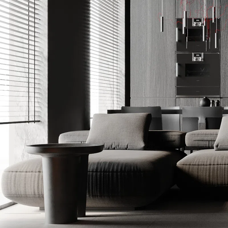
The customers, a pleasant young couple, founders of a large IT-company, turned to us after they had seen one of our TV-projects. Initially, the apartment was handed over by the developer in a “white box” state – when there were partitions, the electrical system was laid out, indoor units of air conditioners were installed, besides, the customers had already purchased some furniture by that time (a kitchen, sofa, kitchen island). All this imposed certain restrictions on the design process, we even doubted for some time, whether in these conditions to make something interesting and take the project into work. But we were won over by the clients’ readiness for experimentation and commitment to the strict contemporary aesthetics. And we were not sorry – the project was successful indeed, both in terms of implementation and in terms of interesting design solutions.
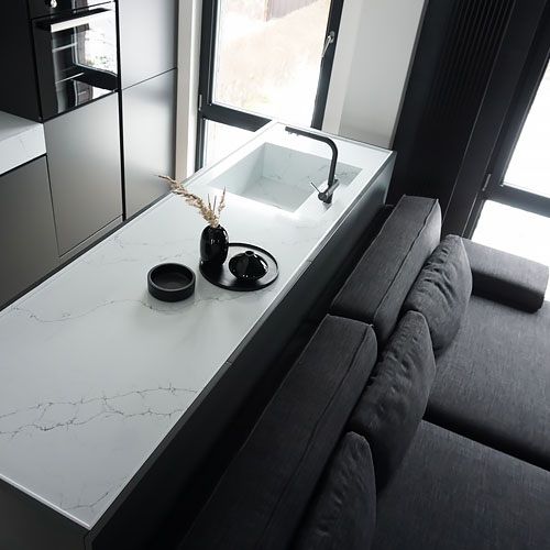
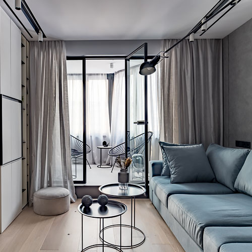
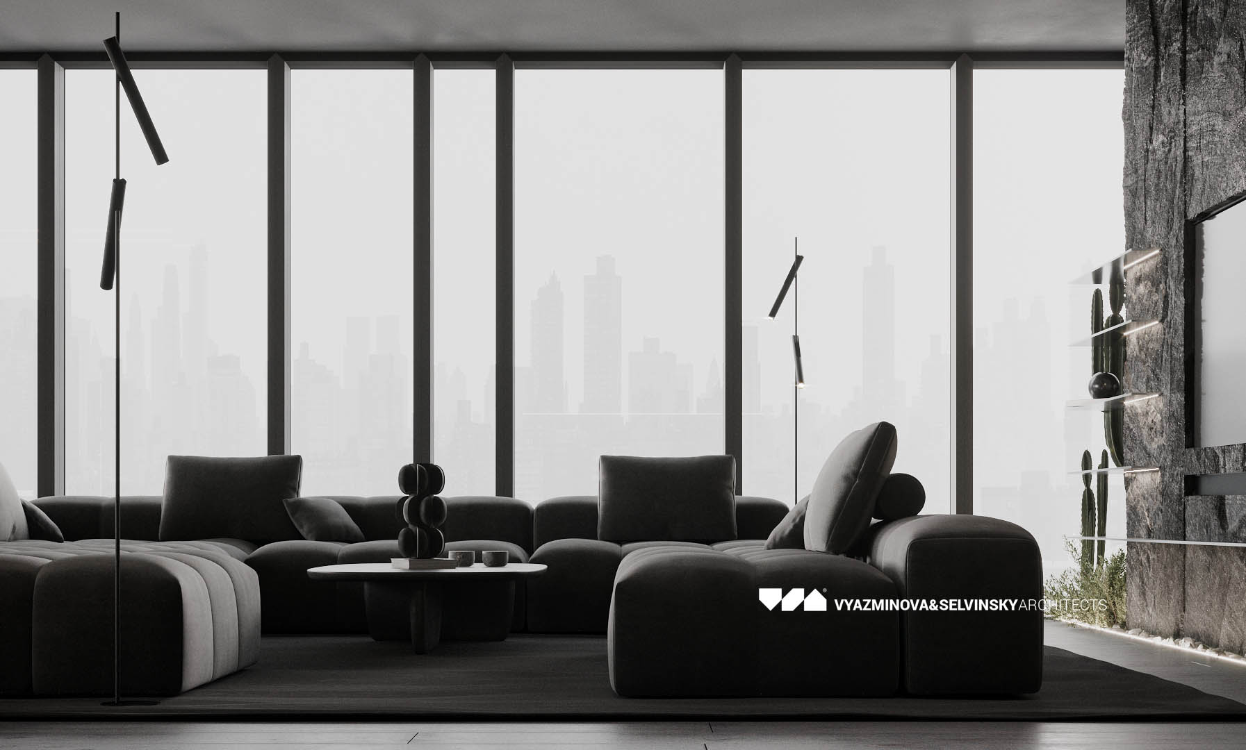
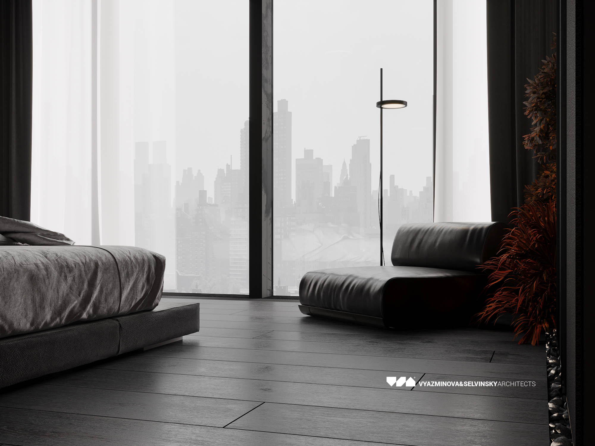
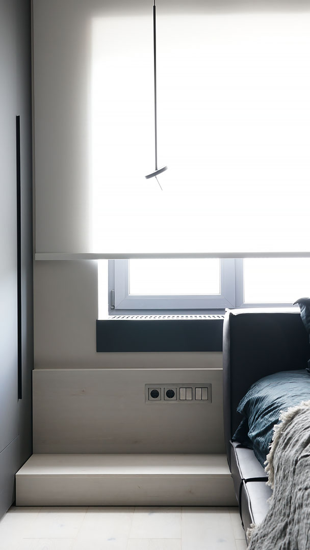
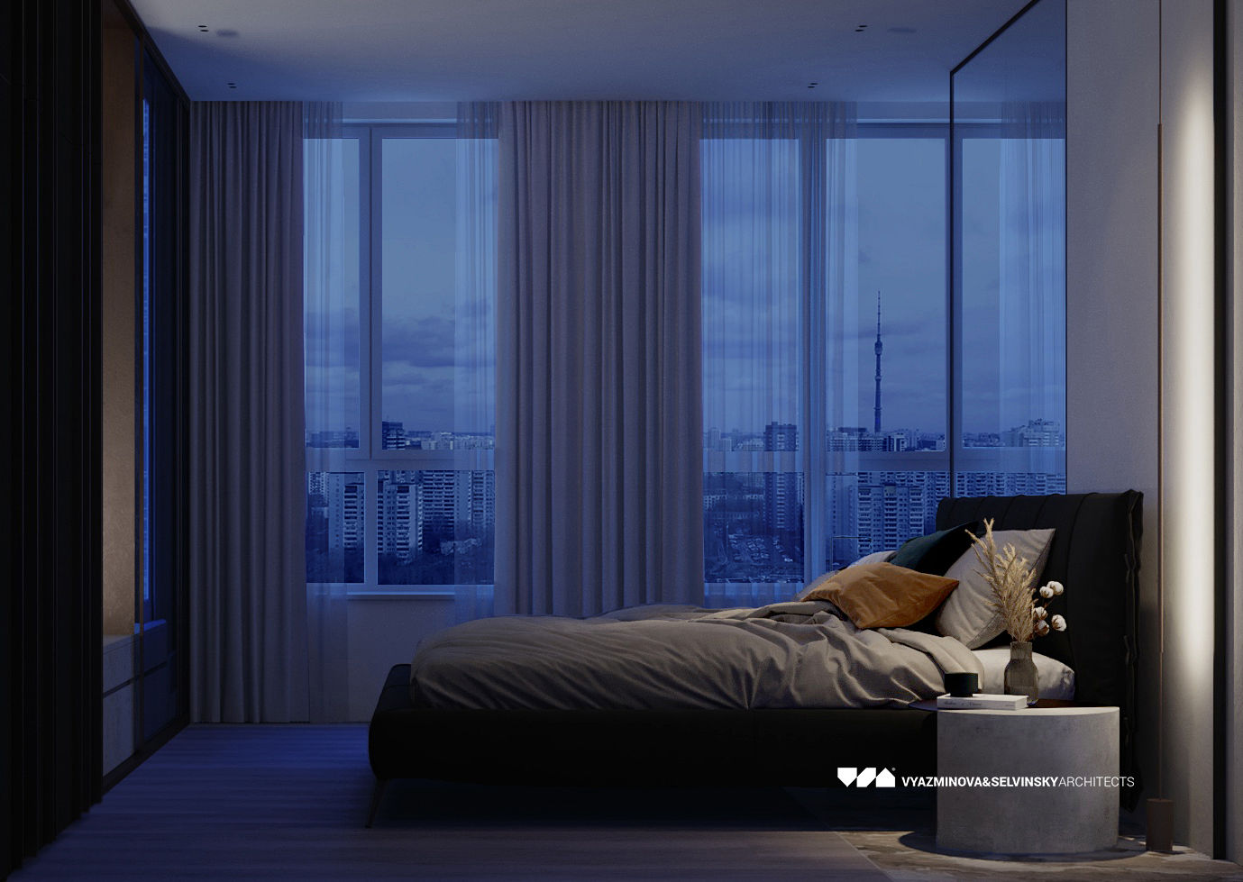
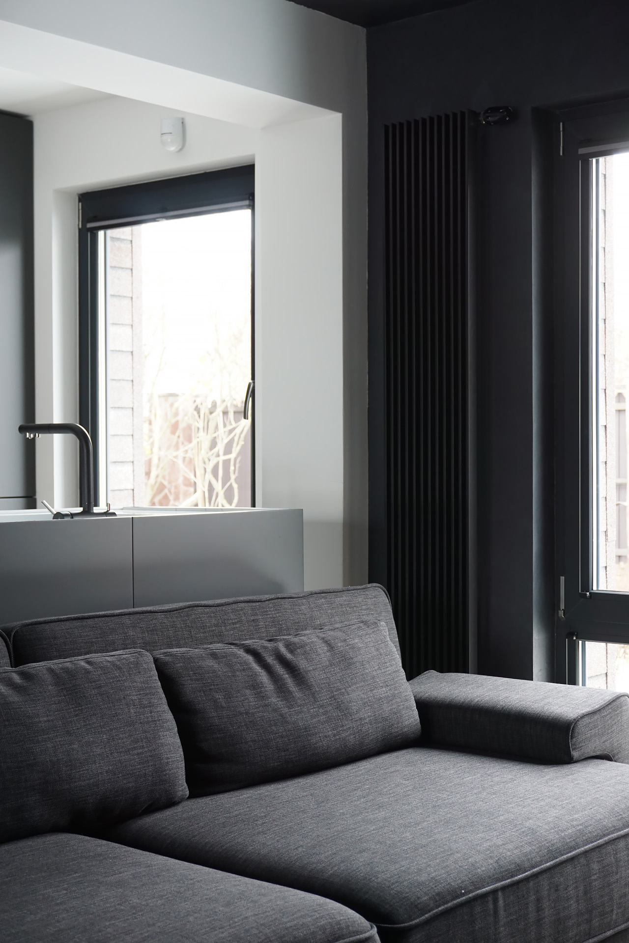
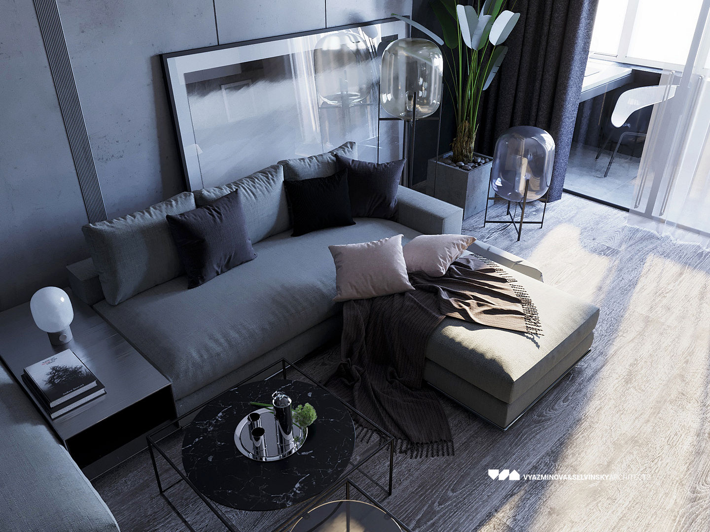
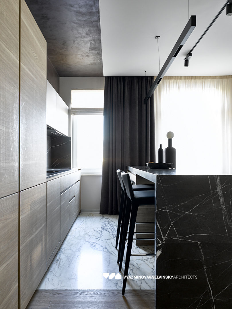
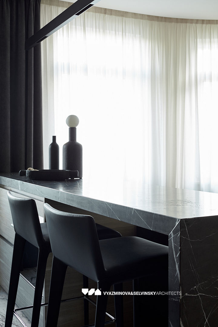
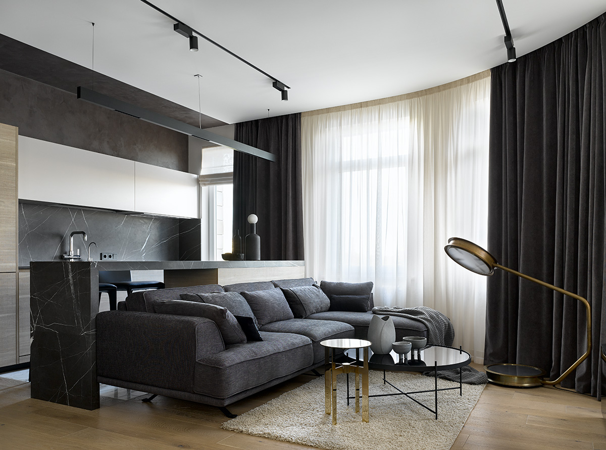
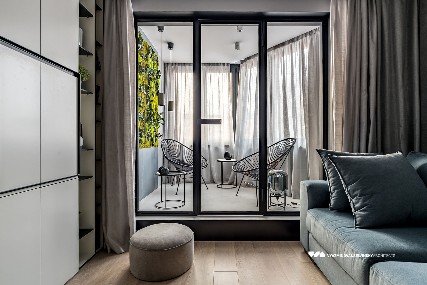
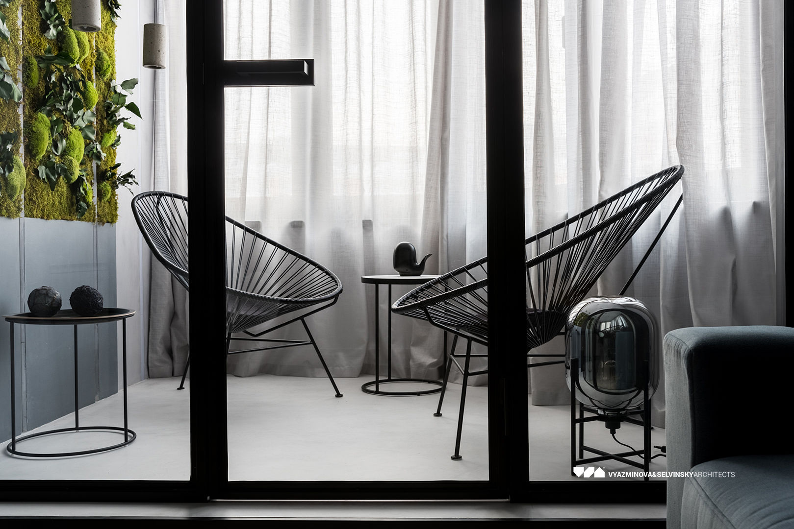
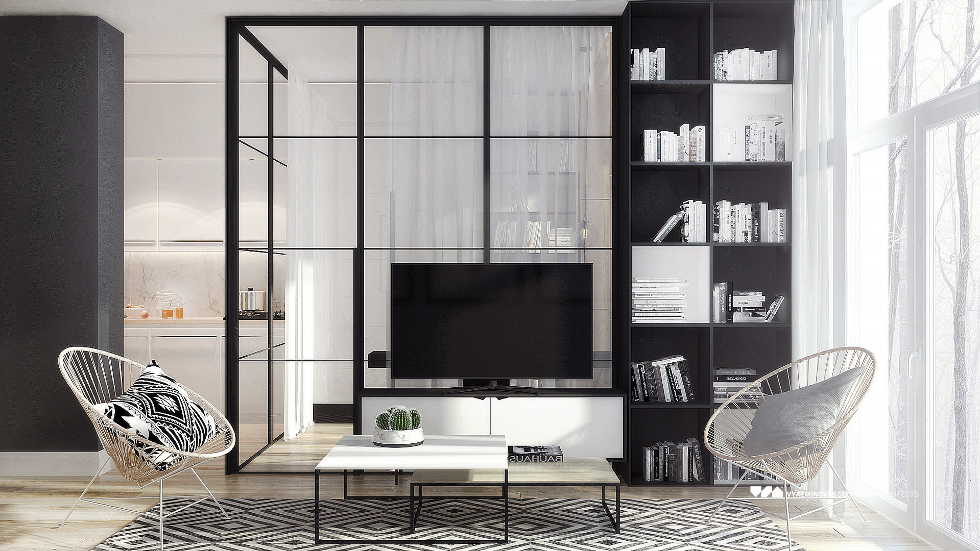
The austere, minimalist interior of the apartment looks particularly cinematic in cloudy weather, in the whole range of the gray shades. It may seem to some that such a “Scandinavian” character makes the space cold and uncomfortable, but only to those who have never experienced it. In fact the textile textures, soft warm light, muted shades only increase the effect that you are in your quiet corner, in your home, and only watching life behind the glass from the side.
And a separate, absolutely fantastic experience arises in a moment of low cloudiness, when behind the window absolutely nothing is visible, and only homogeneous “white” milk, more like a huge light box. You begin to feel like one of the characters in a sci-fi movie, rushing through space and time in the body of a huge spaceship to new adventures.
Area: 110 m2
Initially in “white box”
Design: 2020
Realization: 2021
Leading designer: Ekaterina Zhigaleva
Photographer: Anastasia Martova
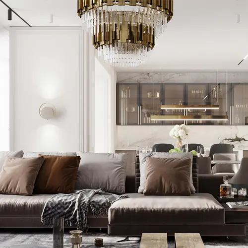
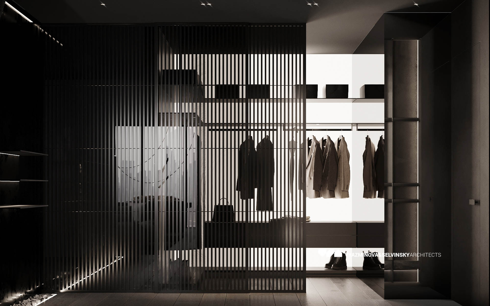
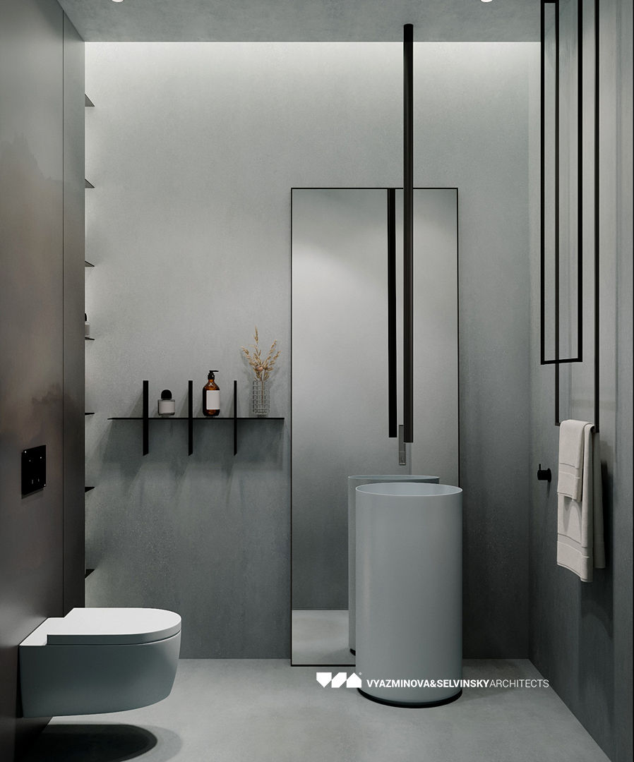
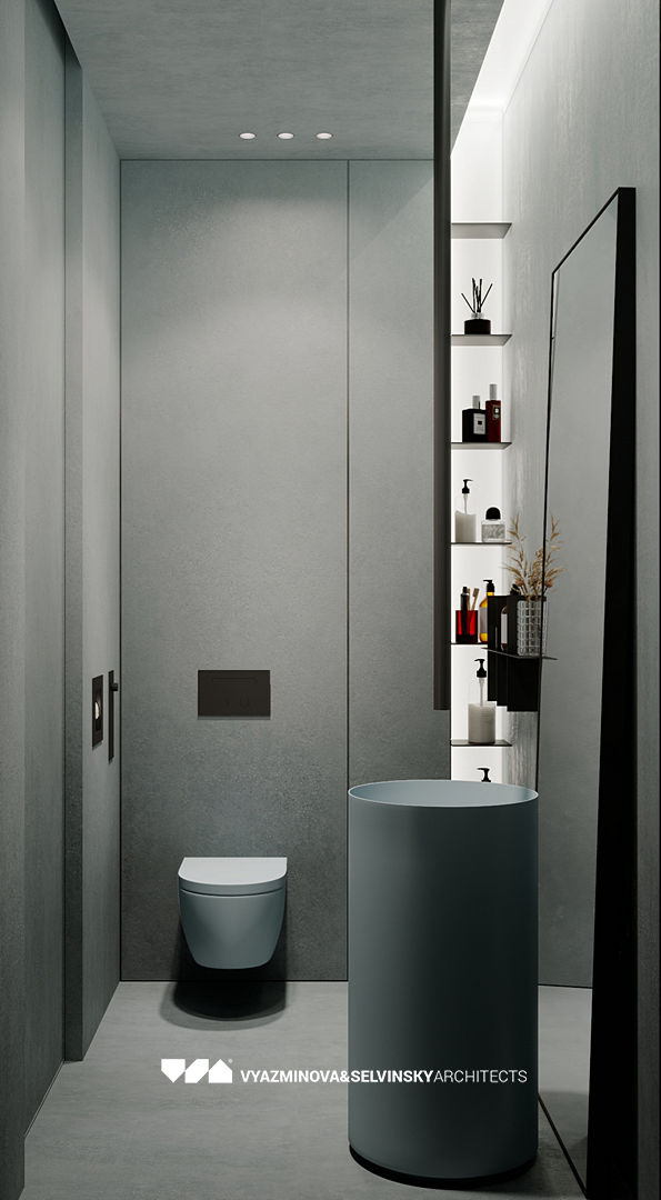
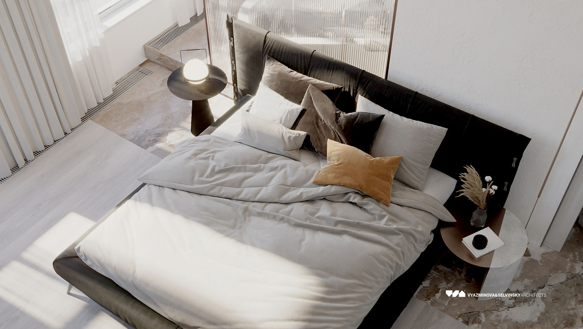
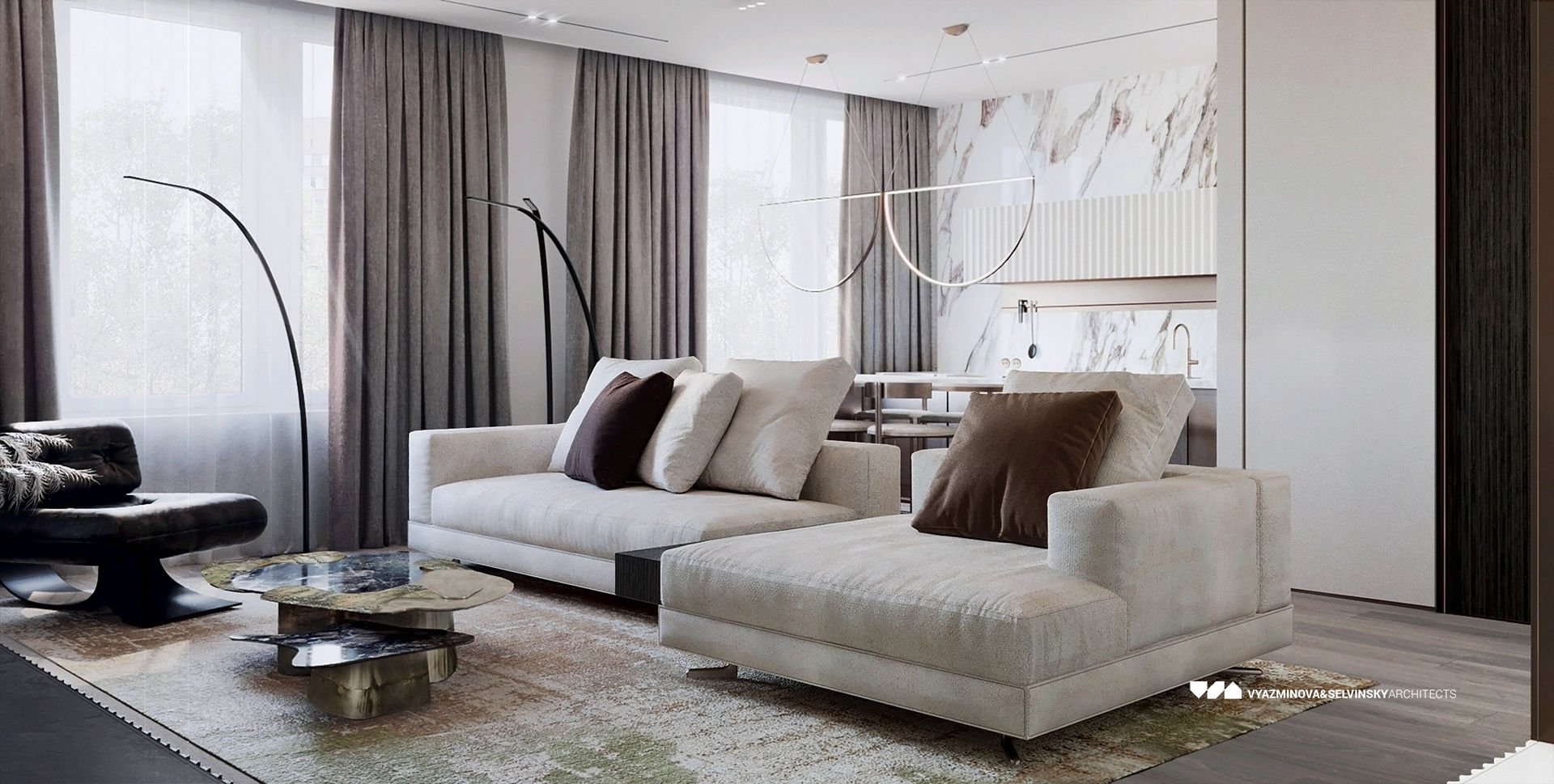
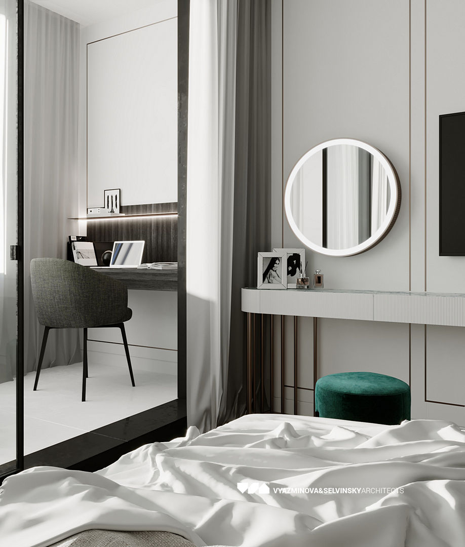
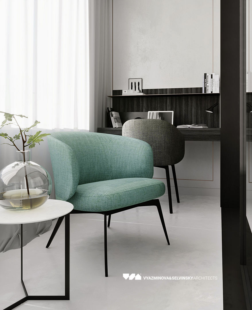
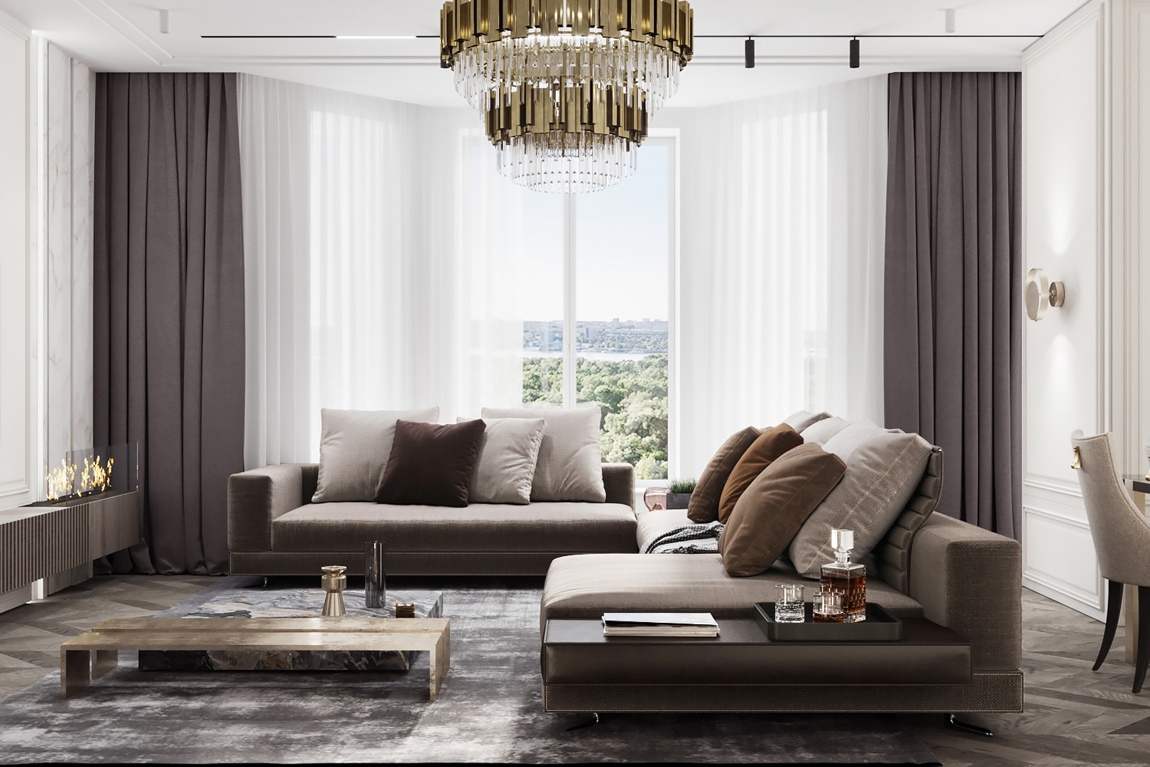
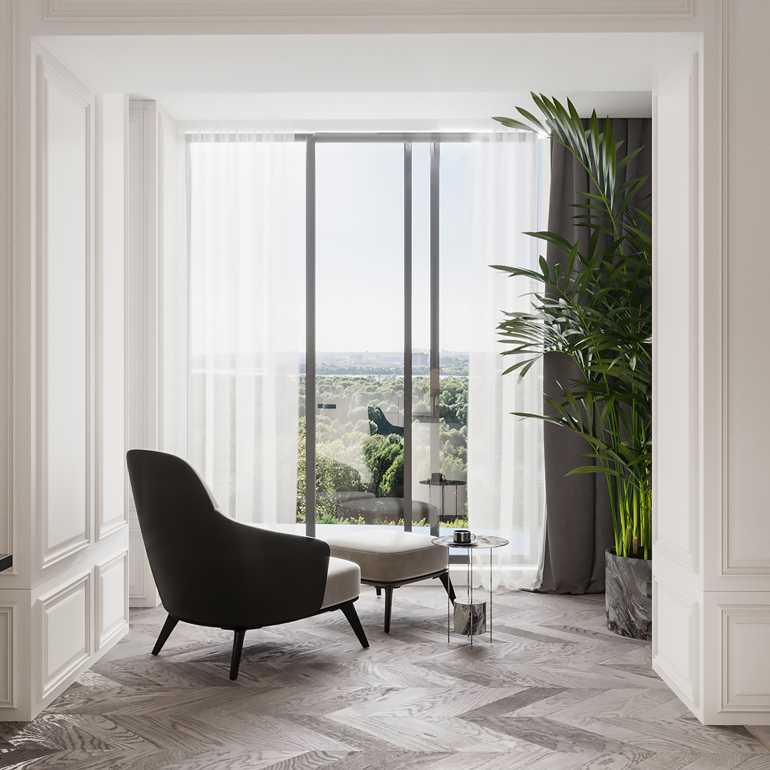
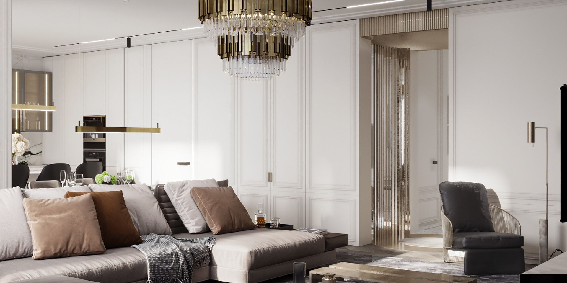
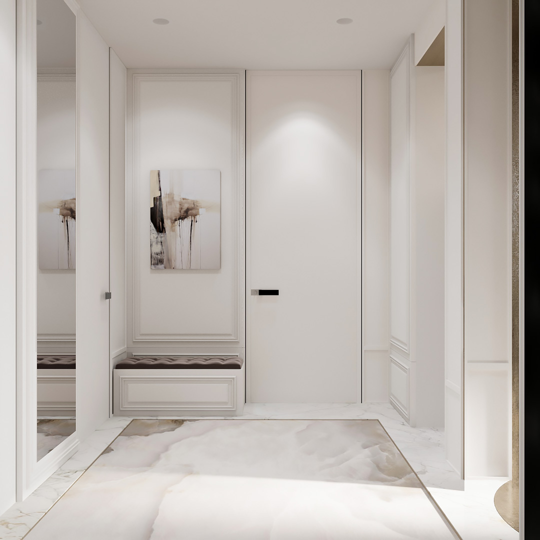
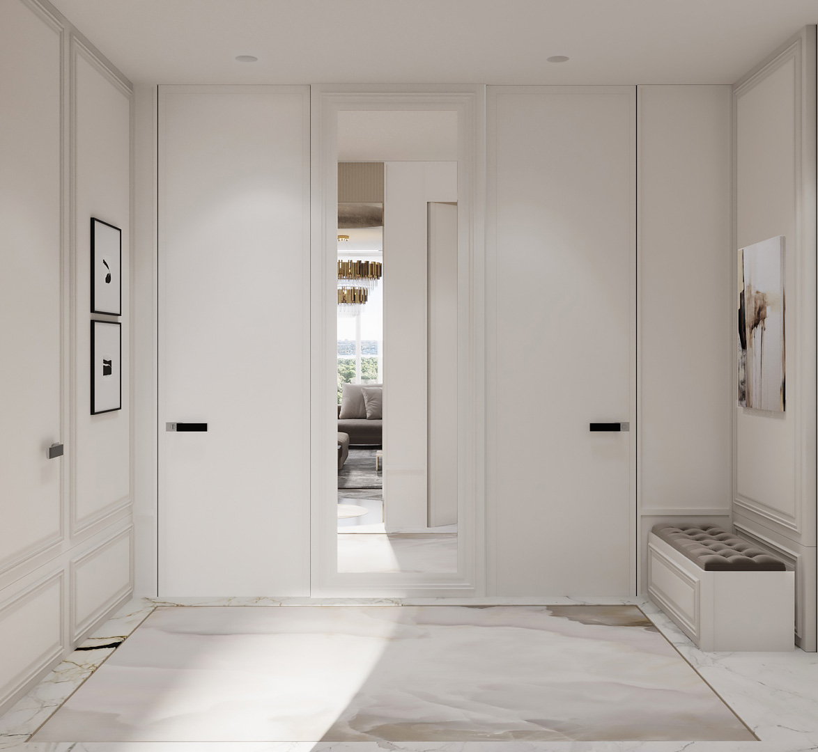
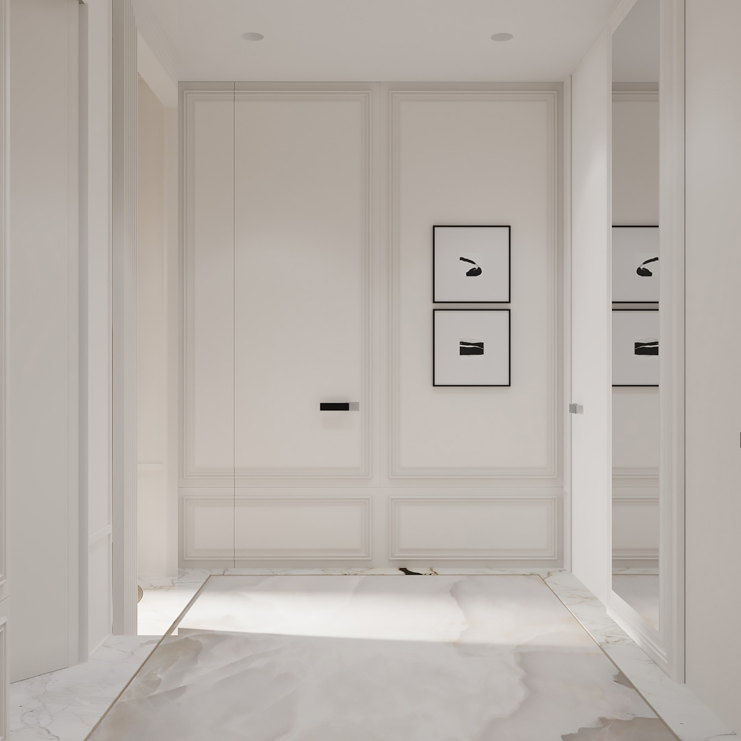
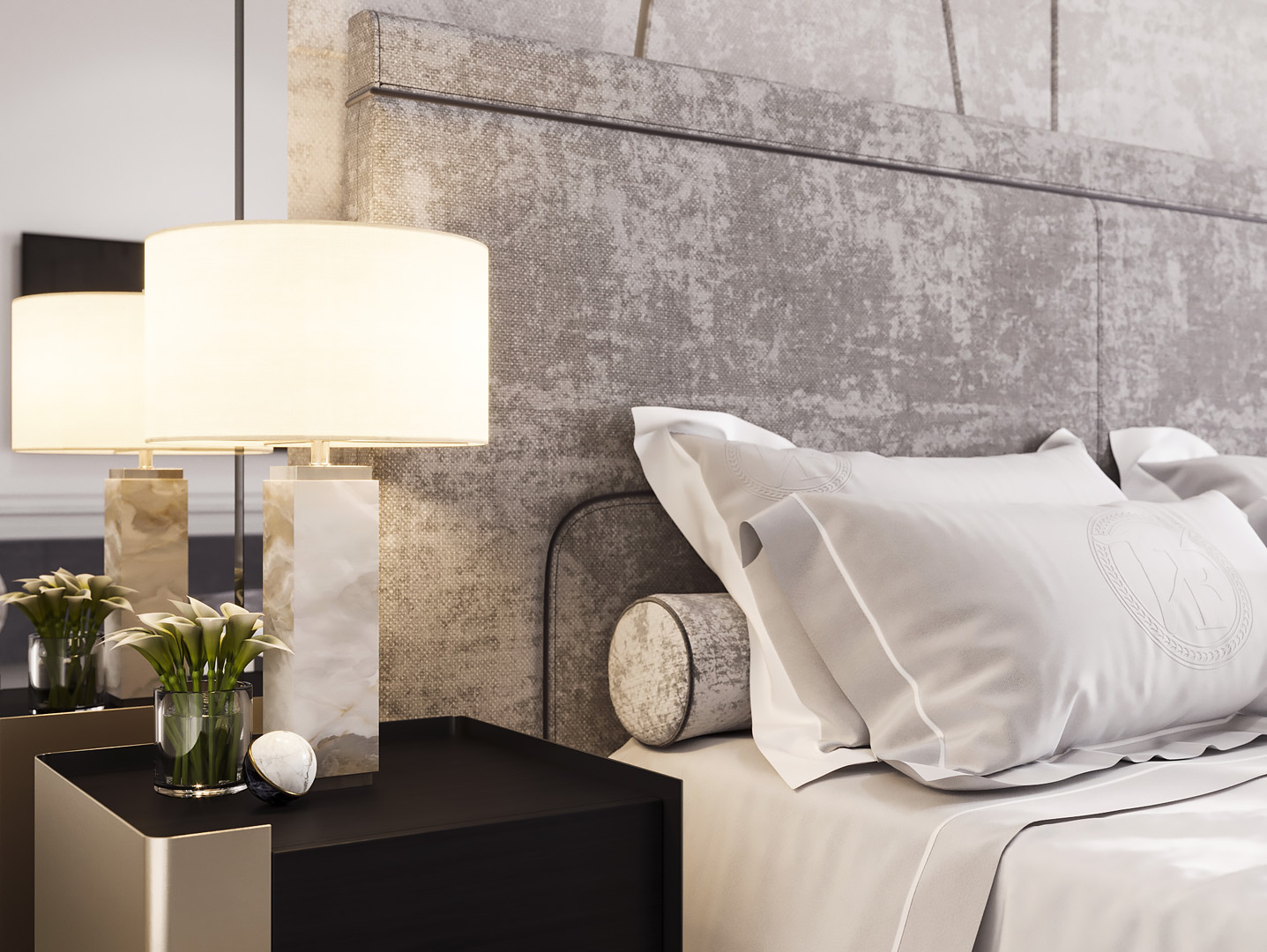
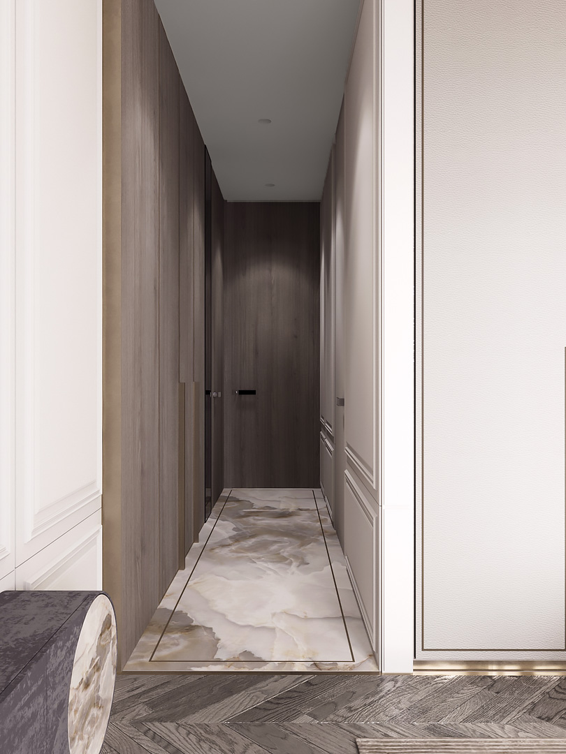
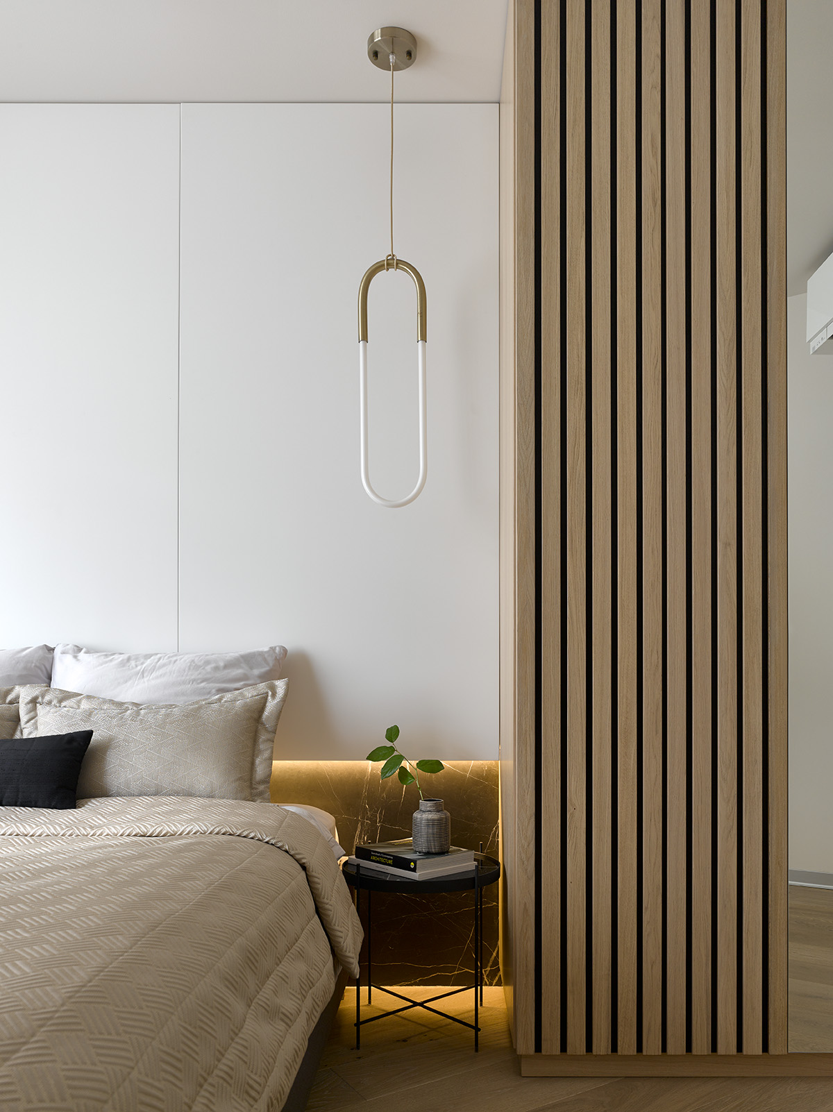
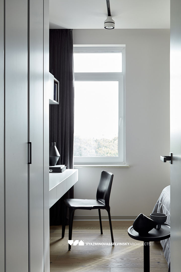
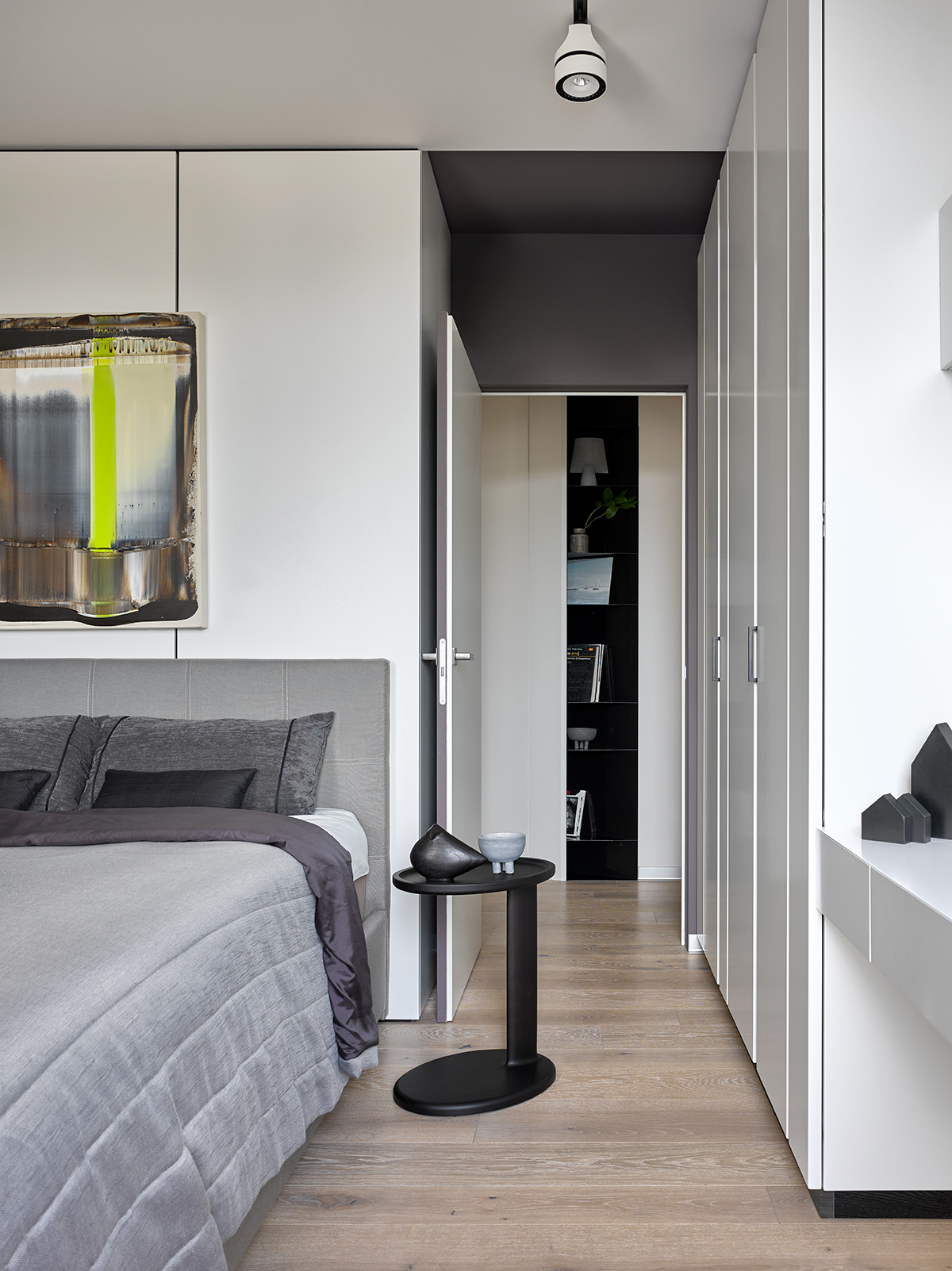
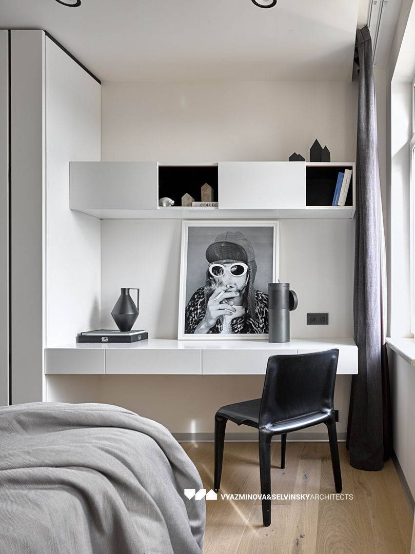
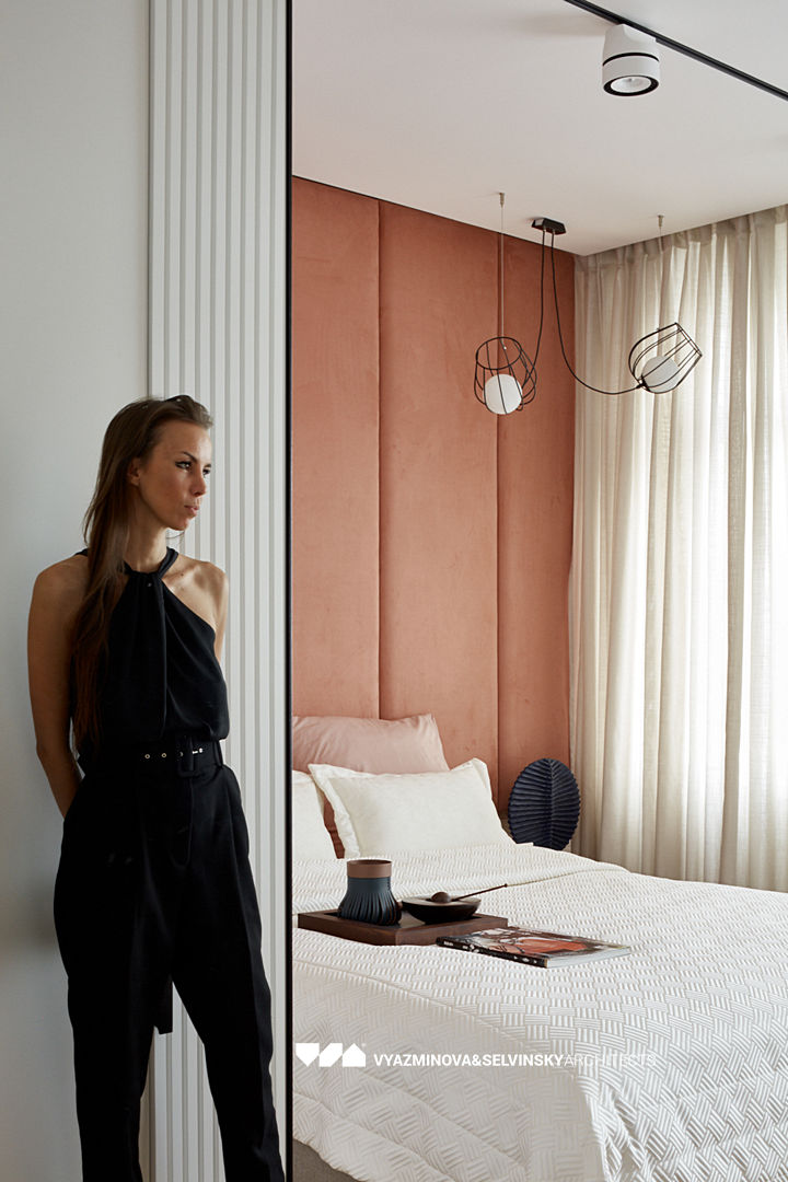
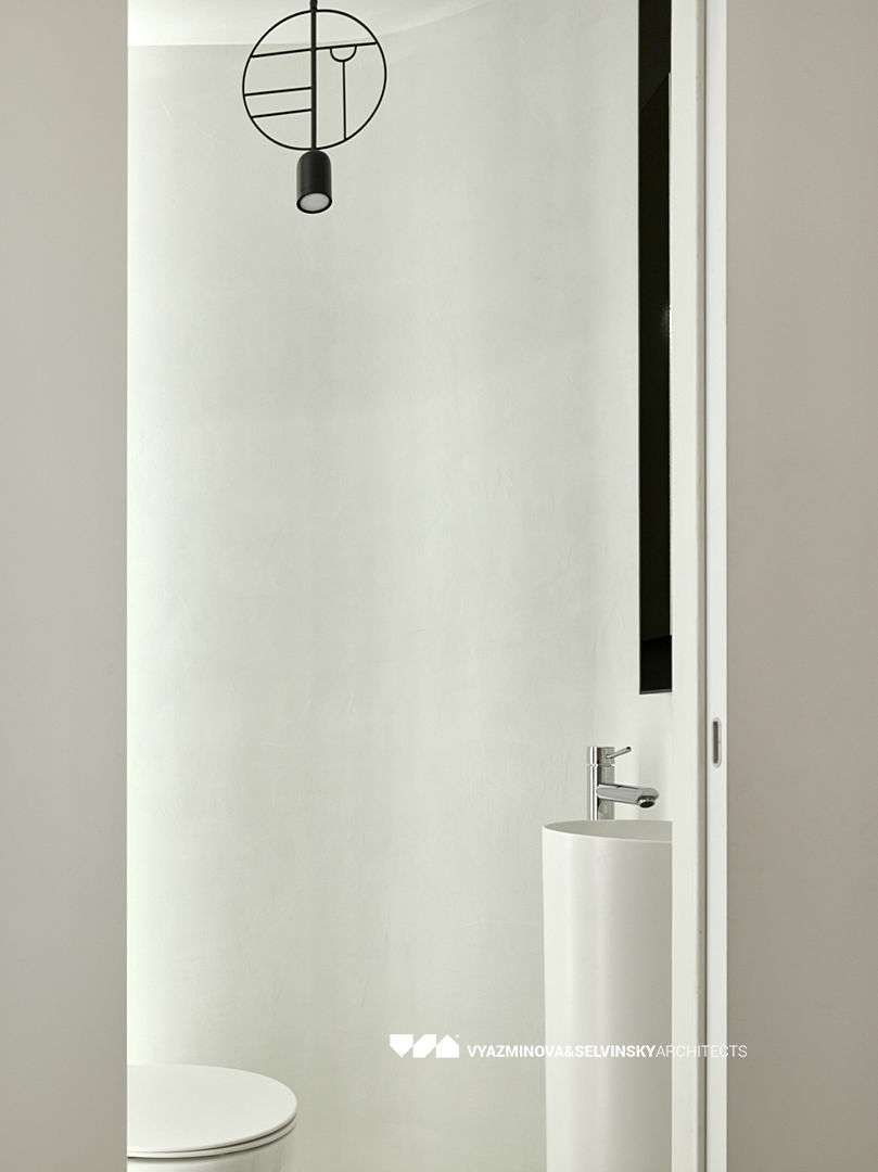
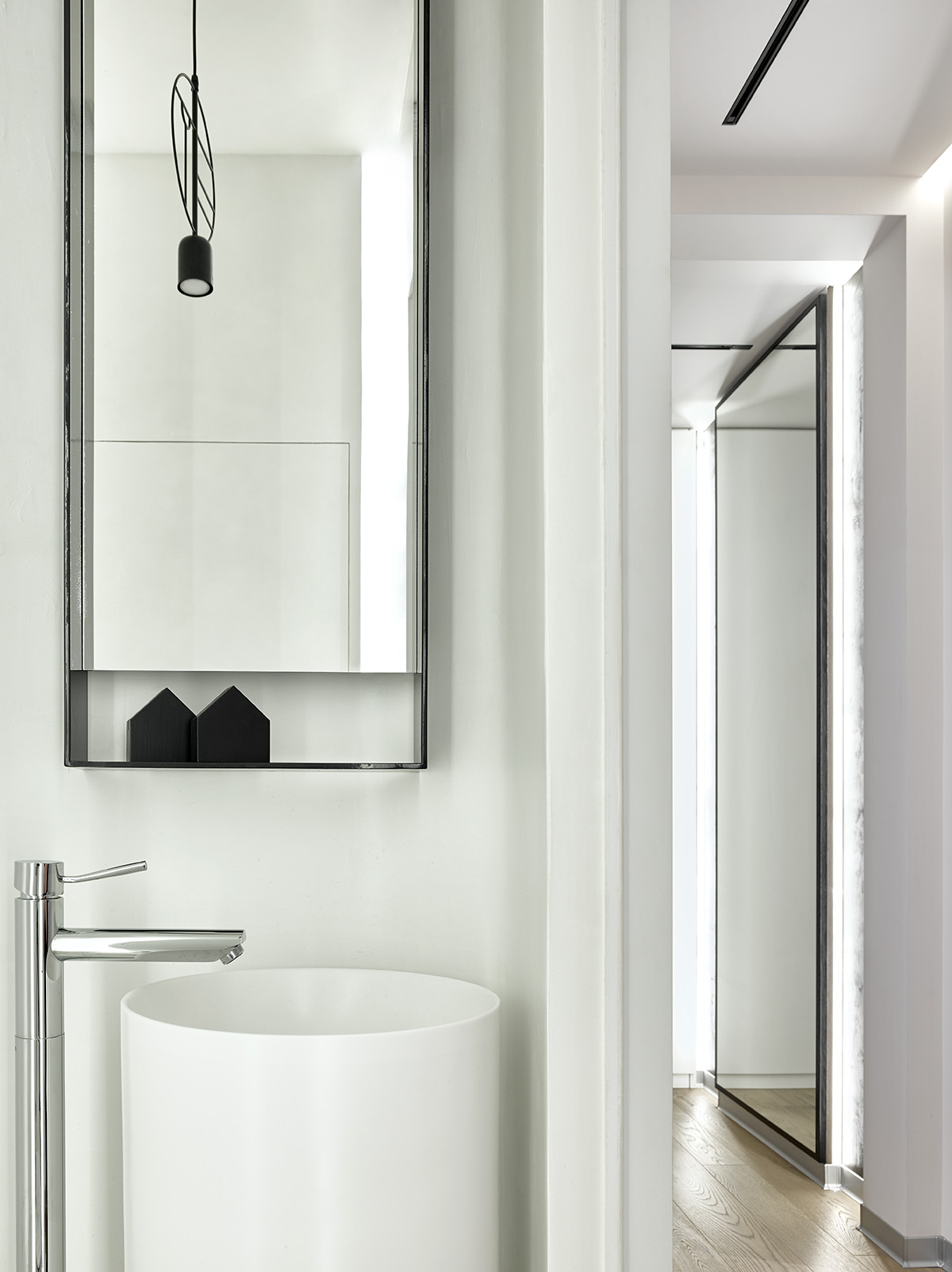
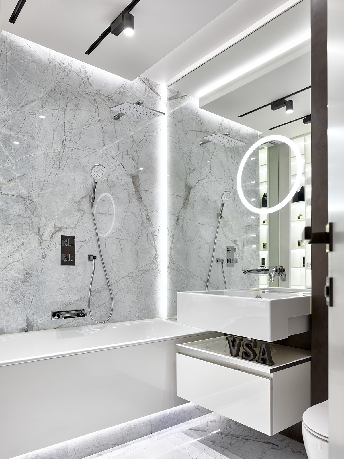
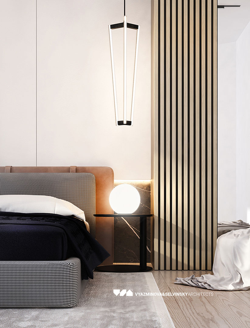
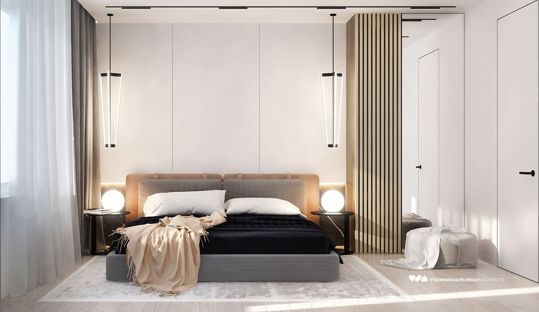
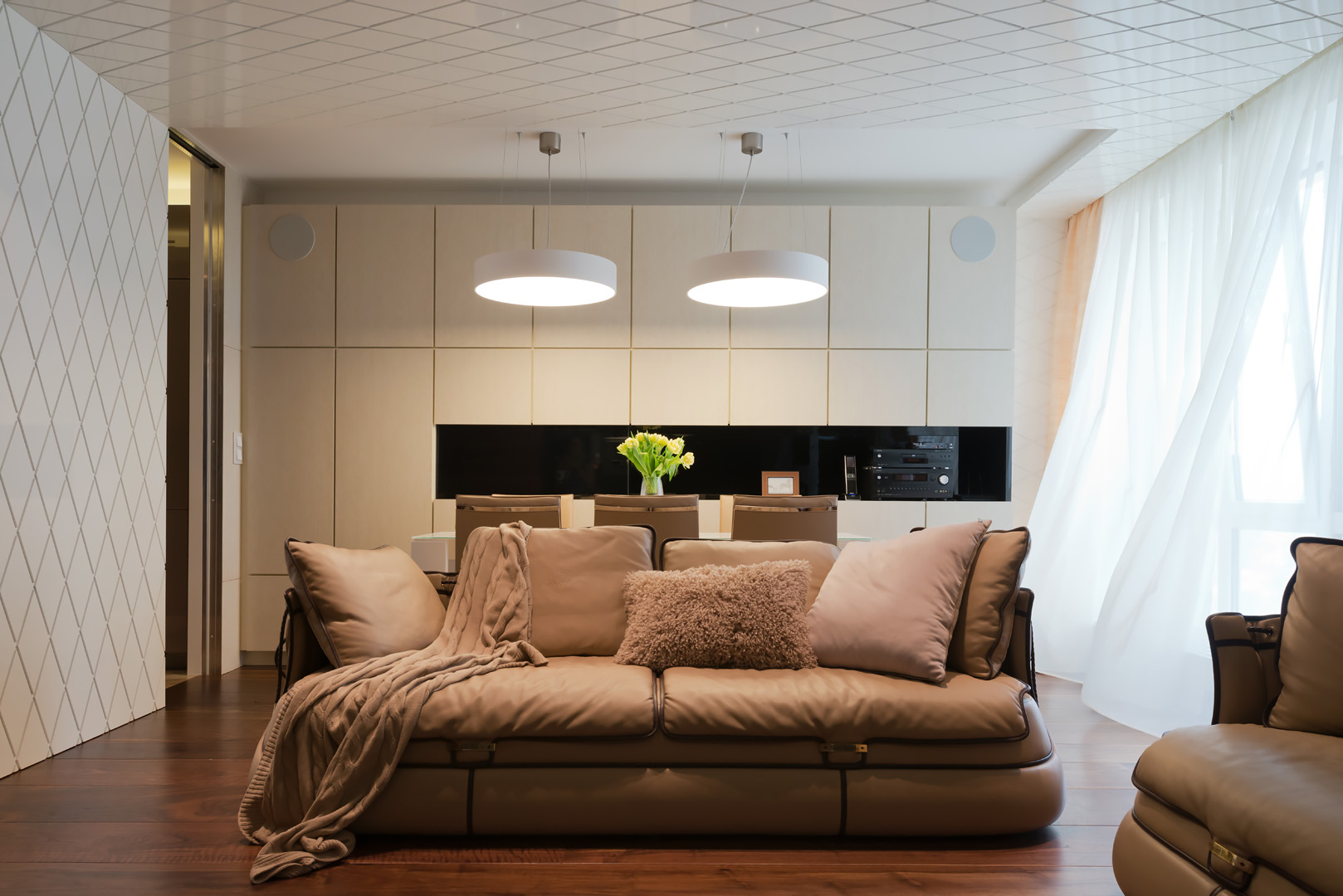
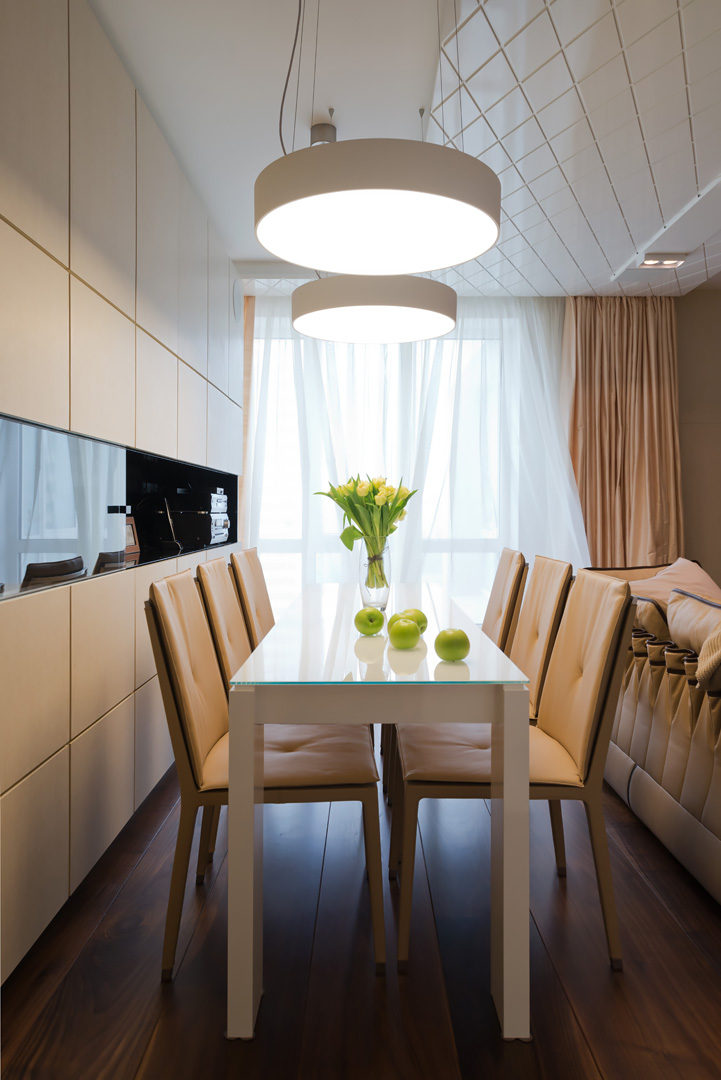
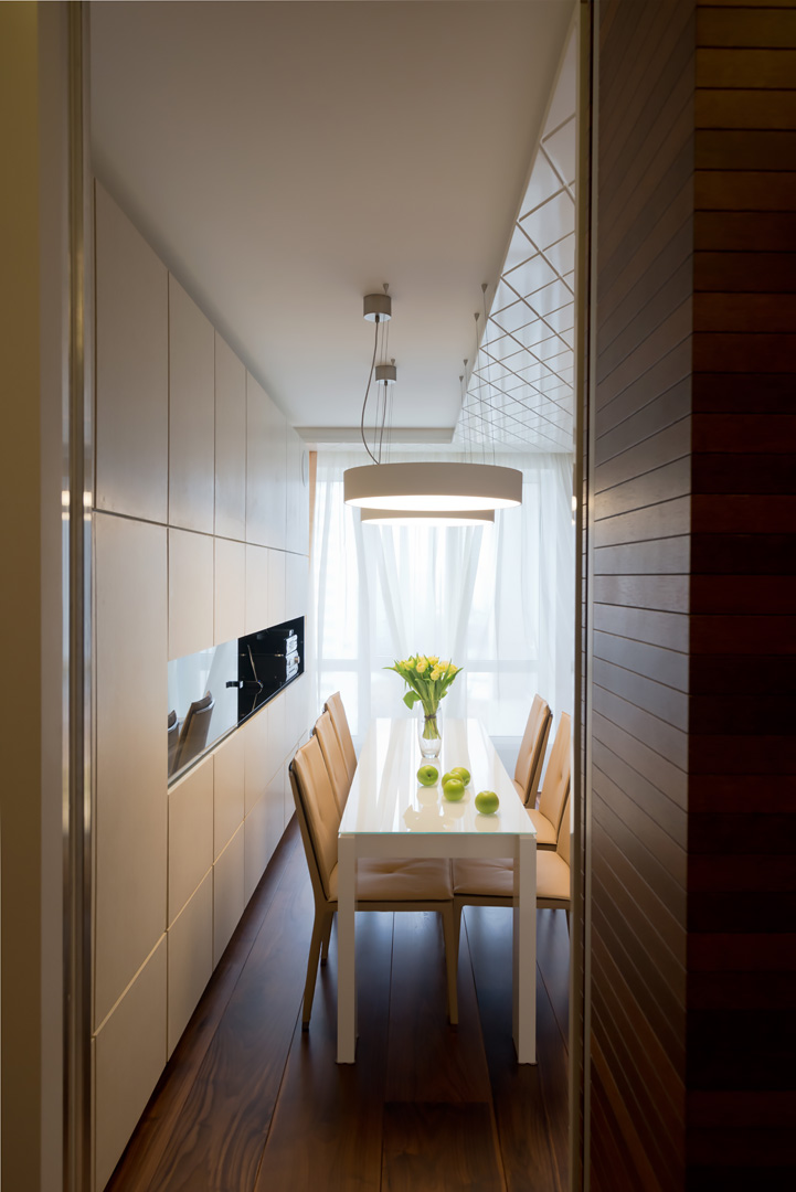
Our team designed the interior for a typical apartment in the clubhouse LUCE on Krestovozdvizhensky Lane for MR Group. One perfect style in three color schemes: light, dark and polychrome. We offer you the light version.
In addition to the apartments we have also developed a concept for the interiors of common areas in the house LUCE, designed in a style of strict minimalist luxury, with tactile surfaces of natural materials – wood, aged travertine and oxidized metal.
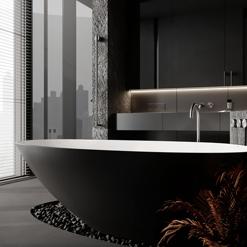


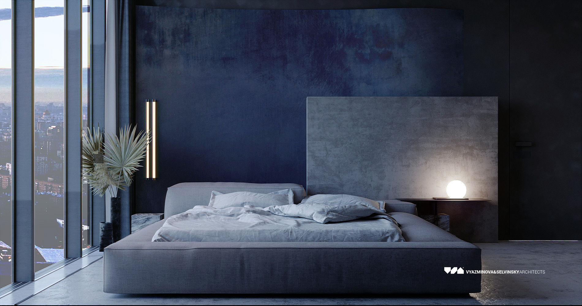
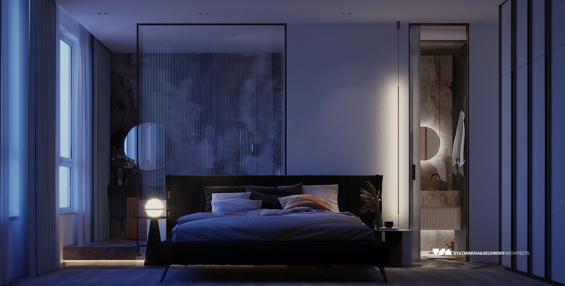
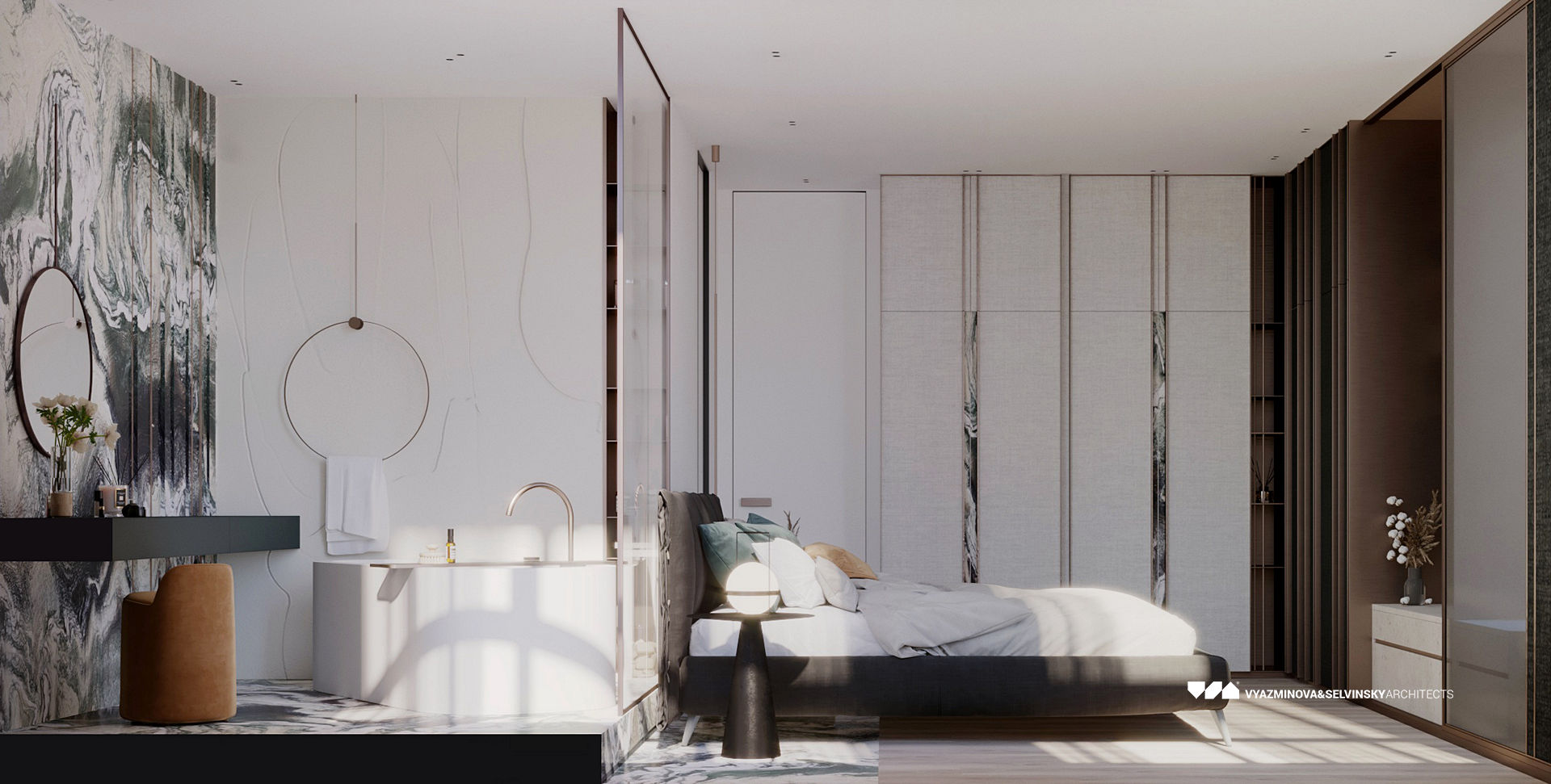
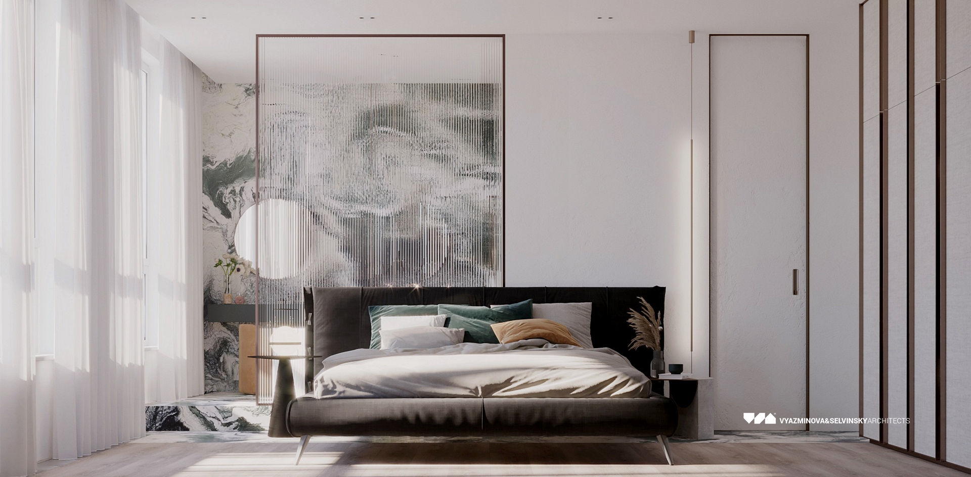
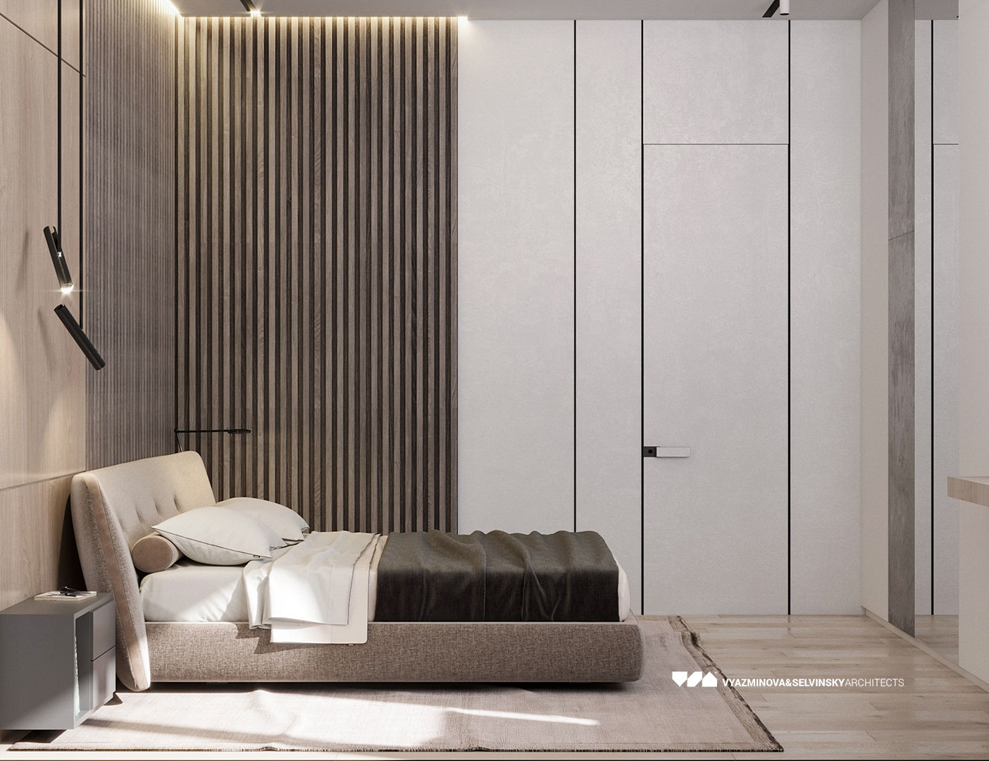
master bedroom
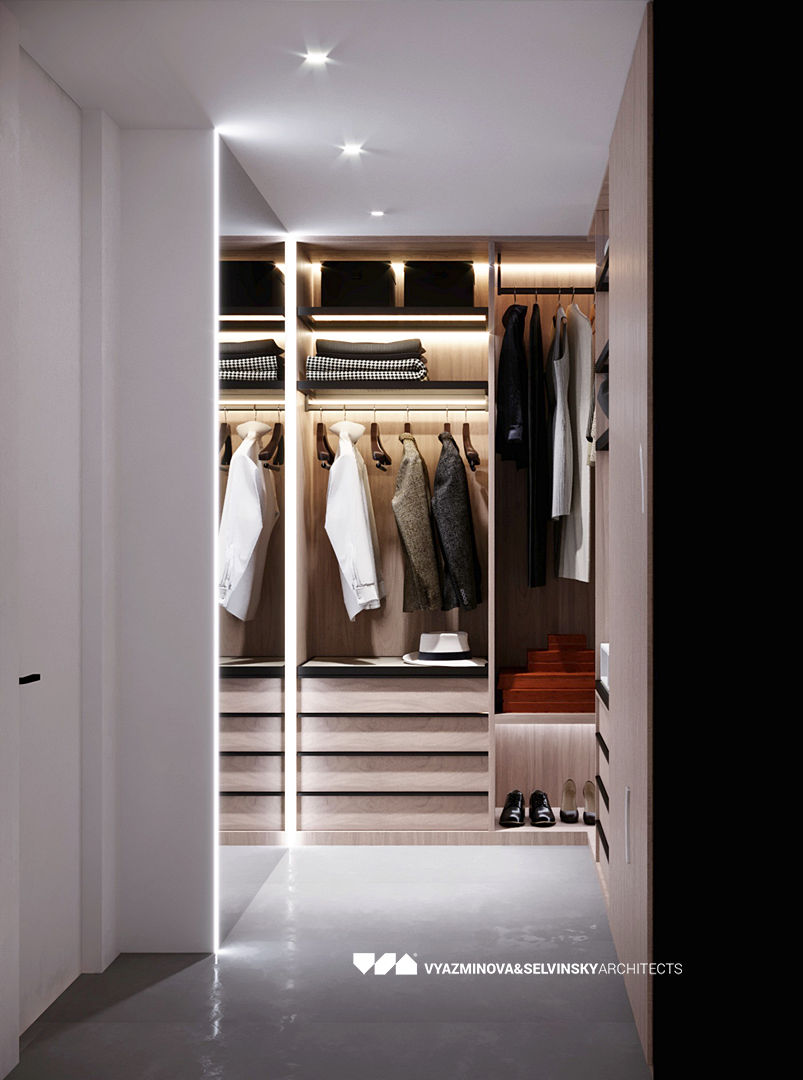
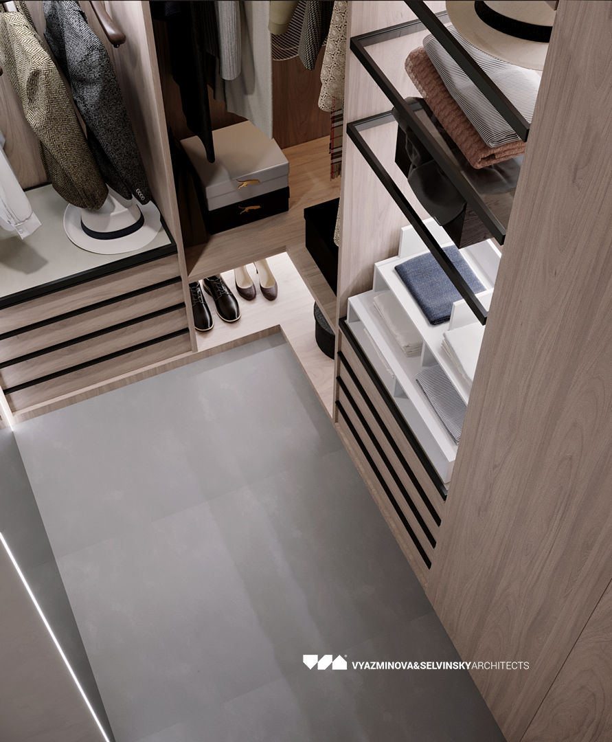
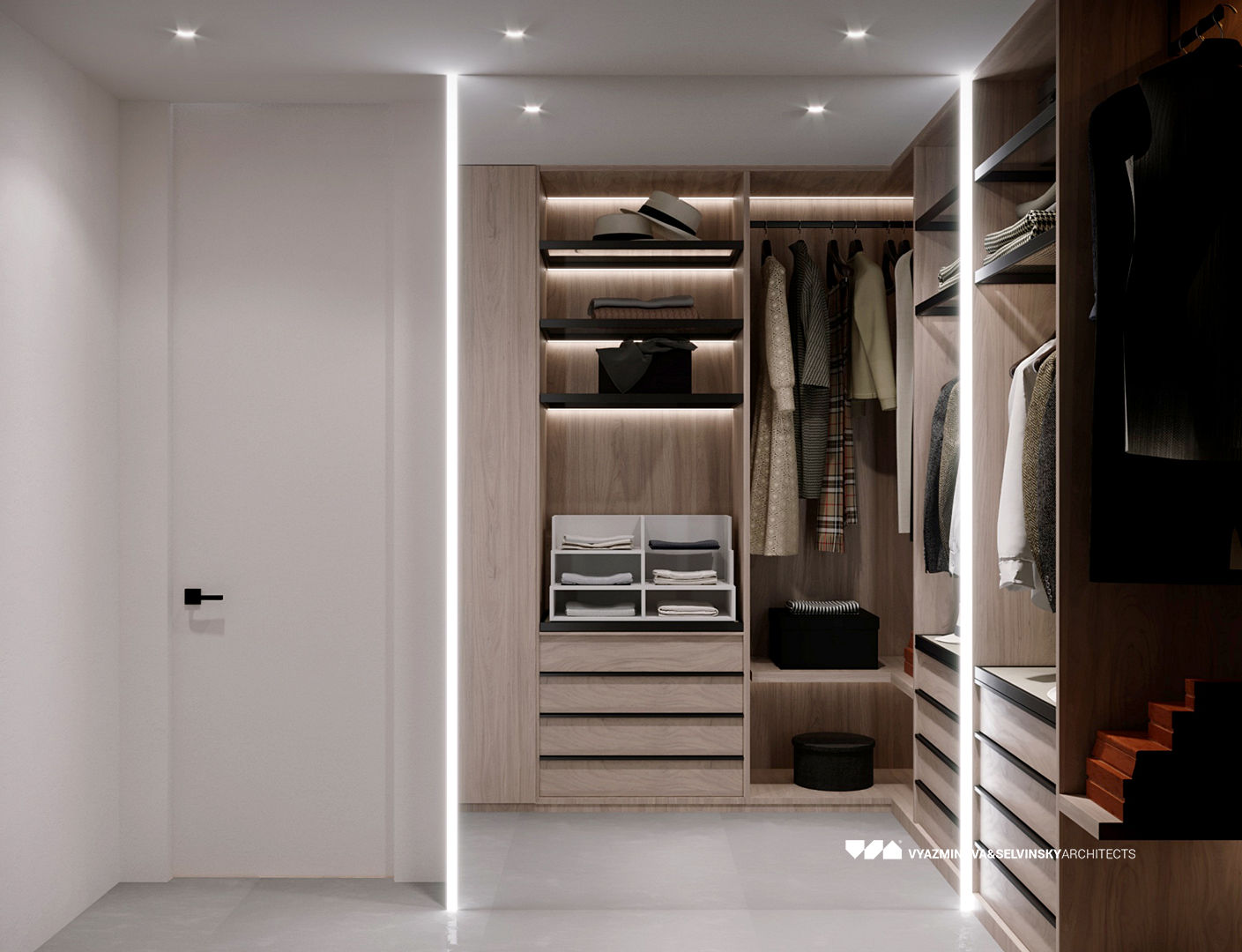
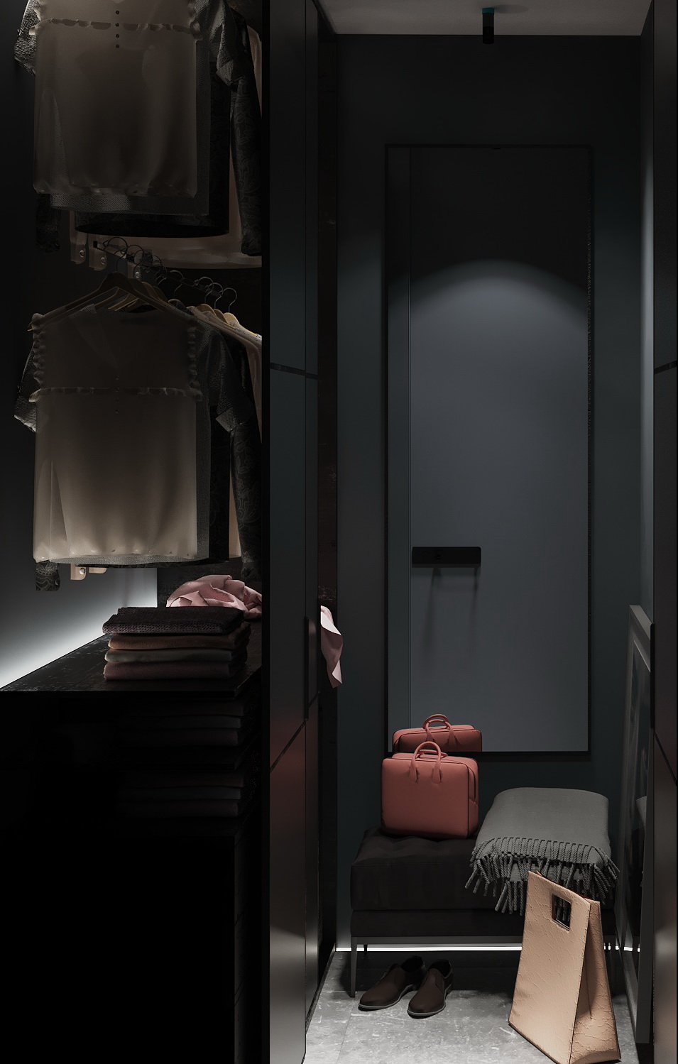
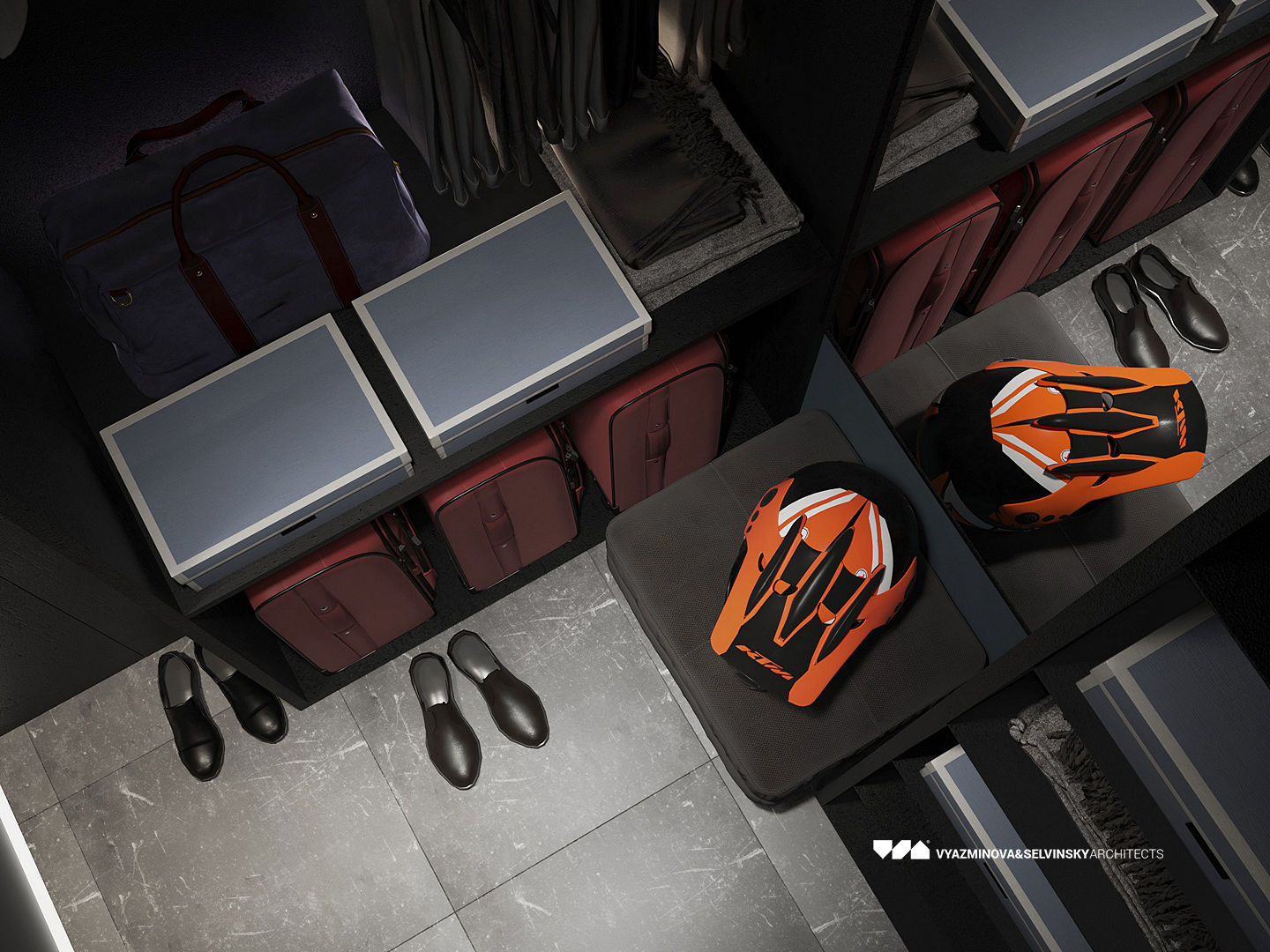
wardrobe
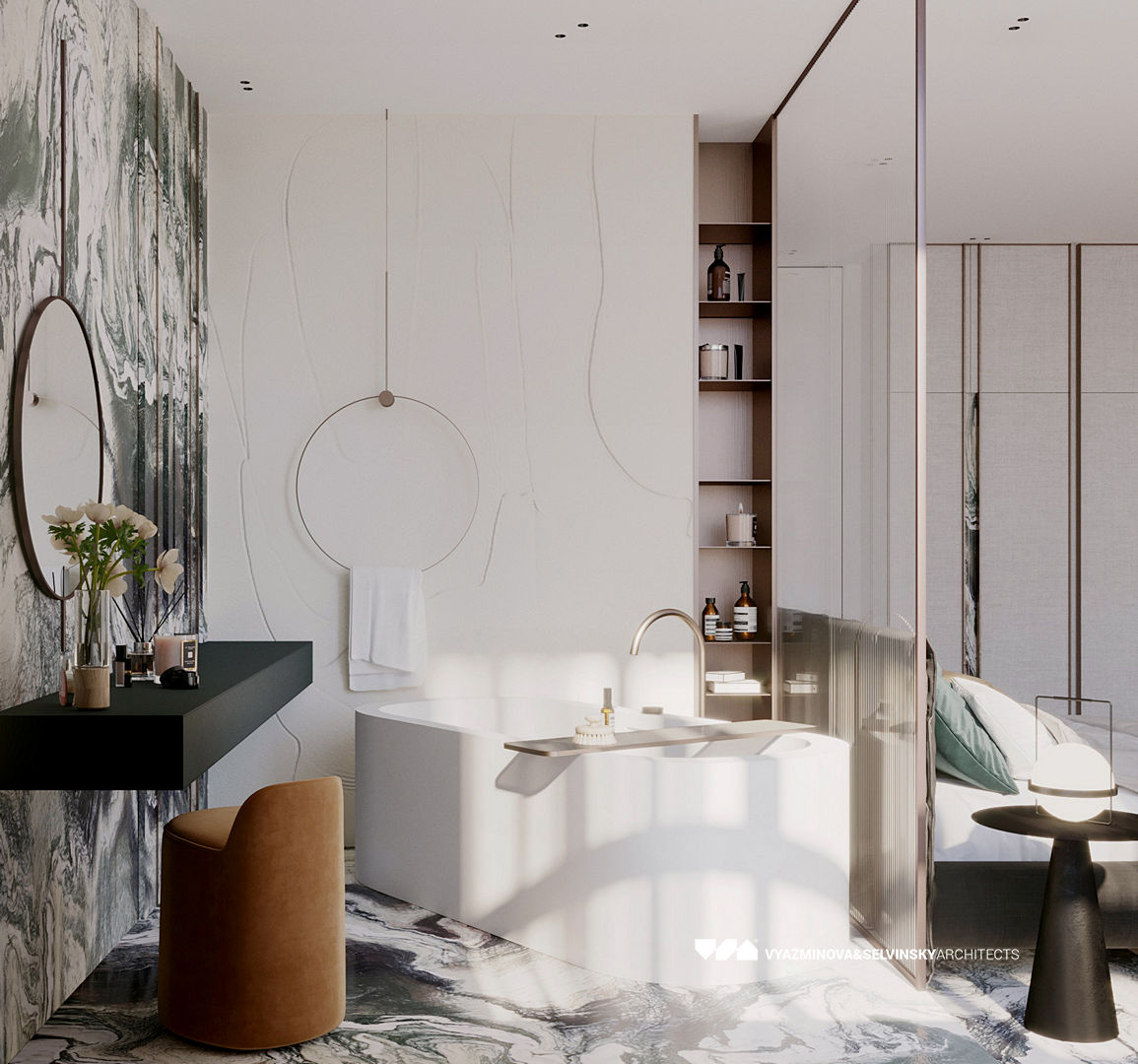
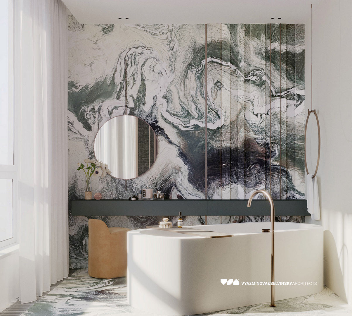
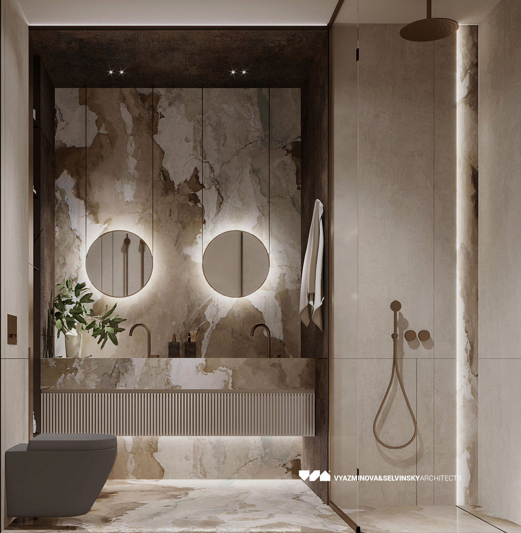
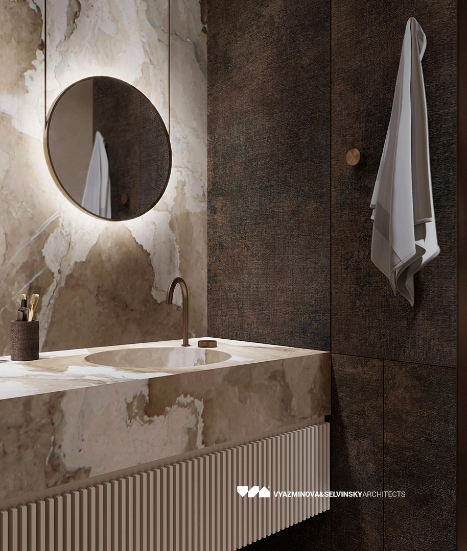
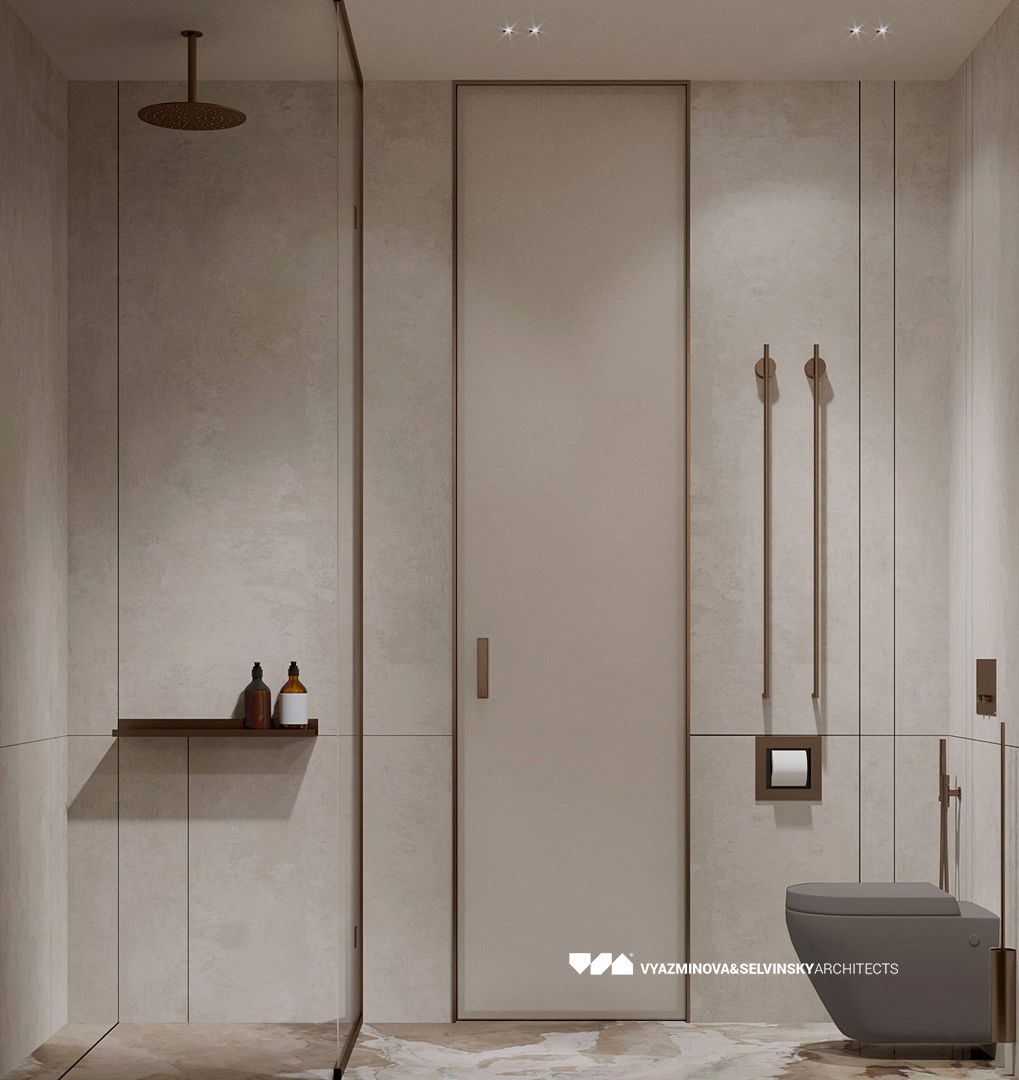
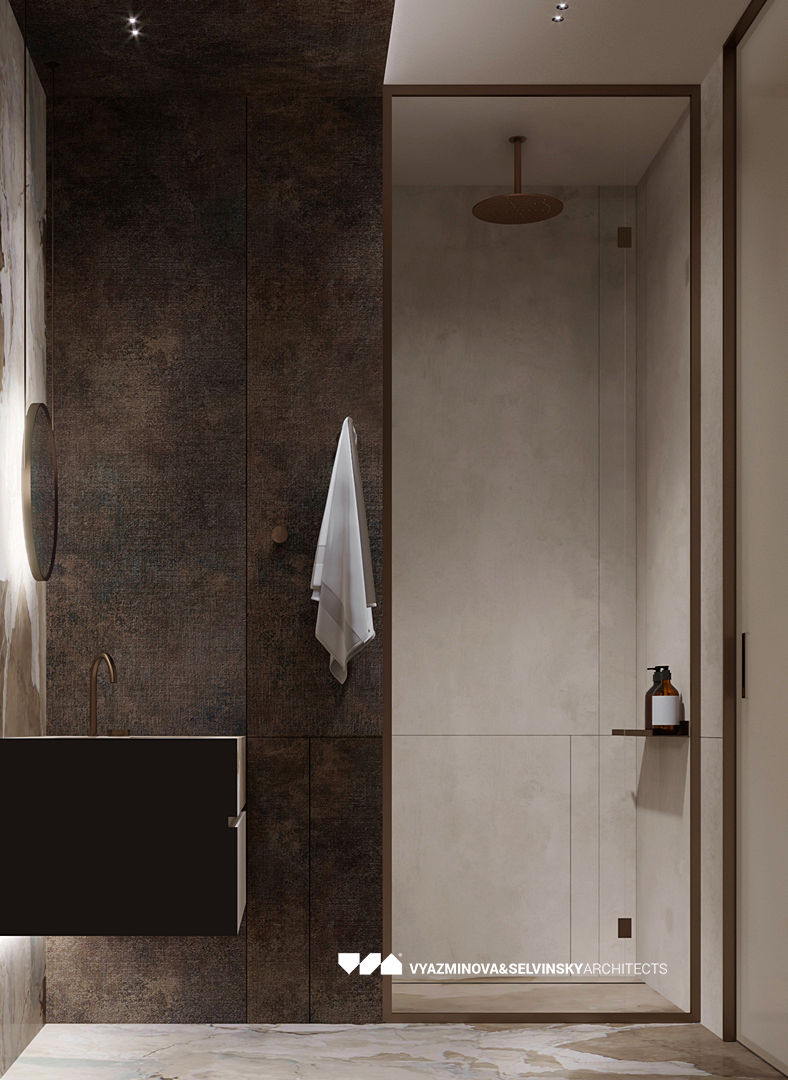
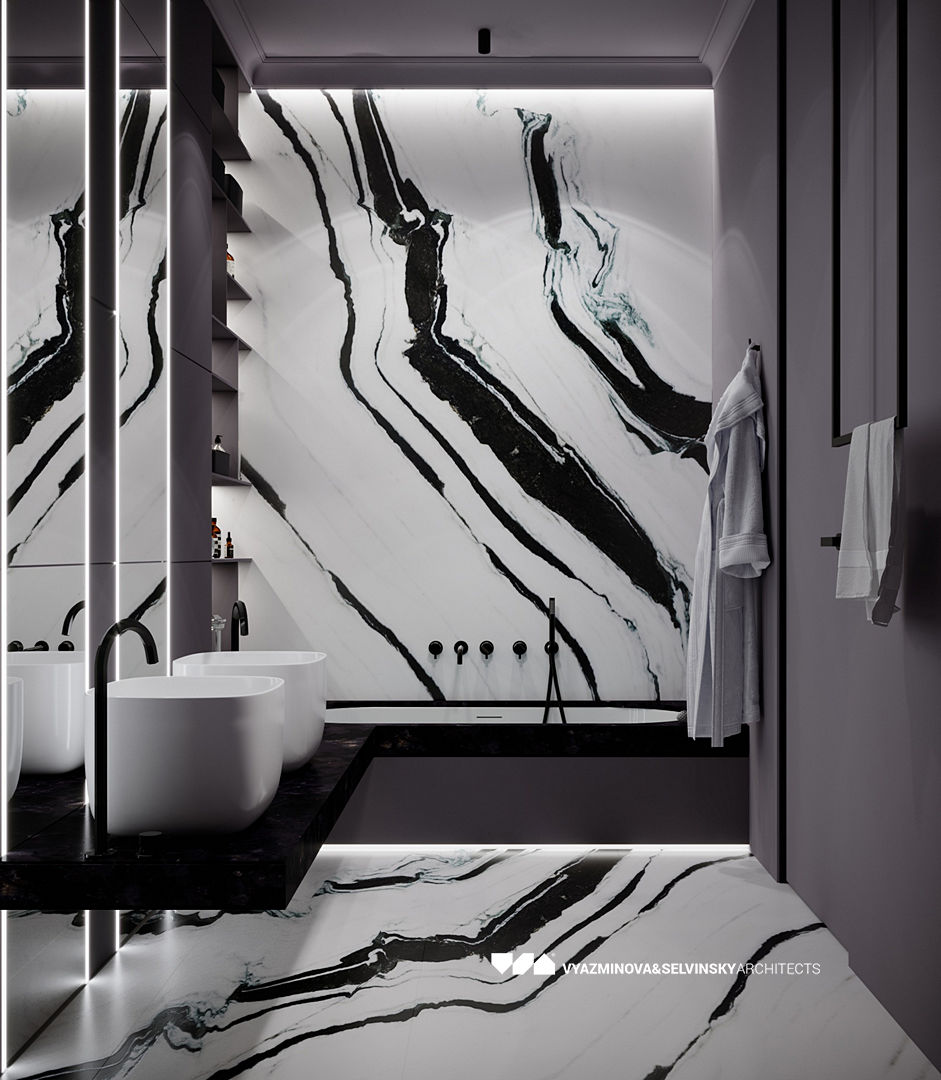
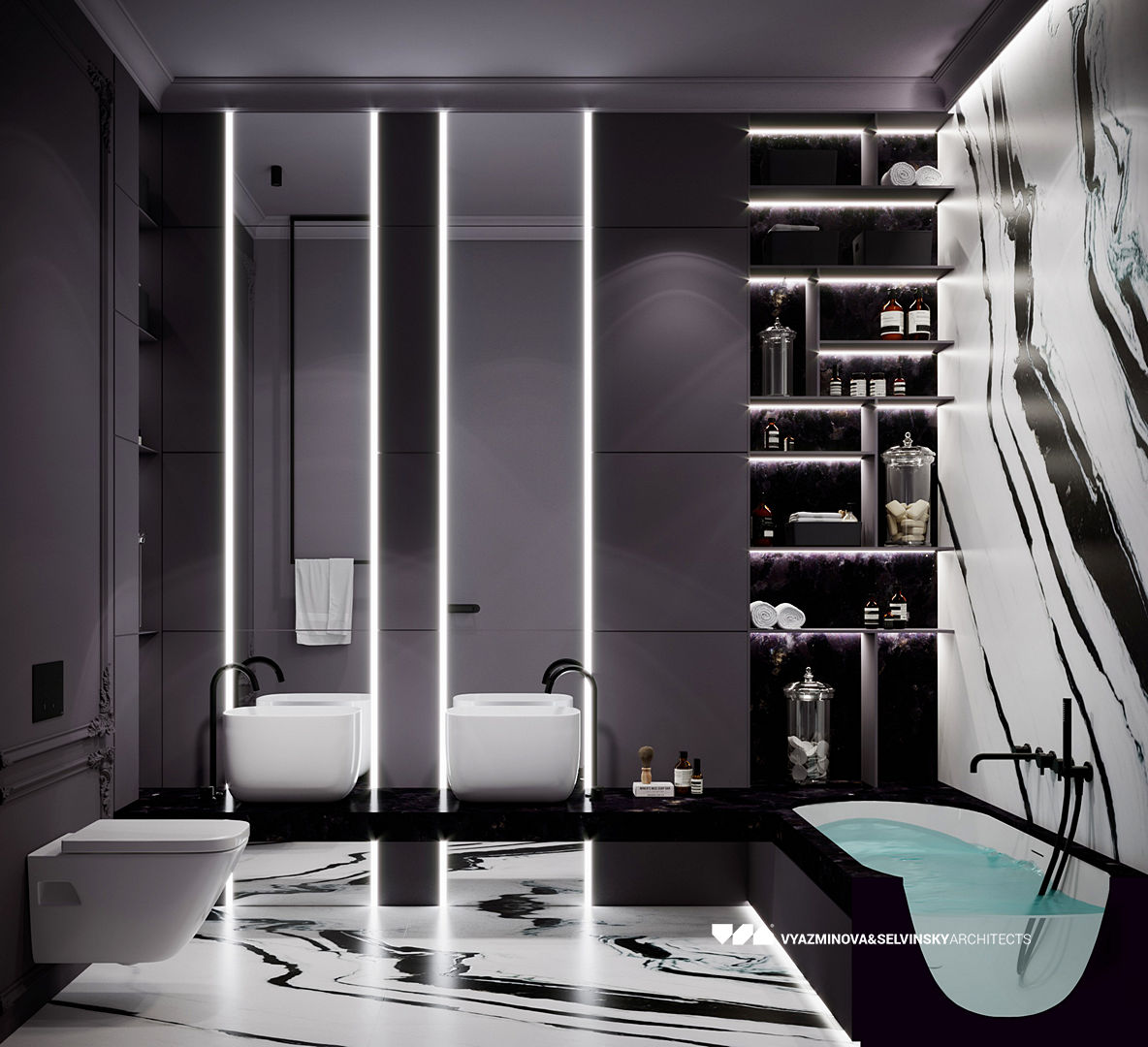
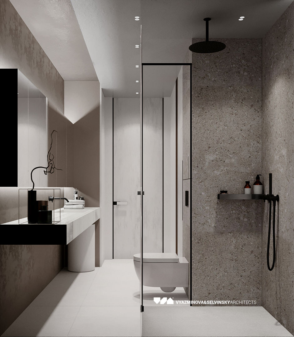
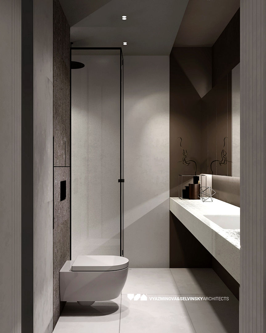
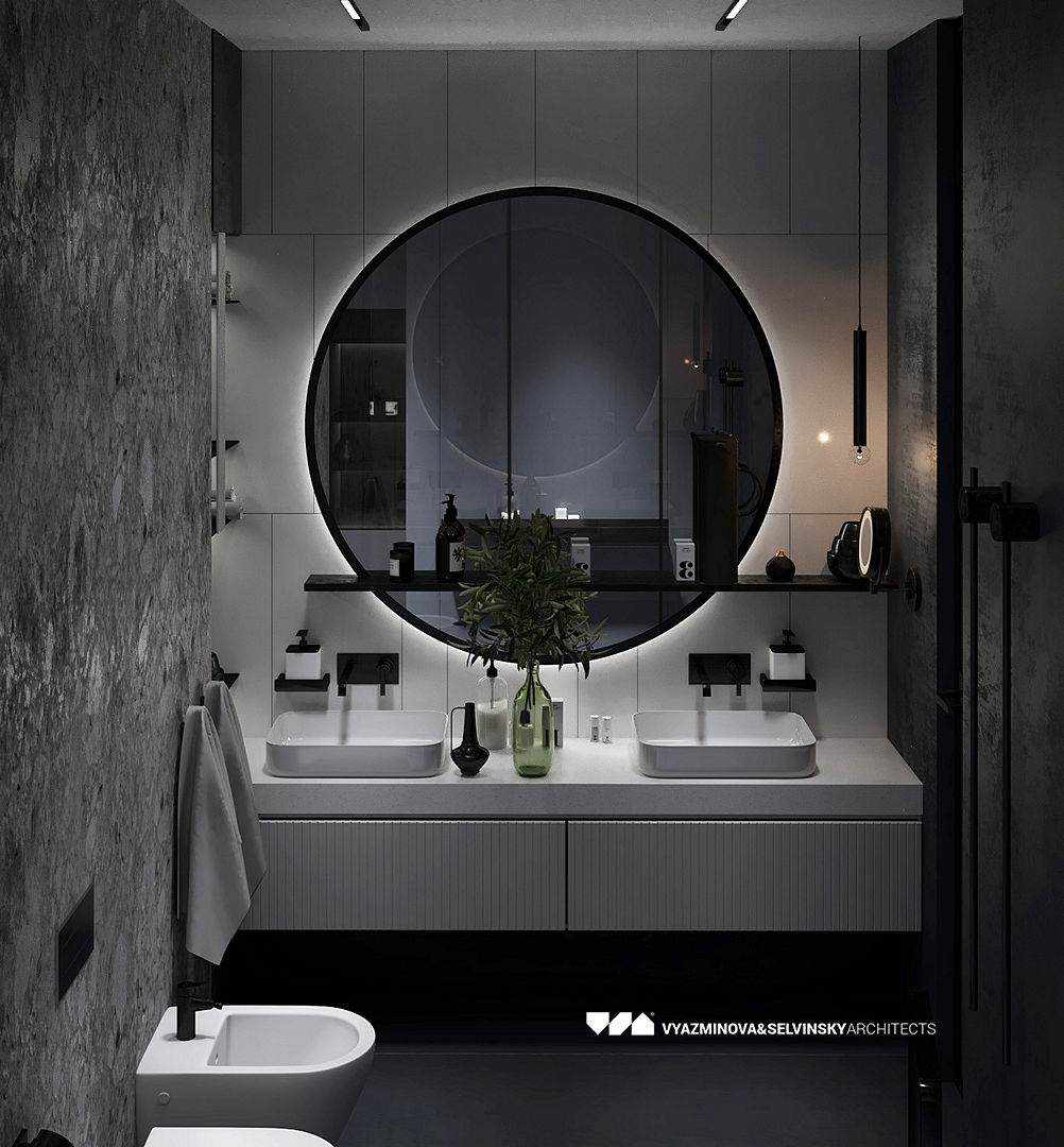
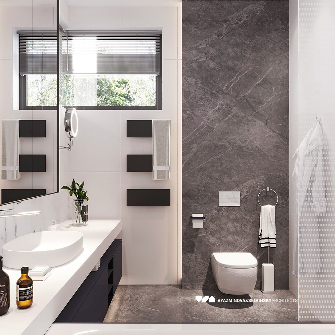
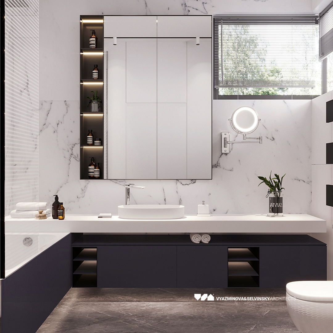
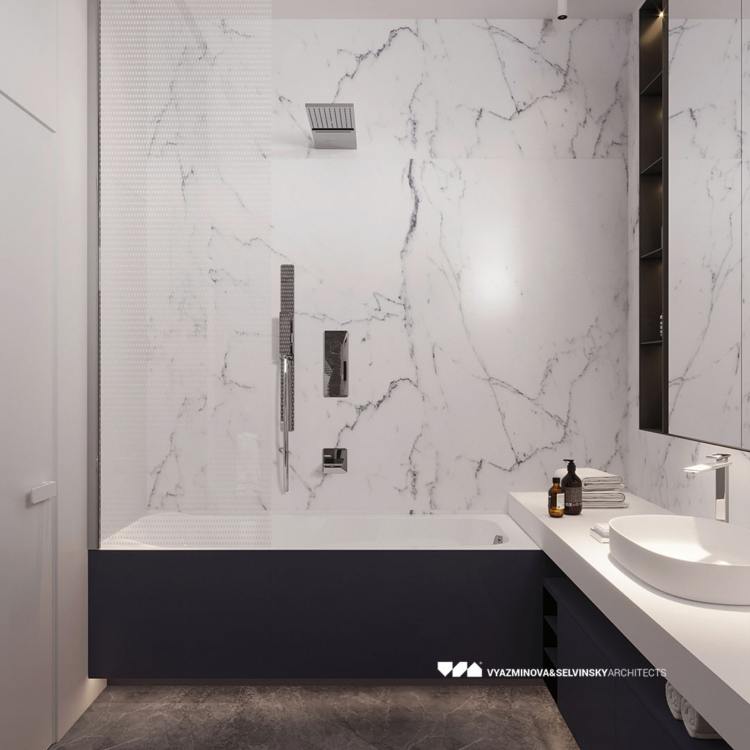
master bathroom
entrance hall
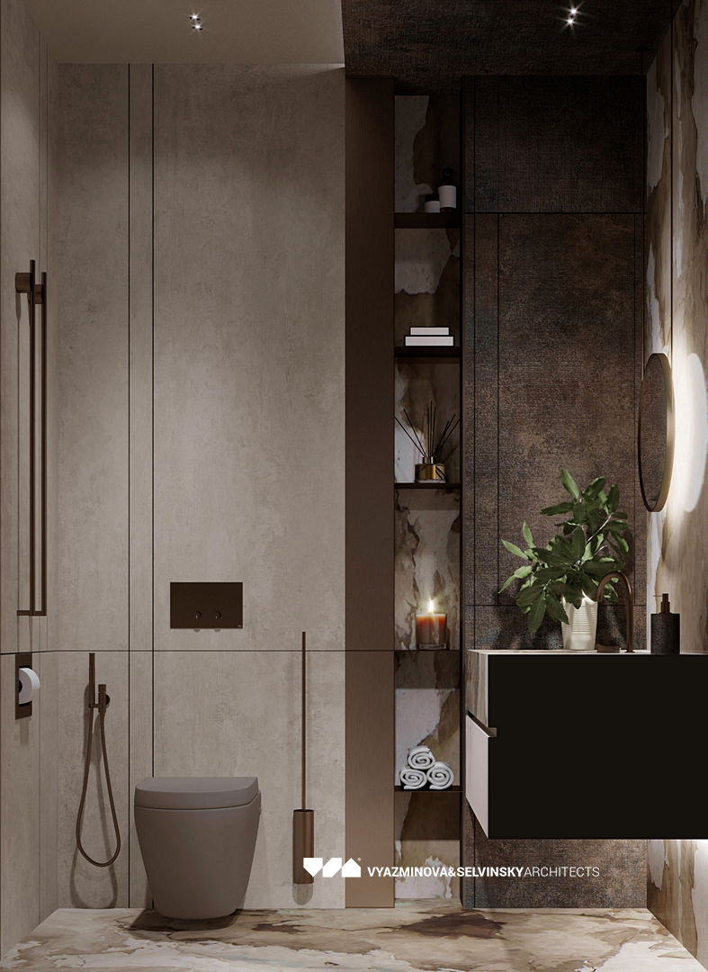
wc & hammam
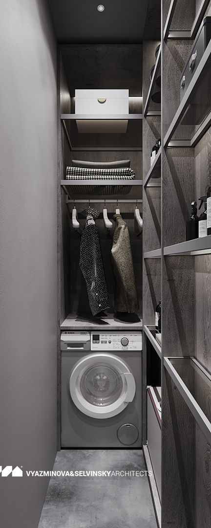
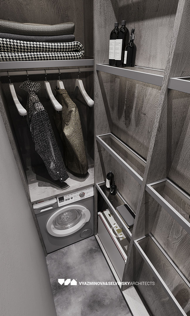
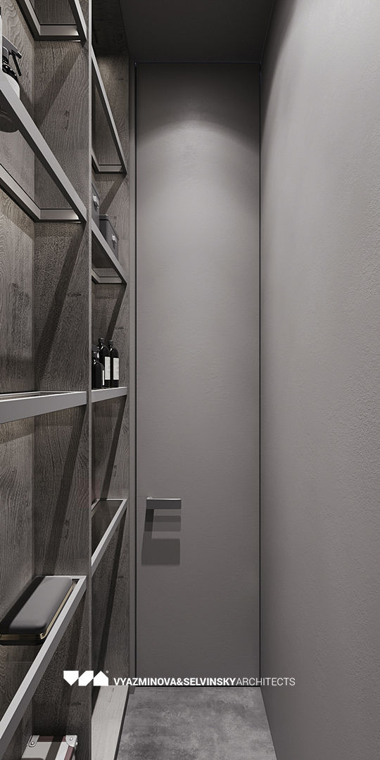
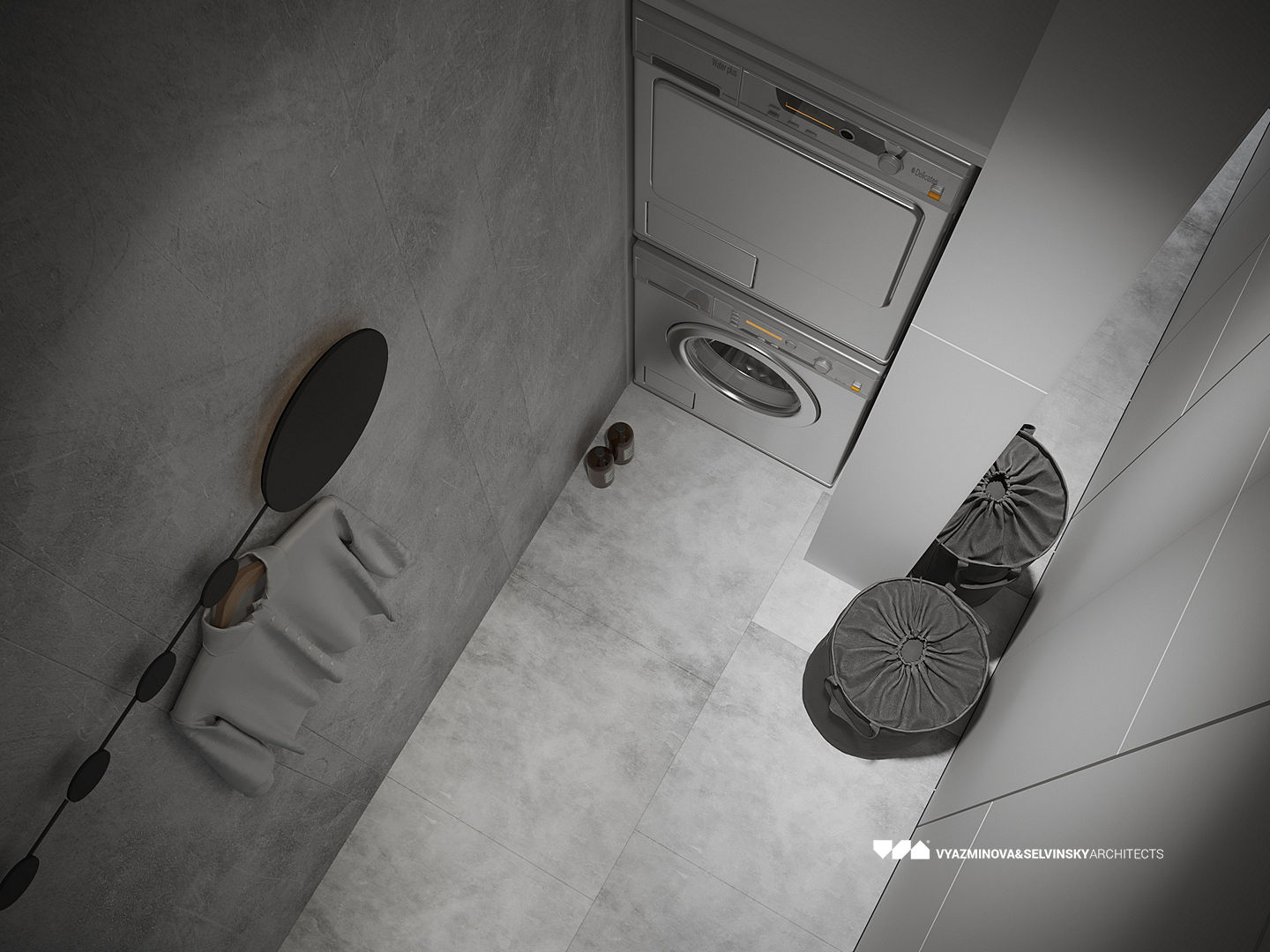
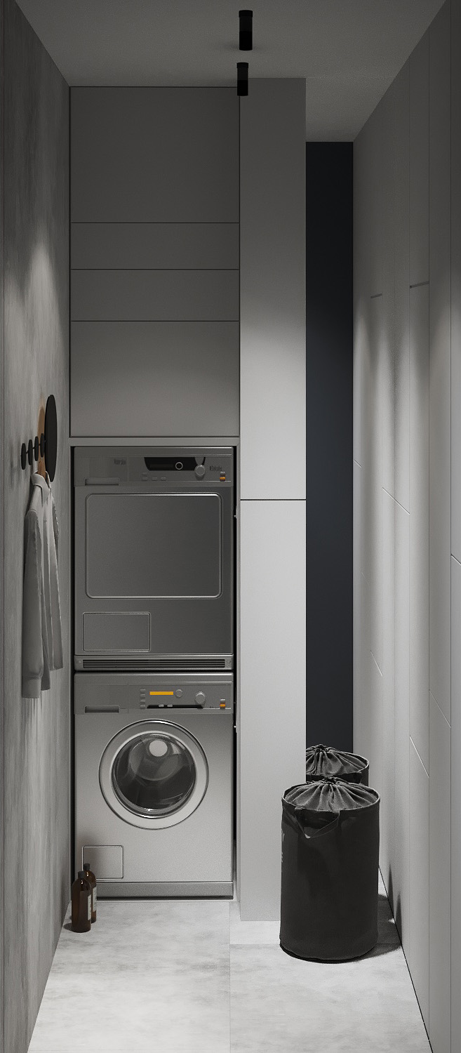
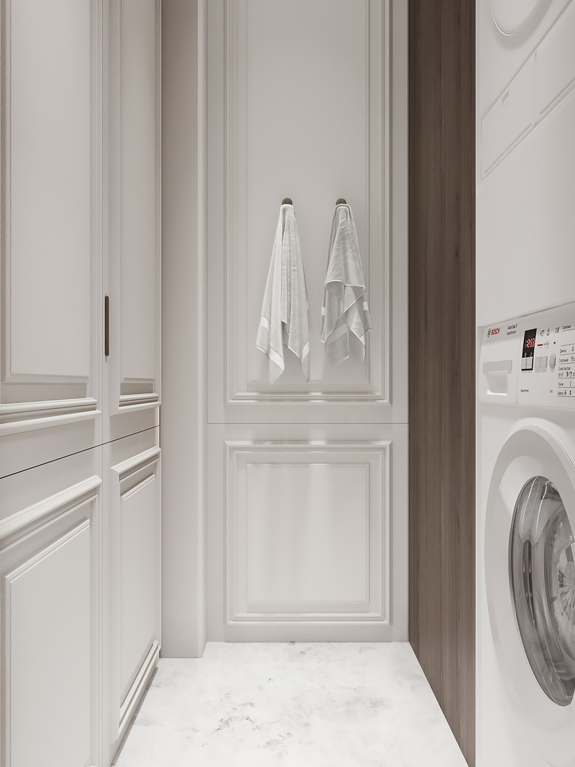
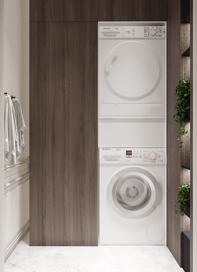
laundry
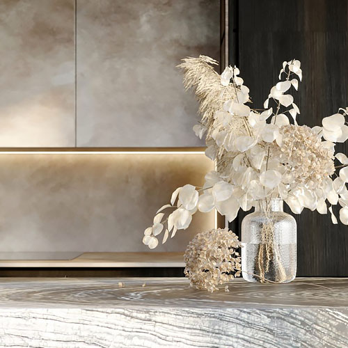
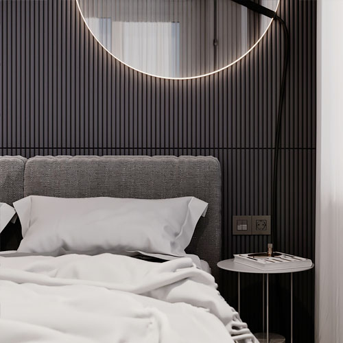
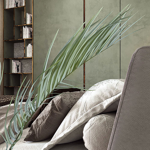
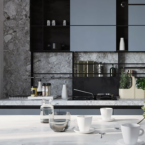
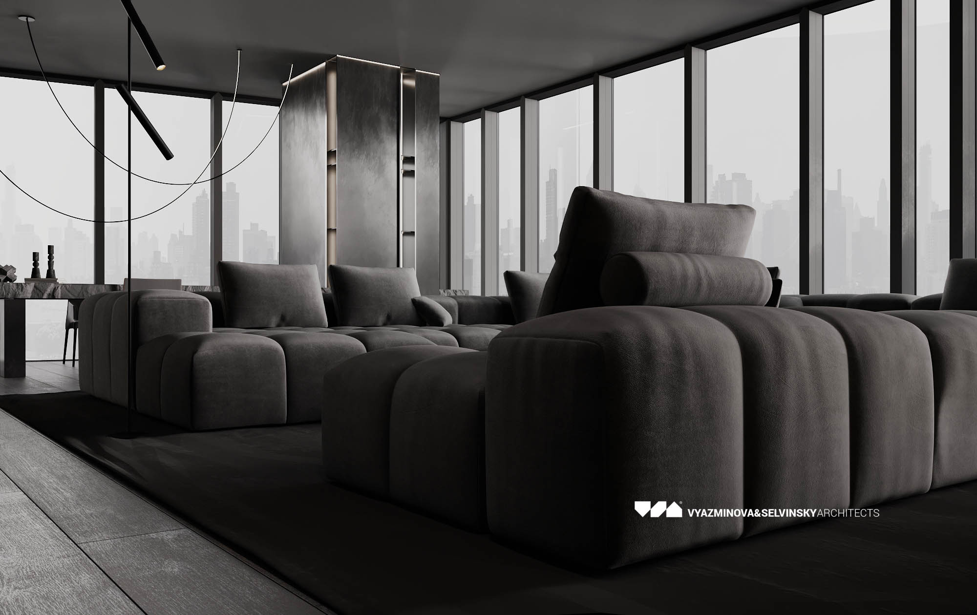
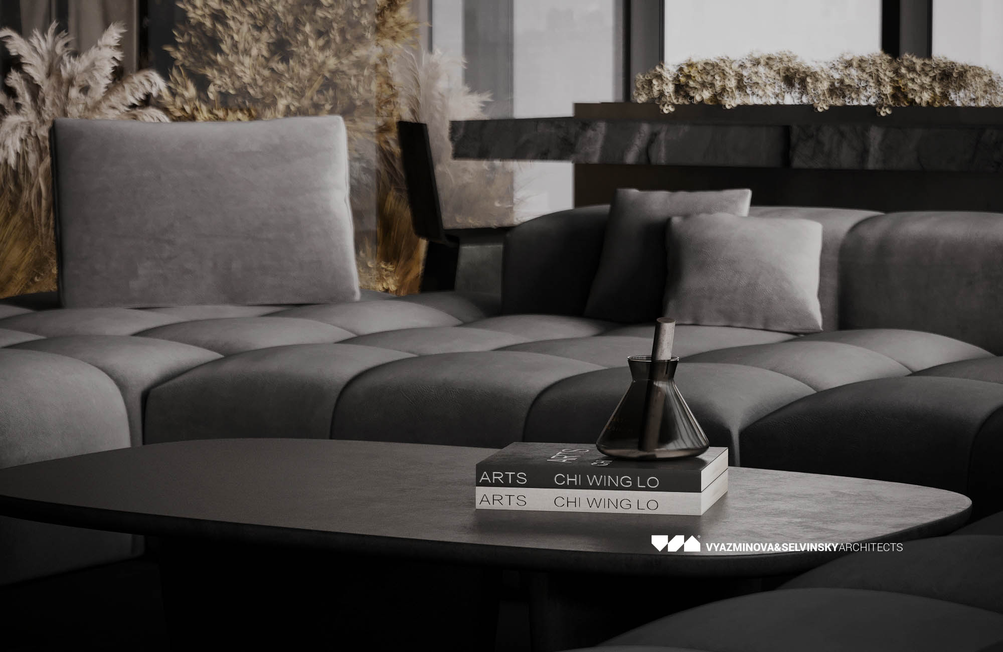
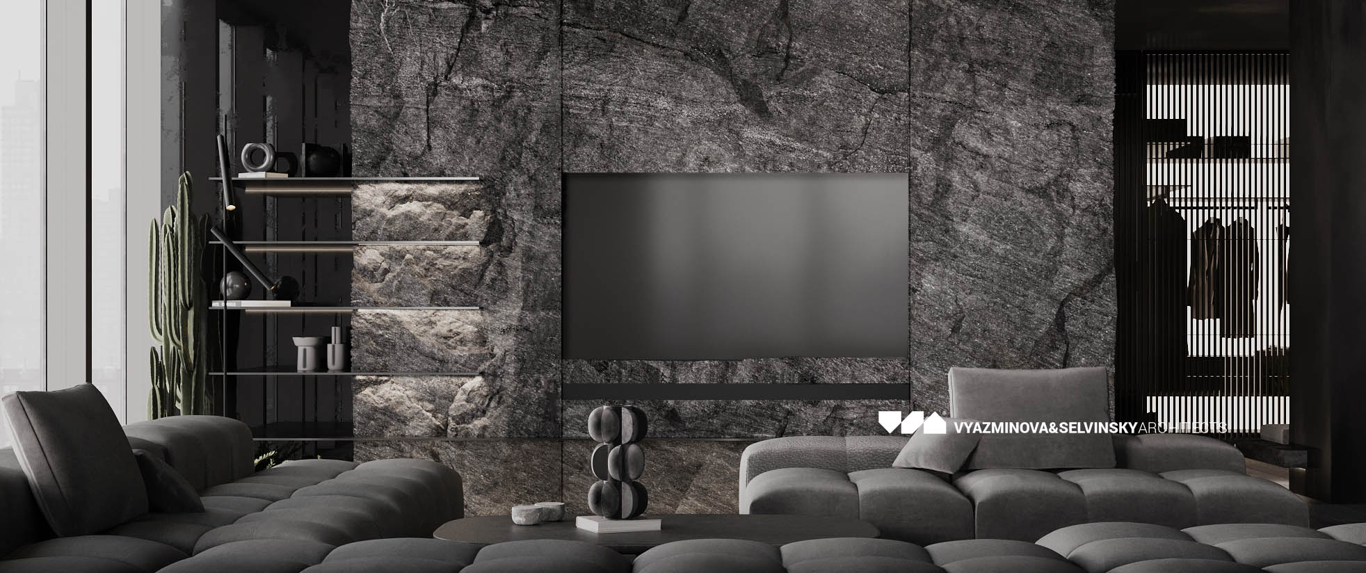
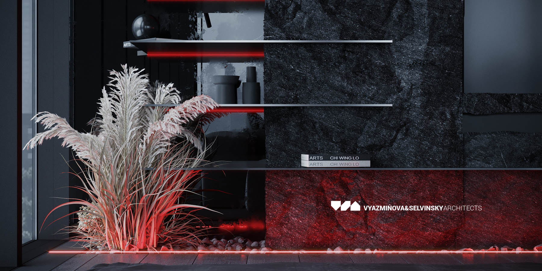
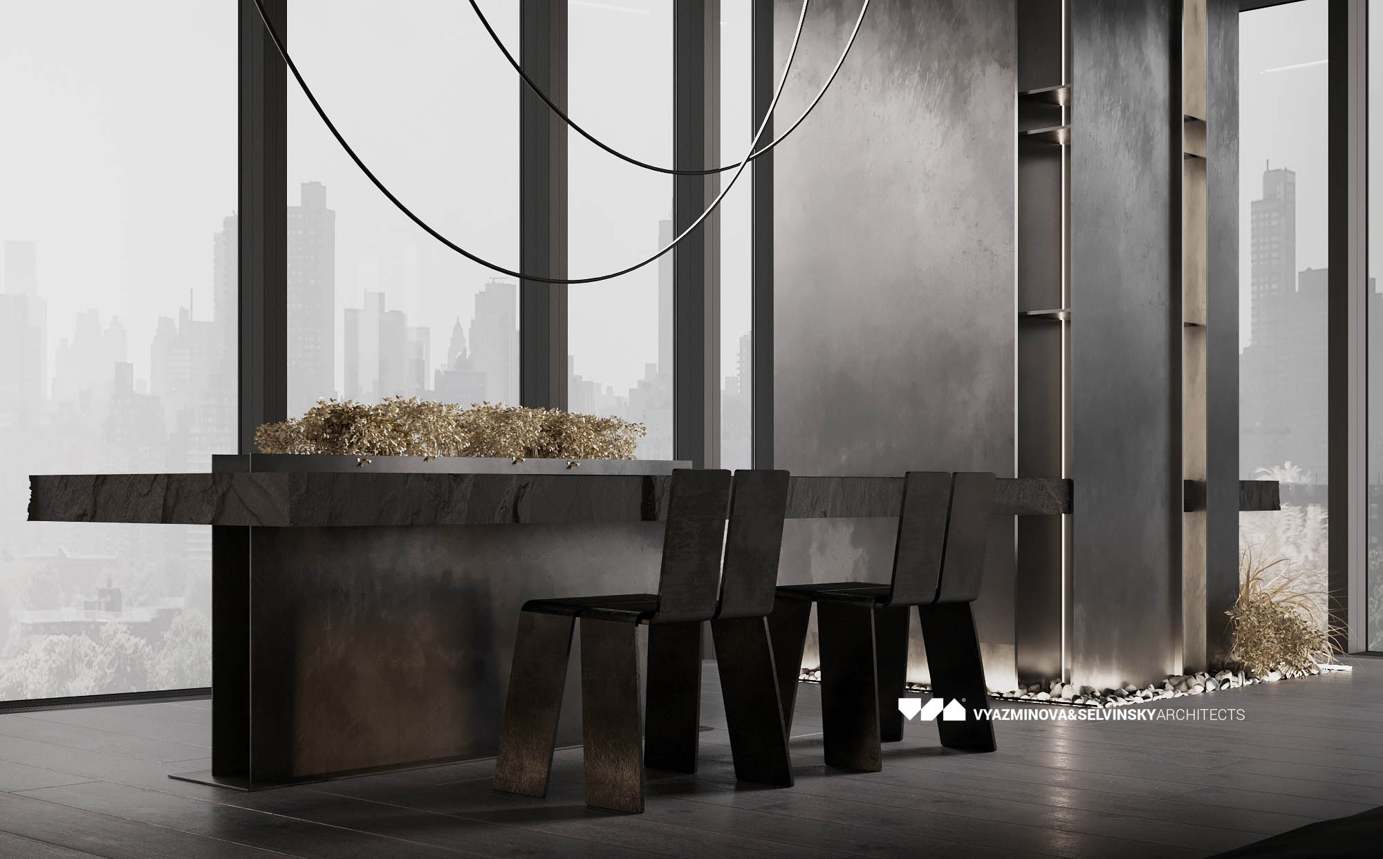
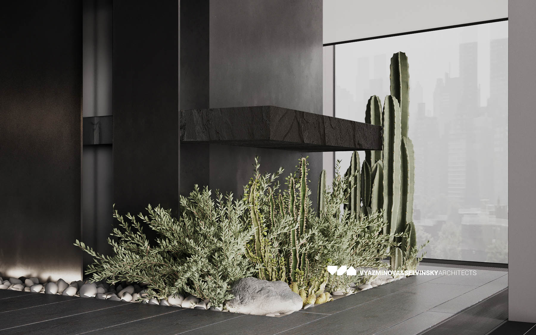
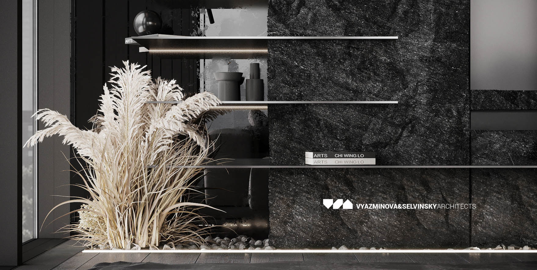
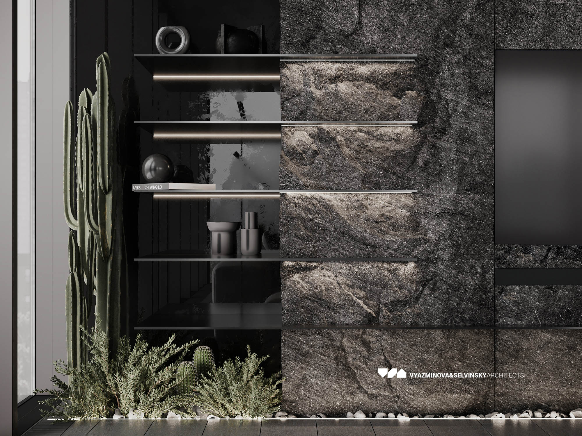
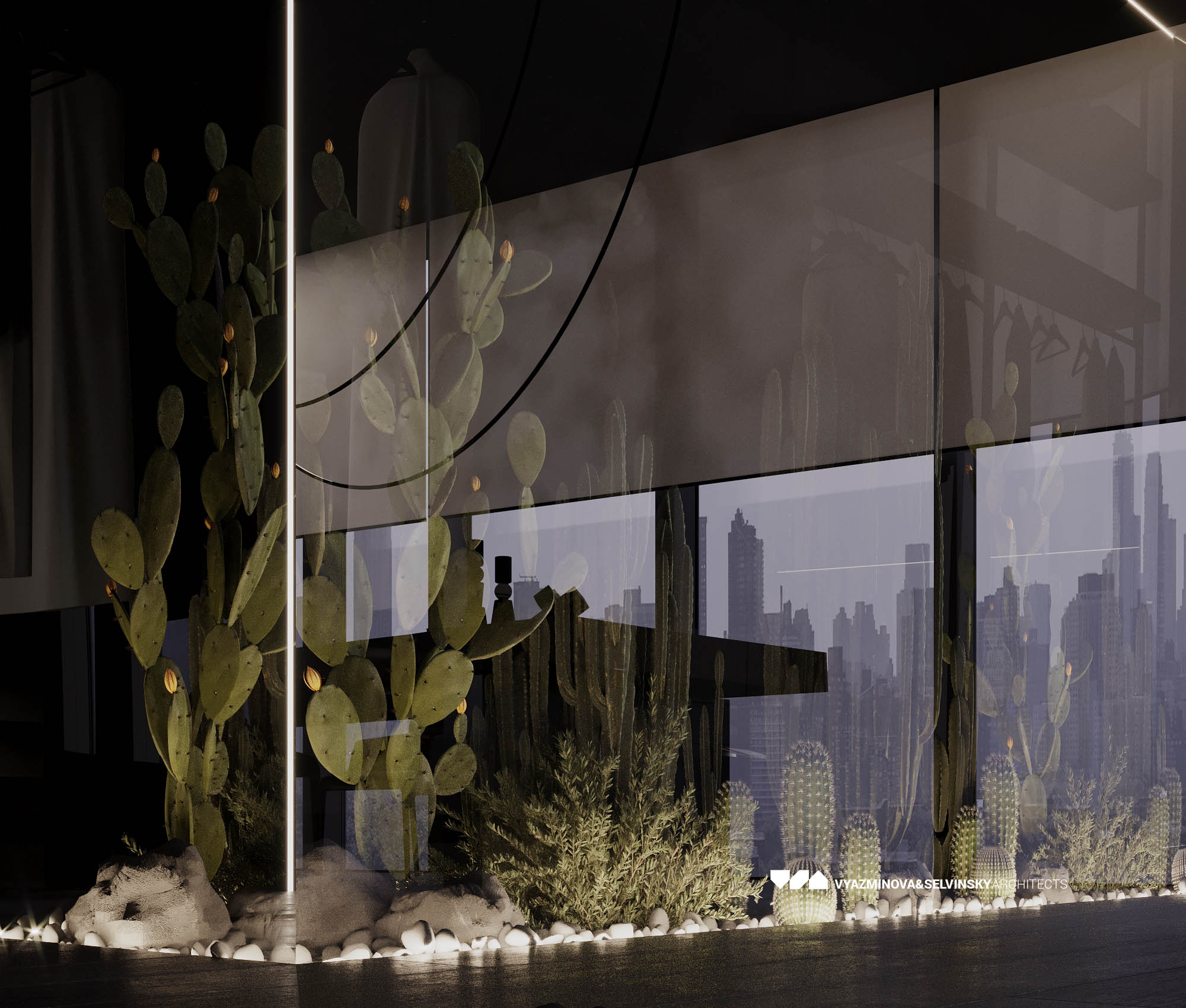
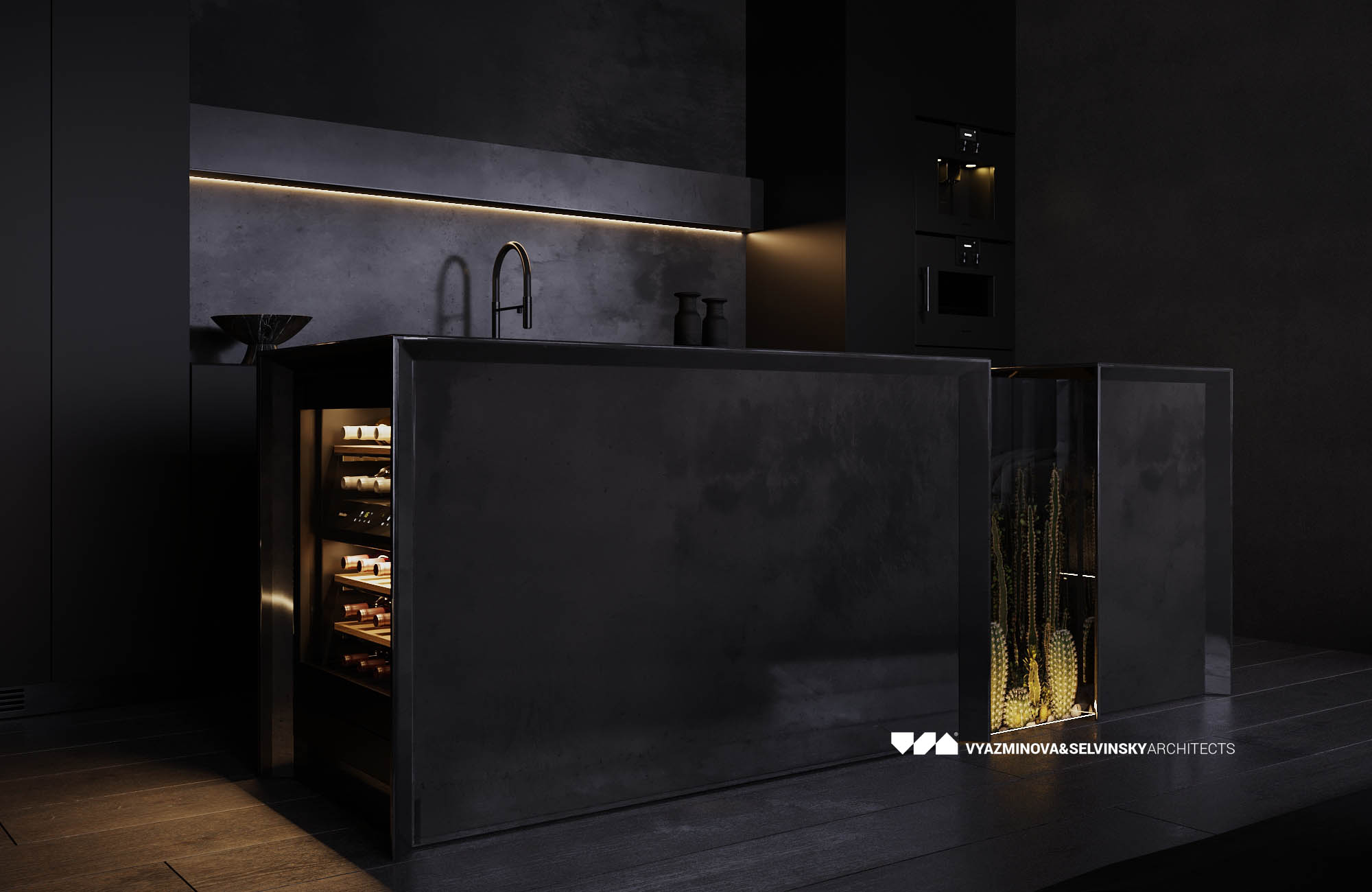
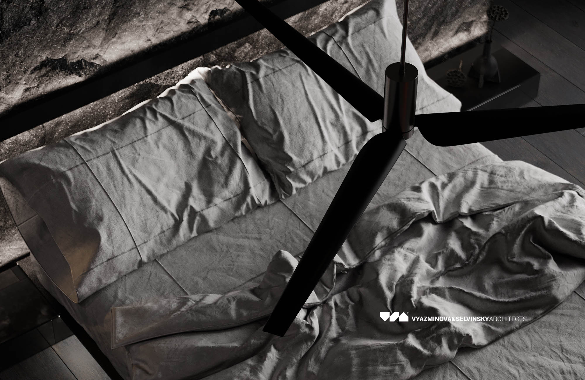
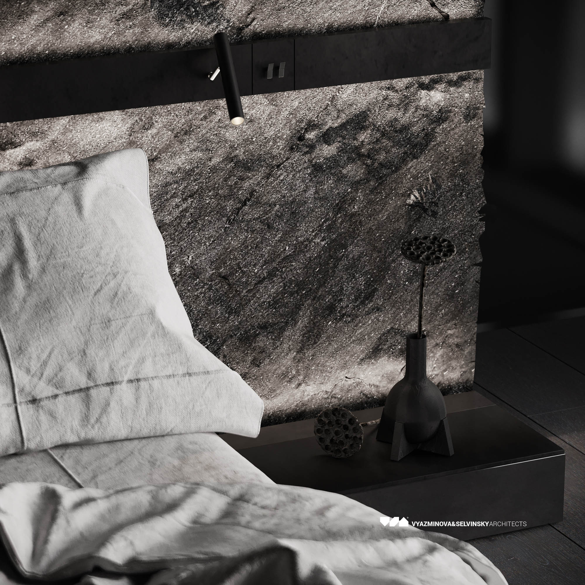
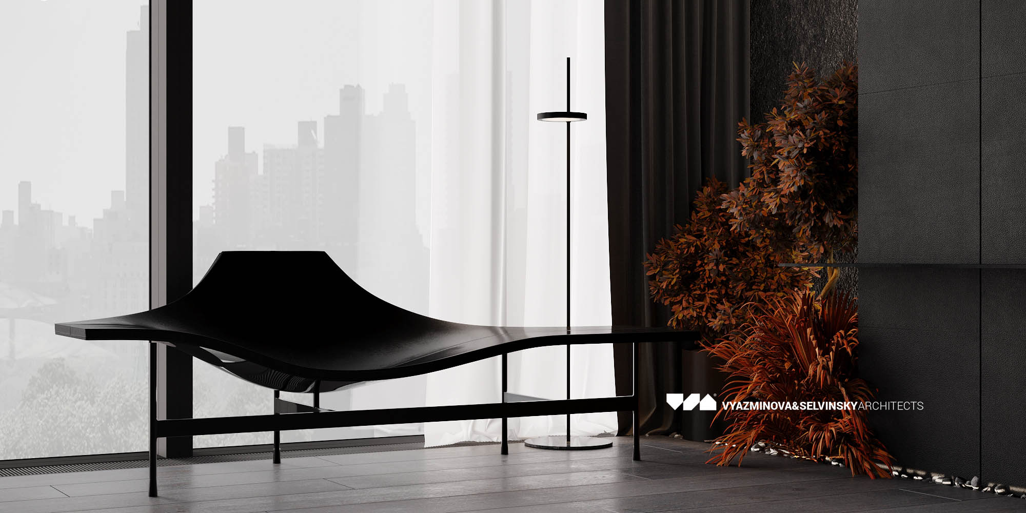
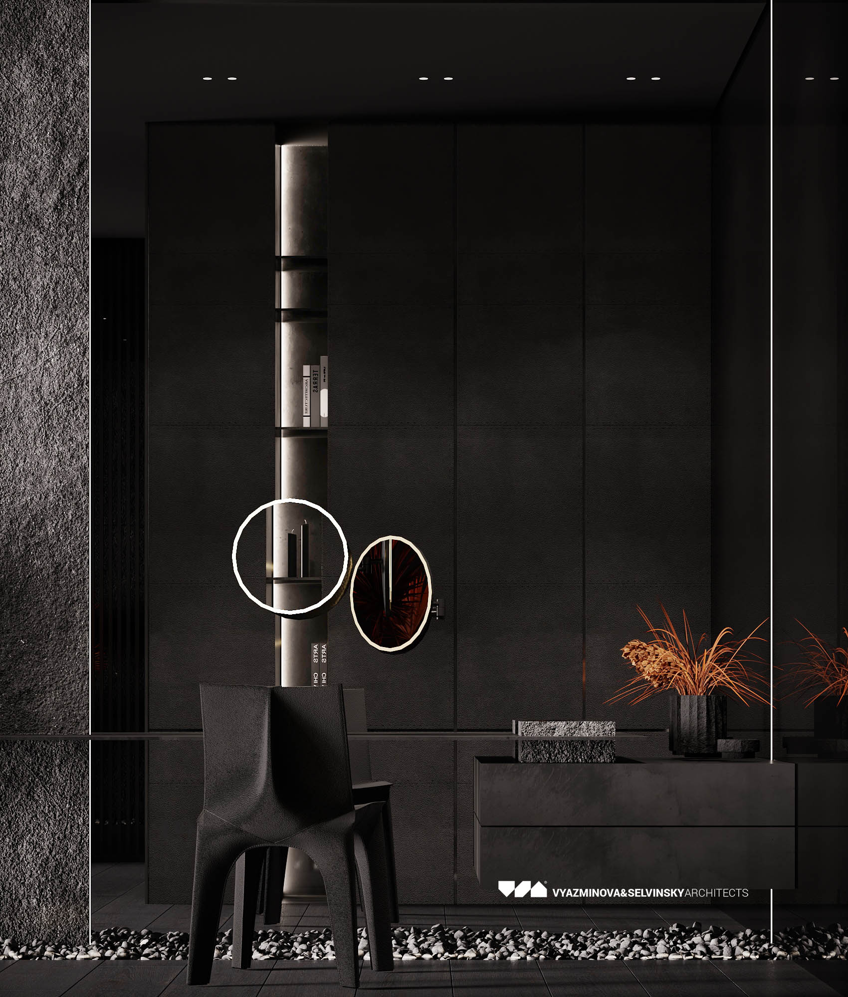
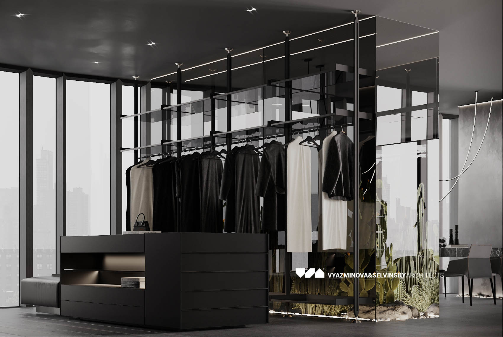
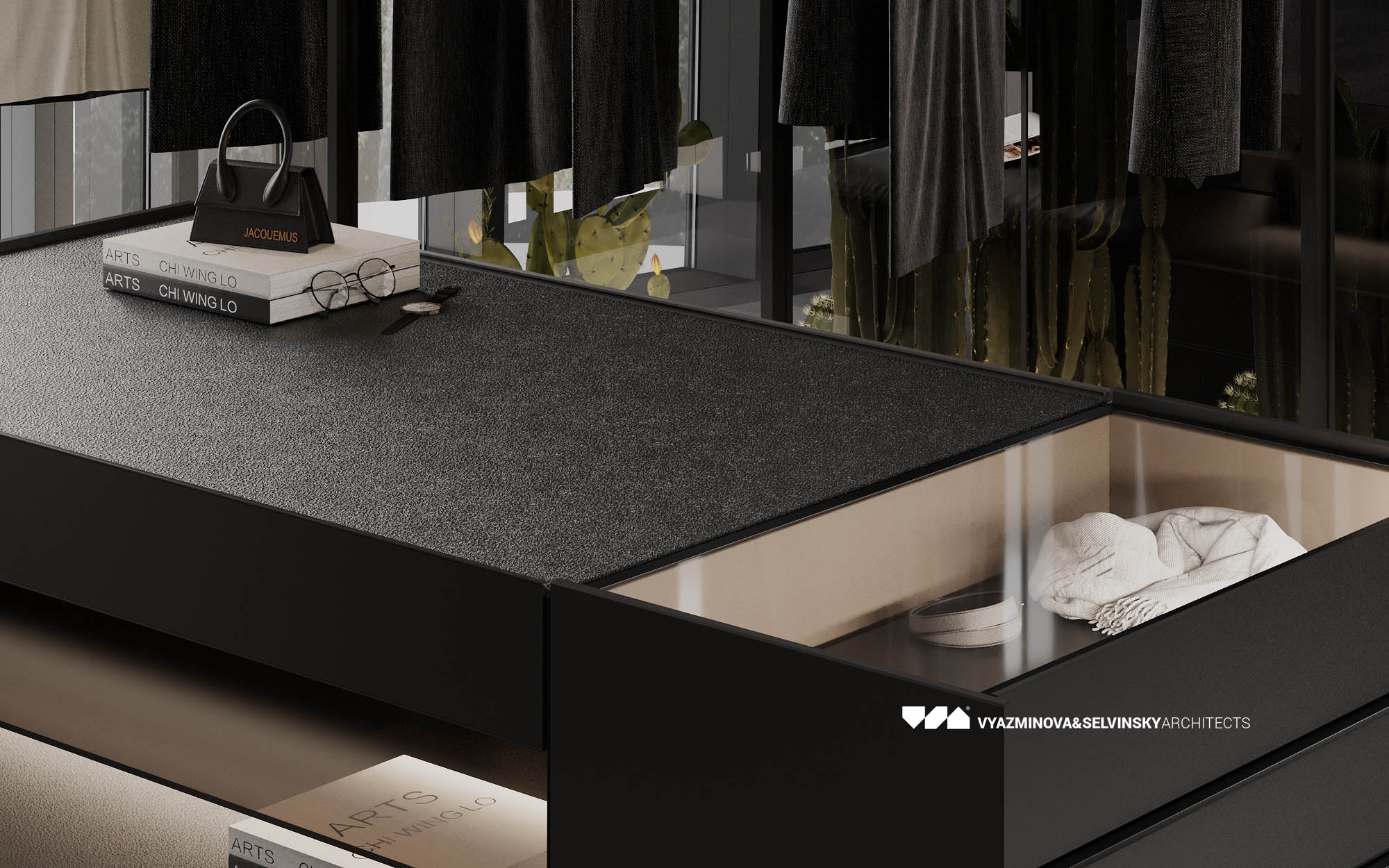
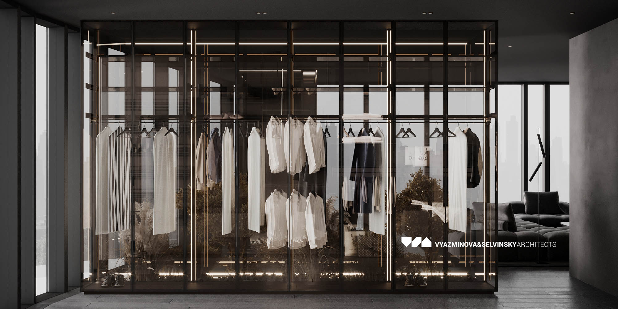
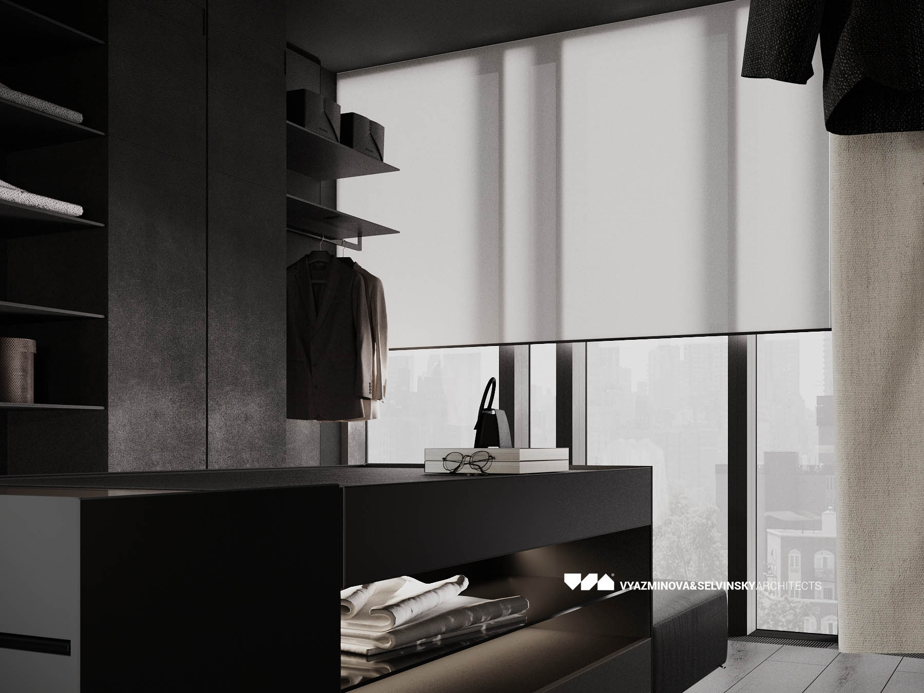
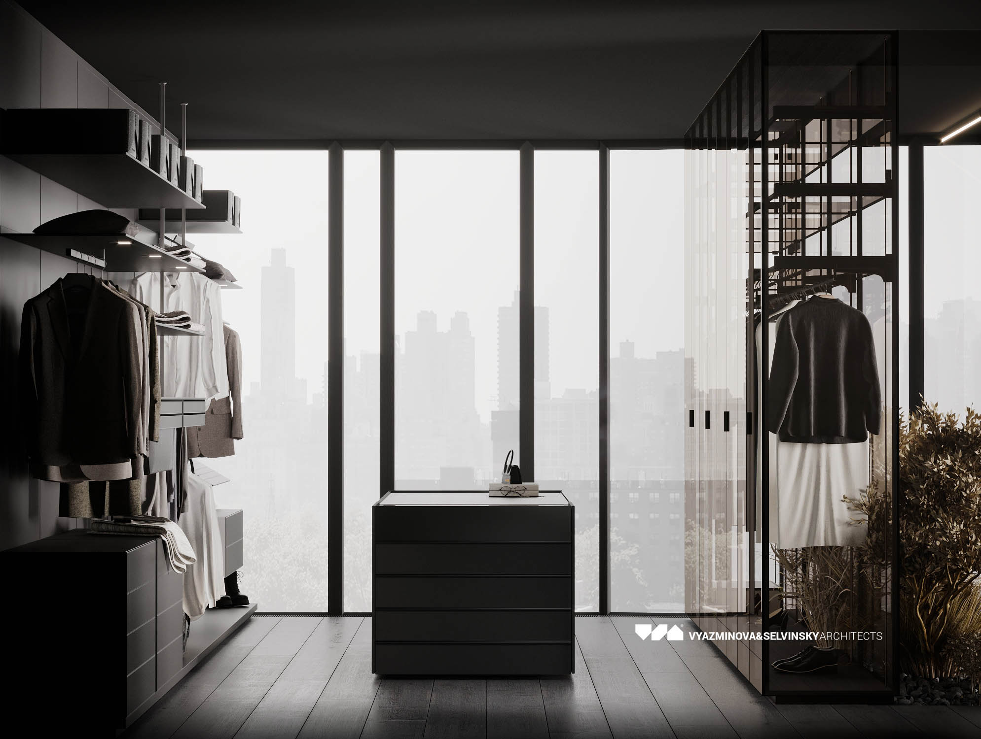
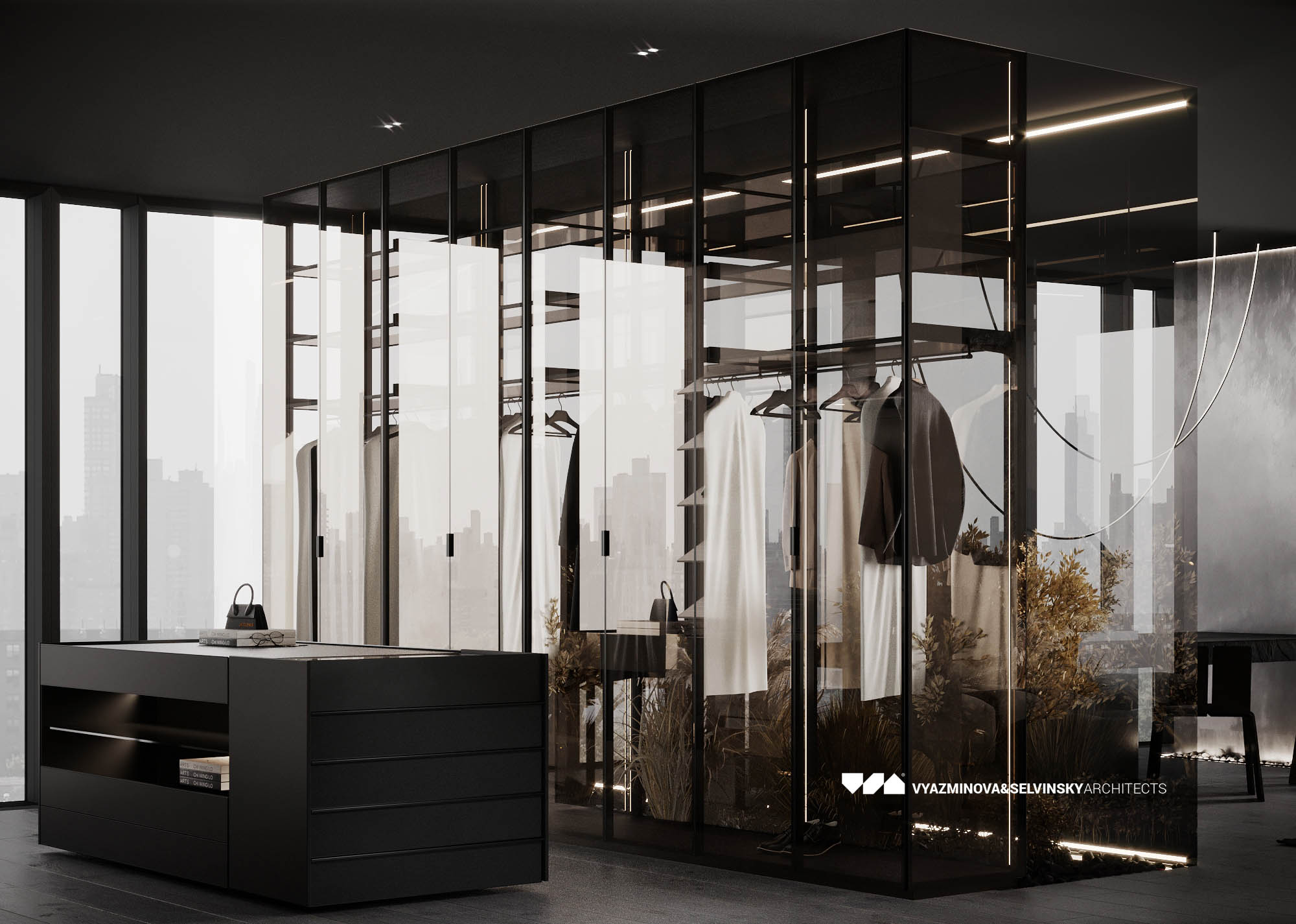
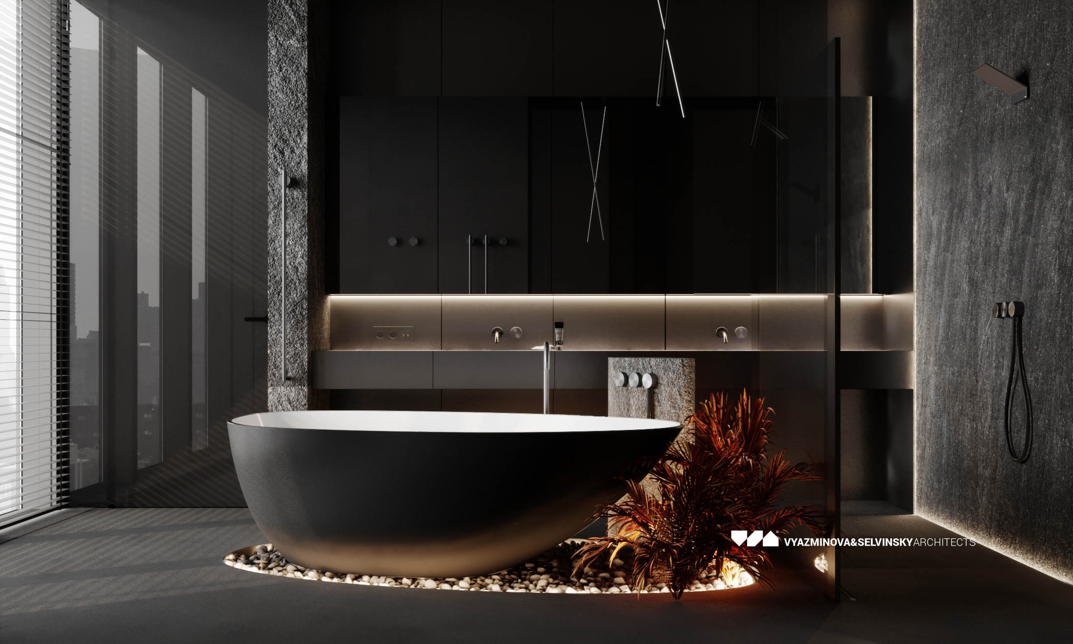
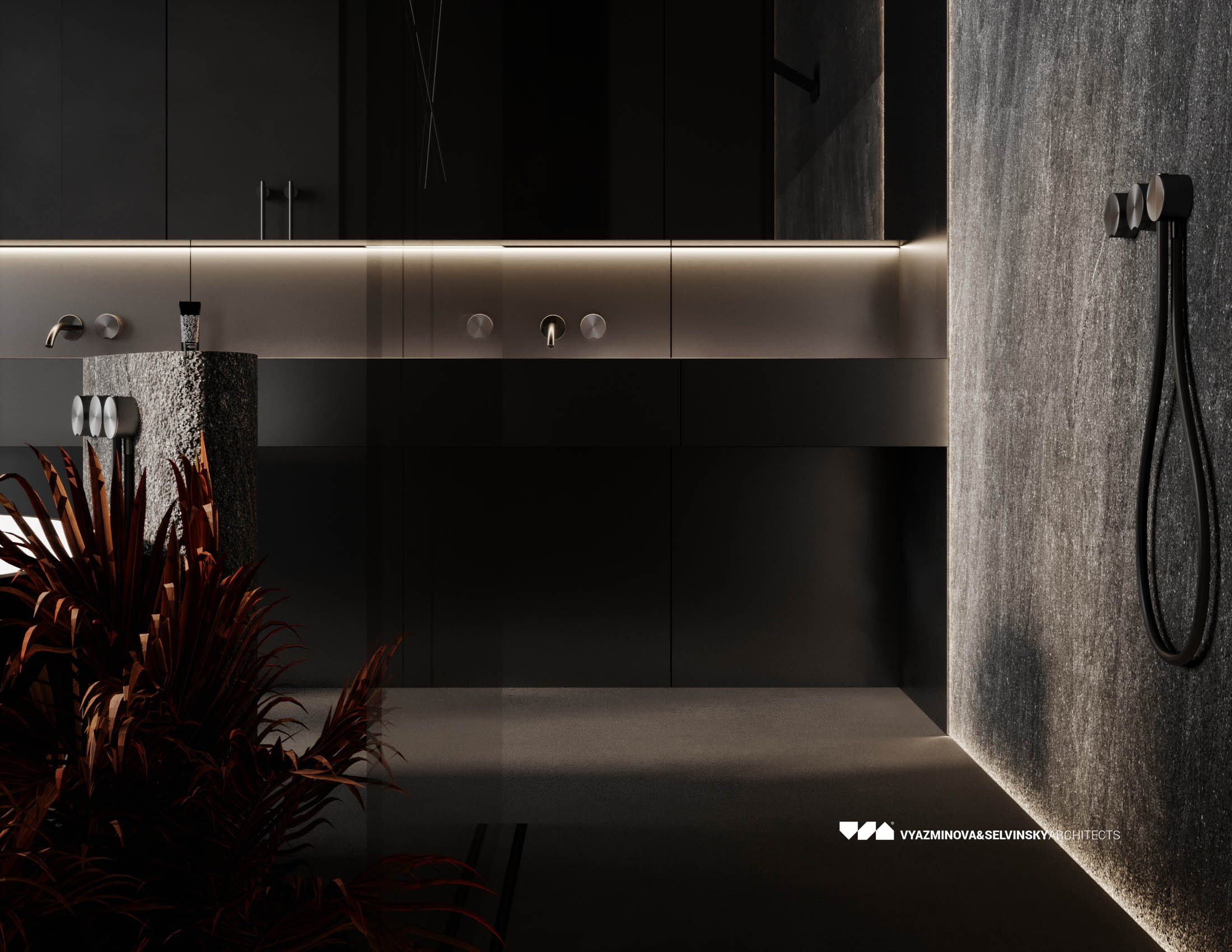
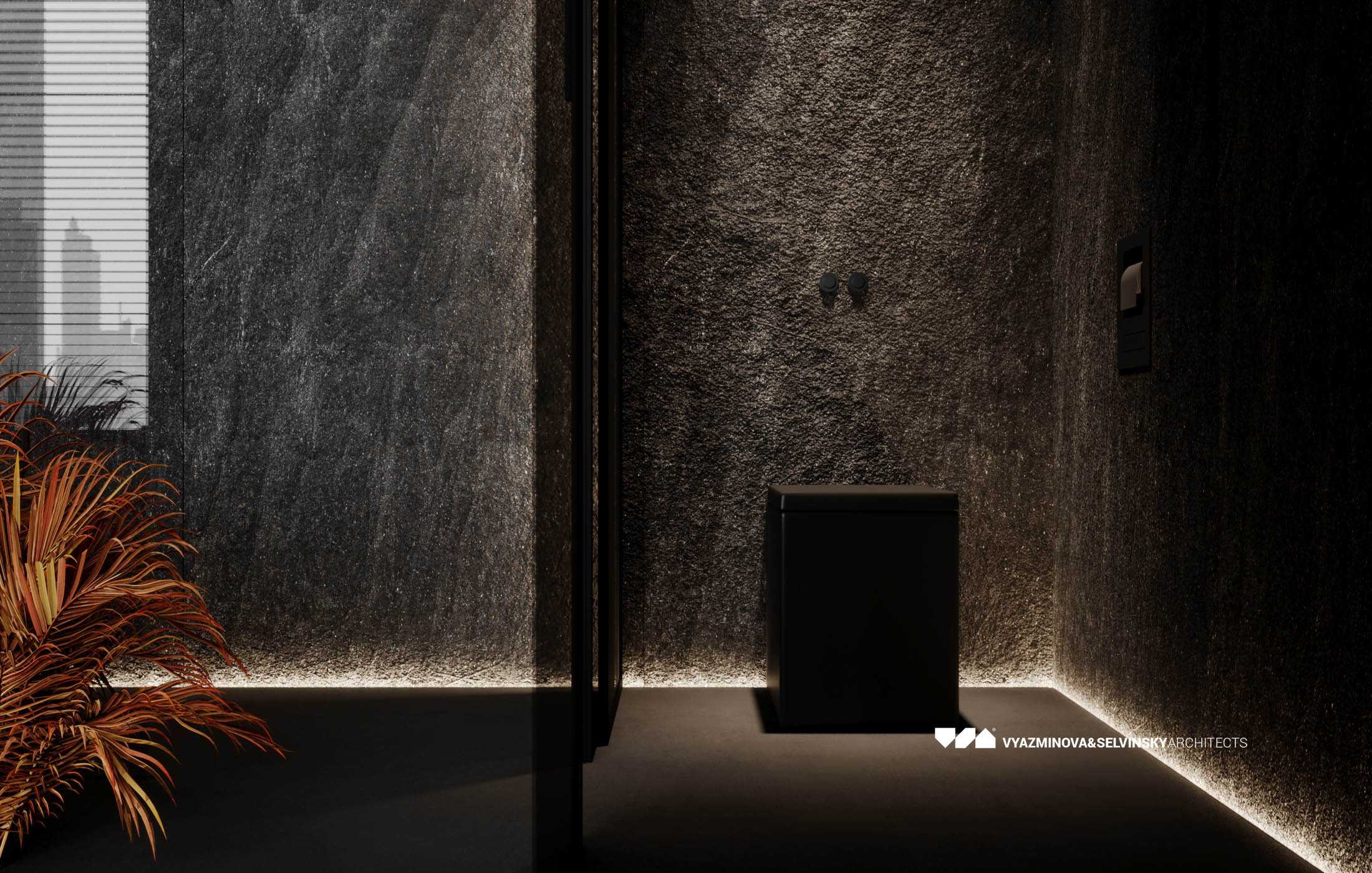
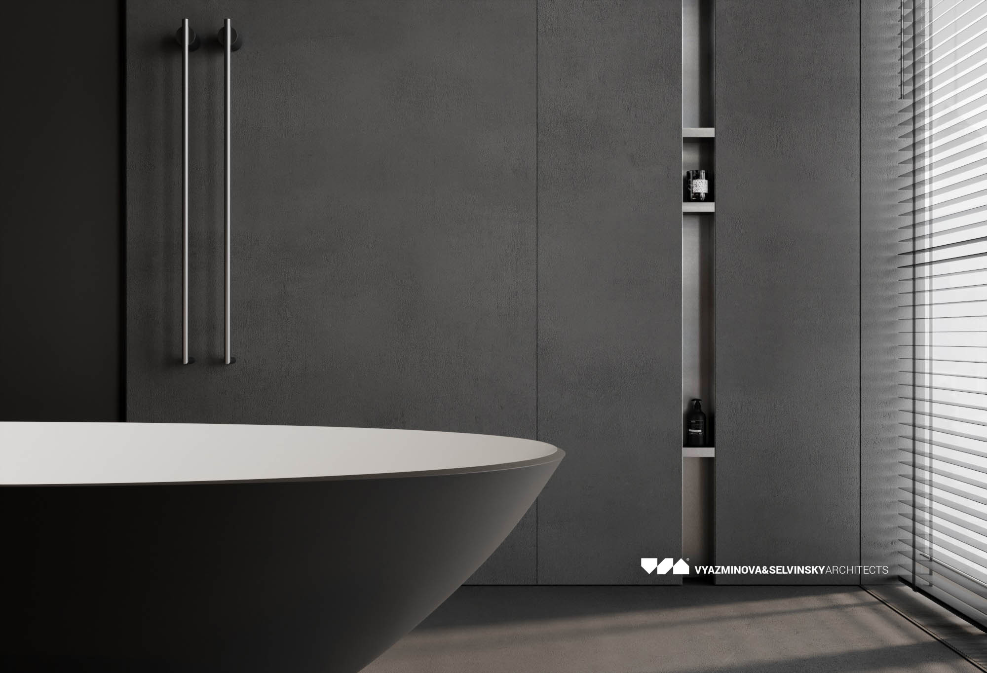
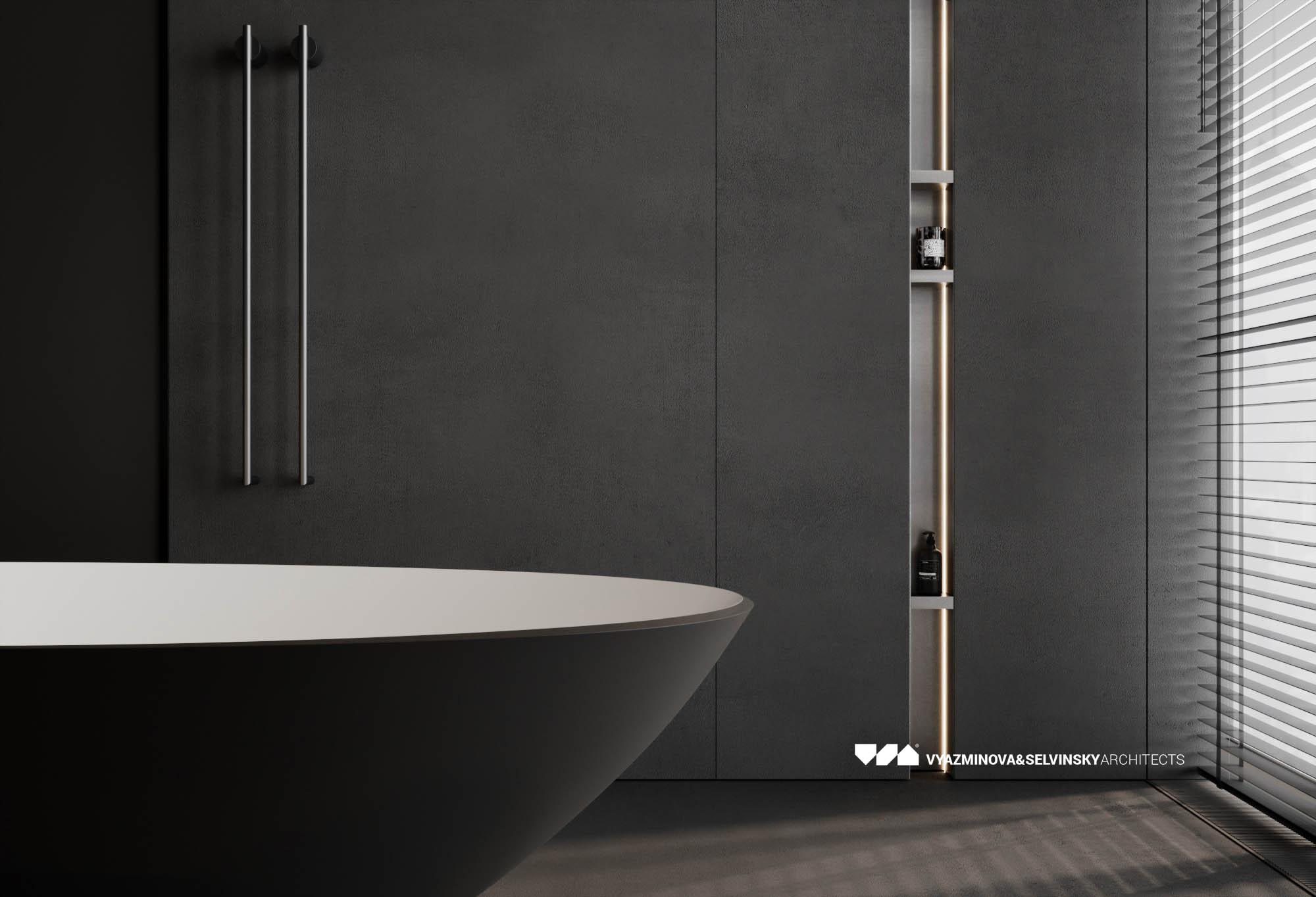
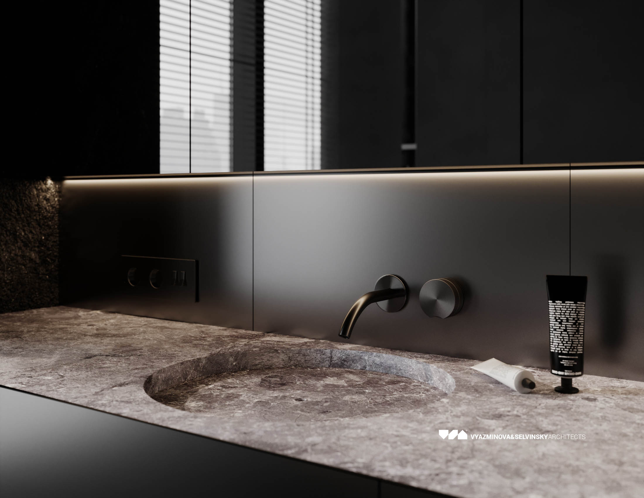
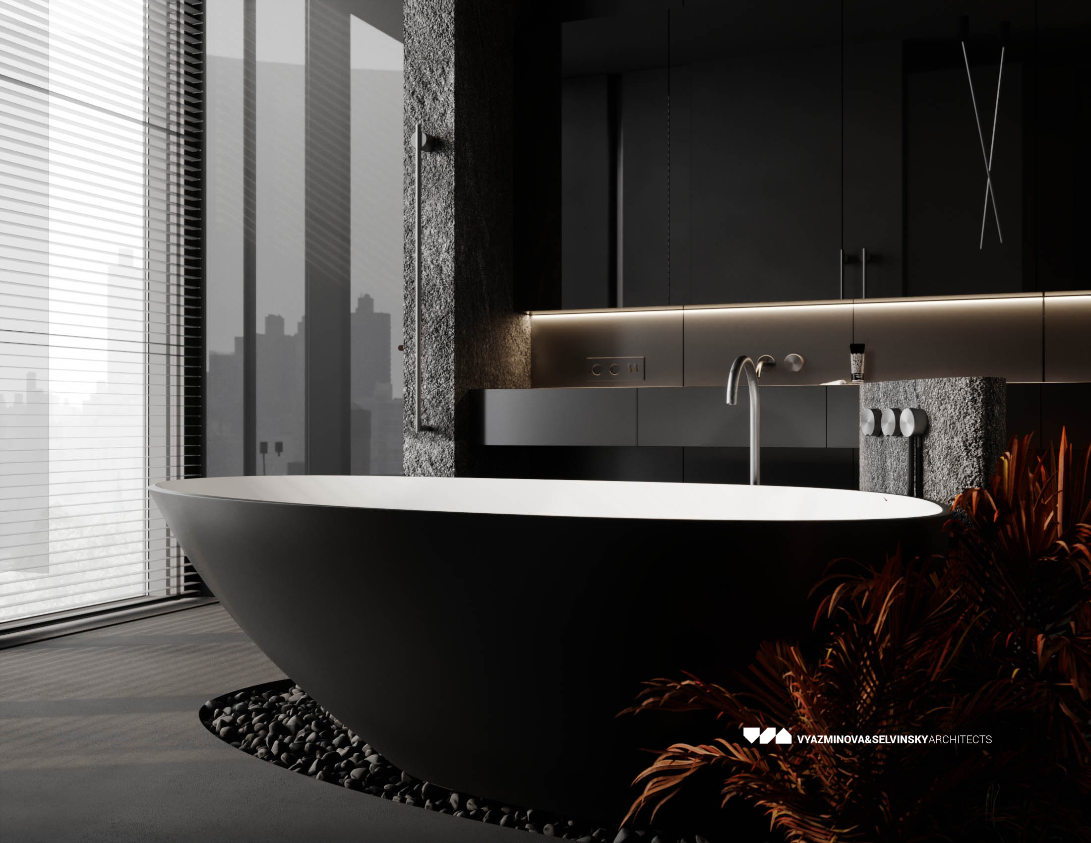
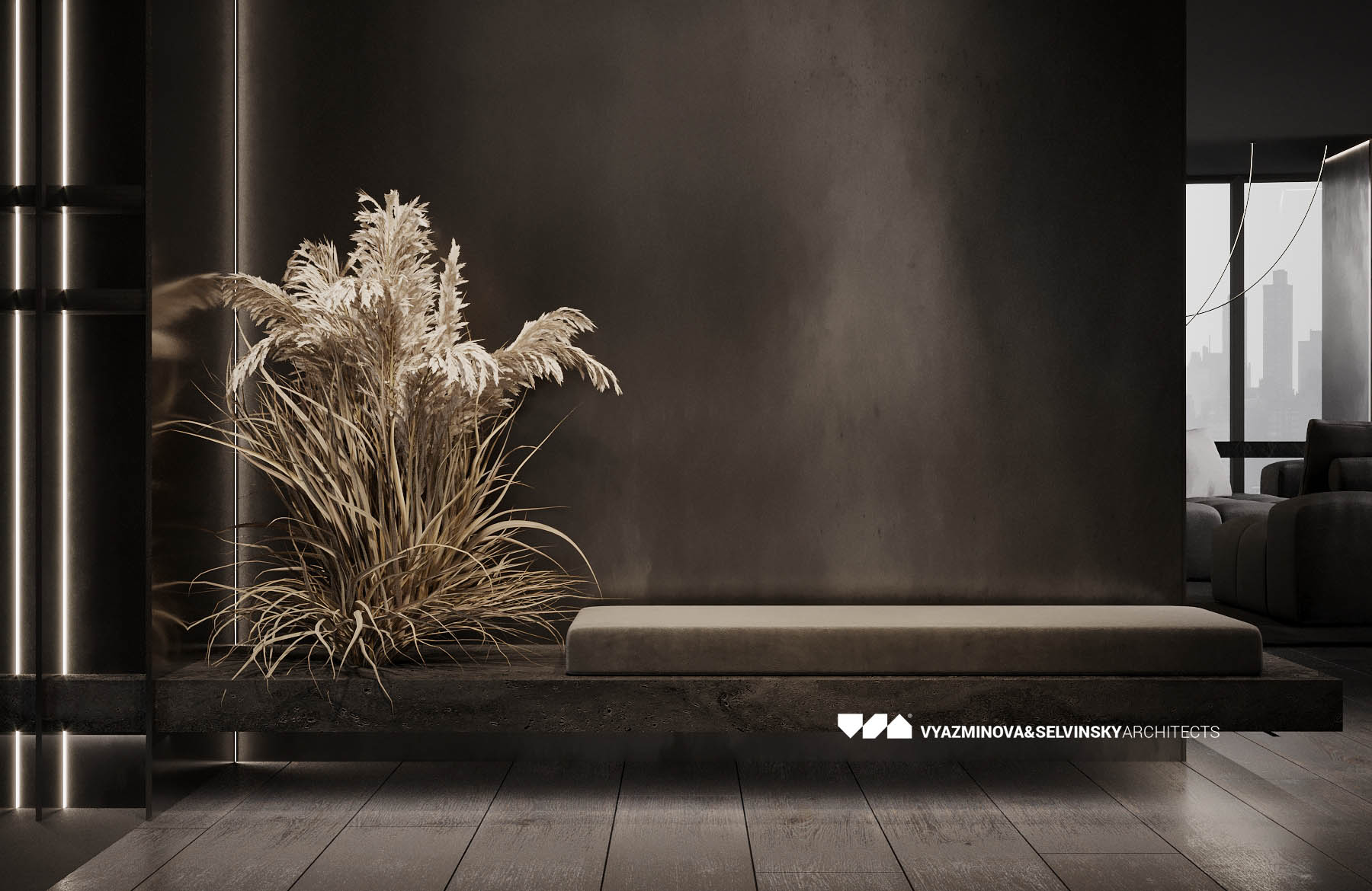
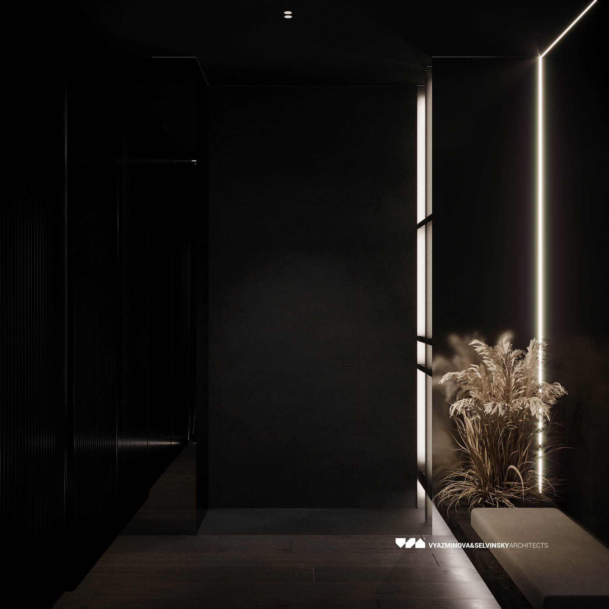
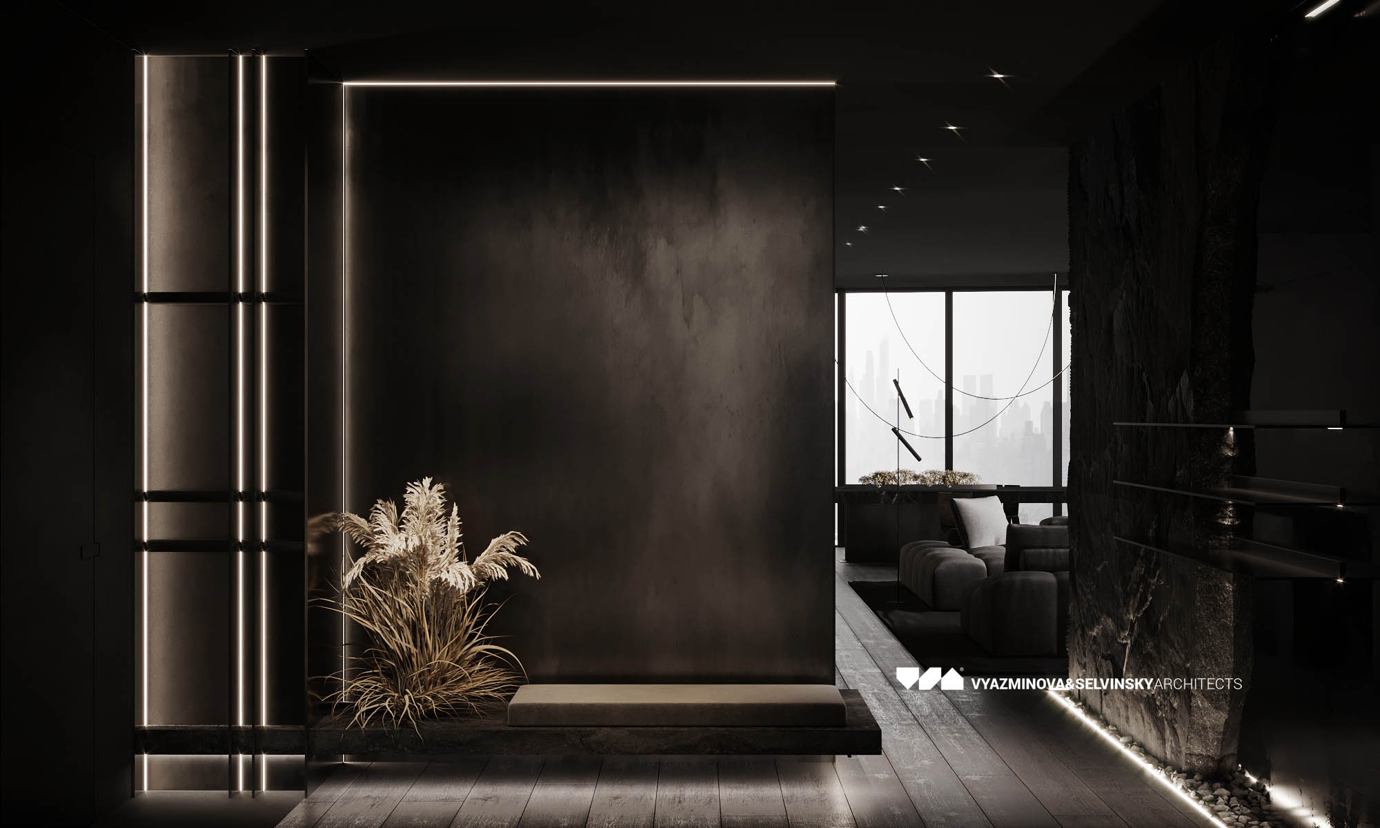
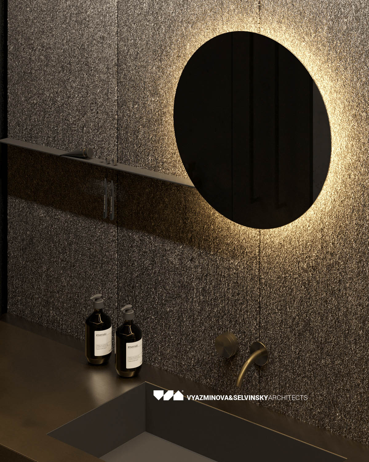
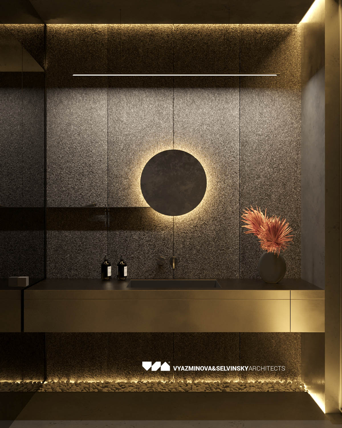
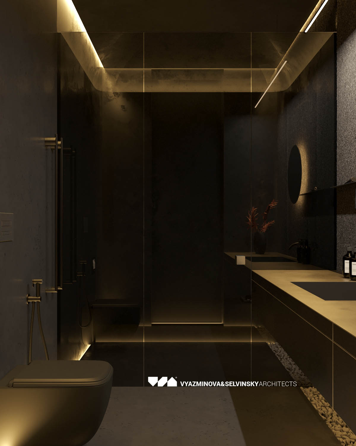
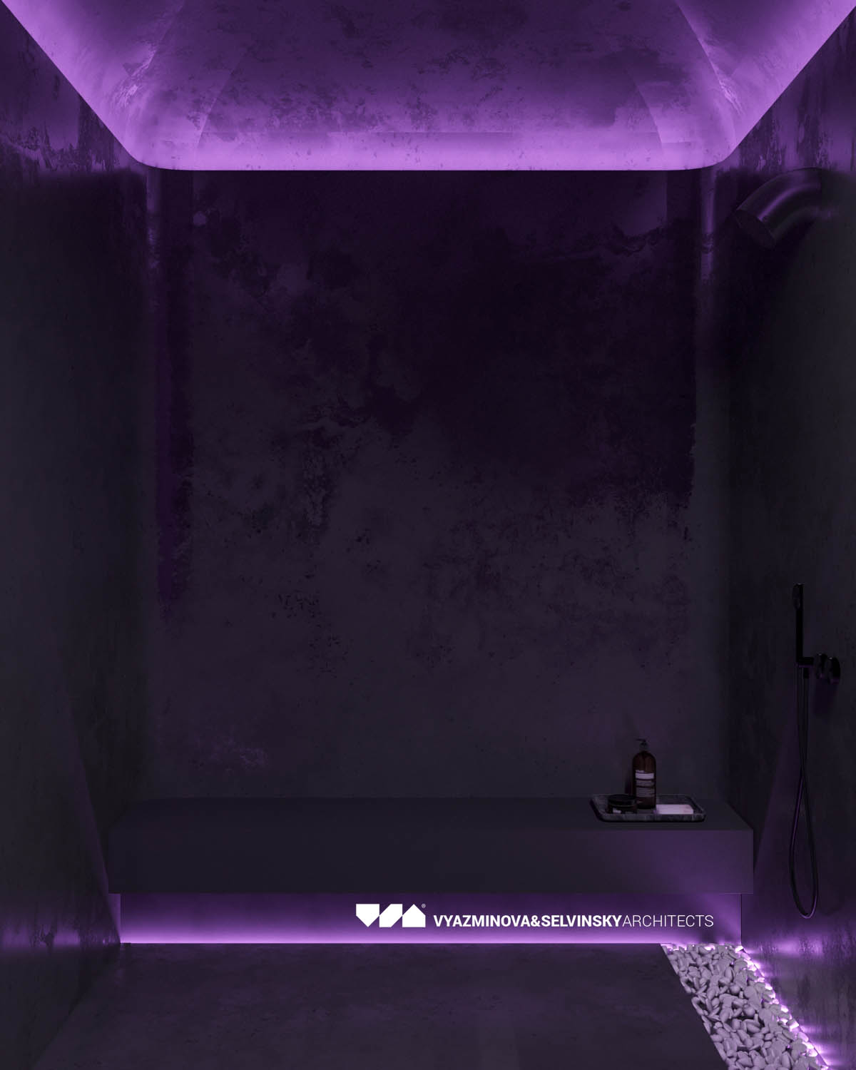
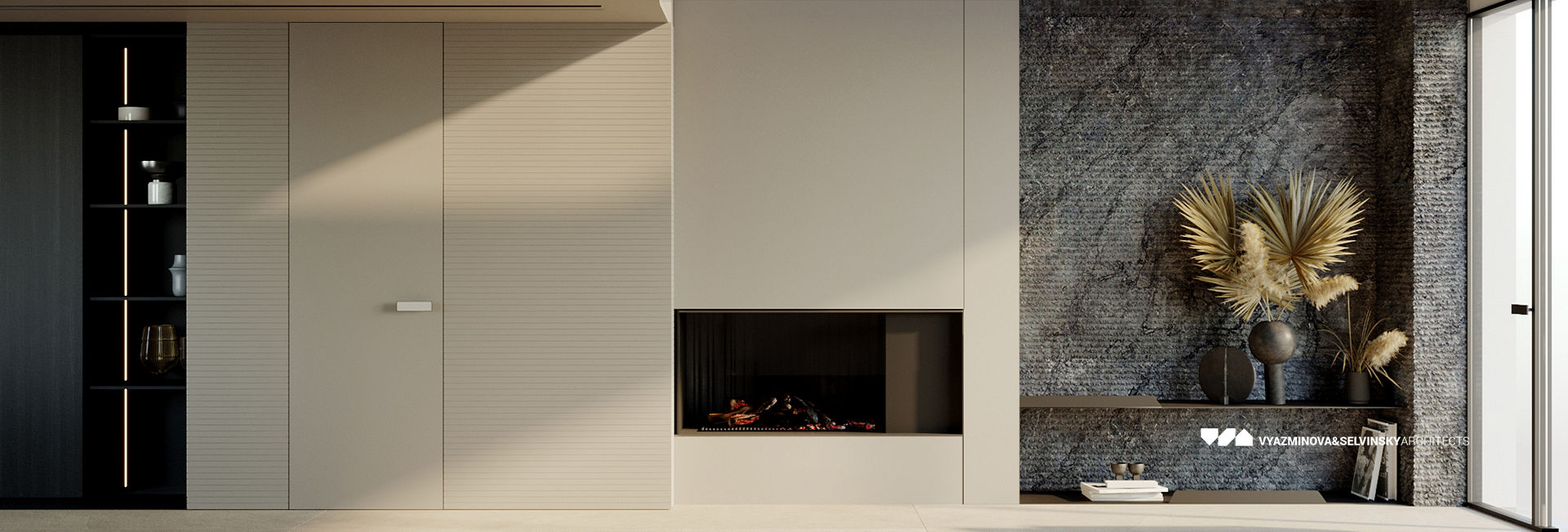
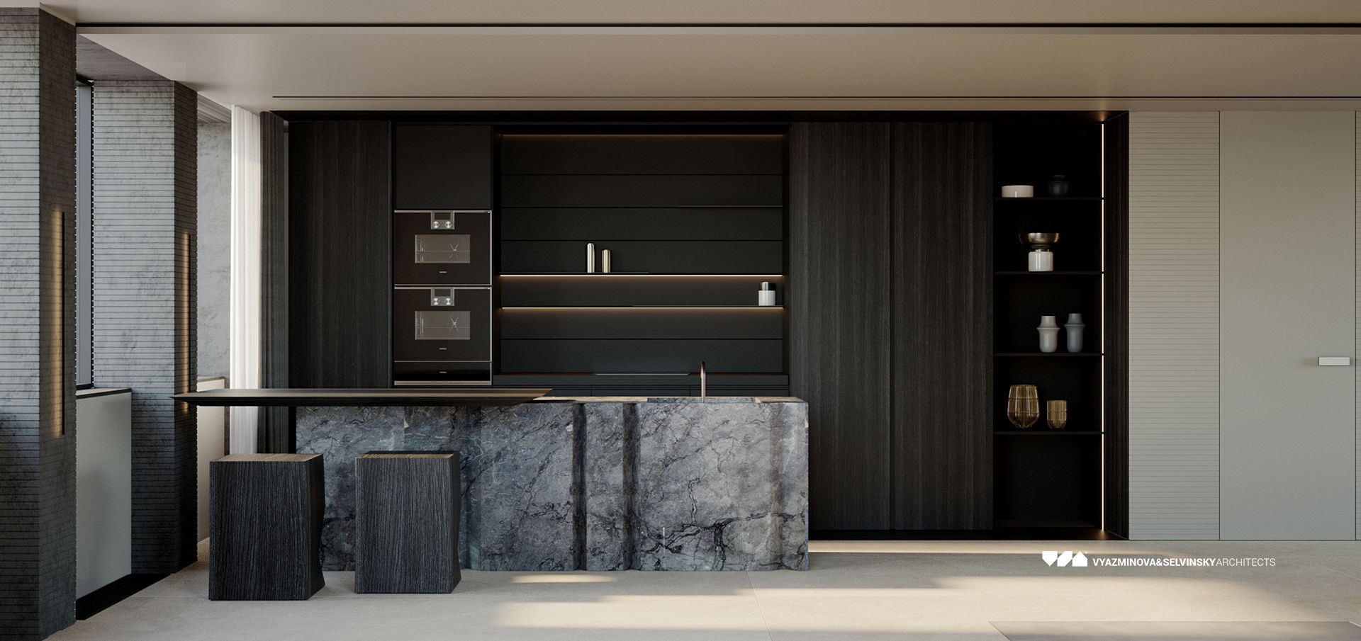
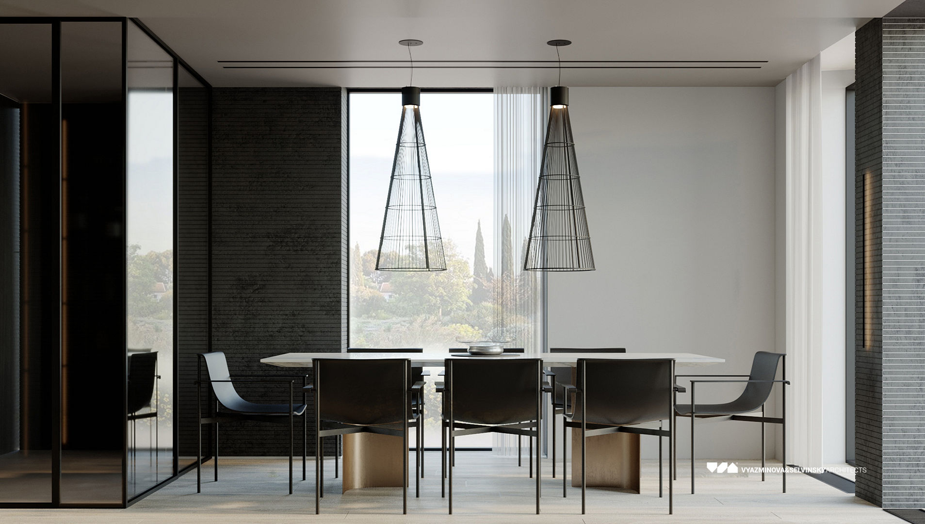
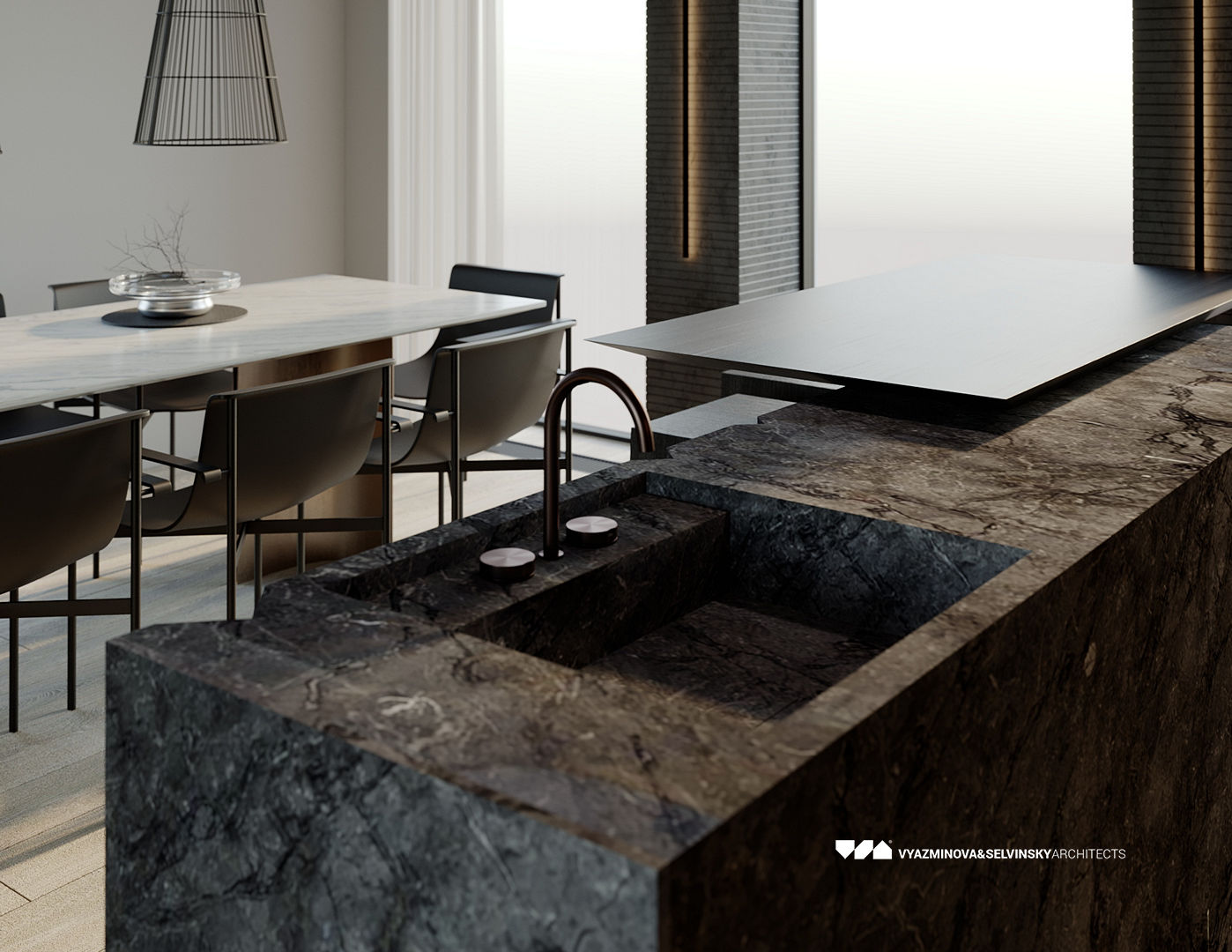
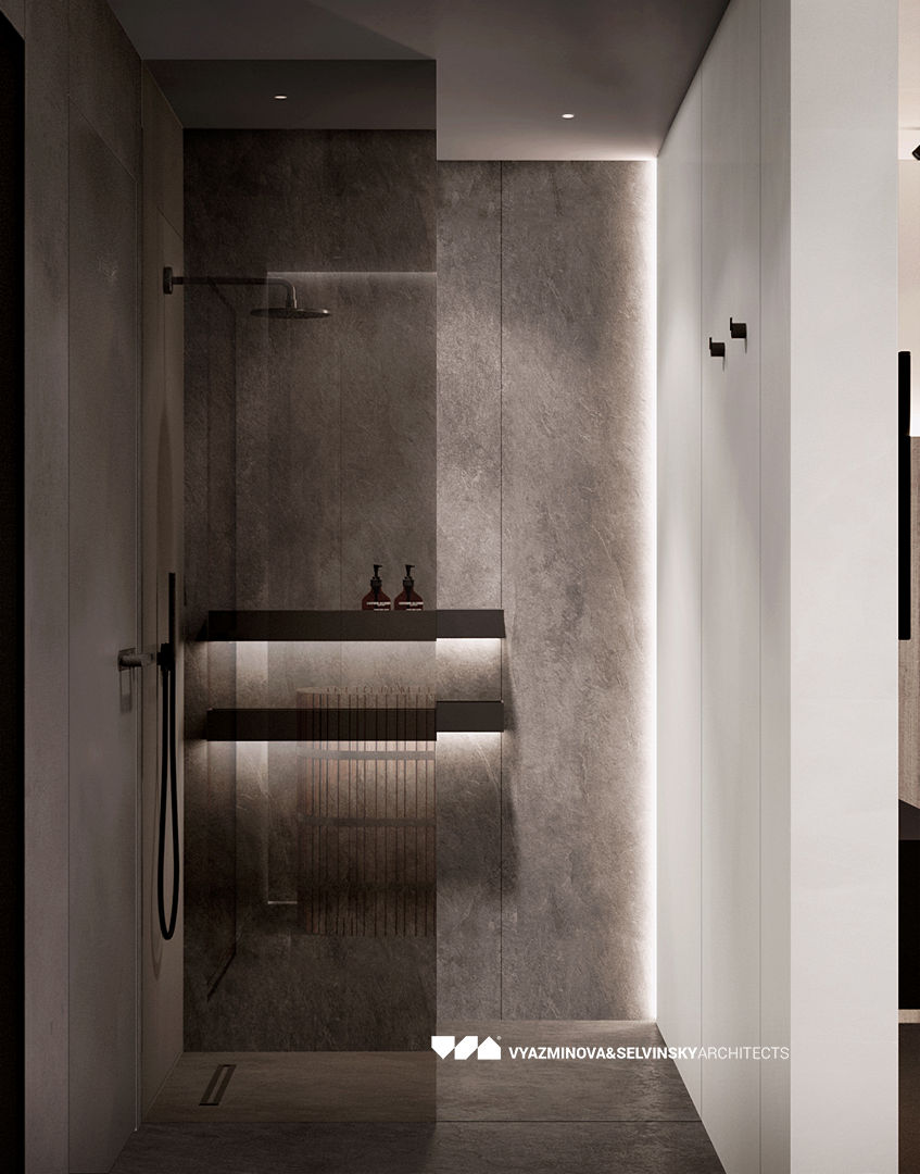
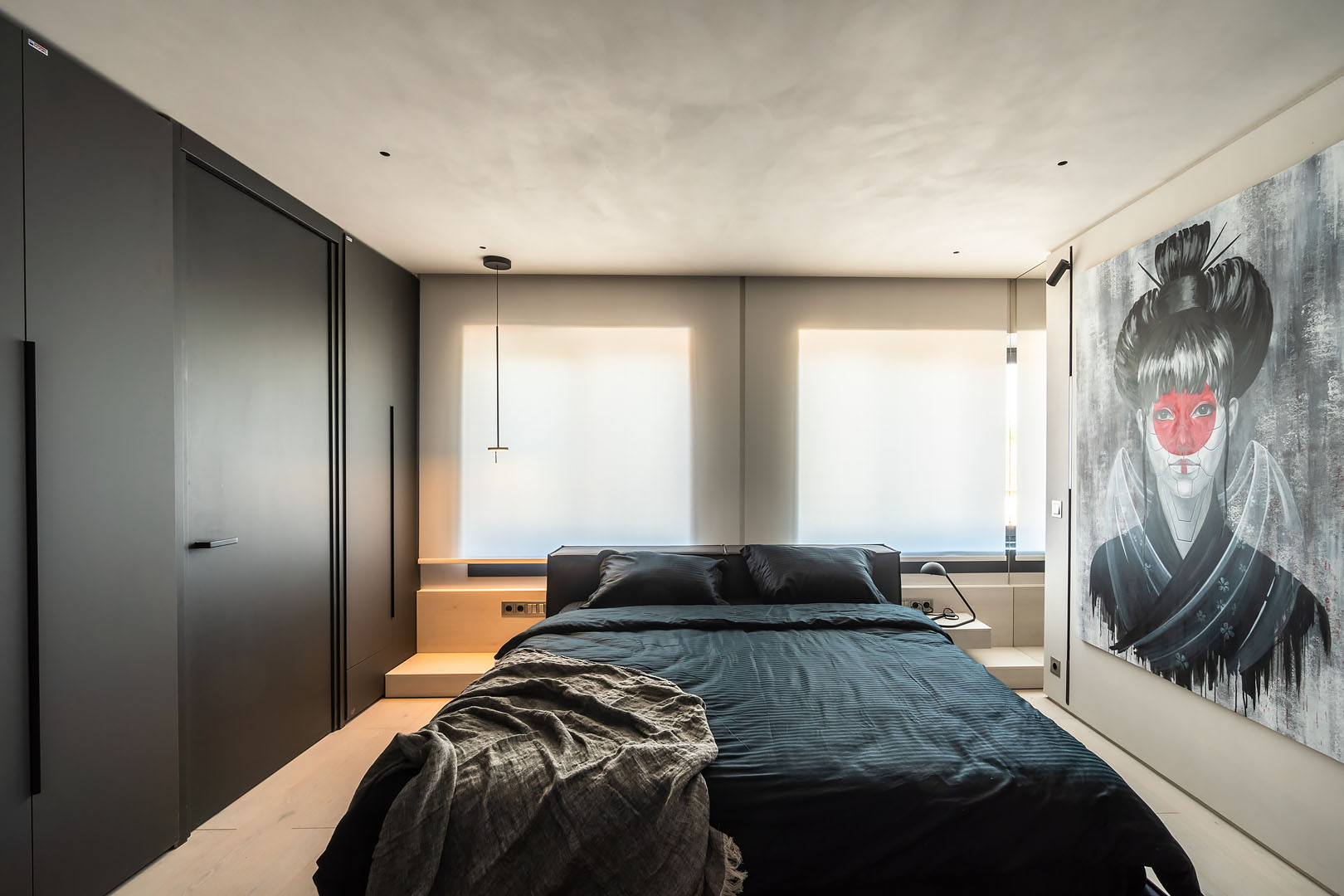
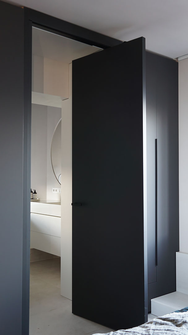
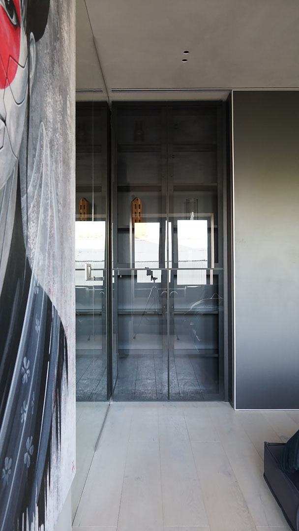
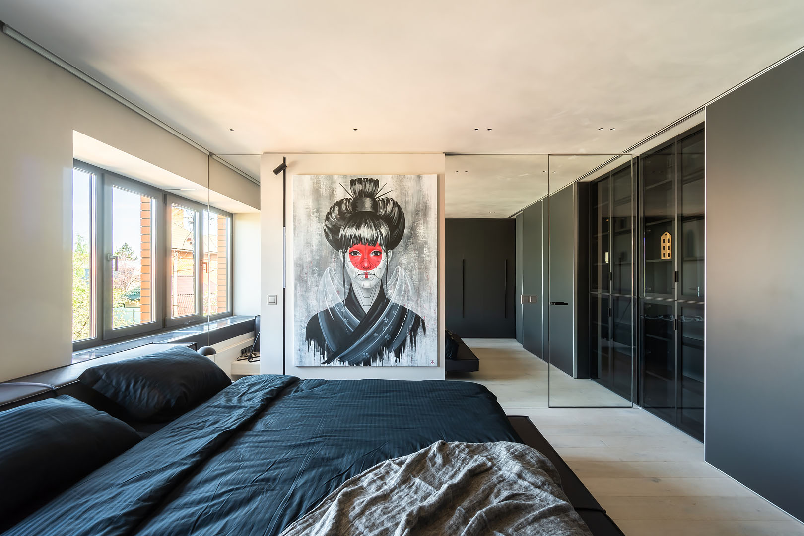
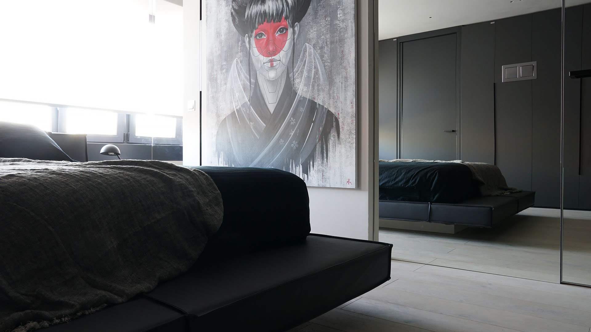
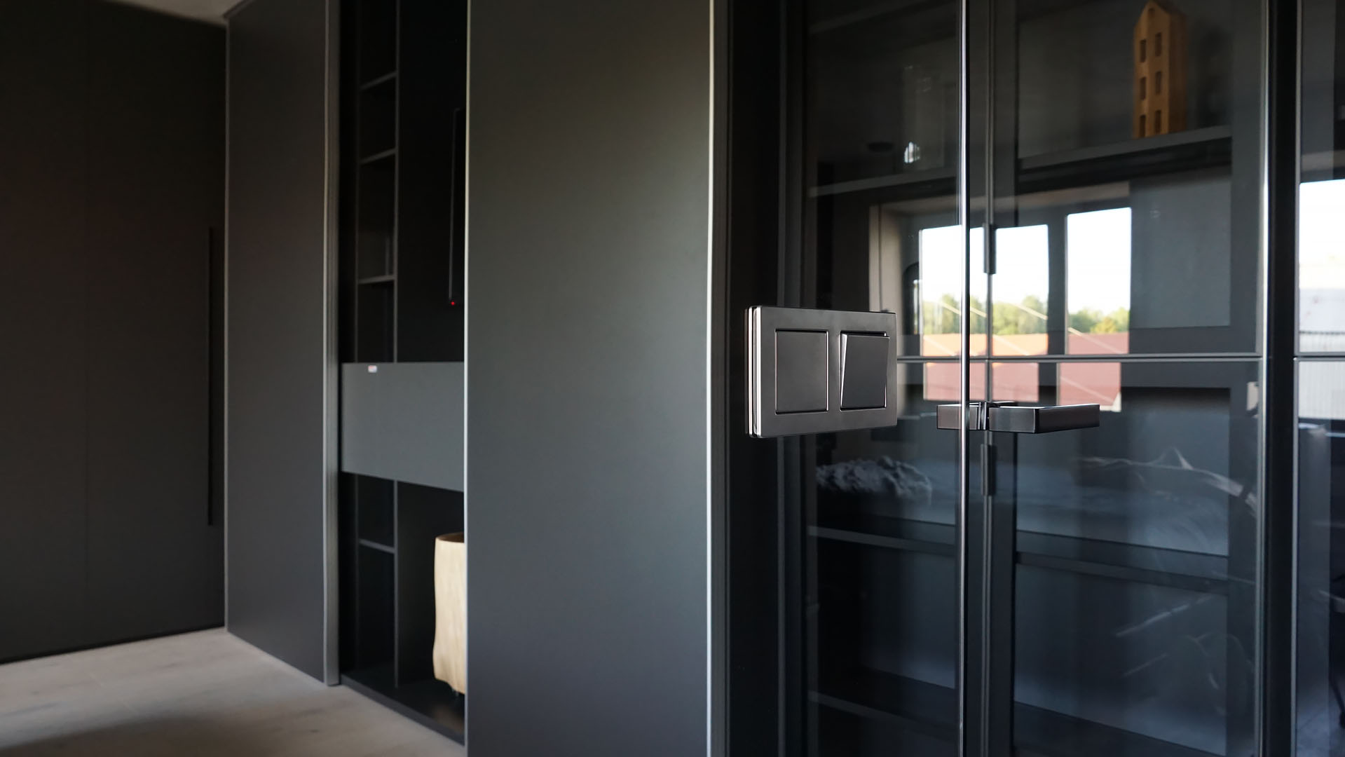
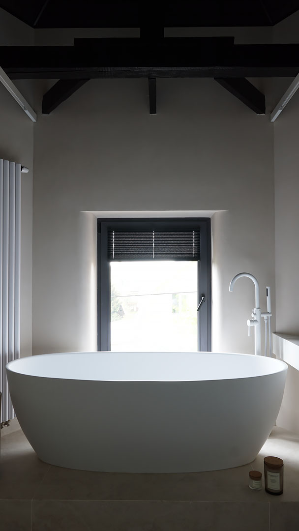
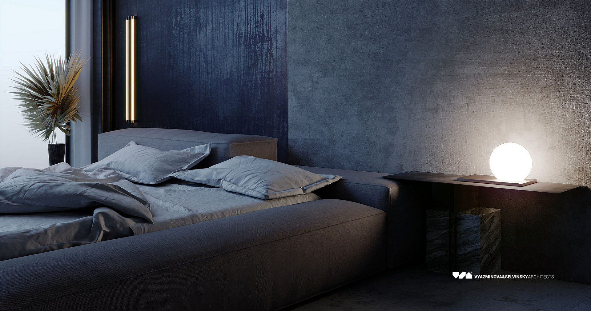
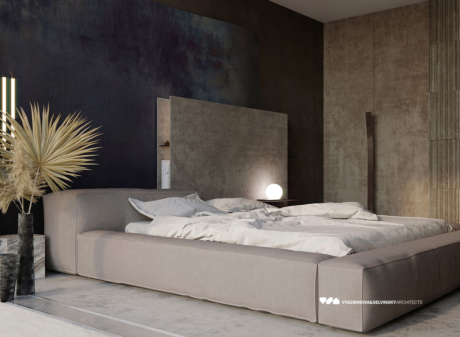
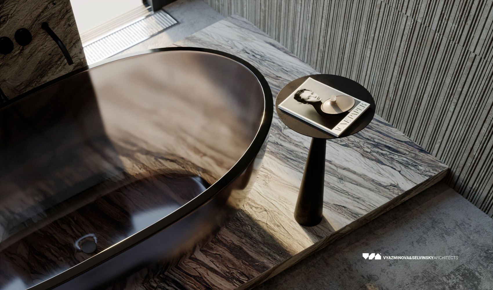
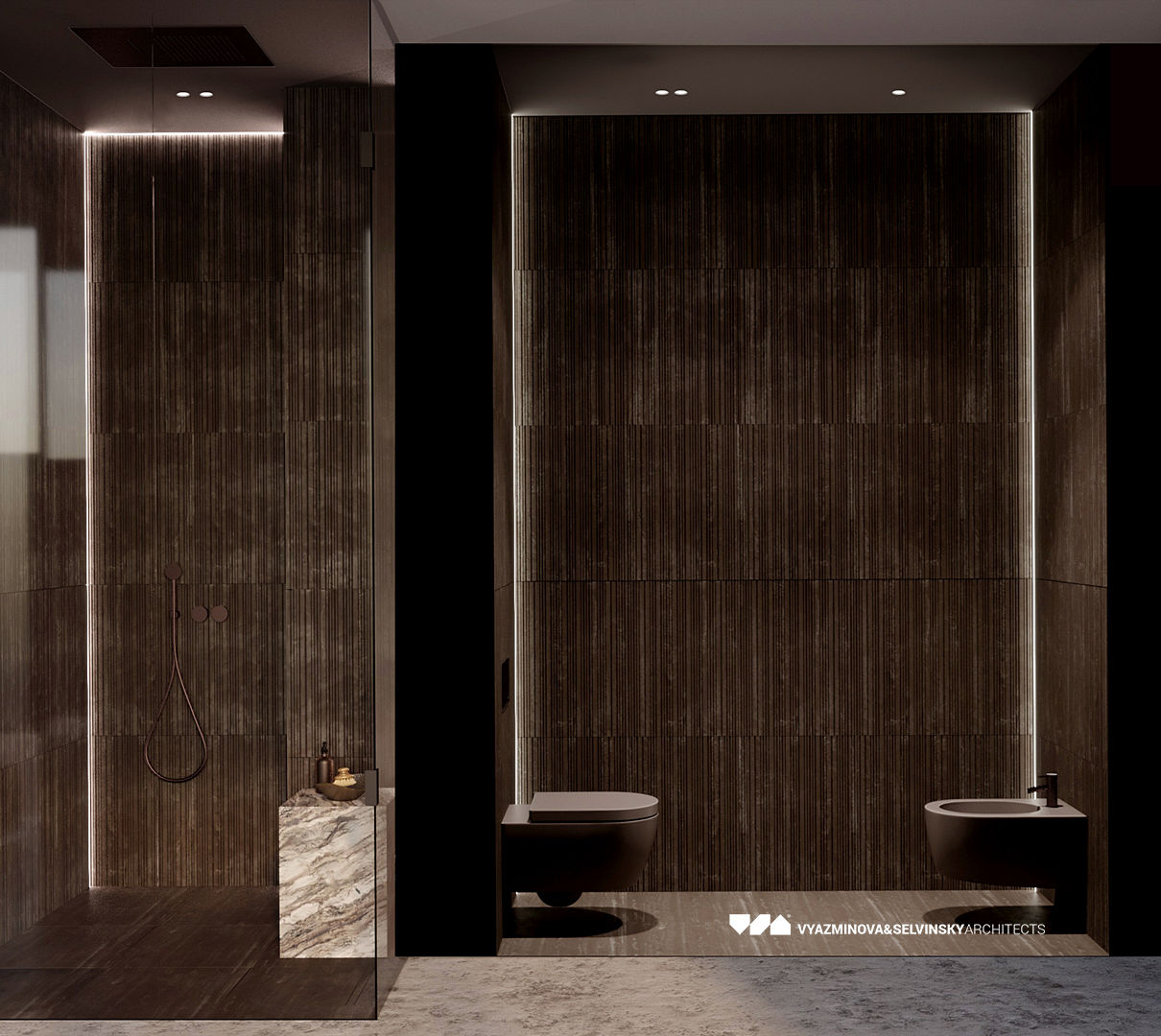
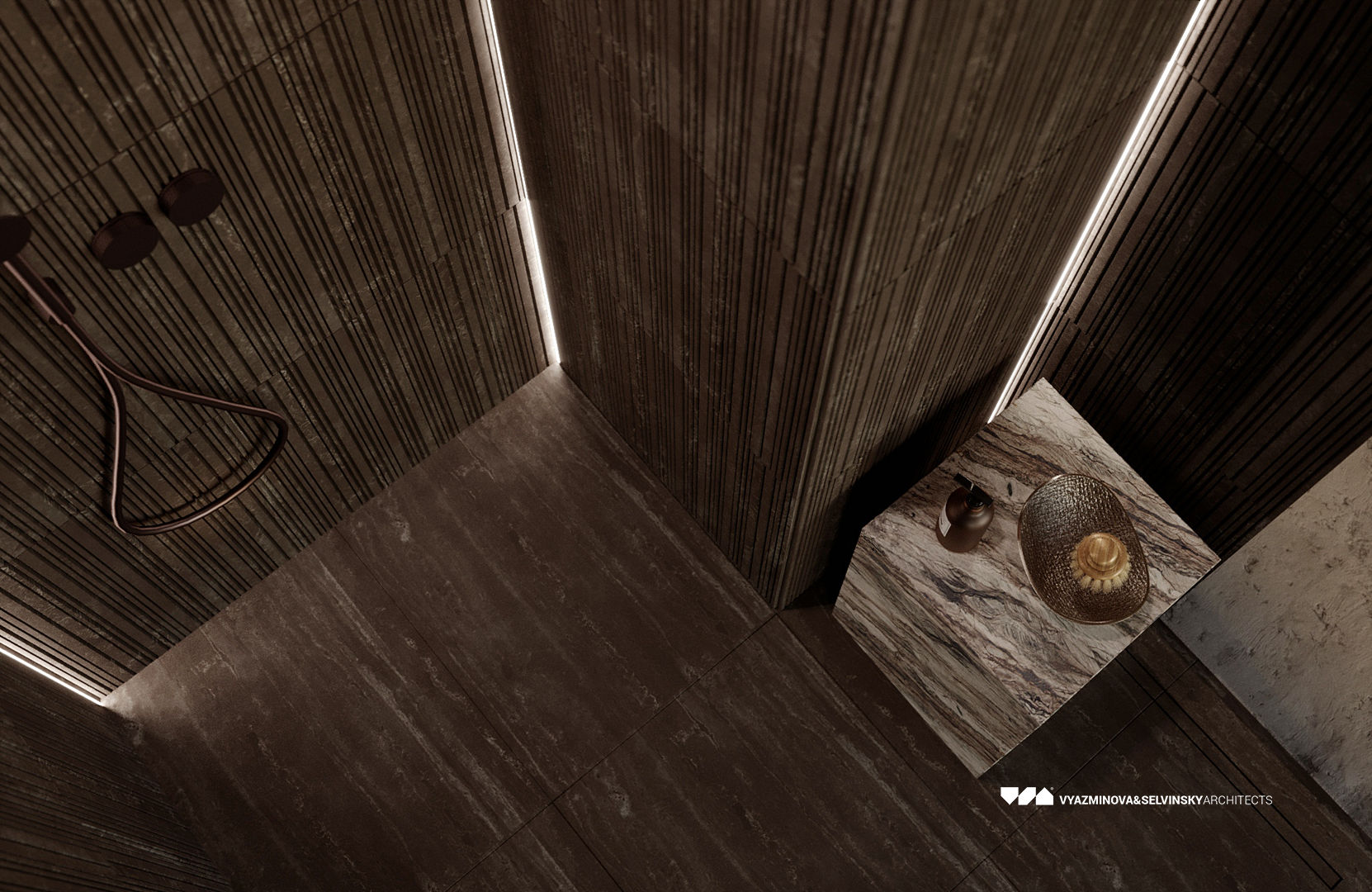
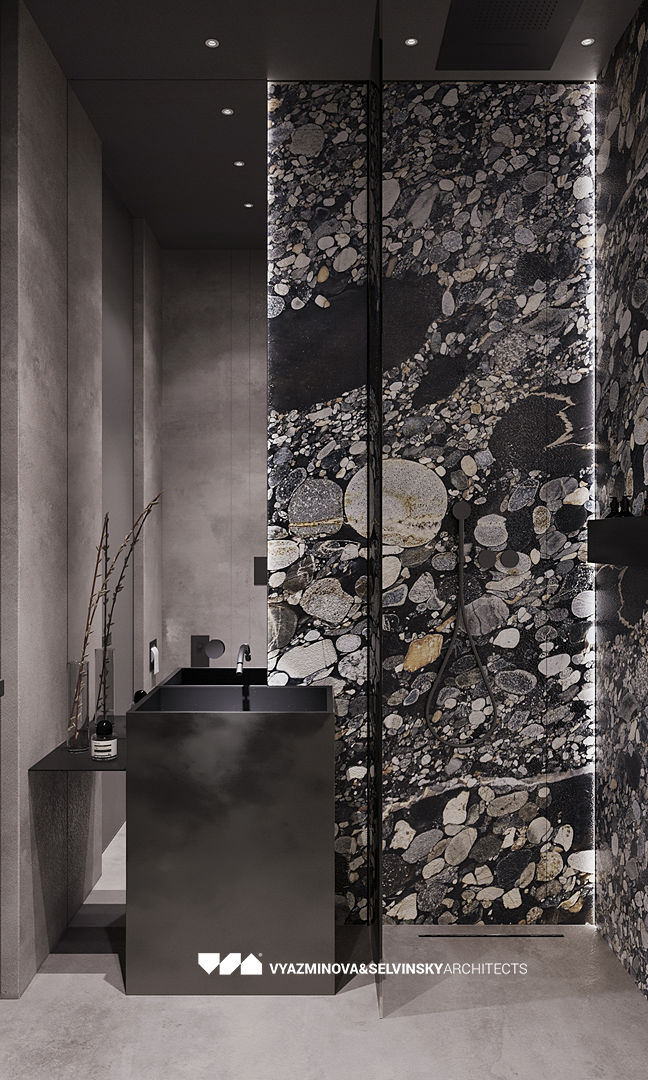
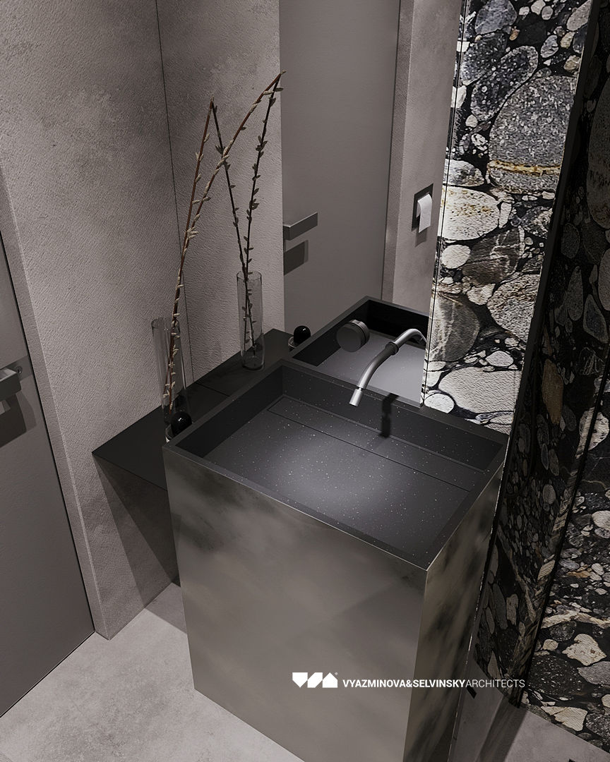
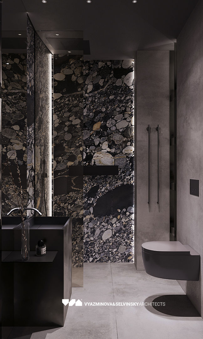
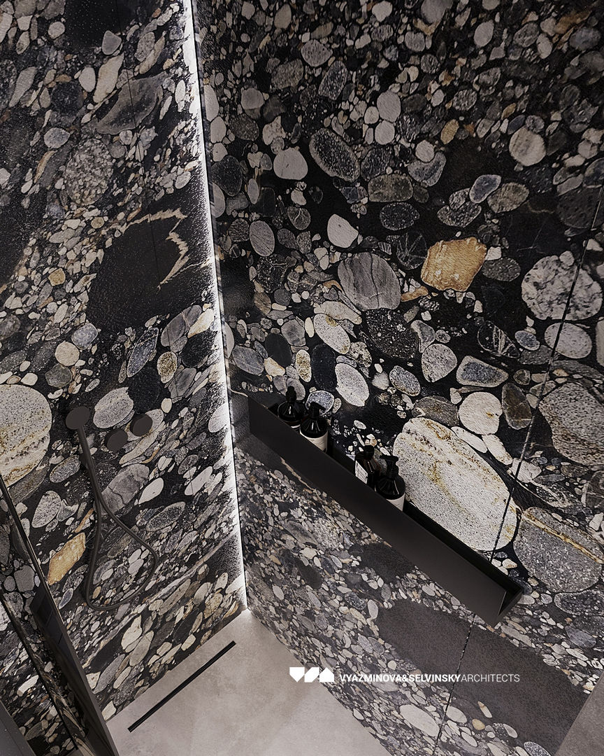
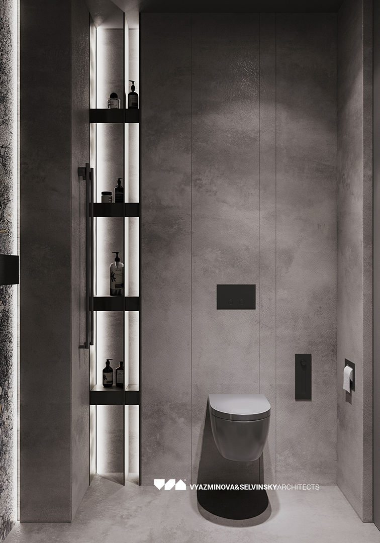
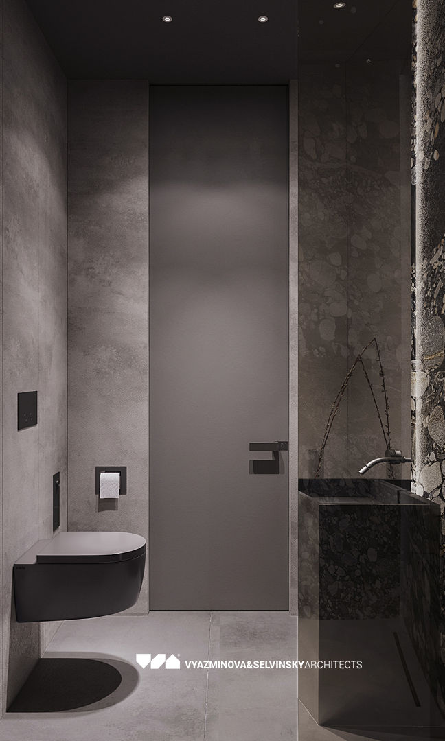
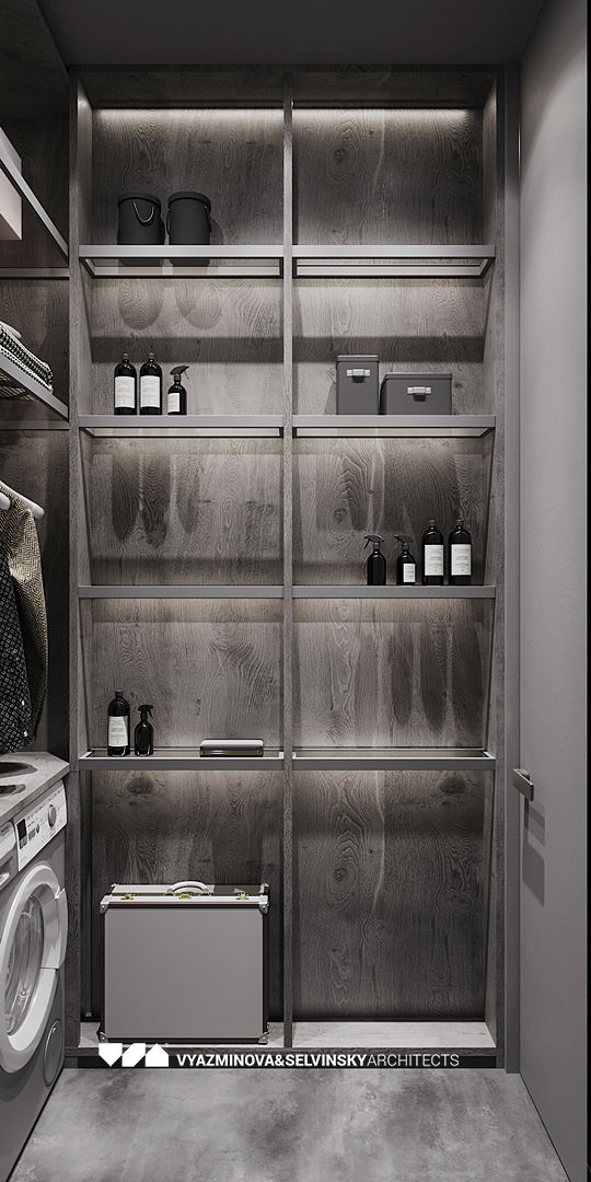
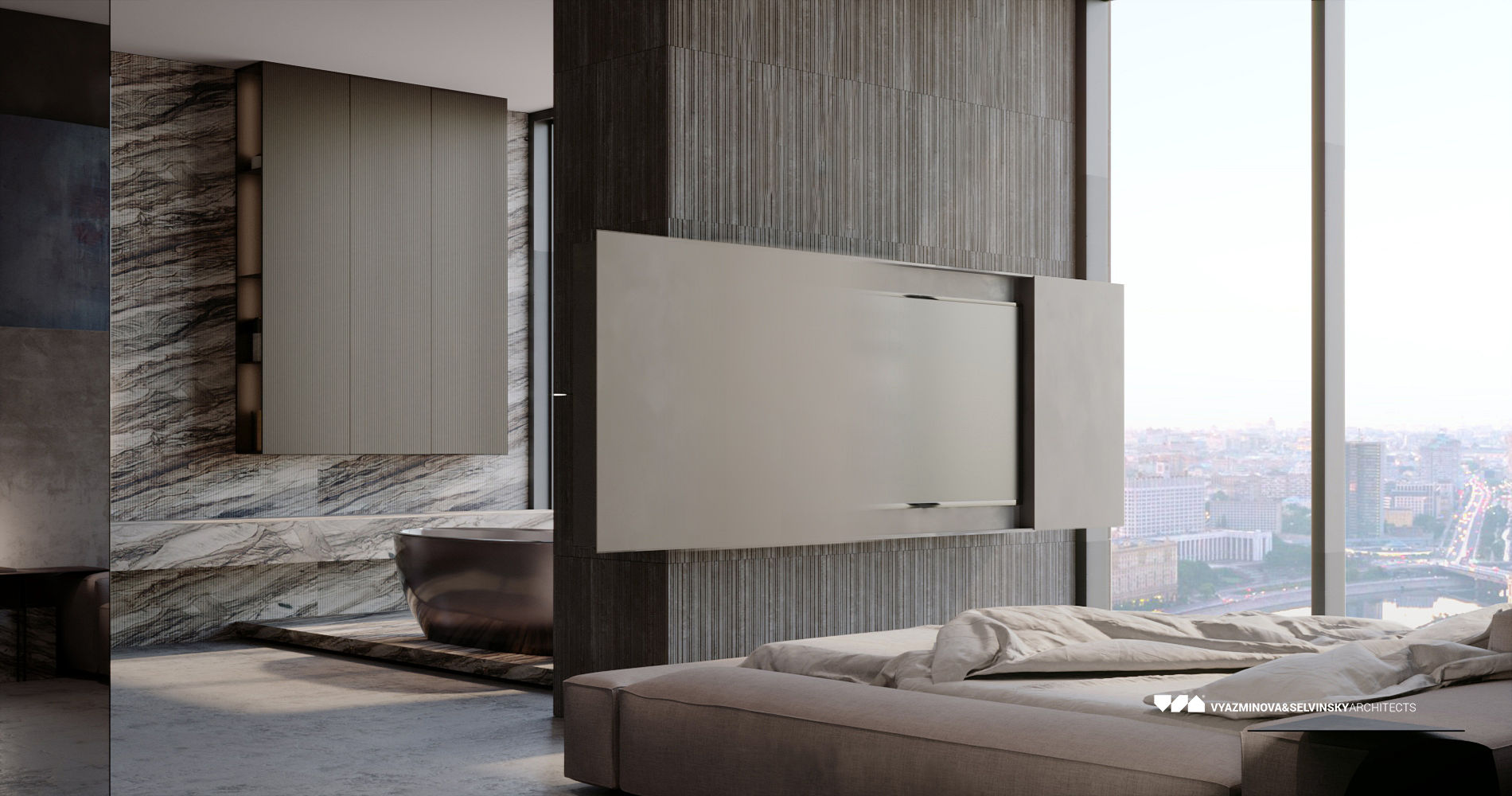
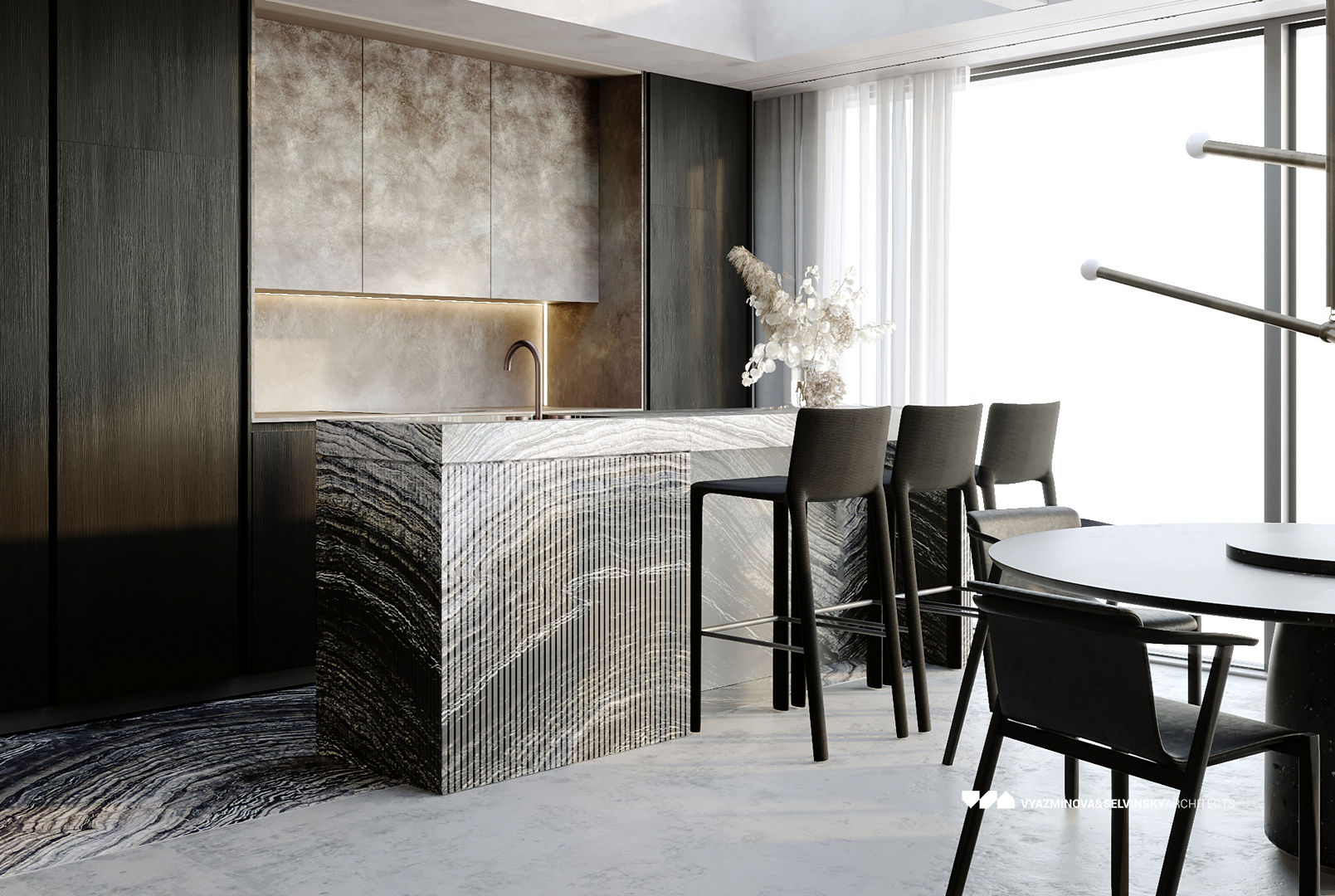
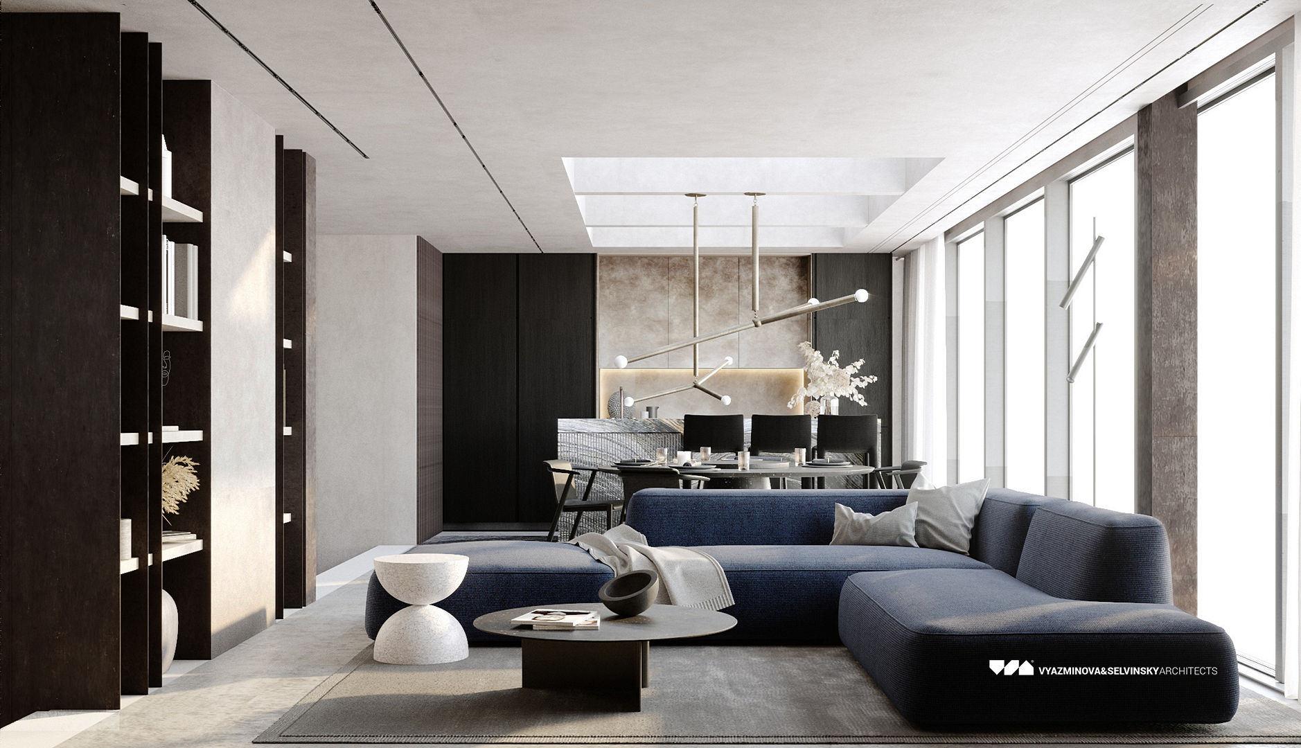
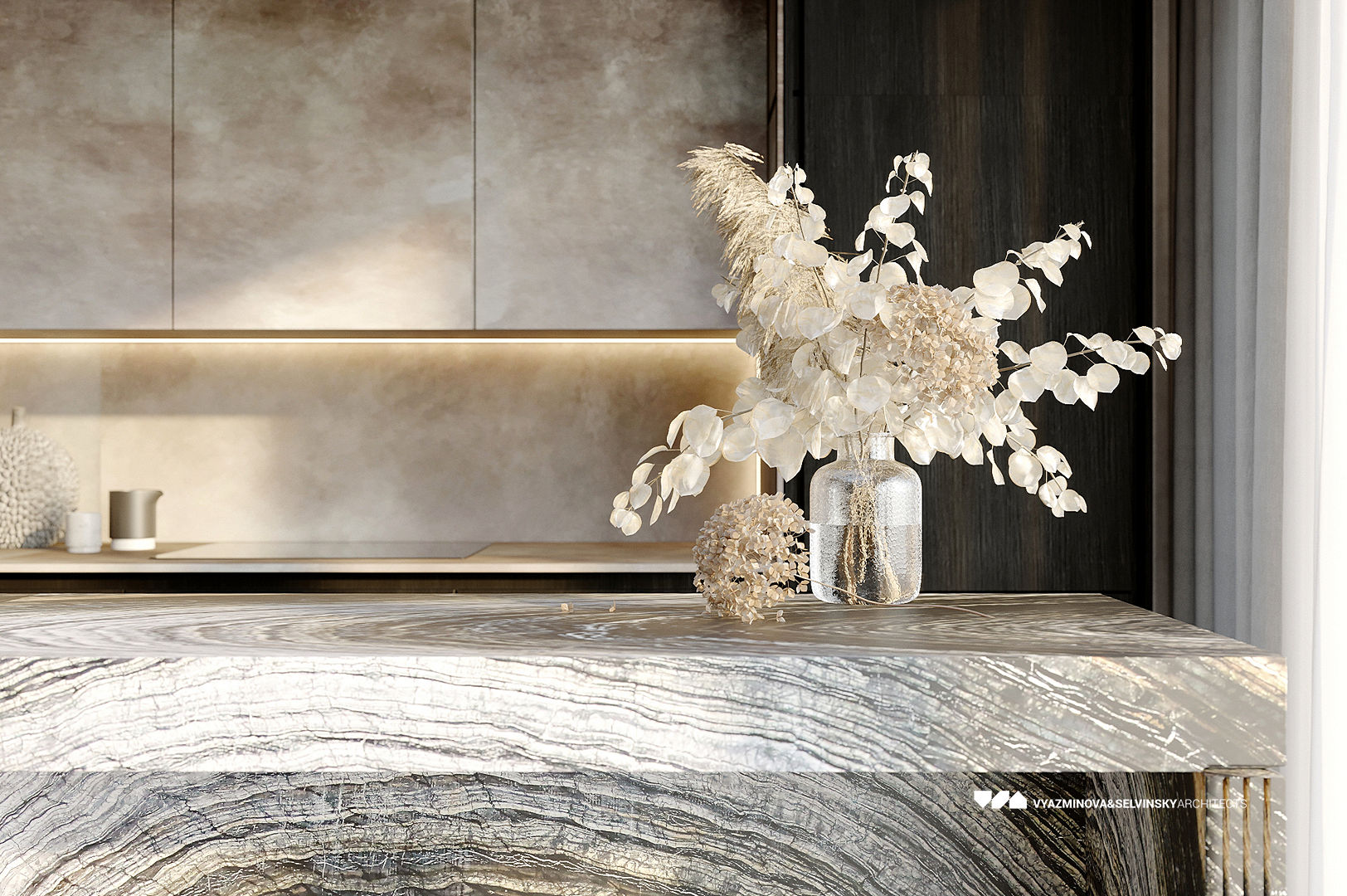
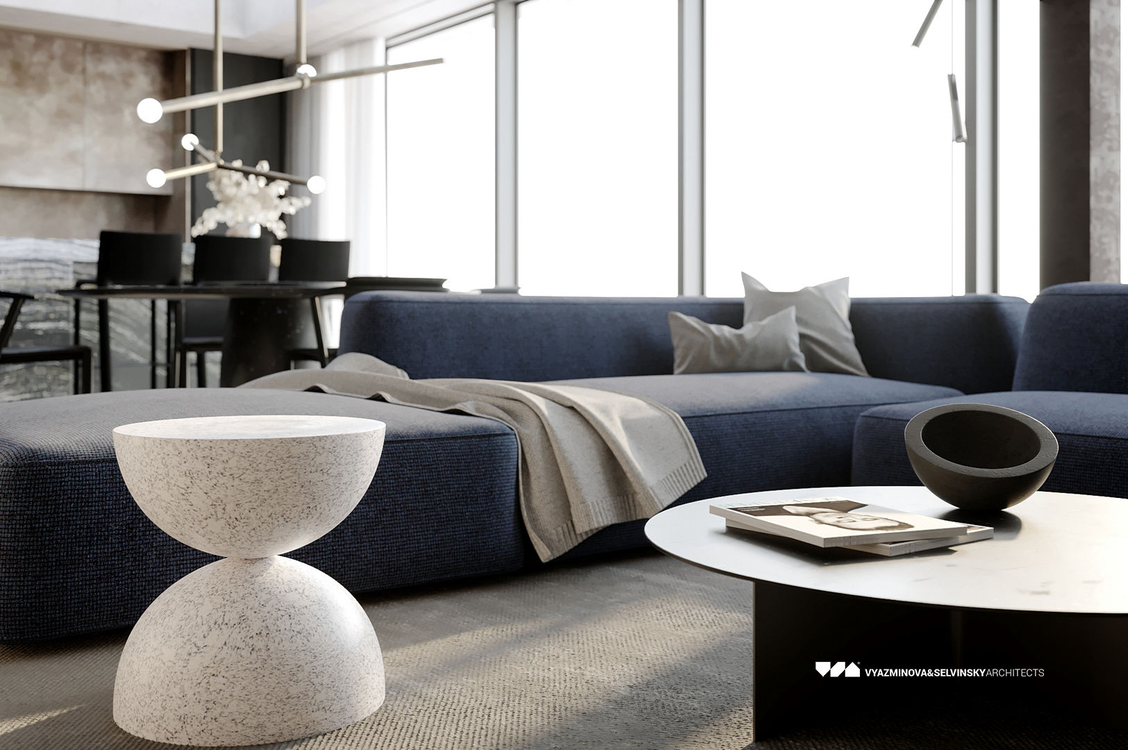
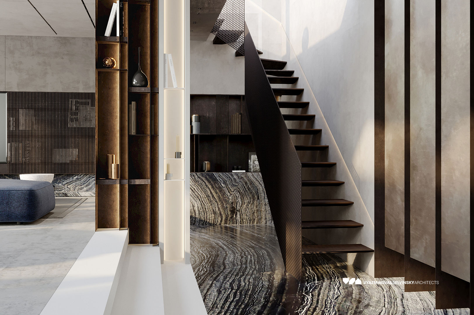
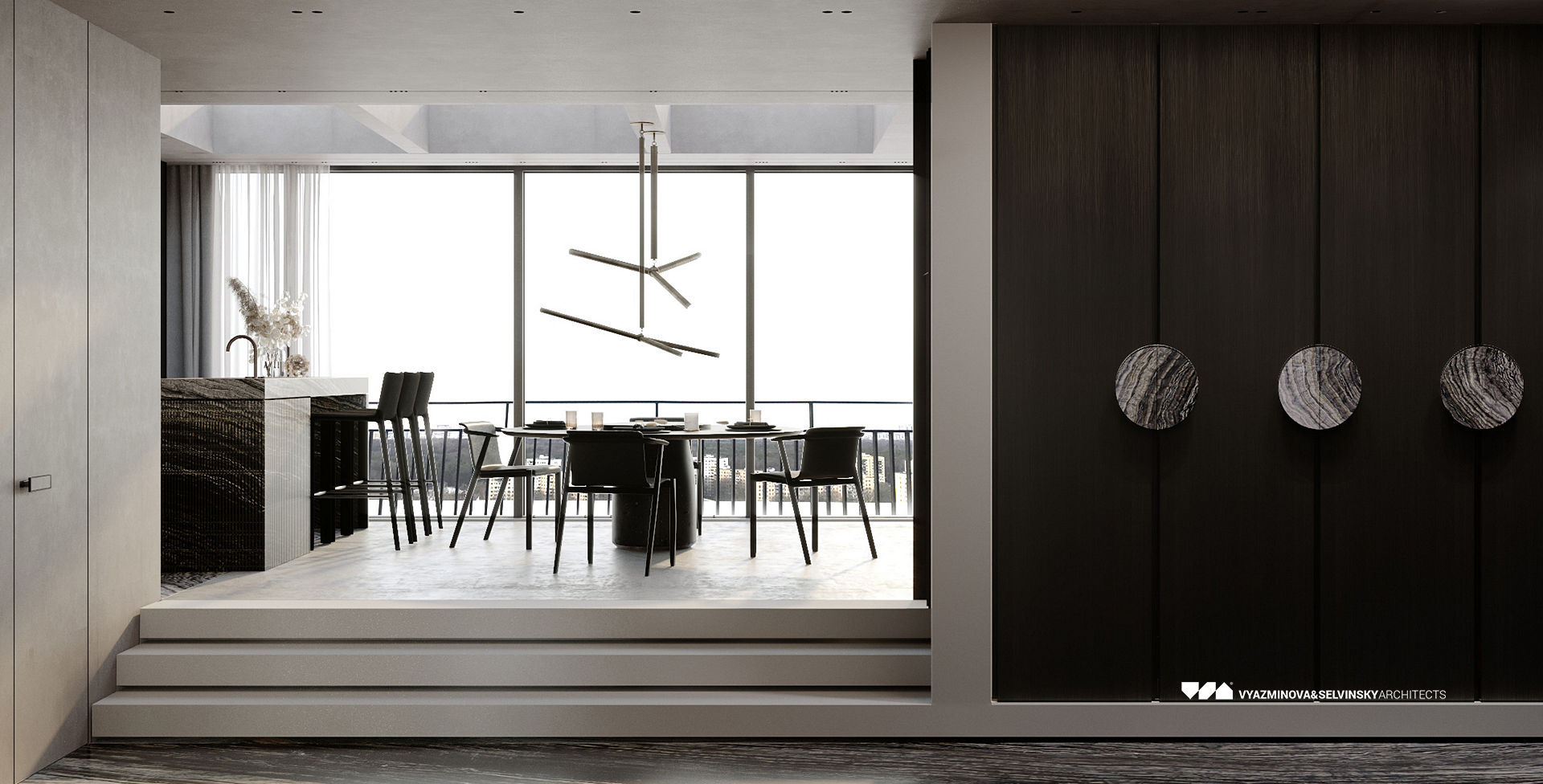
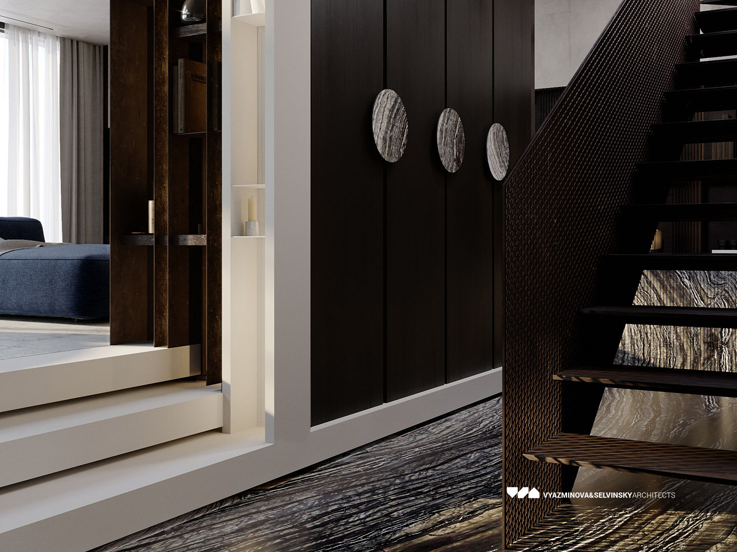
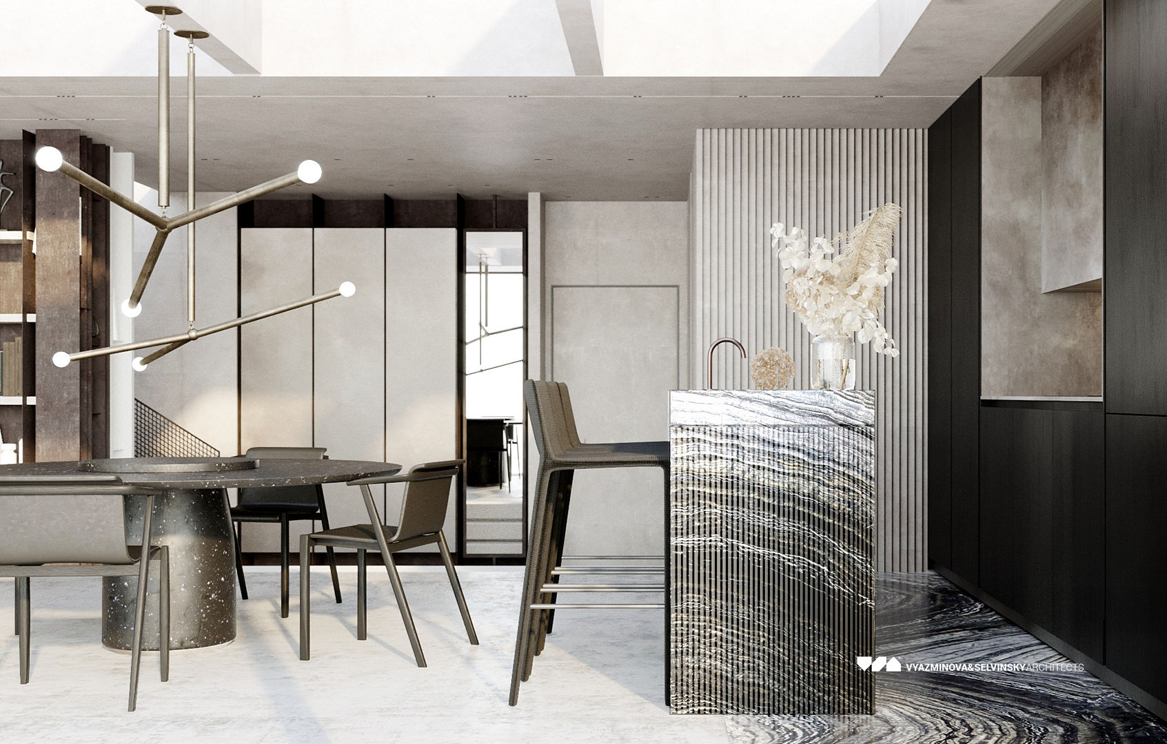
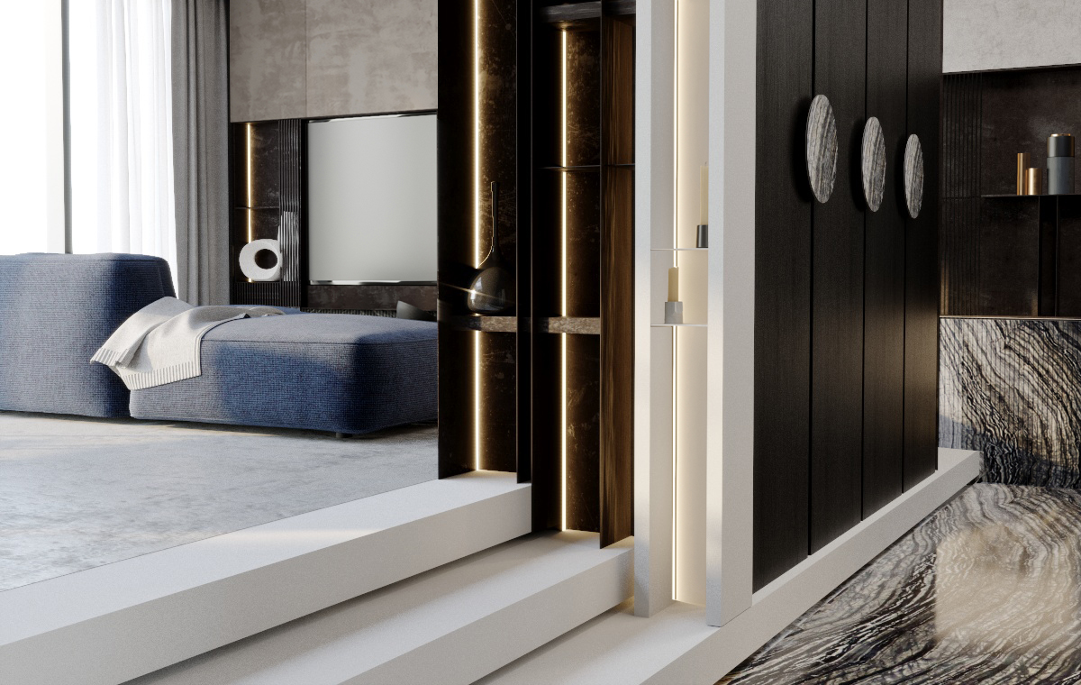
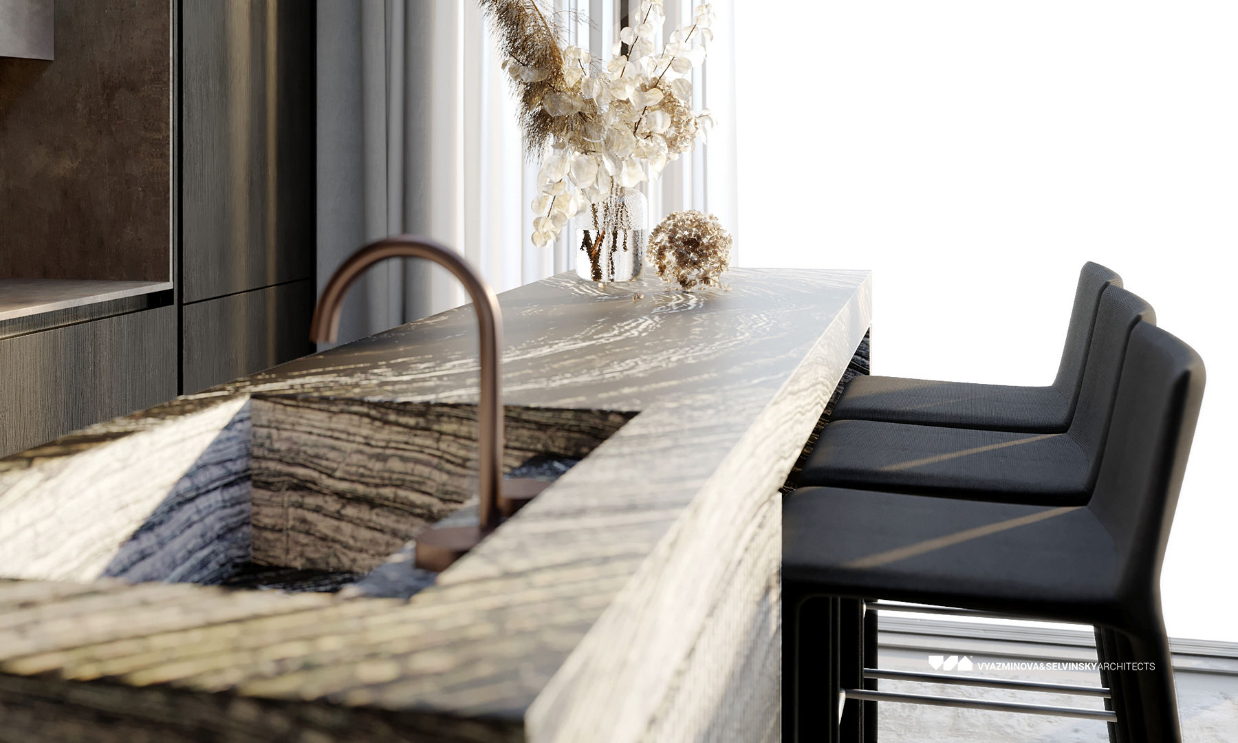
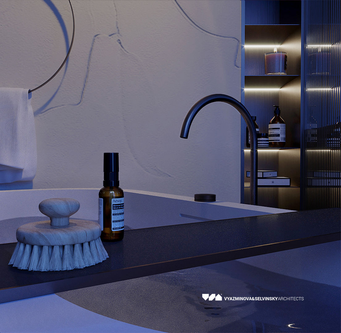
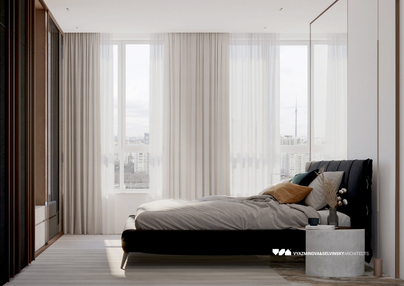
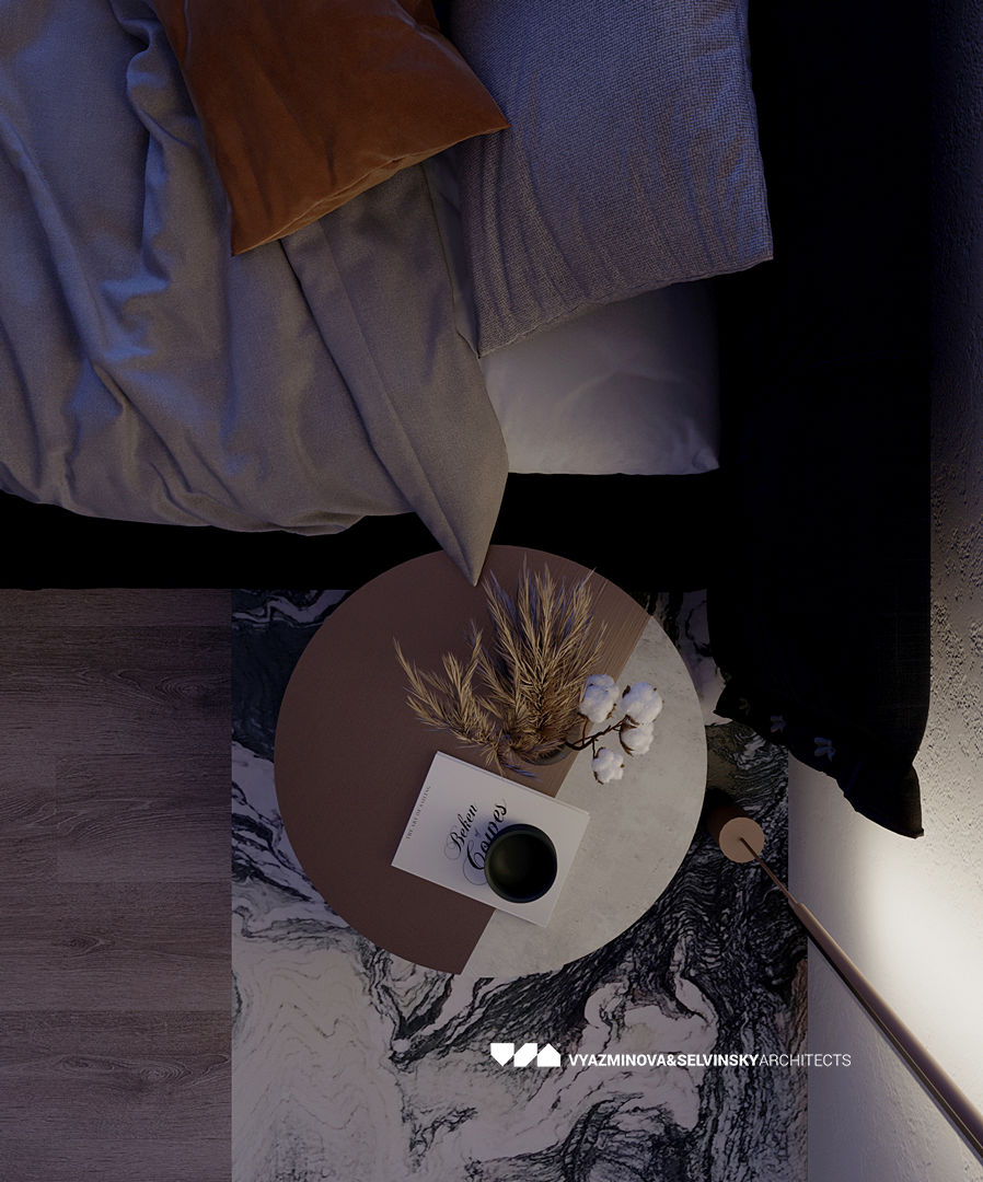
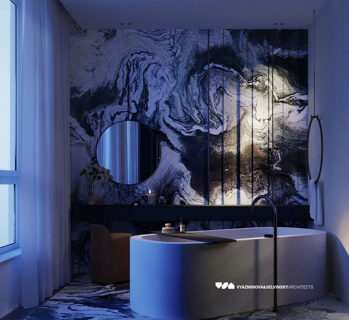
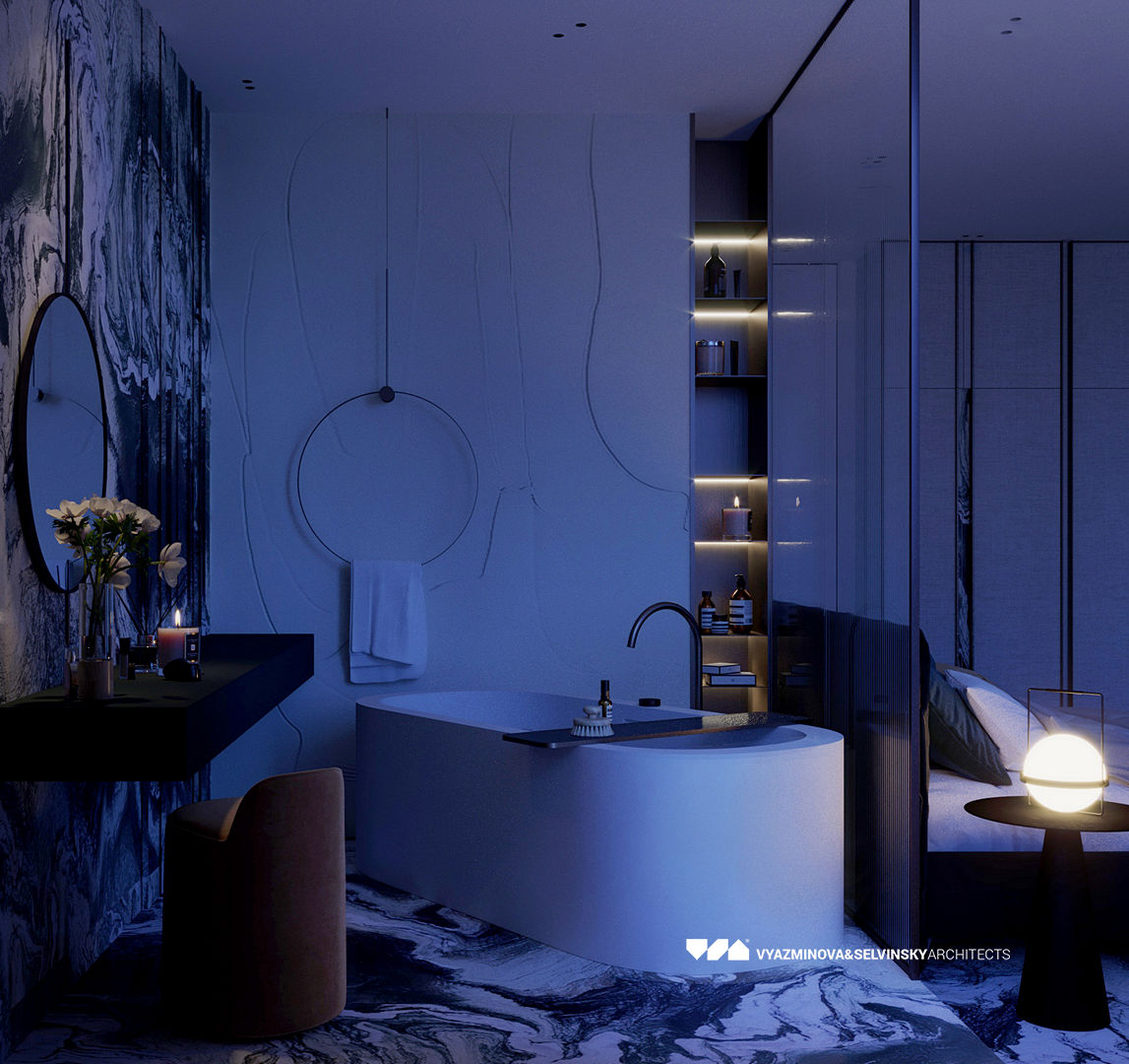
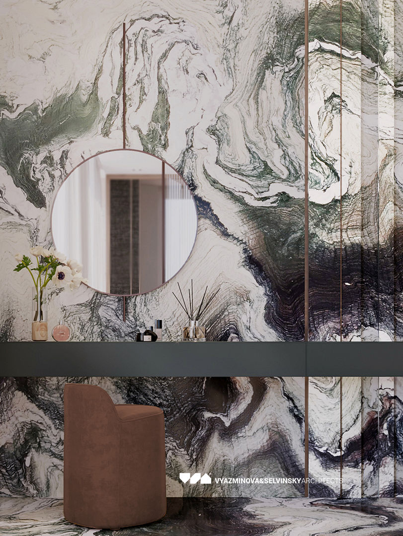
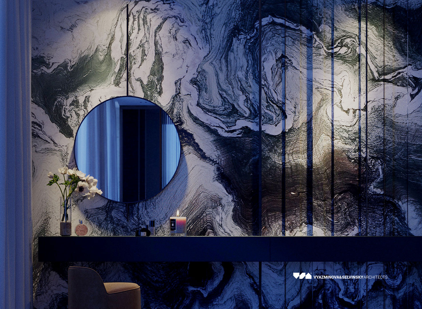
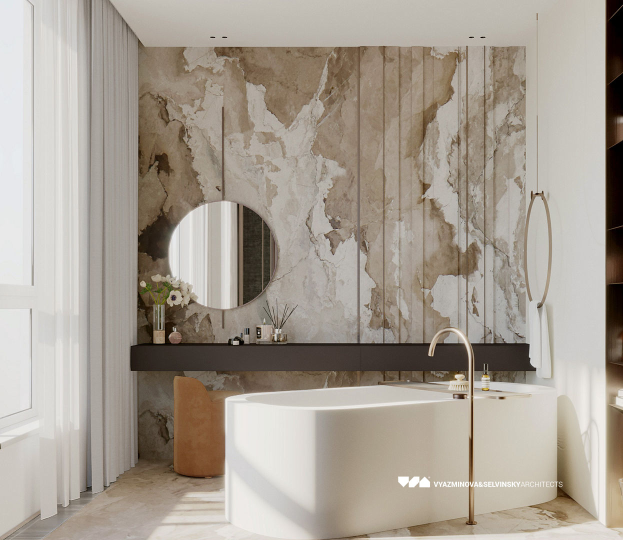
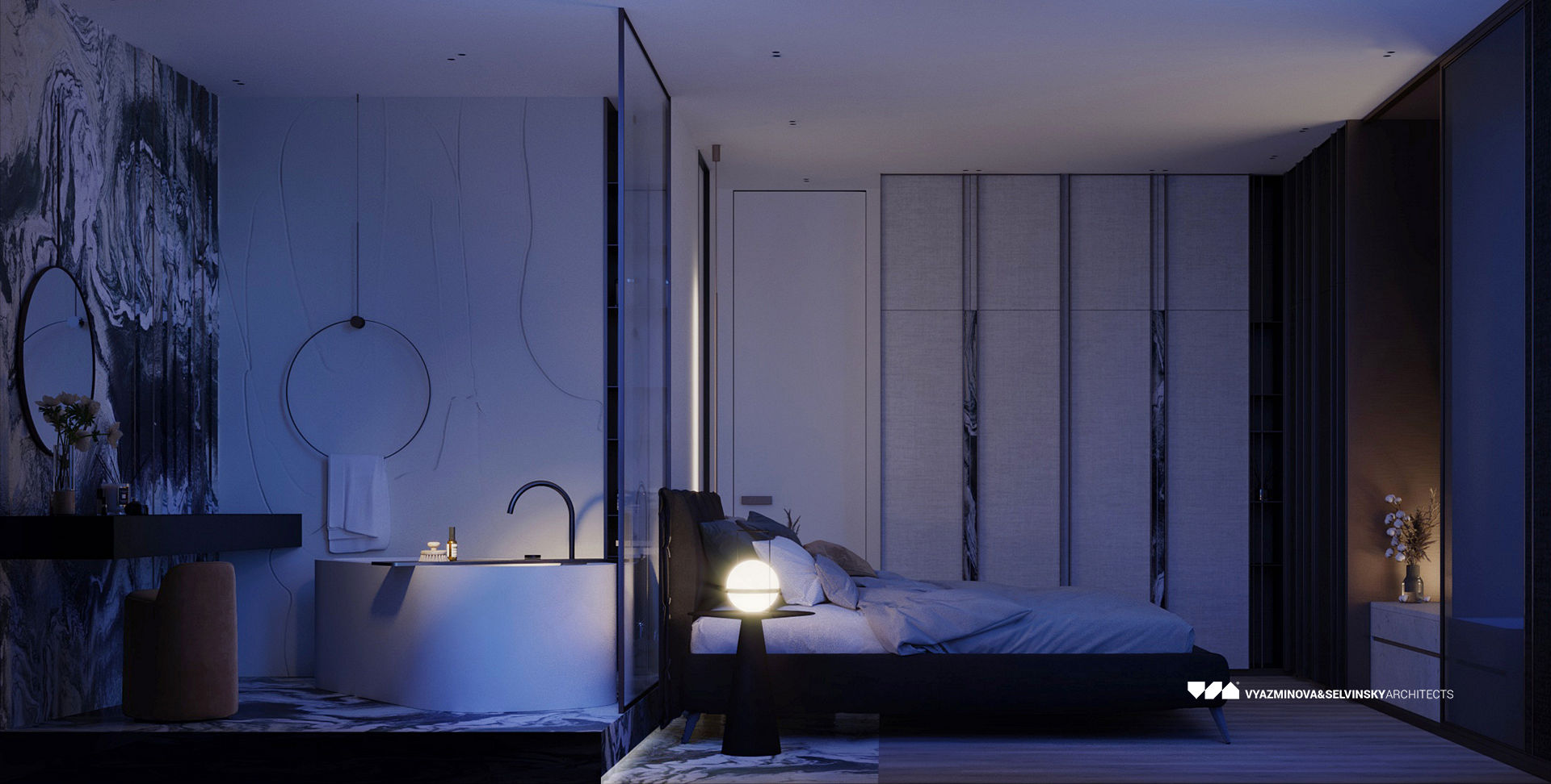
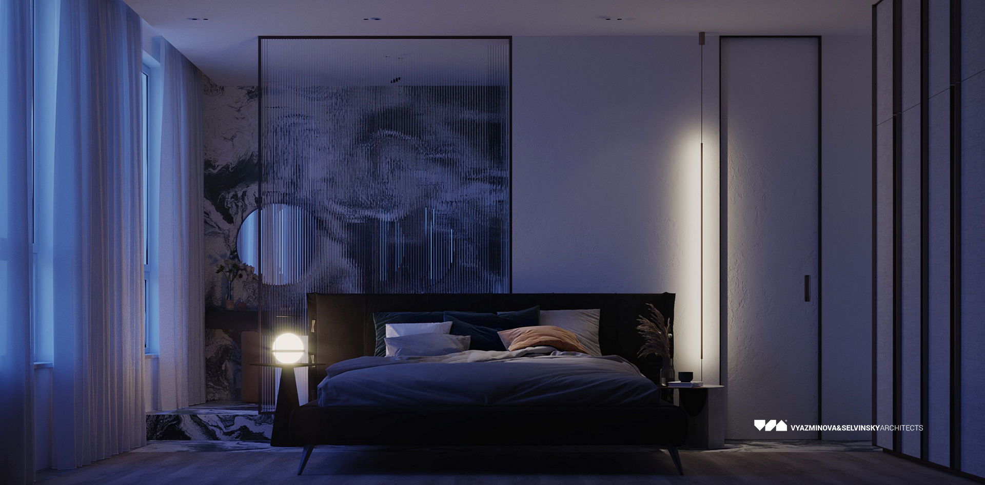
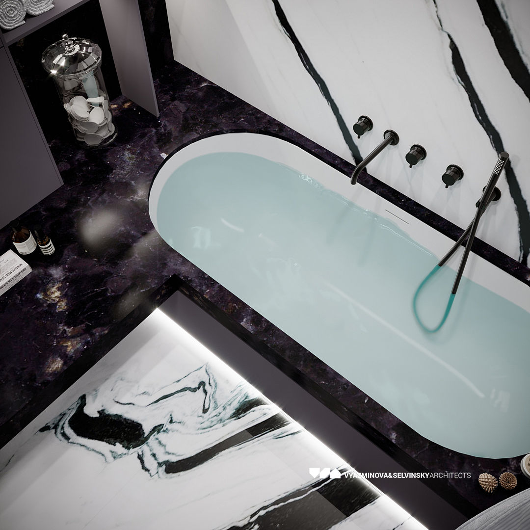
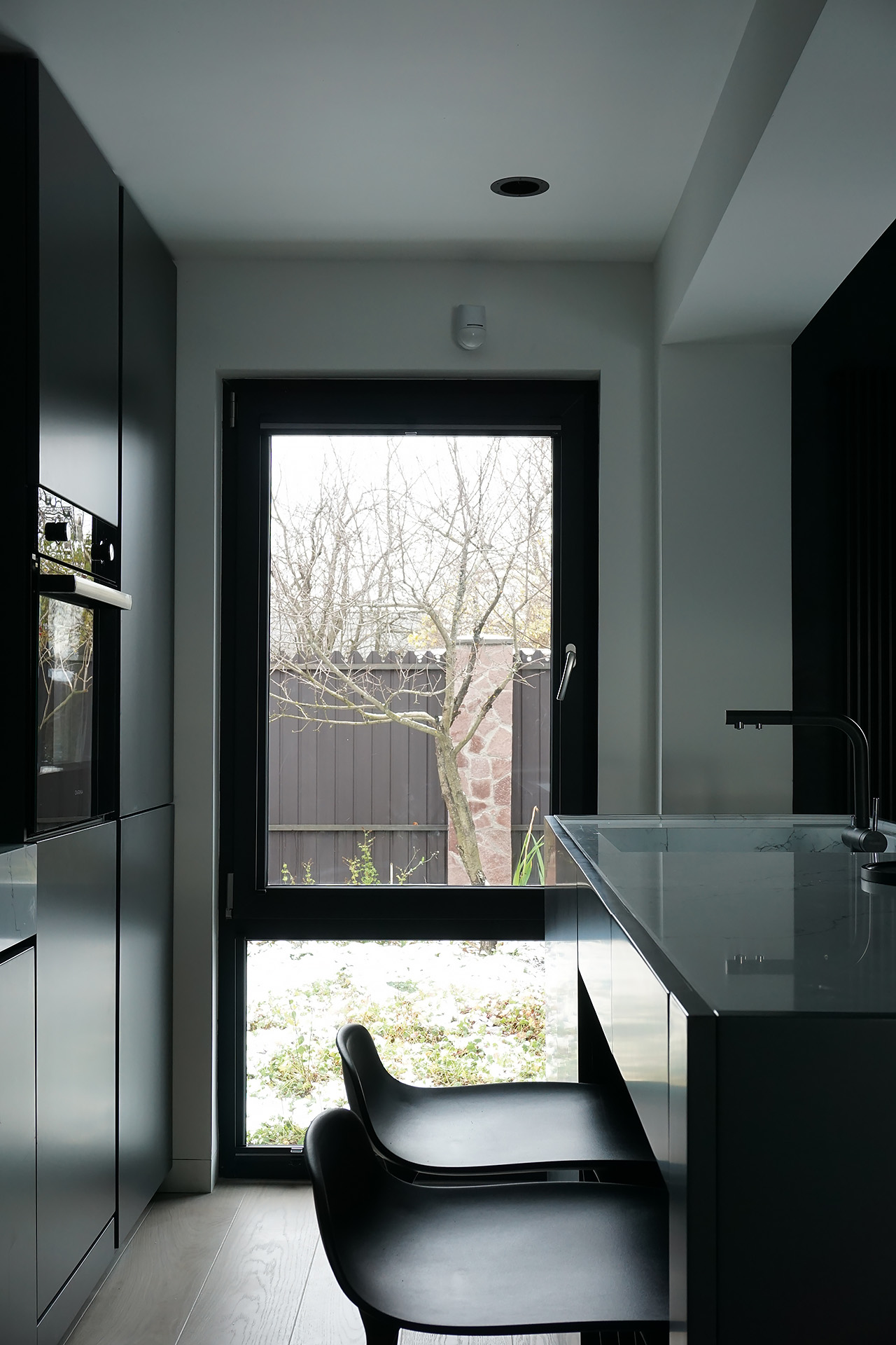
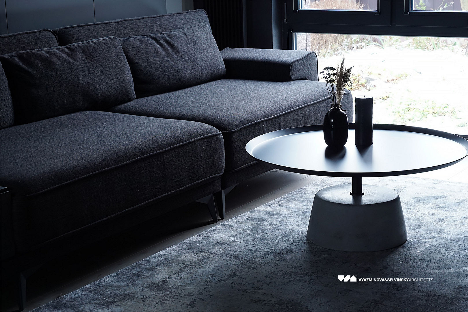
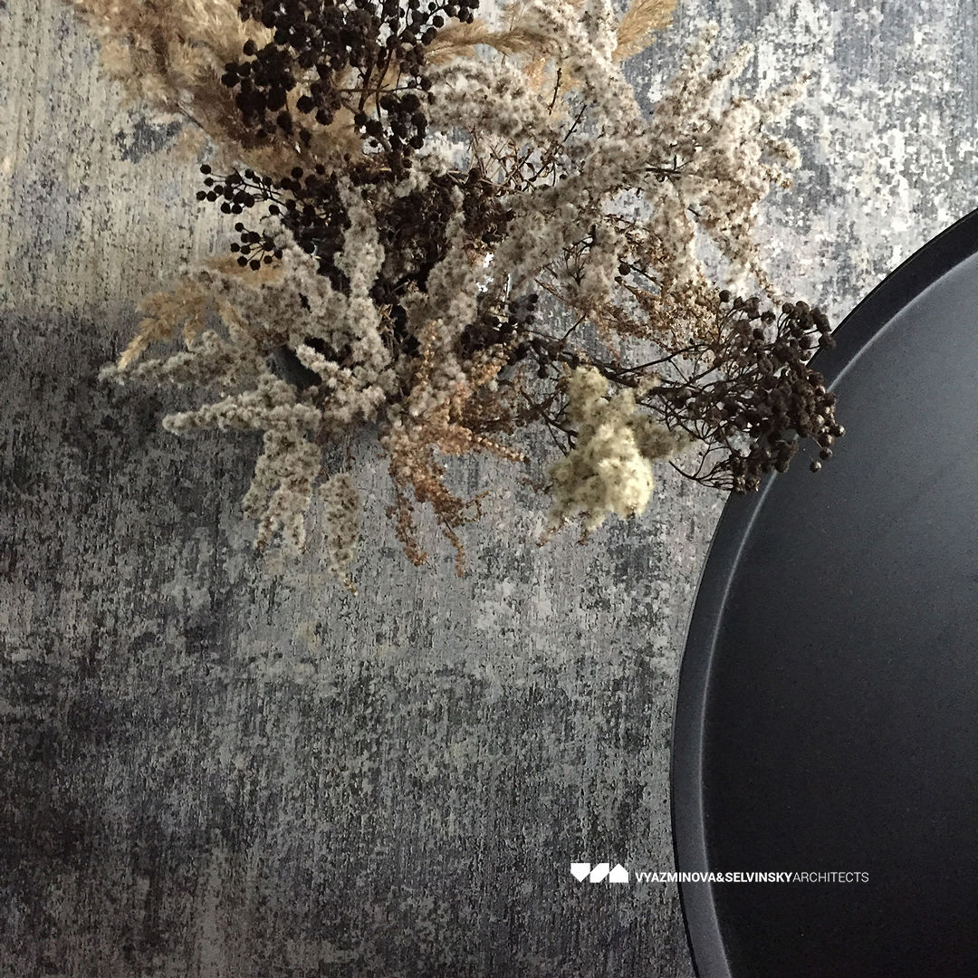
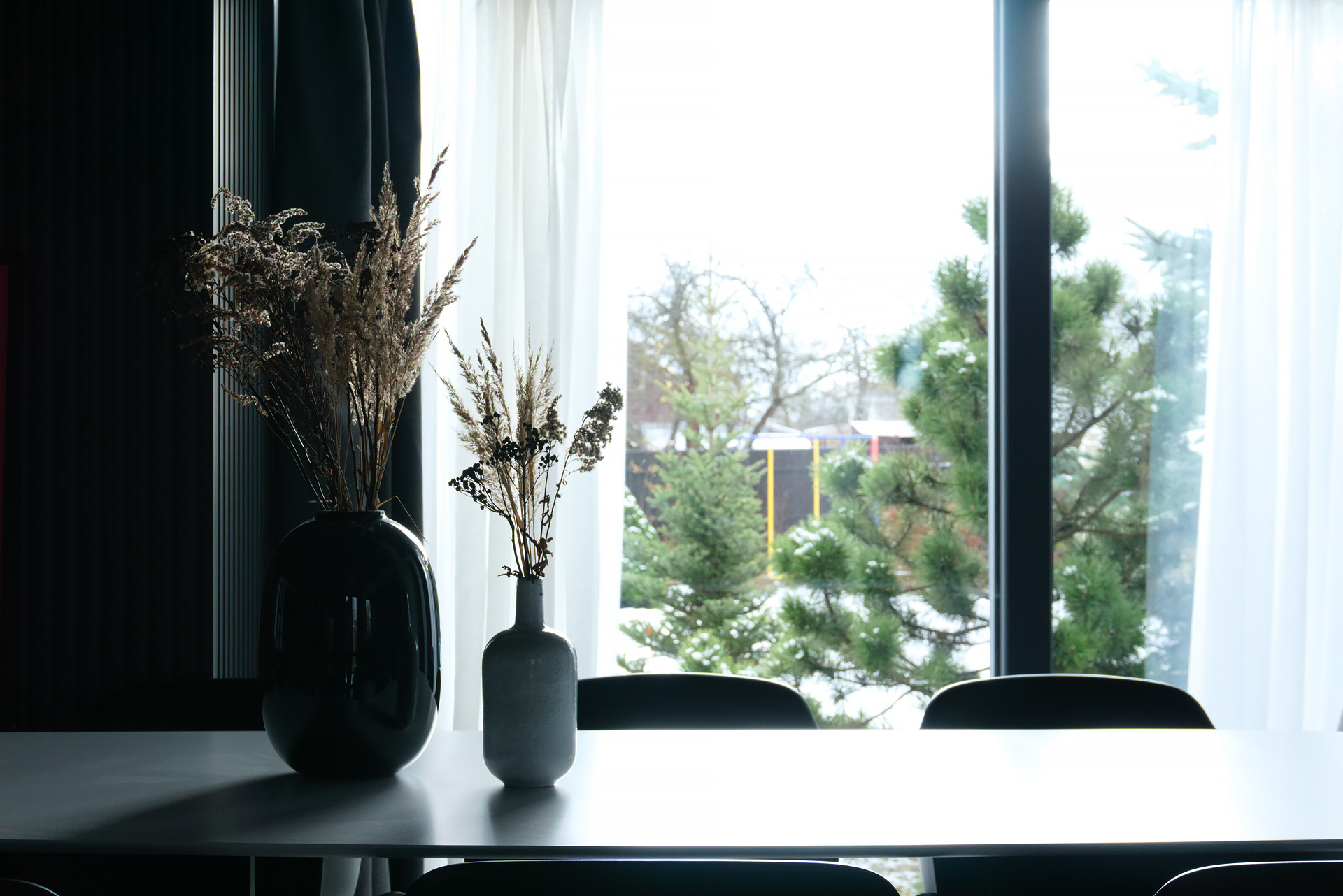
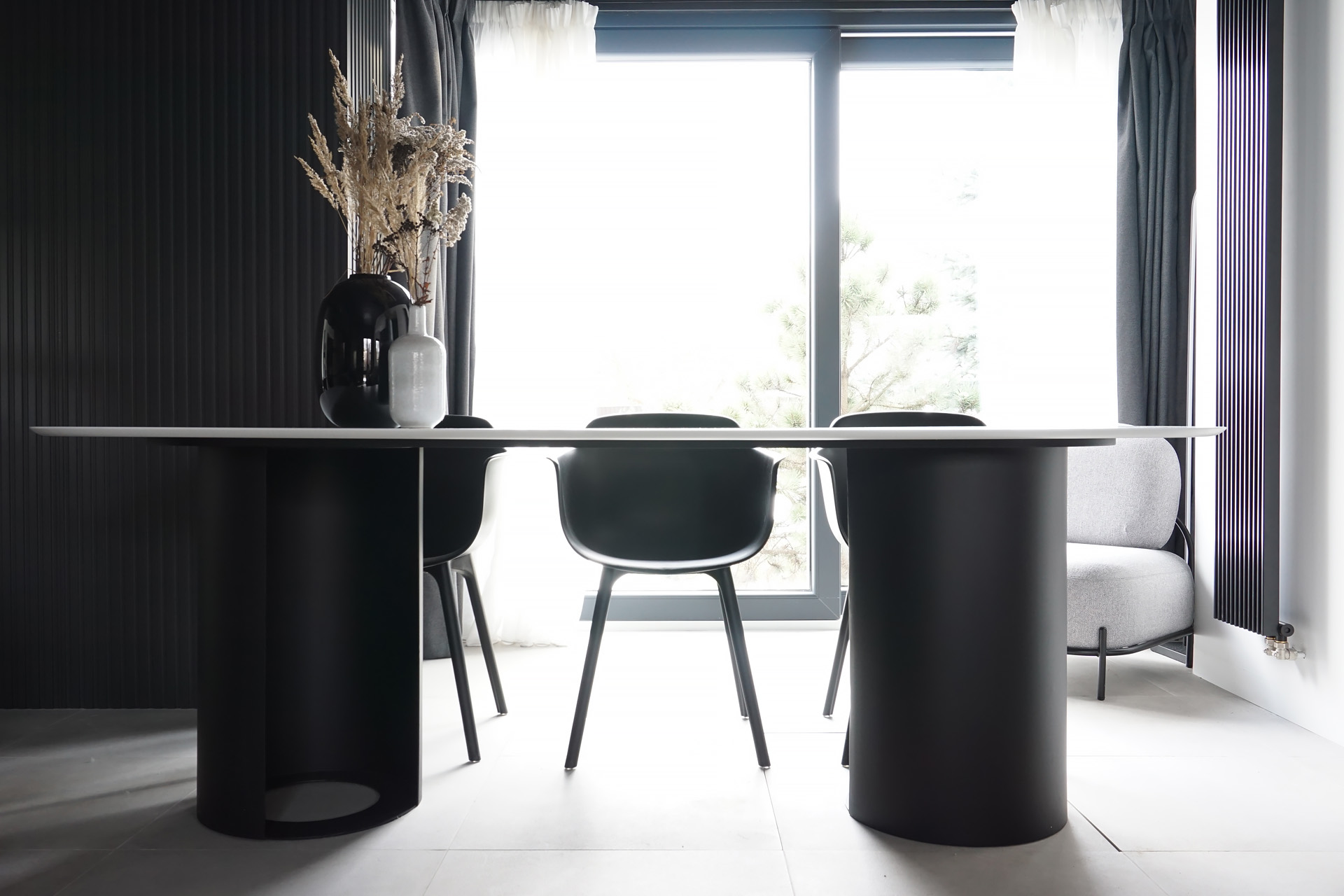
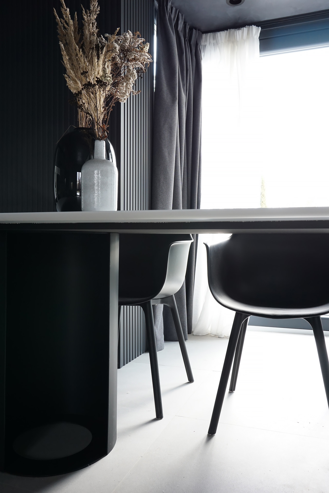
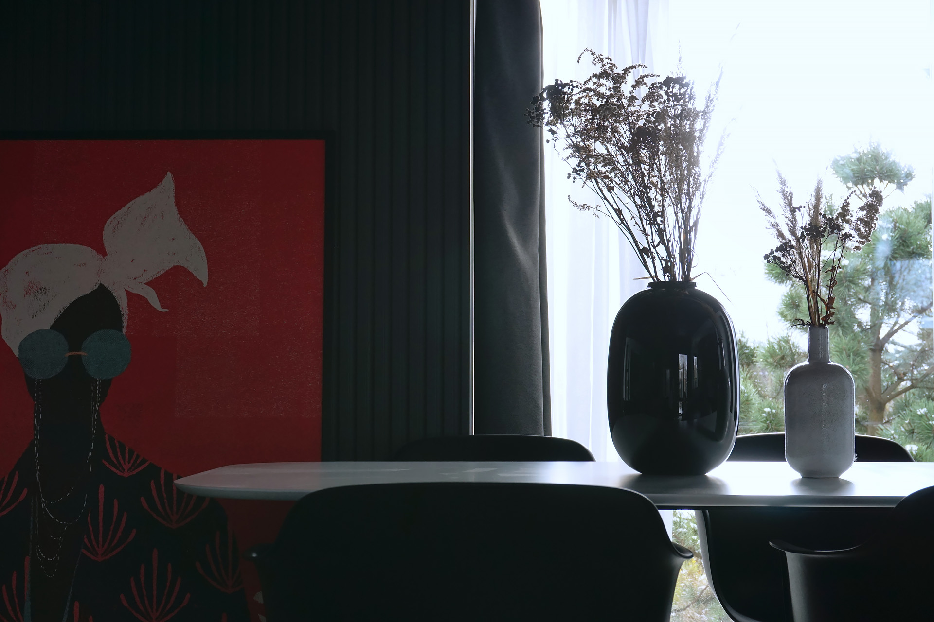
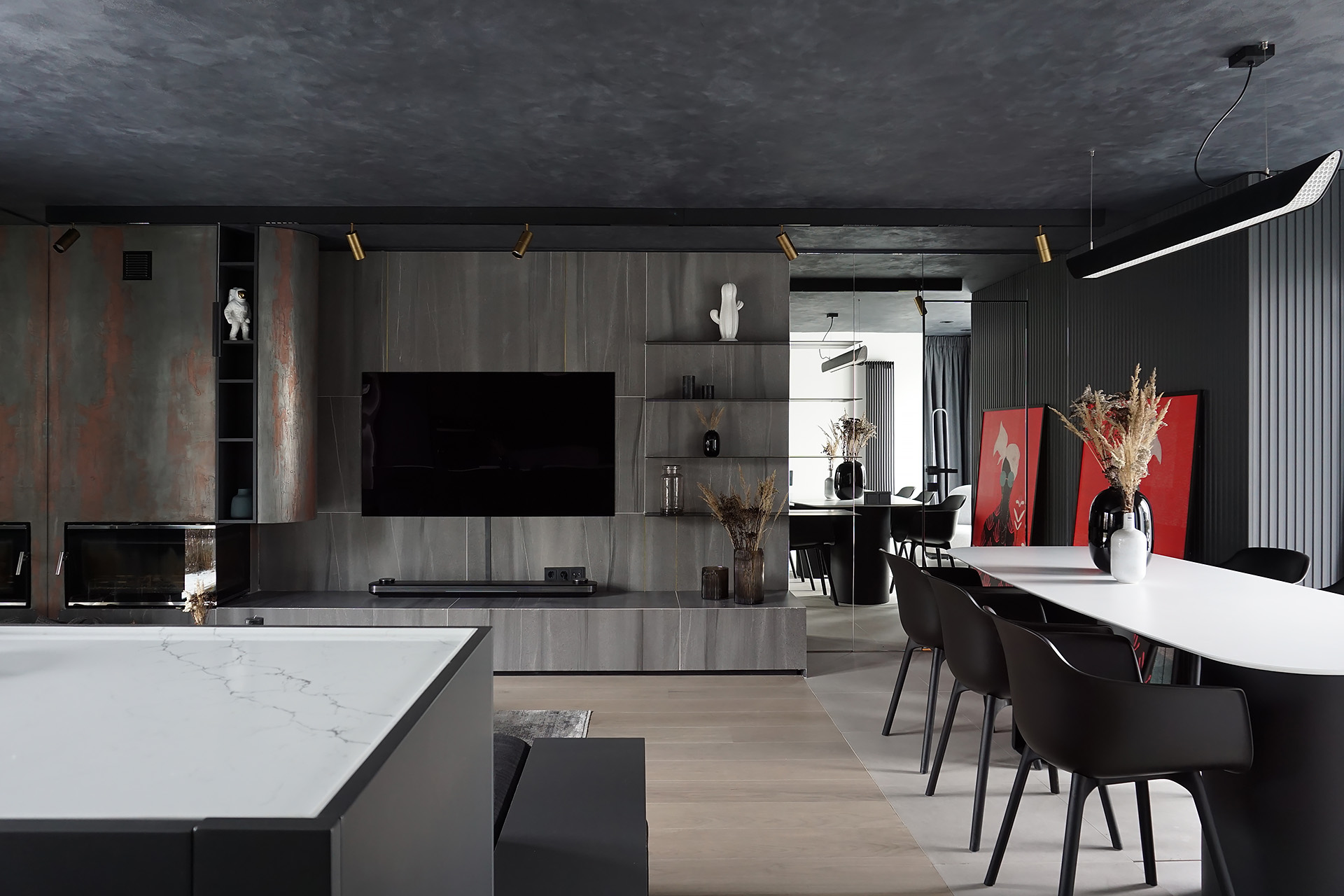
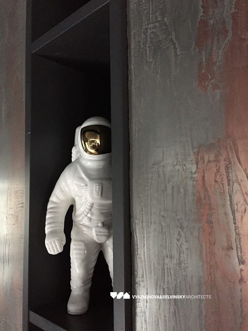
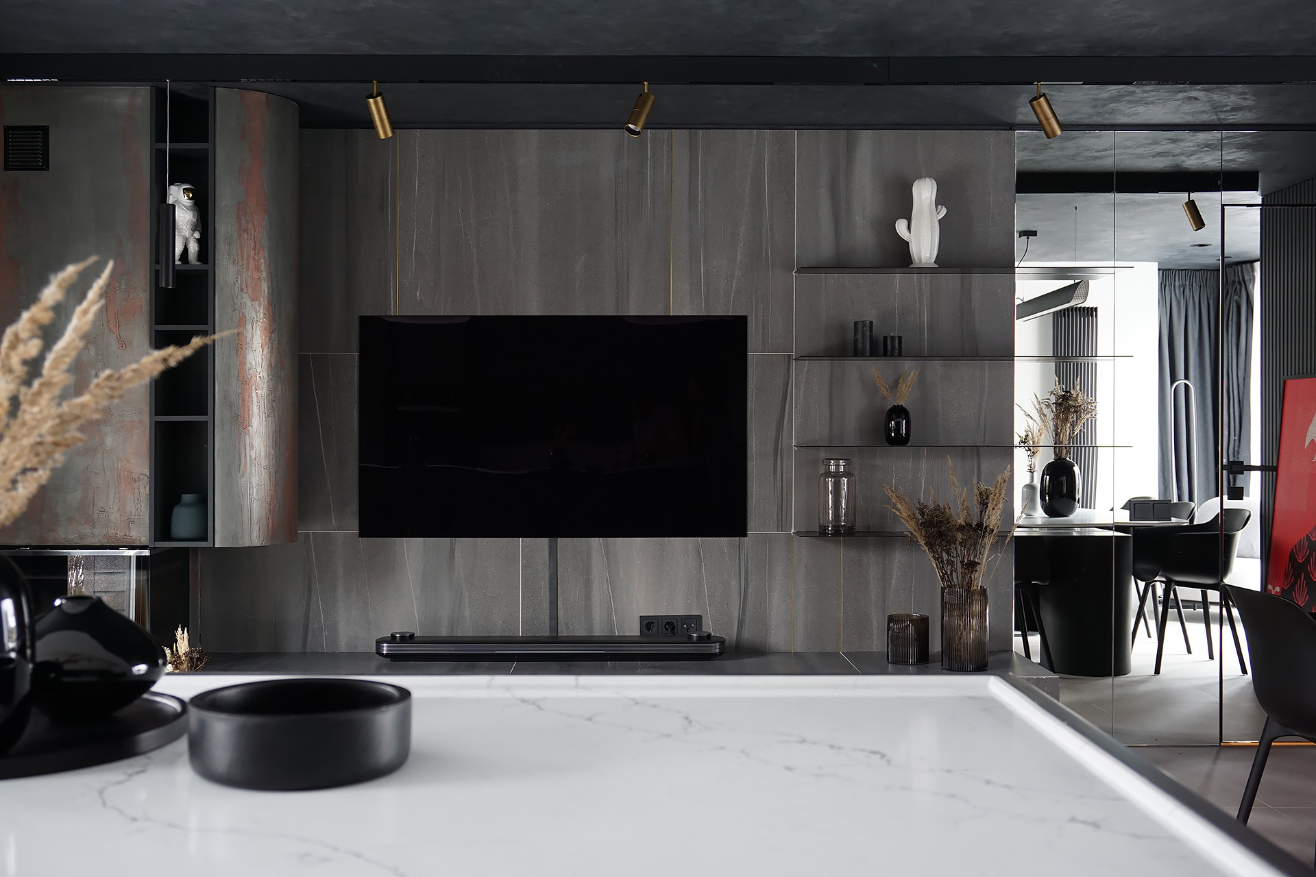
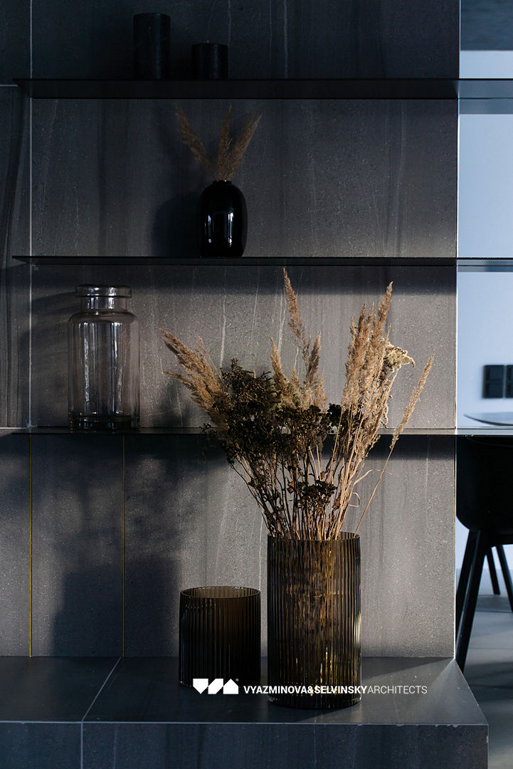
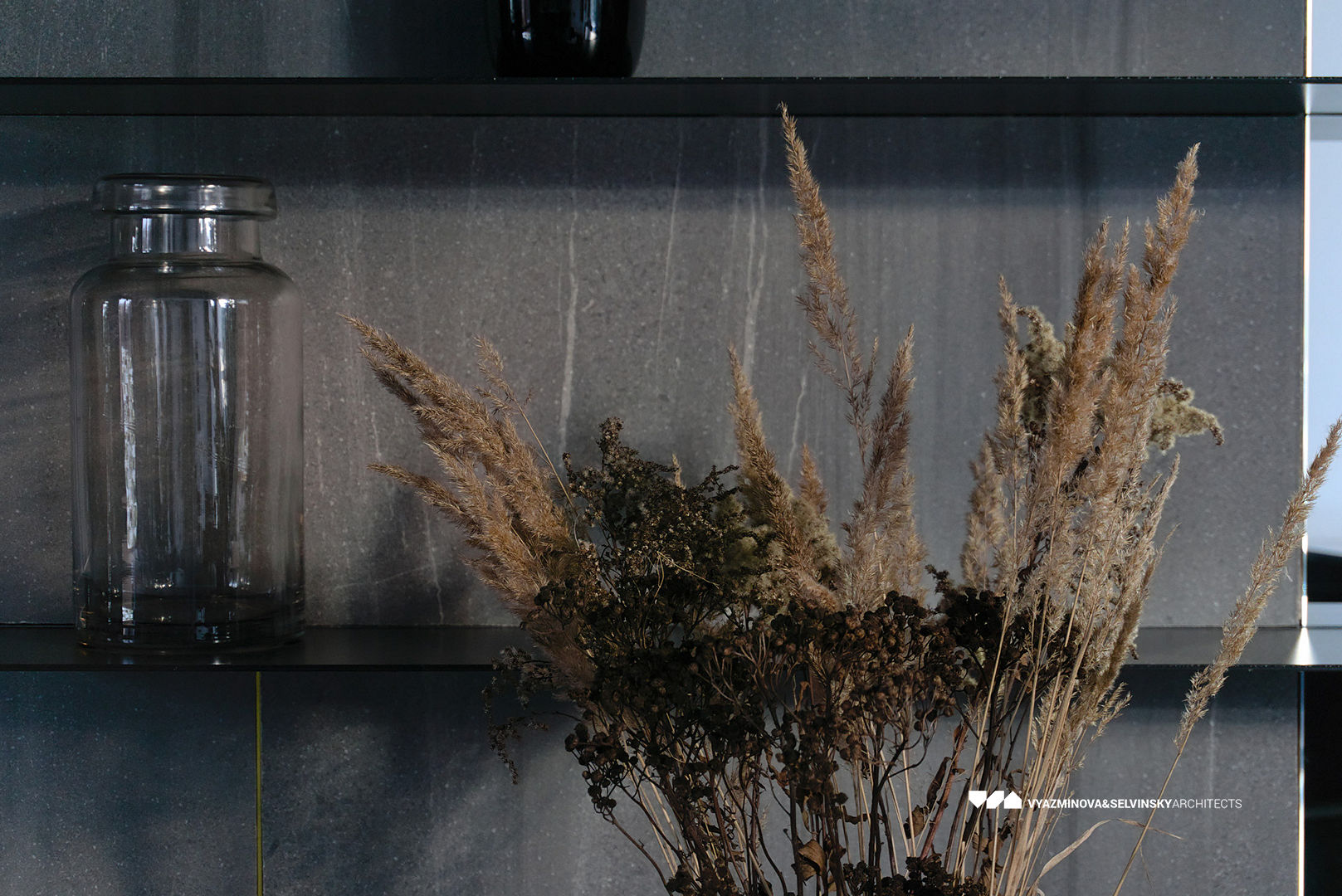
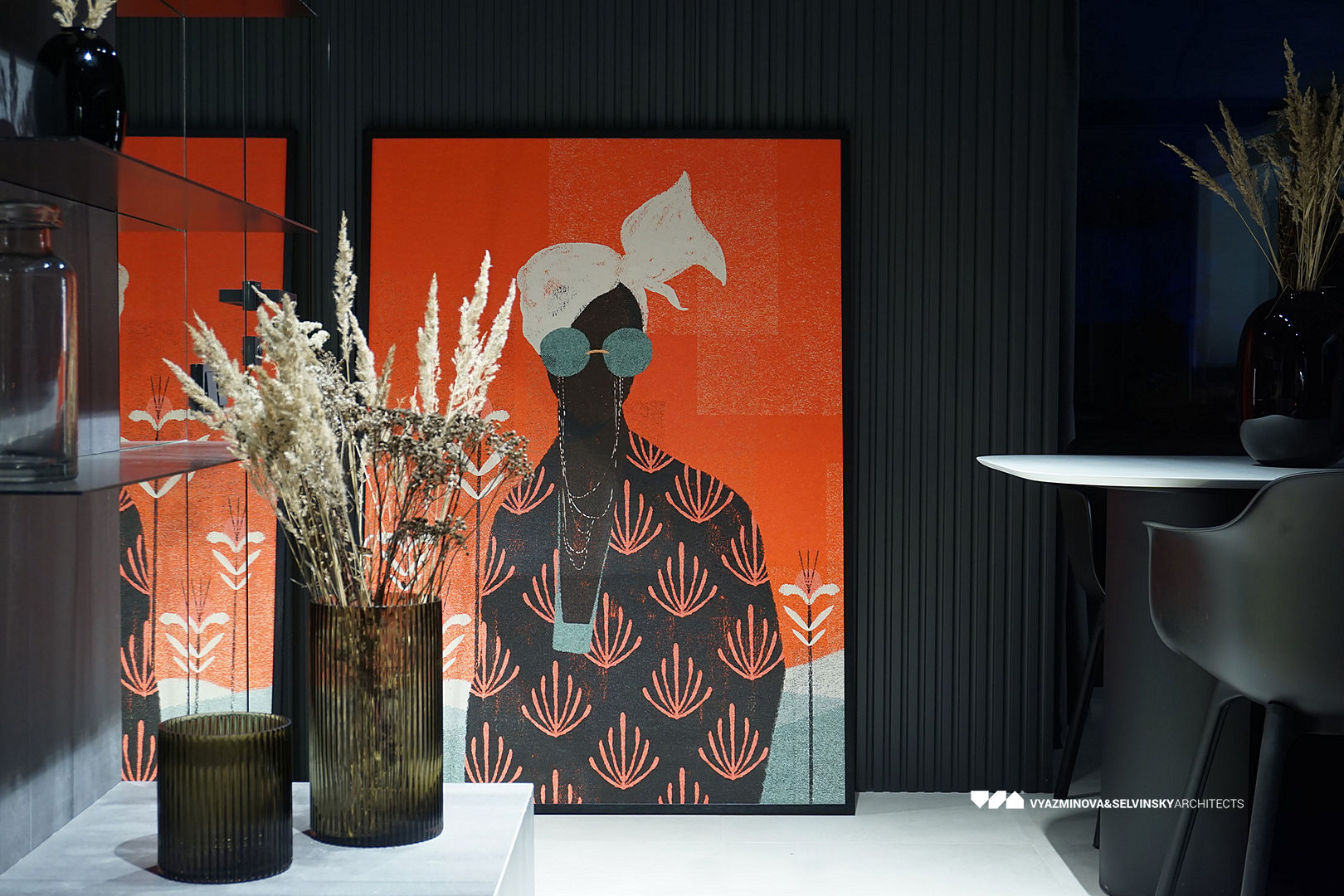
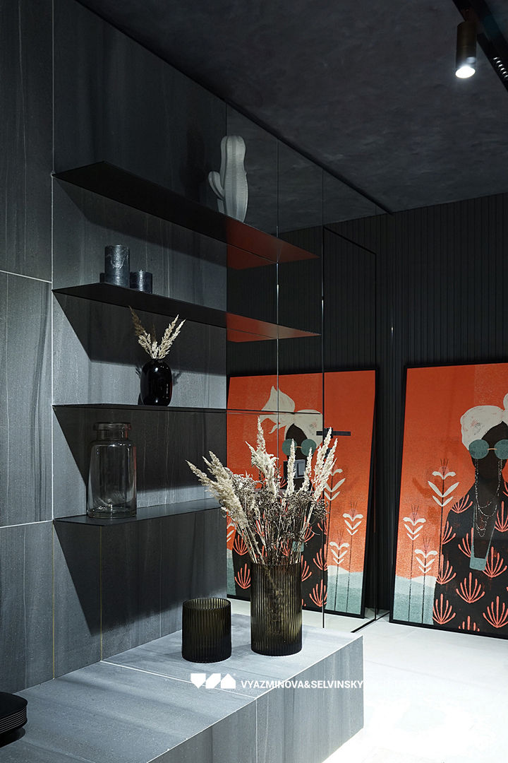
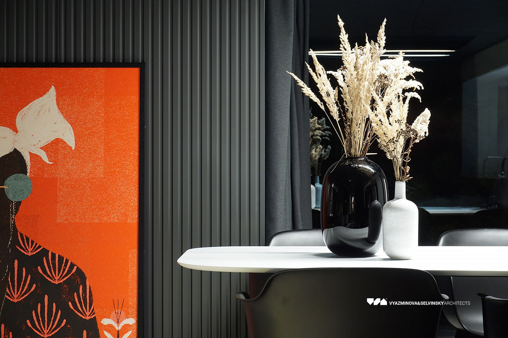
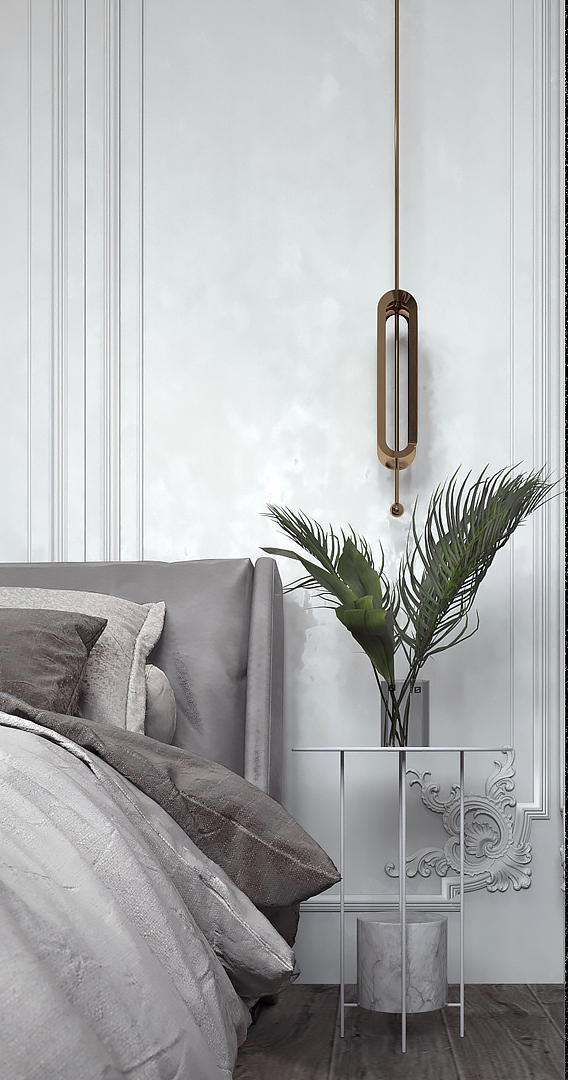
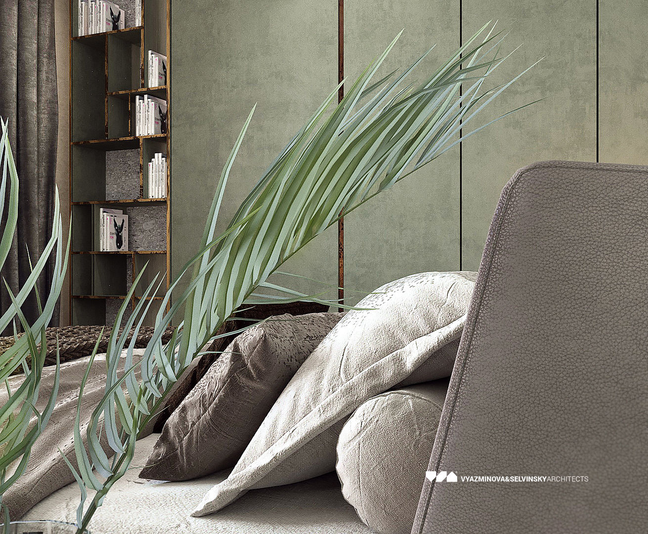
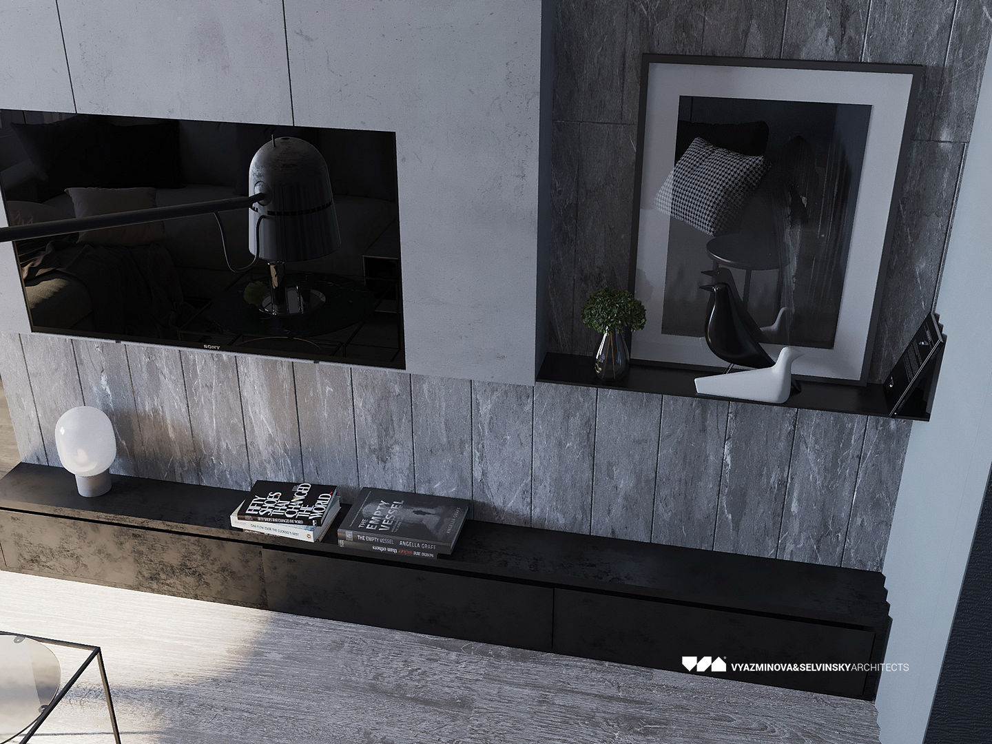
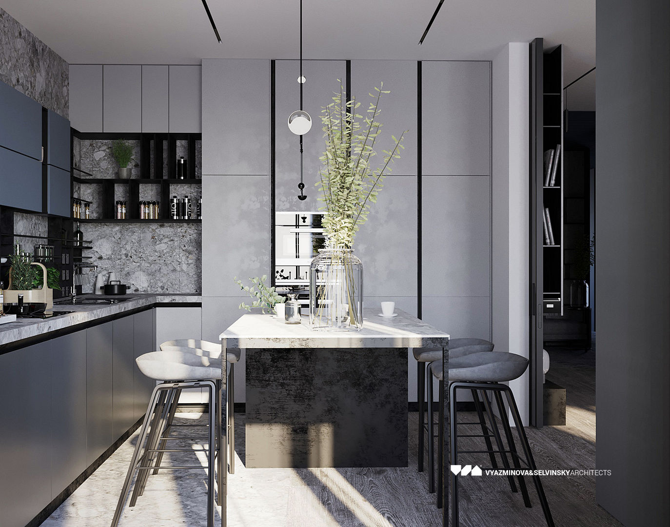
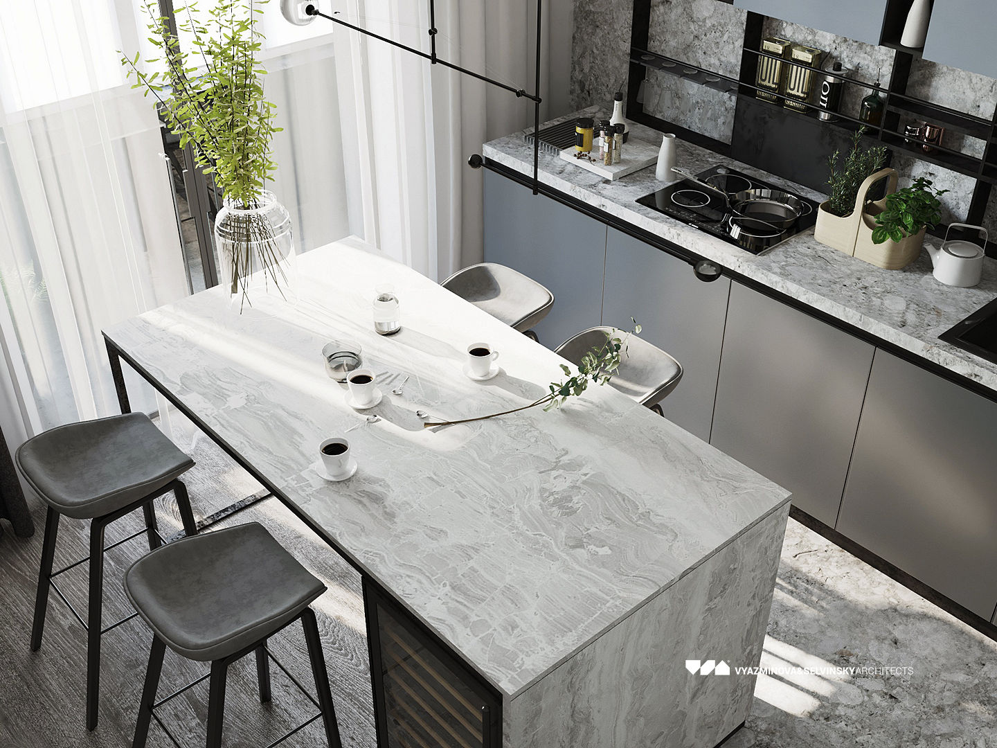
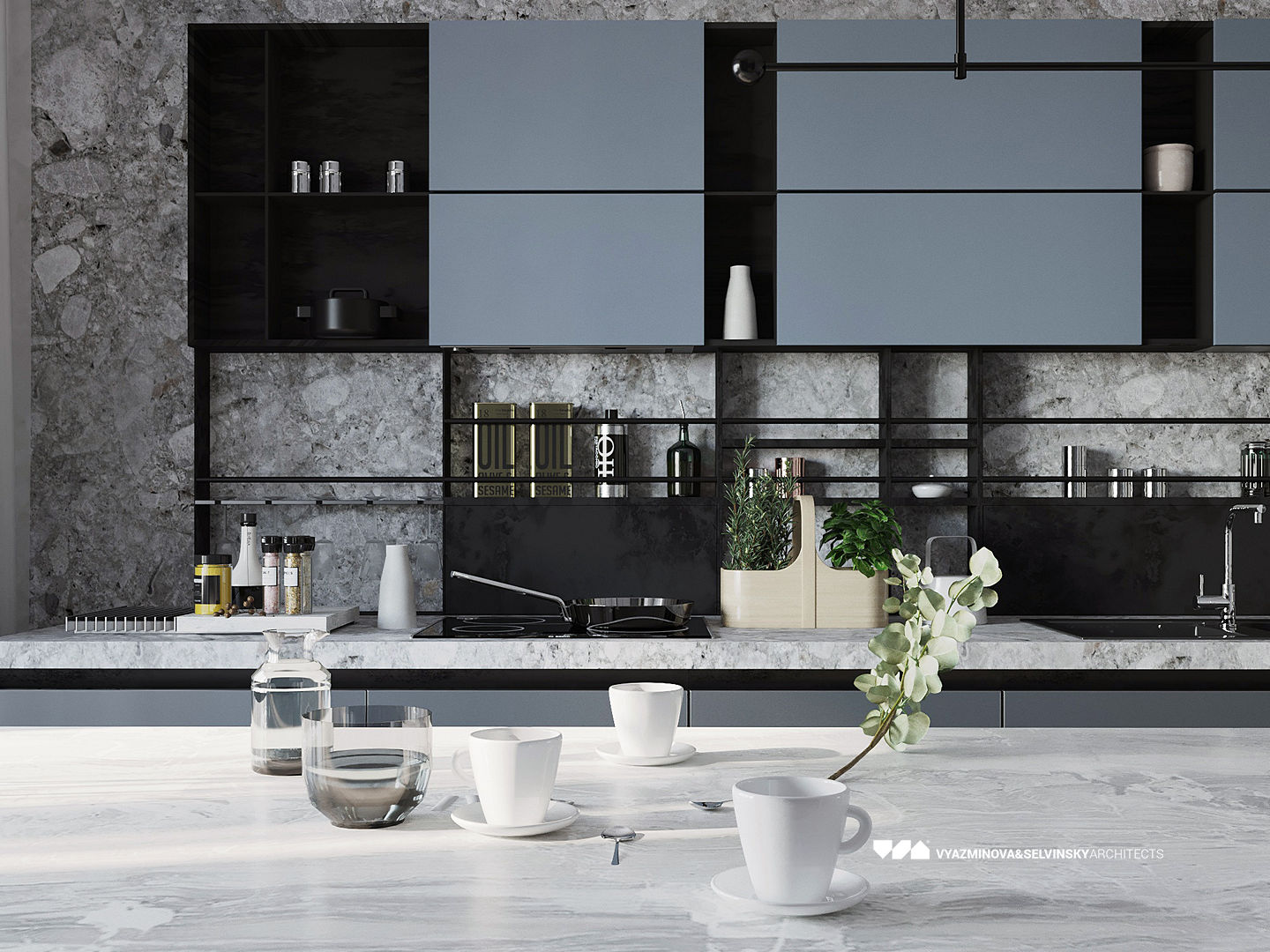
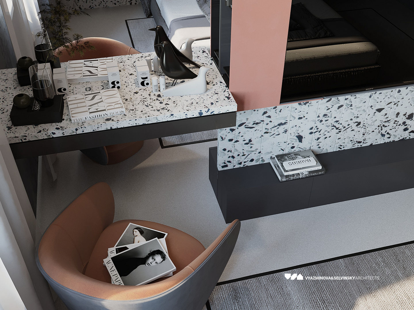
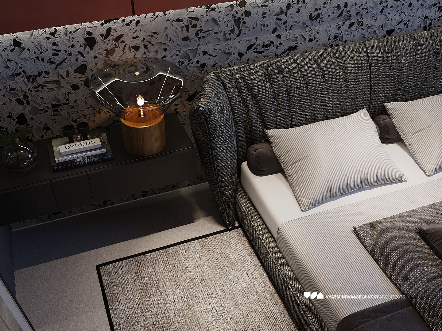
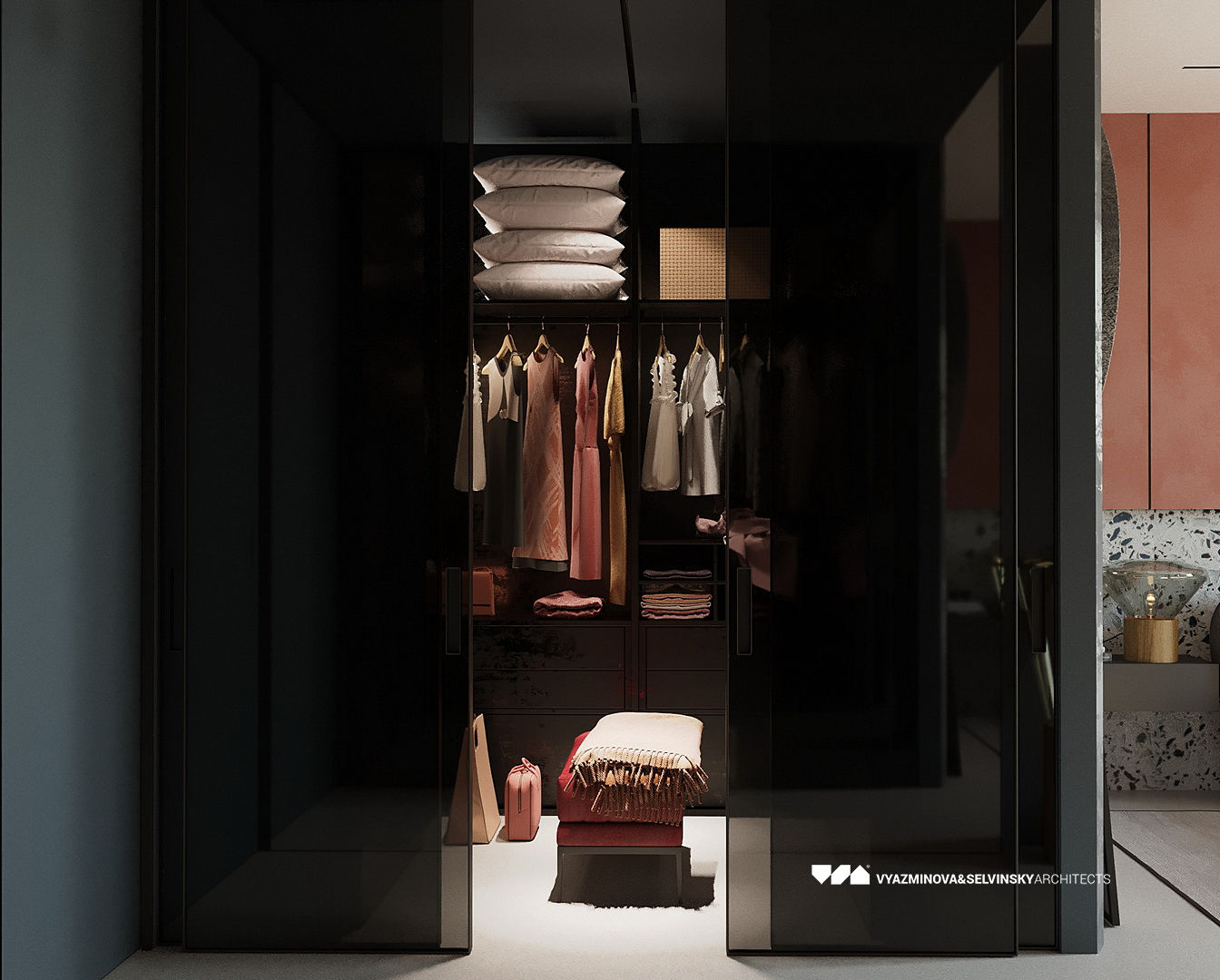
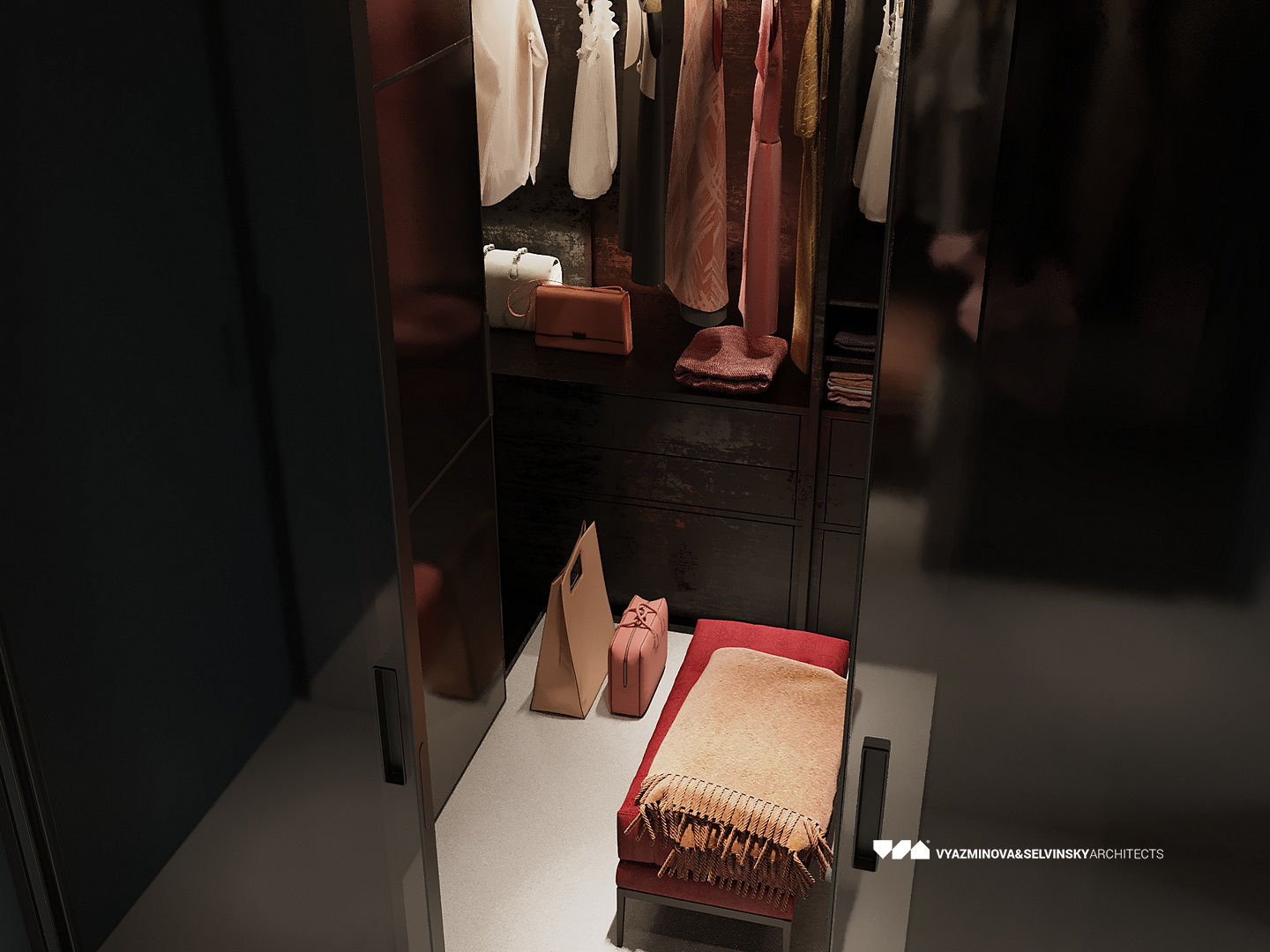
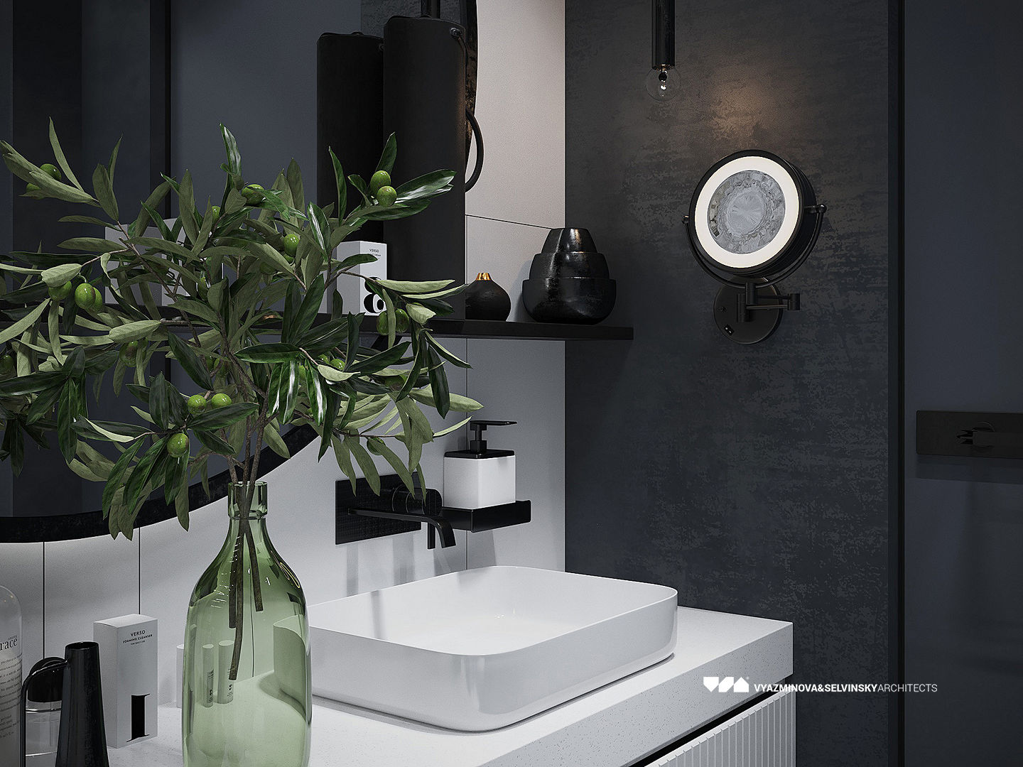
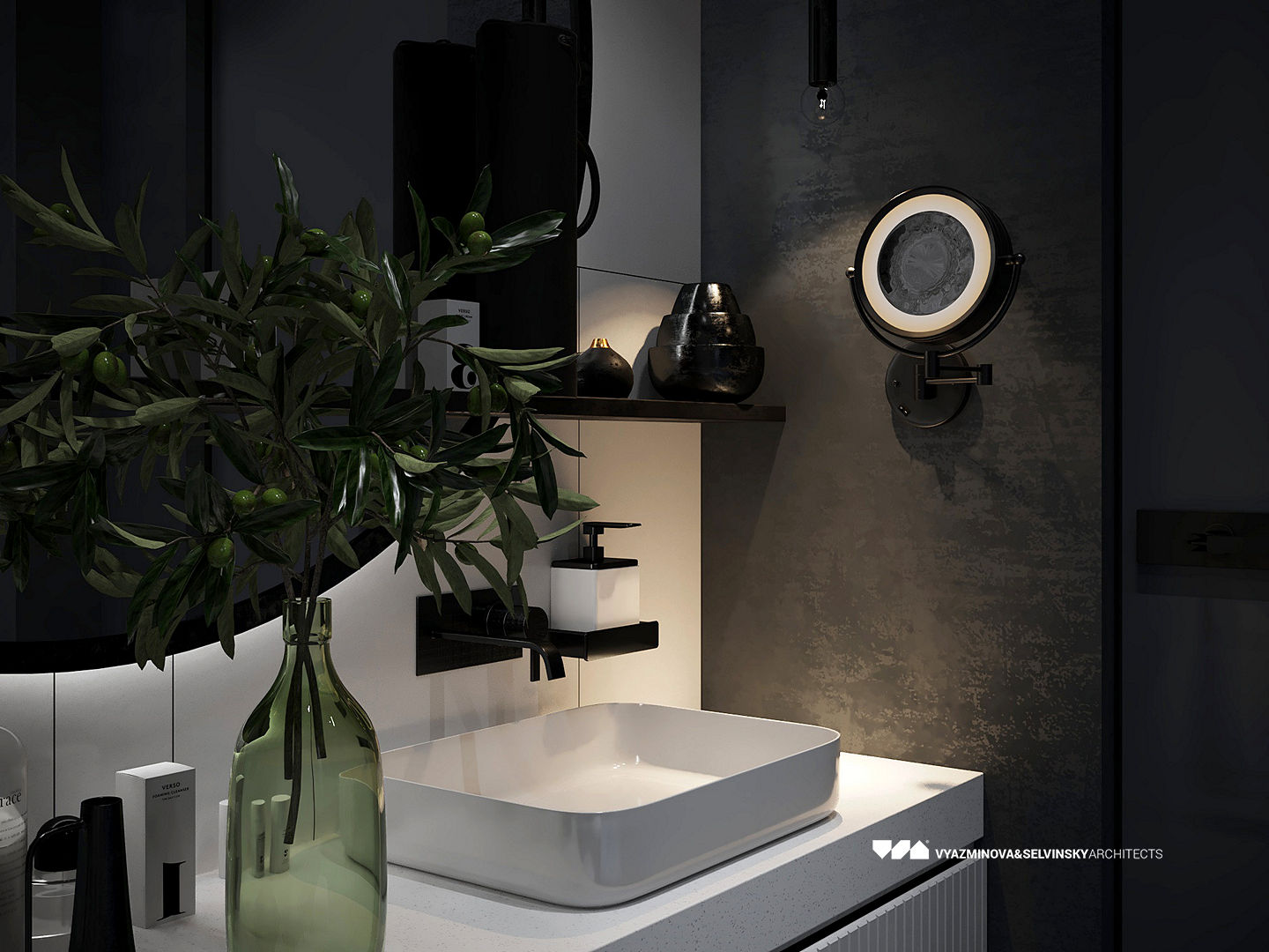
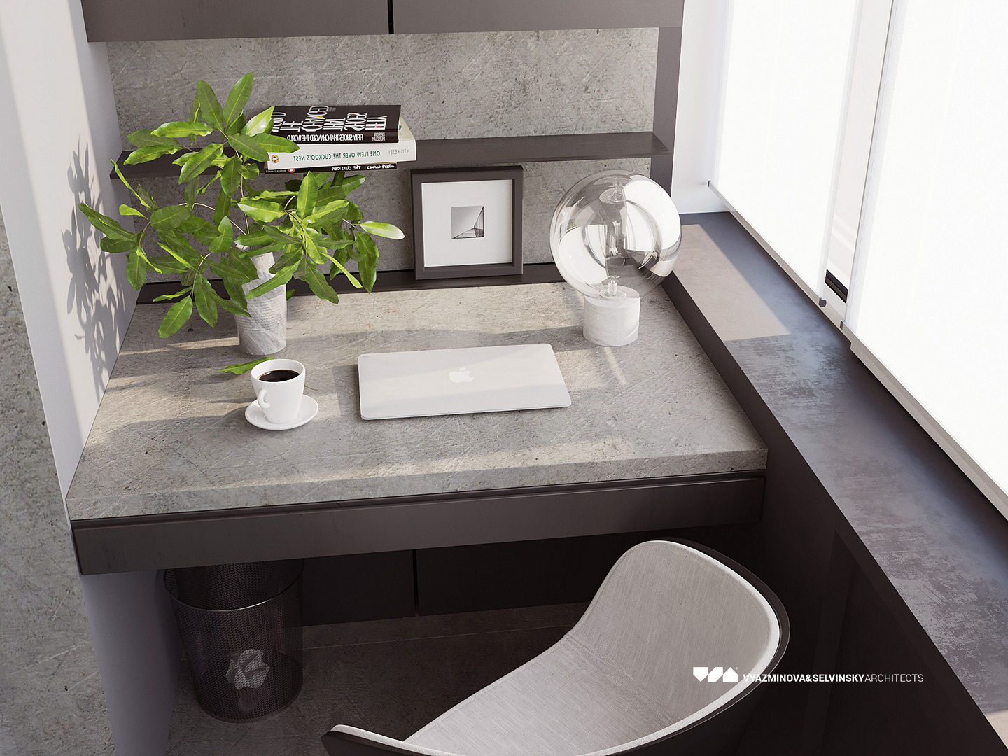
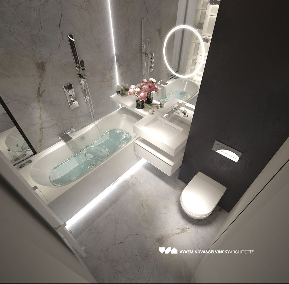
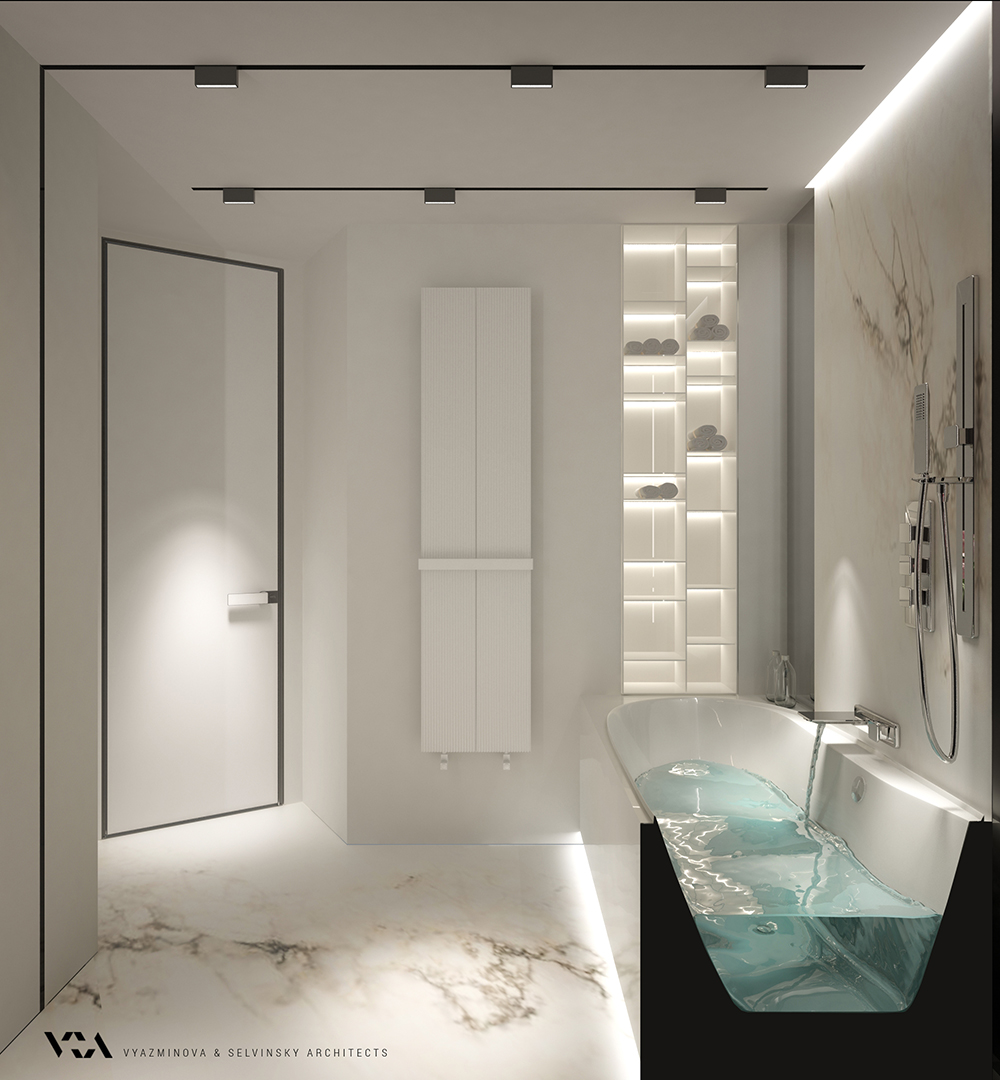
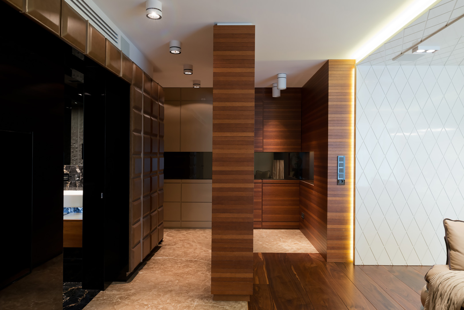
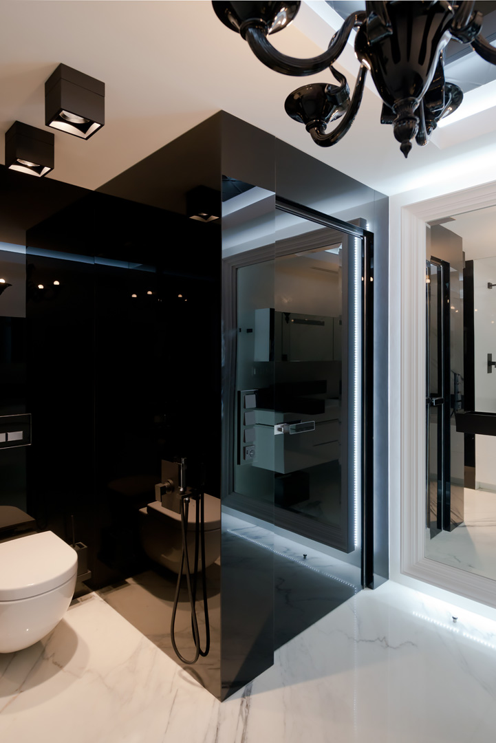
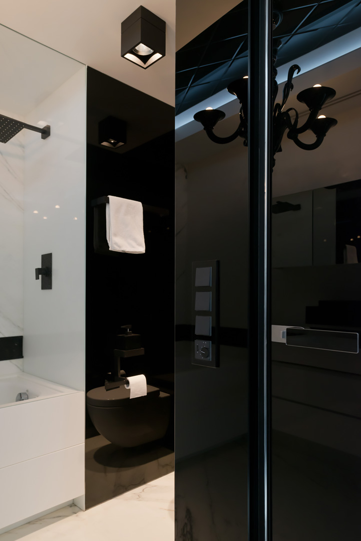
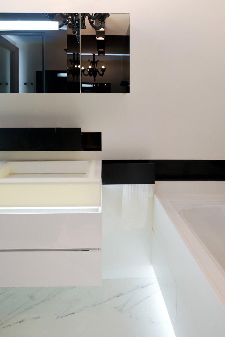
The interior design of the 180m2 apartment is made in dark colors with natural accents in the form of a rough texture of stone and wood. The connection with nature is also given by compositions of dried flowers and leaves. A huge living area with a kitchen is the compositional center of the layout. On one side, it adjoins a dressing room with glass cabinets, behind which, like in an aquarium, there is a huge composition of various plants, creating the effect of an untouched jungle. There, in the dressing area, there is a bathroom with a hammam. On the other hand, the master block adjoins the living area, where the space of the bedroom and the bathroom are almost not separated by anything. A stand-alone gem of the project is the freestanding bathroom with a breathtaking bird’s-eye view.
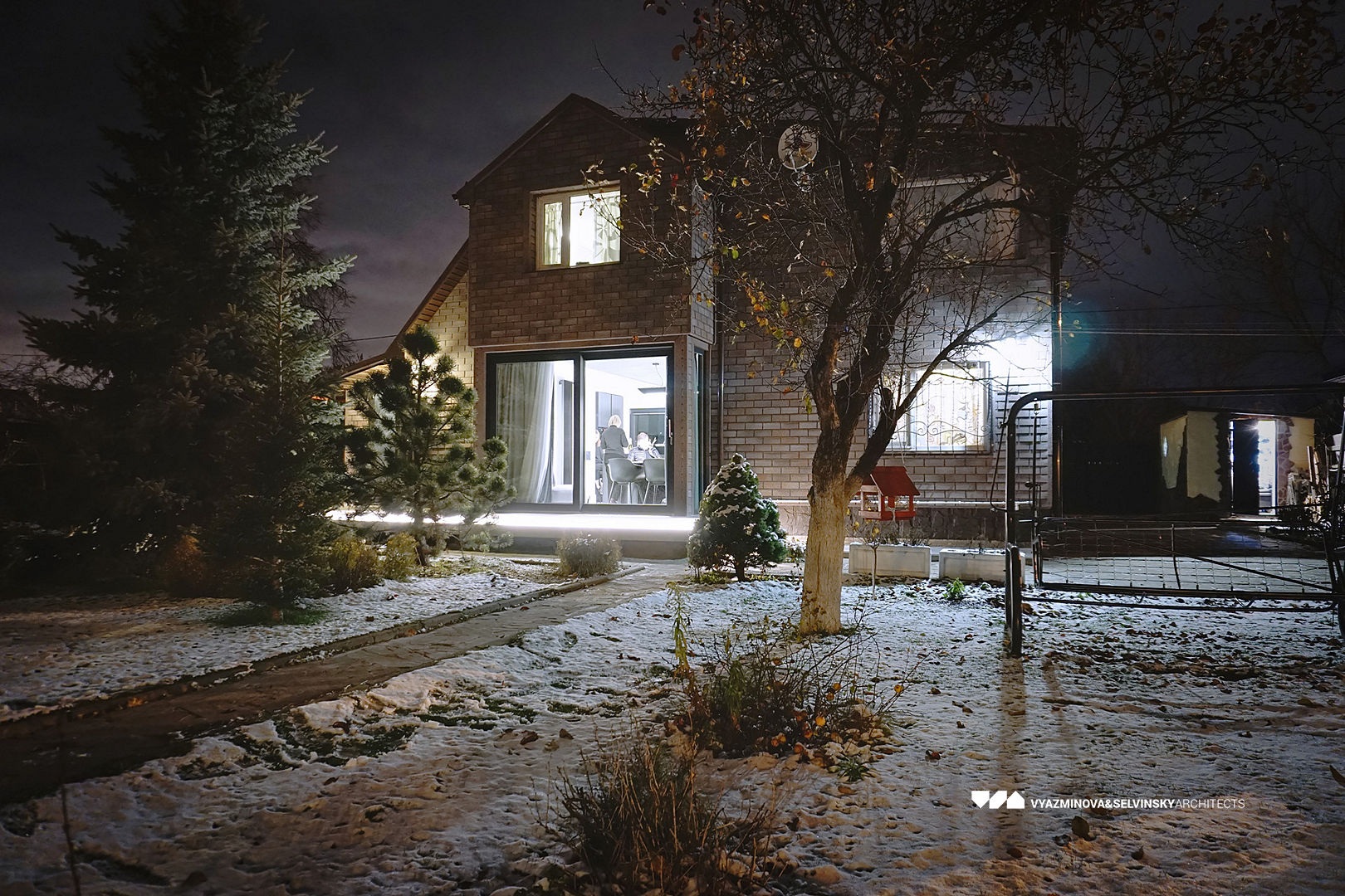
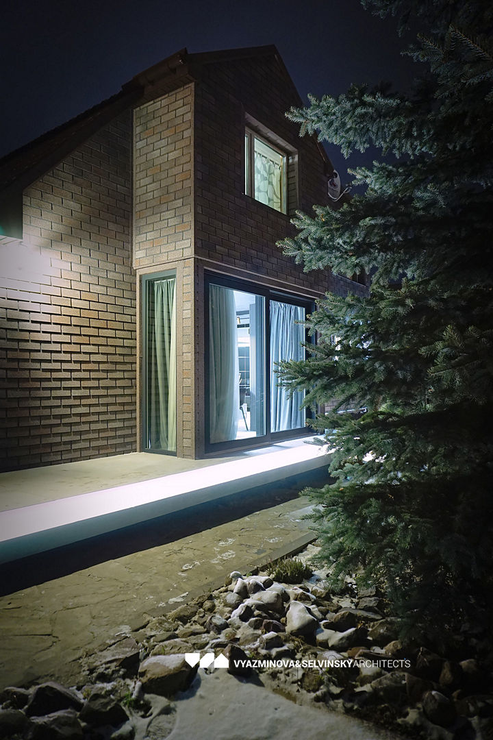
The building – a duplex, built in the mid-90s, is located in a cottage community near the city, on a slope, and from its second floor offers an absolutely amazing and unusual for Moscow suburbs view of the vast panorama of fields and forests, to the horizon. Perhaps this was enough for the owner to choose between building a house on a new plot or reconstruction of the existing half of the duplex. And we understand him as no one else does. But the disadvantages of the existing home don’t end with one common wall with the neighbors. Built in the early post-perestroika years according to those, still Soviet and familiar “norms”, the house has absolutely microscopic storey heights. The highest, second, had a height of only 2.40m, the first floor was in some places no higher than 2.2m. Add to this the narrow staircase to the second floor, and the absence of the stairs for descent to the basement (where, by the way, the laundry, garage and sauna with a rest room are located) and the general picture will be formed completely. On the one hand, a neat and generally very nice house, dizzying views from the windows and charming garden. And on the other – small floor space, low ceilings, narrow staircases and the need to pick up laundry across the street…
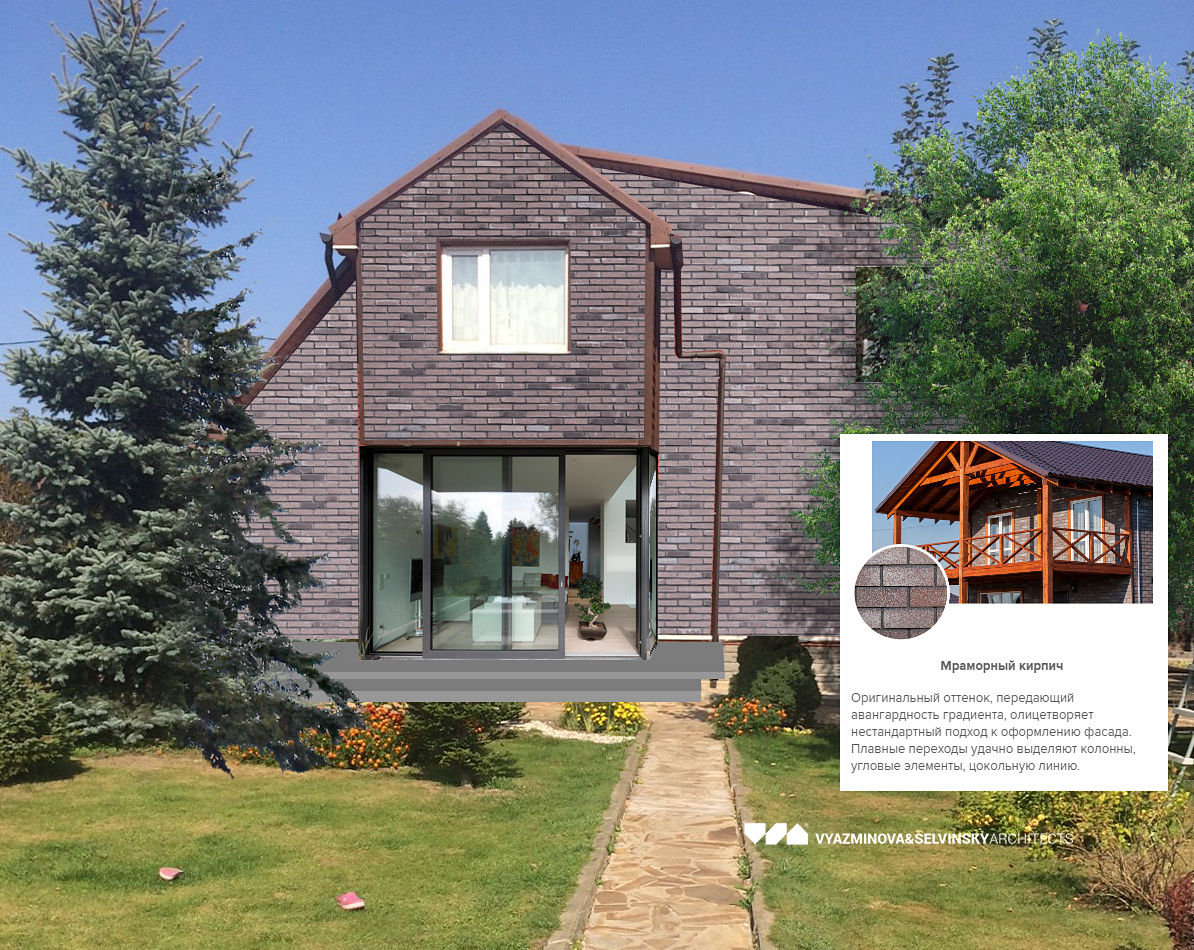
The client turned to us after seeing the issue of Dachnaya Otvet in Monino, where we were reconstructing an old house. Among other things, he was attracted by the large panoramic windows that we laid in that project. And that was probably the only wish he had for the “renovation” of the architecture – just to make the window openings bigger, so that there would be more light and there would be an exit to the backyard. But we, as is often the case, could not stop there. Thinking about how we could solve the problem of low ceilings without demolishing the house, we suggested the client to make a small second light in the living room area to give the feeling of extending the space somewhere upwards. In addition, we have reconfigured all the staircases, made them normal, double staircases, of a comfortable width, from the basement to the second floor. The stairs from the first to the second floor were made as transparent and openwork as possible, so that there was actually another second light connecting the two floors.
Of the other changes, we widened the second floor window opening, moved the porch, added a summer gallery to the house with a patio area and sliding sun shades, and many other less visible but important little things. In fact, we completely rebuilt the entire house and designed it anew.

Project for a summer veranda extension in Zvenigorod
Check out photos of the finished interior here!
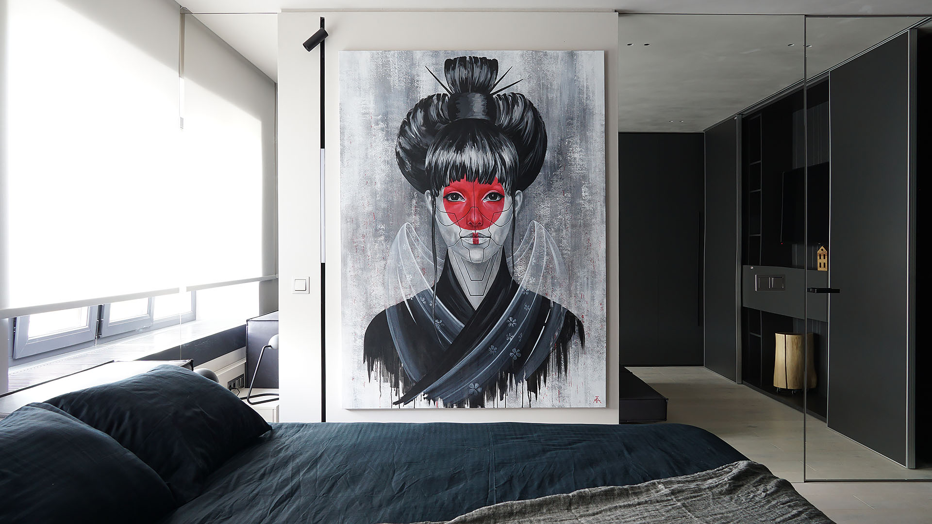
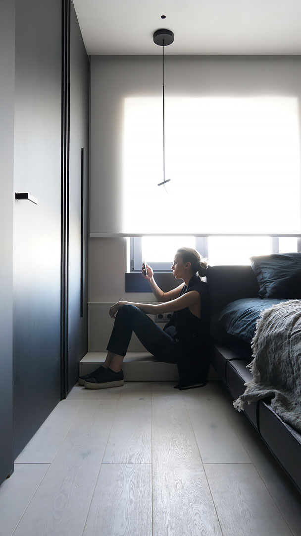
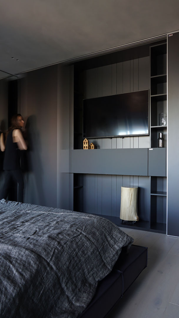
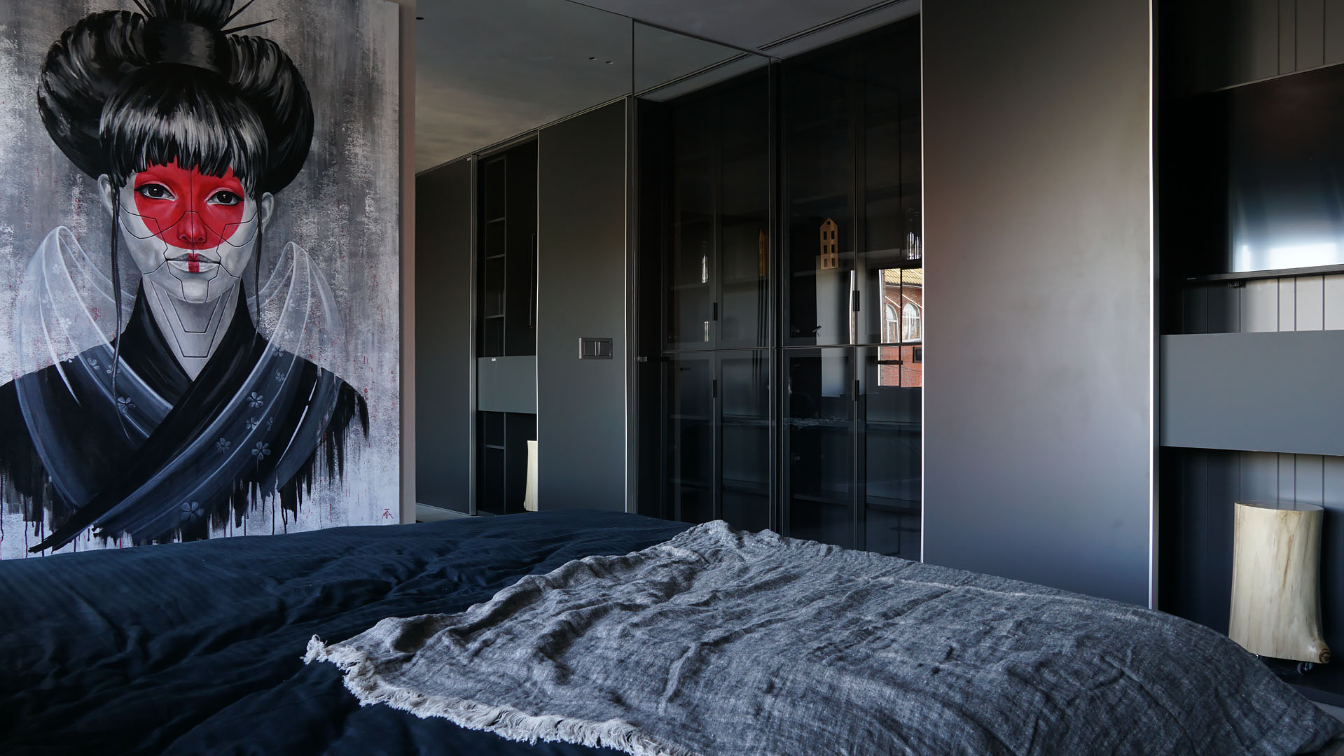
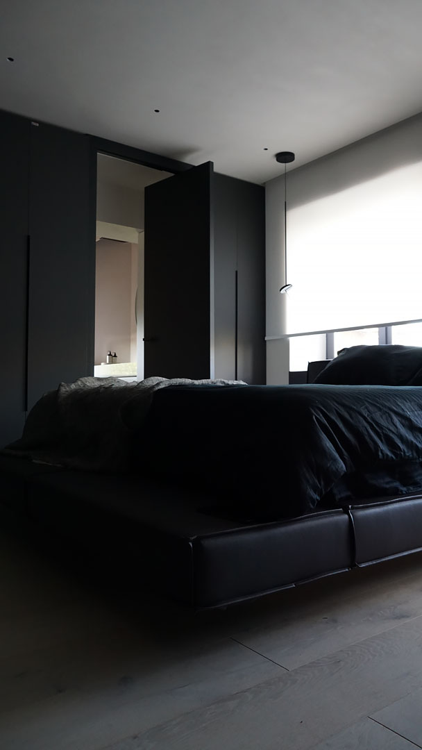
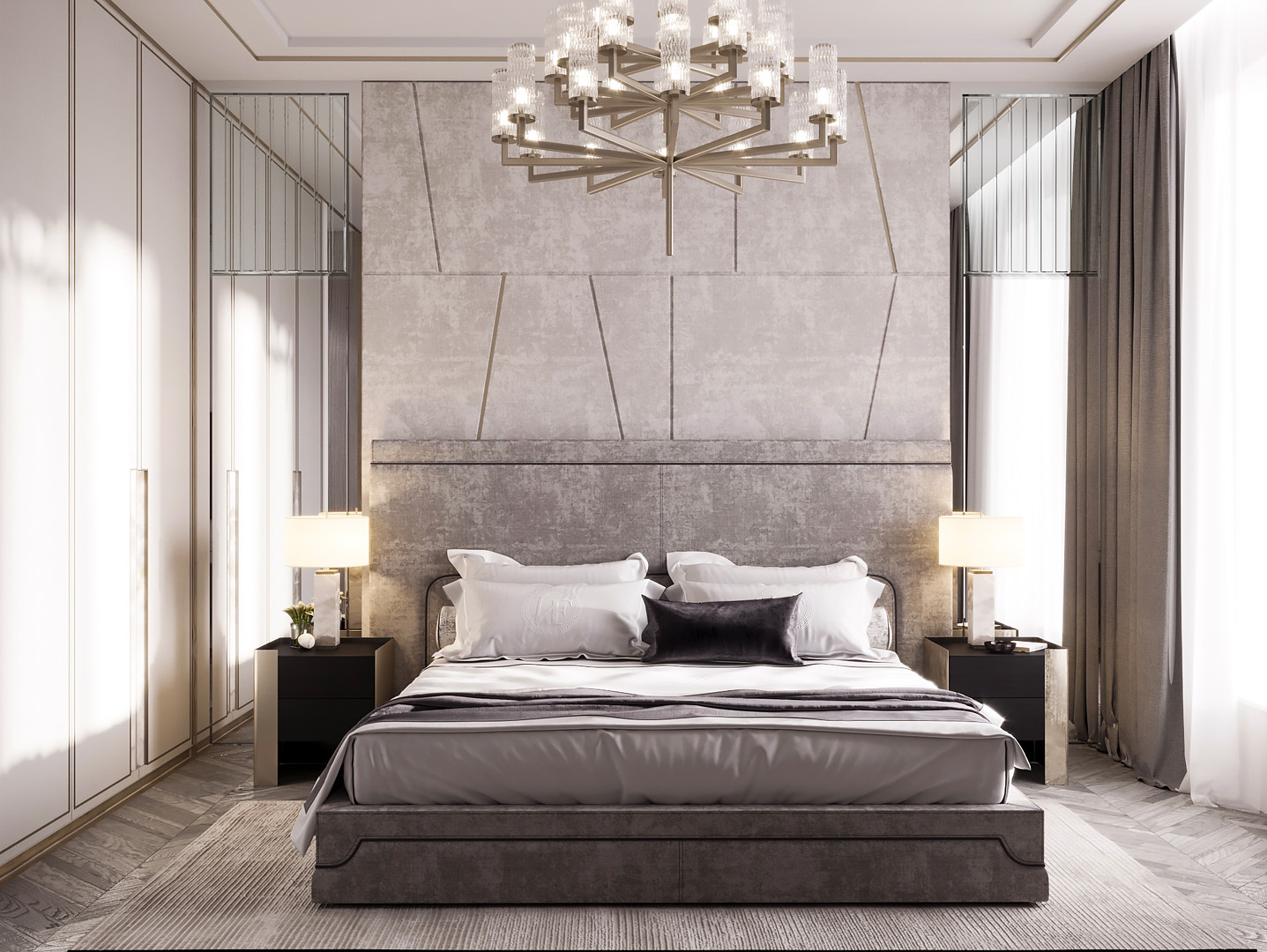
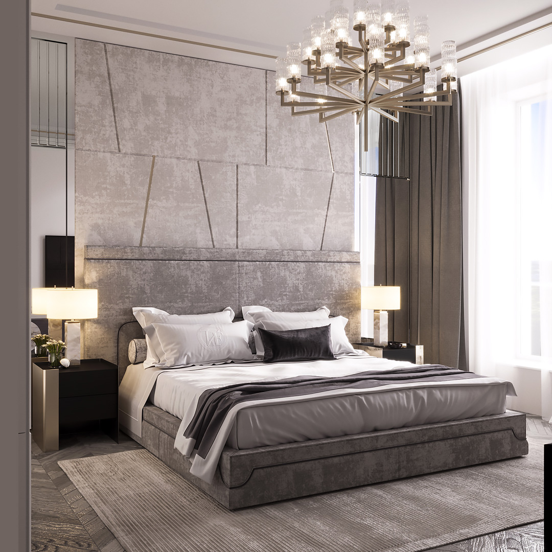
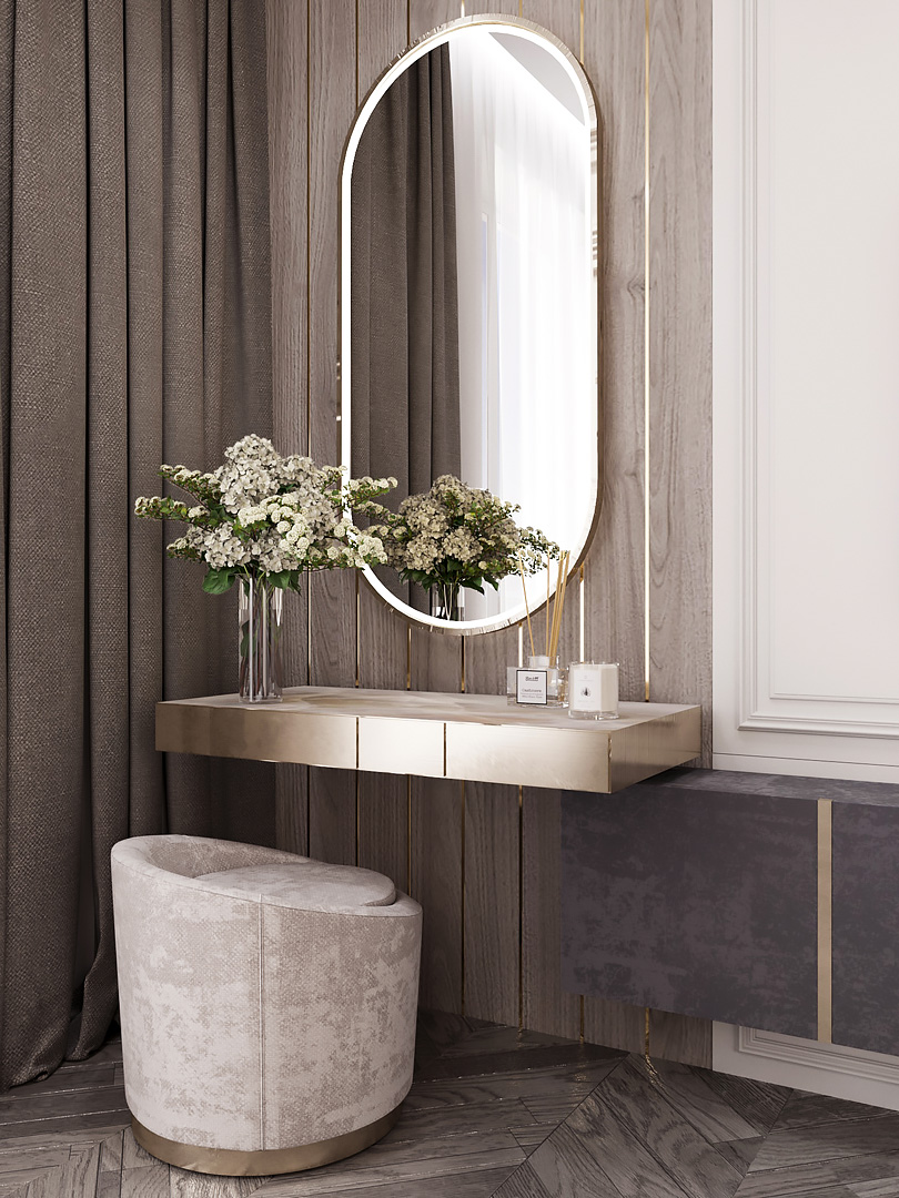
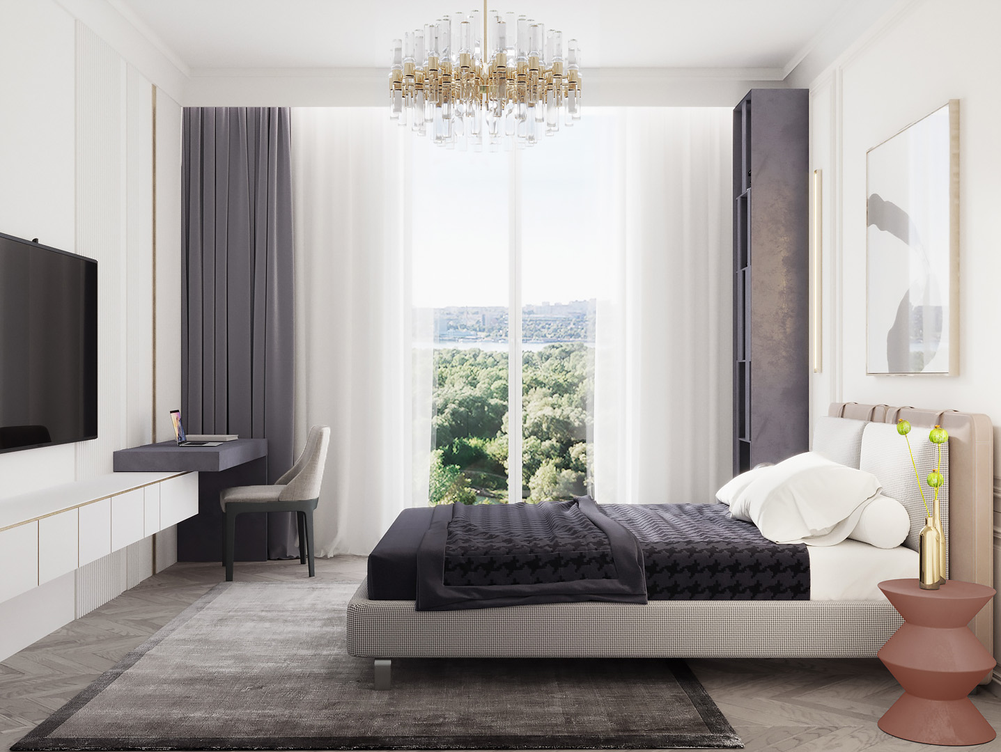
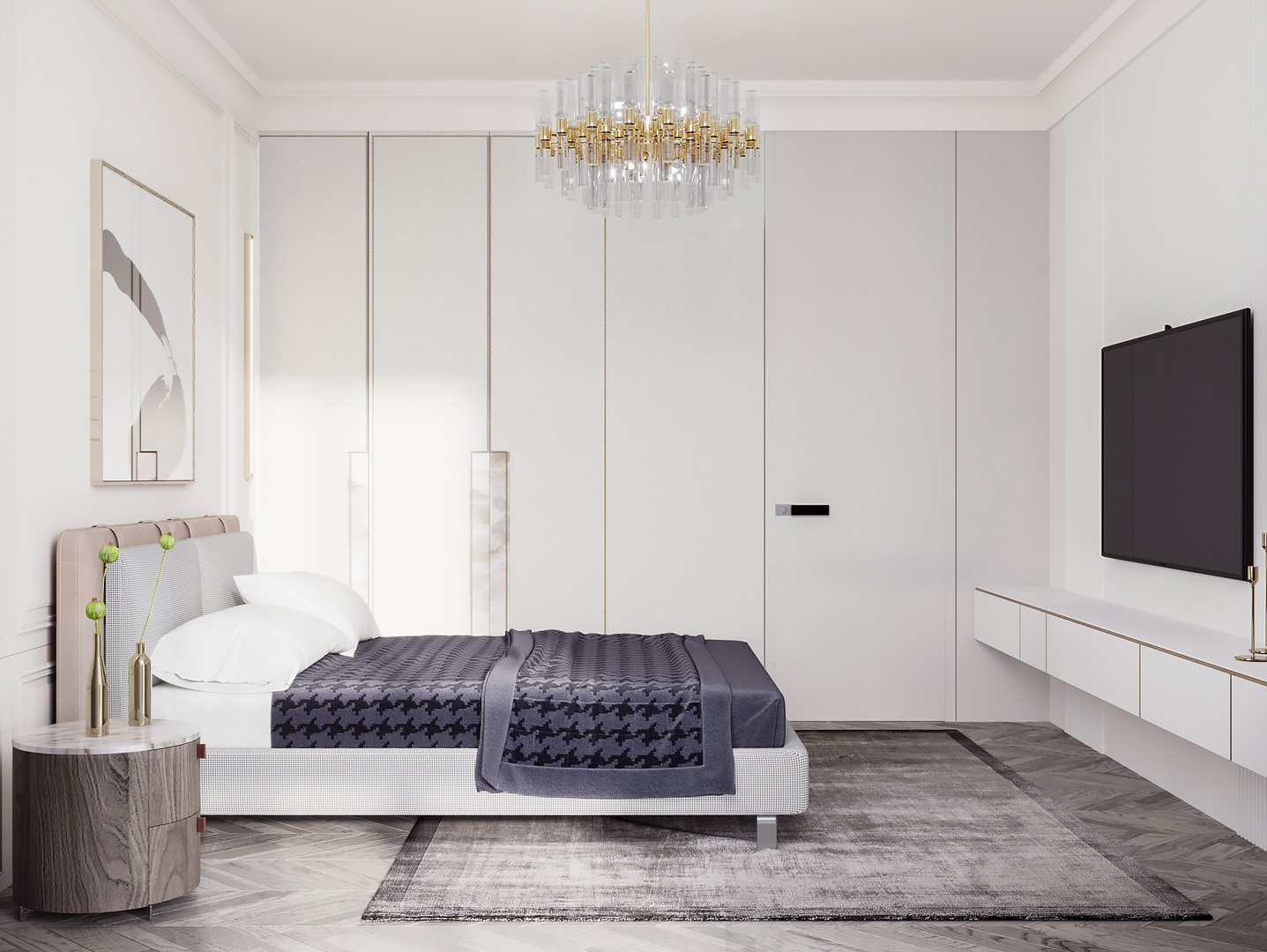
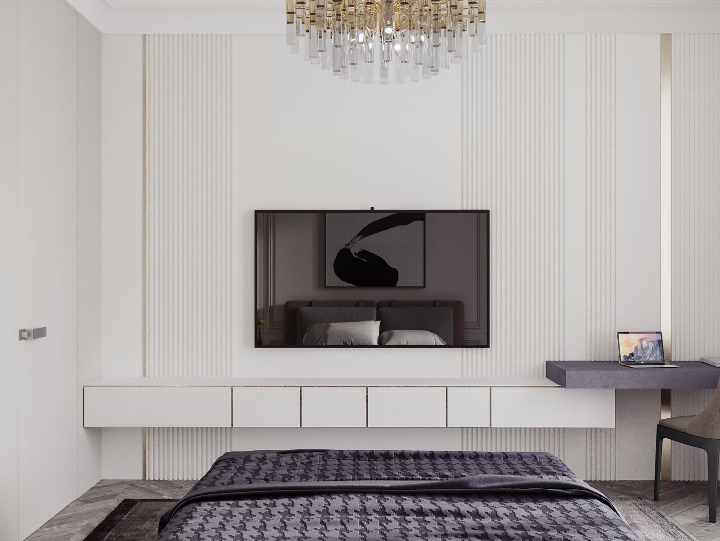
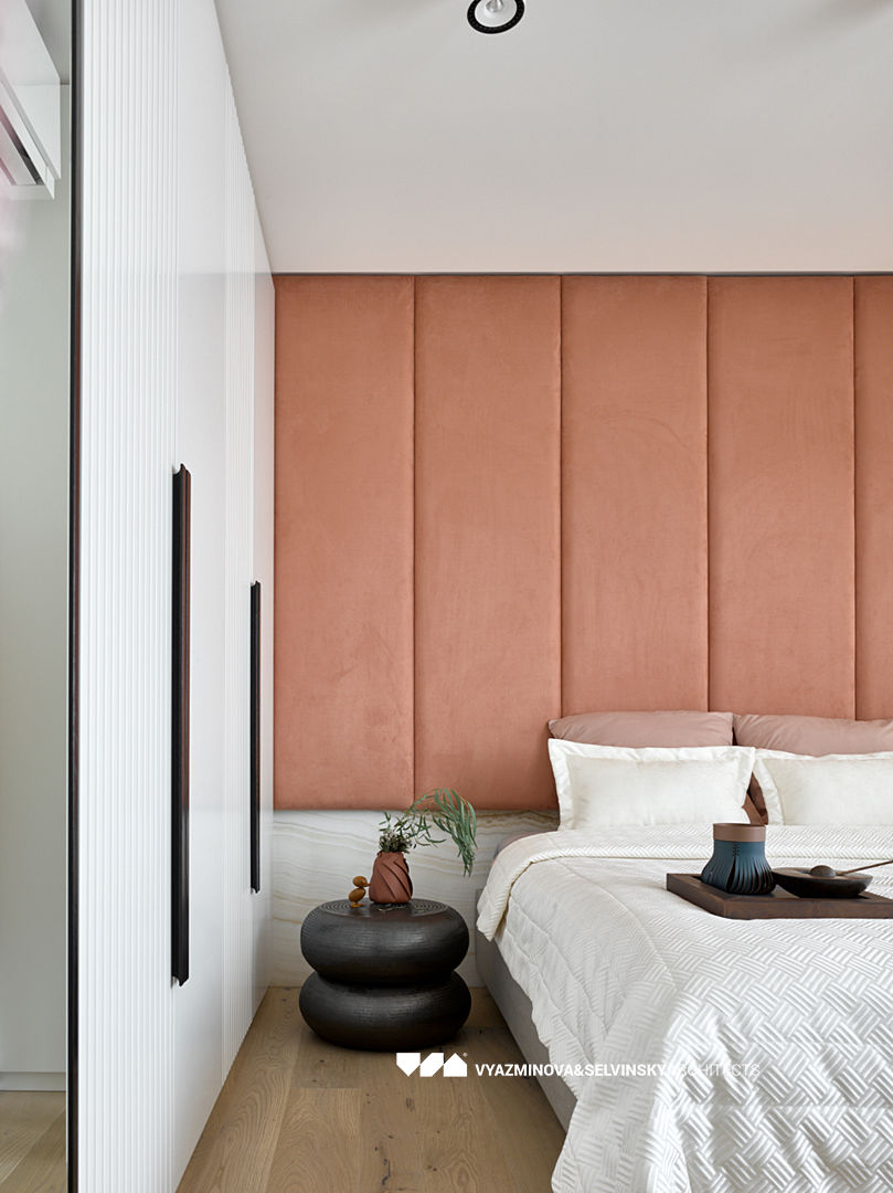
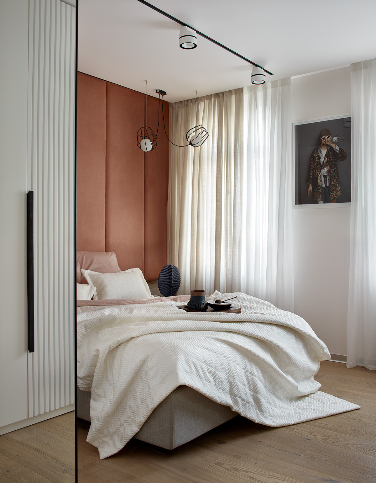
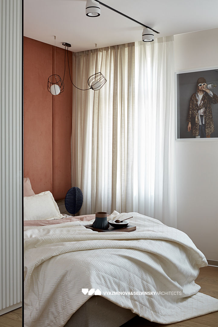
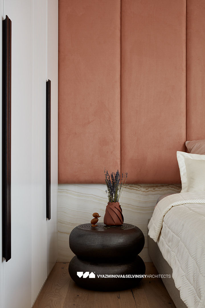
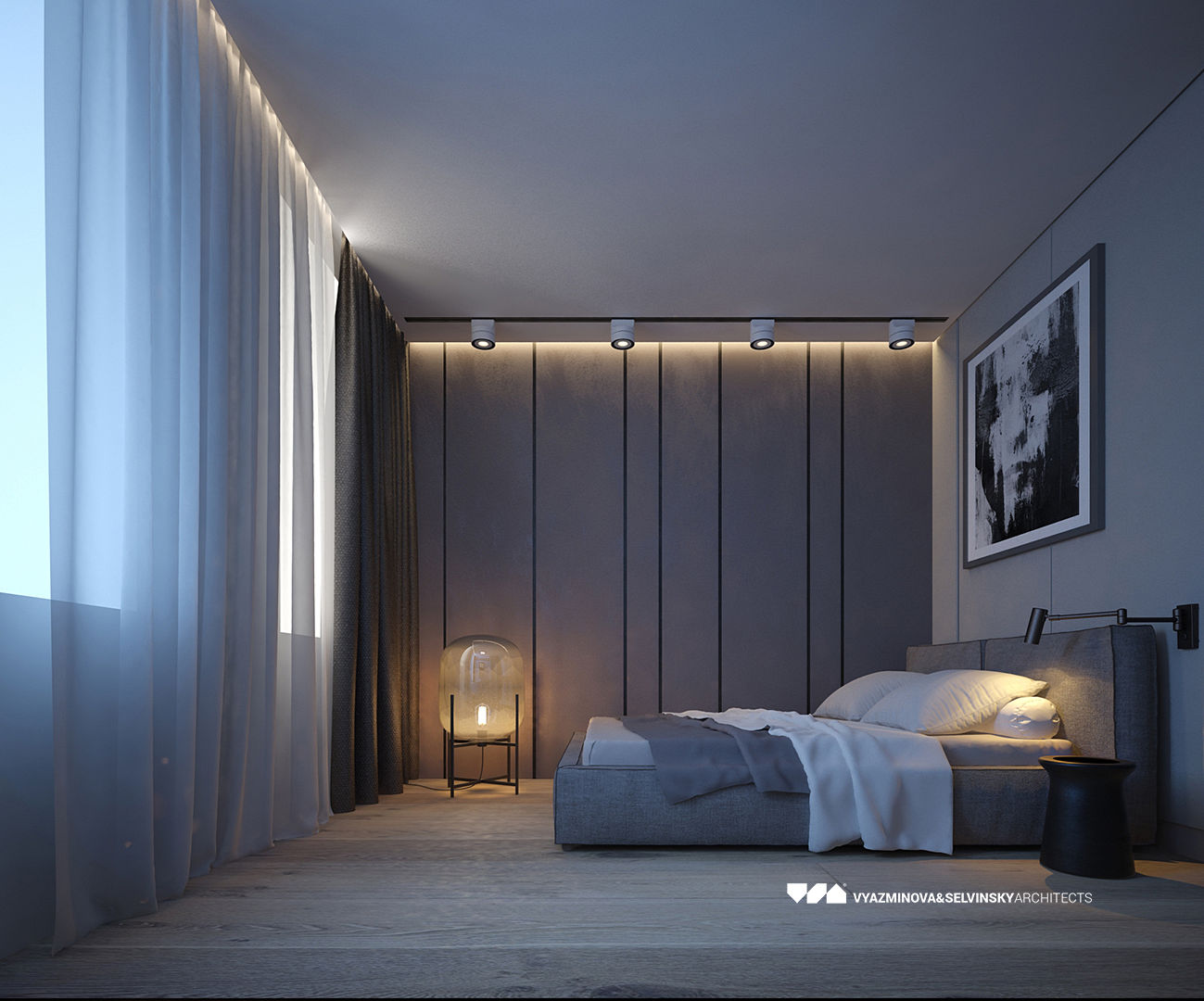
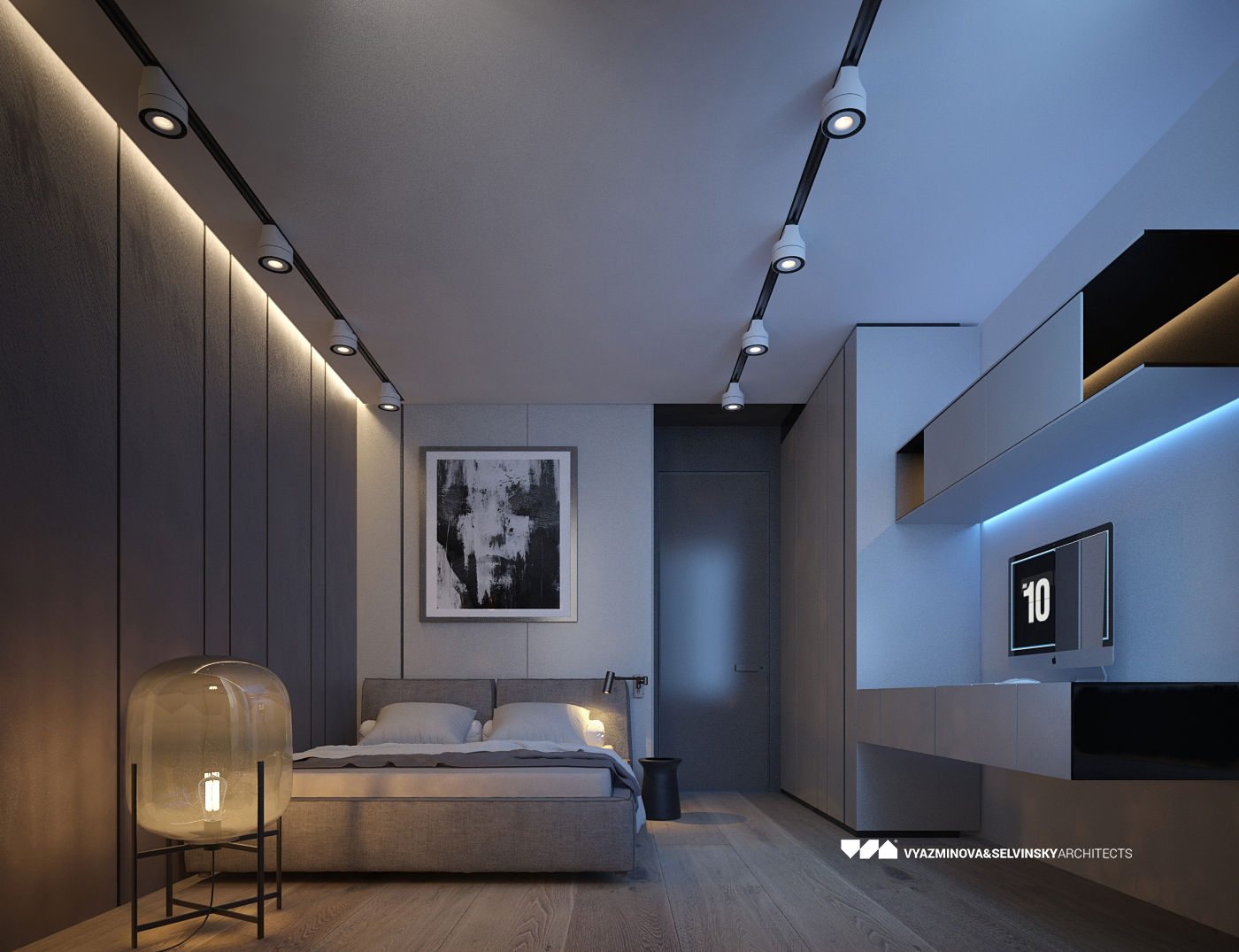
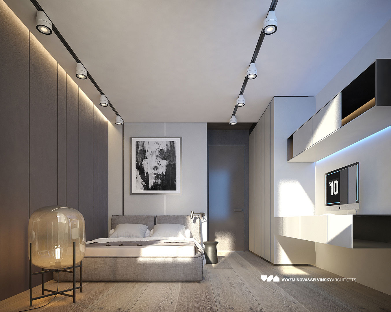
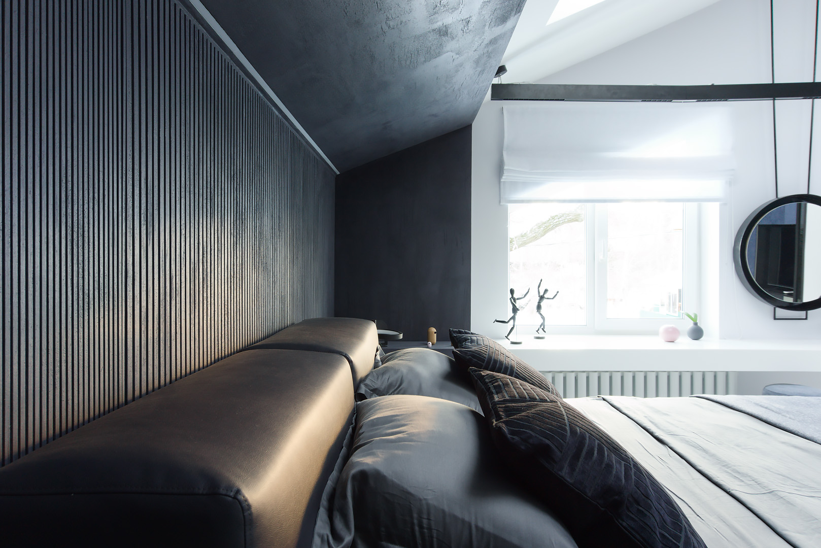
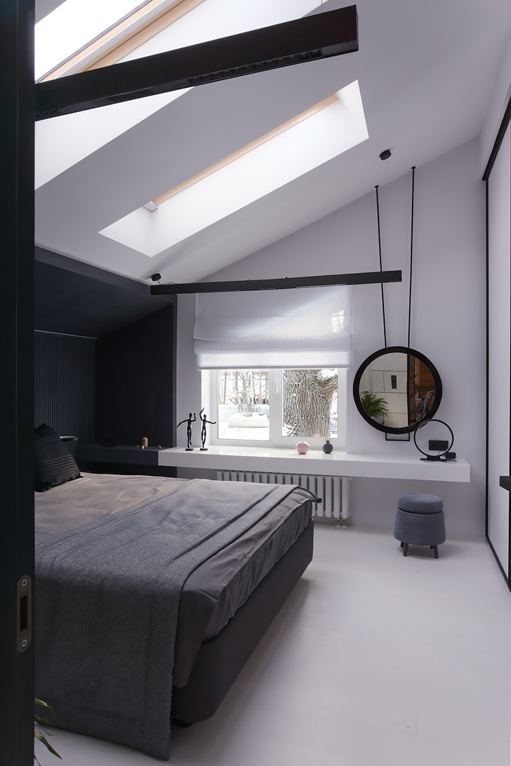
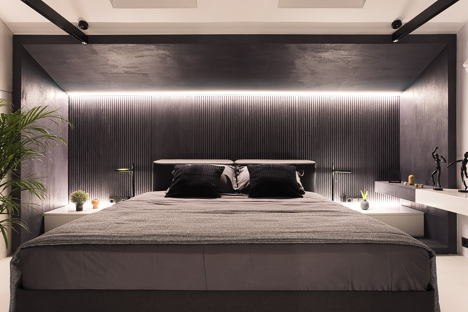
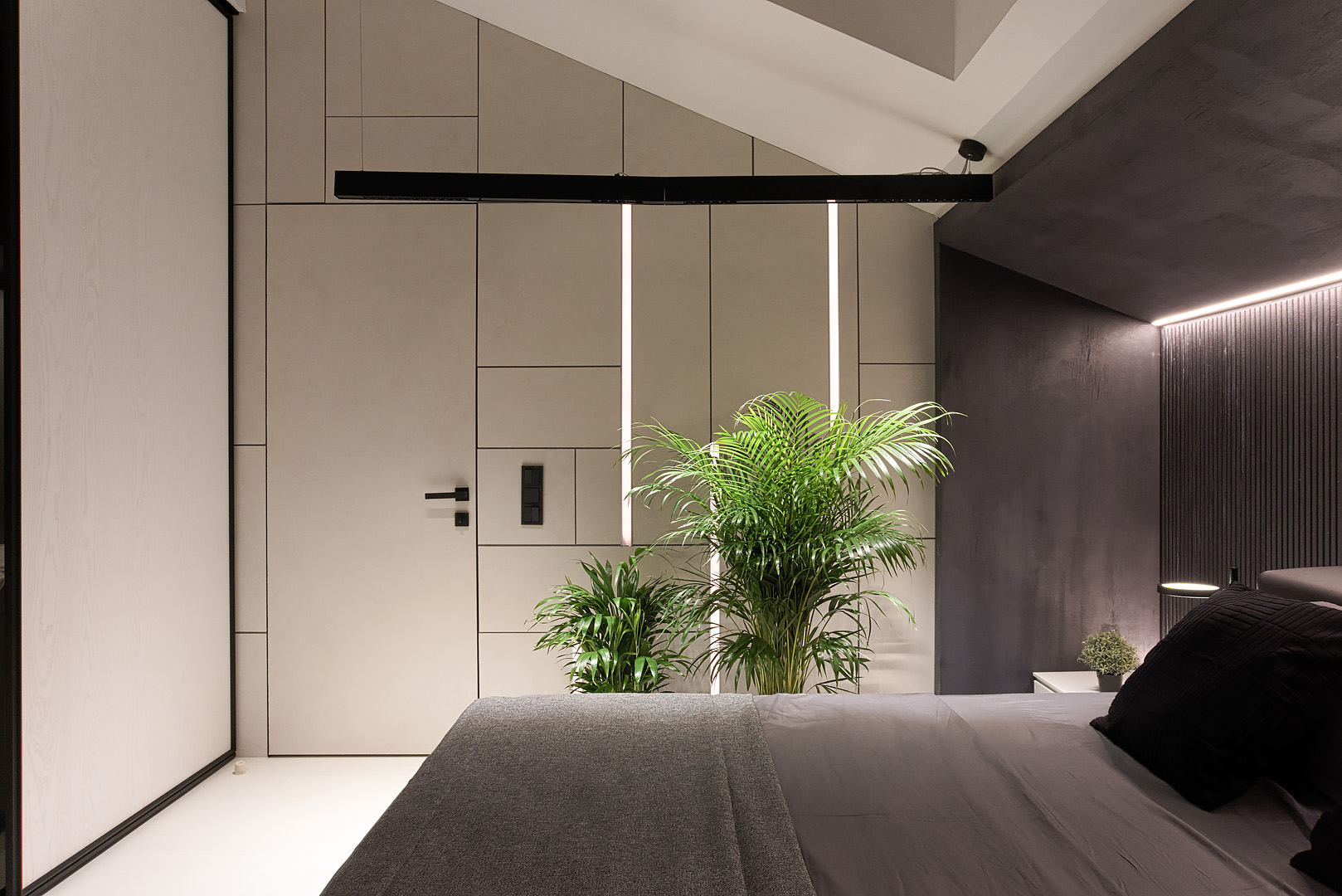
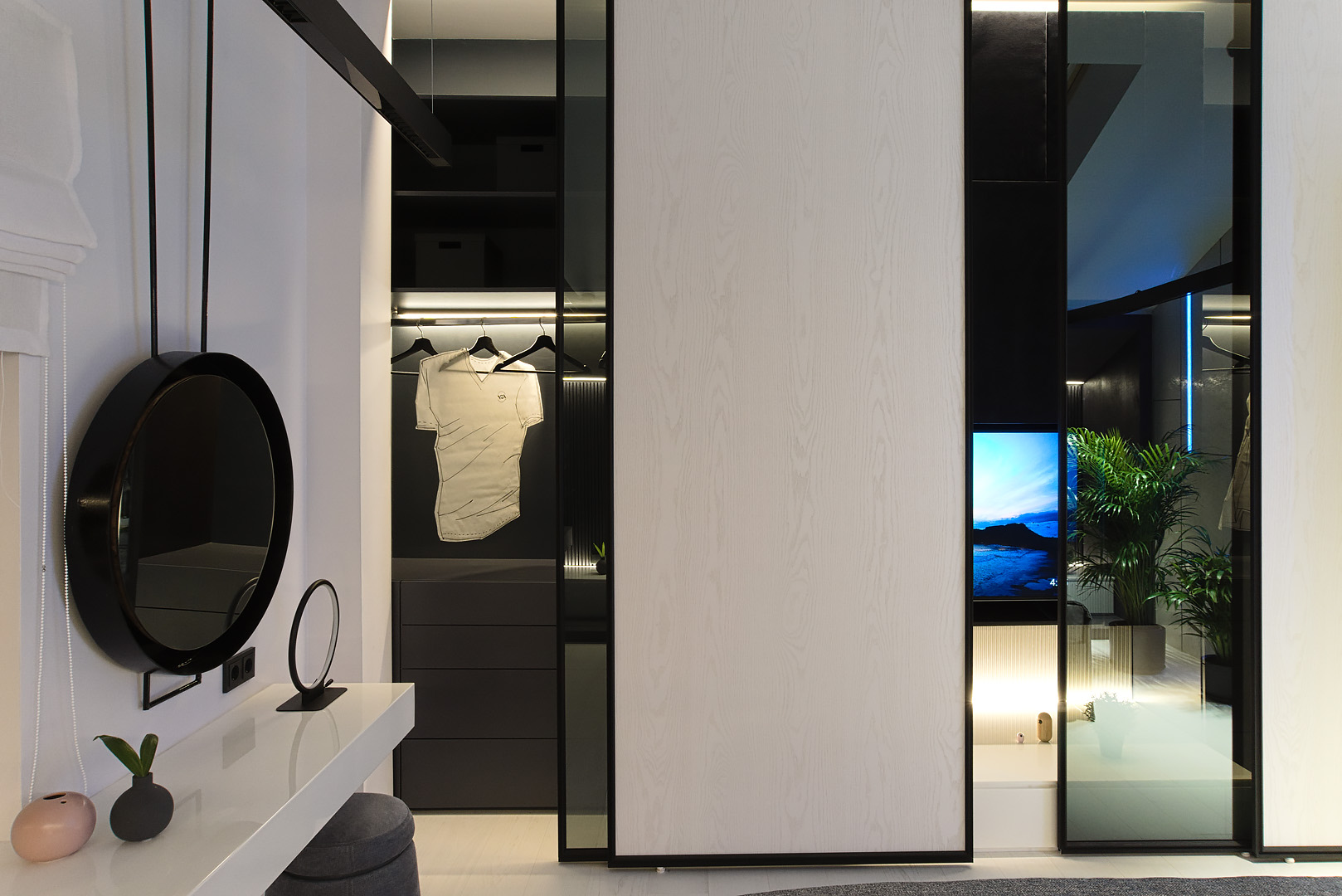
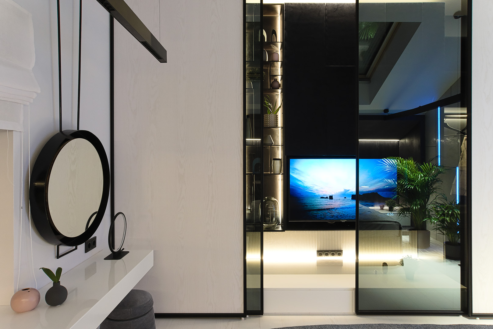
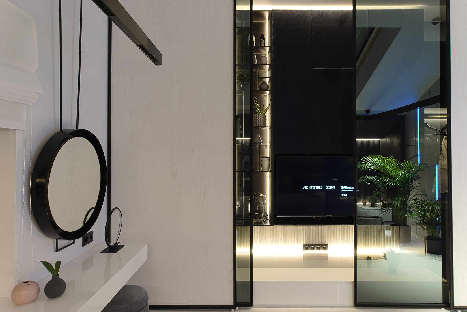
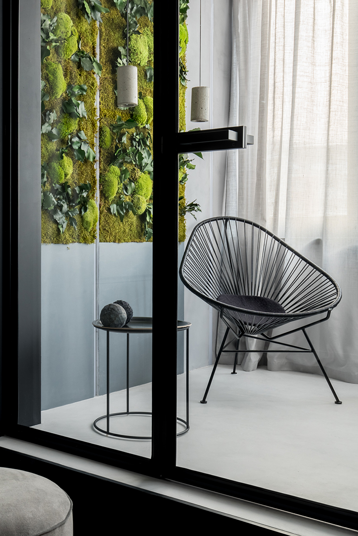
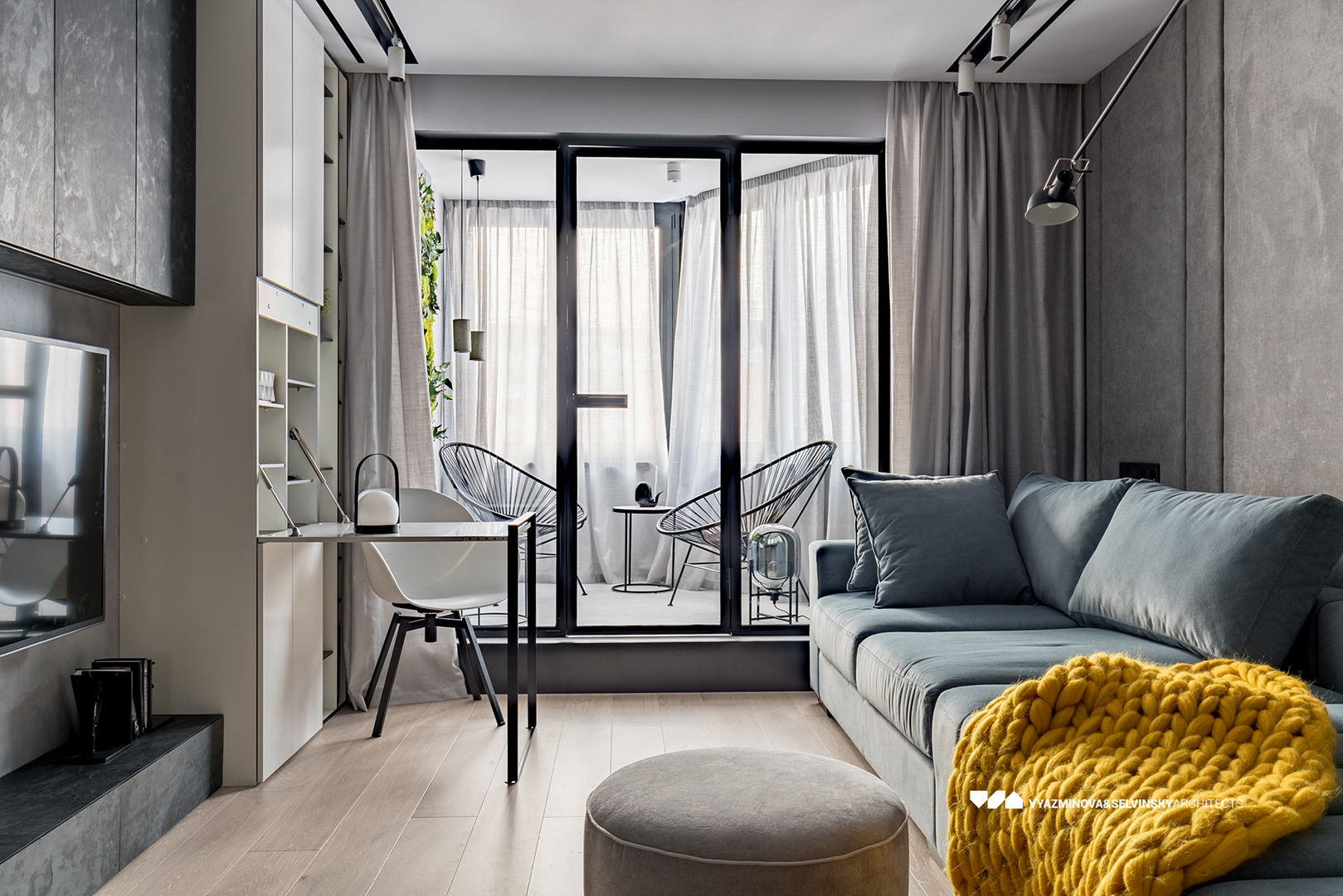
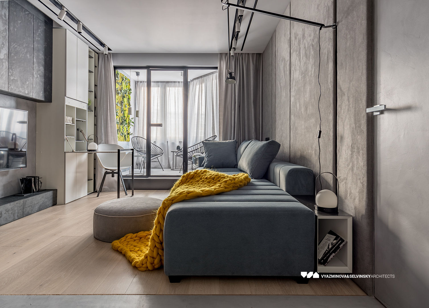
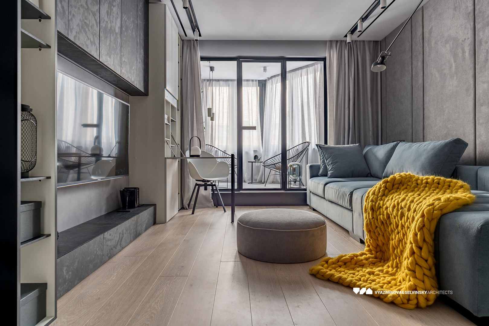
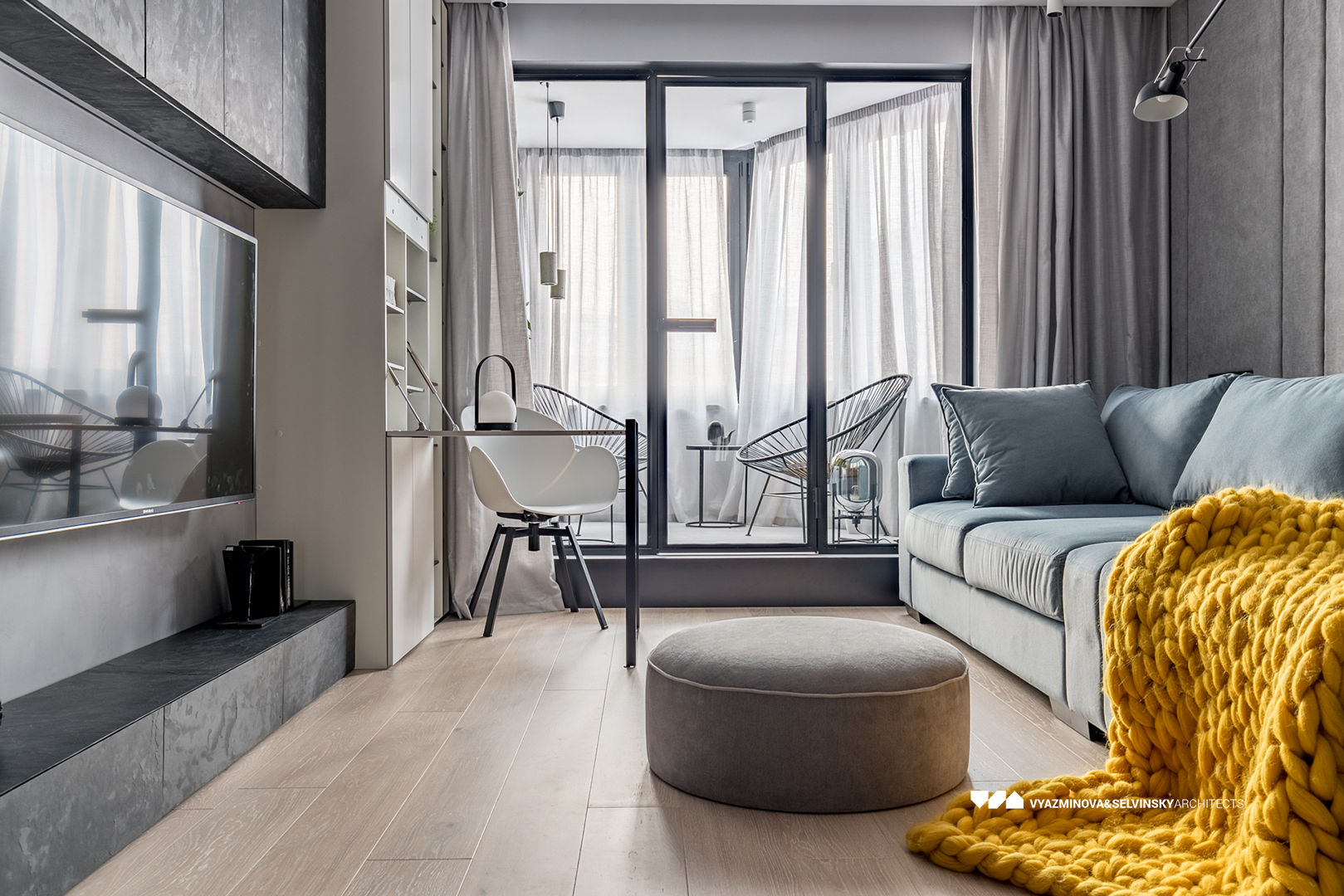
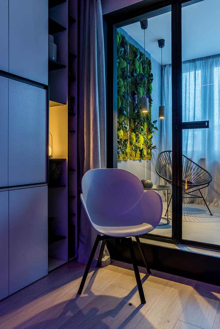
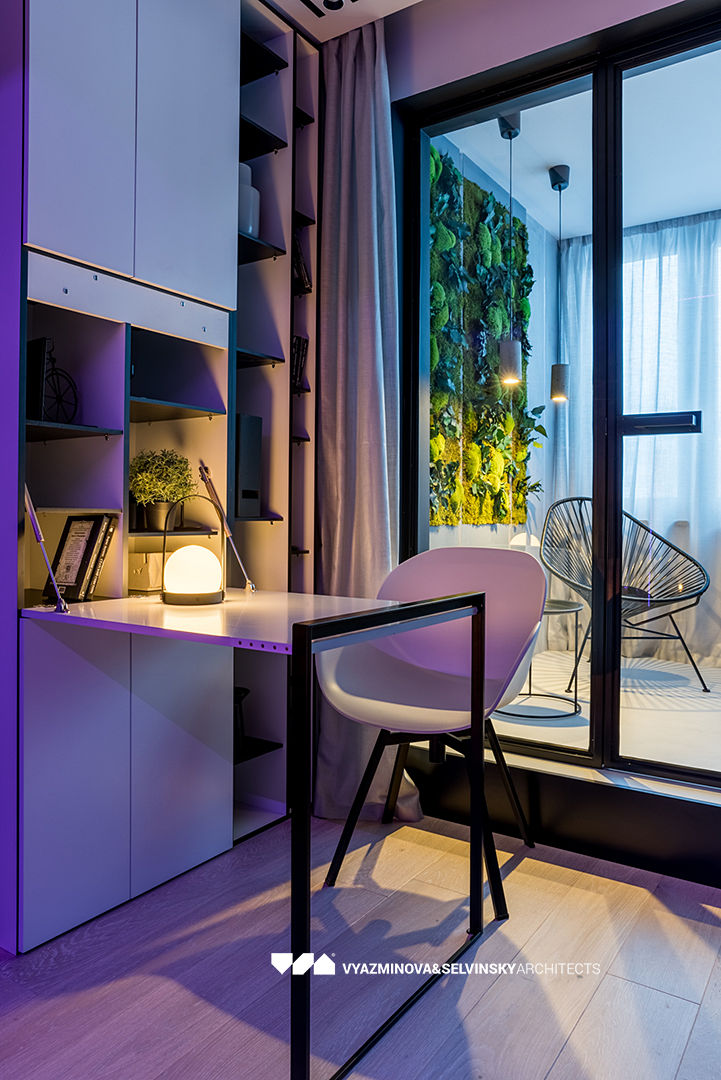
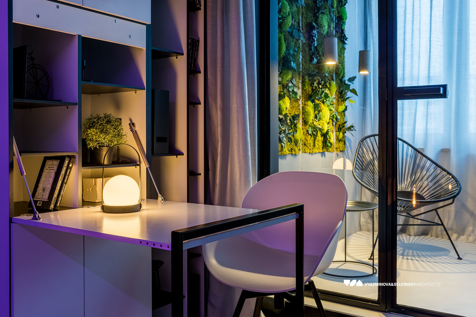
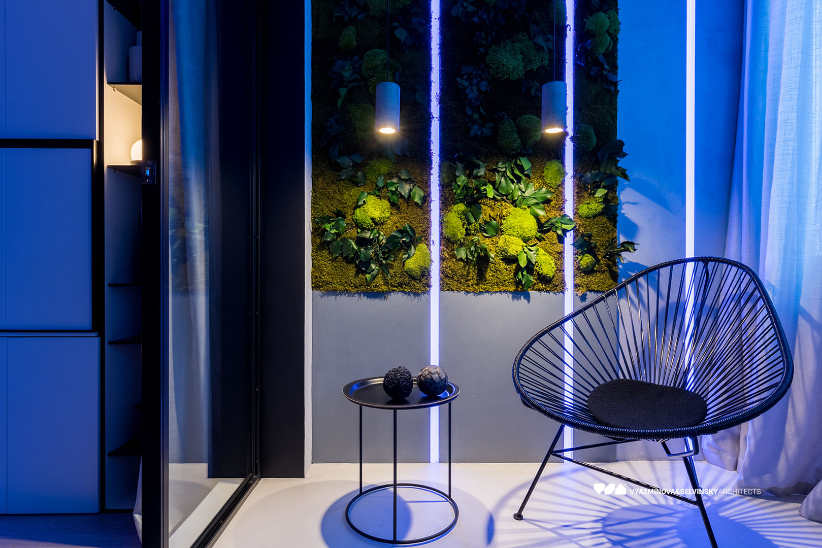
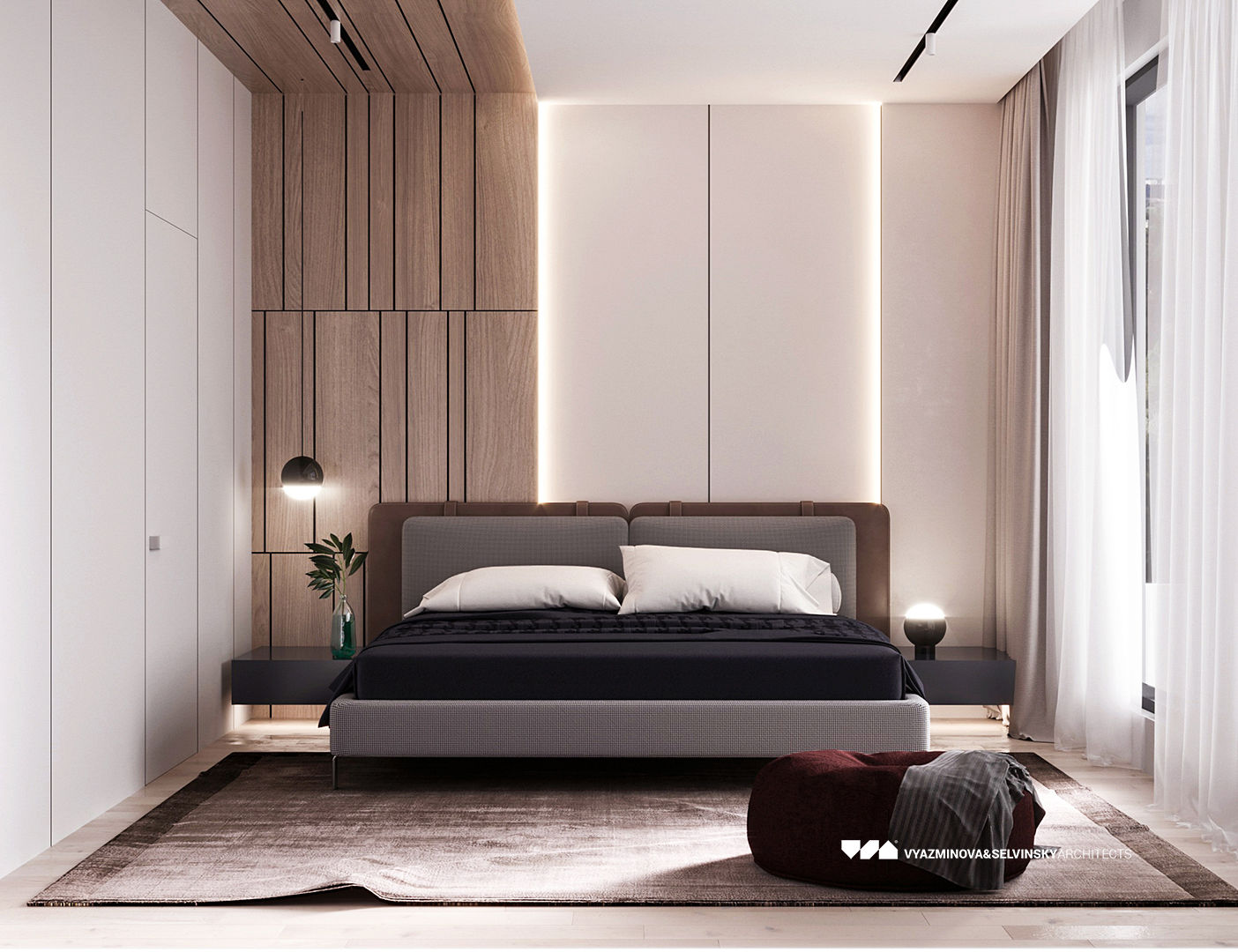
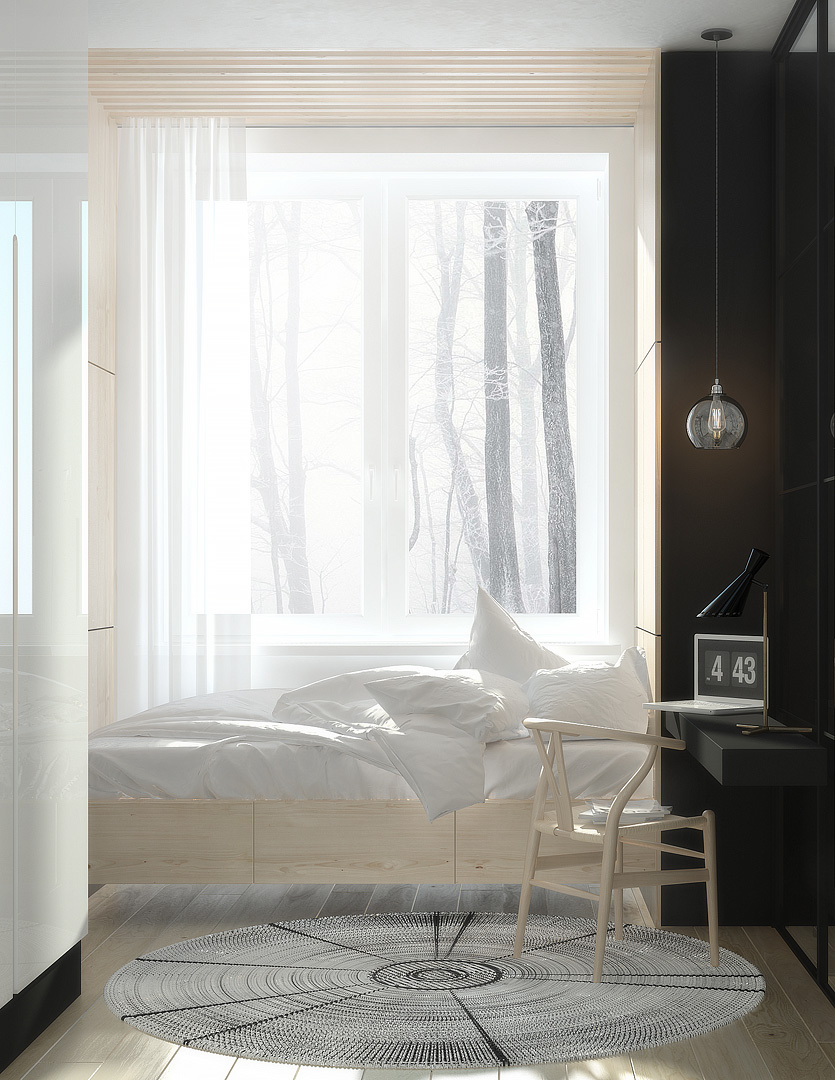
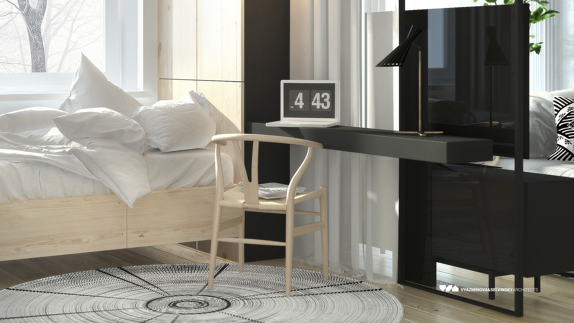
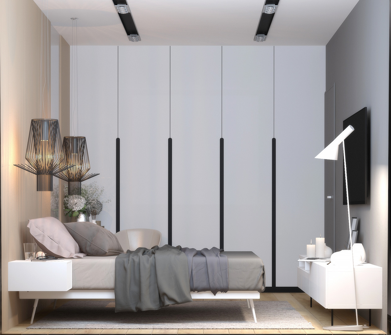
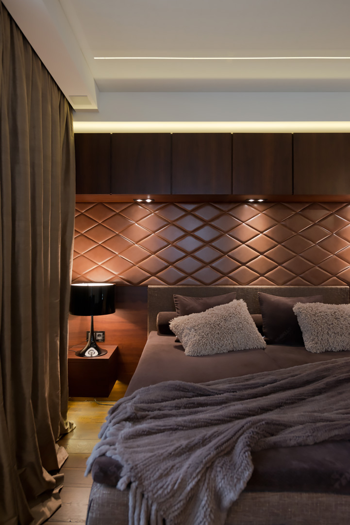
…we didn’t want to limit ourselves to the sleeping function. It is not enough to make just a beautiful interior, it should be interesting and from a technical point of view, be a bit transformer and include additional, not the most obvious functions
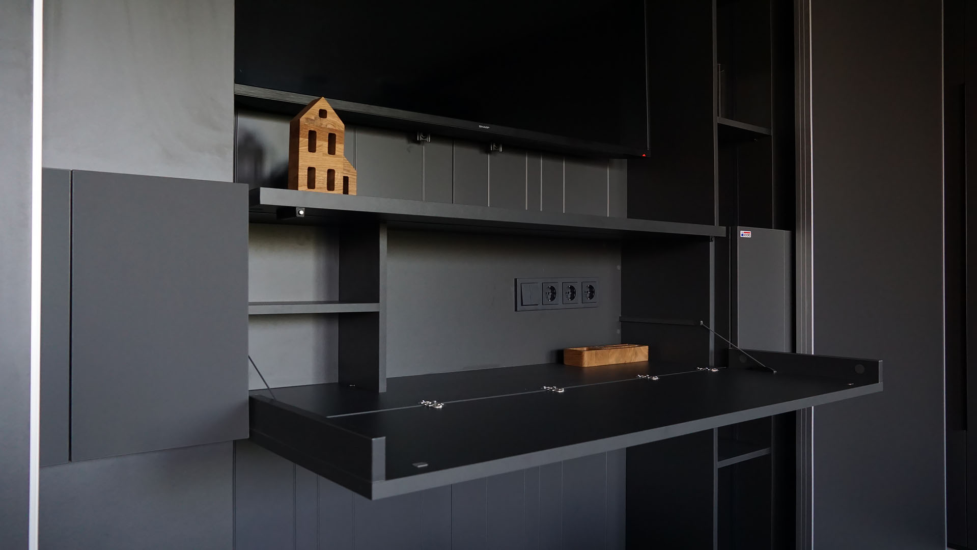
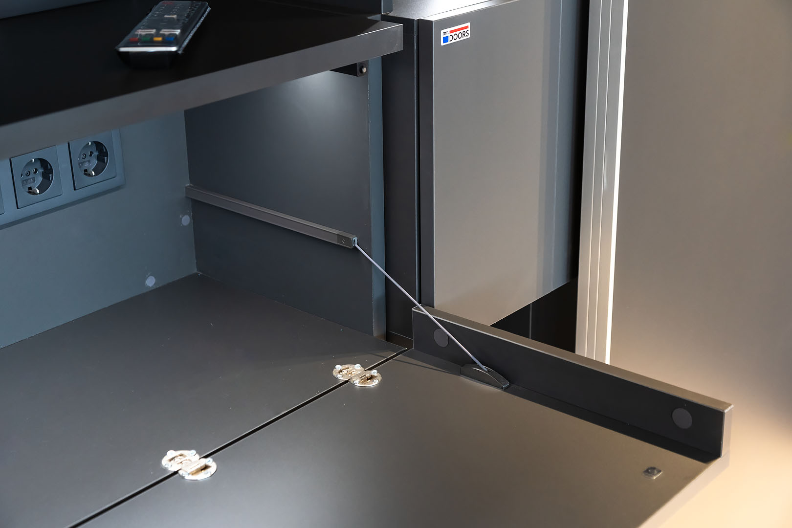
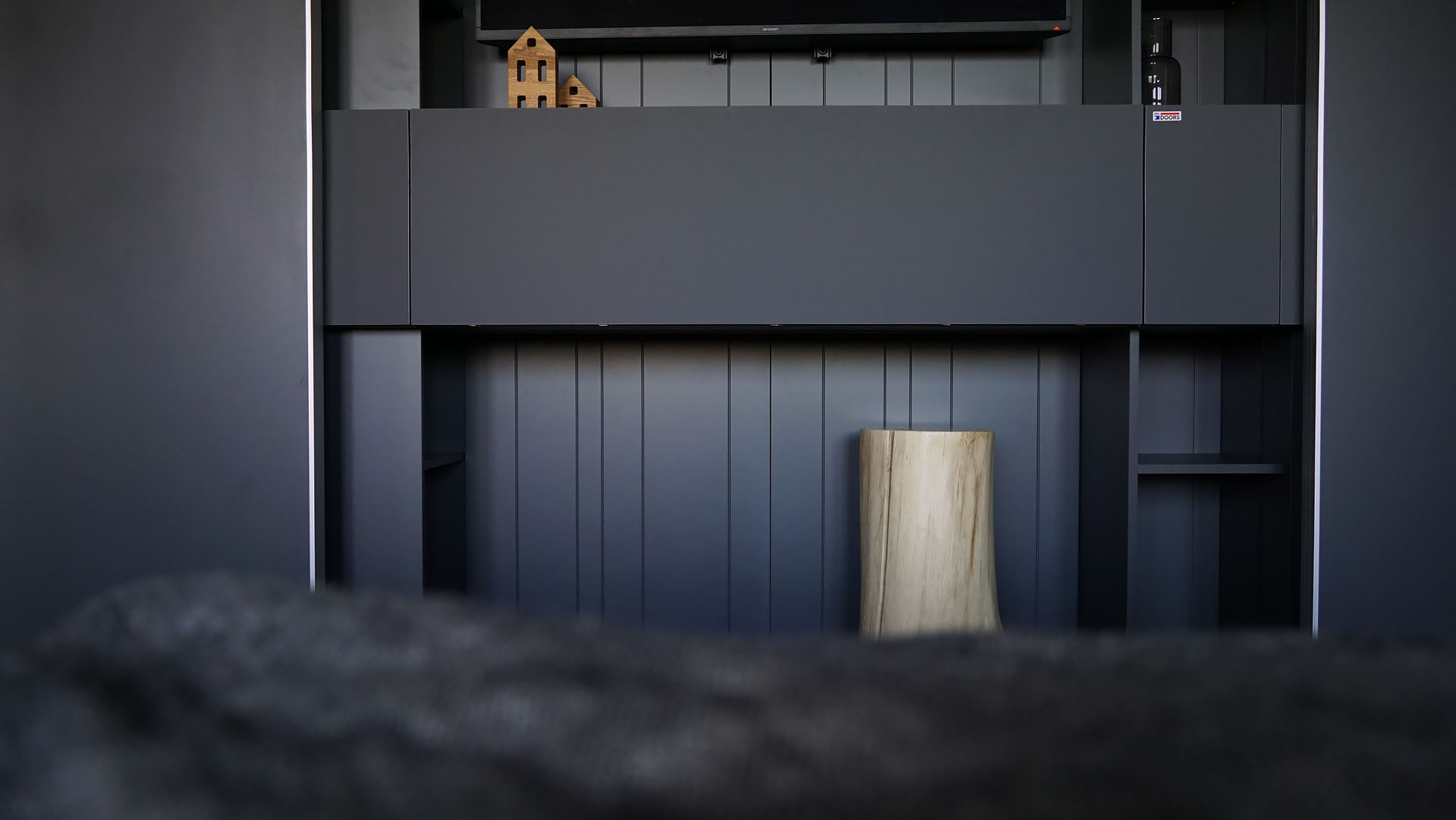
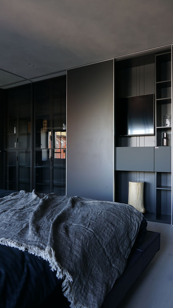
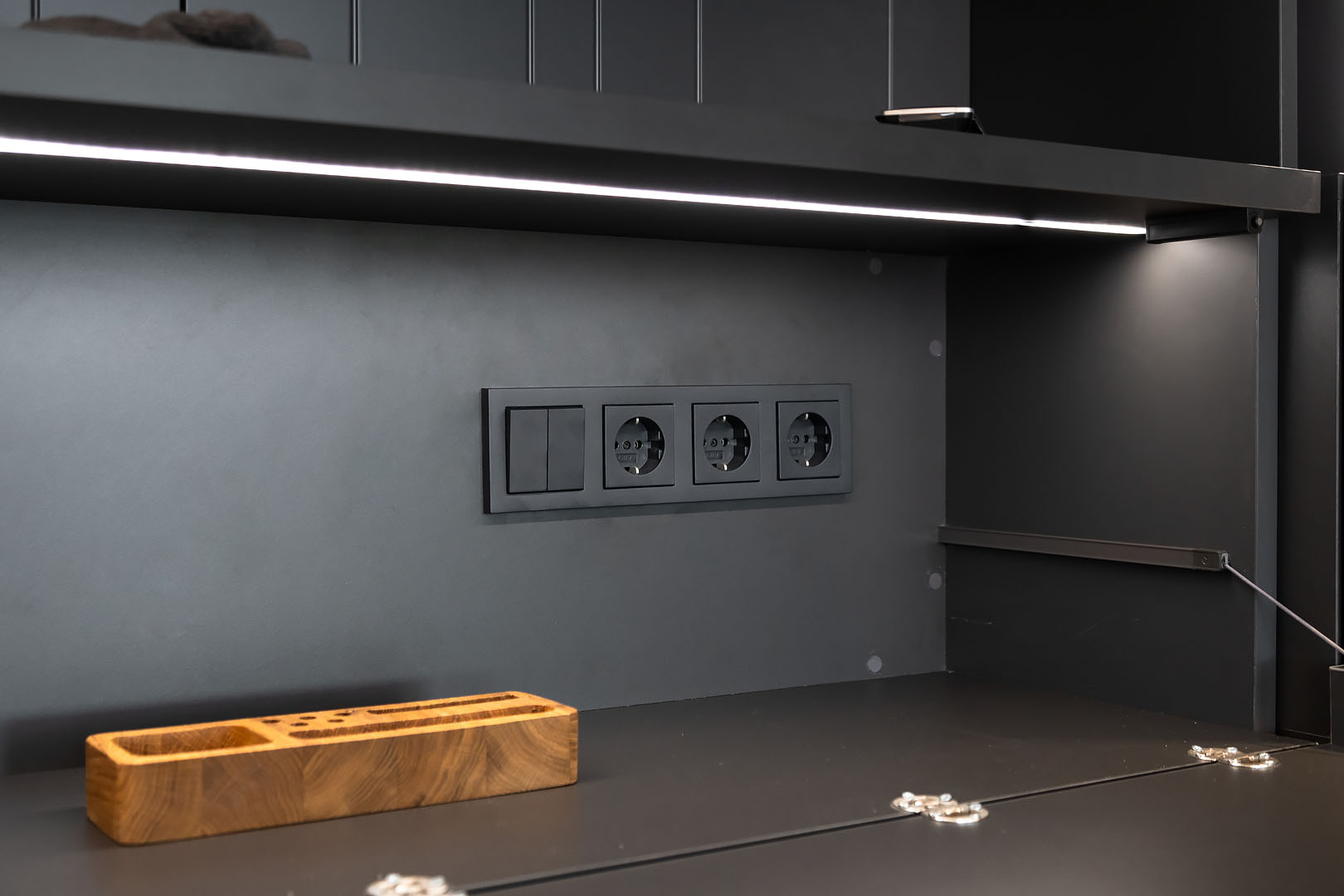
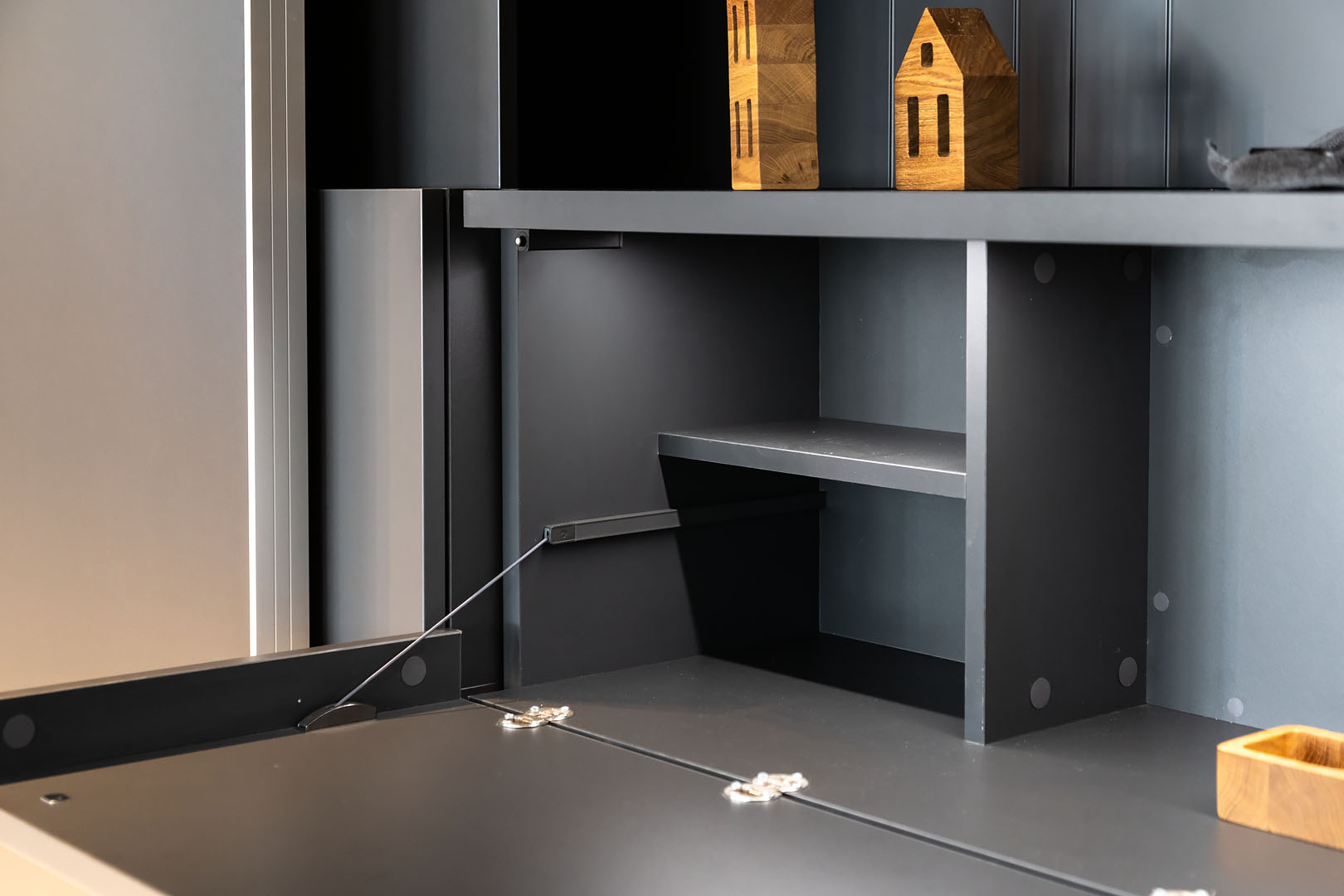
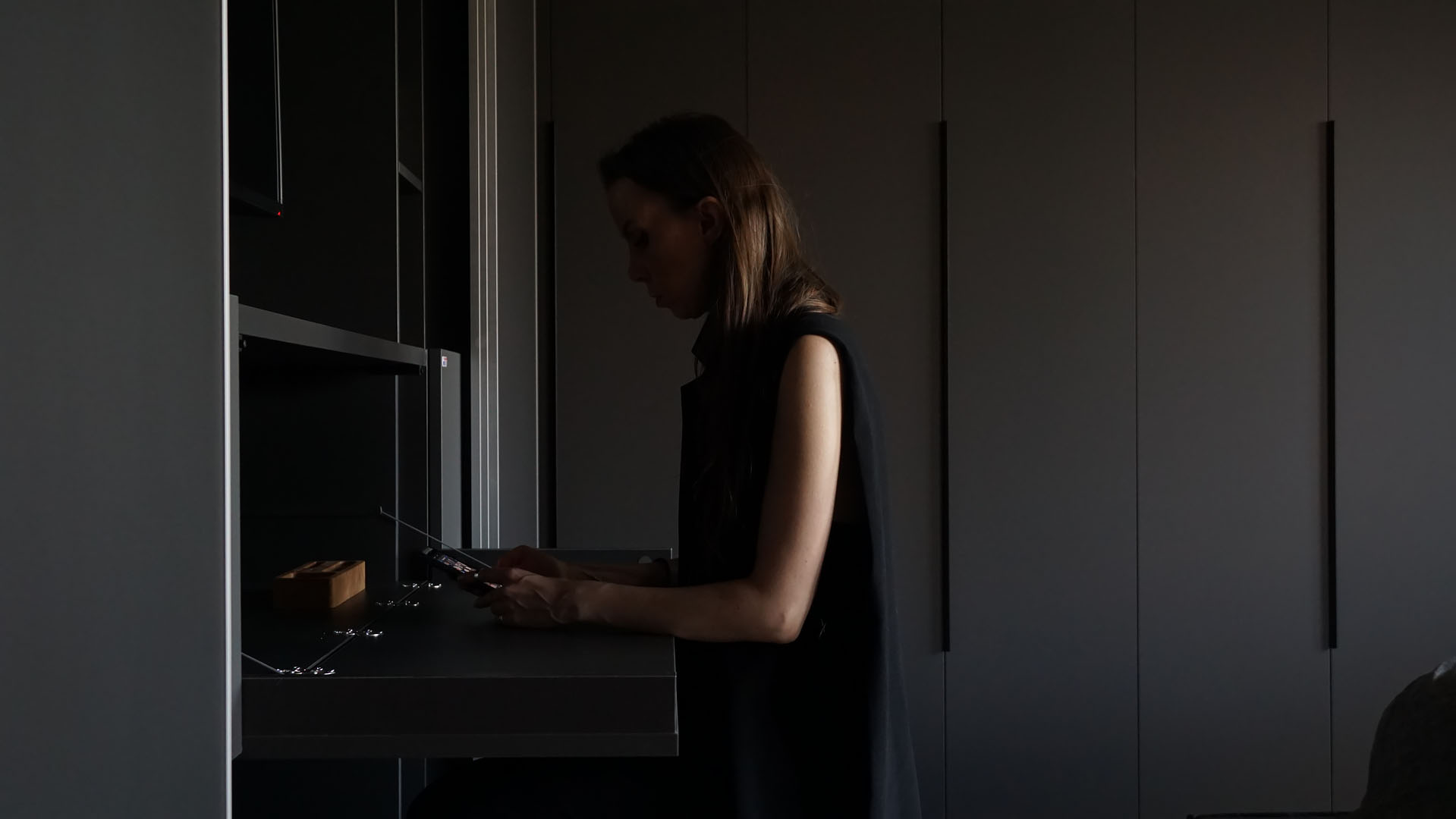
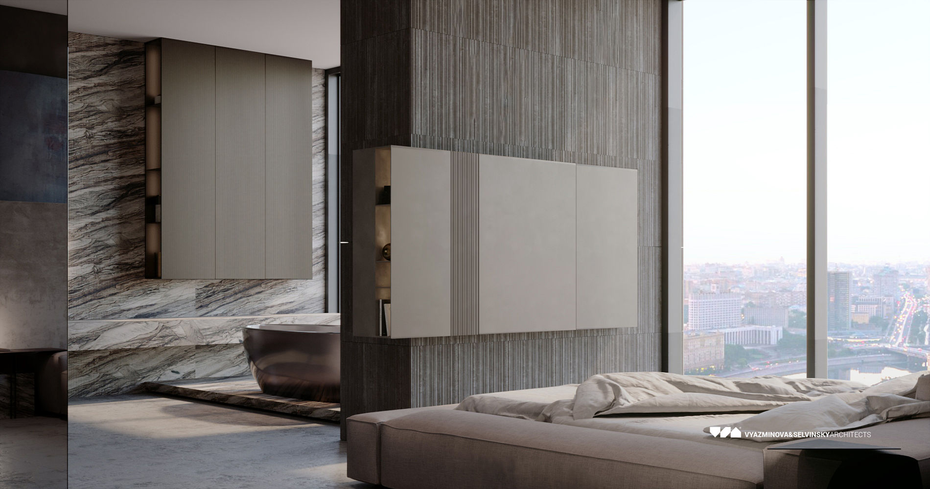
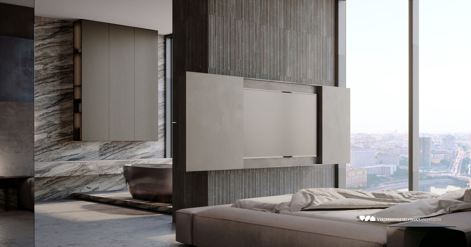
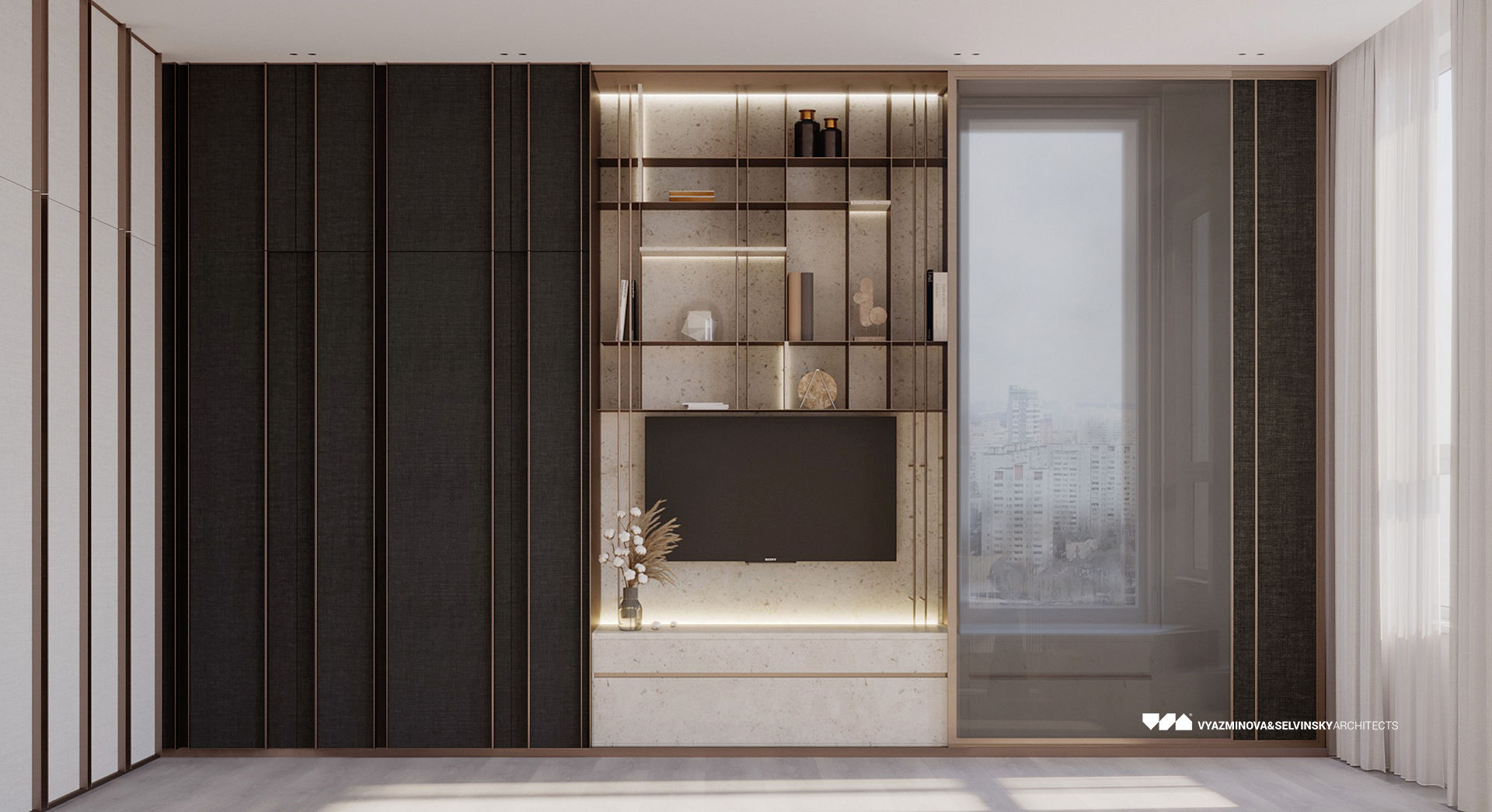
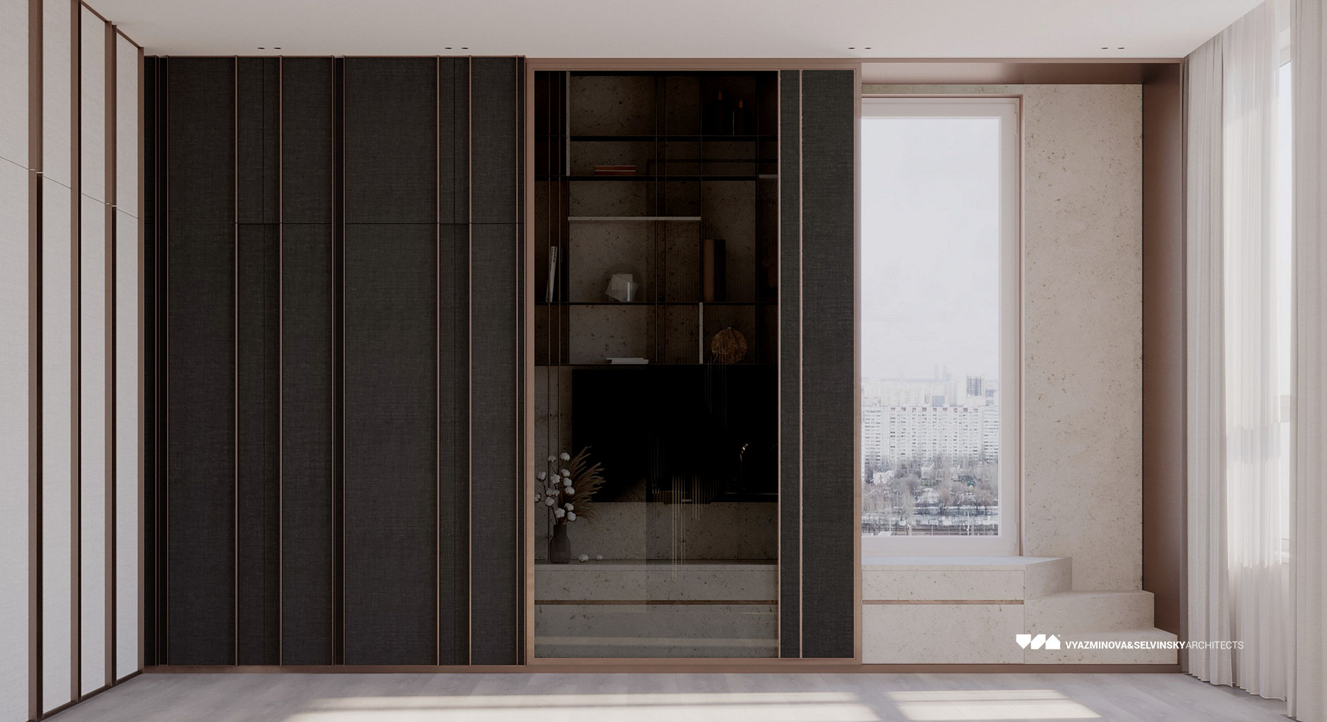
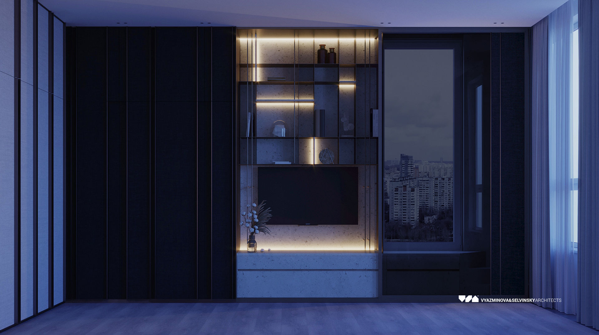
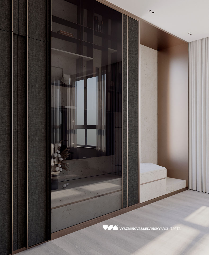
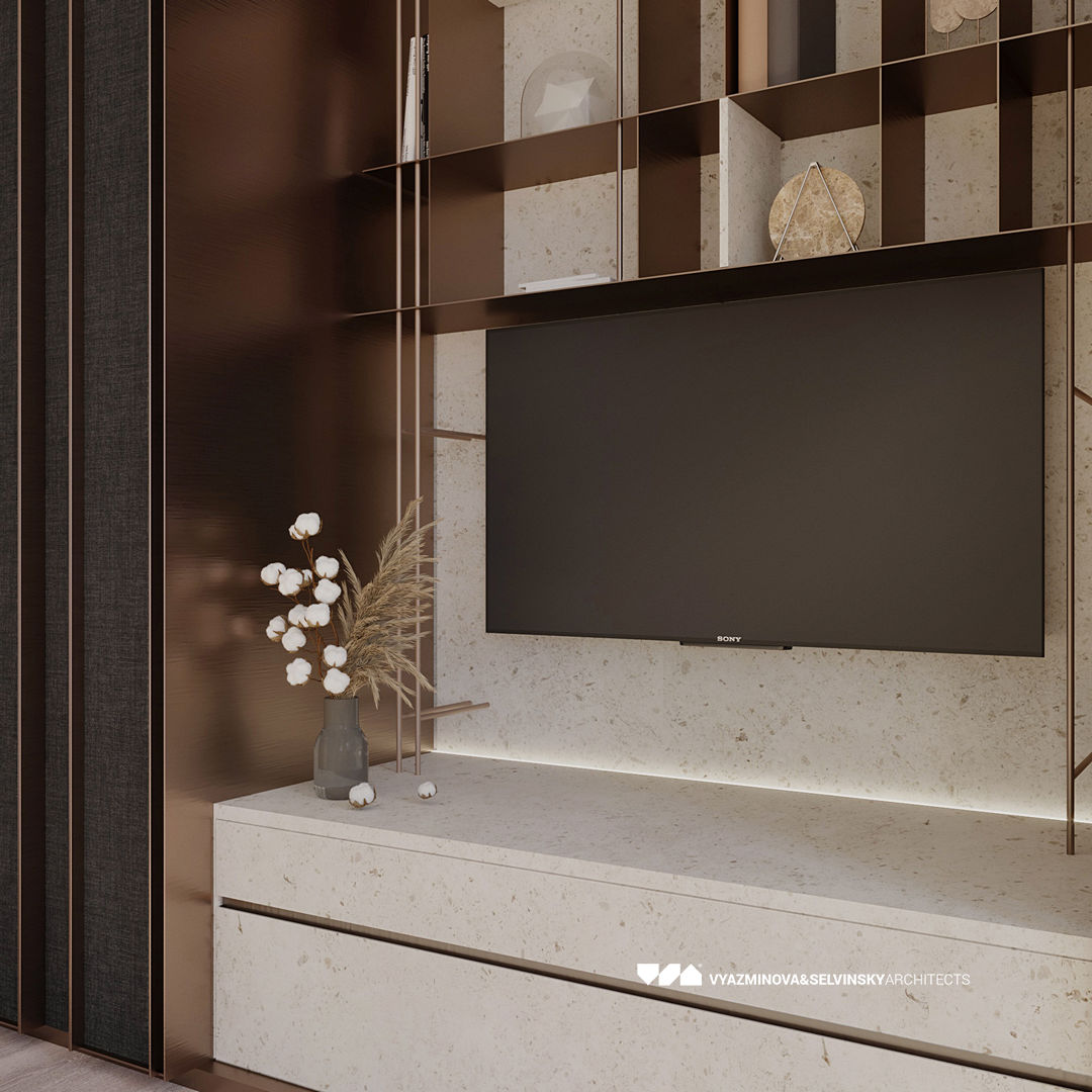
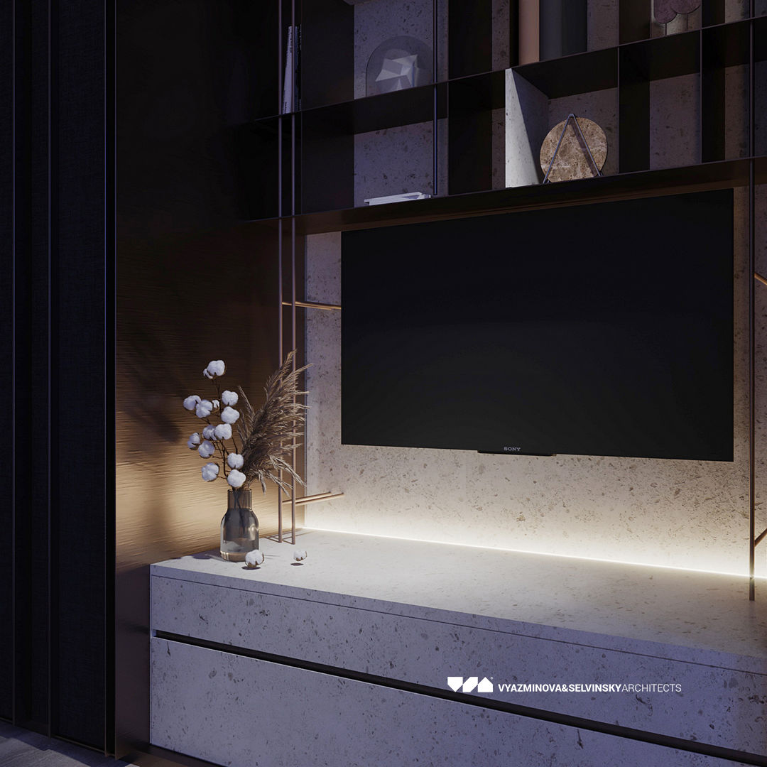
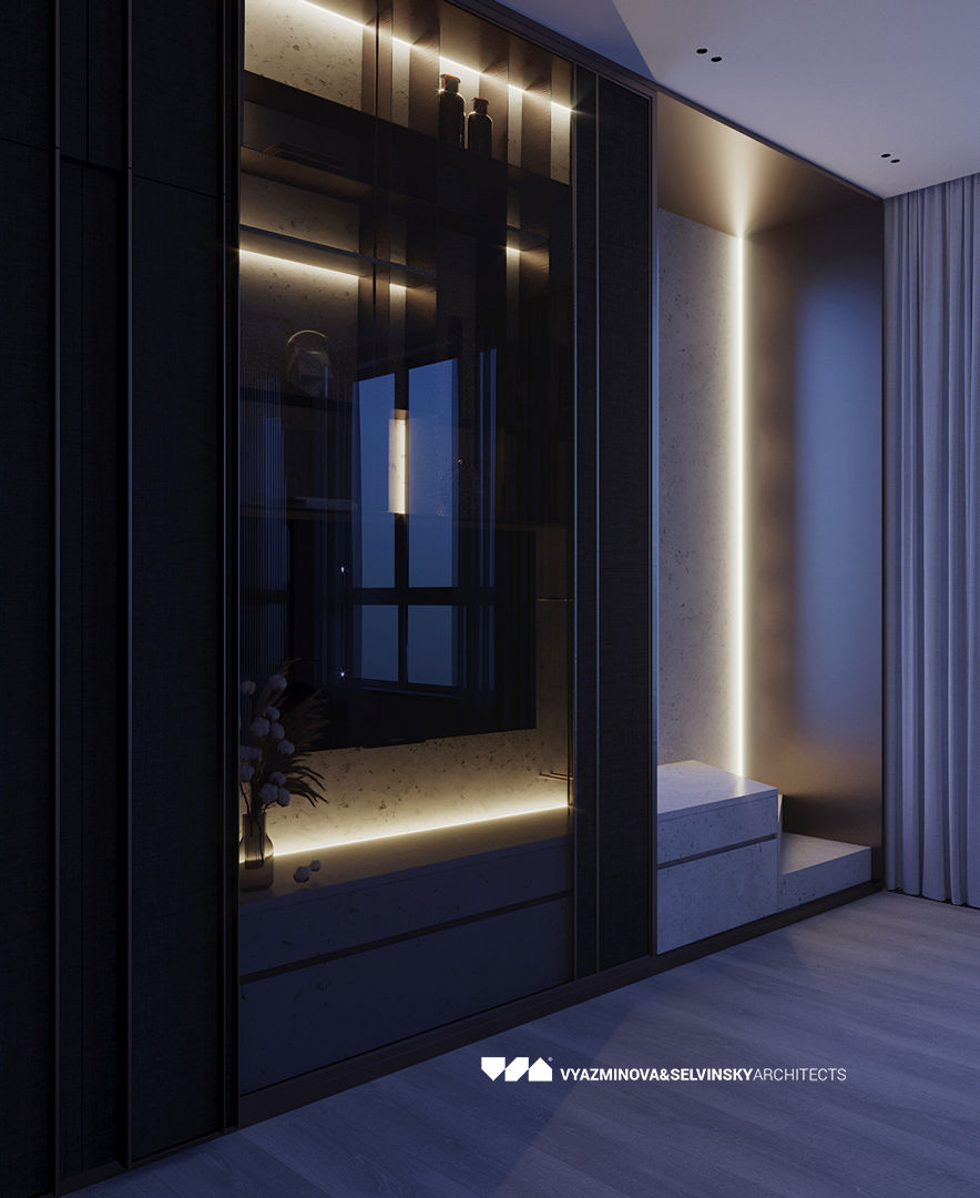
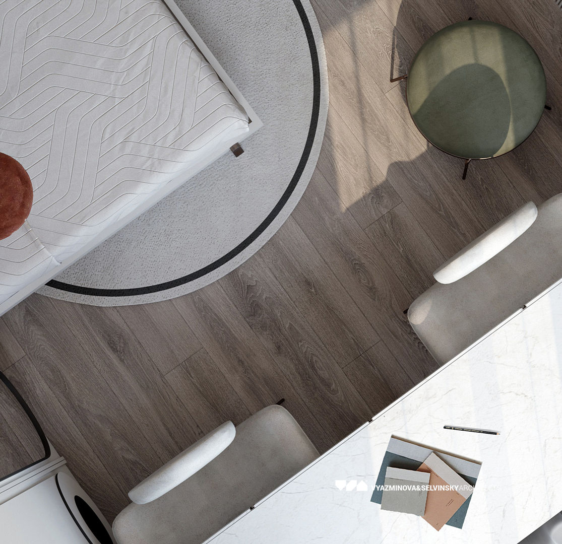
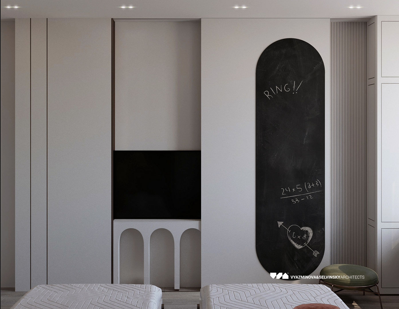
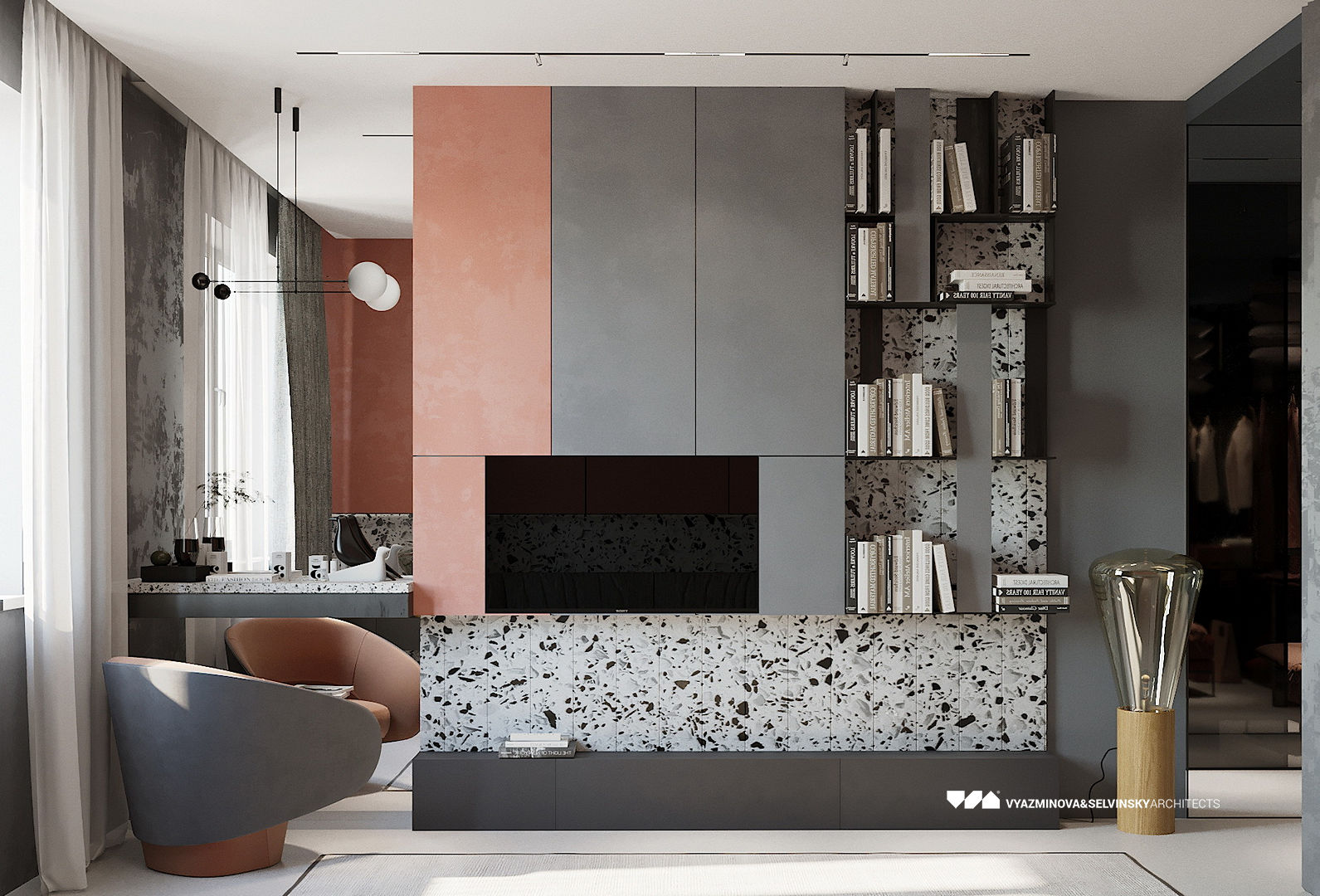
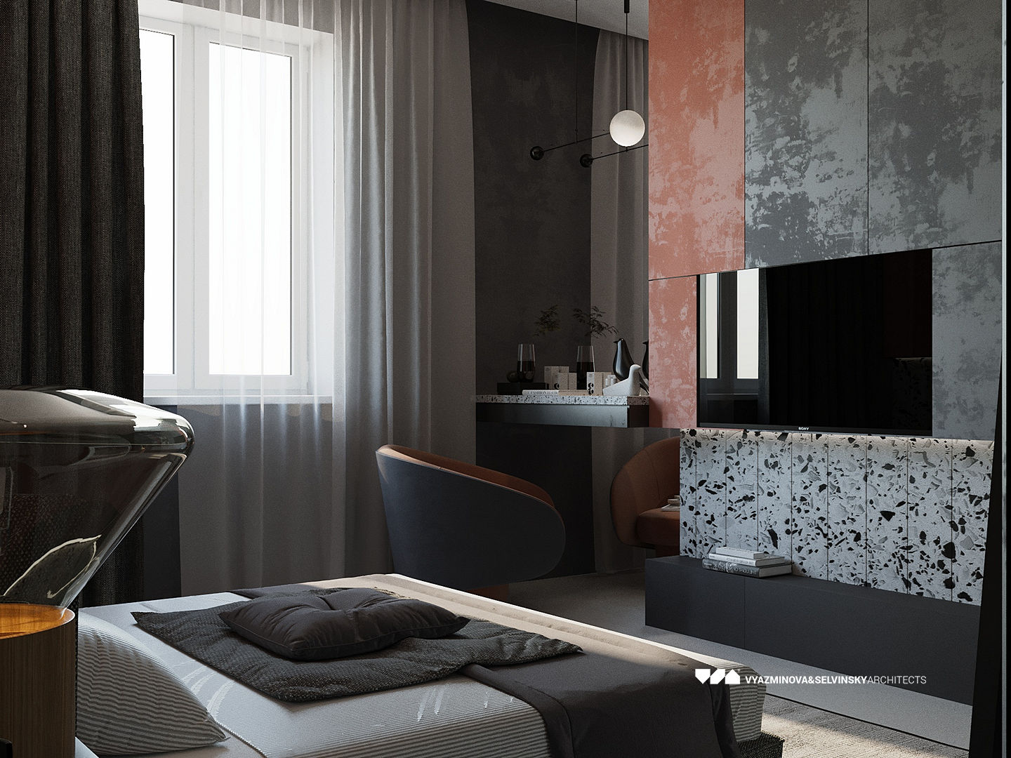
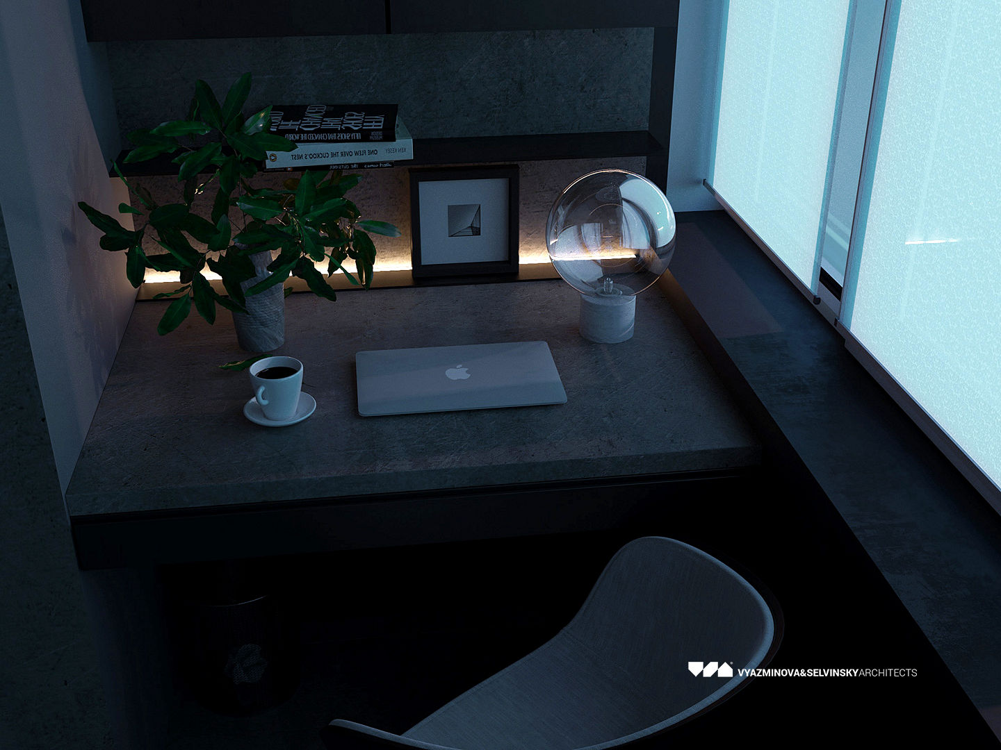
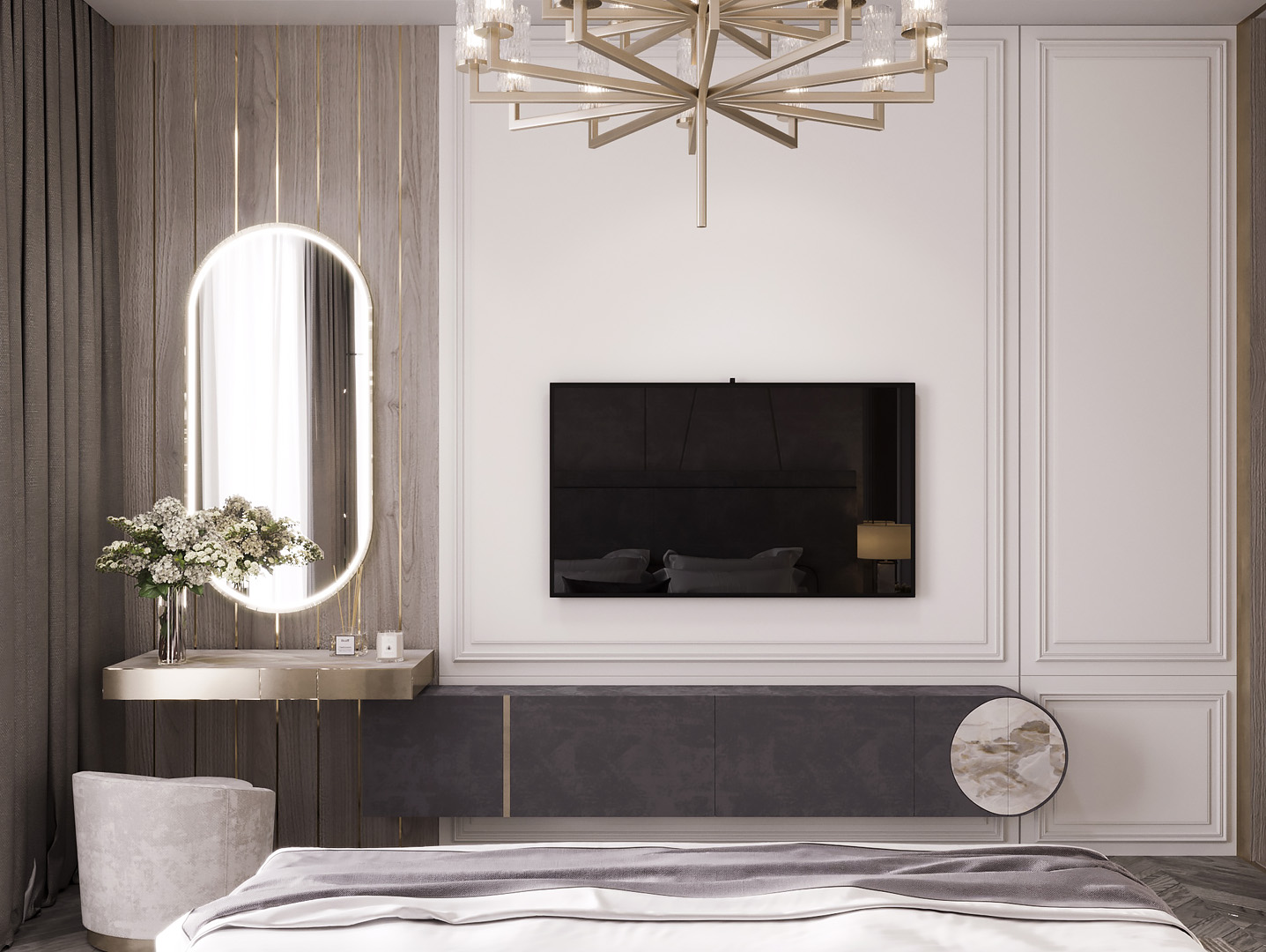
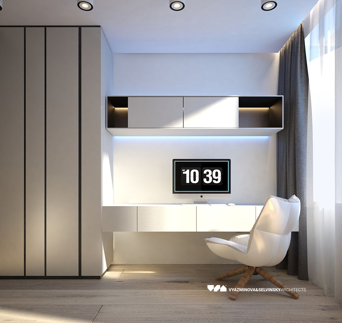
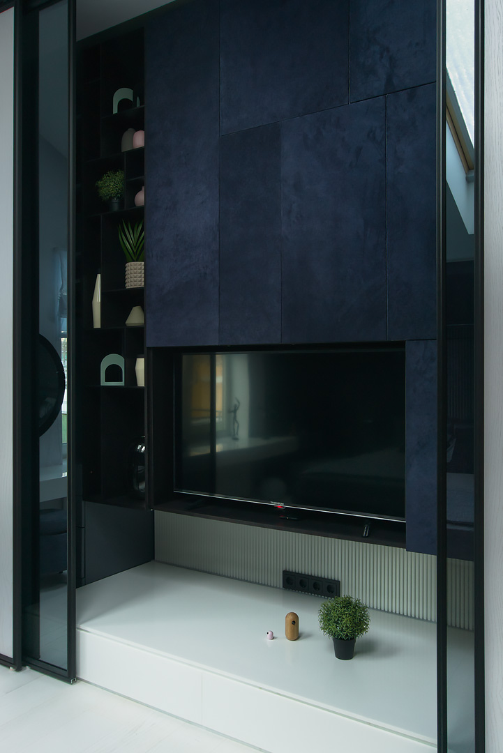
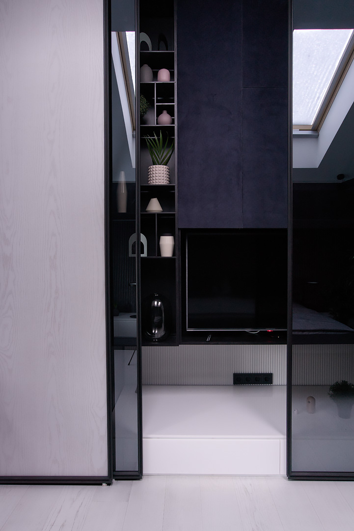
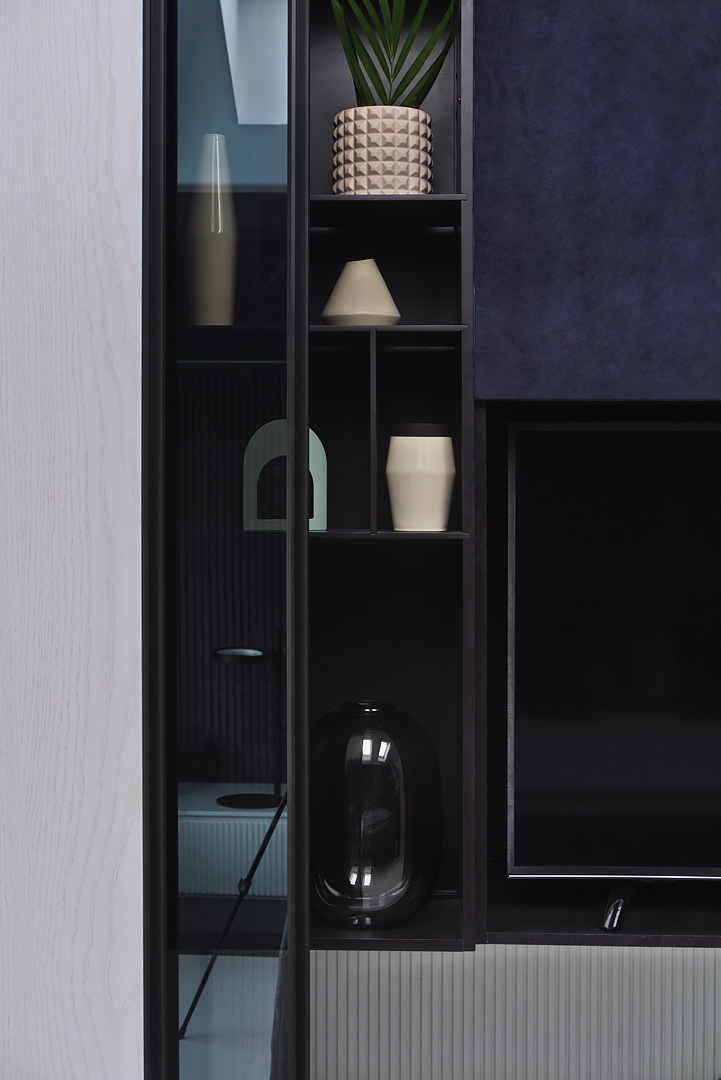
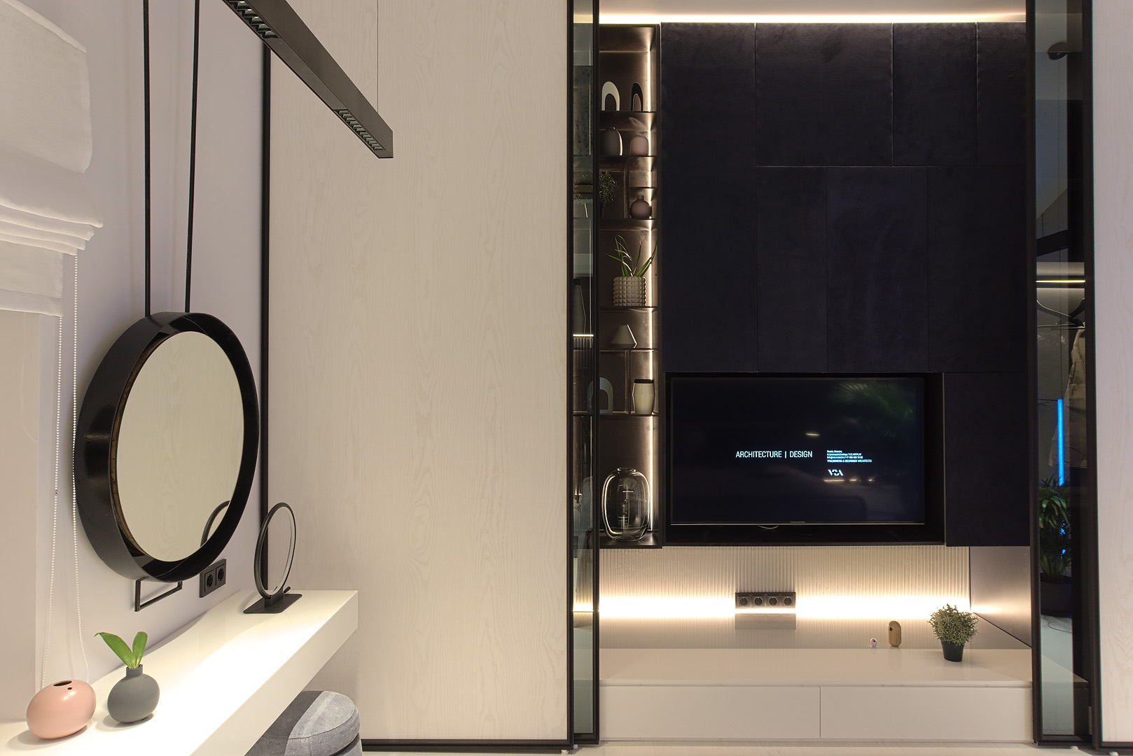
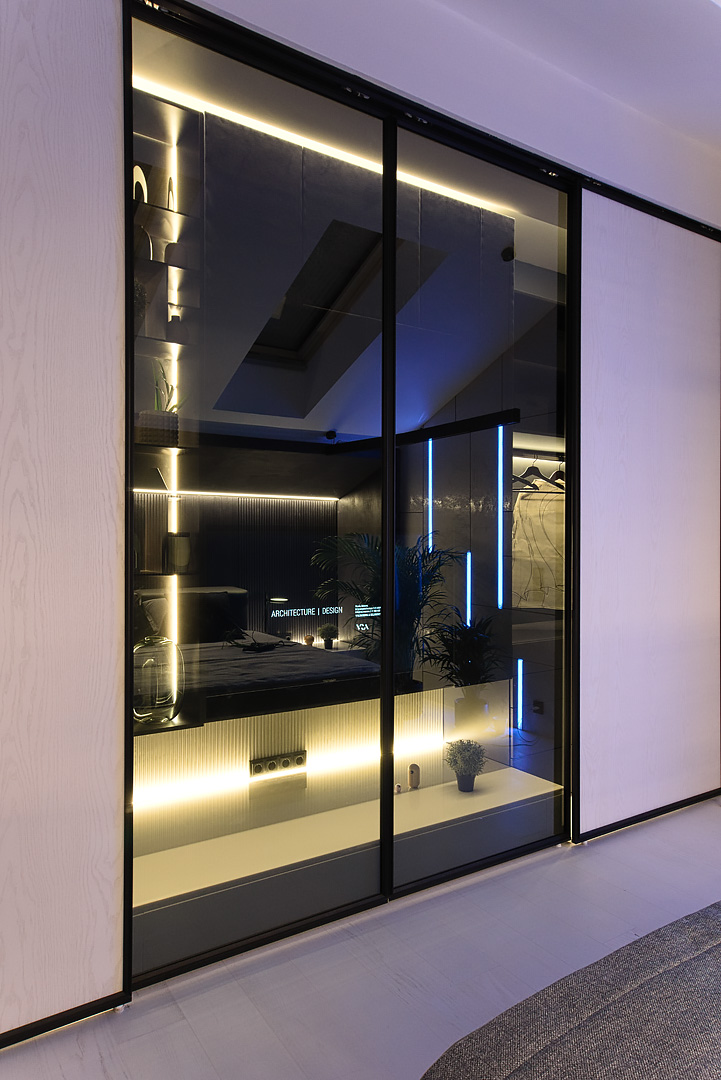
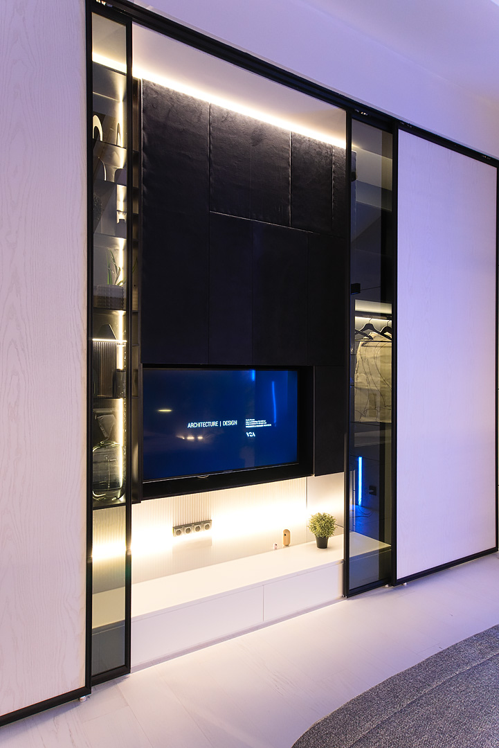
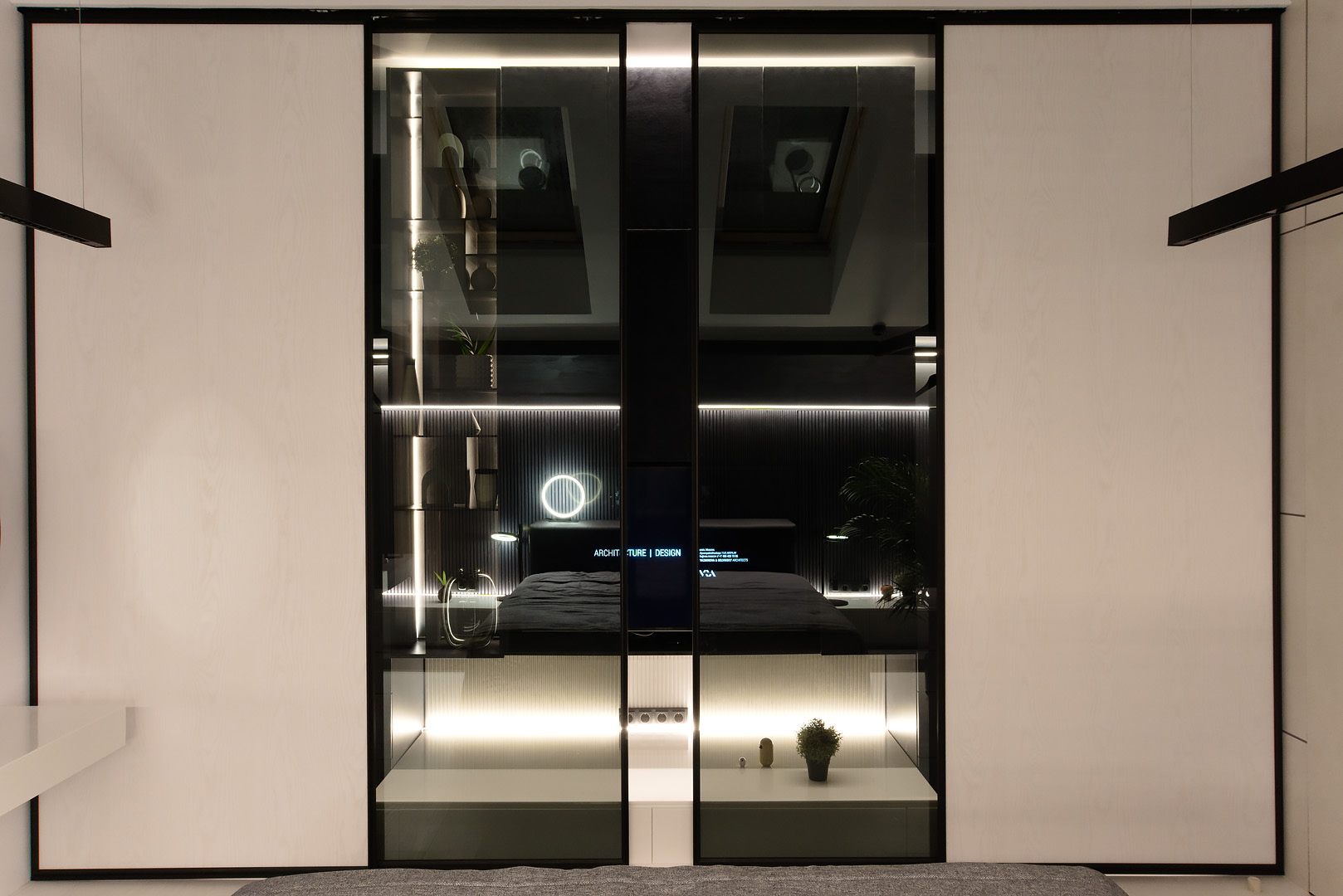
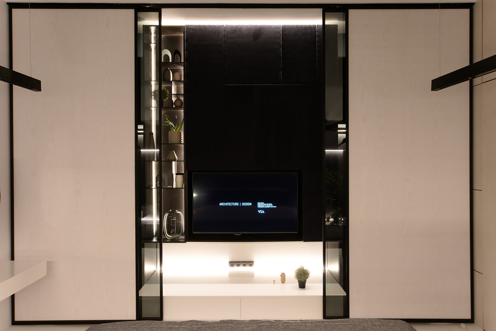
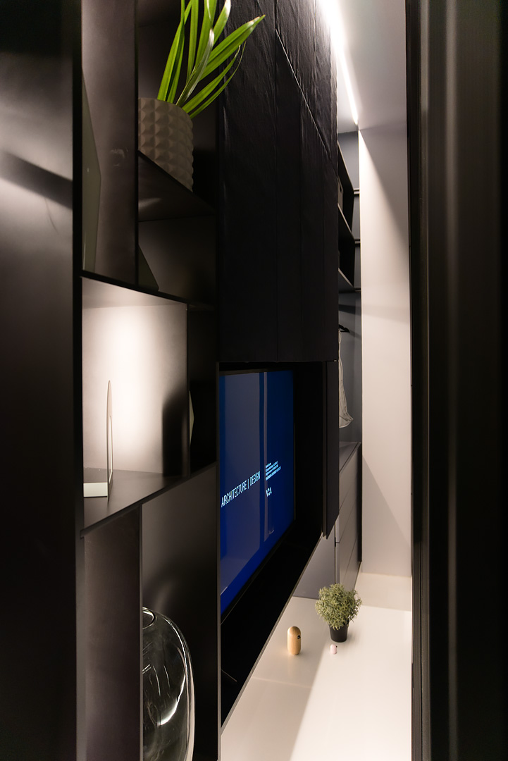
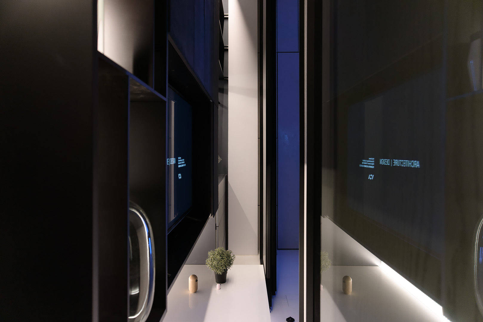
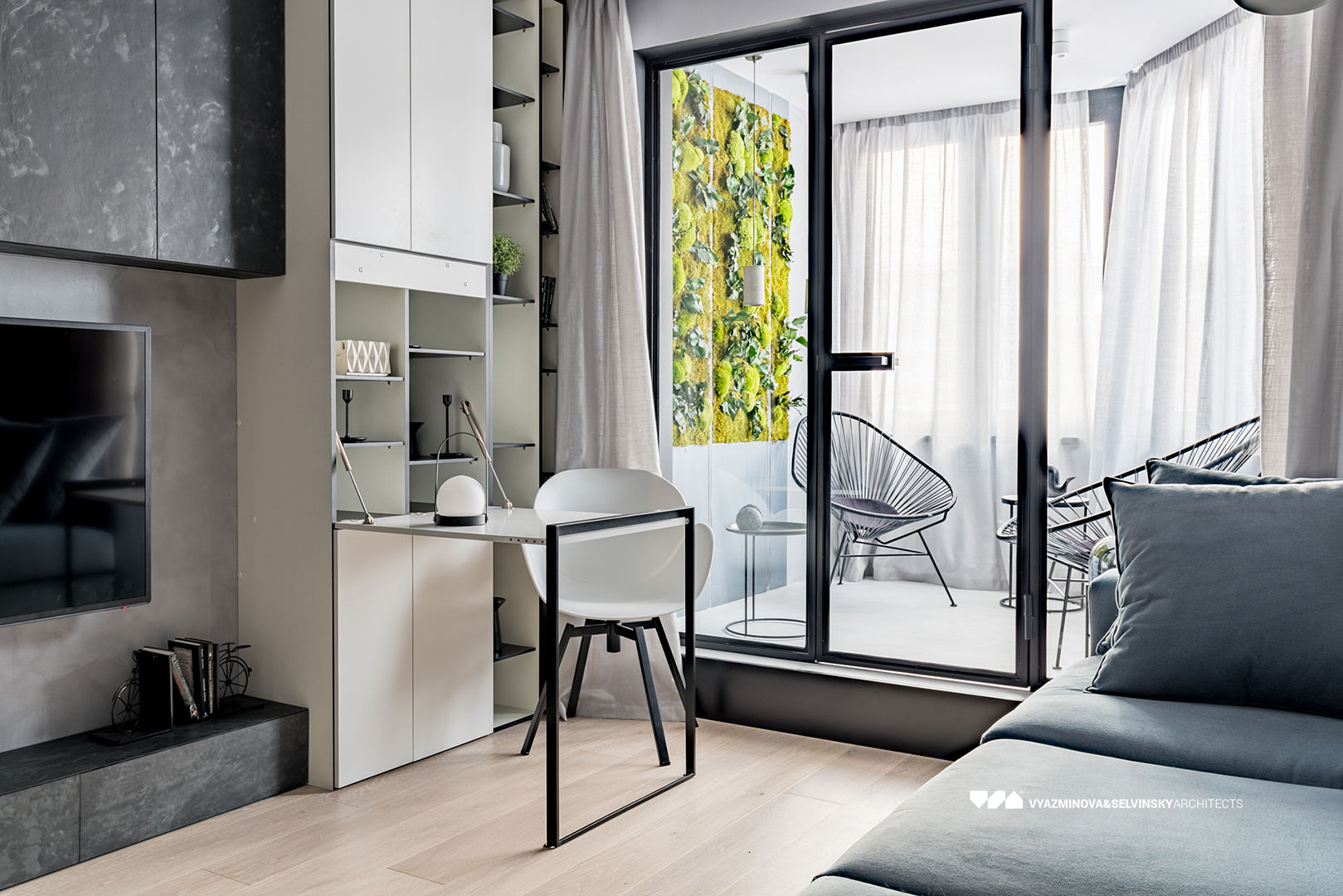
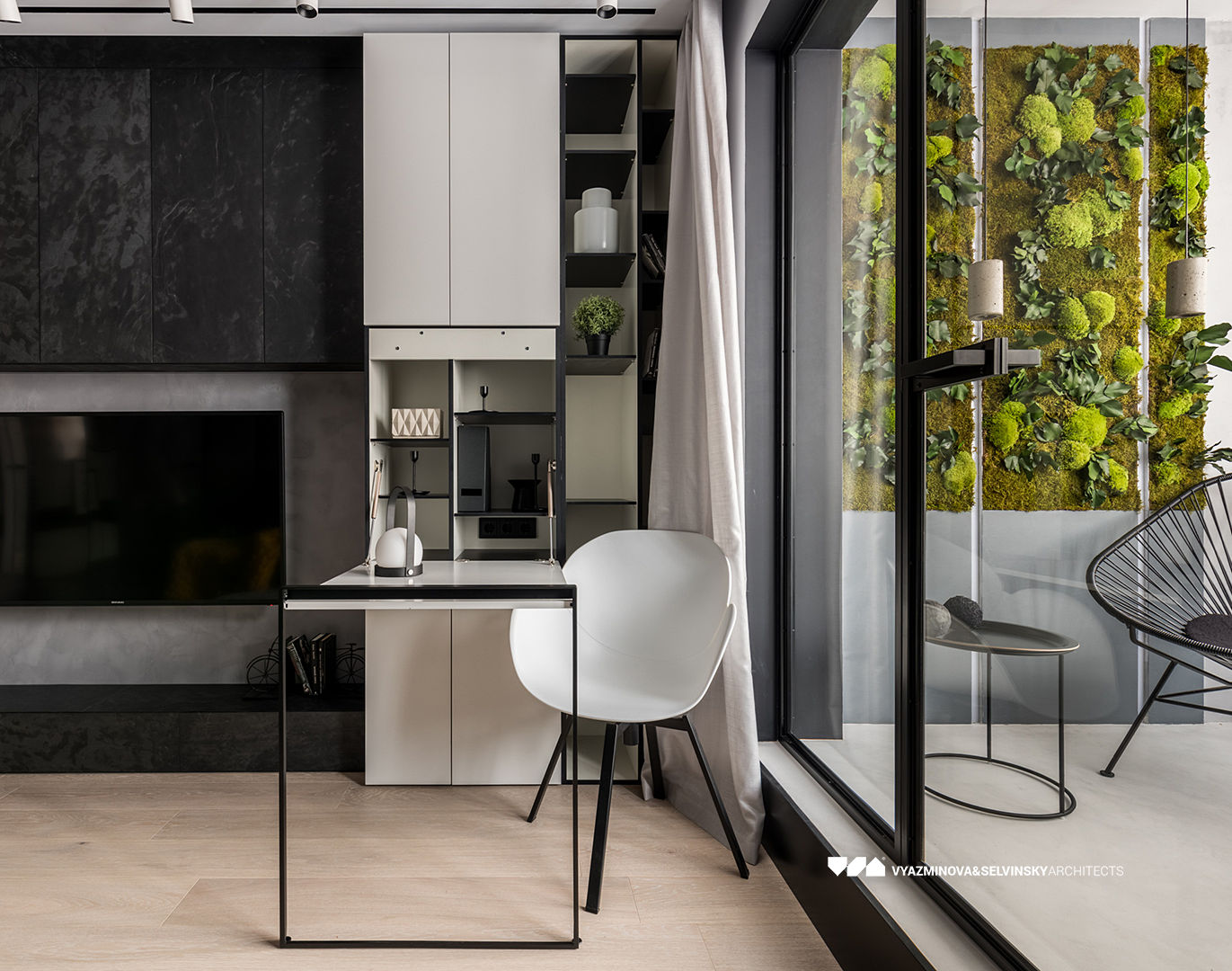
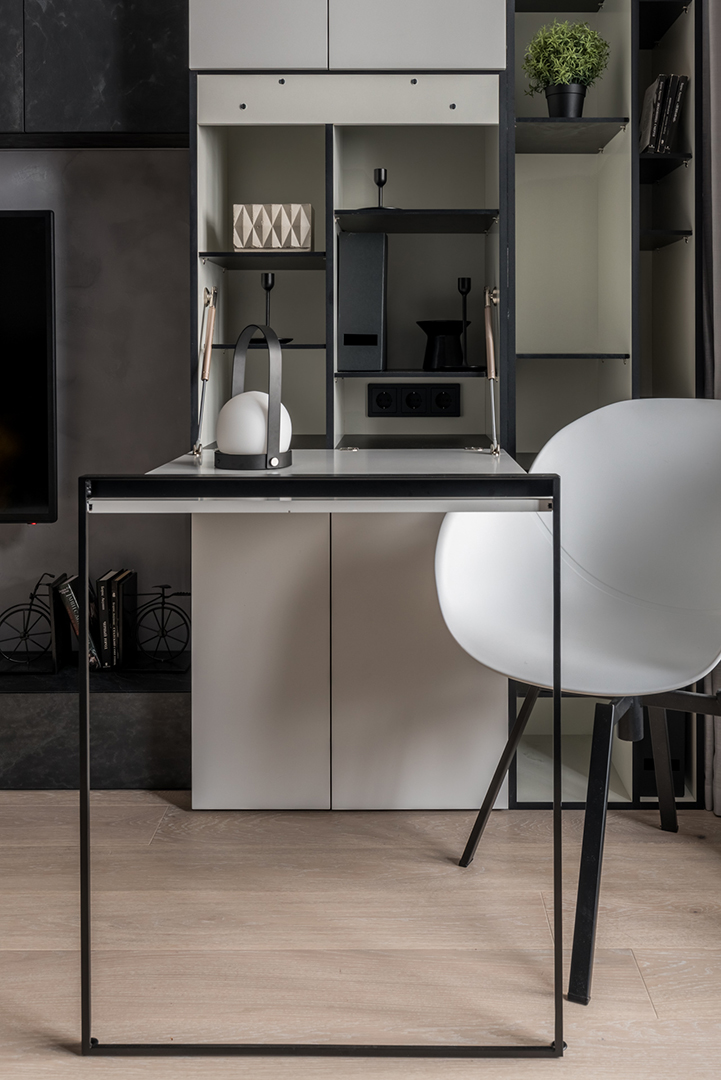
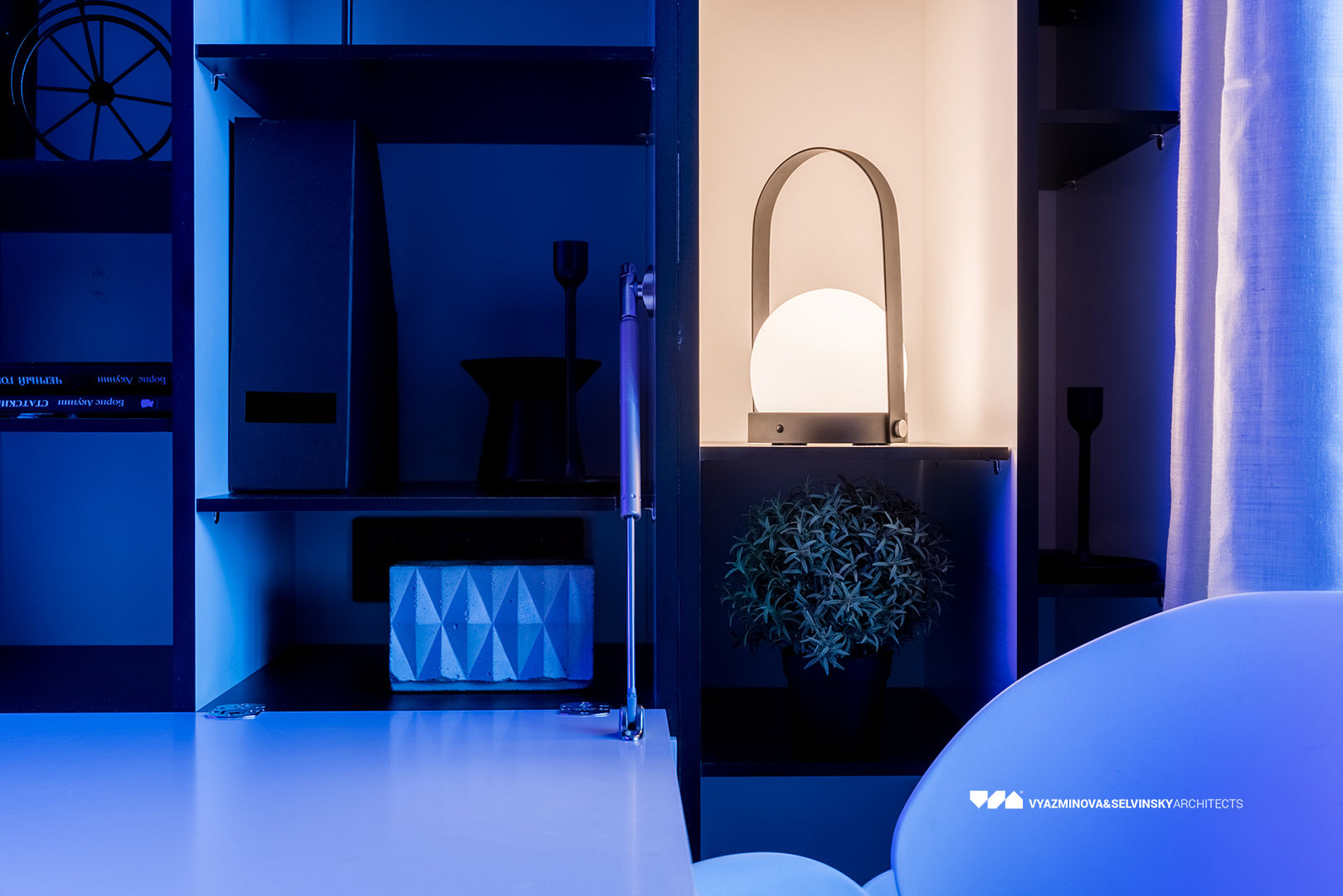
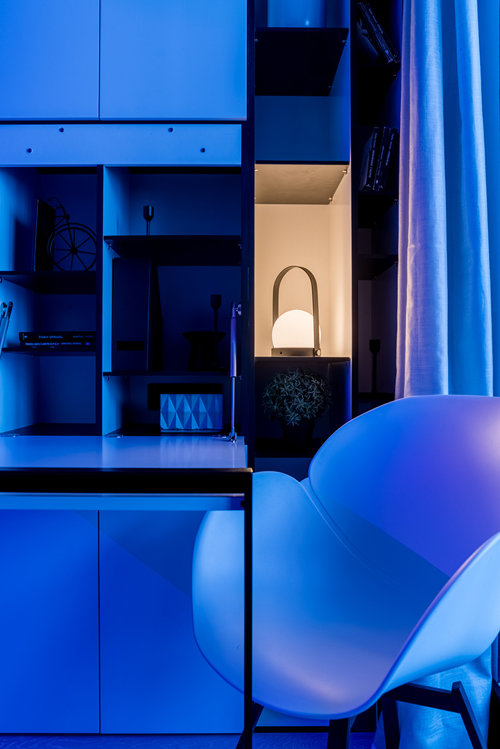
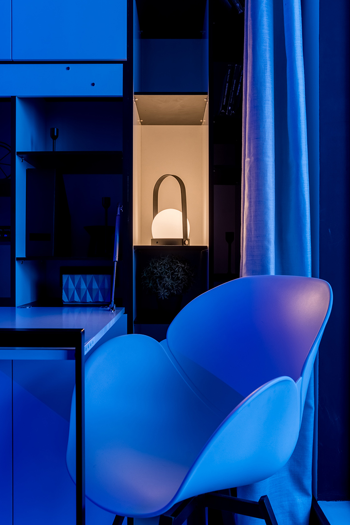
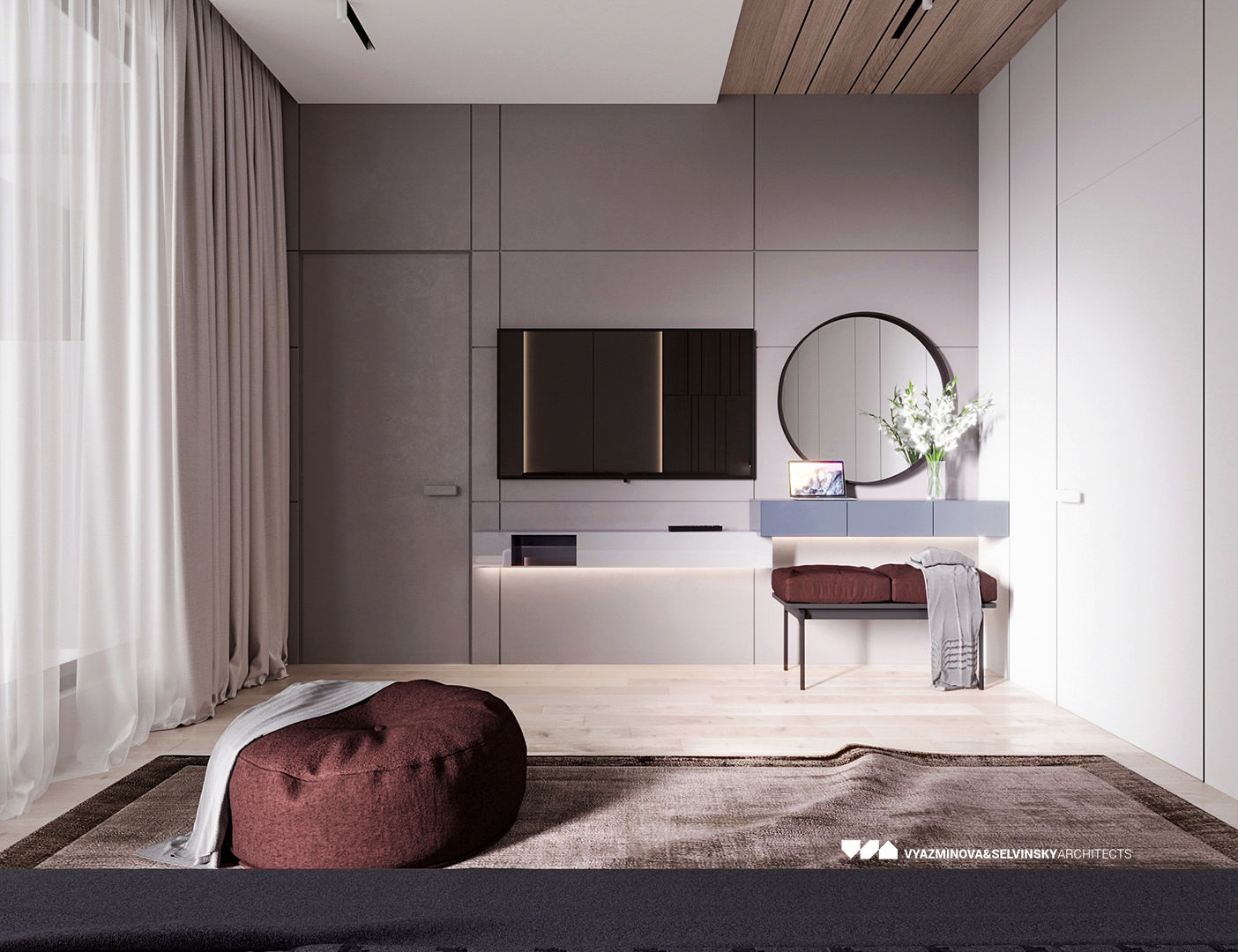
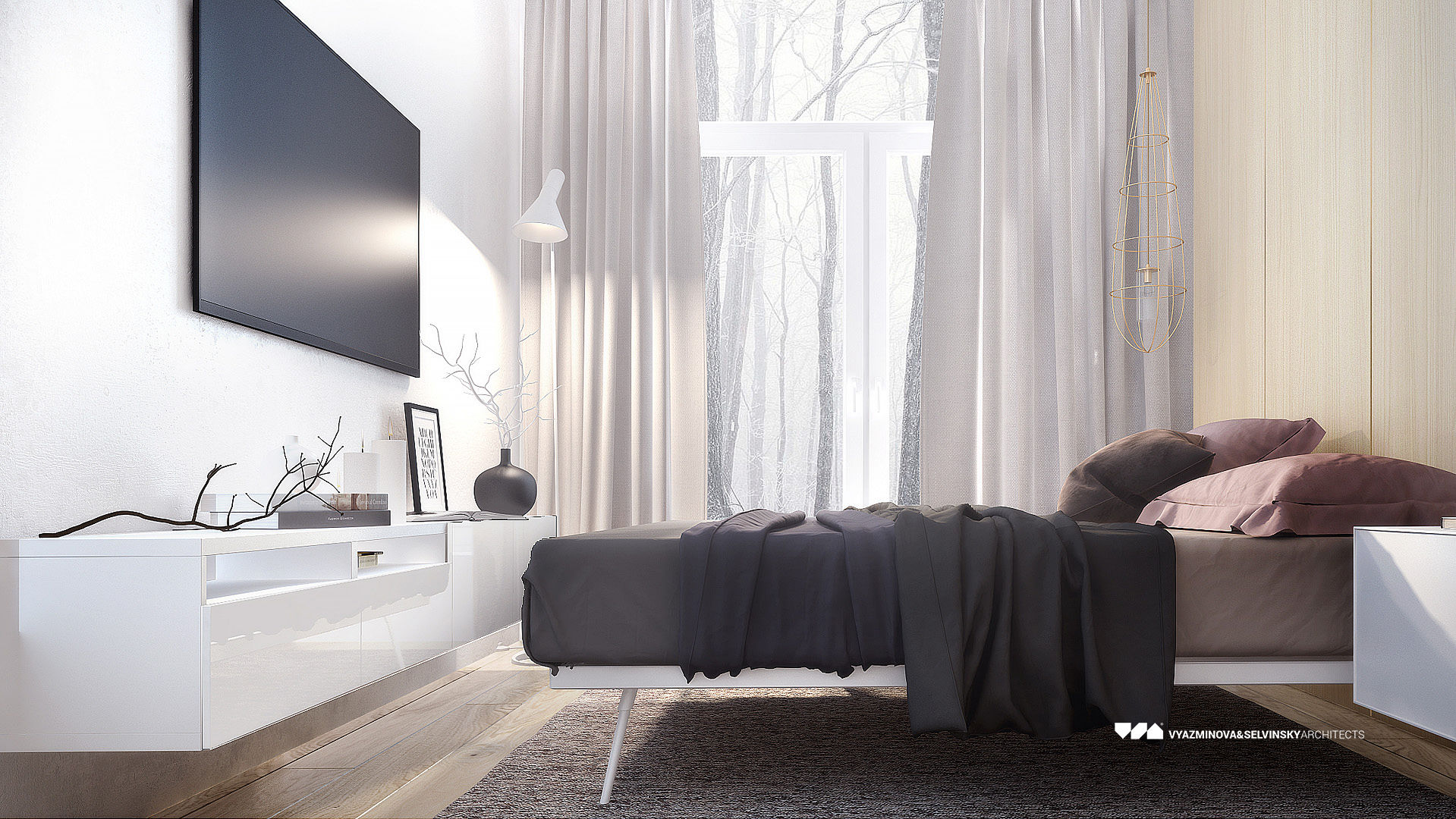
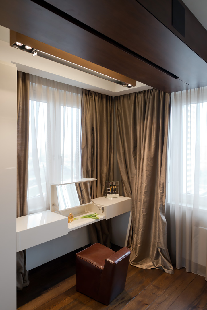
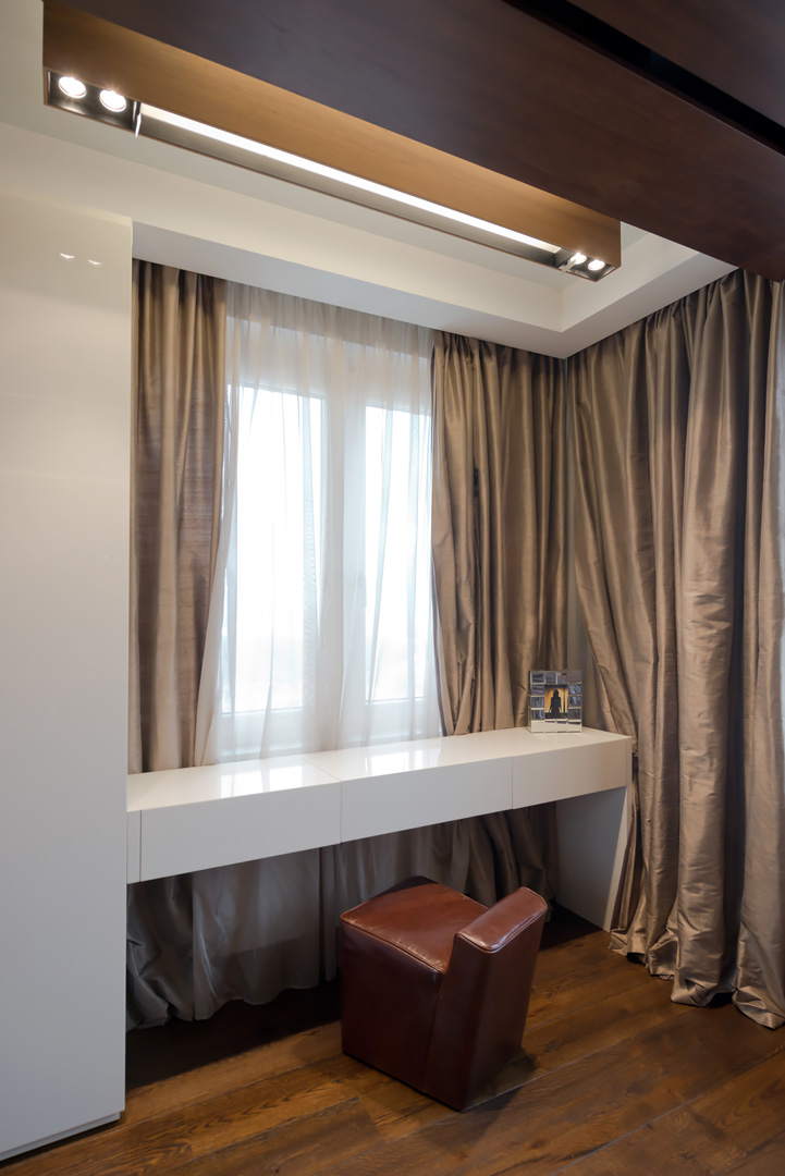
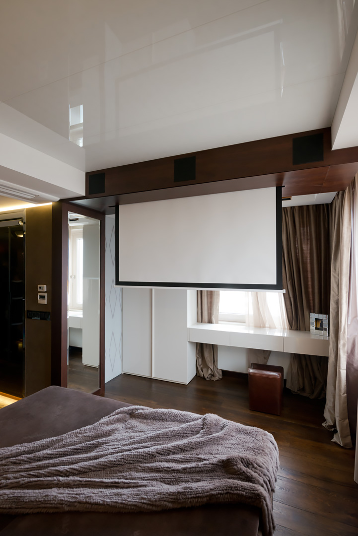
In front of the bed we placed a furniture structure, which includes a TV set and a bureau with a folding front, behind which you can sit comfortably to work: sort out papers, work with a laptop.
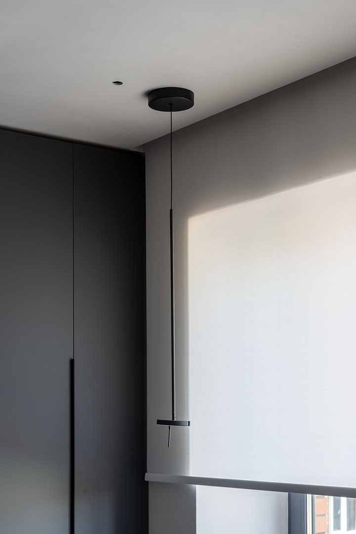
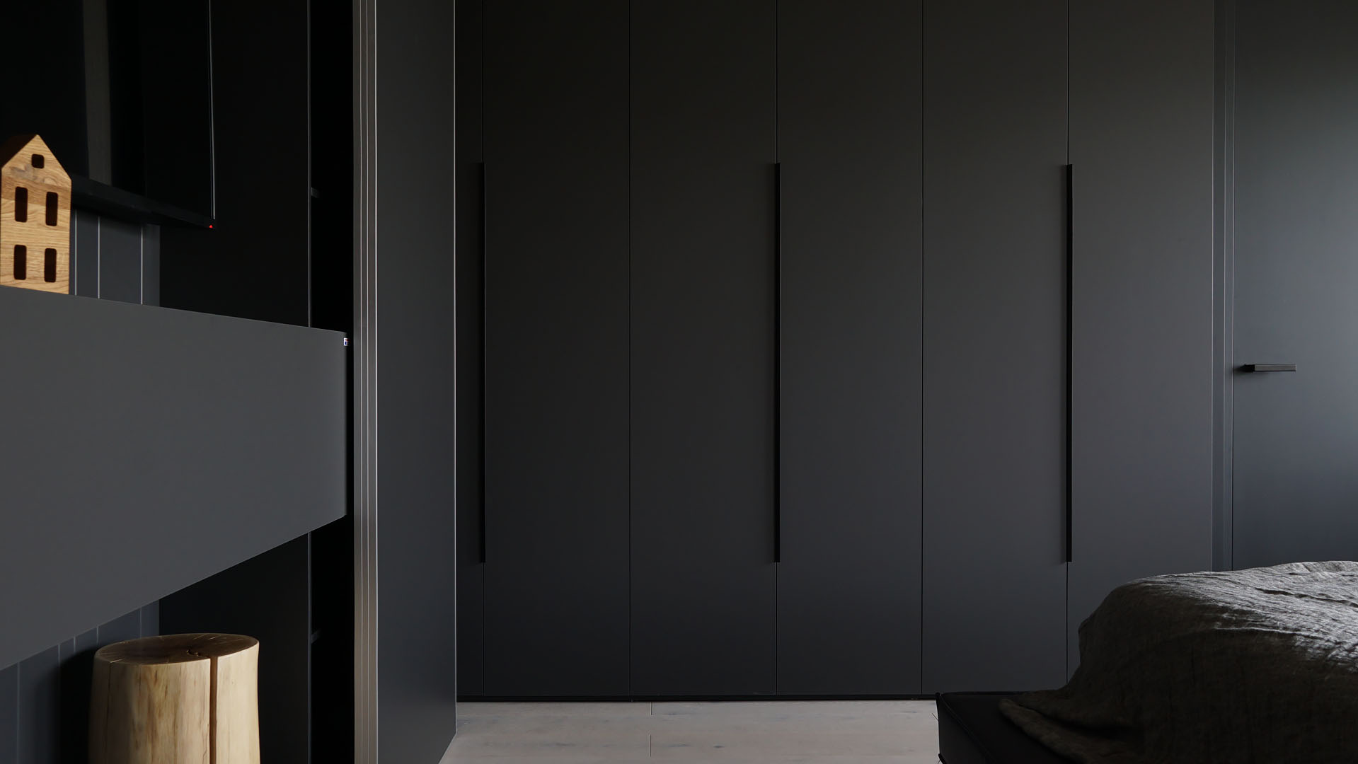
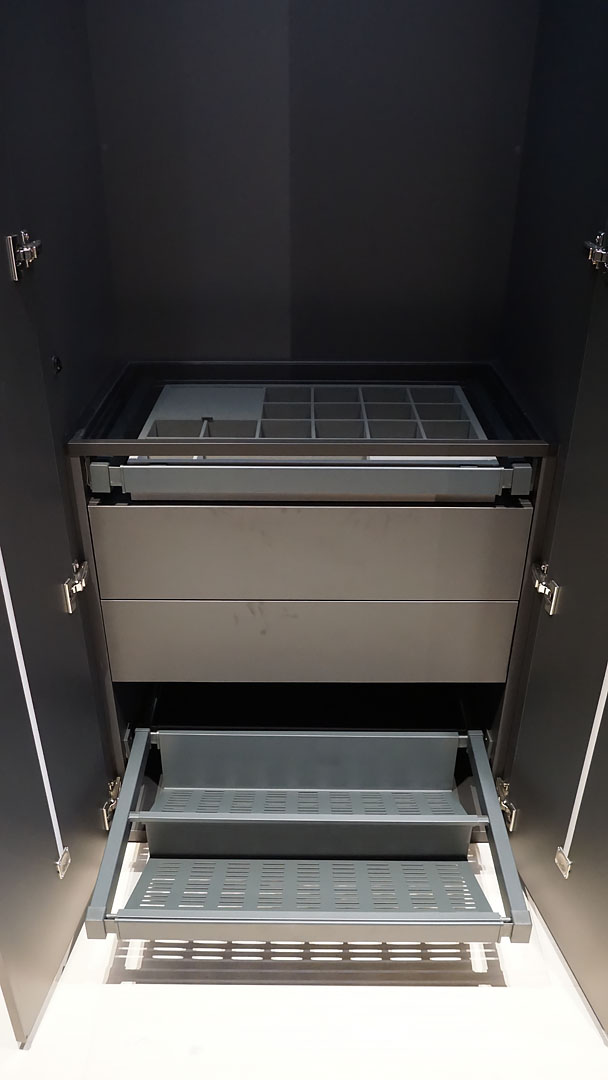
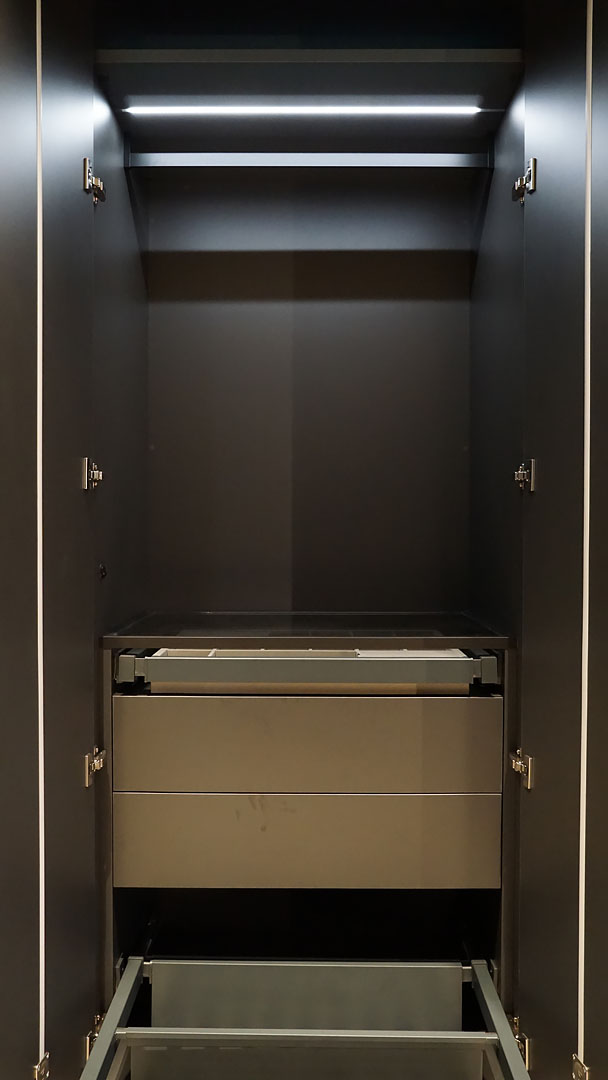
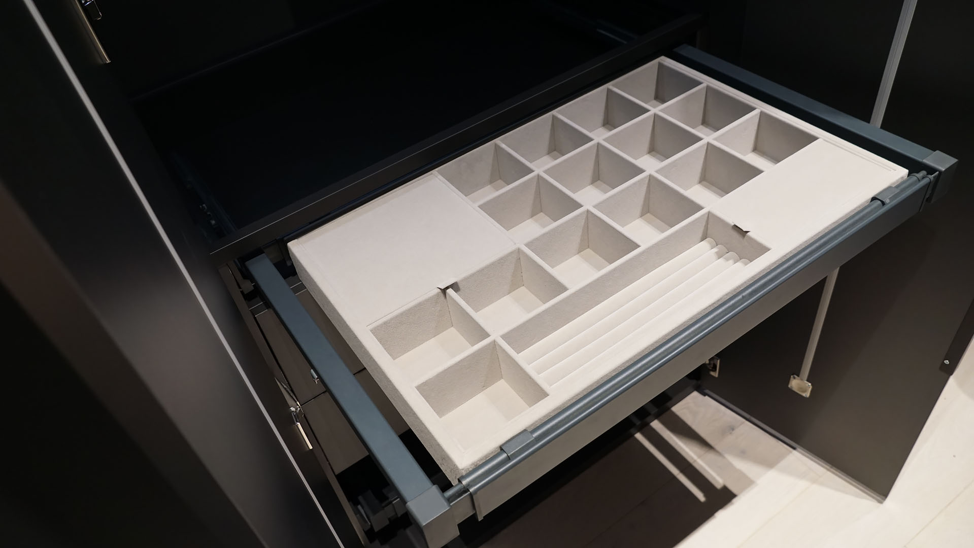
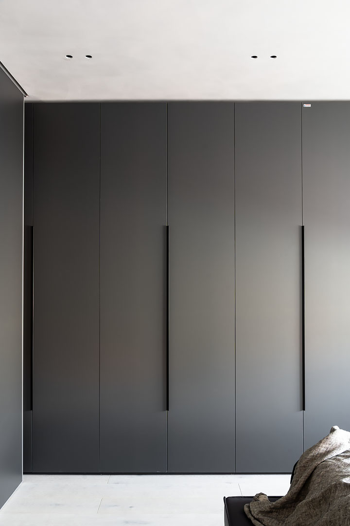
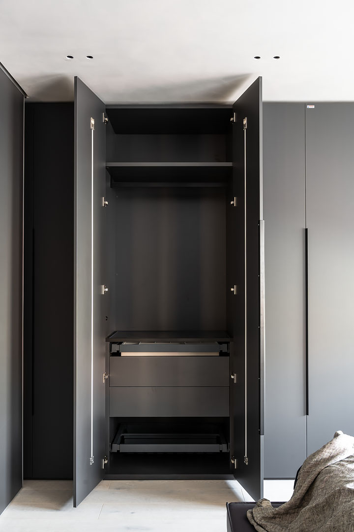
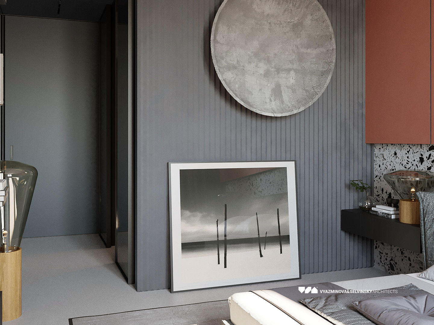
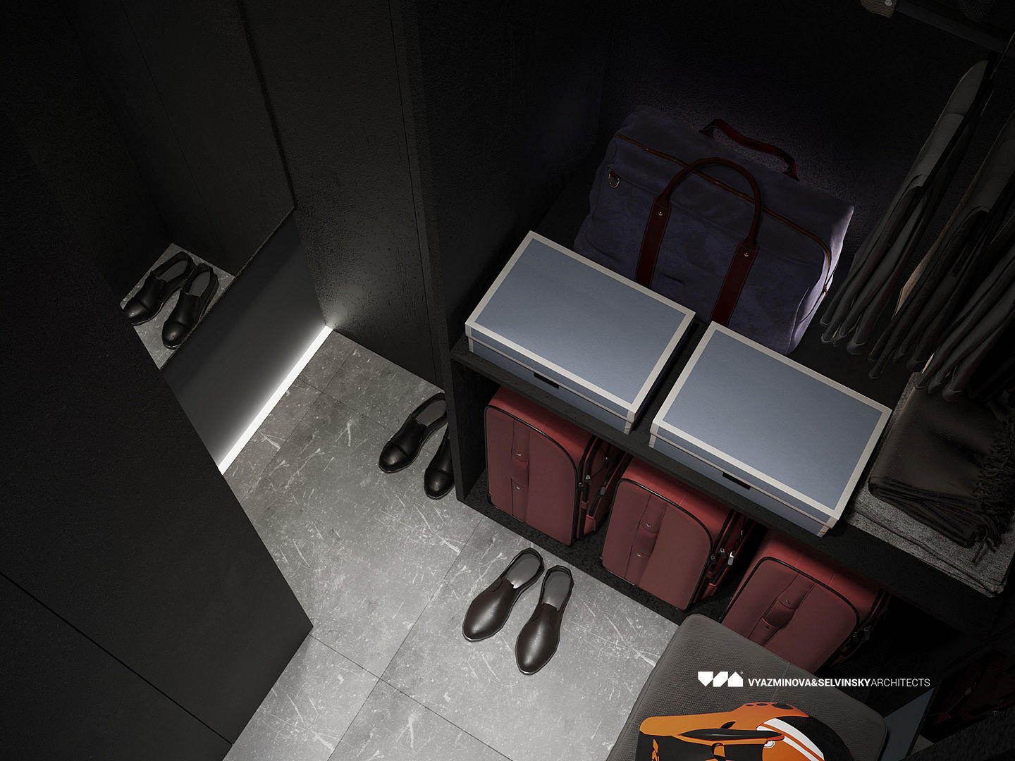
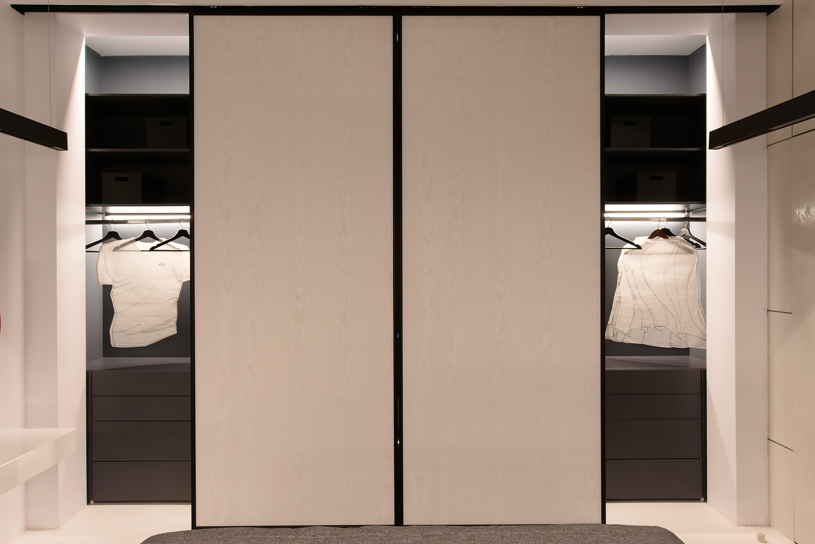
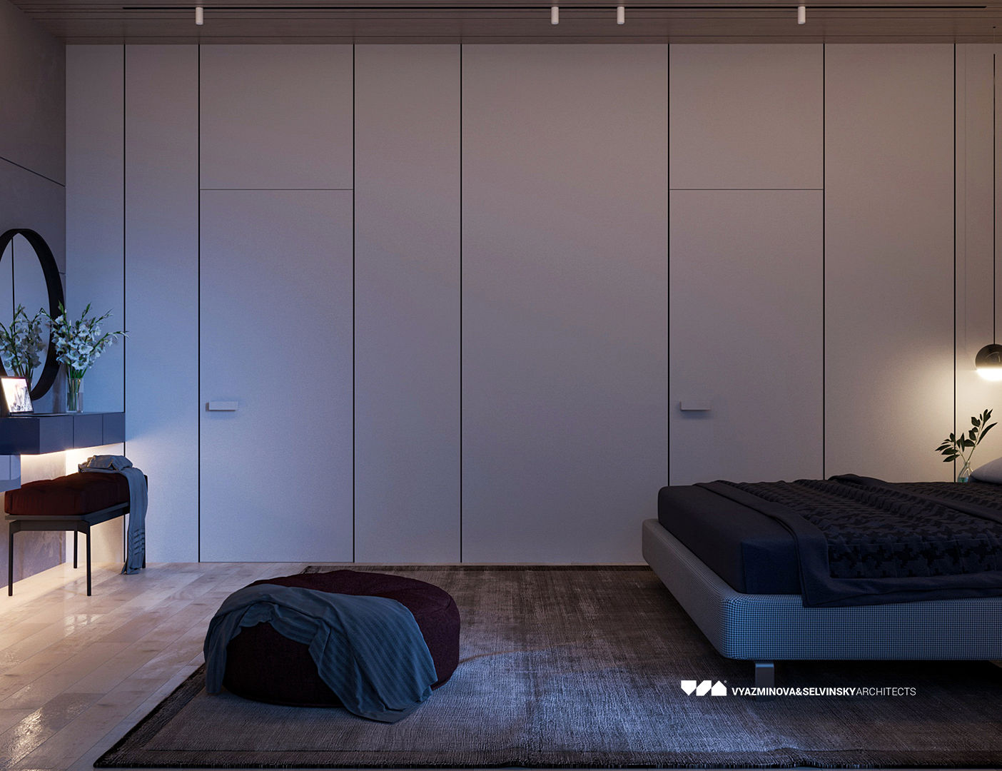
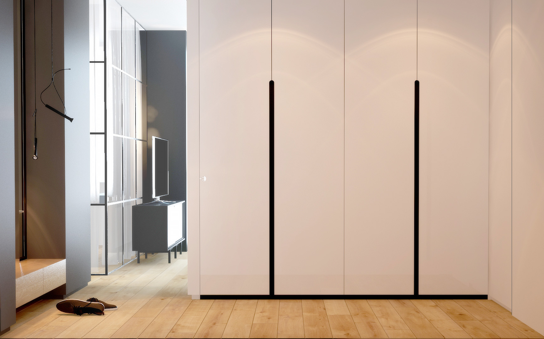
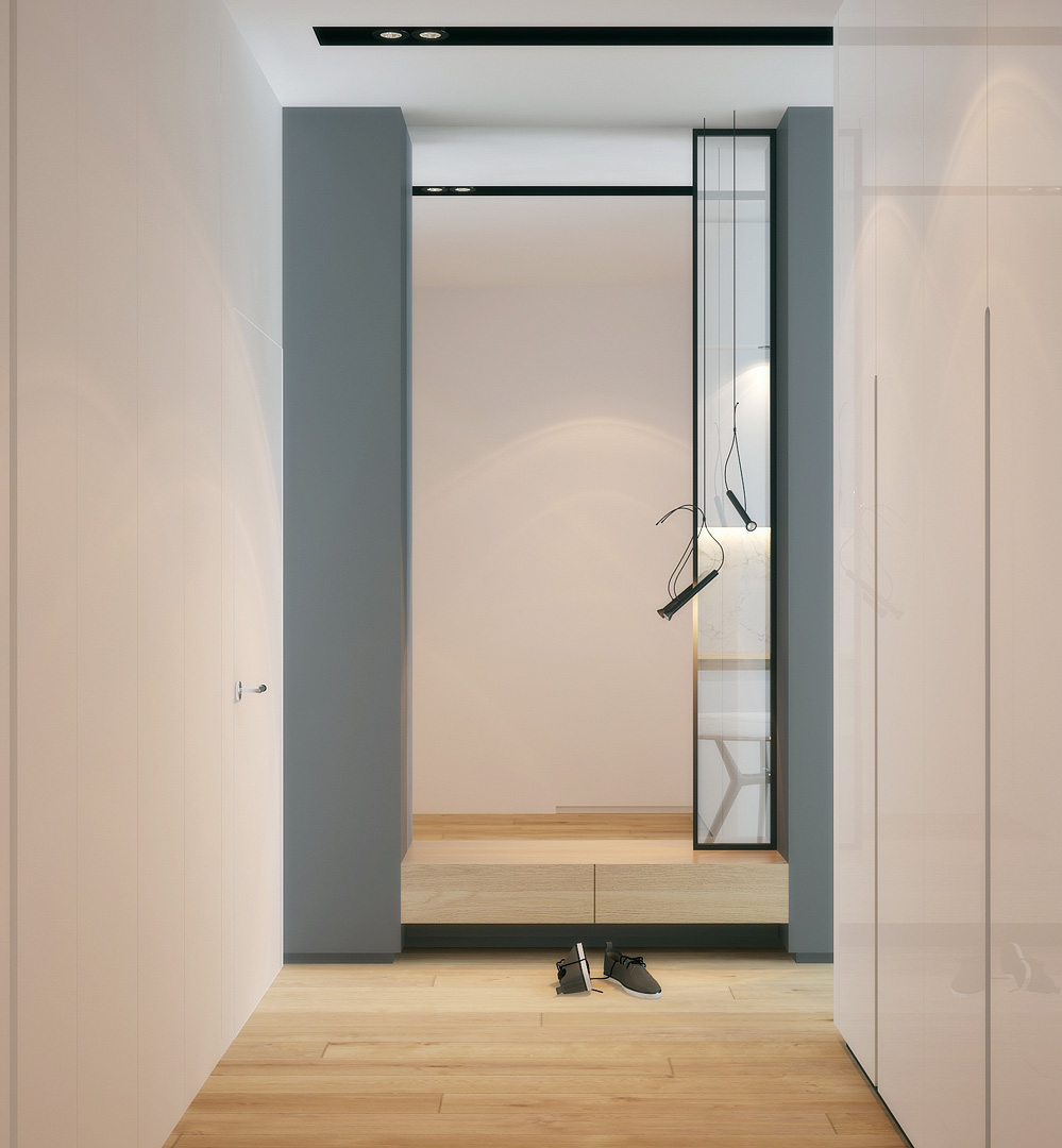
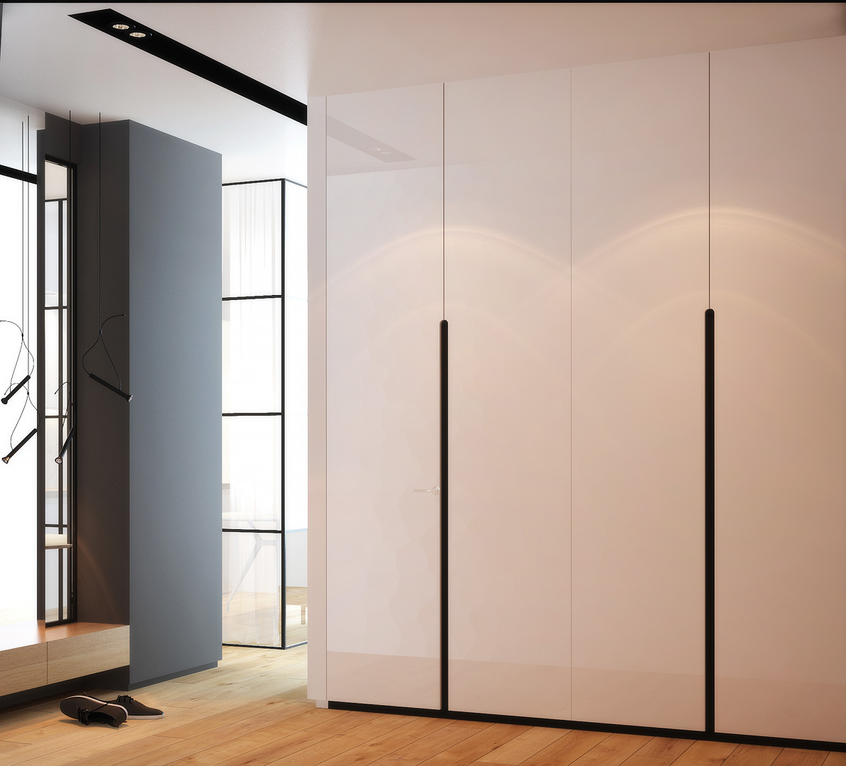
On the adjacent wall, we placed a line of cabinets, laconic in design, but functional inside: there is an organizer for storing accessories, and lights, and bars for ordinary things, and for elongated, and sliding shelves for shoes
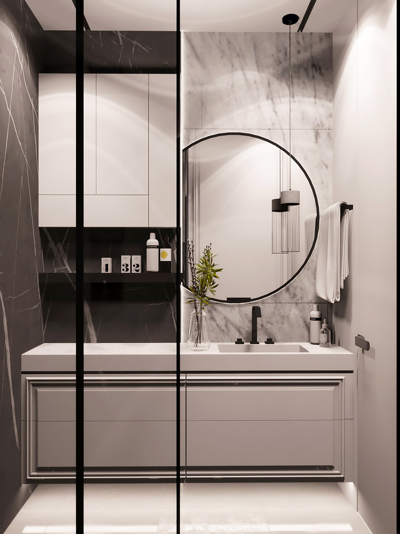
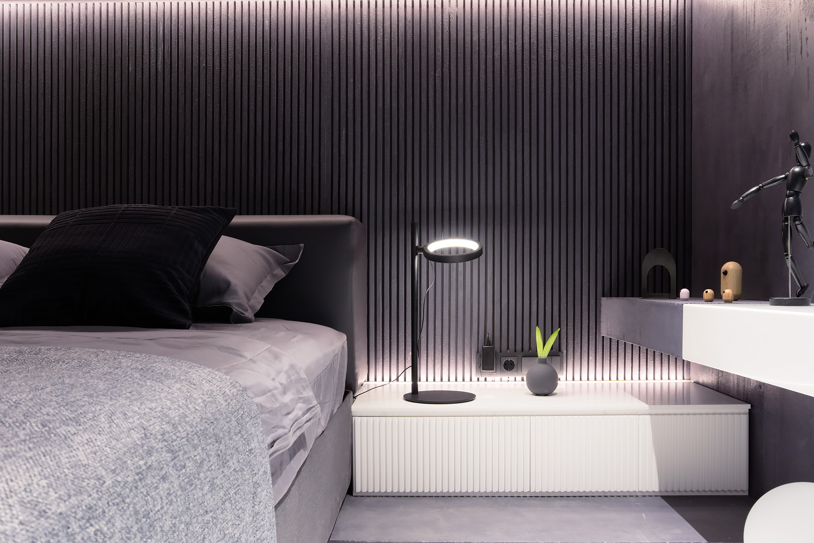
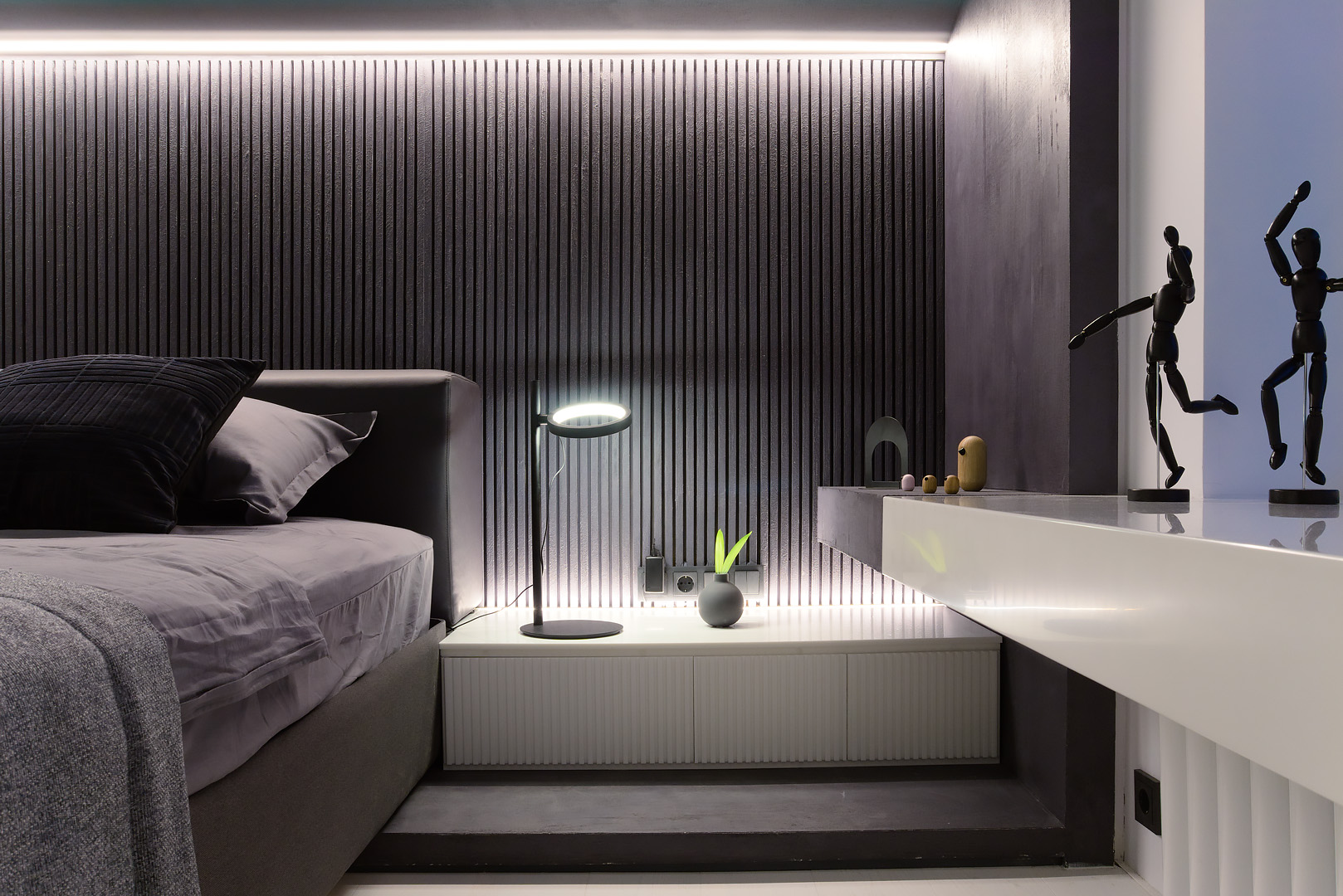
For all the technological complexity of the project – the abundance of furniture, appliances, bathroom equipment – the finishing is simple and ascetic. The tones of the materials are chosen in such a way that they all look monochromatic